Search results for "Straightforward" in Home Design Ideas
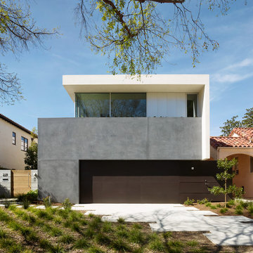
A straightforward composition of stucco, concrete and wood produced both a contemporary and warm respite in this urban setting. (Photography by Matthew Millman)

Free ebook, CREATING THE IDEAL KITCHEN
Download now → http://bit.ly/idealkitchen
This Glen Ellyn couple wanted to transform their dated kitchen into a more family-friendly space to use on a daily basis for cooking family meals and for entertaining friends. The existing kitchen was quite chopped up with strange soffits and different ceiling heights. To make the space flow in a more logical manner, we borrowed an unused desk area from the adjoining hallway and reconfigured a neighboring bath. Getting it to work on paper was fairly straightforward, but there was a bit of complicated beam work involved as the new kitchen flows through what was an old exterior wall. The new ceiling is now completely flush as we were able to hide the support in the ceiling joists.
A new, larger window was added at the sink, the doorway to the room was widened and the resulting space creates a more easy flow from dining room to family room.
The clients chose white inset cabinets, white marble tops and an apron sink to keep the space feeling simple yet original to the home's Colonial styling.
Ship lap siding on the back of the island and at the pantry storage ceiling, a walnut butcher block, and antique brass details give the space an updated look.
Professional stainless appliances are functional and beautiful. In addition to a large built-in fridge and 36" range, a second oven is housed in the island for flexibility.
The pantry area has a convenience station that houses the family's espresso machine along with the microwave drawer. Another large bank of cabinets in the same area serves as pantry storage for dry goods.
The bathroom was also remodeled as part of this project. The full bath has a vanity, shower and convenient baby changing area.
The floor is encaustic tile, a type of concrete tile recognizable by its bold graphics. The mirror and lighting add a few modern touches to keep it in line with the Owner's personal style.
Designed by: Susan Klimala, CKD, CBD
Photography by: Carlos Vergara
For more information on kitchen and bath design ideas go to: www.kitchenstudio-ge.com

 
Free ebook, Creating the Ideal Kitchen. DOWNLOAD NOW
 
This Glen Ellyn couple wanted to transform their dated kitchen into a more family-friendly space to use on a daily basis for cooking family meals and for entertaining friends. The existing kitchen was quite chopped up with strange soffits and different ceiling heights. To make the space flow in a more logical manner, we borrowed an unused desk area from the adjoining hallway and reconfigured a neighboring bath. Getting it to work on paper was fairly straightforward, but there was a bit of complicated beam work involved as the new kitchen flows through what was an old exterior wall. The new ceiling is now completely flush as we were able to hide the support in the ceiling joists.
A new, larger window was added at the sink, the doorway to the room was widened and the resulting space creates a more easy flow from dining room to family room.
The clients chose white inset cabinets, white marble tops and an apron sink to keep the space feeling simple yet original to the home's Colonial styling.
Ship lap siding on the back of the island and at the pantry storage ceiling, a walnut butcher block, and antique brass details give the space an updated look.
Professional stainless appliances are functional and beautiful. In addition to a large built-in fridge and 36" range, a second oven is housed in the island for flexibility.
The pantry area has a convenience station that houses the family's espresso machine along with the microwave drawer. Another large bank of cabinets in the same area serves as pantry storage for dry goods.
The bathroom was also remodeled as part of this project. The full bath has a vanity, shower and convenient baby changing area.
The floor is encaustic tile, a type of concrete tile recognizable by its bold graphics. The mirror and lighting add a few modern touches to keep it in line with the Owner's personal style.
Designed by: Susan Klimala, CKD, CBD
Photography by: Carlos Vergara
For more information on kitchen and bath design ideas go to: www.kitchenstudio-ge.com
Find the right local pro for your project
The homeowners purchased a 1956 brick home with the goal of an addition and renovation to modernize make it work better for their family. The existing maze-like first floor had three bedrooms, a kitchen, living room and bathroom. The homeowners opted for a full reconfiguration of the first floor as the family living area and to add square footage with a full second story addition for the bedrooms. The one story house was out of scale and character for the neighborhood that featured mostly two-story homes. The clients and designer also felt that a second story would offer a simpler, more straightforward circulation pattern for family connectivity. Our designer’s main challenge in adding a second story was to make it look like it was always part of the house. Creating a flow and selecting materials added to the challenge. Our designer's solution was a Craftsman-style house where the roof creates a second story and covers the full footprint of the first floor, making it look original to the house. Adding two gable dormers in the front and a shed dormer gives the interior space enough ceiling height. Windows. We replaced all the windows with a 6 over 1 grid pattern for the windows that evokes the Craftsman style.
Doors. The new dark front door and sidelight allow for natural light and have a simple glass pattern that also contributes to the Craftsman style.
Front Porch. A new porch spans the width of the house. The continuation of the house’s roof provides the cover for the front porch. We used low-maintenance Trex decking and railing.
Exterior. To create shingle-looking exterior we used composite Cedar Impressions shakes, which are low maintenance. We also used composite trim and brackets.

For this kitchen, designed by Peter Bittner, the client had a very clear idea of what she wanted right from the start. She did her research. The mother of a fast growing, young family, she wanted something as efficient as it was beautiful – on the simple, yet elegant side. Her requests were straightforward: white and light grey Bilotta cabinetry in a transitional style so as not to compete with the detailing inside her 1950s Tudor-style home; a heated tile floor (By Rye Ridge Tile); stainless appliances; white subway tile backsplash by Walker Zanger (again to keep it clean and not compete with its surroundings); and seating at the island for snacks and homework. The “pop” suggested by Peter was done through the satin brass hardware and lighting fixtures. The real challenge with this space was to fit as much as possible into the existing footprint which was overall on the smaller side. The solution was eliminating a doorway (with a swinging door that opened into the kitchen) and stairs from the kitchen to the basement. By moving the stairs and doorway, the usable space increased considerably. The typical working triangle became the focus for one side of the kitchen and the island overhang and seating became available on the other side. To make up for the limited amount of wall cabinets Peter designed shallow pantry-style cabinets along the back wall. Quartz Countertops by Rom Stone Fabrication. Designer: Peter Bittner Photographer: Peter Krupenye

Michael Moran/OTTO photography.
The objective of this award-winning gut renovation was to create a spatially dynamic, light-filled, and energy-efficient home with a strong connection to Long Island Sound. The design strategy is straightforward: a gabled roof covers a central “spine” corridor that terminates with cathedral ceilinged spaces at both ends. The relocated approach and entry deposit visitors into the front hall with its curvilinear, cantilevered stair. A two-story, windowed family gathering space lies ahead – a straight shot to the water beyond.
The design challenge was to utilize the existing house footprint and structure, while raising the top of foundation walls to exceed new flood regulations, reconfiguring the spatial organization, and using innovative materials to produce a tight thermal envelope and contemporary yet contextually appropriate facades.

Custom White kitchen with black island. Topped with a custom maple butcher block
Example of a cottage l-shaped eat-in kitchen design in Other with a drop-in sink, shaker cabinets, white cabinets, granite countertops and stainless steel appliances

Kristin Widman
Inspiration for a transitional master white tile marble floor bathroom remodel in Seattle with an undermount sink, furniture-like cabinets, white cabinets, a one-piece toilet and gray walls

Design ideas for a small traditional front yard landscaping in Other.

Hallway with runner on stairs
Staircase - large contemporary carpeted straight wood railing staircase idea in Essex with carpeted risers

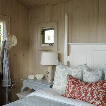
BLDG Workshop was enlisted to aid Sarah Richardson Design in the creation of her Bunkie for her show Sarah's Cottage. The structure was a fairly straightforward design which became the background for Sarah's amazing interior design that delighted viewers.
With nearly 14,000 square feet of transparent planar architecture, In Plane Sight, encapsulates — by a horizontal bridge-like architectural form — 180 degree views of Paradise Valley, iconic Camelback Mountain, the city of Phoenix, and its surrounding mountain ranges.
Large format wall cladding, wood ceilings, and an enviable glazing package produce an elegant, modernist hillside composition.
The challenges of this 1.25 acre site were few: a site elevation change exceeding 45 feet and an existing older home which was demolished. The client program was straightforward: modern and view-capturing with equal parts indoor and outdoor living spaces.
Though largely open, the architecture has a remarkable sense of spatial arrival and autonomy. A glass entry door provides a glimpse of a private bridge connecting master suite to outdoor living, highlights the vista beyond, and creates a sense of hovering above a descending landscape. Indoor living spaces enveloped by pocketing glass doors open to outdoor paradise.
The raised peninsula pool, which seemingly levitates above the ground floor plane, becomes a centerpiece for the inspiring outdoor living environment and the connection point between lower level entertainment spaces (home theater and bar) and upper outdoor spaces.
Project Details: In Plane Sight
Architecture: Drewett Works
Developer/Builder: Bedbrock Developers
Interior Design: Est Est and client
Photography: Werner Segarra
Awards
Room of the Year, Best in American Living Awards 2019
Platinum Award – Outdoor Room, Best in American Living Awards 2019
Silver Award – One-of-a-Kind Custom Home or Spec 6,001 – 8,000 sq ft, Best in American Living Awards 2019

For this kitchen, designed by Peter Bittner, the client had a very clear idea of what she wanted right from the start. She did her research. The mother of a fast growing, young family, she wanted something as efficient as it was beautiful – on the simple, yet elegant side. Her requests were straightforward: white and light grey Bilotta cabinetry in a transitional style so as not to compete with the detailing inside her 1950s Tudor-style home; a heated tile floor (By Rye Ridge Tile); stainless appliances; white subway tile backsplash by Walker Zanger (again to keep it clean and not compete with its surroundings); and seating at the island for snacks and homework. The “pop” suggested by Peter was done through the satin brass hardware and lighting fixtures. The real challenge with this space was to fit as much as possible into the existing footprint which was overall on the smaller side. The solution was eliminating a doorway (with a swinging door that opened into the kitchen) and stairs from the kitchen to the basement. By moving the stairs and doorway, the usable space increased considerably. The typical working triangle became the focus for one side of the kitchen and the island overhang and seating became available on the other side. To make up for the limited amount of wall cabinets Peter designed shallow pantry-style cabinets along the back wall. Quartz Countertops by Rom Stone Fabrication. Designer: Peter Bittner Photographer: Peter Krupenye

Bathroom - mid-sized modern 3/4 white tile and ceramic tile ceramic tile, gray floor and single-sink bathroom idea in Los Angeles with flat-panel cabinets, medium tone wood cabinets, a one-piece toilet, white walls, an undermount sink, quartzite countertops, white countertops, a niche and a floating vanity

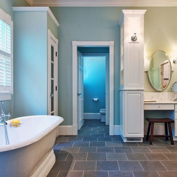
Bathroom - mid-sized traditional master mosaic tile floor and multicolored floor bathroom idea in New Orleans with shaker cabinets, gray cabinets, a one-piece toilet, blue walls, an undermount sink and marble countertops

Materials traditionally used in Spanish houses were incorporated - all but with a modern twist; a straightforward composition of stucco, concrete and wood produced both a contemporary and warm respite in this urban setting.
(Photography by Matthew Millman)
Situated in Kenwood, Maryland just outside of Washington, D.C., this whole-house renovation reinterprets a 1950s split-level into a rustic French country house. Published 3 times, The French country house plans for this renovation inform and guide the remodel. Short double-hung existing windows of various sizes on a 1950s brick front wall (see below) were replaced by straightforward openings along the front facade. By replacing them with a series of similar openings, the end result is a principled, simple elegance inspired by French country style homes. The rustic application of field stone arches and rough stucco are both inviting and enchanting, echoing French country interior design.
Elements of French country home decor complement the home. The traditional French country home design has been widely published, including features in Renovation Style and Maryland Life magazines, among others. One singular continuous walkway runs the entire length of the main front under each of the French doors, and a courtyard created by stucco walls and stone piers create an inner sanctum in the front yard. In the back of the property, added French gates lead to a newly constructed pavilion.

RVP Photography
Walk-in shower - transitional master white tile and ceramic tile ceramic tile walk-in shower idea in Cincinnati with shaker cabinets, gray cabinets, gray walls, an undermount sink and marble countertops

For this kitchen, designed by Peter Bittner, the client had a very clear idea of what she wanted right from the start. She did her research. The mother of a fast growing, young family, she wanted something as efficient as it was beautiful – on the simple, yet elegant side. Her requests were straightforward: white and light grey Bilotta cabinetry in a transitional style so as not to compete with the detailing inside her 1950s Tudor-style home; a heated tile floor (By Rye Ridge Tile); stainless appliances; white subway tile backsplash by Walker Zanger (again to keep it clean and not compete with its surroundings); and seating at the island for snacks and homework. The “pop” suggested by Peter was done through the satin brass hardware and lighting fixtures. The real challenge with this space was to fit as much as possible into the existing footprint which was overall on the smaller side. The solution was eliminating a doorway (with a swinging door that opened into the kitchen) and stairs from the kitchen to the basement. By moving the stairs and doorway, the usable space increased considerably. The typical working triangle became the focus for one side of the kitchen and the island overhang and seating became available on the other side. To make up for the limited amount of wall cabinets Peter designed shallow pantry-style cabinets along the back wall. Quartz Countertops by Rom Stone Fabrication. Designer: Peter Bittner Photographer: Peter Krupenye

For this kitchen, designed by Peter Bittner, the client had a very clear idea of what she wanted right from the start. She did her research. The mother of a fast growing, young family, she wanted something as efficient as it was beautiful – on the simple, yet elegant side. Her requests were straightforward: white and light grey Bilotta cabinetry in a transitional style so as not to compete with the detailing inside her 1950s Tudor-style home; a heated tile floor (By Rye Ridge Tile); stainless appliances; white subway tile backsplash by Walker Zanger (again to keep it clean and not compete with its surroundings); and seating at the island for snacks and homework. The “pop” suggested by Peter was done through the satin brass hardware and lighting fixtures. The real challenge with this space was to fit as much as possible into the existing footprint which was overall on the smaller side. The solution was eliminating a doorway (with a swinging door that opened into the kitchen) and stairs from the kitchen to the basement. By moving the stairs and doorway, the usable space increased considerably. The typical working triangle became the focus for one side of the kitchen and the island overhang and seating became available on the other side. To make up for the limited amount of wall cabinets Peter designed shallow pantry-style cabinets along the back wall. Quartz Countertops by Rom Stone Fabrication. Designer: Peter Bittner Photographer: Peter Krupenye
13