Search results for "Straightforward" in Home Design Ideas

Megan Maloy
Example of a small trendy backyard stone patio design in New York with no cover

Situated in Kenwood, Maryland just outside of Washington, D.C., this whole-house renovation reinterprets a 1950s split-level into a rustic French country house. Published 3 times, The French country house plans for this renovation inform and guide the remodel. Short double-hung existing windows of various sizes on a 1950s brick front wall (see below) were replaced by straightforward openings along the front facade. By replacing them with a series of similar openings, the end result is a principled, simple elegance inspired by French country style homes. The rustic application of field stone arches and rough stucco are both inviting and enchanting, echoing French country interior design.
Elements of French country home decor complement the home. The traditional French country home design has been widely published, including features in Renovation Style and Maryland Life magazines, among others. One singular continuous walkway runs the entire length of the main front under each of the French doors, and a courtyard created by stucco walls and stone piers create an inner sanctum in the front yard. In the back of the property, added French gates lead to a newly constructed pavilion.
Find the right local pro for your project
This straightforward closet provides a solution for every clothing storage need within an understated, streamlined design.
Reach-in closet - mid-sized contemporary gender-neutral medium tone wood floor reach-in closet idea in Nashville with open cabinets and white cabinets

 
Free ebook, Creating the Ideal Kitchen. DOWNLOAD NOW
 
This Glen Ellyn couple wanted to transform their dated kitchen into a more family-friendly space to use on a daily basis for cooking family meals and for entertaining friends. The existing kitchen was quite chopped up with strange soffits and different ceiling heights. To make the space flow in a more logical manner, we borrowed an unused desk area from the adjoining hallway and reconfigured a neighboring bath. Getting it to work on paper was fairly straightforward, but there was a bit of complicated beam work involved as the new kitchen flows through what was an old exterior wall. The new ceiling is now completely flush as we were able to hide the support in the ceiling joists.
A new, larger window was added at the sink, the doorway to the room was widened and the resulting space creates a more easy flow from dining room to family room.
The clients chose white inset cabinets, white marble tops and an apron sink to keep the space feeling simple yet original to the home's Colonial styling.
Ship lap siding on the back of the island and at the pantry storage ceiling, a walnut butcher block, and antique brass details give the space an updated look.
Professional stainless appliances are functional and beautiful. In addition to a large built-in fridge and 36" range, a second oven is housed in the island for flexibility.
The pantry area has a convenience station that houses the family's espresso machine along with the microwave drawer. Another large bank of cabinets in the same area serves as pantry storage for dry goods.
The bathroom was also remodeled as part of this project. The full bath has a vanity, shower and convenient baby changing area.
The floor is encaustic tile, a type of concrete tile recognizable by its bold graphics. The mirror and lighting add a few modern touches to keep it in line with the Owner's personal style.
Designed by: Susan Klimala, CKD, CBD
Photography by: Carlos Vergara
For more information on kitchen and bath design ideas go to: www.kitchenstudio-ge.com

For this kitchen, designed by Peter Bittner, the client had a very clear idea of what she wanted right from the start. She did her research. The mother of a fast growing, young family, she wanted something as efficient as it was beautiful – on the simple, yet elegant side. Her requests were straightforward: white and light grey Bilotta cabinetry in a transitional style so as not to compete with the detailing inside her 1950s Tudor-style home; a heated tile floor (By Rye Ridge Tile); stainless appliances; white subway tile backsplash by Walker Zanger (again to keep it clean and not compete with its surroundings); and seating at the island for snacks and homework. The “pop” suggested by Peter was done through the satin brass hardware and lighting fixtures. The real challenge with this space was to fit as much as possible into the existing footprint which was overall on the smaller side. The solution was eliminating a doorway (with a swinging door that opened into the kitchen) and stairs from the kitchen to the basement. By moving the stairs and doorway, the usable space increased considerably. The typical working triangle became the focus for one side of the kitchen and the island overhang and seating became available on the other side. To make up for the limited amount of wall cabinets Peter designed shallow pantry-style cabinets along the back wall. Quartz Countertops by Rom Stone Fabrication. Designer: Peter Bittner Photographer: Peter Krupenye

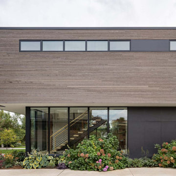
The Main Stay House exists as a straightforward proposal on an urban infill lot, paring down the components of a house to a minimal amount of planes and openings. The scheme is anchored by a modern entry sequence and a staircase volume, both clad in iron spot masonry externally and internally, creating thresholds between the respective realms of public, common and private, by minimal means. The masonry contrasts with an otherwise muted interior atmosphere of smooth, desaturated surfaces.
The entry sequence is a twist upon the conventional domestic front door, front facade, and fence. The front masonry wall replaces the typical residential fence and frames an indirect access to the front door, functioning as a privacy barrier while revealing slices of the interior to the public street.
The staircase bifurcates the layout to provide a clear division between the common and private zones of the house, while clearly reading as a mass from all outside view. Brick and glass become portals between common and private zones.
The design consolidates the service core along the west façade, allowing the structure to fully open the living zone to the pool court and existing trees. This directly connects interior and exterior, as well as human and nature. Freedom to vary the program or functional use of the area is enabled and strongly encouraged.
Photography: Charles Davis Smith

Mission style awning. Simple and straightforward. Built with pvc lumber to withstand harsh Michigan winters. Antique cast iron fixture lights the way.
Photos by Fred Sons

Reveal Aluminum Railing – Designed to highlight the beauty of any view, Trex Reveal features a sleek – yet sturdy – construction that complements the entire line of Trex decking. With its straightforward and unobtrusive look, Trex Reveal spans long lengths for panoramic sight lines from residential decks, patios, balconies and front steps – as well as commercial installations – and can be installed with continuously graspable stair rail options for safety, comfort and code compliance.

The final design includes several "courtyard" and transitional spaces to accommodate the unique grading and provide several lounge spaces. Each of the home's many windows provides a different, picturesque view of the water feature focal point. The hot tub is purposefully close to the house for easy access, yet carefully positioned out of sight from the rest of the lounge areas so as to not draw attention away from the focal point.
Quaint seating spaces, a fire pit lounge area, and a covered dining space are accented by ornamental grasses, hydrangeas, and night lighting. Our clients are thrilled with how the final project made their oddly shaped yard now perfectly fit their landscape needs and desires!

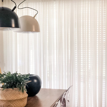
Motorized Roller Window Shades with Smart Home Integration | Fabric: Bravado Blackout Magnolia (17001)
Huge mid-century modern master medium tone wood floor, brown floor and tray ceiling bedroom photo in Atlanta with beige walls and no fireplace

 
Free ebook, Creating the Ideal Kitchen. DOWNLOAD NOW
 
This Glen Ellyn couple wanted to transform their dated kitchen into a more family-friendly space to use on a daily basis for cooking family meals and for entertaining friends. The existing kitchen was quite chopped up with strange soffits and different ceiling heights. To make the space flow in a more logical manner, we borrowed an unused desk area from the adjoining hallway and reconfigured a neighboring bath. Getting it to work on paper was fairly straightforward, but there was a bit of complicated beam work involved as the new kitchen flows through what was an old exterior wall. The new ceiling is now completely flush as we were able to hide the support in the ceiling joists.
A new, larger window was added at the sink, the doorway to the room was widened and the resulting space creates a more easy flow from dining room to family room.
The clients chose white inset cabinets, white marble tops and an apron sink to keep the space feeling simple yet original to the home's Colonial styling.
Ship lap siding on the back of the island and at the pantry storage ceiling, a walnut butcher block, and antique brass details give the space an updated look.
Professional stainless appliances are functional and beautiful. In addition to a large built-in fridge and 36" range, a second oven is housed in the island for flexibility.
The pantry area has a convenience station that houses the family's espresso machine along with the microwave drawer. Another large bank of cabinets in the same area serves as pantry storage for dry goods.
The bathroom was also remodeled as part of this project. The full bath has a vanity, shower and convenient baby changing area.
The floor is encaustic tile, a type of concrete tile recognizable by its bold graphics. The mirror and lighting add a few modern touches to keep it in line with the Owner's personal style.
Designed by: Susan Klimala, CKD, CBD
Photography by: Carlos Vergara
For more information on kitchen and bath design ideas go to: www.kitchenstudio-ge.com

This Beacon Hill brownstone started with a new rubber roof, bare and sprawling, the ideal spot for a great family gathering place. After thoughtful consideration, a master plan was developed to provide all the amenities an urban outdoor space could offer; comfortable seating, customized storage, mature plantings, a fully functioning outdoor kitchen, comprehensive irrigation, discrete lighting, natural materials and open space for larger groups.
As this project was completed in the context of a comprehensive renovation of the building, we were easily afforded access below the deck to augment the structure and accommodate the added weight of the roof deck elements. A new staircase and generous hatch were added from the top floor inside to home to provide easy and convenient use of the deck. Similarly, bringing gas to the large grill, and hot and cold water to the sink, ice-maker and irrigation system were relatively straightforward.
Through the careful use of natural materials and the well designed layout, the space feels like an extension of the inside living space and welcomes its visitors to sounds of music coming from the Hatch Shell steps away and views unique to the character and history of Boston.
Photographer: Eric Roth

Torlando Hakes
Nursery - mid-sized traditional gender-neutral dark wood floor nursery idea in Indianapolis with gray walls

Example of a large classic walk-out vinyl floor basement design in Cleveland with white walls

This fixture is a great way to make a bold yet simple statement. Globe size changes the look: choose the 12" for a schoolhouse approach, the 14" for a versatile style, or the 18" to create a focal point that looks anything but basic.
The globe shown has a wire net, which we first saw in the 1908 Western Electric catalog, originally designed to catch the glass of a broken light - an important feature in high-traffic work areas. Now it provides period authenticity and texture.
The Hood is based on several fixtures made between 1910 and 1920 by the F.W. Wakefield Brass Company of Vermilion, Ohio. They were straightforward, functional designs meant to produce maximum light output with minimum fuss. With the Hood, its clean lines make it feel contemporary. Not bad for a centenarian!
11