
Search results for "Strategize" in Home Design Ideas
 Jenny Martin Design
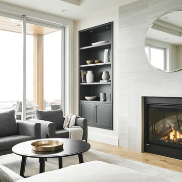
Neutral tones are a consistent theme throughout this home design. We've accented this soft & warm colour palette by strategically adding contrasting elements, such as the built-in shelving next to the fireplace. This allowed us to play with negative space, depth, and form when selecting simple statement decor items.
 In Detail Interiors
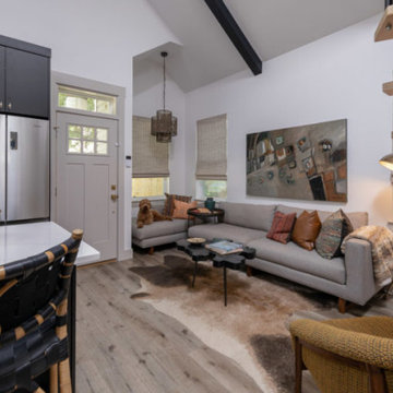
When challenged with the task of turning 500 or so square feet into the most functional residential space one could dream of, the limits of the words “tiny house” did little to falter the creativity and good executed design of this project. From a logistical standpoint, the square footage absolutely had to stay small – but there are so many inventive ways to use that space and end up with something that looks much more finished and comfortable than a camper! Pivoting through each functional item on the list – from the kitchen to the bedroom, and the loft space to the little side yard – all of the “comforts” of easy living were still incorporated for a super stylish end result!
To begin at the beginning – the core needs were to develop a functional cooking and dining space, small gathering area for TV, a bedroom that offered comfortable sleeping quarters, full bathroom with walk in shower and walk-in closet with laundry… of and of course, any extra storage we could muster!
The kitchen design focused on a great “galley” style layout split strategically by a side entry door to a sweet outdoor dining and cocktail space. Capitalizing on a long island that met the side wall, we were able to include more shallow storage on the back of the island beside the pair of counterstools. Mirroring the fridge wall with a built in pantry and storage bench, this half of the main living area provides a comfortable but sweetly styled area for bistro table dining and lots of fun display and closed storage.
Across the room is the living area – with windows perfectly placed for real furniture and a fabulous statement art piece! While the spiral stairs to the loft storage space interject some here, their low profile keeps the visual really clean. As a hub of the home – this area is the main entry / dining / entertaining / storage / kitchen all in one!
Moving to the back side of the house, accenting the smaller bedroom size with a big picture window adds so much beautiful light and a lofty feel to this “master”. Tucking a small vanity/desk area into the corner allowed for really great dedicated storage and work space that meets a multitude of needs (and keeps things sort of tucked away so that when guests come by there isn’t a lot of clutter seen through the doorway! The master bath is 100% style with the cheerful and funky tile that offers a HUGE aesthetic impact for such a small space. Eclectic lighting and a pretty, softly patterned wallpaper layer up the details too. Then the closet houses a stackable washer dryer (that just! fit through the door!) and ample storage for a full wardrobe.
When gazing up – we just love LOVE the view to the pitch of the ceiling and the painted box beams that offer such a perfectly clean visual to collect the feel of the overall home. As a makeshift guest room and storage area, the loft offers ample space for bulkier items and things that need to be tucked away on a daily basis – but as needed offers up a comfy little home-away-from-home for anyone sleeping over. Hidden up here also is the HVAC and water heater so the “side” attic also has some closed off storage that can be used for items that don’t need a temp controlled environment.
Overall – we love the feel of this home space and while “tiny” in size, it really does deliver in so many ways when it comes to style! Like a dollhouse for adults ? We can’t wait to build our next one!!
 Jenny Kramer
Steve Craft Photography
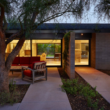
Minimalist courtyard concrete patio photo in Phoenix with no cover
Minimalist courtyard concrete patio photo in Phoenix with no cover
Find the right local pro for your project
 Morningside Architects LLP
Morningside Architect, LLP
Contractor: Lone Star Custom Homes
Photographer: Rick Gardner Photography
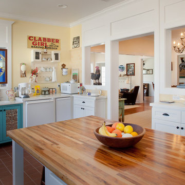
Inspiration for a mid-sized cottage l-shaped terra-cotta tile eat-in kitchen remodel in Austin with a farmhouse sink, recessed-panel cabinets, white cabinets, solid surface countertops, beige backsplash, subway tile backsplash, stainless steel appliances and an island
Inspiration for a mid-sized cottage l-shaped terra-cotta tile eat-in kitchen remodel in Austin with a farmhouse sink, recessed-panel cabinets, white cabinets, solid surface countertops, beige backsplash, subway tile backsplash, stainless steel appliances and an island
 Camden Lane Interiors
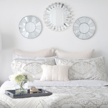
A master bedroom design for a lovely home in Toronto Beaches. I wanted to make our client feel relaxed with soft tones in the bedding, walls, and the overall decor. We used two decorative mirror styles and placed them strategically to create a focal point on the headboard wall. What's great about the mirrors is they are beautiful and a cost-effective. This look adds plenty of interest by creating a pattern with the mirror placement and style.
Project completed by Toronto interior design firm Camden Lane Interiors, which serves Toronto.
For more about Camden Lane Interiors, click here: https://www.camdenlaneinteriors.com/
To learn more about this project, click here: https://www.camdenlaneinteriors.com/portfolio-item/beachesbedroom/
 Soucie Horner, Ltd.
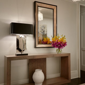
Glamorous. Refined. Luxurious. Kid-friendly? Indeed! In fact, this Michigan Avenue weekend retreat is home-away-from-home for a family of six, including four young children. Still, serenity and sophistication reign, thanks to a rich array of shimmering, shining, glossy, glassy surfaces, from subtly patterned fabrics that disguise peanut butter and jelly fingerprints to luminous accents that cast an urbane glow as the sunsets over the Lake Michigan sky. Mostly-neutral interiors are energized by strategic pops of color; custom architectural embellishments infuse additional character. Floor plan modifications ensure expansive sightlines throughout, and accentuate skyline views.
 KohlMark Architects and Builders
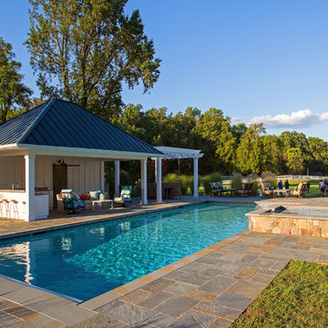
The clients wanted a small, simple pool house to compliment their historic farmhouse and provide abundant capabilities for outdoor entertaining. They settled on a small, open structure with a vaulted cedar ceiling and task/ambient lighting. An outdoor kitchen, a covered seating area, a storage/changing room and an all-weather Azek pergola with party-lighting were included. A structural retaining wall was needed to provide level ground for both the in-ground pool and pool house, along with strategically planted ornamental grasses for privacy. The green standing seam roof, sliding barn door, board & batten siding and period-correct trim all mirror details from the residence and detached barn.
 Kat Nelson Designs
 Lisa Konz Photography
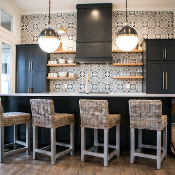
This was such a fun project working with these clients who wanted to take an old school, traditional lake house and update it. We moved the kitchen from the previous location to the breakfast area to create a more open space floor plan. We also added ship lap strategically to some feature walls and columns. The color palette we went with was navy, black, tan and cream. The decorative and central feature of the kitchen tile and family room rug really drove the direction of this project. With plenty of light once we moved the kitchen and white walls, we were able to go with dramatic black cabinets. The solid brass pulls added a little drama, but the light reclaimed open shelves and cross detail on the island kept it from getting too fussy and clean white Quartz countertops keep the kitchen from feeling too dark.
There previously wasn't a fireplace so added one for cozy winter lake days with a herringbone tile surround and reclaimed beam mantle.
To ensure this family friendly lake house can withstand the traffic, we added sunbrella slipcovers to all the upholstery in the family room.
The back screened porch overlooks the lake and dock and is ready for an abundance of extended family and friends to enjoy this beautiful updated and classic lake home.
 Adelene Keeler Smith Interior Design
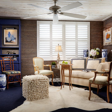
Dramatic blue hues and accents are incorporated into custom built bookcases, iridescent grass cloth, berber wool carpet and various strategically placed blue and white ware. Seating and ottomans are kept light and easily moved to make way for sleep sofa bed. White-washed pecky cypress planked ceiling adds warmth while concealing wiring to the new ceiling fan. New studio design touts a visual array of textural interest found in natural surfaces found on floor, ceiling and the walls.
 Schwartz and Architecture
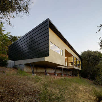
Despite an extremely steep, almost undevelopable, wooded site, the Overlook Guest House strategically creates a new fully accessible indoor/outdoor dwelling unit that allows an aging family member to remain close by and at home.
Photo by Matthew Millman
 down2earth Interior Design, LLC.
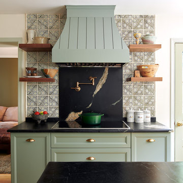
It is not uncommon for down2earth interior design to be tasked with the challenge of combining an existing kitchen and dining room into one open space that is great for communal cooking and entertaining. But what happens when that request is only the beginning? In this kitchen, our clients had big dreams for their space that went well beyond opening up the plan and included flow, organization, a timeless aesthetic, and partnering with local vendors.
Although the family wanted all the modern conveniences afforded them by a total kitchen renovation, they also wanted it to look timeless and fit in with the aesthetic of their 100 year old home. So all design decisions were made with an eye towards timelessness, from the profile of the cabinet doors, to the handmade backsplash tiles, to the choice of soapstone for countertops, which is a beautiful material that is naturally heat resistant. The soapstone was strategically positioned so that the most stunning veins would be on display across the island top and on the wall behind the cooktop. Even the green color of the cabinet, and the subtle green-greys of the trim were specifically chosen for their softness so they will not look stark or trendy in this classic home.
To address issues of flow, the clients really analyzed how they cook, entertain, and eat. We went well beyond the typical “kitchen triangle” to make sure all the hot spots of the kitchen were in the most functional locations within the space. Once we located the “big moves” we really dug down into the details. Some noteworthy ones include a whole wall of deep pantries with pull outs so all food storage is in one place, knives stored in a drawer right over the cutting boards, trash located right behind the sink, and pots, pans, cookie sheets located right by the oven, and a pullout for the Kitchenaid mixer. There are also pullouts that serve as dedicated storage next to the oven for oils, spices, and utensils, and a microwave located in the island which will facilitate aging in place if that becomes an objective in the future. A broom and cleaning supply storage closet at the top of the basement stairs coordinates with the kitchen cabinets so it will look nice if on view, or it can be hidden behind barn doors that tuck just a bit behind the oven. Storage for platters and a bar are located near the dining room so they will be on hand for entertaining.
As a couple deeply invested in their local community, it was important to the homeowners to work with as many local vendors as possible. From flooring to woodwork to tile to countertops, choosing the right materials to make this project come together was a real collaborative effort. Their close community connections also inspired these empty nesters to stay in their home and update it to their needs, rather than relocating. The space can now accommodate their growing family that might consist of children’s spouses, grandkids, and furry friends alike.
 Lars Remodeling & Design
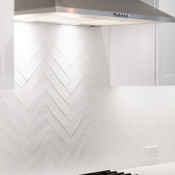
The goal for this Point Loma home was to transform it from the adorable beach bungalow it already was by expanding its footprint and giving it distinctive Craftsman characteristics while achieving a comfortable, modern aesthetic inside that perfectly caters to the active young family who lives here. By extending and reconfiguring the front portion of the home, we were able to not only add significant square footage, but create much needed usable space for a home office and comfortable family living room that flows directly into a large, open plan kitchen and dining area. A custom built-in entertainment center accented with shiplap is the focal point for the living room and the light color of the walls are perfect with the natural light that floods the space, courtesy of strategically placed windows and skylights. The kitchen was redone to feel modern and accommodate the homeowners busy lifestyle and love of entertaining. Beautiful white kitchen cabinetry sets the stage for a large island that packs a pop of color in a gorgeous teal hue. A Sub-Zero classic side by side refrigerator and Jenn-Air cooktop, steam oven, and wall oven provide the power in this kitchen while a white subway tile backsplash in a sophisticated herringbone pattern, gold pulls and stunning pendant lighting add the perfect design details. Another great addition to this project is the use of space to create separate wine and coffee bars on either side of the doorway. A large wine refrigerator is offset by beautiful natural wood floating shelves to store wine glasses and house a healthy Bourbon collection. The coffee bar is the perfect first top in the morning with a coffee maker and floating shelves to store coffee and cups. Luxury Vinyl Plank (LVP) flooring was selected for use throughout the home, offering the warm feel of hardwood, with the benefits of being waterproof and nearly indestructible - two key factors with young kids!
For the exterior of the home, it was important to capture classic Craftsman elements including the post and rock detail, wood siding, eves, and trimming around windows and doors. We think the porch is one of the cutest in San Diego and the custom wood door truly ties the look and feel of this beautiful home together.
 Everything Home
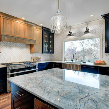
The centerpiece of this exquisite kitchen is the deep navy island adorned with a stunning quartzite slab. Its rich hue adds a touch of sophistication and serves as a captivating focal point. Complementing this bold choice, the two-tone color-blocked cabinet design elevates the overall aesthetic, showcasing a perfect blend of style and functionality. Light counters and a thoughtfully selected backsplash ensure a bright and inviting atmosphere.
The intelligent layout separates the work zones, allowing for seamless workflow, while the strategic placement of the island seating around three sides ensures ample space and prevents any crowding. A larger window positioned above the sink not only floods the kitchen with natural light but also provides a picturesque view of the surrounding environment. And to create a cozy corner for relaxation, a delightful coffee nook is nestled in front of the lower windows, allowing for moments of tranquility and appreciation of the beautiful surroundings.
---
Project completed by Wendy Langston's Everything Home interior design firm, which serves Carmel, Zionsville, Fishers, Westfield, Noblesville, and Indianapolis.
For more about Everything Home, see here: https://everythinghomedesigns.com/
To learn more about this project, see here:
https://everythinghomedesigns.com/portfolio/carmel-indiana-elegant-functional-kitchen-design
 MONTRÉAL CONSTRUCTION Inc.
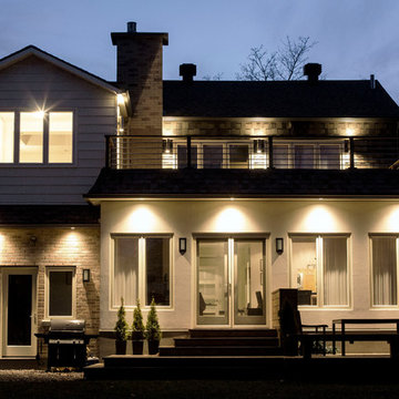
An architect and an engineer combined forces to design this fabulous back garden addition that doubled interior living space and quadrupled outdoor deck space. Strategically placed lighting creates drama on the exterior walls.
 Visbeen Architects
Builder: Segard Builders
Rendering: Visbeen Architects, Inc.
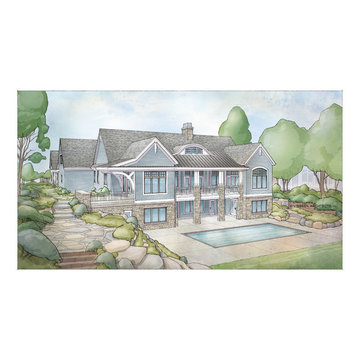
Symmetry and traditional sensibilities drive this homes stately style. Flanking garages compliment a grand entrance and frame a roundabout style motor court. On axis, and centered on the homes roofline is a traditional A-frame dormer. The walkout rear elevation is covered by a paired column gallery that is connected to the main levels living, dining, and master bedroom. Inside, the foyer is centrally located, and flanked to the right by a grand staircase. To the left of the foyer is the homes private master suite featuring a roomy study, expansive dressing room, and bedroom. The dining room is surrounded on three sides by large windows and a pair of French doors open onto a separate outdoor grill space. The kitchen island, with seating for seven, is strategically placed on axis to the living room fireplace and the dining room table. Taking a trip down the grand staircase reveals the lower level living room, which serves as an entertainment space between the private bedrooms to the left and separate guest bedroom suite to the right. Rounding out this plans key features is the attached garage, which has its own separate staircase connecting it to the lower level as well as the bonus room above.
 Kat Nelson Designs
 Lisa Konz Photography
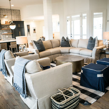
This was such a fun project working with these clients who wanted to take an old school, traditional lake house and update it. We moved the kitchen from the previous location to the breakfast area to create a more open space floor plan. We also added ship lap strategically to some feature walls and columns. The color palette we went with was navy, black, tan and cream. The decorative and central feature of the kitchen tile and family room rug really drove the direction of this project. With plenty of light once we moved the kitchen and white walls, we were able to go with dramatic black cabinets. The solid brass pulls added a little drama, but the light reclaimed open shelves and cross detail on the island kept it from getting too fussy and clean white Quartz countertops keep the kitchen from feeling too dark.
There previously wasn't a fireplace so added one for cozy winter lake days with a herringbone tile surround and reclaimed beam mantle.
To ensure this family friendly lake house can withstand the traffic, we added sunbrella slipcovers to all the upholstery in the family room.
The back screened porch overlooks the lake and dock and is ready for an abundance of extended family and friends to enjoy this beautiful updated and classic lake home.
 Amanda Martocchio Architecture
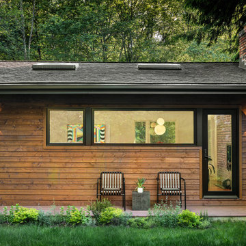
Time had stood still at this 1970s ranch in Armonk when the owners invited us to collaborate with them to transform it into a modern, light-filled home for their young family. The budget was lean, so economy was a primary consideration for every design decision. The challenge was to identify the modest home’s virtues – vaulted ceilings and a lovely backyard – and accentuate them by strategically optimizing available funds.
We were tasked with rectifying a dysfunctional interior stair, connecting to the outdoors with new large windows, and updating the exterior. We focused our attention on a finite set of architectural moves which would have the biggest impact and improve our clients’ daily experience of the home. Detailing was kept simple, using common grade materials and standard components. All exterior walls were revamped with new windows and siding. Although these materials were not particularly costly, thoughtful layout of boards, battens, and openings produced a cohesive, rigorous composition at each facade.
Since the budget would not cover the homeowners’ complete wish list, some items were bracketed for subsequent phases. The challenge was to establish a framework that would allow future work – including a new roof and kitchen renovation – to proceed smoothly.
The homeowners, both scientists, were enthusiastic collaborators, contributing their outstanding design sensibilities to selection of fixtures and finishes. Construction ended just in time for the arrival of their baby – and with that, the transformation of their family home was complete.
 PB Kitchen Design
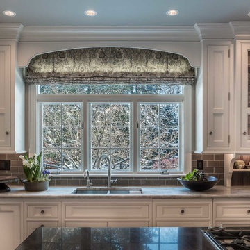
This homeowner is a local shop keeper and interior designer in Geneva, who exudes style and a has a great eye for interiors. There was no doubt that we had to create a space that showcased her favorite decorative accents and heirlooms. A myriad of display cabinets were artfully fitted into the design which delightfully boasts her family’s keepsakes. The refrigerator, strategically hidden within the wall, is a millwork backdrop – Not standing in the way, like refrigerators are famous for. The kitchen a visual work of art amid the ordinary tasks of cooking and tidying.
Project specs: Appliances by Gaggenau, Walnut island with natural quartzite countertops. Limestone countertops on the perimeter’s white painted cabinets.
Photo Bruce Van Inwegen
 Solda Pools Ltd.
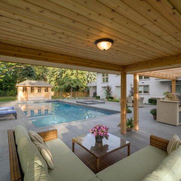
Mid-sized transitional backyard concrete paver and rectangular lap hot tub photo in Toronto
 Spaces Designed, Interior Design Studio, LLC
“We could never have envisioned what could be” – Steiner Ranch Homeowner and Client
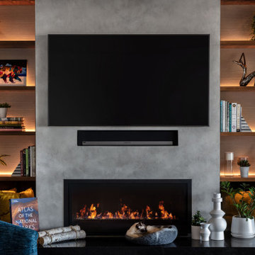
It is an especially fulfilling Project for an Interior Designer when the outcome exceeds Client expectations, and imagination. This remodeling project required instilling modern sensibilities, openness, styles and textures into a dated house that was past its prime. Strategically, the goal was to tear down where it made sense without doing a complete teardown.
Starting with the soul of the home, the kitchen, we expanded out room by room to create a cohesiveness and flow that invites, supports and provides the warmth and relaxation that only a home can.
In the Kitchen, we started by removing the wooden beams and adding bright recessed lighting. We removed the old limestone accent wall and moved the sink and cooktop from the island on to the countertop – the key goal was to create room for the family to gather around the kitchen. We replaced all appliances with modern Energy Star ones, along with adding a wine rack.
The first order of business for the Living Room was to brighten it up by adding more lighting and replacing an unused section with a glass door to the backyard. Multi-section windows were replaced with large no-split glass overlooking the backyard. Once more, the limestone accent was removed to create a clean, modern look. Replacing the dated wooden staircase with the clean lines of a metal, wire and wooded staircase added interest and freshness. An odd bend in the staircase was removed to clean things up.
The Master Bedroom went from what looked like a motel room with green carpet and cheap blinds to an oasis of luxury and charm. A section of the wraparound doors were closed off to increase privacy, accentuate the best view from the bedroom and to add usable space. Artwork, rug, contemporary bed and other accent pieces brought together the seamless look across the home.
The Master Bathroom remodel started by replacing the standard windows with a single glass pane that enhanced the view of the outdoors. The dated shower was replaced by a walk-in shower and soaking tub to create the ultimate at-home spa experience. Lighted LED mirrors frame His & Hers sinks and bathe them in a soft light.
The flooring was upgraded throughout the house to reflect the contemporary color scheme.
Each of the smaller bedrooms were similarly upgraded to match the clean and modern décor of the rest of the house.
After such a transformation inside, it was only appropriate that the exterior needed an upgrade as well. All of the legacy limestone accents were replaced by stucco and the color scheme extended from the interior of the house to the gorgeous wrap around balconies, trim, garage doors etc. to complete the inside outside transformation.
84