
Search results for "Suffered" in Home Design Ideas
 Lincoln Lighthill Architect
What does a roof deck look like when every part of the roof, even areas deemed uninhabitable and structurally weak, is utilized and optimized?
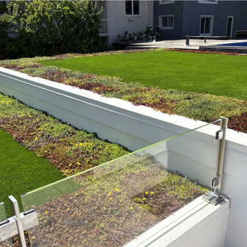
This large midcentury home on the edge of Presidio National Park in San Francisco had an incredible location and views. But the original roof deck suffered from poor design detailing that had rendered it a leaking, deteriorating mess. Even worse, the previous owner had covered three roof areas surrounding the deck with river stones, structurally overloading the building and endangering its occupants.
We removed the river stones and everything else down to the framing. An expertly detailed drainage and waterproofing system underlies everything above. The deck and access stairs are surfaced with durable and refined porcelain pavers. The guardrail is made from custom stainless steel supports with clear, low-iron, laminated glass spanning between for an unobstructed view. Heated seats make watching the chilly fog roll in through the gate comfy.
Planting and greenery surround the deck. The type varies depending on structural conditions- a deep planter sits on top of a structural wall, sedums in shallow soil occupy the strong edges of the surrounding rooftops, and faux grass turf fills out the middle in areas that can’t support the weight of wet soil.
 12/12 Architects & Planners
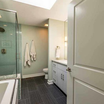
This family of 5 was quickly out-growing their 1,220sf ranch home on a beautiful corner lot. Rather than adding a 2nd floor, the decision was made to extend the existing ranch plan into the back yard, adding a new 2-car garage below the new space - for a new total of 2,520sf. With a previous addition of a 1-car garage and a small kitchen removed, a large addition was added for Master Bedroom Suite, a 4th bedroom, hall bath, and a completely remodeled living, dining and new Kitchen, open to large new Family Room. The new lower level includes the new Garage and Mudroom. The existing fireplace and chimney remain - with beautifully exposed brick. The homeowners love contemporary design, and finished the home with a gorgeous mix of color, pattern and materials.
The project was completed in 2011. Unfortunately, 2 years later, they suffered a massive house fire. The house was then rebuilt again, using the same plans and finishes as the original build, adding only a secondary laundry closet on the main level.
 Balestri Architects
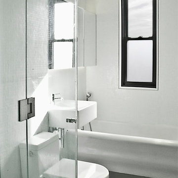
Low cost renovation of a classic pre-war apartment in Brooklyn, New York. The original floor plan of this one bedroom pre-war unit was simple and efficient, but the space suffered from over 90 years of neglect and poor maintenance.
The existing kitchen and bathrooms spaces were gutted and updated with new stone finishes and chrome fixtures. The linear kitchen layout was flipped to allow maximum natural light to the primary work areas. A new glass shower enclosure replaces the original tile shower stall to provide a more opening feeling.
New plaster finishes, minimal window treatments, door hardware, and custom furniture complete the renovation.
Find the right local pro for your project
 Lamont Bros. Design & Construction
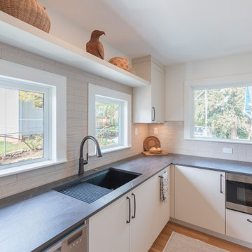
After years of suffering through a poorly designed kitchen that didn’t meet her needs, our client made the difficult decision to re-remodel her kitchen. Now that the kitchen is complete, she's happier than ever in her new kitchen. What used to be a space that was intimidating and difficult to use has become a place designed specifically for her needs, where every appliance and shelf is within comfortable reach and the design is tailored exactly to her personal style.
 AP HomesLLC
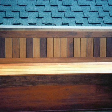
bench seating resting on roof structure. deck area suffered extensive dry rot damage to structure . repair included adding a pony wall doubling as a seating area. built ipe back and seat as sleeper system to cover Gaco weatherproof covering material
 MD Seamless
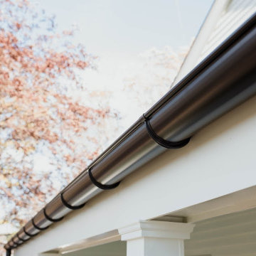
This is half-round gutter. This is a beautiful style available with either internal hangers or external hanger hangers as shown in the photo. This gutter looks great on every home! It is a more expensive product and it usually suffers from over'splash due to the curve of the gutter.
 G. Christianson Construction, Inc.
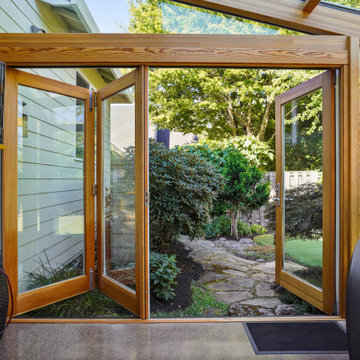
We recently completed a spectacularly beautiful sunroom for Richard and Cynthia. We worked previously with Cynthia on her business and because of our relationship, she felt comfortable asking us to build their Corvallis sunroom. The inspiration for this project came from the desire to have the ambiance of an outdoor hot tub, but without Corvallis’ cold wet weather. The sunroom adds a warm, bright 325 square feet just outside their kitchen and living room. This is the perfect addition if you are suffering from Corvallis’ cloud cover. The vibrant hues of the stained and finished Douglas fir glulam beams complement the beauty of the outdoors. These beams support the glass roof. In addition, the sunroom includes two operable skylights, a nine foot wide bifold door, a full glass roof system and full glass walls. Westview Sunrooms (the manufacturer) has a number of other beautiful ideas on their site: http://www.westviewproducts.com/pictures.html We would love the opportunity to build for you.
 Honey Bee Carpentry Inc.
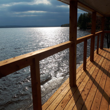
The updated and restructured load bearing balcony that serves both as a solid support for the wide overhanging roof and as a safe space to enjoy year-round views over the lake. A natural armour stone retaining wall was added to strengthen the shoreline right away as well. Timber-framed braces support the roof where the unstable slope suffers from erosion. Railings are cedar posts with top cedar rails and high tension cable wires (which are difficult to see in the photos).
 New Roots Landscaping
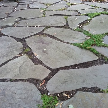
Natural bluestone patio replaces a lawn area that had suffered as the surrounding ornamental trees provided too much shade for the grass. Post intallation, ground cover just starting to fill in.
 Listino Painting Company
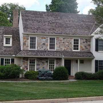
Complete exterior painting project on the stucco, wood trim, windows, and doors.
We replaced much on the right hand porch, and three windows which suffered wood rot.
 Tile Doctor Ltd
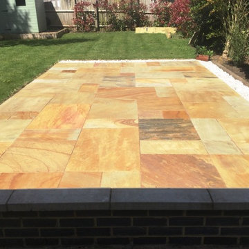
At the start of the year we usually get asked to restore the appearance of patios and other outside areas which have suffered from the staining of autumn leaves and the ravages of winter cold snaps. Most patios are quite straight forward to maintain however when you’re dealing natural stone then it’s best to call in your local Tile Doctor to ensure nothing is applied to the stone that could damage it.
Such was the case with this four-year-old Sandstone Patio at a house in the town of Kettering. Unfortunately, it was not sealed when it was first installed and the combination of weather and UV sunlight had faded the tiles, this together with general soiling had greatly affected the appearance of this beautiful stone and could almost have been mistaken for concrete slabs.
My first course of action was to lightly spray the area with a dilution of Tile Doctor Pro-Clean which is a powerful tile cleaning product that is safe to use on Stone. The solution was allowed to soak in for a while before being agitated with a brush to bring out the dirt. This was followed by pressure washing with a spinning tool at a medium pressure so as to not damage the stone.
Once dry I re-grouted the entire area and then sealed with Tile Doctor Colour Grow Sealant which is a impregnating breathable product (essential for damp environments) that also enhances the natural colours of the stone.
Within hours of finishing the customer came home and called me straight away to say he couldn’t believe the transformation that was achieved and they looked better than when they were first laid.
Phil Vissian
Northamptonshire Tile Doctor
 KURV Architecture DPC (Alex Hughes Architects)
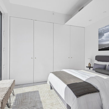
Located in the heart of Manhattan’s Lower East Side, the building was erected on a shallow commercial lot between two 120 year old masonry buildings and a new residential rental building. 330 Grand Street is a mix of 725 SF 1BRs and 1050 SF 2BR apartments. It also contains a 1100 SF two story duplex as well as private and public rooftop space, large private balconies for most units and two large private terraces for the ground floor units.
330 Grand Street was originally designed and approved at the NYC DOB as a prefabricated modular building. During the pandemic, as shipping costs skyrocketed putting the project at risk, we suggested redesigning the building as a reinforced cast-in-place concrete structure. Concrete was readily available and prices had not been affected by the demand increase that many other materials suffered in the pandemic. We took this opportunity to raise floor to ceiling heights, enlarge high performance windows and redistribute the buildings MEPFS and Structural Systems to create very open floor plans.
The challenge was to create a luxurious sensorial living experience with very limited means. In a city with very high construction costs, low cost residential buildings in the area are usually devoid of good quality, design and character. Our approach was to aim high for the end user, prioritizing natural light, open space with long visual perspectives, high ceilings and as always, rejecting the use of predefined building templates.
Our biggest challenge was to ensure that the small spaces feel as clean cut, large and bright as possible. Several unique design decisions were made to ensure low cost and high quality;
Floor plans were laid out so that spaces were wide open and free of clutter from mechanical or structural interruptions. Therefore all infrastructure was placed in lateral demising walls, which in turn act as the unit’s storage and kitchen. The apartments feel wide open, are super quiet and have more storage space than any other comparable apartment in the city.
To solve the problem of the site’s shallow commercial lot which is typically prone to dark interior spaces we focused our attention on the building’s envelope. Instead of the usual small punched window openings, oversized high performance windows were designed to ensure that light penetrated as far as possible into the units. In the smaller 1BR units, the full 50’ depth of the lot is perceived by partitioning spaces with sliding pocket doors that can be retracted to allow deep visual perspectives, making the sight lines in the space feel longer, larger, more ample than normal. In addition to the full height glazing, each unit above the 2nd floor receives a 7 foot covered balcony, adding 120 to 240 sf to each apartment, something unusual in New York City buildings. The space is large enough for a full size dining table, when the weather permits being outside.
We also worked hard to ensure modularity. For example, all kitchen units are all identical throughout the building. The idea of modularity and the economy of the repetitive unit is exercised to the maximum through the building.
Hardware, appliances, flooring, wall coverings and material finishes are all carefully selected to feel bespoke, high quality and unique.
It was important to KURV that the result of this work manifest into something that would deeply connect with the end user and sustain relationships with the consumers of this space.
All images by KURV Architecture ©
 KURV Architecture DPC (Alex Hughes Architects)
Located in the heart of Manhattan’s Lower East Side, the building was erected on a shallow commercial lot between two 120 year old masonry buildings and a new residential rental building. 330 Grand Street is a mix of 725 SF 1BRs and 1050 SF 2BR apartments. It also contains a 1100 SF two story duplex as well as private and public rooftop space, large private balconies for most units and two large private terraces for the ground floor units.
330 Grand Street was originally designed and approved at the NYC DOB as a prefabricated modular building. During the pandemic, as shipping costs skyrocketed putting the project at risk, we suggested redesigning the building as a reinforced cast-in-place concrete structure. Concrete was readily available and prices had not been affected by the demand increase that many other materials suffered in the pandemic. We took this opportunity to raise floor to ceiling heights, enlarge high performance windows and redistribute the buildings MEPFS and Structural Systems to create very open floor plans.
The challenge was to create a luxurious sensorial living experience with very limited means. In a city with very high construction costs, low cost residential buildings in the area are usually devoid of good quality, design and character. Our approach was to aim high for the end user, prioritizing natural light, open space with long visual perspectives, high ceilings and as always, rejecting the use of predefined building templates.
Our biggest challenge was to ensure that the small spaces feel as clean cut, large and bright as possible. Several unique design decisions were made to ensure low cost and high quality;
Floor plans were laid out so that spaces were wide open and free of clutter from mechanical or structural interruptions. Therefore all infrastructure was placed in lateral demising walls, which in turn act as the unit’s storage and kitchen. The apartments feel wide open, are super quiet and have more storage space than any other comparable apartment in the city.
To solve the problem of the site’s shallow commercial lot which is typically prone to dark interior spaces we focused our attention on the building’s envelope. Instead of the usual small punched window openings, oversized high performance windows were designed to ensure that light penetrated as far as possible into the units. In the smaller 1BR units, the full 50’ depth of the lot is perceived by partitioning spaces with sliding pocket doors that can be retracted to allow deep visual perspectives, making the sight lines in the space feel longer, larger, more ample than normal. In addition to the full height glazing, each unit above the 2nd floor receives a 7 foot covered balcony, adding 120 to 240 sf to each apartment, something unusual in New York City buildings. The space is large enough for a full size dining table, when the weather permits being outside.
We also worked hard to ensure modularity. For example, all kitchen units are all identical throughout the building. The idea of modularity and the economy of the repetitive unit is exercised to the maximum through the building.
Hardware, appliances, flooring, wall coverings and material finishes are all carefully selected to feel bespoke, high quality and unique.
It was important to KURV that the result of this work manifest into something that would deeply connect with the end user and sustain relationships with the consumers of this space.
All images by KURV Architecture ©
 12/12 Architects & Planners
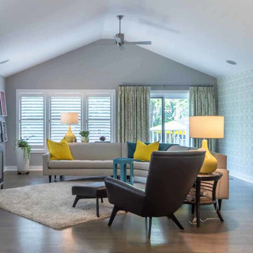
This family of 5 was quickly out-growing their 1,220sf ranch home on a beautiful corner lot. Rather than adding a 2nd floor, the decision was made to extend the existing ranch plan into the back yard, adding a new 2-car garage below the new space - for a new total of 2,520sf. With a previous addition of a 1-car garage and a small kitchen removed, a large addition was added for Master Bedroom Suite, a 4th bedroom, hall bath, and a completely remodeled living, dining and new Kitchen, open to large new Family Room. The new lower level includes the new Garage and Mudroom. The existing fireplace and chimney remain - with beautifully exposed brick. The homeowners love contemporary design, and finished the home with a gorgeous mix of color, pattern and materials.
The project was completed in 2011. Unfortunately, 2 years later, they suffered a massive house fire. The house was then rebuilt again, using the same plans and finishes as the original build, adding only a secondary laundry closet on the main level.
 Alloy Architecture & Construction
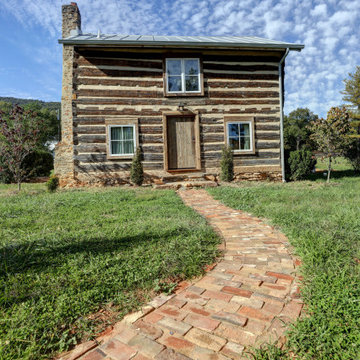
Alloy was truly fortunate to have the opportunity to restore and renovate this 1850’s log cabin at Afton Mountain. No home looks more at home than this cabin in the foothills.
The cabin suffered years of decay and an unsympathetic interior renovation so our first step was to work with a local log cabin specialist to correctly restore the structure. We then rebuilt much of the interior to have everything a modern home needs while staying true to the log cabin aesthetic.
On all of our projects we carefully research materials and finishes but this one really took that to the next level. We enjoyed the challenge and the chance to show off the impressive craftsmanship of our carpenters.
As you approach on the winding path, the log cabin feels like a part of the landscape. And now, when you come inside, you can keep that connected feeling – in comfort.
 Ploughshare Design | Build
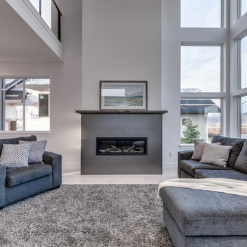
The living room in The Maslow House at Flanders Mill. Many Montanans suffer some degree of seasonal affective disorder during the long winter months. To help, generous windows and crisp white walls pipe daylight into every corner of the home's common spaces.
 Best Online Cabinets
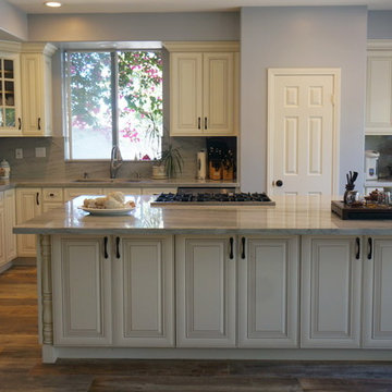
The Dove White Glaze is one of our most popular traditional style cabinets for those searching for white cabinets with a glaze. The door style is a raised panel beautified with a hand drawn dark brown glaze. Similar to our White and Grey Shaker, what makes this line unique is the door is made from a one piece solid wood which means not only does it look clean and sleek; it is not prone to the issue white colored cabinets suffer from shrinkage and expansion. The most common issue for white cabinets with a five piece construction is when there is shrinkage or expansion, the lines from the joint or seams will be distorted and noticeable, but this does not happen in our Dove White Glaze cabinets due to the door being a one piece construction.
Alone, the cabinets look gorgeous, but when combined with crown molding, decorative fillers, and other accessories, you must see it to believe how magnificent they truly look. Other great ideas to spruce up your kitchen with traditional style cabinets include: a high low or staggered height wall cabinet, decorative doors, different array of islands with pillars/columns, or even adding the cabinets in your bathroom and laundry room. The quality does not just stop at the door. If we dive deeper into this cabinet line, we will see that the cabinet comes with soft close hinges and drawer glides, dovetailed full extension drawers, a full piece plywood back panel, and 5/8” plywood box. Do not let the low price for the quality you are receiving deceive you. The low cost is possible only because we own the factory and only supply ourselves to bring homeowners quality & uniqueness at an affordable price. Don’t just take our word for it, order a sample door here and you be the judge!
 Tracy Berman Interiors
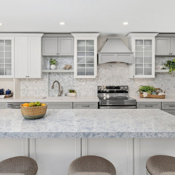
This beach house was not only dated but the kitchen was suffering from a wall that closed it off and a peninsula that cut the space in half. Those were the first things we corrected. The wall was removed which opened the space up. The new layout has a large island instead of the peninsula for better flow and entertaining. This home is across the street from the beach so our design cues came from the ocean and natural surroundings. Our color pallet is white and coastal blue for the cabinets. The new luxury vinyl plank floor is light like the sand. The glass backsplash tile and quartz countertops carry the coastal feel. The main bathroom for the lower level is off the kitchen. We improved the shower size and updated all of the finishes. This beach house is now bright and open with a warm coastal feel.
 KURV Architecture DPC (Alex Hughes Architects)
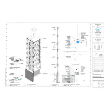
Located in the heart of Manhattan’s Lower East Side, the building was erected on a shallow commercial lot between two 120 year old masonry buildings and a new residential rental building. 330 Grand Street is a mix of 725 SF 1BRs and 1050 SF 2BR apartments. It also contains a 1100 SF two story duplex as well as private and public rooftop space, large private balconies for most units and two large private terraces for the ground floor units.
330 Grand Street was originally designed and approved at the NYC DOB as a prefabricated modular building. During the pandemic, as shipping costs skyrocketed putting the project at risk, we suggested redesigning the building as a reinforced cast-in-place concrete structure. Concrete was readily available and prices had not been affected by the demand increase that many other materials suffered in the pandemic. We took this opportunity to raise floor to ceiling heights, enlarge high performance windows and redistribute the buildings MEPFS and Structural Systems to create very open floor plans.
The challenge was to create a luxurious sensorial living experience with very limited means. In a city with very high construction costs, low cost residential buildings in the area are usually devoid of good quality, design and character. Our approach was to aim high for the end user, prioritizing natural light, open space with long visual perspectives, high ceilings and as always, rejecting the use of predefined building templates.
Our biggest challenge was to ensure that the small spaces feel as clean cut, large and bright as possible. Several unique design decisions were made to ensure low cost and high quality;
Floor plans were laid out so that spaces were wide open and free of clutter from mechanical or structural interruptions. Therefore all infrastructure was placed in lateral demising walls, which in turn act as the unit’s storage and kitchen. The apartments feel wide open, are super quiet and have more storage space than any other comparable apartment in the city.
To solve the problem of the site’s shallow commercial lot which is typically prone to dark interior spaces we focused our attention on the building’s envelope. Instead of the usual small punched window openings, oversized high performance windows were designed to ensure that light penetrated as far as possible into the units. In the smaller 1BR units, the full 50’ depth of the lot is perceived by partitioning spaces with sliding pocket doors that can be retracted to allow deep visual perspectives, making the sight lines in the space feel longer, larger, more ample than normal. In addition to the full height glazing, each unit above the 2nd floor receives a 7 foot covered balcony, adding 120 to 240 sf to each apartment, something unusual in New York City buildings. The space is large enough for a full size dining table, when the weather permits being outside.
We also worked hard to ensure modularity. For example, all kitchen units are all identical throughout the building. The idea of modularity and the economy of the repetitive unit is exercised to the maximum through the building.
Hardware, appliances, flooring, wall coverings and material finishes are all carefully selected to feel bespoke, high quality and unique.
It was important to KURV that the result of this work manifest into something that would deeply connect with the end user and sustain relationships with the consumers of this space.
All images by KURV Architecture ©
 JLC Architecture
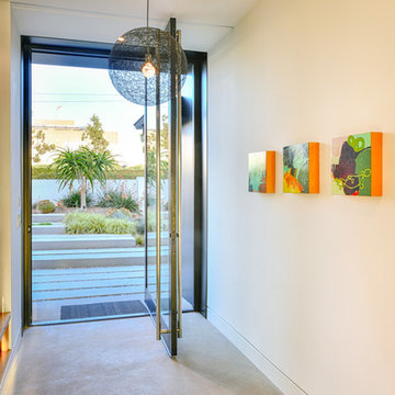
JLC was charged with transforming a 35 year old home which had suffered a remodel or two into a cohesive and modern home. Sustainable design principles were placed at the forefront of the design process alongside functionality and aesthetics. The end result is a roughly 3,000 sf home that is both comfortable and beautiful. The exterior palette is defined by Resysta siding and decking, acrylic stucco, a standing seam metal roof and black aluminum windows and doors. At the interiors white oak and walnut cabinetry throughout bring natural warmth to the clean, white interior. The home achieved LEED Platinum in 2017 and was featured on the San Diego Green Building Council’s 2017 Green Homes Tour.
Project website: neuhaus-encinitas.blogspot.com
12