
Search results for "Suffered" in Home Design Ideas
 The Renowned Group
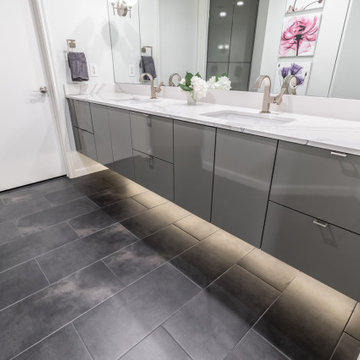
 The original Master bath suffered a tiny shower and a tub that was never used. It was very dark and cavernous and needed some softness to oppose angled walls. The tub was removed to make a larger, more accessible shower. The desired style was modern but not severe. We installed Cambria Britannica quartz slab with large veining and soft flowing movement on all the shower walls. A dark floor grounds the space. A combination of light walls, and sleek floating cabinets, creates an overall softness in this Modern Masterpiece.
 Alloy Architecture & Construction
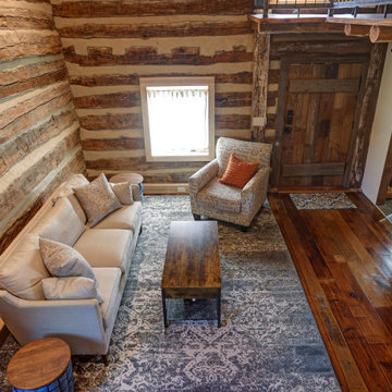
Alloy was truly fortunate to have the opportunity to restore and renovate this 1850’s log cabin at Afton Mountain. No home looks more at home than this cabin in the foothills.
The cabin suffered years of decay and an unsympathetic interior renovation so our first step was to work with a local log cabin specialist to correctly restore the structure. We then rebuilt much of the interior to have everything a modern home needs while staying true to the log cabin aesthetic.
On all of our projects we carefully research materials and finishes but this one really took that to the next level. We enjoyed the challenge and the chance to show off the impressive craftsmanship of our carpenters.
As you approach on the winding path, the log cabin feels like a part of the landscape. And now, when you come inside, you can keep that connected feeling – in comfort.
 12/12 Architects & Planners
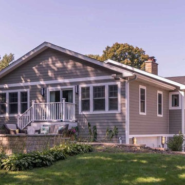
This family of 5 was quickly out-growing their 1,220sf ranch home on a beautiful corner lot. Rather than adding a 2nd floor, the decision was made to extend the existing ranch plan into the back yard, adding a new 2-car garage below the new space - for a new total of 2,520sf. With a previous addition of a 1-car garage and a small kitchen removed, a large addition was added for Master Bedroom Suite, a 4th bedroom, hall bath, and a completely remodeled living, dining and new Kitchen, open to large new Family Room. The new lower level includes the new Garage and Mudroom. The existing fireplace and chimney remain - with beautifully exposed brick. The homeowners love contemporary design, and finished the home with a gorgeous mix of color, pattern and materials.
The project was completed in 2011. Unfortunately, 2 years later, they suffered a massive house fire. The house was then rebuilt again, using the same plans and finishes as the original build, adding only a secondary laundry closet on the main level.
Find the right local pro for your project
 Meredith O'Donnell Fine Furniture
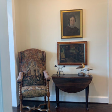
In this unit Senior Designer Jon Fortuna of Meredith O'Donnell Fine Furniture was tasked with creating a warm and livable space from scratch for a client who had suffered a catastrophic loss in a fire and given one week to make a new space feel like the home the client had lived in for decades. The foyer featured French and English antiques sourced in Houston.
 Saikley Architects
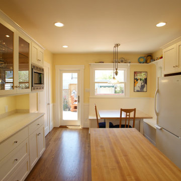
The original house suffered from issues common in many older homes: the existing kitchen was cramped, poorly laid out, and separated from the back yard by several tiny inefficient rooms, storage was inadequate, and the old deck was oversized and in poor condition.
https://saikleyarchitects.com/portfolio/open-kitchen/
 Windy City Painters
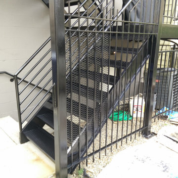
xterior Metal Staircase & Iron Railing Refinishing – Chicago, IL
Windy City Painters completed a comprehensive metal refinishing project featuring an exterior steel staircase, diamond mesh security screening, handrails, and surrounding perimeter railings on a Chicago multi-family property. The existing metalwork suffered from severe rust, flaking paint, and exposure to winter freeze-thaw cycles. Our team executed full mechanical rust removal, wire-brush prep, application of industrial rust-inhibiting Direct-To-Metal (DTM) primer, and finished with high-durability exterior oil-based alkyd enamel. Designed to provide long-lasting corrosion protection, enhance property security, and elevate curb appeal for Chicago homeowners, condo associations, and property managers.
 Master Blinds
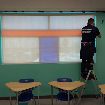
School settings require students to maintain concentration and sit still for long periods of time throughout the day. Needless to say, that can be tough not only for teenagers but adults as well. Harnessing sheer roller shades to cover classroom windows helps ensure sunlight doesn’t become a hindrance in the path of education, but a facilitator of better learning. By diffusing sunlight that enters the classrooms, students don’t suffer the negative cognitive impact of harsh glare that’s strainful on the eyes. Instead, they enjoy the benefits sunlight plays in maintaining alertness and attentiveness. Classroom window shades that provide better privacy also help to keep outside distractions from interfering with the lessons, keeping students focused on the subject at hand. The right use of colorful roller shades can also complement sensory cues for focus created by the classroom environment. Talk to Master Blinds’ design team to see what roller shades can offer your classroom spaces. Get in touch with us at 877-708-5883 to schedule a free in-person consultation with no obligation for more details!

 Plain & Posh
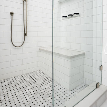
This master bath was long and narrow and suffered from a 1990's renovation with a huge tub no one used and a tiny shower area. The vanity was also quite small. By removing the tub and relocating the shower from the toilet room to the main area, the shower was able to double in size.
The vanity area is also almost twice as large as before.
 Spring Creek Design
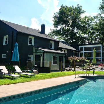
The homeowners loved the lot this home sat on, but it lacked a garage and the exterior suffered from years of deferred maintenance before they purchased. With new siding, windows, roof, and an attached two-car garage addition with bonus room above, they have more living and storage space, and a clearly dedicated path to the front door — the addition also added a foyer. Corrugated metal accents add interest. The new screened porch is convenient to the pool and house.
Photo by Liz Smutko
 Wood Front Kitchens
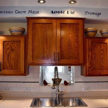
This customer spent over 40 years building and renovating his home. In his younger days, he was an amazing building and craftsman. Recently, he suffered a stroke and lost the ability to build. He wants to leave his home to his daughter, so he planned one last renovation project. For this project, he wanted to choose a renovation company that could build a kitchen as well as he could. Luckily, he chose Wood Front Kitchens. He was thrilled with the result. He loved that we were able to keep storage features he had built in his previous cabinets and transfer them to the new cabinets.
This homeowner chose shaker-style oak cabinets stained in Michels. He chose Amerock Conrad Square hardware in oil-rubbed bronze to give his rustic cabinets an industrial feel. He and his daughter are both pleased with the results, and with their huge increase in storage space.
 KURV Architecture DPC (Alex Hughes Architects)
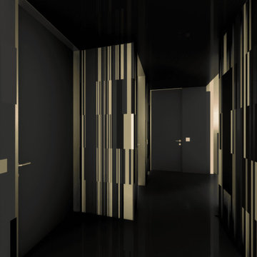
Located in the heart of Manhattan’s Lower East Side, the building was erected on a shallow commercial lot between two 120 year old masonry buildings and a new residential rental building. 330 Grand Street is a mix of 725 SF 1BRs and 1050 SF 2BR apartments. It also contains a 1100 SF two story duplex as well as private and public rooftop space, large private balconies for most units and two large private terraces for the ground floor units.
330 Grand Street was originally designed and approved at the NYC DOB as a prefabricated modular building. During the pandemic, as shipping costs skyrocketed putting the project at risk, we suggested redesigning the building as a reinforced cast-in-place concrete structure. Concrete was readily available and prices had not been affected by the demand increase that many other materials suffered in the pandemic. We took this opportunity to raise floor to ceiling heights, enlarge high performance windows and redistribute the buildings MEPFS and Structural Systems to create very open floor plans.
The challenge was to create a luxurious sensorial living experience with very limited means. In a city with very high construction costs, low cost residential buildings in the area are usually devoid of good quality, design and character. Our approach was to aim high for the end user, prioritizing natural light, open space with long visual perspectives, high ceilings and as always, rejecting the use of predefined building templates.
Our biggest challenge was to ensure that the small spaces feel as clean cut, large and bright as possible. Several unique design decisions were made to ensure low cost and high quality;
Floor plans were laid out so that spaces were wide open and free of clutter from mechanical or structural interruptions. Therefore all infrastructure was placed in lateral demising walls, which in turn act as the unit’s storage and kitchen. The apartments feel wide open, are super quiet and have more storage space than any other comparable apartment in the city.
To solve the problem of the site’s shallow commercial lot which is typically prone to dark interior spaces we focused our attention on the building’s envelope. Instead of the usual small punched window openings, oversized high performance windows were designed to ensure that light penetrated as far as possible into the units. In the smaller 1BR units, the full 50’ depth of the lot is perceived by partitioning spaces with sliding pocket doors that can be retracted to allow deep visual perspectives, making the sight lines in the space feel longer, larger, more ample than normal. In addition to the full height glazing, each unit above the 2nd floor receives a 7 foot covered balcony, adding 120 to 240 sf to each apartment, something unusual in New York City buildings. The space is large enough for a full size dining table, when the weather permits being outside.
We also worked hard to ensure modularity. For example, all kitchen units are all identical throughout the building. The idea of modularity and the economy of the repetitive unit is exercised to the maximum through the building.
Hardware, appliances, flooring, wall coverings and material finishes are all carefully selected to feel bespoke, high quality and unique.
It was important to KURV that the result of this work manifest into something that would deeply connect with the end user and sustain relationships with the consumers of this space.
All images by KURV Architecture ©
 HALLETT & Co.
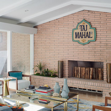
This mid century modern home, built in 1957, suffered a fire and poor repairs over twenty years ago. A cohesive approach of restoration and remodeling resulted in this newly modern home which preserves original features and brings living spaces into the 21st century. Photography by Atlantic Archives
 KB Designs
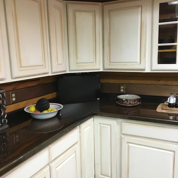
This home was suffering from way too much wood. Log and wainscot walls, wood floors and ceiling, wood cabinets.
Kitchen cabinets were refinished in a cream color and given a soft glazed look around crevices. Part of the backsplash was finished in a copper/bronze hammered look. Countertops refinished over the existing laminate using colorants and epoxy.
White appliances were replaced with stainless and sink was updated to a copper farm sink.
 Lamont Bros. Design & Construction
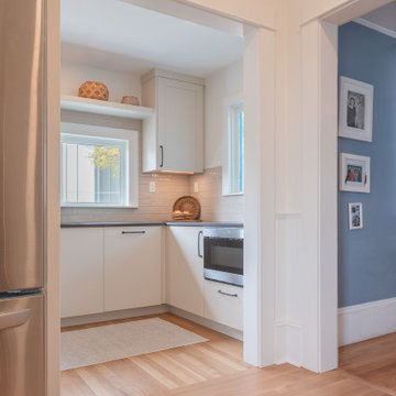
After years of suffering through a poorly designed kitchen that didn’t meet her needs, our client made the difficult decision to re-remodel her kitchen. Now that the kitchen is complete, she's happier than ever in her new kitchen. What used to be a space that was intimidating and difficult to use has become a place designed specifically for her needs, where every appliance and shelf is within comfortable reach and the design is tailored exactly to her personal style.
 Marwood Design
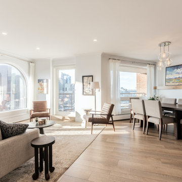
This 1700 sqf. condo overlooking downtown Calgary was suffering from an outdated kitchen, a view partial obstructed by a patio door and outdated floors and lighting. Marwood designs modernized the kitchen with bright colours hiding the fridge to blend the galley with modern materials at the same time maximizing space. In the living room, we moved the door to the side window opening allowing for maximum light that improve the incredible view of the Bow river and downtown Calgary. The floors where brighten and the old-style track lighting replaced with pot lighting giving the condo a contemporary finish. The completed project creates a space that is special and distinct enjoying the serenity of Calgary .
 Lisa Shaffer
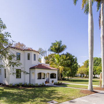
This house suffered from many renovations gone wrong. We "un-enclosed" the front porch and restored the arches.
Large mediterranean white two-story concrete house exterior idea in Miami with a gambrel roof and a shingle roof
Large mediterranean white two-story concrete house exterior idea in Miami with a gambrel roof and a shingle roof
 Pro-Tile & Marble
Pro-Tile & Marble, Inc.
Wood Look Tile Pros
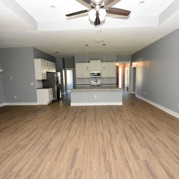
Value- Tile has always been a better value than hardwood.
Durability - It’s a fact. Tile is one of the most durable flooring materials you can buy. If you take care of it, it will still look new in 20 years; unlike its counterpart.
Maintenance - Tile is ridiculously easy to maintain. You won’t need fancy tools or expensive cleaners. A regular tile mop and static broom or tile vacuum will work fine.
Versatility - Do you long for versatile flooring that can go anywhere in your home? If so, wood-look tile fits the bill. You can install tile in bathrooms, and kitchens.
Variety - If you’re craving a flooring solution that allows for endless possibilities, wood-look tile is an excellent option.
Allergy-friendly - Wood grain tile is perfect for allergy sufferers. It doesn’t harbor dirt and dander like carpet can (that goes for both ceramic and porcelain).
Pet-friendly - Tile is a wise pet-friendly flooring option for the dog or cat owner who worries about scratches and scuff marks. Even if you have large dogs, quality tile won’t scratch like hardwood can. And unlike other surfaces, your cat can’t shred it or use it as a scratching post.
Pro-Tile & Marble 904-731-6471
 Irene Designs
Kitchen — Project Description (Bolton, CT)
(Full Renovation • Reconfiguration • Architectural Corrections)
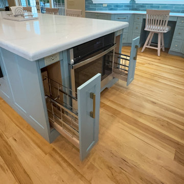
The original kitchen suffered from spatial imbalance and limited functionality: the right side was visually and physically heavy with cabinetry and appliances, the 135-degree angled walls lacked symmetry due to a missing window on the driveway side, and the small island could only seat two. Circulation was obstructed by a desk positioned in the main traffic flow, and the low French door felt disproportionate in scale compared to the large windows and adjacent two-story Great Room.
Major Structural & Functional Improvements
Repositioned window on the front elevation to the right, creating a long-desired view to the driveway while freeing space for a centered cooktop and statement hood — visually aligning with the Great Room’s redesigned fireplace focal wall.
Installed a new custom sliding door, significantly taller and wider than the original French door. This upgrade enhances natural light, visually opens the kitchen to the deck, and provides unobstructed traffic flow thanks to its sliding operation.
New Kitchen Layout & Enhanced Functionality
Designed an entirely new layout centered around a 10' double-slab island, providing expansive workspace and a natural gathering zone.
Added conversational seating for the whole family, allowing comfortable interaction on all sides of the island.
Introduced purpose-designed storage solutions, including pullouts, rollouts, spice towers, tray organizers, and deep drawers to maximize usability.
Reallocated the desk area to a dedicated window spot overlooking the backyard, removing it from traffic paths and improving both functionality and comfort.
Cabinetry & Architectural Detailing
Custom two-tone cabinetry in soft white and a serene blue-green tone reflects the visual language of the adjacent Great Room, creating whole-home cohesion.
Installed lit upper glass cabinets along the entire perimeter, balancing vertical proportions and creating an elegant display band throughout the kitchen.
A custom range hood was designed and painted to match the base cabinetry, becoming a focal point framed by symmetrical windows.
Surfaces, Lighting & Finishes
The island features a double-thickness quartz slab with a soft ogee radius for a timeless, furniture-like feel.
A full-height, handcrafted aqua subway tile backsplash introduces depth, texture, and a gentle reflective quality.
New layered lighting concept, including recessed lights, pendants, task lighting, and integrated cabinet lighting, ensures a warm and functional workspace at any time of day.
 RB73
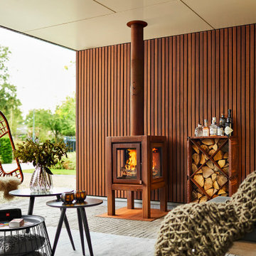
RB73Outdoor fireplace made of 3mm CorTen steel. Closed with 3 sided glass. So no suffer from ash, smoke and fire sparks on your terrace. Backside is made with heat resistant concrete so it will get warm but not hot.
16