
Search results for "Suffered" in Home Design Ideas
 Plain & Posh
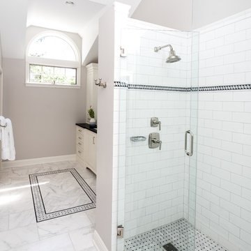
This master bath was long and narrow and suffered from a 1990's renovation with a huge tub no one used and a tiny shower area. The vanity was also quite small. By removing the tub and relocating the shower from the toilet room to the main area, the shower was able to double in size.
The vanity area is also almost twice as large as before.
 Freund Studio
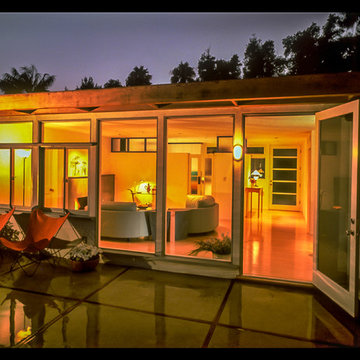
This 1948 house designed by renowned mid-century modernist Architect Gregory Ain suffered thru several bad remodels before we totally restored it and added on a new master suite.
 Pamela Sandall Design
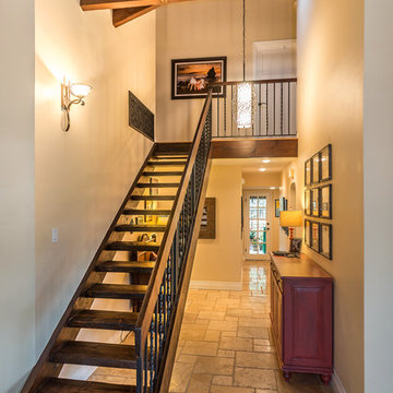
These stairs suffered from a carpet wrapped tread and mis matched wood tones. Exposing the wood of the stairs was a fun surprise as they had great texture! New rich stain on the treads, the rails and the handle and it came together beautifully! Tom Clary, Clarified Studios
Find the right local pro for your project
 Lincoln Lighthill Architect
What does a roof deck look like when every part of the roof, even areas deemed uninhabitable and structurally weak, is utilized and optimized?
This large midcentury home on the edge of Presidio National Park in San Francisco had an incredible location and views. But the original roof deck suffered from poor design detailing that had rendered it a leaking, deteriorating mess. Even worse, the previous owner had covered three roof areas surrounding the deck with river stones, structurally overloading the building and endangering its occupants.
We removed the river stones and everything else down to the framing. An expertly detailed drainage and waterproofing system underlies everything above. The deck and access stairs are surfaced with durable and refined porcelain pavers. The guardrail is made from custom stainless steel supports with clear, low-iron, laminated glass spanning between for an unobstructed view. Heated seats make watching the chilly fog roll in through the gate comfy.
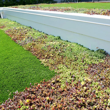
Planting and greenery surround the deck. The type varies depending on structural conditions- a deep planter sits on top of a structural wall, sedums in shallow soil occupy the strong edges of the surrounding rooftops, and faux grass turf fills out the middle in areas that can’t support the weight of wet soil.
 JLC Architecture
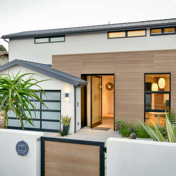
JLC was charged with transforming a 35 year old home which had suffered a remodel or two into a cohesive and modern home. Sustainable design principles were placed at the forefront of the design process alongside functionality and aesthetics. The end result is a roughly 3,000 sf home that is both comfortable and beautiful. The exterior palette is defined by Resysta siding and decking, acrylic stucco, a standing seam metal roof and black aluminum windows and doors. At the interiors white oak and walnut cabinetry throughout bring natural warmth to the clean, white interior. The home achieved LEED Platinum in 2017 and was featured on the San Diego Green Building Council’s 2017 Green Homes Tour.
Project website: neuhaus-encinitas.blogspot.com
 12/12 Architects & Planners
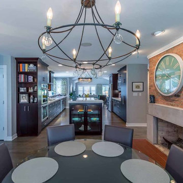
This family of 5 was quickly out-growing their 1,220sf ranch home on a beautiful corner lot. Rather than adding a 2nd floor, the decision was made to extend the existing ranch plan into the back yard, adding a new 2-car garage below the new space - for a new total of 2,520sf. With a previous addition of a 1-car garage and a small kitchen removed, a large addition was added for Master Bedroom Suite, a 4th bedroom, hall bath, and a completely remodeled living, dining and new Kitchen, open to large new Family Room. The new lower level includes the new Garage and Mudroom. The existing fireplace and chimney remain - with beautifully exposed brick. The homeowners love contemporary design, and finished the home with a gorgeous mix of color, pattern and materials.
The project was completed in 2011. Unfortunately, 2 years later, they suffered a massive house fire. The house was then rebuilt again, using the same plans and finishes as the original build, adding only a secondary laundry closet on the main level.
 Michael Gorski Architect
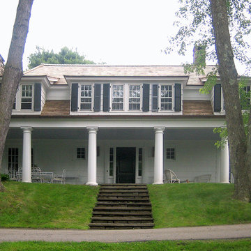
The original 1920’s cottage was charming, but suffered from a series of additions that marred the exterior and created an awkward floor plan. To renovate this home, the exterior of the original cottage was left largely intact, the previous additions were removed, a garage/bedroom wing was added to the rear, and a glazed breakfast room was added where old and new construction meet. Within the original cottage, several partitions were removed and openings between rooms were widened. The resulting home maintains the intimate feel of the original cottage, while creating the light and airy interior desired by the owner.
 Manubric
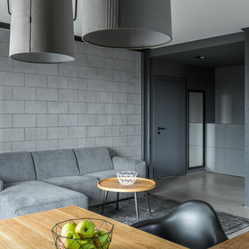
Faithful reproduction of concrete blocks that have suffered the bad weather of time.
This product is so easy to install and heat resistant. The look of this product is just magnificent. Those around you will undoubtedly remember it.

 Advance Design Studio, Ltd.
Laundry rooms and mudrooms can be a headache for many homeowners. They are usually cramped with poor functionality and little storage space. Joe and Kristin suffered all those aches and more, as their laundry room lacked clothing storage. Shoes were crammed in every corner. There was nowhere to fold clothes without taking them to the kitchen. They were ready for a complete laundry room remodel project.
Joe and Kristin interviewed several local remodeling companies but didn’t connect with anyone who could understand their vision. During the summer, when they were attending their son’s race venue, they noticed fellow kart racers Todd and Christine Jurs’ sponsor banner for their remodeling company, Advance Design Studio. Immediately they were thrilled that they knew someone they trusted who could handle the renovation.
“We wanted someone that we actually knew, who has a little bit more invested than an outside person that we don’t have any ties to,” Kristin said.
Project Designer Nicole Ryan came to their home in Warrenville for the initial consultation. Kristin, an avid HGTV viewer, brought her ideas to Nicole. Throughout the design process, they worked together designing the space, selecting materials, and choosing colors. Nicole made sure to incorporate Kristin’s must-haves into the finished laundry room remodel.
“It was really easy. Nicole made the transition very easy,” Kristin said of Nicole’s work in the design phase of the project. With the materials selected and the drawings finalized, it was time to begin construction. Kristin and Joe were impressed with how quickly and cleanly this phase went.
“Everyone that came in was very respectful, very neat, and that was a big part for me because I didn’t want dust going through the rest of my house,” Kristin said.
The new combination mudroom/laundry room is everything Kristin and Joe hoped. There is plenty of storage, three pull-out laundry hampers for presorting laundry, a large central island for folding clothes, a designated bar to hang dry, and even a unique rotating shoe rack to keep shoes from cluttering the space.
“My rotating shoe rack,” Kristin said when asked what her favorite part of her new laundry room was. “We have four kids. We have a lot of shoes and sporting events. So it makes sense to have all that space for shoes.”
The center island has an exceptional feature as well. It has wheels. Kristin wanted to be able to move the island out of the way for different functions in the room. An island with wheels can be placed wherever needed in the space.
The two existing closets were reconfigured with built-in closet storage systems to make them more functional than before with shelves for baskets holding gloves and hats, umbrellas, and coats.
“They love it,” Project Designer Nicole Ryan said. “They had a vision of how they wanted the space to function but didn’t know exactly how to get it there. My design took all their needs and used the most efficient products to get them the desired outcome. Tons of function, while still looking beautiful!”
The “White” Hudson Panel Dura Supreme cabinetry on the perimeter brightens the space and contrasts the popular blue “Gale Force” Dura Supreme cabinetry of the rolling island. The black and white encaustic design porcelain tile backsplash adds visual interest to the room above the white quartz countertops. Additionally, an oil-rubbed bronze bar for hanging clothes is conveniently located above the washer/dryer, and a stainless-steel under-mount sink with a matching Kohler faucet offers perfect functionality.
“I would definitely recommend Advance Design; they’ve been wonderful. They were so helpful. Any little changes we had, they were able to accommodate,” Kristin said.
 KURV Architecture DPC (Alex Hughes Architects)
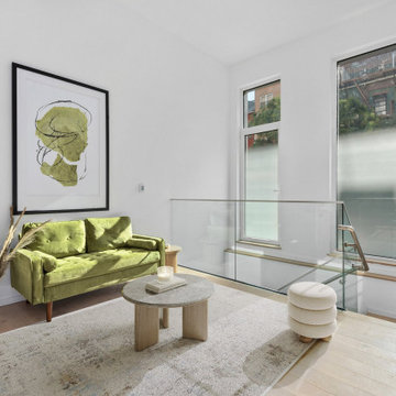
Located in the heart of Manhattan’s Lower East Side, the building was erected on a shallow commercial lot between two 120 year old masonry buildings and a new residential rental building. 330 Grand Street is a mix of 725 SF 1BRs and 1050 SF 2BR apartments. It also contains a 1100 SF two story duplex as well as private and public rooftop space, large private balconies for most units and two large private terraces for the ground floor units.
330 Grand Street was originally designed and approved at the NYC DOB as a prefabricated modular building. During the pandemic, as shipping costs skyrocketed putting the project at risk, we suggested redesigning the building as a reinforced cast-in-place concrete structure. Concrete was readily available and prices had not been affected by the demand increase that many other materials suffered in the pandemic. We took this opportunity to raise floor to ceiling heights, enlarge high performance windows and redistribute the buildings MEPFS and Structural Systems to create very open floor plans.
The challenge was to create a luxurious sensorial living experience with very limited means. In a city with very high construction costs, low cost residential buildings in the area are usually devoid of good quality, design and character. Our approach was to aim high for the end user, prioritizing natural light, open space with long visual perspectives, high ceilings and as always, rejecting the use of predefined building templates.
Our biggest challenge was to ensure that the small spaces feel as clean cut, large and bright as possible. Several unique design decisions were made to ensure low cost and high quality;
Floor plans were laid out so that spaces were wide open and free of clutter from mechanical or structural interruptions. Therefore all infrastructure was placed in lateral demising walls, which in turn act as the unit’s storage and kitchen. The apartments feel wide open, are super quiet and have more storage space than any other comparable apartment in the city.
To solve the problem of the site’s shallow commercial lot which is typically prone to dark interior spaces we focused our attention on the building’s envelope. Instead of the usual small punched window openings, oversized high performance windows were designed to ensure that light penetrated as far as possible into the units. In the smaller 1BR units, the full 50’ depth of the lot is perceived by partitioning spaces with sliding pocket doors that can be retracted to allow deep visual perspectives, making the sight lines in the space feel longer, larger, more ample than normal. In addition to the full height glazing, each unit above the 2nd floor receives a 7 foot covered balcony, adding 120 to 240 sf to each apartment, something unusual in New York City buildings. The space is large enough for a full size dining table, when the weather permits being outside.
We also worked hard to ensure modularity. For example, all kitchen units are all identical throughout the building. The idea of modularity and the economy of the repetitive unit is exercised to the maximum through the building.
Hardware, appliances, flooring, wall coverings and material finishes are all carefully selected to feel bespoke, high quality and unique.
It was important to KURV that the result of this work manifest into something that would deeply connect with the end user and sustain relationships with the consumers of this space.
All images by KURV Architecture ©
 Poore & Company
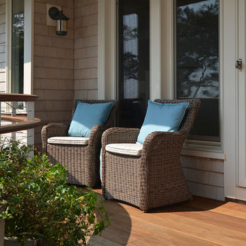
The original house was built as a kit on the coast. The potential view was spectacular but the existing house suffered from a deep sense of tunnel vision and the interior was a maze of disconnected spaces. By changing the location of the kitchen to a more commanding location and unfolding the spaces into a more logical flow the house not only captures the panoramic view but feels twice as big without adding one square foot to the building footprint. Small changes in the deck sizes with some sweeping curves and more logical exterior stair locations connect the interior with the surrounding natural landscape. An “away” space, affectionately called the Quiet Room, is crowned with a sculptural plaster ceiling that evokes a wave, or a shell, or a soft sky canopy floating above this unusual living area. Outdoors is an infinity edge spa overlooking Gloucester’s Eastern Point Lighthouse and the ocean beyond.
 Care Free Homes, Inc.
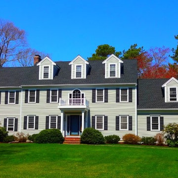
This beautiful colonial in Marion, Massachusetts is even more gorgeous with its new GAF Timberline HD roof!
There is more to a roof than shingles – in fact there are several components to a professionally installed GAF Lifetime Roofing System. Here is the anatomy of our Marion homeowner’s roof:
GAF Timberline HD Shingles Marion, MAGAF Timberline HD Roof Shingles: A beautiful architectural shingle at an affordable price! This is our most popular roof shingle here at Care Free Homes! Our Marion customer selected the classic color, Charcoal. This high performance shingle features a 130 mph wind rating and highest possible fire rating.
Underlayment: A felt/paper product that is installed over the entire roof deck, underlayment provides an additional layer of protection between the roof deck and the roof shingles.
Ice Dam and Water Shield: After a brutal winter and unprecedented snow fall, many New England homes suffered damage from ice dams. Ice Dam and Water Shield provides added protection for eves, rakes, valleys as well as flashed areas around vent pipes, chimneys, dormers, and skylights. Whether it’s a winter wonderland or a hurricane, this homeowner will not have to worry about ice dams or driving rain.
GAF Timberline HD, Marion, MA Dormers
Premium Aluminum Drip Edge: Installed along the rakes, drip edge serves several purposes. It improves the efficiency of water shedding, prevents leaking from a wind-driven rain as well as movement between the deck and fascia boards. Drip edge also keeps pesky insects from infiltrating the space between the roof deck and the fascia boards. With a choice of three colors, white, brown and gray, it provides a finished look for a roof.
GAF Pro-Start Eave/Rake Starter Strip: Every story has a beginning and every roof should have a starter strip. Here in New England we’ve got to have our roof be tougher than mother nature. To prevent shingle blow off, an ultra-adhered starter strip properly secures shingles in place during a storm. In contrast, the amateur roofer will often use cut-up shingles as a starter course. This weakened “starter course” lowers the wind resistance of a roof and makes it more susceptible to both wind and water damage. With straighter edges, Dura-Grip adhesive, and outstanding warranties – starter strip will provide beauty, performance and peace of mind.
GAF Cobra Ridge Vent: Ridge vents provide necessary airflow to remove excess heat and moisture in an attic. It inhibits the growth of mold and protects the health of the homeowners as well as their stored possessions. A properly vented attic will also protect homes in harsh winter climates from ice damming.
Why wait? Contact us today and make your house a Care Free home!
 Lamont Bros. Design & Construction
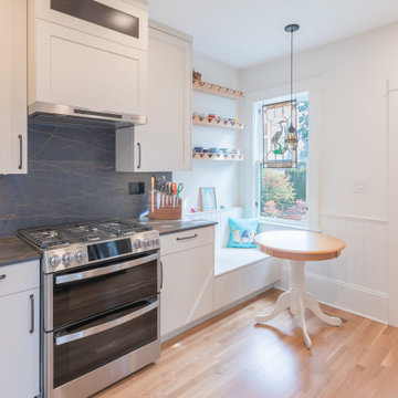
After years of suffering through a poorly designed kitchen that didn’t meet her needs, our client made the difficult decision to re-remodel her kitchen. Now that the kitchen is complete, she's happier than ever in her new kitchen. What used to be a space that was intimidating and difficult to use has become a place designed specifically for her needs, where every appliance and shelf is within comfortable reach and the design is tailored exactly to her personal style.
 Tile Doctor Ltd
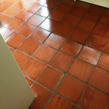
Newly built properties are not without their problems and often take a while to resolve all the snagging which occasionally extends to resolving problems with newly laid tiled floors. At this new property in the village of Malvern, and overlooked by the Malvern hills, the builders had left the Terracotta tiled kitchen floor covered in grout smears (also known as Grout Haze) following installation. They had also neglected to seal the tiles, which was actually quite fortunate in this case as they would have sealed in the grout haze, making it more difficult to remove.
Naturally, the property owner wanted the problem to be resolved as soon as possible, and for me to make the tiles easy to keep clean in future, which can be achieved by sealing the tile.
Before starting work, I made sure to fully protect any exposed woodwork with a plastic sheet covering to protect them from potential damage. I then proceeded to give the floor a thorough clean, using Tile Doctor Remove and Go to clean the floor and eradicate some stains that had been left behind as a result of the building work.
Next, I paid special attention to the grout, where the very visible problem of grout haze had arisen. To neutralise these smears I used Tile Doctor Grout Clean Up, a concentrated phosphoric acid cleaner that can also remove alkaline mineral deposits and efflorescence. Grout Clean Up is only to be used on acid resistant stone, as sensitive stone can suffer from irreparable etching if it comes into contact with the product.
Once completely clean and free of grout smears the floor was thoroughly rinsed with water to remove any trace of product and then dried as much as possible with a wet vacuum, afterwards an air mover was installed to speed up the drying process.
Later that afternoon the floor was dry and I was able to apply a sealer. To do this I opted to use several coats of Tile Doctor Seal and Go Extra, a topical, fully breathable sealer that works really well on Terracotta.
The sealer builds up a layer of protection on the surface of the tiles, protecting against ingrained dirt and stains. Seal and Go Extra also provides a high quality sheen finish which really did well to enhance the look of the Terracotta.
The property owner was exceptionally pleased with the results, and to have this problem dealt with quickly and efficiently, additionally the sealer will ensure the Kitchen floor is easy to keep clean in the future.
 Studio Roundtop LLC
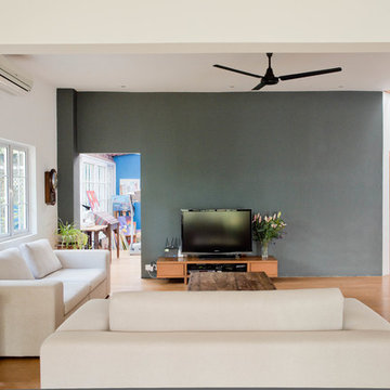
The owners of this house appreciate living in a home that is connected with its tropical context. Set in a dense residential neighborhood, the challenge was to create a home with a garden as an extension of its interior, whilst retaining a sense of privacy that the owners valued. Working within the existing shell of an old semi-detatched house, the interior layout was reconfigured to create a series spaces that open out to the lush tropical garden.
The existing kitchen was converted into an open kitchen, connecting the backyard to the dining and living room. Large sliding windows open the living/dining space to its patio and garden to offer an outdoor dining experience.
The existing hallway and common bathroom also suffered from daylight and natural ventilation. A skylight was inserted to brighten the otherwise existing dim hallway. The previously mechanically ventilated bathroom was also converted into a semi-outdoor bathroom with the introduction of an air-well and feature rock wall.
The guest bedroom, previously accessible through the kitchen, was turned into a home office now exclusive to the master bedroom. A private courtyard was introduced to connect the master bedroom and home office to create a private sanctuary for one residing in the the bedroom or working in the office.
 Horn & Co. (Previously JHLA)
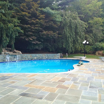
The existing concrete aggregate terrace suffered from disrepair and access was limited from the rear of the Bethesda home. We were tasked with replacing all paving, coping, and stairs. An improved water feature behind the original kidney-shaped pool provided white noise to distract visitors from the nearby highway noise.
 Michael Gorski Architect
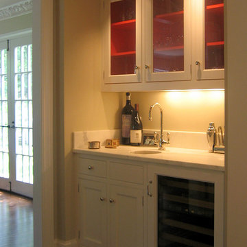
The original 1920’s cottage was charming, but suffered from a series of additions that marred the exterior and created an awkward floor plan. To renovate this home, the exterior of the original cottage was left largely intact, the previous additions were removed, a garage/bedroom wing was added to the rear, and a glazed breakfast room was added where old and new construction meet. Within the original cottage, several partitions were removed and openings between rooms were widened. The resulting home maintains the intimate feel of the original cottage, while creating the light and airy interior desired by the owner.
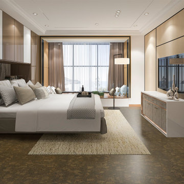
 iCork Floor
- Installation Type: Floating
- Licensed Uniclic Flooring system
- Square Edge Plank (seamless floor)
- Finish: Three coats water based polyurethane
- Wear Layer: 3mm genuine cork
- Middle Layer: 7mm E1 Class High Density Fiberboard (HDF)
- Integrated Underlayment: 1mm agglomerated cork.
- Plank Width: 12” (315mm)
- Plank Length: 36" (915mm)
- Plank Thickness: 7/16" (11mm)
- Carton coverage: 21.03 sqft
- Pieces per carton: 7
- 25 year warranty (residential installation)
- Underlayment not required
- Hypo-allergenic
- Healthy alternative to carpet
- Excellent thermal and acoustic insulation
- Stain resistant
- Naturally resistant to insects, mould, mildew due to anti-microbial propertiesi
- Low slip surface
- Excellent surface for seniors, children or people suffering from arthritis or joint pain
Order FREE SAMPLES on our website: www.icorkfloor.com
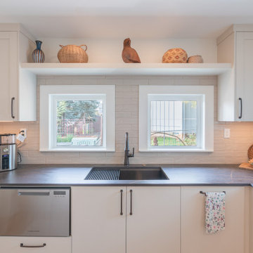 Lamont Bros. Design & Construction
After years of suffering through a poorly designed kitchen that didn’t meet her needs, our client made the difficult decision to re-remodel her kitchen. Now that the kitchen is complete, she's happier than ever in her new kitchen. What used to be a space that was intimidating and difficult to use has become a place designed specifically for her needs, where every appliance and shelf is within comfortable reach and the design is tailored exactly to her personal style.
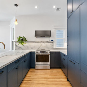
 Centoni Restoration & Development, Inc.
This lovely 2-story townhome suffered the effects of more than 120 years of “remuddling” and “modernization” through significant modification of the structural framing. With a large section of a load-bearing wall removed and shear walls, the full 3-story building was structurally compromised.
The program included the installation of a steel beam and structural reframing, beginning at the ground floor and through to the 3rd-floor living space.
The new structural design allowed for a significantly improved living space. The kitchen was relocated and expanded, as were the living room and dining room.
Several upgrades were made to the home, including incorporating all-electrical appliances. 1900 Victorian now boasts several eco-friendly and energy-efficient features.
14