Search results for "Sufferers" in Home Design Ideas
Modest home on the water! Horizontal, Board and Batten (River Rock) and 7" Shakes (Wrought Iron) Celect Cellular Composite Siding gives the look of wood without the maintenance! Celect is made from recyclable, state-of-the-art cellular materials. Which means it won't rot, split, crack, warp, twist, blister, flake, peel, delaminate or suffer loss of structural properties due to termites, microbiological growth or other decay!!
The Celect trims also adds so much character!

Modest home on the water! Horizontal, Board and Batten (River Rock) and 7" Shakes (Wrought Iron) Celect Cellular Composite Siding gives the look of wood without the maintenance! Celect is made from recyclable, state-of-the-art cellular materials. Which means it won't rot, split, crack, warp, twist, blister, flake, peel, delaminate or suffer loss of structural properties due to termites, microbiological growth or other decay!! The Celect trims also adds so much character!

A friend of mine suffered damage from a hurricane, I rebuilt the dock, roof over the boat and floating dock.
Mid-sized traditional one-story exterior home idea in Jacksonville
Find the right local pro for your project
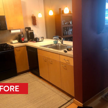
This customer spent over 40 years building and renovating his home. In his younger days, he was an amazing building and craftsman. Recently, he suffered a stroke and lost the ability to build. He wants to leave his home to his daughter, so he planned one last renovation project. For this project, he wanted to choose a renovation company that could build a kitchen as well as he could. Luckily, he chose Wood Front Kitchens. He was thrilled with the result. He loved that we were able to keep storage features he had built in his previous cabinets and transfer them to the new cabinets.
This homeowner chose shaker-style oak cabinets stained in Michels. He chose Amerock Conrad Square hardware in oil-rubbed bronze to give his rustic cabinets an industrial feel. He and his daughter are both pleased with the results, and with their huge increase in storage space.

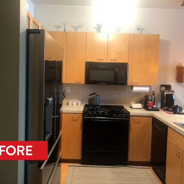
After years of suffering through a poorly designed kitchen that didn’t meet her needs, our client made the difficult decision to re-remodel her kitchen. Now that the kitchen is complete, she's happier than ever in her new kitchen. What used to be a space that was intimidating and difficult to use has become a place designed specifically for her needs, where every appliance and shelf is within comfortable reach and the design is tailored exactly to her personal style.

Kitchen — Project Description (Bolton, CT)
(Full Renovation • Reconfiguration • Architectural Corrections)
The original kitchen suffered from spatial imbalance and limited functionality: the right side was visually and physically heavy with cabinetry and appliances, the 135-degree angled walls lacked symmetry due to a missing window on the driveway side, and the small island could only seat two. Circulation was obstructed by a desk positioned in the main traffic flow, and the low French door felt disproportionate in scale compared to the large windows and adjacent two-story Great Room.
Major Structural & Functional Improvements
Repositioned window on the front elevation to the right, creating a long-desired view to the driveway while freeing space for a centered cooktop and statement hood — visually aligning with the Great Room’s redesigned fireplace focal wall.
Installed a new custom sliding door, significantly taller and wider than the original French door. This upgrade enhances natural light, visually opens the kitchen to the deck, and provides unobstructed traffic flow thanks to its sliding operation.
New Kitchen Layout & Enhanced Functionality
Designed an entirely new layout centered around a 10' double-slab island, providing expansive workspace and a natural gathering zone.
Added conversational seating for the whole family, allowing comfortable interaction on all sides of the island.
Introduced purpose-designed storage solutions, including pullouts, rollouts, spice towers, tray organizers, and deep drawers to maximize usability.
Reallocated the desk area to a dedicated window spot overlooking the backyard, removing it from traffic paths and improving both functionality and comfort.
Cabinetry & Architectural Detailing
Custom two-tone cabinetry in soft white and a serene blue-green tone reflects the visual language of the adjacent Great Room, creating whole-home cohesion.
Installed lit upper glass cabinets along the entire perimeter, balancing vertical proportions and creating an elegant display band throughout the kitchen.
A custom range hood was designed and painted to match the base cabinetry, becoming a focal point framed by symmetrical windows.
Surfaces, Lighting & Finishes
The island features a double-thickness quartz slab with a soft ogee radius for a timeless, furniture-like feel.
A full-height, handcrafted aqua subway tile backsplash introduces depth, texture, and a gentle reflective quality.
New layered lighting concept, including recessed lights, pendants, task lighting, and integrated cabinet lighting, ensures a warm and functional workspace at any time of day.

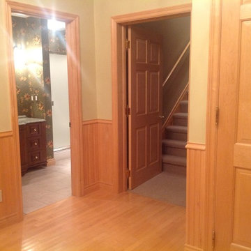
The original foyer featured light maple floors, beadboard & trim. Although the materials were in decent shape, the house suffered from an identity crisis as well as some layout challenges. We decided to gut the property and completely redesign.
Photo Credit: TraceJordan Properties
This beautiful colonial in Marion, Massachusetts is even more gorgeous with its new GAF Timberline HD roof!
There is more to a roof than shingles – in fact there are several components to a professionally installed GAF Lifetime Roofing System. Here is the anatomy of our Marion homeowner’s roof:
GAF Timberline HD Shingles Marion, MAGAF Timberline HD Roof Shingles: A beautiful architectural shingle at an affordable price! This is our most popular roof shingle here at Care Free Homes! Our Marion customer selected the classic color, Charcoal. This high performance shingle features a 130 mph wind rating and highest possible fire rating.
Underlayment: A felt/paper product that is installed over the entire roof deck, underlayment provides an additional layer of protection between the roof deck and the roof shingles.
Ice Dam and Water Shield: After a brutal winter and unprecedented snow fall, many New England homes suffered damage from ice dams. Ice Dam and Water Shield provides added protection for eves, rakes, valleys as well as flashed areas around vent pipes, chimneys, dormers, and skylights. Whether it’s a winter wonderland or a hurricane, this homeowner will not have to worry about ice dams or driving rain.
GAF Timberline HD, Marion, MA Dormers
Premium Aluminum Drip Edge: Installed along the rakes, drip edge serves several purposes. It improves the efficiency of water shedding, prevents leaking from a wind-driven rain as well as movement between the deck and fascia boards. Drip edge also keeps pesky insects from infiltrating the space between the roof deck and the fascia boards. With a choice of three colors, white, brown and gray, it provides a finished look for a roof.
GAF Pro-Start Eave/Rake Starter Strip: Every story has a beginning and every roof should have a starter strip. Here in New England we’ve got to have our roof be tougher than mother nature. To prevent shingle blow off, an ultra-adhered starter strip properly secures shingles in place during a storm. In contrast, the amateur roofer will often use cut-up shingles as a starter course. This weakened “starter course” lowers the wind resistance of a roof and makes it more susceptible to both wind and water damage. With straighter edges, Dura-Grip adhesive, and outstanding warranties – starter strip will provide beauty, performance and peace of mind.
GAF Cobra Ridge Vent: Ridge vents provide necessary airflow to remove excess heat and moisture in an attic. It inhibits the growth of mold and protects the health of the homeowners as well as their stored possessions. A properly vented attic will also protect homes in harsh winter climates from ice damming.
Why wait? Contact us today and make your house a Care Free home!

Challenge:
This prestigious Bridle Path kitchen suffered from poor lighting and functionality issues that prevented it from reaching its full potential. Our clients desired a luxury kitchen that would serve as both a functional workspace and an elegant entertaining hub, requiring us to address the lighting deficiencies while creating a sophisticated aesthetic worthy of this upscale neighborhood.
Solution:
We transformed this space into a luxury kitchen that balances exceptional functionality with breathtaking beauty. The design centers around the stunning Taj Mahal quartzite, whose naturally elegant patterns became the foundation for all other design decisions. By addressing the lighting challenges and incorporating warm finishes throughout, we created a space that feels both inviting and sophisticated.
Highlights:
• Taj Mahal quartzite countertops and backsplash - the jewel of the space with naturally beautiful and elegant patterns
• Custom millwork cabinetry designed for both beauty and optimal functionality
• High-end appliances seamlessly integrated into the sophisticated design
• Warm finishes throughout that complement the quartzite's natural beauty
• Expert craftsmanship by skilled local fabricators ensuring flawless installation
Results:
The transformed kitchen now serves as a stunning centerpiece of this Bridle Path home, where the Taj Mahal quartzite's natural elegance takes center stage. This project demonstrates our ability to solve functional challenges while creating luxury spaces that celebrate exceptional materials, proving that sometimes the most beautiful design solutions let natural beauty shine without unnecessary embellishment.

Kitchen designed for differing heights of kitchen cooks. One of the homeowners has an arm / shoulder injury making chopping food painful. The island countertop was lowered to accommodate her height and allow her to cut at a level that didn't cause pain.
Photography: Augie Salbosa

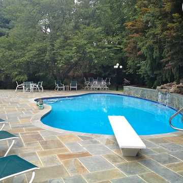
The existing concrete aggregate terrace suffered from disrepair and access was limited from the rear of the Bethesda home. We were tasked with replacing all paving, coping, and stairs. An improved water feature behind the original kidney-shaped pool provided white noise to distract visitors from the nearby highway noise.
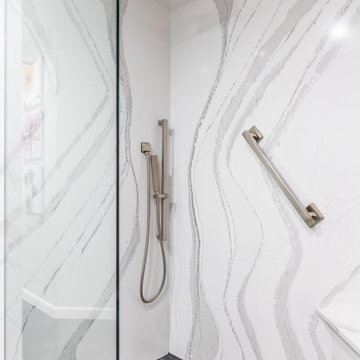
The Master Bath needed some updates as it suffered from an out of date, extra large tub, a very small shower and only one sink. Keeping with the Mood, a new larger vanity was added in a beautiful dark green with two sinks and ample drawer space, finished with gold framed mirrors and two glamorous gold leaf sconces. Taking in a small linen closet allowed for more room at the shower which is enclosed by a dramatic black framed door. Also, the old tub was replaced with a new alluring freestanding tub surrounded by beautiful marble tiles in a large format that sits under a deco glam chandelier. All warmed by the use of gold fixtures and hardware.

The original 1920’s cottage was charming, but suffered from a series of additions that marred the exterior and created an awkward floor plan. To renovate this home, the exterior of the original cottage was left largely intact, the previous additions were removed, a garage/bedroom wing was added to the rear, and a glazed breakfast room was added where old and new construction meet. Within the original cottage, several partitions were removed and openings between rooms were widened. The resulting home maintains the intimate feel of the original cottage, while creating the light and airy interior desired by the owner.

This family of 5 was quickly out-growing their 1,220sf ranch home on a beautiful corner lot. Rather than adding a 2nd floor, the decision was made to extend the existing ranch plan into the back yard, adding a new 2-car garage below the new space - for a new total of 2,520sf. With a previous addition of a 1-car garage and a small kitchen removed, a large addition was added for Master Bedroom Suite, a 4th bedroom, hall bath, and a completely remodeled living, dining and new Kitchen, open to large new Family Room. The new lower level includes the new Garage and Mudroom. The existing fireplace and chimney remain - with beautifully exposed brick. The homeowners love contemporary design, and finished the home with a gorgeous mix of color, pattern and materials.
The project was completed in 2011. Unfortunately, 2 years later, they suffered a massive house fire. The house was then rebuilt again, using the same plans and finishes as the original build, adding only a secondary laundry closet on the main level.

Located in the heart of Manhattan’s Lower East Side, the building was erected on a shallow commercial lot between two 120 year old masonry buildings and a new residential rental building. 330 Grand Street is a mix of 725 SF 1BRs and 1050 SF 2BR apartments. It also contains a 1100 SF two story duplex as well as private and public rooftop space, large private balconies for most units and two large private terraces for the ground floor units.
330 Grand Street was originally designed and approved at the NYC DOB as a prefabricated modular building. During the pandemic, as shipping costs skyrocketed putting the project at risk, we suggested redesigning the building as a reinforced cast-in-place concrete structure. Concrete was readily available and prices had not been affected by the demand increase that many other materials suffered in the pandemic. We took this opportunity to raise floor to ceiling heights, enlarge high performance windows and redistribute the buildings MEPFS and Structural Systems to create very open floor plans.
The challenge was to create a luxurious sensorial living experience with very limited means. In a city with very high construction costs, low cost residential buildings in the area are usually devoid of good quality, design and character. Our approach was to aim high for the end user, prioritizing natural light, open space with long visual perspectives, high ceilings and as always, rejecting the use of predefined building templates.
Our biggest challenge was to ensure that the small spaces feel as clean cut, large and bright as possible. Several unique design decisions were made to ensure low cost and high quality;
Floor plans were laid out so that spaces were wide open and free of clutter from mechanical or structural interruptions. Therefore all infrastructure was placed in lateral demising walls, which in turn act as the unit’s storage and kitchen. The apartments feel wide open, are super quiet and have more storage space than any other comparable apartment in the city.
To solve the problem of the site’s shallow commercial lot which is typically prone to dark interior spaces we focused our attention on the building’s envelope. Instead of the usual small punched window openings, oversized high performance windows were designed to ensure that light penetrated as far as possible into the units. In the smaller 1BR units, the full 50’ depth of the lot is perceived by partitioning spaces with sliding pocket doors that can be retracted to allow deep visual perspectives, making the sight lines in the space feel longer, larger, more ample than normal. In addition to the full height glazing, each unit above the 2nd floor receives a 7 foot covered balcony, adding 120 to 240 sf to each apartment, something unusual in New York City buildings. The space is large enough for a full size dining table, when the weather permits being outside.
We also worked hard to ensure modularity. For example, all kitchen units are all identical throughout the building. The idea of modularity and the economy of the repetitive unit is exercised to the maximum through the building.
Hardware, appliances, flooring, wall coverings and material finishes are all carefully selected to feel bespoke, high quality and unique.
It was important to KURV that the result of this work manifest into something that would deeply connect with the end user and sustain relationships with the consumers of this space.
All images by KURV Architecture ©

Client requested "short steps" due to the older woman who would be using them, she suffers from arthritis.
Inspiration for a large transitional wooden straight staircase remodel in Houston with wooden risers

Located in the heart of Manhattan’s Lower East Side, the building was erected on a shallow commercial lot between two 120 year old masonry buildings and a new residential rental building. 330 Grand Street is a mix of 725 SF 1BRs and 1050 SF 2BR apartments. It also contains a 1100 SF two story duplex as well as private and public rooftop space, large private balconies for most units and two large private terraces for the ground floor units.
330 Grand Street was originally designed and approved at the NYC DOB as a prefabricated modular building. During the pandemic, as shipping costs skyrocketed putting the project at risk, we suggested redesigning the building as a reinforced cast-in-place concrete structure. Concrete was readily available and prices had not been affected by the demand increase that many other materials suffered in the pandemic. We took this opportunity to raise floor to ceiling heights, enlarge high performance windows and redistribute the buildings MEPFS and Structural Systems to create very open floor plans.
The challenge was to create a luxurious sensorial living experience with very limited means. In a city with very high construction costs, low cost residential buildings in the area are usually devoid of good quality, design and character. Our approach was to aim high for the end user, prioritizing natural light, open space with long visual perspectives, high ceilings and as always, rejecting the use of predefined building templates.
Our biggest challenge was to ensure that the small spaces feel as clean cut, large and bright as possible. Several unique design decisions were made to ensure low cost and high quality;
Floor plans were laid out so that spaces were wide open and free of clutter from mechanical or structural interruptions. Therefore all infrastructure was placed in lateral demising walls, which in turn act as the unit’s storage and kitchen. The apartments feel wide open, are super quiet and have more storage space than any other comparable apartment in the city.
To solve the problem of the site’s shallow commercial lot which is typically prone to dark interior spaces we focused our attention on the building’s envelope. Instead of the usual small punched window openings, oversized high performance windows were designed to ensure that light penetrated as far as possible into the units. In the smaller 1BR units, the full 50’ depth of the lot is perceived by partitioning spaces with sliding pocket doors that can be retracted to allow deep visual perspectives, making the sight lines in the space feel longer, larger, more ample than normal. In addition to the full height glazing, each unit above the 2nd floor receives a 7 foot covered balcony, adding 120 to 240 sf to each apartment, something unusual in New York City buildings. The space is large enough for a full size dining table, when the weather permits being outside.
We also worked hard to ensure modularity. For example, all kitchen units are all identical throughout the building. The idea of modularity and the economy of the repetitive unit is exercised to the maximum through the building.
Hardware, appliances, flooring, wall coverings and material finishes are all carefully selected to feel bespoke, high quality and unique.
It was important to KURV that the result of this work manifest into something that would deeply connect with the end user and sustain relationships with the consumers of this space.
All images by KURV Architecture ©

Forna Taupe Leather cork flooring
Ever been to a physical therapy center and wonder what kind of wood flooring they had that was so comfortable because you could never find that level of comfort from your hardwood or stone-based flooring. If you suffer from leg joint pains, feet pain, even back pain, you know what we’re talking about. Hardwood floors and stone floors are resistant flooring, anything coming into contact with them will find no give.

Located in the heart of Manhattan’s Lower East Side, the building was erected on a shallow commercial lot between two 120 year old masonry buildings and a new residential rental building. 330 Grand Street is a mix of 725 SF 1BRs and 1050 SF 2BR apartments. It also contains a 1100 SF two story duplex as well as private and public rooftop space, large private balconies for most units and two large private terraces for the ground floor units.
330 Grand Street was originally designed and approved at the NYC DOB as a prefabricated modular building. During the pandemic, as shipping costs skyrocketed putting the project at risk, we suggested redesigning the building as a reinforced cast-in-place concrete structure. Concrete was readily available and prices had not been affected by the demand increase that many other materials suffered in the pandemic. We took this opportunity to raise floor to ceiling heights, enlarge high performance windows and redistribute the buildings MEPFS and Structural Systems to create very open floor plans.
The challenge was to create a luxurious sensorial living experience with very limited means. In a city with very high construction costs, low cost residential buildings in the area are usually devoid of good quality, design and character. Our approach was to aim high for the end user, prioritizing natural light, open space with long visual perspectives, high ceilings and as always, rejecting the use of predefined building templates.
Our biggest challenge was to ensure that the small spaces feel as clean cut, large and bright as possible. Several unique design decisions were made to ensure low cost and high quality;
Floor plans were laid out so that spaces were wide open and free of clutter from mechanical or structural interruptions. Therefore all infrastructure was placed in lateral demising walls, which in turn act as the unit’s storage and kitchen. The apartments feel wide open, are super quiet and have more storage space than any other comparable apartment in the city.
To solve the problem of the site’s shallow commercial lot which is typically prone to dark interior spaces we focused our attention on the building’s envelope. Instead of the usual small punched window openings, oversized high performance windows were designed to ensure that light penetrated as far as possible into the units. In the smaller 1BR units, the full 50’ depth of the lot is perceived by partitioning spaces with sliding pocket doors that can be retracted to allow deep visual perspectives, making the sight lines in the space feel longer, larger, more ample than normal. In addition to the full height glazing, each unit above the 2nd floor receives a 7 foot covered balcony, adding 120 to 240 sf to each apartment, something unusual in New York City buildings. The space is large enough for a full size dining table, when the weather permits being outside.
We also worked hard to ensure modularity. For example, all kitchen units are all identical throughout the building. The idea of modularity and the economy of the repetitive unit is exercised to the maximum through the building.
Hardware, appliances, flooring, wall coverings and material finishes are all carefully selected to feel bespoke, high quality and unique.
It was important to KURV that the result of this work manifest into something that would deeply connect with the end user and sustain relationships with the consumers of this space.
All images by KURV Architecture ©

This La Jolla client suffered a water loss and took the opportunity to upgrade and remodel their kitchen. The remodel included high gloss laminate cabinets, black granite countertops with glass tile backsplash, step up bar at peninsula, custom rollup appliance garage, step up ceiling with recessed lights and skylight. We painted an accent wall to complement the kitchen and used different paint shades in the step up ceiling to accent the skylight and create more depth.
16