
Search results for "Sufferers" in Home Design Ideas

 User
UserThis garden suffered severe damage from Hurricane Sandy. The owners wanted a complete makeover. Working with the grading of the land, we cut raised beds into the landscape. Two of these cedar raised beds are 18' long giving this homeowner a huge canvas for growing veggies. We now grow berry bushes, fruit trees within this space along side tomatoes, beans, peppers and more. Truly a mini farm for this family. Photo credit- Joseph Leonard

 Blinds.com
Alison suffers from terrible migraines and wanted a room in her home that was dark enough to help her recover naturally. She found that our Ultimate Blackout Cellular Shades and Movable Arch Blackout Shades were the perfect fit for her unique shaped windows. These shades have vinyl channels that block all light coming in from the sides of the shades for a complete blackout.
To learn more about Alison of How She Does, check out here blog post, here: http://www.howdoesshe.com/migraines-blinds-com/
 Marwood Design
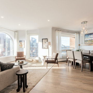
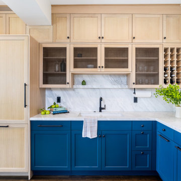
This 1700 sqf. condo overlooking downtown Calgary was suffering from an outdated kitchen, a view partial obstructed by a patio door and outdated floors and lighting. Marwood designs modernized the kitchen with bright colours hiding the fridge to blend the galley with modern materials at the same time maximizing space. In the living room, we moved the door to the side window opening allowing for maximum light that improve the incredible view of the Bow river and downtown Calgary. The floors where brighten and the old-style track lighting replaced with pot lighting giving the condo a contemporary finish. The completed project creates a space that is special and distinct enjoying the serenity of Calgary .
Find the right local pro for your project
 JLC Architecture
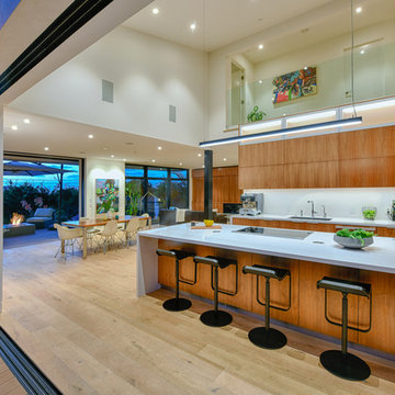
JLC was charged with transforming a 35 year old home which had suffered a remodel or two into a cohesive and modern home. Sustainable design principles were placed at the forefront of the design process alongside functionality and aesthetics. The end result is a roughly 3,000 sf home that is both comfortable and beautiful. The exterior palette is defined by Resysta siding and decking, acrylic stucco, a standing seam metal roof and black aluminum windows and doors. At the interiors white oak and walnut cabinetry throughout bring natural warmth to the clean, white interior. The home achieved LEED Platinum in 2017 and was featured on the San Diego Green Building Council’s 2017 Green Homes Tour.
Project website: neuhaus-encinitas.blogspot.com
 JLC Architecture
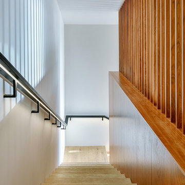
JLC was charged with transforming a 35 year old home which had suffered a remodel or two into a cohesive and modern home. Sustainable design principles were placed at the forefront of the design process alongside functionality and aesthetics. The end result is a roughly 3,000 sf home that is both comfortable and beautiful. The exterior palette is defined by Resysta siding and decking, acrylic stucco, a standing seam metal roof and black aluminum windows and doors. At the interiors white oak and walnut cabinetry throughout bring natural warmth to the clean, white interior. The home achieved LEED Platinum in 2017 and was featured on the San Diego Green Building Council’s 2017 Green Homes Tour.
Project website: neuhaus-encinitas.blogspot.com
 Capstone Restoration
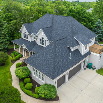
Full roof replacement completed for a homeowner in Noblesville, Indiana. The home suffered severe storm damage, and Capstone Restoration managed the complete restoration process from initial inspection through insurance claim approval—getting the entire project 100% funded by insurance.
Project Details:
Complete tear-off of damaged shingles
High-performance underlayment and ice/water shield installation
Installation of premium dark charcoal architectural shingles
Complete clean-up and magnetic sweep to protect lawn and driveway

 HeatTrak Snow Melting Mats
"These HeatTrak large mats and step mats have saved me this winter. Suffering from herniated discs in my neck, shoveling is extremely painful.
Not having to worry about getting in and out of our house through this snowy, icy winter has been amazing. My dogs like them as well.
I can only say that it was a very wise investment, and I am glad that I have them. And now I recommend them to my clients for their homes (I now have 4 clients homes using the mats)."
- Linda
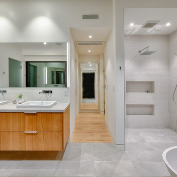 JLC Architecture
JLC was charged with transforming a 35 year old home which had suffered a remodel or two into a cohesive and modern home. Sustainable design principles were placed at the forefront of the design process alongside functionality and aesthetics. The end result is a roughly 3,000 sf home that is both comfortable and beautiful. The exterior palette is defined by Resysta siding and decking, acrylic stucco, a standing seam metal roof and black aluminum windows and doors. At the interiors white oak and walnut cabinetry throughout bring natural warmth to the clean, white interior. The home achieved LEED Platinum in 2017 and was featured on the San Diego Green Building Council’s 2017 Green Homes Tour.
Project website: neuhaus-encinitas.blogspot.com
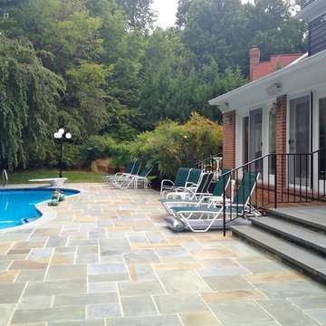
 Horn & Co. (Previously JHLA)
The existing concrete aggregate terrace suffered from disrepair and access was limited from the rear of the Bethesda home. We were tasked with replacing all paving, coping, and stairs. An improved water feature behind the original kidney-shaped pool provided white noise to distract visitors from the nearby highway noise. New masonry stairs provides a seamless connection with the house and leads the residents to the new outdoor kitchen.
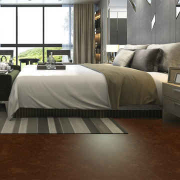
 iCork Floor
- Installation Type: Floating / Glue Down
- Edge type: square edge (seamless floor)
- Finish: Three coats German water based polyurethane
- Made with formaldehyde free adhesives
- 25 year warranty (residential installation)
- Underlayment not required
- Hypo-allergenic
- Healthy alternative to carpet
- Excellent thermal and acoustic insulation
- Stain resistant
- Naturally resistant to insects, mould, mildew due to anti-microbial prosperities
- Low slip surface
- Excellent surface for seniors, children or people suffering from arthritis or joint pain
*** The price for glue down tile is $2.29/sqft
Order FREE SAMPLES on our website: www.icorkfloor.com

 Hotel Collection
Pure luxury. Hotel Collection's 600 Thread Count Egyptian Cotton Bedding Collection is a best-selling basic that features layers of white/ivory for a clean, sophisticated look. Irresistible textures provide a 5-star feel.
Color: white/ivory
Available in Full, Queen, King, & California King
Available exclusively at Macy's and macys.com
Have a question? Ask us at www.macys.com/contactus
Getting married? Create a registry at www.macys.com/registry
Let us help! Macy’s By Appointment can style your bedroom or bathroom for FREE! Learn more at www.macys.com/mba
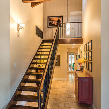
 Pamela Sandall Design
These stairs suffered from a carpet wrapped tread and mis matched wood tones. Exposing the wood of the stairs was a fun surprise as they had great texture! New rich stain on the treads, the rails and the handle and it came together beautifully! Tom Clary, Clarified Studios
 Counterbalance Studio
When we first met, this classic 1900 home in Queen Anne was suffering from an unfortunate 1980’s remodel. The owner was interested in recapturing some of the historical charm with a modern sensibility, while celebrating the breath-taking views of Puget Sound and the Space Needle.
Custom details included woven blackened steel infill panels in the white oak cabinets, bookmatched marble back-splashes and countertops, bespoke brass and walnut light fixtures, and a hand-troweled venetian plaster hood surround.
The kitchen was equipped with top-notch appliances for this accomplished home cook, and ample storage was provided for gadgetry and food-stuffs.
 Elizabeth Minish Design
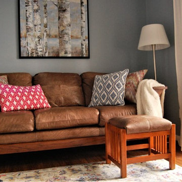
The TV room/Den in this multi-level townhouse suffered from an identity crisis. It opened onto a covered patio but the carpeted floor made it seem more like a bedroom than a room with outdoor access. It sometimes served as an extra bedroom for guests, but was primarily a TV room. An adjacent laundry room was oddly configured and opened into a busy hallway/landing area. The fix included closing off the existing door to the laundry room and opening it up to the den. This made both rooms more user-friendly. The carpet was replaced with luxury vinyl plank flooring in both rooms, making a much more practical surface for a room with an exterior door. A pocket door was not feasible in the location so barn-door hardware solved the problem of a door opening onto the sofa.
 Home Taylored
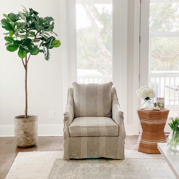
When I met my clients, their room suffered from two things, furniture that was too small for the room AND a lack of layers and textures to warm it up.
My clients were a dream to work with, and really trusted me to add to the room. Through the design process, they saw how by adding more things to the room, it actually made it feel bigger, not smaller. We also utilized all the space in the room by filling in dead space that was previously wasted. They live by the water and had a vision for comfortable and welcoming family room with coastal touches.
 JLC Architecture
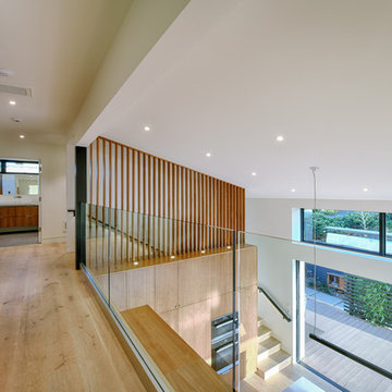
JLC was charged with transforming a 35 year old home which had suffered a remodel or two into a cohesive and modern home. Sustainable design principles were placed at the forefront of the design process alongside functionality and aesthetics. The end result is a roughly 3,000 sf home that is both comfortable and beautiful. The exterior palette is defined by Resysta siding and decking, acrylic stucco, a standing seam metal roof and black aluminum windows and doors. At the interiors white oak and walnut cabinetry throughout bring natural warmth to the clean, white interior. The home achieved LEED Platinum in 2017 and was featured on the San Diego Green Building Council’s 2017 Green Homes Tour.
Project website: neuhaus-encinitas.blogspot.com
 Marwood Design
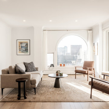
This 1700 sqf. condo overlooking downtown Calgary was suffering from an outdated kitchen, a view partial obstructed by a patio door and outdated floors and lighting. Marwood designs modernized the kitchen with bright colours hiding the fridge to blend the galley with modern materials at the same time maximizing space. In the living room, we moved the door to the side window opening allowing for maximum light that improve the incredible view of the Bow river and downtown Calgary. The floors where brighten and the old-style track lighting replaced with pot lighting giving the condo a contemporary finish. The completed project creates a space that is special and distinct enjoying the serenity of Calgary .

 Studio TOOP
design: Studio TOOP, 2013
location: Rotterdam, NL
status: built in 2014, Weldam Groenprojecten
photo: Hans Clauzing, 2014
Our good friend Gerda is an avid photographer with a special interest in nature photography and butterflies. She also suffers from a lung disease that sometimes leaves her less mobile and able to head out to pursue this passion. A garden to take pictures in, even when you're not up to heading further out into the world. That was the main goal of this garden. With limited means and the use of affordable materials we created a wheel chair friendly garden that offers ample space for both human and wild life.
 Blinds.com
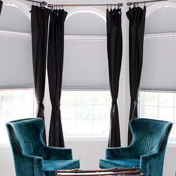
Alison suffers from terrible migraines and wanted a room in her home that was dark enough to help her recover naturally. She found that our Ultimate Blackout Cellular Shades and Movable Arch Blackout Shades were the perfect fit for her unique shaped windows. These shades have vinyl channels that block all light coming in from the sides of the shades for a complete blackout.
To learn more about Alison of How She Does, check out here blog post, here: http://www.howdoesshe.com/migraines-blinds-com/
 The Renowned Group
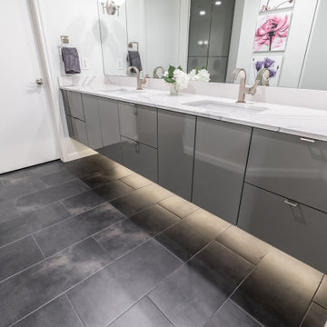
 The original Master bath suffered a tiny shower and a tub that was never used. It was very dark and cavernous and needed some softness to oppose angled walls. The tub was removed to make a larger, more accessible shower. The desired style was modern but not severe. We installed Cambria Britannica quartz slab with large veining and soft flowing movement on all the shower walls. A dark floor grounds the space. A combination of light walls, and sleek floating cabinets, creates an overall softness in this Modern Masterpiece.
20