Search results for "Sufferers" in Home Design Ideas
This nice little cottage located in Toluca Lake has a special story to all the team that we worked on. Our client, related to the movie industry, purchased it to make it his permanent residence and the realtor said that at a certain point it was bought by Bing Crosby for his mother. We were all excited to renovate and preserve such a part of local history. We had a great time reviving its structure and overall look. Barcelona Design was in charge of the artistic direction, as exterior finishes and design and interiors as well. The house suffered many unfortunate alterations during its history. Having a broad experience in building preservation and restoration made it easier to restore its charm.

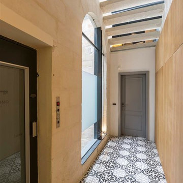
Located in the heart of Manhattan’s Lower East Side, the building was erected on a shallow commercial lot between two 120 year old masonry buildings and a new residential rental building. 330 Grand Street is a mix of 725 SF 1BRs and 1050 SF 2BR apartments. It also contains a 1100 SF two story duplex as well as private and public rooftop space, large private balconies for most units and two large private terraces for the ground floor units.
330 Grand Street was originally designed and approved at the NYC DOB as a prefabricated modular building. During the pandemic, as shipping costs skyrocketed putting the project at risk, we suggested redesigning the building as a reinforced cast-in-place concrete structure. Concrete was readily available and prices had not been affected by the demand increase that many other materials suffered in the pandemic. We took this opportunity to raise floor to ceiling heights, enlarge high performance windows and redistribute the buildings MEPFS and Structural Systems to create very open floor plans.
The challenge was to create a luxurious sensorial living experience with very limited means. In a city with very high construction costs, low cost residential buildings in the area are usually devoid of good quality, design and character. Our approach was to aim high for the end user, prioritizing natural light, open space with long visual perspectives, high ceilings and as always, rejecting the use of predefined building templates.
Our biggest challenge was to ensure that the small spaces feel as clean cut, large and bright as possible. Several unique design decisions were made to ensure low cost and high quality;
Floor plans were laid out so that spaces were wide open and free of clutter from mechanical or structural interruptions. Therefore all infrastructure was placed in lateral demising walls, which in turn act as the unit’s storage and kitchen. The apartments feel wide open, are super quiet and have more storage space than any other comparable apartment in the city.
To solve the problem of the site’s shallow commercial lot which is typically prone to dark interior spaces we focused our attention on the building’s envelope. Instead of the usual small punched window openings, oversized high performance windows were designed to ensure that light penetrated as far as possible into the units. In the smaller 1BR units, the full 50’ depth of the lot is perceived by partitioning spaces with sliding pocket doors that can be retracted to allow deep visual perspectives, making the sight lines in the space feel longer, larger, more ample than normal. In addition to the full height glazing, each unit above the 2nd floor receives a 7 foot covered balcony, adding 120 to 240 sf to each apartment, something unusual in New York City buildings. The space is large enough for a full size dining table, when the weather permits being outside.
We also worked hard to ensure modularity. For example, all kitchen units are all identical throughout the building. The idea of modularity and the economy of the repetitive unit is exercised to the maximum through the building.
Hardware, appliances, flooring, wall coverings and material finishes are all carefully selected to feel bespoke, high quality and unique.
It was important to KURV that the result of this work manifest into something that would deeply connect with the end user and sustain relationships with the consumers of this space.
All images by KURV Architecture ©

This 100 year old home was in disrepair and suffering from a layout that left it dark and uninviting. By removing walls between the living, dining, and kitchen areas, and reconfiguring some awkwardly placed kitchen cabinetry from a previous renovation, Lincoln Lighthill Architect created a 50 foot long great room, flooding the space with light and views to the front and rear yards. A new built-in credenza replaces a full height wall and matches the existing kitchen casework, which gets a cost-effective update with a coat of white paint.
Find the right local pro for your project
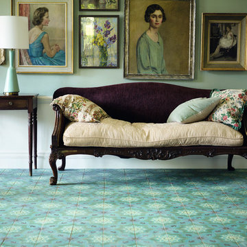
Faithful reproduction of concrete blocks that have suffered the bad weather of time.
This product is so easy to install and heat resistant. The look of this product is just magnificent. Those around you will undoubtedly remember it.

- Installation Type: Floating
- Licensed Uniclic Flooring system
- Square Edge Plank (seamless floor)
- Finish: Three coats water based polyurethane
- Wear Layer: 3mm genuine cork
- Middle Layer: 7mm E1 Class High Density Fiberboard (HDF)
- Integrated Underlayment: 1mm agglomerated cork.
- Plank Width: 12” (315mm)
- Plank Length: 36" (915mm)
- Plank Thickness: 7/16" (11mm)
- Carton coverage: 21.03 sqft
- Pieces per carton: 7
- 25 year warranty (residential installation)
- Underlayment not required
- Hypo-allergenic
- Healthy alternative to carpet
- Excellent thermal and acoustic insulation
- Stain resistant
- Naturally resistant to insects, mould, mildew due to anti-microbial properties
- Low slip surface
- Excellent surface for seniors, children or people suffering from arthritis or joint pain
Price may change without notice. Please check our website for the guaranteed price.
Order FREE SAMPLES on our website: www.icorkfloor.com

This Victorian tiled hallway was one of the most beautiful Victorian floors I have ever had the pleasure to work on. With the wide range of patterns and colours they are available in, it seems no two Victorian tiled floors are exactly the same, and this uniqueness is part of what makes them so appealing to property owners.
Unfortunately, this floor had been poorly maintained over the years, even suffering from a few loose and missing tiles. There was a thick coating of dust and dirt soiling its appearance, and the property owner was understandably keen to remedy the situation. Having realised that everyday household cleaners are not likely to achieve great results, she asked me to carry out a full professional restoration, including making some repairs where necessary. I was pleasantly surprised to find out that this property was situated in the town of Wyken, which is a few miles outside of Coventry city centre and in fact just down the road from where I live myself!
Before making a start on the cleaning process, it was first necessary to re-fix the small number of loose tiles and replace a single missing tile by the radiator. Fortunately, I’ve been working on these types of floors for some time and have built up a good collection of replacement Victorian tiles so I was able to find one that matched in nicely with the rest of the floor without too much problem.
To clean the tiles, I began by applying a layer of Tile Doctor Oxy-Gel directly into the floor with a small brush. This product is very similar to the popular Tile Doctor Pro Clean: both are strong alkaline cleaners, strippers and degreasers, with the main difference being that Oxy-Clean comes in a gel form, making it easier to control and therefore ideal for precise cleaning, or for application to vertical surfaces. Like Pro Clean and being an alkaline base it is suitable for use on all types of natural stone and tile. The Oxy-Gel was left to soak into the tiles for around ten minutes before being scrubbed in and then rinsed off carefully with water, I then used a wet vacuum to extract the now soiled cleaning solution off the floor.
The next step was to acid wash the floor using Tile Doctor Acid Gel; this served to break down alkaline mineral deposits inherent in the grout along with some excess grout that had been left on the untidily left on tile from installation. It is recommended not to use this product on acid-sensitive soon such as Marble and Limestone as it can cause irreparable etching but its fine on Victorian tiles as long as you don’t leave it on too long.
Finally, the floor was given a rinse with clean water to remove any trace of chemicals from the cleaning and to neutralise the area in preparation for sealing.
I left the floor for 48 hours to dry before returning to the property to seal the tiles. This allowed plenty of time for the floor to dry completely, which is important as any excess moisture can damage the ability of the sealer to protect against dirt and stains.
My choice of sealer for this floor was Tile Doctor High Shine; three coats in total were applied, providing – as the product name suggests – the high shine finish that the customer had requested. The sealer will provide durable surface protection going forward preventing dirt from becoming ingrained into the pores of the tile and ensuring it remains easy to clean and keeping its appearance for some time to come.
As a big fan of Victorian tiles, it was a great pleasure to restore this floor, and my customer was certainly pleased too. It’s amazing how far a little professional maintenance can go to improving the appearance of these fantastic types of floor.
Mick Gayton
Warwickshire Tile Doctor

This complex has a deck on every unit, I have done 5 in this neighborhood. They have become my bread and butter for framing and completely water proofing the home. Many of these townhouses had suffered from water damage from the original builder of the townhouses with lack of metal flashing and water proofing.

This home was suffering from way too much wood. Log and wainscot walls, wood floors and ceiling, wood cabinets.
Kitchen cabinets were refinished in a cream color and given a soft glazed look around crevices. Part of the backsplash was finished in a copper/bronze hammered look. Countertops refinished over the existing laminate using colorants and epoxy.
White appliances were replaced with stainless and sink was updated to a copper farm sink.

This family of 5 was quickly out-growing their 1,220sf ranch home on a beautiful corner lot. Rather than adding a 2nd floor, the decision was made to extend the existing ranch plan into the back yard, adding a new 2-car garage below the new space - for a new total of 2,520sf. With a previous addition of a 1-car garage and a small kitchen removed, a large addition was added for Master Bedroom Suite, a 4th bedroom, hall bath, and a completely remodeled living, dining and new Kitchen, open to large new Family Room. The new lower level includes the new Garage and Mudroom. The existing fireplace and chimney remain - with beautifully exposed brick. The homeowners love contemporary design, and finished the home with a gorgeous mix of color, pattern and materials.
The project was completed in 2011. Unfortunately, 2 years later, they suffered a massive house fire. The house was then rebuilt again, using the same plans and finishes as the original build, adding only a secondary laundry closet on the main level.

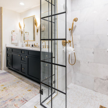
This project involved 2 bathrooms, one in front of the other. Both needed facelifts and more space. We ended up moving the wall to the right out to give the space (see the before photos!) This is the master bathroom, which suffered before from being dark, outdated, and non-functional. My client and I call this "organic glam". we wanted a spa-like bath but with some color. I decided on an earthy, organic palette of taupes, grays, and green. We ditched the tub for a walk-in shower. Satin brass fixtures, a teak vanity, acrylic accessories add to the luxe feel.

When this 6,000-square-foot vacation home suffered water damage in its family room, the homeowners decided it was time to update the interiors at large. They wanted an elegant, sophisticated, and comfortable style that served their lives but also required a design that would preserve and enhance various existing details.
To begin, we focused on the timeless and most interesting aspects of the existing design. Details such as Spanish tile floors in the entry and kitchen were kept, as were the dining room's spirited marine-blue combed walls, which were refinished to add even more depth. A beloved lacquered linen coffee table was also incorporated into the great room's updated design.
To modernize the interior, we looked to the home's gorgeous water views, bringing in colors and textures that related to sand, sea, and sky. In the great room, for example, textured wall coverings, nubby linen, woven chairs, and a custom mosaic backsplash all refer to the natural colors and textures just outside. Likewise, a rose garden outside the master bedroom and study informed color selections there. We updated lighting and plumbing fixtures and added a mix of antique and new furnishings.
In the great room, seating and tables were specified to fit multiple configurations – the sofa can be moved to a window bay to maximize summer views, for example, but can easily be moved by the fireplace during chillier months.
Project designed by Boston interior design Dane Austin Design. Dane serves Boston, Cambridge, Hingham, Cohasset, Newton, Weston, Lexington, Concord, Dover, Andover, Gloucester, as well as surrounding areas.
For more about Dane Austin Design, click here: https://daneaustindesign.com/
To learn more about this project, click here:
https://daneaustindesign.com/oyster-harbors-estate

Pets can make our daily routines life more interesting. It is enough to find the videos with pets to make sure that they are so cute and funny. They know how to cheer up and to share their positive energy.
Often, children want to have a pet. However, before you go to the pet store, you need to decide for yourself the following questions.
1. Are you ready to take a full responsibility for the animal? This is not a toy to give, give back or throw. The animal is not a person, but it has a soul. It can be hurt. It also knows how to love.
2. Are you ready to become a true friend for an animal? It needs to be fed. You should give him leisure and walking and solve the issues of the toilet. You cannot bring it to the house as part of the new interior. He need your attention and serious care.
3. You will need to ensure the safety of those around him. For example, you need to control whether the dog does not hurt anyone, especially children. If the choice fell on the cat, try to make it not disturb the neighbors. Do not let snakes, spiders to walk alone on the street, sometimes they are and strive to get out of home. Love animals, but without fanaticism. They should not interfere a life of other people.
4. When you are ready to solve all these issues concerning the animal, it means that you really care about it. Can you fall in love with the animal as a member of your family? If you do not like it, then you will only irritate the duty to care for him. Both you and your animal will suffer.
5. Are you ready to take care of the health of the animal? After all, the animals can bring fleas or ringworm to your house. It is necessary to control that there are no such things, because in this case the animal becomes dangerous for people.
6. You need to give love and then it returns the positive energy to your. It is worth emphasizing, if you have a small child, the animal will teach your child the two main qualities: the ability to make friends and responsibility.
About the Author: Vivien Smith is a writer from California. She cooperates with a huge variety of online magazines like essaybuyers.com/research-paper-writing/ website.

JLC was charged with transforming a 35 year old home which had suffered a remodel or two into a cohesive and modern home. Sustainable design principles were placed at the forefront of the design process alongside functionality and aesthetics. The end result is a roughly 3,000 sf home that is both comfortable and beautiful. The exterior palette is defined by Resysta siding and decking, acrylic stucco, a standing seam metal roof and black aluminum windows and doors. At the interiors white oak and walnut cabinetry throughout bring natural warmth to the clean, white interior. The home achieved LEED Platinum in 2017 and was featured on the San Diego Green Building Council’s 2017 Green Homes Tour.
Project website: neuhaus-encinitas.blogspot.com

design: Studio TOOP, 2013
location: Rotterdam, NL
status: built in 2014, Weldam Groenprojecten
photo: Hans Clauzing, 2014
Our good friend Gerda is an avid photographer with a special interest in nature photography and butterflies. She also suffers from a lung disease that sometimes leaves her less mobile and able to head out to pursue this passion. A garden to take pictures in, even when you're not up to heading further out into the world. That was the main goal of this garden. With limited means and the use of affordable materials we created a wheel chair friendly garden that offers ample space for both human and wild life.

This customer spent over 40 years building and renovating his home. In his younger days, he was an amazing building and craftsman. Recently, he suffered a stroke and lost the ability to build. He wants to leave his home to his daughter, so he planned one last renovation project. For this project, he wanted to choose a renovation company that could build a kitchen as well as he could. Luckily, he chose Wood Front Kitchens. He was thrilled with the result. He loved that we were able to keep storage features he had built in his previous cabinets and transfer them to the new cabinets.
This homeowner chose shaker-style oak cabinets stained in Michels. He chose Amerock Conrad Square hardware in oil-rubbed bronze to give his rustic cabinets an industrial feel. He and his daughter are both pleased with the results, and with their huge increase in storage space.

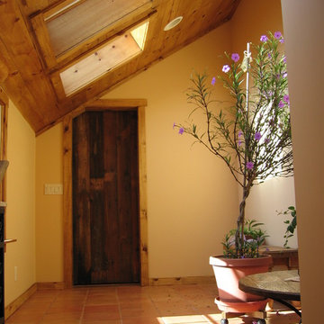
The she shed was intended for a combination art studio and a place to relax for the homeowner who was elderly and suffered with a severe medical condition. We needed to maximize the space to it’s potential, especially since it’s a small space. Included was higher-end pieces such as a stunning chandelier and a stunning Anderson door entrance system. For a more tranquil environment, we incorporated space for comfortable furniture and a propane fireplace. Space was used to the max with built in shelving and cabinetry for the art work and supplies.
This she-shed was built with custom features consisting of:
Cathedral ceiling with skylights for abundance of natural light
Propane fireplace
Built in cabinets and shelving for art studio supplies
Barn door entrance to small garden tool storage area

This lovely 2-story townhome suffered the effects of more than 120 years of “remuddling” and “modernization” through significant modification of the structural framing. With a large section of a load-bearing wall removed and shear walls, the full 3-story building was structurally compromised.
The program included the installation of a steel beam and structural reframing, beginning at the ground floor and through to the 3rd-floor living space.
The new structural design allowed for a significantly improved living space. The kitchen was relocated and expanded, as were the living room and dining room.
Several upgrades were made to the home, including incorporating all-electrical appliances. 1900 Victorian now boasts several eco-friendly and energy-efficient features.

design: Studio TOOP, 2013
location: Rotterdam, NL
status: built in 2014, Weldam Groenprojecten
photo: Hans Clauzing, 2014
Our good friend Gerda is an avid photographer with a special interest in nature photography and butterflies. She also suffers from a lung disease that sometimes leaves her less mobile and able to head out to pursue this passion. A garden to take pictures in, even when you're not up to heading further out into the world. That was the main goal of this garden. With limited means and the use of affordable materials we created a wheel chair friendly garden that offers ample space for both human and wild life.

Located in the heart of Manhattan’s Lower East Side, the building was erected on a shallow commercial lot between two 120 year old masonry buildings and a new residential rental building. 330 Grand Street is a mix of 725 SF 1BRs and 1050 SF 2BR apartments. It also contains a 1100 SF two story duplex as well as private and public rooftop space, large private balconies for most units and two large private terraces for the ground floor units.
330 Grand Street was originally designed and approved at the NYC DOB as a prefabricated modular building. During the pandemic, as shipping costs skyrocketed putting the project at risk, we suggested redesigning the building as a reinforced cast-in-place concrete structure. Concrete was readily available and prices had not been affected by the demand increase that many other materials suffered in the pandemic. We took this opportunity to raise floor to ceiling heights, enlarge high performance windows and redistribute the buildings MEPFS and Structural Systems to create very open floor plans.
The challenge was to create a luxurious sensorial living experience with very limited means. In a city with very high construction costs, low cost residential buildings in the area are usually devoid of good quality, design and character. Our approach was to aim high for the end user, prioritizing natural light, open space with long visual perspectives, high ceilings and as always, rejecting the use of predefined building templates.
Our biggest challenge was to ensure that the small spaces feel as clean cut, large and bright as possible. Several unique design decisions were made to ensure low cost and high quality;
Floor plans were laid out so that spaces were wide open and free of clutter from mechanical or structural interruptions. Therefore all infrastructure was placed in lateral demising walls, which in turn act as the unit’s storage and kitchen. The apartments feel wide open, are super quiet and have more storage space than any other comparable apartment in the city.
To solve the problem of the site’s shallow commercial lot which is typically prone to dark interior spaces we focused our attention on the building’s envelope. Instead of the usual small punched window openings, oversized high performance windows were designed to ensure that light penetrated as far as possible into the units. In the smaller 1BR units, the full 50’ depth of the lot is perceived by partitioning spaces with sliding pocket doors that can be retracted to allow deep visual perspectives, making the sight lines in the space feel longer, larger, more ample than normal. In addition to the full height glazing, each unit above the 2nd floor receives a 7 foot covered balcony, adding 120 to 240 sf to each apartment, something unusual in New York City buildings. The space is large enough for a full size dining table, when the weather permits being outside.
We also worked hard to ensure modularity. For example, all kitchen units are all identical throughout the building. The idea of modularity and the economy of the repetitive unit is exercised to the maximum through the building.
Hardware, appliances, flooring, wall coverings and material finishes are all carefully selected to feel bespoke, high quality and unique.
It was important to KURV that the result of this work manifest into something that would deeply connect with the end user and sustain relationships with the consumers of this space.
All images by KURV Architecture ©

When this 6,000-square-foot vacation home suffered water damage in its family room, the homeowners decided it was time to update the interiors at large. They wanted an elegant, sophisticated, and comfortable style that served their lives but also required a design that would preserve and enhance various existing details.
To begin, we focused on the timeless and most interesting aspects of the existing design. Details such as Spanish tile floors in the entry and kitchen were kept, as were the dining room's spirited marine-blue combed walls, which were refinished to add even more depth. A beloved lacquered linen coffee table was also incorporated into the great room's updated design.
To modernize the interior, we looked to the home's gorgeous water views, bringing in colors and textures that related to sand, sea, and sky. In the great room, for example, textured wall coverings, nubby linen, woven chairs, and a custom mosaic backsplash all refer to the natural colors and textures just outside. Likewise, a rose garden outside the master bedroom and study informed color selections there. We updated lighting and plumbing fixtures and added a mix of antique and new furnishings.
In the great room, seating and tables were specified to fit multiple configurations – the sofa can be moved to a window bay to maximize summer views, for example, but can easily be moved by the fireplace during chillier months.
Project designed by Boston interior design Dane Austin Design. Dane serves Boston, Cambridge, Hingham, Cohasset, Newton, Weston, Lexington, Concord, Dover, Andover, Gloucester, as well as surrounding areas.
For more about Dane Austin Design, click here: https://daneaustindesign.com/
To learn more about this project, click here:
https://daneaustindesign.com/oyster-harbors-estate
14