
Search results for "Sufferers" in Home Design Ideas
 G. Christianson Construction, Inc.
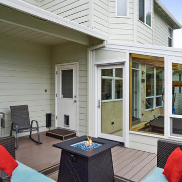
We recently completed a spectacularly beautiful sunroom for Richard and Cynthia. We worked previously with Cynthia on her business and because of our relationship, she felt comfortable asking us to build their Corvallis sunroom. The inspiration for this project came from the desire to have the ambiance of an outdoor hot tub, but without Corvallis’ cold wet weather. The sunroom adds a warm, bright 325 square feet just outside their kitchen and living room. This is the perfect addition if you are suffering from Corvallis’ cloud cover. The vibrant hues of the stained and finished Douglas fir glulam beams complement the beauty of the outdoors. These beams support the glass roof. In addition, the sunroom includes two operable skylights, a nine foot wide bifold door, a full glass roof system and full glass walls. Westview Sunrooms (the manufacturer) has a number of other beautiful ideas on their site: http://www.westviewproducts.com/pictures.html We would love the opportunity to build for you.
 Helix Green Designs
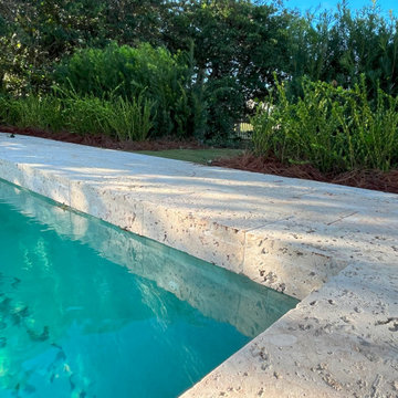
The backyard, fragmented and lacking privacy, suffered from overgrown vegetation and a mismatched pool deck.
Helix Green Designs' vision centered on enhancing functionality while creating a secluded oasis. In the backyard, privacy became paramount. A double hedge of podocarpus and boxwood now surrounds the expanded pool deck, while transplanted deciduous hydrangeas were replaced with an evergreen podocarpus hedge along the fence line. Two strategically placed flowering crape myrtle trees flank a new custom gate, offering additional privacy from the golf course. A stepping stone walkway seamlessly connects the detached guest house, a popular grilling spot for the homeowners. Preserving the existing specimen oak trees was a priority. These established giants provided valuable shade and protection from the hot western sun, contributing significantly to the backyard's character and enjoyment.
 G. Christianson Construction, Inc.
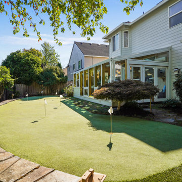
We recently completed a spectacularly beautiful sunroom for Richard and Cynthia. We worked previously with Cynthia on her business and because of our relationship, she felt comfortable asking us to build their Corvallis sunroom. The inspiration for this project came from the desire to have the ambiance of an outdoor hot tub, but without Corvallis’ cold wet weather. The sunroom adds a warm, bright 325 square feet just outside their kitchen and living room. This is the perfect addition if you are suffering from Corvallis’ cloud cover. The vibrant hues of the stained and finished Douglas fir glulam beams complement the beauty of the outdoors. These beams support the glass roof. In addition, the sunroom includes two operable skylights, a nine foot wide bifold door, a full glass roof system and full glass walls. Westview Sunrooms (the manufacturer) has a number of other beautiful ideas on their site: http://www.westviewproducts.com/pictures.html We would love the opportunity to build for you.
Find the right local pro for your project
 Master Blinds
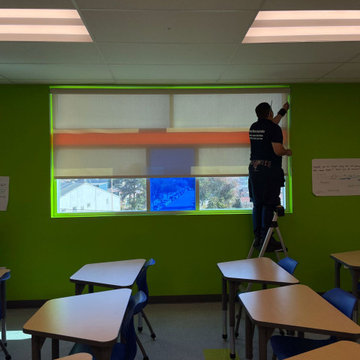
School settings require students to maintain concentration and sit still for long periods of time throughout the day. Needless to say, that can be tough not only for teenagers but adults as well. Harnessing sheer roller shades to cover classroom windows helps ensure sunlight doesn’t become a hindrance in the path of education, but a facilitator of better learning. By diffusing sunlight that enters the classrooms, students don’t suffer the negative cognitive impact of harsh glare that’s strainful on the eyes. Instead, they enjoy the benefits sunlight plays in maintaining alertness and attentiveness. Classroom window shades that provide better privacy also help to keep outside distractions from interfering with the lessons, keeping students focused on the subject at hand. The right use of colorful roller shades can also complement sensory cues for focus created by the classroom environment. Talk to Master Blinds’ design team to see what roller shades can offer your classroom spaces. Get in touch with us at 877-708-5883 to schedule a free in-person consultation with no obligation for more details!
 Edgewood
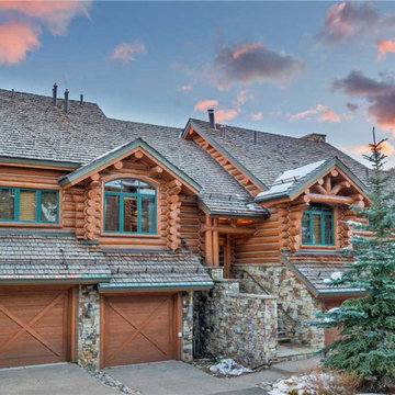
“My partner and I purchased the project after the first developer had gone bankrupt. Not wanting to make the same mistakes they had, we sought out a more intelligent approach to building an upscale ski-in/out authentic full log commercial project. We sent word out for referrals, did internet research, and interviewed log home companies. An old friend of mine told me about a company in Idaho that had impressed him.
In hiring Edgewood to help us redesign and plan the project for success, we found a wealth of practical knowledge and expertise. Additionally their “hands-on” approach on-site proved invaluable when coupled with the very sophisticated and creative design horsepower they brought to the table. Their methods proved to not only be highly cost-effective, but very authentic and desirable to our future owners. Simply put, if we had not found Edgewood, we would likely have suffered the same fate at the first developer.”
 dasMOD
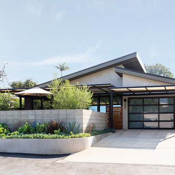
If Howard Stevens needs to escape the hustle bustle of LA, the former longtime stand up comic, turned television host now has the perfect hideout in the North County San Diego beach town of Encinitas, CA.
The Emmy Award winning writer, was introduced to Encinitas while visiting friends. He was immediately taken by the walkability and friendliness of the small beach town. “Not to mention the good looking women,” chuckles Stevens who also made note of a community on the move and with little real estate inventory.
Introduced to dasMOD Co-Founder, Erik Gilmer, the two spent many hours touring the up-and-coming Encinitas Highlands neighborhood where Stevens settled on a 1950’s stereotypical, boxy tract house, suffering from decay and a serious lack of attention.
The dasMOD team recognized the unspectacular, old-age spirit of the house could easily transition into an intimate, low-maintenance yet dynamic second home for Stevens that reflected the timeless beauty and simple comforts of a beach community. The renovation was a sustainable effort and an adaptive use of the existing property. One that focused on tearing down selectively with an emphasis on doing something fun and cool, with a vibe similar to that of an art gallery. The result is an inspiring collaboration between the dasMOD team and Stevens whose passion for architecture and design is present throughout the home.
 Studio Roundtop LLC
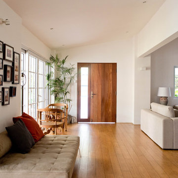
The owners of this house appreciate living in a home that is connected with its tropical context. Set in a dense residential neighborhood, the challenge was to create a home with a garden as an extension of its interior, whilst retaining a sense of privacy that the owners valued. Working within the existing shell of an old semi-detatched house, the interior layout was reconfigured to create a series spaces that open out to the lush tropical garden.
The existing kitchen was converted into an open kitchen, connecting the backyard to the dining and living room. Large sliding windows open the living/dining space to its patio and garden to offer an outdoor dining experience.
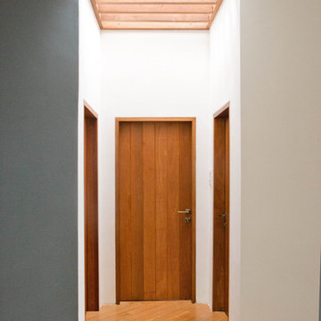
The existing hallway and common bathroom also suffered from daylight and natural ventilation. A skylight was inserted to brighten the otherwise existing dim hallway. The previously mechanically ventilated bathroom was also converted into a semi-outdoor bathroom with the introduction of an air-well and feature rock wall.
The guest bedroom, previously accessible through the kitchen, was turned into a home office now exclusive to the master bedroom. A private courtyard was introduced to connect the master bedroom and home office to create a private sanctuary for one residing in the the bedroom or working in the office.
 12/12 Architects & Planners
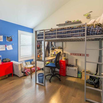
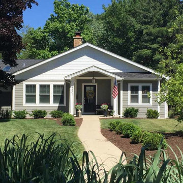
This family of 5 was quickly out-growing their 1,220sf ranch home on a beautiful corner lot. Rather than adding a 2nd floor, the decision was made to extend the existing ranch plan into the back yard, adding a new 2-car garage below the new space - for a new total of 2,520sf. With a previous addition of a 1-car garage and a small kitchen removed, a large addition was added for Master Bedroom Suite, a 4th bedroom, hall bath, and a completely remodeled living, dining and new Kitchen, open to large new Family Room. The new lower level includes the new Garage and Mudroom. The existing fireplace and chimney remain - with beautifully exposed brick. The homeowners love contemporary design, and finished the home with a gorgeous mix of color, pattern and materials.
The project was completed in 2011. Unfortunately, 2 years later, they suffered a massive house fire. The house was then rebuilt again, using the same plans and finishes as the original build, adding only a secondary laundry closet on the main level.
 12/12 Architects & Planners
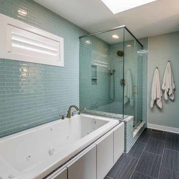
This family of 5 was quickly out-growing their 1,220sf ranch home on a beautiful corner lot. Rather than adding a 2nd floor, the decision was made to extend the existing ranch plan into the back yard, adding a new 2-car garage below the new space - for a new total of 2,520sf. With a previous addition of a 1-car garage and a small kitchen removed, a large addition was added for Master Bedroom Suite, a 4th bedroom, hall bath, and a completely remodeled living, dining and new Kitchen, open to large new Family Room. The new lower level includes the new Garage and Mudroom. The existing fireplace and chimney remain - with beautifully exposed brick. The homeowners love contemporary design, and finished the home with a gorgeous mix of color, pattern and materials.
The project was completed in 2011. Unfortunately, 2 years later, they suffered a massive house fire. The house was then rebuilt again, using the same plans and finishes as the original build, adding only a secondary laundry closet on the main level.
 12/12 Architects & Planners
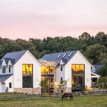
This family of 5 was quickly out-growing their 1,220sf ranch home on a beautiful corner lot. Rather than adding a 2nd floor, the decision was made to extend the existing ranch plan into the back yard, adding a new 2-car garage below the new space - for a new total of 2,520sf. With a previous addition of a 1-car garage and a small kitchen removed, a large addition was added for Master Bedroom Suite, a 4th bedroom, hall bath, and a completely remodeled living, dining and new Kitchen, open to large new Family Room. The new lower level includes the new Garage and Mudroom. The existing fireplace and chimney remain - with beautifully exposed brick. The homeowners love contemporary design, and finished the home with a gorgeous mix of color, pattern and materials.
The project was completed in 2011. Unfortunately, 2 years later, they suffered a massive house fire. The house was then rebuilt again, using the same plans and finishes as the original build, adding only a secondary laundry closet on the main level.

 Clare Sells Homes, Inc.
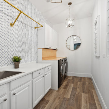
Super proud of this transformation! We removed the wire racks above the laundry units and replaced them with stock cabinetry, painted the beige counter white, swapped out a broken plastic sink for a stainless steel option + new faucet, added luxury vinyl plank flooring, relocated the lights and added a junction box to have two matching chandeliers instead of one center light, added a custom surround for the laundry units that can easily open when necessary to get to the water shut off, added wallpaper, shirt hanging rod, two clothes hanging racks and a mirror to reflect all this happiness. Seller was THRILLED with this transformation and couldn't believe she had suffered a sad, dark laundry room for years prior. This was NOT an expensive re-do either - just looks like it!!
 Anthony J. Musso Architect
Anthony J. Musso, Architect
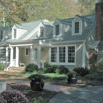
Inspiration for a mid-sized timeless beige one-story concrete fiberboard gable roof remodel in New York
Inspiration for a mid-sized timeless beige one-story concrete fiberboard gable roof remodel in New York
 Studio Roundtop LLC
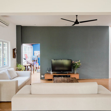
The owners of this house appreciate living in a home that is connected with its tropical context. Set in a dense residential neighborhood, the challenge was to create a home with a garden as an extension of its interior, whilst retaining a sense of privacy that the owners valued. Working within the existing shell of an old semi-detatched house, the interior layout was reconfigured to create a series spaces that open out to the lush tropical garden.
The existing kitchen was converted into an open kitchen, connecting the backyard to the dining and living room. Large sliding windows open the living/dining space to its patio and garden to offer an outdoor dining experience.
The existing hallway and common bathroom also suffered from daylight and natural ventilation. A skylight was inserted to brighten the otherwise existing dim hallway. The previously mechanically ventilated bathroom was also converted into a semi-outdoor bathroom with the introduction of an air-well and feature rock wall.
The guest bedroom, previously accessible through the kitchen, was turned into a home office now exclusive to the master bedroom. A private courtyard was introduced to connect the master bedroom and home office to create a private sanctuary for one residing in the the bedroom or working in the office.

 Aquatica Plumbing Group
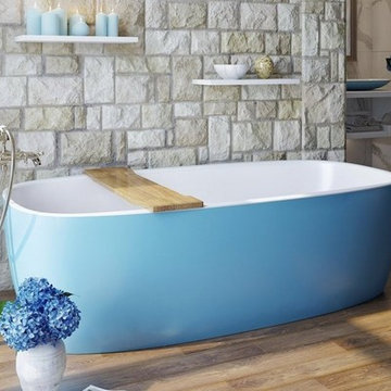
Coletta freestanding stone bathtub was designed with easy access as the principle advantage. The low profile walls of only 19.75” in height make it easier for older and physically challenged bathers such as those suffering from arthritis, to get in and out of the bathtub easily. Combining the low height feature and our firm yet smooth Aquatex material, the Coletta is a unique low step-in bathtub which puts it far ahead of the flimsy and obsolete looking competitor models found on the market.
 Studio Roundtop LLC
The owners of this house appreciate living in a home that is connected with its tropical context. Set in a dense residential neighborhood, the challenge was to create a home with a garden as an extension of its interior, whilst retaining a sense of privacy that the owners valued. Working within the existing shell of an old semi-detatched house, the interior layout was reconfigured to create a series spaces that open out to the lush tropical garden.
The existing kitchen was converted into an open kitchen, connecting the backyard to the dining and living room. Large sliding windows open the living/dining space to its patio and garden to offer an outdoor dining experience.
The existing hallway and common bathroom also suffered from daylight and natural ventilation. A skylight was inserted to brighten the otherwise existing dim hallway. The previously mechanically ventilated bathroom was also converted into a semi-outdoor bathroom with the introduction of an air-well and feature rock wall.
The guest bedroom, previously accessible through the kitchen, was turned into a home office now exclusive to the master bedroom. A private courtyard was introduced to connect the master bedroom and home office to create a private sanctuary for one residing in the the bedroom or working in the office.

 12/12 Architects & Planners
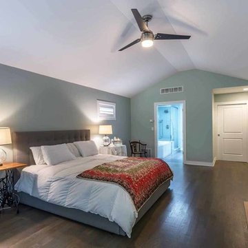
This family of 5 was quickly out-growing their 1,220sf ranch home on a beautiful corner lot. Rather than adding a 2nd floor, the decision was made to extend the existing ranch plan into the back yard, adding a new 2-car garage below the new space - for a new total of 2,520sf. With a previous addition of a 1-car garage and a small kitchen removed, a large addition was added for Master Bedroom Suite, a 4th bedroom, hall bath, and a completely remodeled living, dining and new Kitchen, open to large new Family Room. The new lower level includes the new Garage and Mudroom. The existing fireplace and chimney remain - with beautifully exposed brick. The homeowners love contemporary design, and finished the home with a gorgeous mix of color, pattern and materials.
The project was completed in 2011. Unfortunately, 2 years later, they suffered a massive house fire. The house was then rebuilt again, using the same plans and finishes as the original build, adding only a secondary laundry closet on the main level.

30