
Search results for "Suitably" in Home Design Ideas
 Drury Design
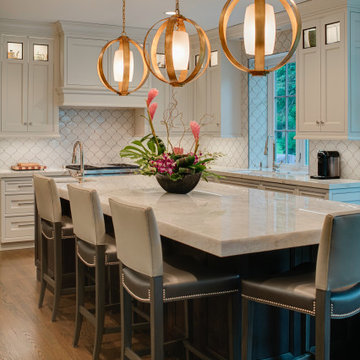
This kitchen is home to two taller individuals who both use the space equally and requested a taller workspace to comfortably accommodate their needs. The island cabinets are standard 34-1/2” tall but the Iceberg countertops were installed with a 3” build-up to add height to the island. Cabinets on the long wall were designed to break up the wall of white: buffet on the end with walnut-framed glass cabinets and seashell backsplash; double refrigerators in a painted, distressed mahogany finish were pulled forward to simulate texture and depth on the wall; wide pantry cabinets with roll-out drawers sitting on the countertops flank the refrigerators. On the opposite wall, a new window box at the kitchen sink was built to add more countertop behind the sink and to let in more light, adding dimension to the room.
The cabinetry in the original existing kitchen was disjointed at the dining room entrance and made the room appear much smaller than it really was. To remedy this, the entry to the dining room from the kitchen was closed up and relocated around the corner from the foyer; 2 simple, stacked columns were built to highlight the new opening. These transitional style columns and wider room openings at the family room and dining room entrances provide an open layout suitable for large groups to mingle comfortably; family room cabinetry and dining room fireplace surround matches kitchen cabinets.
 TVL Creative Ltd.
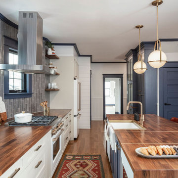
This 1910 West Highlands home was so compartmentalized that you couldn't help to notice you were constantly entering a new room every 8-10 feet. There was also a 500 SF addition put on the back of the home to accommodate a living room, 3/4 bath, laundry room and back foyer - 350 SF of that was for the living room. Needless to say, the house needed to be gutted and replanned.
Kitchen+Dining+Laundry-Like most of these early 1900's homes, the kitchen was not the heartbeat of the home like they are today. This kitchen was tucked away in the back and smaller than any other social rooms in the house. We knocked out the walls of the dining room to expand and created an open floor plan suitable for any type of gathering. As a nod to the history of the home, we used butcherblock for all the countertops and shelving which was accented by tones of brass, dusty blues and light-warm greys. This room had no storage before so creating ample storage and a variety of storage types was a critical ask for the client. One of my favorite details is the blue crown that draws from one end of the space to the other, accenting a ceiling that was otherwise forgotten.
Primary Bath-This did not exist prior to the remodel and the client wanted a more neutral space with strong visual details. We split the walls in half with a datum line that transitions from penny gap molding to the tile in the shower. To provide some more visual drama, we did a chevron tile arrangement on the floor, gridded the shower enclosure for some deep contrast an array of brass and quartz to elevate the finishes.
Powder Bath-This is always a fun place to let your vision get out of the box a bit. All the elements were familiar to the space but modernized and more playful. The floor has a wood look tile in a herringbone arrangement, a navy vanity, gold fixtures that are all servants to the star of the room - the blue and white deco wall tile behind the vanity.
Full Bath-This was a quirky little bathroom that you'd always keep the door closed when guests are over. Now we have brought the blue tones into the space and accented it with bronze fixtures and a playful southwestern floor tile.
Living Room & Office-This room was too big for its own good and now serves multiple purposes. We condensed the space to provide a living area for the whole family plus other guests and left enough room to explain the space with floor cushions. The office was a bonus to the project as it provided privacy to a room that otherwise had none before.
 Artistic Tile
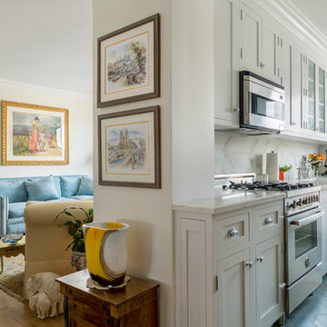
Example of a small transitional galley slate floor enclosed kitchen design in New York with a farmhouse sink, recessed-panel cabinets, white cabinets, marble countertops, white backsplash, stone tile backsplash, stainless steel appliances and no island
Find the right local pro for your project
 Normandy Remodeling
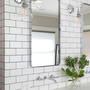
The softened corners of the rectangular mirror match the shape of the sink and offer a nod to the subway tile.
To see more from Normandy Designer Vince Weber, visit https://www.normandyremodeling.com/team/vince-weber
 Blu Homes
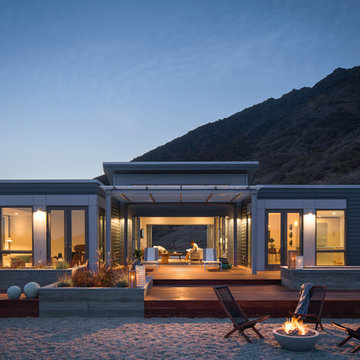
A warm breeze flows from the outside into the Breezespace as the sun sets over the mountains.
Photo Credt: Michael Kelley
Large contemporary gray one-story concrete fiberboard exterior home idea in Los Angeles
Large contemporary gray one-story concrete fiberboard exterior home idea in Los Angeles
 Sadie & Co
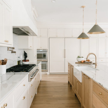
Large transitional galley light wood floor and brown floor eat-in kitchen photo in Salt Lake City with a farmhouse sink, beaded inset cabinets, light wood cabinets, marble countertops, white backsplash, marble backsplash, paneled appliances, two islands and white countertops
 DEMESNE
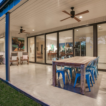
The large, expansive patio adjacent to the backyard living space is for suitable entertainment. The sequence of spaces feel as though the outdoor flows right through the dining, with large views to the front courtyard. Aluminum frames, concrete flooring and metal roof accent the soft inviting space. Art by Martha Burkert. ©Shoot2Sell Photography
 S-Squared // Architecture + Interiors + Landscape
photo: Mark Pinkerton, VI360
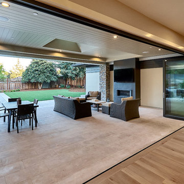
Home design - transitional home design idea in San Francisco
Home design - transitional home design idea in San Francisco
 Stephanie Charest Interior Design
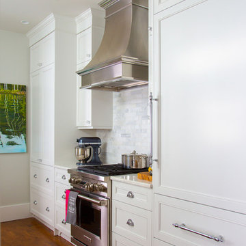
My client contacted me to update the kitchen and main bathroom of her 1912 home in Calgary, located in Elbow Park - one of the oldest communities in the city. The previous owners had done an addition on the back of the house and installed a kitchen that looked more suitable for a 1980’s garage than a home built in 1912. The challenge was to update the look and incorporate modern elements, yet retain the feel and character of a home from that era.
Timeless details were added like marble quartz countertops, Shaker style cabinets and a much more symmetrical layout that positioned the sink under the window, instead of the opposite wall. The 9’-0” ceilings allowed us to design the cabinets to the full ceiling height, giving the home owner much needed storage space. Even though the space has been modernized, it beautifully flows from the living spaces and no longer looks like an after thought, like the previous kitchen did. Check out that custom hood we designed! It’s so killer - I die!
Photography by Lori Andrews
 Walker Zanger
CALACATTA PORCELAIN
Porcelain
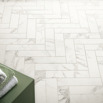
The beauty of authentic Calacata Marble from Italy is undeniable, but there are situations - application or project budget - where it might not be suitable. For that we offer Calacatta Porcelain. Italian tile technology replicates with amazing fidelity the varied veining of the actual marble and the smooth but slightly undulated surface has the hand feel of true stone. Offered in multiple sizes, Calacatta Porcelain allows you to bring the beauty of Italian white marble to any space.
Usage:
Residential: All interior surfaces, exterior walls and pool lines. Commercial: All interior surfaces, including heavy pedestrian traffic flooring. Exterior walls and water features. See Tools | Usage Guide for more details.
For more information on Calacatta Porcelain, please visit http://walkerzanger.com/collections/products.php?view=style&mat=Traditional&coll=Calacatta%20Porcelain
 Masterworks Window Fashions & Design, LLC
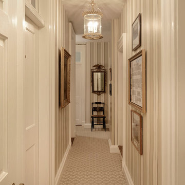
This narrow hallway was given new carpeting, new wallpaper, fresh paint on the trim, and many of the works of art were relocated or given new archival mats and glass, if not completely reframed. The light fixture is also new, and a larger scale more suitable for the tall ceilings, with more light than the old fixture. The diagonal pattern of the carpet makes the narrow hallway feel wider, while the striped wallcovering emphasizes the generous 11' ceiling height. The Ronald Redding striped wallcovering has traditional detail and elegance, immediately elevating the hallway first impression. Bob Narod, Photographer. Design by Linda H. Bassert, Masterworks Window Fashions & Design, LLC.
 McKinney York Architects
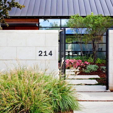
The client for this home wanted a modern structure that was suitable for displaying her art-glass collection. Located in a recently developed community, almost every component of the exterior was subject to an array of neighborhood and city ordinances. These were all accommodated while maintaining modern sensibilities and detailing on the exterior, then transitioning to a more minimalist aesthetic on the interior. The one-story building comfortably spreads out on its large lot, embracing a front and back courtyard and allowing views through and from within the transparent center section to other parts of the home. A high volume screened porch, the floating fireplace, and an axial swimming pool provide dramatic moments to the otherwise casual layout of the home.
 TVL Creative Ltd.
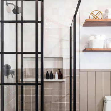
This 1910 West Highlands home was so compartmentalized that you couldn't help to notice you were constantly entering a new room every 8-10 feet. There was also a 500 SF addition put on the back of the home to accommodate a living room, 3/4 bath, laundry room and back foyer - 350 SF of that was for the living room. Needless to say, the house needed to be gutted and replanned.
Kitchen+Dining+Laundry-Like most of these early 1900's homes, the kitchen was not the heartbeat of the home like they are today. This kitchen was tucked away in the back and smaller than any other social rooms in the house. We knocked out the walls of the dining room to expand and created an open floor plan suitable for any type of gathering. As a nod to the history of the home, we used butcherblock for all the countertops and shelving which was accented by tones of brass, dusty blues and light-warm greys. This room had no storage before so creating ample storage and a variety of storage types was a critical ask for the client. One of my favorite details is the blue crown that draws from one end of the space to the other, accenting a ceiling that was otherwise forgotten.
Primary Bath-This did not exist prior to the remodel and the client wanted a more neutral space with strong visual details. We split the walls in half with a datum line that transitions from penny gap molding to the tile in the shower. To provide some more visual drama, we did a chevron tile arrangement on the floor, gridded the shower enclosure for some deep contrast an array of brass and quartz to elevate the finishes.
Powder Bath-This is always a fun place to let your vision get out of the box a bit. All the elements were familiar to the space but modernized and more playful. The floor has a wood look tile in a herringbone arrangement, a navy vanity, gold fixtures that are all servants to the star of the room - the blue and white deco wall tile behind the vanity.
Full Bath-This was a quirky little bathroom that you'd always keep the door closed when guests are over. Now we have brought the blue tones into the space and accented it with bronze fixtures and a playful southwestern floor tile.
Living Room & Office-This room was too big for its own good and now serves multiple purposes. We condensed the space to provide a living area for the whole family plus other guests and left enough room to explain the space with floor cushions. The office was a bonus to the project as it provided privacy to a room that otherwise had none before.
 Drury Design
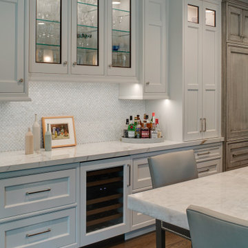
This kitchen is home to two taller individuals who both use the space equally and requested a taller workspace to comfortably accommodate their needs. The island cabinets are standard 34-1/2” tall but the Iceberg countertops were installed with a 3” build-up to add height to the island. Cabinets on the long wall were designed to break up the wall of white: buffet on the end with walnut-framed glass cabinets and seashell backsplash; double refrigerators in a painted, distressed mahogany finish were pulled forward to simulate texture and depth on the wall; wide pantry cabinets with roll-out drawers sitting on the countertops flank the refrigerators. On the opposite wall, a new window box at the kitchen sink was built to add more countertop behind the sink and to let in more light, adding dimension to the room.
The cabinetry in the original existing kitchen was disjointed at the dining room entrance and made the room appear much smaller than it really was. To remedy this, the entry to the dining room from the kitchen was closed up and relocated around the corner from the foyer; 2 simple, stacked columns were built to highlight the new opening. These transitional style columns and wider room openings at the family room and dining room entrances provide an open layout suitable for large groups to mingle comfortably; family room cabinetry and dining room fireplace surround matches kitchen cabinets.
 Drury Design
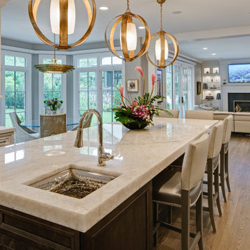
This kitchen is home to two taller individuals who both use the space equally and requested a taller workspace to comfortably accommodate their needs. The island cabinets are standard 34-1/2” tall but the Iceberg countertops were installed with a 3” build-up to add height to the island. Cabinets on the long wall were designed to break up the wall of white: buffet on the end with walnut-framed glass cabinets and seashell backsplash; double refrigerators in a painted, distressed mahogany finish were pulled forward to simulate texture and depth on the wall; wide pantry cabinets with roll-out drawers sitting on the countertops flank the refrigerators. On the opposite wall, a new window box at the kitchen sink was built to add more countertop behind the sink and to let in more light, adding dimension to the room.
The cabinetry in the original existing kitchen was disjointed at the dining room entrance and made the room appear much smaller than it really was. To remedy this, the entry to the dining room from the kitchen was closed up and relocated around the corner from the foyer; 2 simple, stacked columns were built to highlight the new opening. These transitional style columns and wider room openings at the family room and dining room entrances provide an open layout suitable for large groups to mingle comfortably; family room cabinetry and dining room fireplace surround matches kitchen cabinets.
 Bellamy Homes
Photography: Colin Jewall Photo Studios Inc
Builder: Bellamy Homes Inc
Interior Designer: Design Evolution
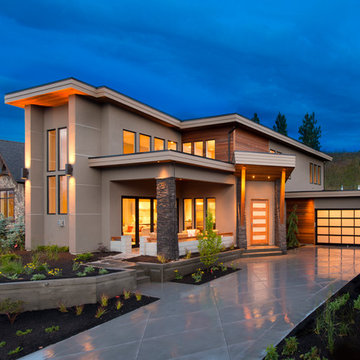
Example of a trendy exterior home design in Vancouver
Example of a trendy exterior home design in Vancouver

 Downtown Tile Centre
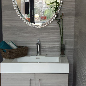
Finesse glazed ceramic wall tile brings a fresh, clean look to brighten any space. Suitable for interior applications throughout the home including kitchen counters, backsplashes and bathroom walls, this tile will provide the perfect complement to a variety of design styles.
Classic white ceramic tile with a unique wave pattern in a contemporary 10”x26” size. Add interest and dimension with this wave tile. Excellent for wall and backslash usage. Glazed ceramic with an easy to clean surface. Vanity was designed by us and made by our custom mill-worker. Designed by Joana Carreira



50