
Search results for "Supplements" in Home Design Ideas
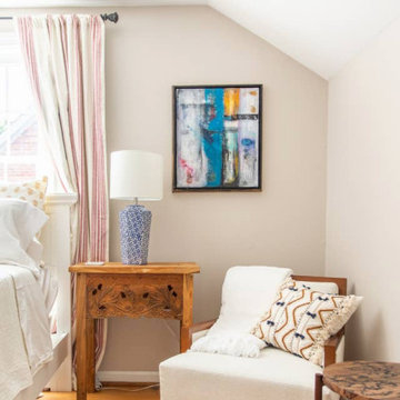
 MOTIV Interiors
Interior Designer: MOTIV Interiors LLC
Photography: Laura Rockett Photography
Design Challenge: MOTIV Interiors created this colorful yet relaxing retreat - a space for guests to unwind and recharge after a long day of exploring Nashville! Luxury, comfort, and functionality merge in this AirBNB project we completed in just 2 short weeks. Navigating a tight budget, we supplemented the homeowner’s existing personal items and local artwork with great finds from facebook marketplace, vintage + antique shops, and the local salvage yard. The result: a collected look that’s true to Nashville and vacation ready!
 Tom Bassett-Dilley Architect, Ltd.
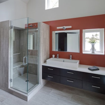
Inside and out, this is a complete “green” house. Designed using Passive House methodology with energy consultant CTI, the house achieves 70% better energy performance than a new built-to-code house, while stylishly fitting the block. Walls and roofs were constructed from 12” Structural Insulated Panels, and triple-glazed Loewen windows completed the high-performance thermal package. Materials and fixtures were selected for efficiency, recycled content, local production, non-toxicity, and durability. Landscape design uses native plantings, a water garden, and permeable paving. As an all-electric house, it uses heat pumps for space conditioning and water heating, and features a pellet stove for supplemental space heating.

Find the right local pro for your project
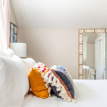 MOTIV Interiors
Interior Designer: MOTIV Interiors LLC
Photography: Laura Rockett Photography
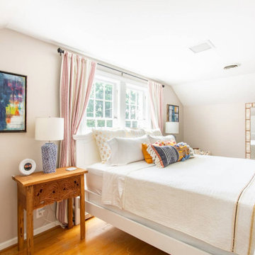
Design Challenge: MOTIV Interiors created this colorful yet relaxing retreat - a space for guests to unwind and recharge after a long day of exploring Nashville! Luxury, comfort, and functionality merge in this AirBNB project we completed in just 2 short weeks. Navigating a tight budget, we supplemented the homeowner’s existing personal items and local artwork with great finds from facebook marketplace, vintage + antique shops, and the local salvage yard. The result: a collected look that’s true to Nashville and vacation ready!
 MOTIV Interiors
Interior Designer: MOTIV Interiors LLC
Photography: Laura Rockett Photography
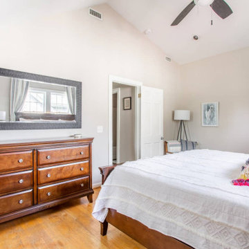
Design Challenge: MOTIV Interiors created this colorful yet relaxing retreat - a space for guests to unwind and recharge after a long day of exploring Nashville! Luxury, comfort, and functionality merge in this AirBNB project we completed in just 2 short weeks. Navigating a tight budget, we supplemented the homeowner’s existing personal items and local artwork with great finds from facebook marketplace, vintage + antique shops, and the local salvage yard. The result: a collected look that’s true to Nashville and vacation ready!
 MOTIV Interiors
Interior Designer: MOTIV Interiors LLC
Photography: Laura Rockett Photography
Design Challenge: MOTIV Interiors created this colorful yet relaxing retreat - a space for guests to unwind and recharge after a long day of exploring Nashville! Luxury, comfort, and functionality merge in this AirBNB project we completed in just 2 short weeks. Navigating a tight budget, we supplemented the homeowner’s existing personal items and local artwork with great finds from facebook marketplace, vintage + antique shops, and the local salvage yard. The result: a collected look that’s true to Nashville and vacation ready!
 Zannino Designs
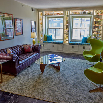
This Fells Point condo update was great fun! The challenge was how to blend antique, traditional, and mid-century styles in a cohesive manner while featuring the client's extensive pottery and fine art collections.
A treasured 165-piece collection of American Art Pottery was one of the driving aesthetic forces for the overall design. To house the pieces, and make the collection a focal point, we specified a custom built-in that draws the eye as you enter the home. It includes interior lighting that supplements natural sunlight, providing perfect articulation of the design and colors of the pottery by day. It also allows the pieces to glow and bask in the light at night, adding drama. Two window seats include textiles reflecting the color palette of the pottery.
 Rent WOW!!!
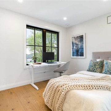
Bedroom in a Wellington County estate home staging project featuring the Leona Twin Bed and a simple white bedding set rented from Rent WOW!!!. The remaining furniture and accessories came from other inventory. This compact bedroom demonstrates how a few essential rental pieces can complete a functional bedroom while making use of furnishings already available.
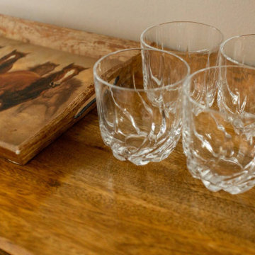 MOTIV Interiors
Interior Designer: MOTIV Interiors LLC
Photography: Laura Rockett Photography
Design Challenge: MOTIV Interiors created this colorful yet relaxing retreat - a space for guests to unwind and recharge after a long day of exploring Nashville! Luxury, comfort, and functionality merge in this AirBNB project we completed in just 2 short weeks. Navigating a tight budget, we supplemented the homeowner’s existing personal items and local artwork with great finds from facebook marketplace, vintage + antique shops, and the local salvage yard. The result: a collected look that’s true to Nashville and vacation ready!
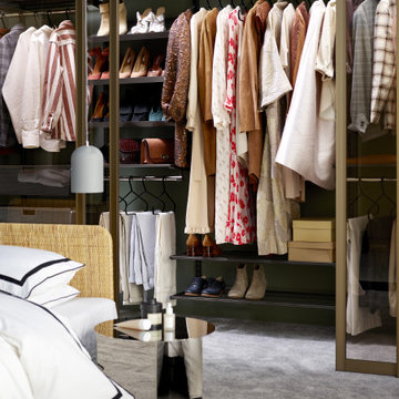
 Organise Space
Elfa make a variety of shelves and book ends all based on their classic 1960's modular shelving designs.
We have reverse engineered all the main Elfa components on our CAD system, we start by building an accurate 3D model of your space the we can quickly populate it with our Elfa component models. We offer a complete design, supply and install service and often supplement the Elfa range with bespoke parts.

 Rent WOW!!!
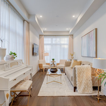
Living room in an East Gwillimbury home staging project featuring selected rental pieces from Rent WOW!!!. We supplied the Penelope coffee table, Esther bench used as piano seating, two Suzanne chairs and a 6’ × 9’ area rug. The rental pieces were incorporated with the homeowner’s existing furniture and the stager’s inventory, demonstrating how a few carefully selected rentals can complete an occupied space without replacing everything already in the home.
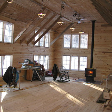
 Lewis Creek Builders
We saved the original windows and added a woodstove for good-cheer.
Mountain style shed photo in Burlington
Mountain style shed photo in Burlington
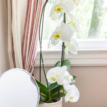 MOTIV Interiors
Interior Designer: MOTIV Interiors LLC
Photography: Laura Rockett Photography
Design Challenge: MOTIV Interiors created this colorful yet relaxing retreat - a space for guests to unwind and recharge after a long day of exploring Nashville! Luxury, comfort, and functionality merge in this AirBNB project we completed in just 2 short weeks. Navigating a tight budget, we supplemented the homeowner’s existing personal items and local artwork with great finds from facebook marketplace, vintage + antique shops, and the local salvage yard. The result: a collected look that’s true to Nashville and vacation ready!
![Design Fixation [Faith Provencher]](https://st.hzcdn.com/fimgs/07a3fbf7003fc8b3_6655-w32-h32-b0-p0--.jpg)
 Butler Restorations LLC
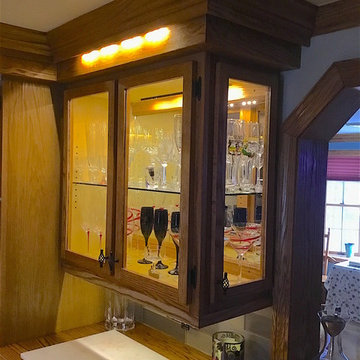
New solid oak cabinet to match existing units for stemware has door on end as well as in the front. Features LED lights and mirrored back.
The client had lived in this house for 30 years with the original builder-grade cabinets, poor lighting, inadequate storage and dated appearance. We built several new cabinets to supplement the old; added oak skins on the unfinished exposed cabinets; installed crown molding and glass tile backsplash.
The old can lights and useless center ceiling light were removed and new LED track lighting installed behind the new crown molding; new under cabinet lights; new glass cabinets with LED lights.
 User
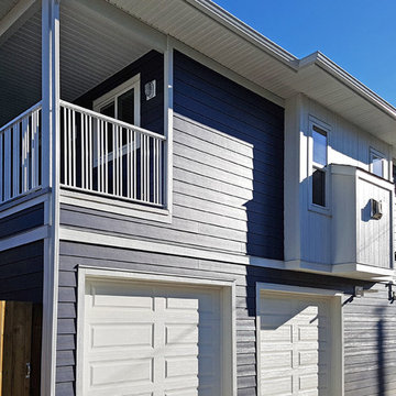
UserA brand-new two bedroom laneway suite with a large balcony, perfect for aging-in-place or supplemental income, complements the renovated exterior on this charming bungalow. A new private porch complete with outdoor heater, ceiling fan and hidden storage completes the transformation. This is a thoughtful alternative to typical inner-city redevelopment, which allows for preservation of the existing home.
 Rent WOW!!!
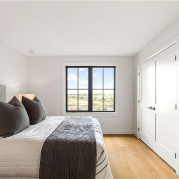
Bedroom in a Wellington County estate home staging project where only a headboard was needed from Rent WOW!!!. The bed, bedding and accessories were already available, while the rented upholstered headboard supplied the missing finishing piece. A good example of selective furniture rental—adding only what is needed to complete the room while making full use of existing inventory.

 Bit Binders
In a world full of quick fixes and pills, The Good Health Revolution takes a different path—one that goes deep into the root of well-being: your gut. Our journey started with a simple idea—fix gut health naturally. Backed by science and practical wisdom, our Gut Detox Diet Plan offers a sustainable, medicine-free solution to cleanse, heal, and nourish your digestive system.
Whether you're struggling with bloating, fatigue, or poor immunity, this program guides you through step-by-step meal plans, natural supplements, and daily habits that bring your gut flora back into balance. Our mission is to empower you to reclaim control over your health—starting from the inside out. Join thousands who are transforming their lives, one bite at a time.
 MOTIV Interiors
Interior Designer: MOTIV Interiors LLC
Photography: Laura Rockett Photography
Design Challenge: MOTIV Interiors created this colorful yet relaxing retreat - a space for guests to unwind and recharge after a long day of exploring Nashville! Luxury, comfort, and functionality merge in this AirBNB project we completed in just 2 short weeks. Navigating a tight budget, we supplemented the homeowner’s existing personal items and local artwork with great finds from facebook marketplace, vintage + antique shops, and the local salvage yard. The result: a collected look that’s true to Nashville and vacation ready!
38