
Search results for "Swapping" in Home Design Ideas
 Unpatterned
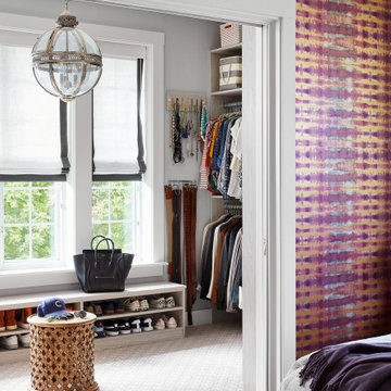
Sometimes we start with a few foundational items and a blank slate. We’ve worked with these Clients on their previous home, and they were ready to make their bedroom suite all their own. Keeping the built-ins was a requirement as was wallpaper, some new window treatments, a closet overhaul, and all the decor and details. We kept the bed and drapes and swapped the rest to create a luxe sleeping retreat.
Phase 2 of this project was to tackle the dining room and adjacent powder room. The dining room had a small sun room attached to it that was not being utilized. We turned it into a luxe home bar with custom cabinetry and a stunning quartz countertop / backsplash. Gold wallpaper on the ceiling completed the room and highlighted all of the fun metal details throughout the space. We ran the color from the bar through the dining room and accented it with bold wallpaper. We added some contrasting colors with the rug selection and brought in wood tones with the furniture to ground the space.
FUN FACT : The art over the fireplace is a vintage photo from District’s Vintage Chicago Project, featuring photos found in vintage furniture over the lifetime of the store.
Bedroom Photography: Dustin Halleck / Dining Room & Bar Photography: Ryan McDonald

 Riverside Construction, LLC
Many West Lafayette homeowners want to change their kitchens, whether because it functions poorly, their tastes have evolved, the kitchen is deteriorating, or they simply want to change.
Tackling several common pain points in their older kitchen, these West Lafayette homeowners approached Riverside Construction with a desire to open up their living area and update all the kitchen amenities including the fixtures, cabinets, and appliances. With peninsula-like counters that were too low, the kitchen also lacked much-needed countertop space. Still yet, the homeowners wanted to add a larger window above the sink to bring in natural light and expand the view of the ravine in the backyard.
Riverside Construction took out the wall separating the living room from the kitchen, and changed the layout (from U-shaped to L-shaped) to create the larger, more functional space our clients were looking for. We swapped the old white cabinetry for new custom Wellborn shaker-style cabinets in a coffee stain and installed a 'City Lights Tokyo' Daltile tile backsplash. The countertops were topped with Giallo Verona granite.
An oversize island was designed into the space to match the new custom cabinetry and provided comfortable seating for five, also eliminating the need for a kitchen table. The old back door was replaced with a large sliding glass door letting in more natural light.
Other highlights of this kitchen remodel include a beautiful Maglia Bronze chandelier that creates a stunning focal point, along with warm and durable Bella Cera Sisters chester engineered hickory hardwood flooring throughout.
 TKS Design Group
Download our free ebook, Creating the Ideal Kitchen. DOWNLOAD NOW
Lakefront property in the northwest suburbs of Chicago is hard to come by, so when we were hired by this young family with exactly that, we were immediately inspired by not just the unusually large footprint of this 1950’s colonial revival but also the lovely views of the manmade lake it was sited on. The large 5-bedroom home was solidly stuck in the 1980’s, but we saw tons of potential. We started out by updating the existing staircase with a fresh coat of paint and adding new herringbone slate to the entry hall.
The powder room off the entryway also got a refresh - new flooring, new cabinets and fixtures. We ran the new slate right through into this space for some consistency. A fun wallpaper and shiplap trim add a welcoming feel and set the tone for the home.
Next, we tackled the kitchen. Located away from the rest of the first floor, the kitchen felt a little isolated, so we immediately began planning for how to better connect it to the rest of the first floor. We landed on removing the wall between the kitchen and dining room and designed a modified galley style space with separate cooking and clean up zones. The cooking zone consists of the refrigerator, prep sink and cooktop, along with a nice long run of prep space at the island. The cleanup side of the kitchen consists of the main sink and dishwasher. Both areas are situated so that the user can view the lake during prep work and cleanup!
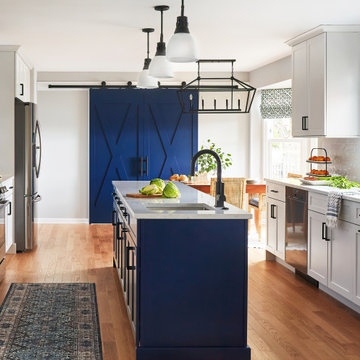
One of the home’s main puzzles was how to incorporate the mudroom and area in front of the patio doors at the back of the house. We already had a breakfast table area, so the space by the patio doors was a bit of a no man’s land. We decided to separate the kitchen proper from what became the new mudroom with a large set of barn doors. That way you can quickly hide any mudroom messes but have easy access to the light coming in through the patio doors as well as the outdoor grilling station. We also love the impact the barn doors add to the overall space.
The homeowners’ first words to us were “it’s time to ditch the brown,” so we did! We chose a lovely blue pallet that reflects the home’s location on the lake which is also vibrant yet easy on the eye. Countertops are white quartz, and the natural oak floor works well with the other honey accents. The breakfast table was given a refresh with new chairs, chandelier and window treatments that frame the gorgeous views of the lake out the back.
We coordinated the slate mudroom flooring with that used in the home’s main entrance for a consistent feel. The storage area consists of open and closed storage to allow for some clutter control as needed.
Next on our “to do” list was revamping the dated brown bar area in the neighboring dining room. We eliminated the clutter by adding some closed cabinets and did some easy updates to help the space feel more current. One snag we ran into here was the discovery of a beam above the existing open shelving that had to be modified with a smaller structural beam to allow for our new design to work. This was an unexpected surprise, but in the end we think it was well worth it!
We kept the colors here a bit more muted to blend with the homeowner’s existing furnishings. Open shelving and polished nickel hardware add some simple detail to the new entertainment zone which also looks out onto the lake!
Next we tackled the upstairs starting with the homeowner’s son’s bath. The bath originally had both a tub shower and a separate shower, so we decided to swap out the shower for a new laundry area. This freed up some space downstairs in what used to be the mudroom/laundry room and is much more convenient for daily laundry needs.
We continued the blue palette here with navy cabinetry and the navy tile in the shower. Porcelain floor tile and chrome fixtures keep maintenance to a minimum while matte black mirrors and lighting add some depth the design. A low maintenance runner adds some warmth underfoot and ties the whole space together.
We added a pocket door to the bathroom to minimize interference with the door swings. The left door of the laundry closet is on a 180 degree hinge to allow for easy full access to the machines. Next we tackled the master bath which is an en suite arrangement. The original was typical of the 1980’s with the vanity outside of the bathroom, situated near the master closet. And the brown theme continued here with multiple shades of brown.
Our first move was to segment off the bath and the closet from the master bedroom. We created a short hall from the bedroom to the bathroom with his and hers walk-in closets on the left and right as well as a separate toilet closet outside of the main bathroom for privacy and flexibility.
The original bathroom had a giant soaking tub with steps (dangerous!) as well as a small shower that did not work well for our homeowner who is 6’3”. With other bathtubs in the home, they decided to eliminate the tub and create an oversized shower which takes up the space where the old tub was located. The double vanity is on the opposite wall and a bench is located under the window for morning conversations and a place to set a couple of towels.
The pallet in here is light and airy with a mix of blond wood, creamy porcelain and marble tile, and brass accents. A simple roman shade adds some texture and it’s top-down mechanism allows for light and privacy.
This large whole house remodel gave our homeowners not only the ability to maximize the potential of their home but also created a lovely new frame from which to view their fabulous lake views.
Designed by: Susan Klimala, CKD, CBD
Photography by: Michael Kaskel
For more information on kitchen and bath design ideas go to: www.kitchenstudio-ge.com
Find the right local pro for your project
 Haus of León
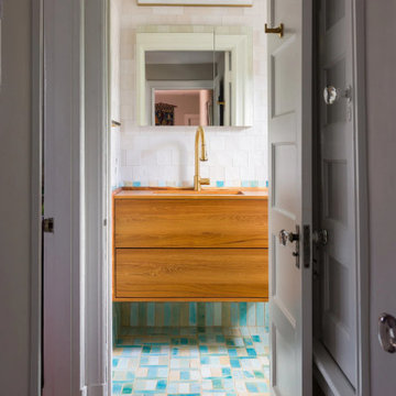
This bathroom at the end of the long hall used to be called, “the haunted bathroom,” and if you saw the before pictures you’d understand why, but they’re too scary so we can’t show them! This bathroom went through a complete metamorphosis. We swapped the location of the shower and vanity, removed the radiator and replaced it with a heated floor, removed a vent duct to keep the ceiling high, and removed very old and heavy plaster walls. Even the window is new.
Because it’s a small bathroom with a shower that won’t be used often we opted for a wet room style shower. The custom built floating vanity by Leah of Saving Face Cabinetry is made of teak and coated in a marine grade finish. It boasts a utility sink and large amounts of storage, and it’s the treasure chest at the bottom of our sea of hand made ceramic tiles from Poland. Each tile is unique and makes the bathroom feel like a natural jewel at the end of the hallway. Like the booty in a treasure chest, we stuck with a brushed gold finish for all the bathroom’s accessories and plumbing fixtures.
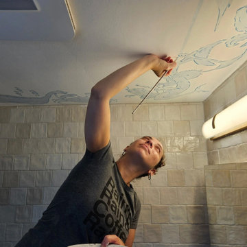
Once the bathroom renovation was complete, we set to work designing and actually painting the mural on the ceiling. We wanted it to have an antique fresco quality so the faded colors and the choppy blue outlines help it look like it’s been there for over a hundred years. It also made Anna feel like her back was 100 years old, but it was worth it!!
 Haus of León
This bathroom at the end of the long hall used to be called, “the haunted bathroom,” and if you saw the before pictures you’d understand why, but they’re too scary so we can’t show them! This bathroom went through a complete metamorphosis. We swapped the location of the shower and vanity, removed the radiator and replaced it with a heated floor, removed a vent duct to keep the ceiling high, and removed very old and heavy plaster walls. Even the window is new.
Because it’s a small bathroom with a shower that won’t be used often we opted for a wet room style shower. The custom built floating vanity by Leah of Saving Face Cabinetry is made of teak and coated in a marine grade finish. It boasts a utility sink and large amounts of storage, and it’s the treasure chest at the bottom of our sea of hand made ceramic tiles from Poland. Each tile is unique and makes the bathroom feel like a natural jewel at the end of the hallway. Like the booty in a treasure chest, we stuck with a brushed gold finish for all the bathroom’s accessories and plumbing fixtures.
Once the bathroom renovation was complete, we set to work designing and actually painting the mural on the ceiling. We wanted it to have an antique fresco quality so the faded colors and the choppy blue outlines help it look like it’s been there for over a hundred years. It also made Anna feel like her back was 100 years old, but it was worth it!!
 ASR DESIGN STUDIO
When a pandemic threatens to keep you locked down inside, there’s only one thing for you to do: Create a stylish sanctuary in your own backyard!
This reasoning spurred the inspiration for the backyard restyle at Project GC, which saw Ariel and Robert furnishing and styling their outdoor space on a budget so they could take advantage of the weather and spend more time outside while WFH during Covid.
Our goal was to design with the great outdoors in mind by selecting furnishings that could withstand the weather and could remain outside throughout the seasons.
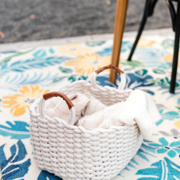
The traditional work desk was swapped for an outdoor table that could easily multitask, and we used an outdoor rug that was both comfy and weather practical.
We intentionally chose furniture that was light and easy to carry so we could shuffle the style to suit our lifestyle.
The blue ottomans allowed us to convert the space from WFH mode to entertainer mode and we added in some comfort and color with seat and back cushions.
Finally, we created mood lighting with strung lights and lanterns of different scales that could remain outside. Voila – an outdoor space we could work, play and stay in!
 Stebnitz Builders, Inc.
In every project we complete, design, form, function and safety are all important aspects to a successful space plan.
For these homeowners, it was an absolute must. The family had some unique needs that needed to be addressed. As physical abilities continued to change, the accessibility and safety in their master bathroom was a significant concern.
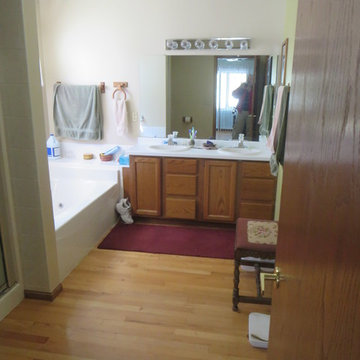
The layout of the bathroom was the first to change. We swapped places with the tub and vanity to give better access to both. A beautiful chrome grab bar was added along with matching towel bar and towel ring.
The vanity was changed out and now featured an angled cut-out for easy access for a wheelchair to pull completely up to the sink while protecting knees and legs from exposed plumbing and looking gorgeous doing it.
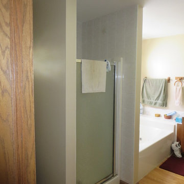
The toilet came out of the corner and we eliminated the privacy wall, giving it far easier access with a wheelchair. The original toilet was in great shape and we were able to reuse it. But now, it is equipped with much-needed chrome grab bars for added safety and convenience.
The shower was moved and reconstructed to allow for a larger walk-in tile shower with stylish chrome grab bars, an adjustable handheld showerhead and a comfortable fold-down shower bench – proving a bathroom can (and should) be functionally safe AND aesthetically beautiful at the same time.
 Stebnitz Builders, Inc.
In every project we complete, design, form, function and safety are all important aspects to a successful space plan.
For these homeowners, it was an absolute must. The family had some unique needs that needed to be addressed. As physical abilities continued to change, the accessibility and safety in their master bathroom was a significant concern.
The layout of the bathroom was the first to change. We swapped places with the tub and vanity to give better access to both. A beautiful chrome grab bar was added along with matching towel bar and towel ring.
The vanity was changed out and now featured an angled cut-out for easy access for a wheelchair to pull completely up to the sink while protecting knees and legs from exposed plumbing and looking gorgeous doing it.
The toilet came out of the corner and we eliminated the privacy wall, giving it far easier access with a wheelchair. The original toilet was in great shape and we were able to reuse it. But now, it is equipped with much-needed chrome grab bars for added safety and convenience.
The shower was moved and reconstructed to allow for a larger walk-in tile shower with stylish chrome grab bars, an adjustable handheld showerhead and a comfortable fold-down shower bench – proving a bathroom can (and should) be functionally safe AND aesthetically beautiful at the same time.
 Irene Designs
The new space looks nothing like it was before. Original kitchen was too small, and adjacent areas had a few other problems.
The front door opened straight into the wall of a long narrow hallway. It created a 90 degree turn to get into the family room.
The door between the kitchen and dining room made the traffic flow awkward for both areas.
Coat closet in the front hallway located right across the stairwell, created potential fall hazard when opening the door.
Solution:
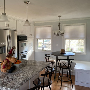
With the rear porch door left in place, the two side windows were swapped and the kitchen was relocated to the opposite wall.
Hallway walls were taken down and the coat closet was relocated away from the stairs.
Door opening between the dining room and former kitchen was restored.
After remodeling, all rooms became bigger and more functional. New beautiful kitchen has a central island and a built-in breakfast nook.
Family room also feels more open. Dining Room has a better traffic flow and holds the potential for a bigger table to seat more guests.
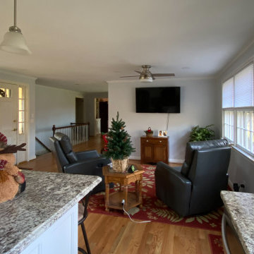 Irene Designs
The new space looks nothing like it was before. Original kitchen was too small, and adjacent areas had a few other problems.
The front door opened straight into the wall of a long narrow hallway. It created a 90 degree turn to get into the family room.
The door between the kitchen and dining room made the traffic flow awkward for both areas.
Coat closet in the front hallway located right across the stairwell, created potential fall hazard when opening the door.
Solution:
With the rear porch door left in place, the two side windows were swapped and the kitchen was relocated to the opposite wall.
Hallway walls were taken down and the coat closet was relocated away from the stairs.
Door opening between the dining room and former kitchen was restored.
After remodeling, all rooms became bigger and more functional. New beautiful kitchen has a central island and a built-in breakfast nook.
Family room also feels more open. Dining Room has a better traffic flow and holds the potential for a bigger table to seat more guests.
 Haus of León
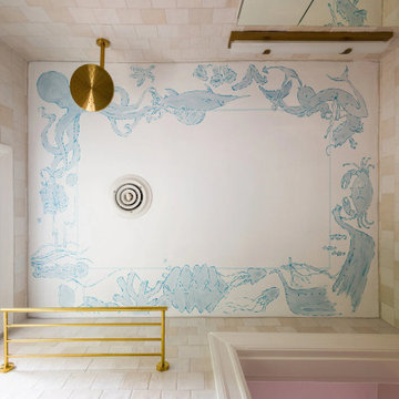
This bathroom at the end of the long hall used to be called, “the haunted bathroom,” and if you saw the before pictures you’d understand why, but they’re too scary so we can’t show them! This bathroom went through a complete metamorphosis. We swapped the location of the shower and vanity, removed the radiator and replaced it with a heated floor, removed a vent duct to keep the ceiling high, and removed very old and heavy plaster walls. Even the window is new.
Because it’s a small bathroom with a shower that won’t be used often we opted for a wet room style shower. The custom built floating vanity by Leah of Saving Face Cabinetry is made of teak and coated in a marine grade finish. It boasts a utility sink and large amounts of storage, and it’s the treasure chest at the bottom of our sea of hand made ceramic tiles from Poland. Each tile is unique and makes the bathroom feel like a natural jewel at the end of the hallway. Like the booty in a treasure chest, we stuck with a brushed gold finish for all the bathroom’s accessories and plumbing fixtures.
Once the bathroom renovation was complete, we set to work designing and actually painting the mural on the ceiling. We wanted it to have an antique fresco quality so the faded colors and the choppy blue outlines help it look like it’s been there for over a hundred years. It also made Anna feel like her back was 100 years old, but it was worth it!!
 ASR DESIGN STUDIO
When a pandemic threatens to keep you locked down inside, there’s only one thing for you to do: Create a stylish sanctuary in your own backyard!
This reasoning spurred the inspiration for the backyard restyle at Project GC, which saw Ariel and Robert furnishing and styling their outdoor space on a budget so they could take advantage of the weather and spend more time outside while WFH during Covid.
Our goal was to design with the great outdoors in mind by selecting furnishings that could withstand the weather and could remain outside throughout the seasons.
The traditional work desk was swapped for an outdoor table that could easily multitask, and we used an outdoor rug that was both comfy and weather practical.
We intentionally chose furniture that was light and easy to carry so we could shuffle the style to suit our lifestyle.
The blue ottomans allowed us to convert the space from WFH mode to entertainer mode and we added in some comfort and color with seat and back cushions.
Finally, we created mood lighting with strung lights and lanterns of different scales that could remain outside. Voila – an outdoor space we could work, play and stay in!
 Peregrine Design Build
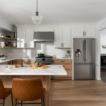
Previously, the kitchen had a door where the fridge is now located. That entry was closed and a new entry was created into the new dining room, a formerly underused formal living room.
 Irene Designs
The new space looks nothing like it was before. Original kitchen was too small, and adjacent areas had a few other problems.
The front door opened straight into the wall of a long narrow hallway. It created a 90 degree turn to get into the family room.
The door between the kitchen and dining room made the traffic flow awkward for both areas.
Coat closet in the front hallway located right across the stairwell, created potential fall hazard when opening the door.
Solution:
With the rear porch door left in place, the two side windows were swapped and the kitchen was relocated to the opposite wall.
Hallway walls were taken down and the coat closet was relocated away from the stairs.
Door opening between the dining room and former kitchen was restored.
After remodeling, all rooms became bigger and more functional. New beautiful kitchen has a central island and a built-in breakfast nook.
Family room also feels more open. Dining Room has a better traffic flow and holds the potential for a bigger table to seat more guests.
 Irene Designs
The new space looks nothing like it was before. Original kitchen was too small, and adjacent areas had a few other problems.
The front door opened straight into the wall of a long narrow hallway. It created a 90 degree turn to get into the family room.
The door between the kitchen and dining room made the traffic flow awkward for both areas.
Coat closet in the front hallway located right across the stairwell, created potential fall hazard when opening the door.
Solution:
With the rear porch door left in place, the two side windows were swapped and the kitchen was relocated to the opposite wall.
Hallway walls were taken down and the coat closet was relocated away from the stairs.
Door opening between the dining room and former kitchen was restored.
After remodeling, all rooms became bigger and more functional. New beautiful kitchen has a central island and a built-in breakfast nook.
Family room also feels more open. Dining Room has a better traffic flow and holds the potential for a bigger table to seat more guests.
 Irene Designs
The new space looks nothing like it was before. Original kitchen was too small, and adjacent areas had a few other problems.
The front door opened straight into the wall of a long narrow hallway. It created a 90 degree turn to get into the family room.
The door between the kitchen and dining room made the traffic flow awkward for both areas.
Coat closet in the front hallway located right across the stairwell, created potential fall hazard when opening the door.
Solution:
With the rear porch door left in place, the two side windows were swapped and the kitchen was relocated to the opposite wall.
Hallway walls were taken down and the coat closet was relocated away from the stairs.
Door opening between the dining room and former kitchen was restored.
After remodeling, all rooms became bigger and more functional. New beautiful kitchen has a central island and a built-in breakfast nook.
Family room also feels more open. Dining Room has a better traffic flow and holds the potential for a bigger table to seat more guests.
 Stebnitz Builders, Inc.
In every project we complete, design, form, function and safety are all important aspects to a successful space plan.
For these homeowners, it was an absolute must. The family had some unique needs that needed to be addressed. As physical abilities continued to change, the accessibility and safety in their master bathroom was a significant concern.
The layout of the bathroom was the first to change. We swapped places with the tub and vanity to give better access to both. A beautiful chrome grab bar was added along with matching towel bar and towel ring.
The vanity was changed out and now featured an angled cut-out for easy access for a wheelchair to pull completely up to the sink while protecting knees and legs from exposed plumbing and looking gorgeous doing it.
The toilet came out of the corner and we eliminated the privacy wall, giving it far easier access with a wheelchair. The original toilet was in great shape and we were able to reuse it. But now, it is equipped with much-needed chrome grab bars for added safety and convenience.
The shower was moved and reconstructed to allow for a larger walk-in tile shower with stylish chrome grab bars, an adjustable handheld showerhead and a comfortable fold-down shower bench – proving a bathroom can (and should) be functionally safe AND aesthetically beautiful at the same time.
 Regarding Design
Built in the iconic neighborhood of Mount Curve, just blocks from the lakes, Walker Art Museum, and restaurants, this is city living at its best. Myrtle House is a design-build collaboration with Hage Homes and Regarding Design with expertise in Southern-inspired architecture and gracious interiors. With a charming Tudor exterior and modern interior layout, this house is perfect for all ages.

 Blue Mountain Kitchens
Jodi Hoelsken
Large country l-shaped dark wood floor eat-in kitchen photo in Denver with an undermount sink, raised-panel cabinets, white cabinets, granite countertops, multicolored backsplash, stainless steel appliances and an island
Large country l-shaped dark wood floor eat-in kitchen photo in Denver with an undermount sink, raised-panel cabinets, white cabinets, granite countertops, multicolored backsplash, stainless steel appliances and an island


171