
Search results for "Swapping" in Home Design Ideas
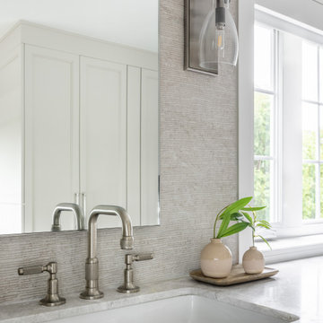
 Stalburg Design
Relocating from their home in Brisbane, Australia with ocean views to the Pacific, our clients envisioned a refresh for their new lakefront cottage on Pine Lake in West Bloomfield, Michigan. Completed in July 2024, we created new spaces, reimagined old ones, and even swapped places for a primary bedroom and its en suite bath.
Our goal was to create a serene and soothing spa- like experience for the bathroom, all while maintaining gorgeous lake views. But this reconfiguration presented some challenges. The primary bedroom was oversized, while its adjacent bath was tiny and crowded. We completely flipped the locations of the bedroom and bathroom, even rerouting plumbing over the bar in the lower level to accommodate the freestanding tub.
To maximize space, we designed large, walk-in dressing pantries that are as functional as they are beautiful, and lead to the large dual custom vanity. The vanity itself is freestanding to provide access for hand towel bath hardware on its sides. The his-and-hers unit contains built-in dividers, laundry hampers and trash pullouts to maximize its function. An enclosed water closet allows for privacy in the open concept bathroom, and is placed beyond the cabinetry.
The star of this space is the large enclosed wet room. As the focal point of the bathroom, its oversized tiled walls and deep built-in bench allow for a steam or soaking in the tub while enjoying stunning lake views. The wet room is spacious and serene, and perfect for an end to a Michigan winter day.

 Chi Renovation & Design
This bathroom renovation kept the vintage ambiance while incorporating a few contemporary finishes. We replaced the pedestal sink with a contemporary square, wall mounted sink & faucet, repainted the radiator in a glamorous silver color, installed octagon-designed floor tiles, new subway tile, designed a sleek medicine cabinet, and installed two shower shelves that were safe and out of reach from the client’s children.
Home located in Edgewater, Chicago. Designed by Chi Renovation & Design who serve Chicago and it's surrounding suburbs, with an emphasis on the North Side and North Shore. You'll find their work from the Loop through Lincoln Park, Skokie, Wilmette, and all of the way up to Lake Forest.
For more about Chi Renovation & Design, click here: https://www.chirenovation.com/
To learn more about this project, click here: https://www.chirenovation.com/portfolio/vintage-bathrooms-renovation/

 Friel Lumber Company
The homeowners chose to install perimeter cabinets using Dynasty by Omega. They chose the Madrid door style, Cherry wood, and a truffle stain. As for the island cabinets, they wanted the Madrid door style and Maple wood and then opted for the Pearl paint. The countertops are quartz and the island is granite.
Before the renovation started, the homeowners selected Jenn-Air appliances, including an induction cooktop and built-in microwave oven with speed cook. Once the construction was underway, we removed the bulkheads to allow new cabinets that extended to the ceiling with two PC crown molding. This provided a cleaner, more modern look along with added storage for items that are occasionally used.
We also swapped the pantry and refrigerator location to open up space as you enter the kitchen from the garage. The redesign also gave the refrigerator a built-in look. Then, we moved the cooktop to the corner and installed stainless steel Zephyr range hood and beveled subway tile in a herringbone pattern. The backsplash and new cooktop turned the most used area of the kitchen into a design feature.
The addition of an enlarged island allows extra seating for up to four people. Moreover, island cabinets include two full-sized waste baskets for recycling and standard waste. The new farmhouse sink from Kohler not only looks and functions well but the drain is positioned at the rear corner. The plumbing in the cabinet below is consolidated to the back corner providing much more storage. Last, the built-in TV not only looks great but also reduces counter clutter. Plus, the drawer below the TV contains USB outlet for small personal device charging.
Find the right local pro for your project

 Jarrett Design
These clients win the award for ‘Most Jarrett Design Projects in One Home’! We consider ourselves extremely fortunate to have been able to work with these kind folks so consistently over the years.
The most recent project features their master bath, a room they have been wanting to tackle for many years. We think it was well worth the wait! It started off as an outdated space with an enormous platform tub open to the bedroom featuring a large round column. The open concept was inspired by island homes long ago, but it was time for some privacy. The water closet, shower and linen closet served the clients well, but the tub and vanities had to be updated with storage improvements desired. The clients also wanted to add organized spaces for clothing, shoes and handbags. Swapping the large tub for a dainty freestanding tub centered on the new window, cleared space for gorgeous his and hers vanities and armoires flanking the tub. The area where the old double vanity existed was transformed into personalized storage closets boasting beautiful custom mirrored doors. The bathroom floors and shower surround were replaced with classic white and grey materials. Handmade vessel sinks and faucets add a rich touch. Soft brass wire doors are the highlight of a freestanding custom armoire created to house handbags adding more convenient storage and beauty to the bedroom. Star sconces, bell jar fixture, wallpaper and window treatments selected by the homeowner with the help of the talented Lisa Abdalla Interiors provide the finishing traditional touches for this sanctuary.
Jacqueline Powell Photography

 Update Your Place Inc
This is a 1920's house that has limited space. We removed the drop ceiling and brought the cabinets all of the way up to allow for optimal usage of space. We also added a pot filler over the stove and re-designed the corner cabinet for better usage of space.

 TKS Design Group
This project is a good example of what can be done with a little refresh. Sometimes parts of your space work well and parts don’t, so a full gut and replace might not make sense. That was the case here.
After living with it for a decade or so realized they would really prefer two sinks in the vanity. Since there were two windows in the bathroom, we decided to eliminate the window to the left of the current vanity and replace with it with a longer run of cabinets.
The other window is to the right of the vanity let’s in beautiful morning light. The window we removed was a northern exposure and its location under an eave didn’t allow for much light, so it was the perfect solution!
In addition to the new vanity, we also changed out the countertop, added new mirrors and lighting, and changed out the tile floor to a larger hex with fewer grout lines. This adds a brighter more modern look while still maintaining the vintage feel of the room.
The shower was in great shape, so we left that as is except for swapping out the shower floor tile to match the main floor and adding a more updated decorative mosaic tile. We added a new toilet and for a bit of luxury a heated towel bar.
Designed by: Susan Klimala, CKD, CBD
Photography by: LOMA Studios
For more information on kitchen and bath design ideas go to: www.kitchenstudio-ge.com
Project Year: 2020
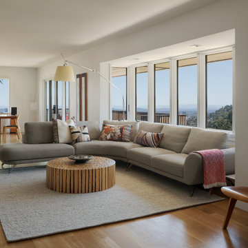


 Castle Building & Remodeling
1950’s kitchens need love too... and make great remodels! These homeowners contacted Castle for help on their kitchen remodel. The biggest wish-list item was a larger and more functional kitchen layout (with expanded views into the previously completed rear addition/dining room).
After some conceptual design concepts were assessed, we chose to keep this kitchen's existing footprint and expand the site lines into the rear dining space with a new drywall opening. We expanded the function of the kitchen by wrapping the peninsula around into the dining room with an additional pantry space for kitchen overflow storage. Each cabinet was well thought out for the homeowners use of the space to include functional storage accessories like plate divides, utensil pull-outs, and trash/recycle bins.
Working with the designer, the homeowners found a beautiful balance of some contemporary aesthetics like the overall color scheme combined with some classic elements such as the detailed cabinetry and herringbone tile backsplash. One of our favorite details in the kitchen is the new tile floor that continues into the dining room. The wood texture plank tile adds depth and texture as well as contrasts nicely with the softer and refined finishes above. New Cambria quartz countertops, new cabinetry, herringbone tile backsplash, new tile floors, custom lighting, and new plumbing fixtures complete the space. The new transitional styled kitchen can grow with the family for many years to come. With a swap out of some furniture the whole space can transition between contemporary or traditional. Truly timeless!
Designed by: Emily Blonigen. See the full details (including before photos) on our website: http://www.castlebri.com/kitchens/project-3309-1/
Make sure to check out this project on the Castle Educational Home Tour, September 29 - 30th, 2018!

 JRP Design & Remodel
Our clients had a cramped and outdated kitchen that lacked flow. They envisioned a space the family could share, including an eat-in kitchen with an island. Their small master bathroom also needed a facelift, more counter space, and storage options. They desired both spaces to be clean with a modern aesthetic.
Thoughtful architectural planning dramatically opened the space in this home to encompass the kitchen, dining, and hallway areas into one unified expanse. JRP removed the soffit and pushed back the appliance wall into the hallway to create the space needed for the central island-a place to hang out while dinner is being made, but also double as an additional food prep area. The cabinetry, along with the quartz backsplash and countertop, made for a clean, modern look.
Upstairs, the master bathroom transformed into a clutter-free zen zone. The tiny closet and outdated vanity were removed and replaced by an integrated counter space with white oak cabinetry, drawers, and open space shelving. The dated round-framed mirrors were swapped out in favor of one large, singular mirror.
The most used areas in this home are now comfortable and polished with surfaces that are both simple and easy to clean. This remodel design embraces modern living at its best. The focus on clean, uncluttered lines, light timber elements, and white countertops came together to give our clients the minimalist esthetics they were looking for.
Photographer: Andrew (Open House VC)

 Oak Hill Architects
Large transitional l-shaped dark wood floor and brown floor eat-in kitchen photo in Boston with a farmhouse sink, beaded inset cabinets, white cabinets, marble countertops, multicolored backsplash, mosaic tile backsplash, paneled appliances and an island

 JDW Construction INC
Example of a small classic medium tone wood floor and brown floor kitchen/dining room combo design in Birmingham with beige walls
 Castle Building & Remodeling
1950’s kitchens need love too... and make great remodels! These homeowners contacted Castle for help on their kitchen remodel. The biggest wish-list item was a larger and more functional kitchen layout (with expanded views into the previously completed rear addition/dining room).
After some conceptual design concepts were assessed, we chose to keep this kitchen's existing footprint and expand the site lines into the rear dining space with a new drywall opening. We expanded the function of the kitchen by wrapping the peninsula around into the dining room with an additional pantry space for kitchen overflow storage. Each cabinet was well thought out for the homeowners use of the space to include functional storage accessories like plate divides, utensil pull-outs, and trash/recycle bins.
Working with the designer, the homeowners found a beautiful balance of some contemporary aesthetics like the overall color scheme combined with some classic elements such as the detailed cabinetry and herringbone tile backsplash. One of our favorite details in the kitchen is the new tile floor that continues into the dining room. The wood texture plank tile adds depth and texture as well as contrasts nicely with the softer and refined finishes above. New Cambria quartz countertops, new cabinetry, herringbone tile backsplash, new tile floors, custom lighting, and new plumbing fixtures complete the space. The new transitional styled kitchen can grow with the family for many years to come. With a swap out of some furniture the whole space can transition between contemporary or traditional. Truly timeless!
Designed by: Emily Blonigen. See the full details (including before photos) on our website: http://www.castlebri.com/kitchens/project-3309-1/
Make sure to check out this project on the Castle Educational Home Tour, September 29 - 30th, 2018!
 TKS Design Group
This project is a good example of what can be done with a little refresh. Sometimes parts of your space work well and parts don’t, so a full gut and replace might not make sense. That was the case here.
After living with it for a decade or so realized they would really prefer two sinks in the vanity. Since there were two windows in the bathroom, we decided to eliminate the window to the left of the current vanity and replace with it with a longer run of cabinets.
The other window is to the right of the vanity let’s in beautiful morning light. The window we removed was a northern exposure and its location under an eave didn’t allow for much light, so it was the perfect solution!
In addition to the new vanity, we also changed out the countertop, added new mirrors and lighting, and changed out the tile floor to a larger hex with fewer grout lines. This adds a brighter more modern look while still maintaining the vintage feel of the room.
The shower was in great shape, so we left that as is except for swapping out the shower floor tile to match the main floor and adding a more updated decorative mosaic tile. We added a new toilet and for a bit of luxury a heated towel bar.
Designed by: Susan Klimala, CKD, CBD
Photography by: LOMA Studios
For more information on kitchen and bath design ideas go to: www.kitchenstudio-ge.com
Project Year: 2020

 P.M. Interiors
Patty Milinkovich
This beautiful kitchen was transformed using existing cabinets and replacing the doors. The original kitchen was blonde oak. Doors were replaced and ends and surfaces veneered to create a beautiful kitchen. Only a couple of cabinets were actually replaced in full. The peninsula area had a raised area for seating and was cut down to create a more modern design. Now with the counter height all one height, the task area is also increased. Beautiful Caesar Stone countertop with a simple beveled white backsplash completes the look.
 JRP Design & Remodel
Our clients had a cramped and outdated kitchen that lacked flow. They envisioned a space the family could share, including an eat-in kitchen with an island. Their small master bathroom also needed a facelift, more counter space, and storage options. They desired both spaces to be clean with a modern aesthetic.
Thoughtful architectural planning dramatically opened the space in this home to encompass the kitchen, dining, and hallway areas into one unified expanse. JRP removed the soffit and pushed back the appliance wall into the hallway to create the space needed for the central island-a place to hang out while dinner is being made, but also double as an additional food prep area. The cabinetry, along with the quartz backsplash and countertop, made for a clean, modern look.
Upstairs, the master bathroom transformed into a clutter-free zen zone. The tiny closet and outdated vanity were removed and replaced by an integrated counter space with white oak cabinetry, drawers, and open space shelving. The dated round-framed mirrors were swapped out in favor of one large, singular mirror.
The most used areas in this home are now comfortable and polished with surfaces that are both simple and easy to clean. This remodel design embraces modern living at its best. The focus on clean, uncluttered lines, light timber elements, and white countertops came together to give our clients the minimalist esthetics they were looking for.
Photographer: Andrew (Open House VC)
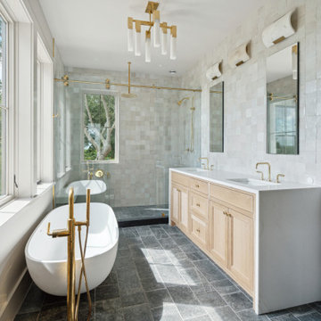
 St. Pierre Construction
Master bathroom featuring tumbled porcelain tile in a varied pattern, hidden tileable linear drain, freestanding tub with brass floor-mounted filler, handmade Moroccan zellige tile on the shower walls, a floating marble shower bench, and unlacquered brass fixtures.

 Kitchen Design Concepts
We must admit, we’ve got yet another show-stopping transformation! With keeping the cabinetry boxes (though few had to be replaced), swapping out drawer and drawer fronts with new ones, and updating all the finishes – we managed to give this space a renovation that could be confused for a full remodel! The combination of a vibrant new backsplash, a light painted cabinetry finish, and new fixtures, these cosmetic changes really made the kitchen become “brand new”. Want to learn more about this space and see how we went from “drab” to “fab” then keep reading!
Cabinetry
The cabinets boxes that needed to be replaced are from WW Woods Shiloh, Homestead door style, in maple wood. These cabinets were unfinished, as we finished the entire kitchen on-site with the rest of the new drawer and drawer fronts for a seamless look. The cabinet fronts that were replaced were from Woodmont cabinetry, in a paint grade maple, and a recessed panel profile door-style. As a result, the perimeter cabinets were painted in Sherwin Williams Tinsmith, the island in Sherwin Williams Sea Serpent, and a few interiors of the cabinets were painted in a Sherwin Williams Tinsmith.
Countertop
The countertops feature a 3 cm Caesarstone Vivid White quartz
Backsplash
The backsplash installed from countertops to the bottom of the furrdown are from Glazzio in the Oceania Herringbone Series, in Cobalt Sea, and are a 1×2 size. We love how vibrant it is!
Fixtures and Fittings
From Blanco, we have a Meridian semi-professional faucet in Satin Nickel, and a granite composite Precis 1-3/4 bowl sink in a finish of Cinder. The floating shelves are from Danver and are a stainless steel finish.
Flooring
The flooring is a cork material from Harris Cork in the Napa Collection, in a Fawn finish.
 Friel Lumber Company
The homeowners chose to install perimeter cabinets using Dynasty by Omega. They chose the Madrid door style, Cherry wood, and a truffle stain. As for the island cabinets, they wanted the Madrid door style and Maple wood and then opted for the Pearl paint. The countertops are quartz and the island is granite.
Before the renovation started, the homeowners selected Jenn-Air appliances, including an induction cooktop and built-in microwave oven with speed cook. Once the construction was underway, we removed the bulkheads to allow new cabinets that extended to the ceiling with two PC crown molding. This provided a cleaner, more modern look along with added storage for items that are occasionally used.
We also swapped the pantry and refrigerator location to open up space as you enter the kitchen from the garage. The redesign also gave the refrigerator a built-in look. Then, we moved the cooktop to the corner and installed stainless steel Zephyr range hood and beveled subway tile in a herringbone pattern. The backsplash and new cooktop turned the most used area of the kitchen into a design feature.
The addition of an enlarged island allows extra seating for up to four people. Moreover, island cabinets include two full-sized waste baskets for recycling and standard waste. The new farmhouse sink from Kohler not only looks and functions well but the drain is positioned at the rear corner. The plumbing in the cabinet below is consolidated to the back corner providing much more storage. Last, the built-in TV not only looks great but also reduces counter clutter. Plus, the drawer below the TV contains USB outlet for small personal device charging.
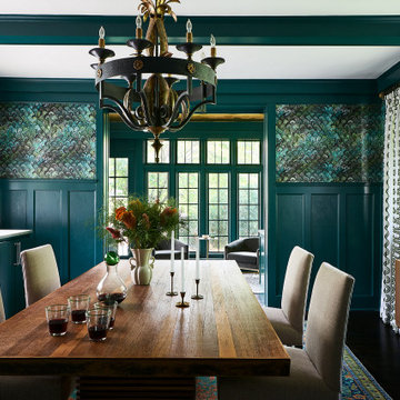
 Unpatterned
Sometimes we start with a few foundational items and a blank slate. We’ve worked with these Clients on their previous home, and they were ready to make their bedroom suite all their own. Keeping the built-ins was a requirement as was wallpaper, some new window treatments, a closet overhaul, and all the decor and details. We kept the bed and drapes and swapped the rest to create a luxe sleeping retreat.
Phase 2 of this project was to tackle the dining room and adjacent powder room. The dining room had a small sun room attached to it that was not being utilized. We turned it into a luxe home bar with custom cabinetry and a stunning quartz countertop / backsplash. Gold wallpaper on the ceiling completed the room and highlighted all of the fun metal details throughout the space. We ran the color from the bar through the dining room and accented it with bold wallpaper. We added some contrasting colors with the rug selection and brought in wood tones with the furniture to ground the space.
FUN FACT : The art over the fireplace is a vintage photo from District’s Vintage Chicago Project, featuring photos found in vintage furniture over the lifetime of the store.
Bedroom Photography: Dustin Halleck / Dining Room & Bar Photography: Ryan McDonald
 TKS Design Group
This project is a good example of what can be done with a little refresh. Sometimes parts of your space work well and parts don’t, so a full gut and replace might not make sense. That was the case here.
After living with it for a decade or so realized they would really prefer two sinks in the vanity. Since there were two windows in the bathroom, we decided to eliminate the window to the left of the current vanity and replace with it with a longer run of cabinets.
The other window is to the right of the vanity let’s in beautiful morning light. The window we removed was a northern exposure and its location under an eave didn’t allow for much light, so it was the perfect solution!
In addition to the new vanity, we also changed out the countertop, added new mirrors and lighting, and changed out the tile floor to a larger hex with fewer grout lines. This adds a brighter more modern look while still maintaining the vintage feel of the room.
The shower was in great shape, so we left that as is except for swapping out the shower floor tile to match the main floor and adding a more updated decorative mosaic tile. We added a new toilet and for a bit of luxury a heated towel bar.
Designed by: Susan Klimala, CKD, CBD
Photography by: LOMA Studios
For more information on kitchen and bath design ideas go to: www.kitchenstudio-ge.com
Project Year: 2020
173