
Search results for "Symmetrical patterns" in Home Design Ideas
 New Generation Home Improvements
Amy Bartlam
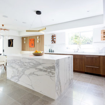
Eat-in kitchen - large contemporary l-shaped ceramic tile and gray floor eat-in kitchen idea in Los Angeles with flat-panel cabinets, brown cabinets, marble countertops, white backsplash, marble backsplash, an island, an undermount sink and paneled appliances
Eat-in kitchen - large contemporary l-shaped ceramic tile and gray floor eat-in kitchen idea in Los Angeles with flat-panel cabinets, brown cabinets, marble countertops, white backsplash, marble backsplash, an island, an undermount sink and paneled appliances
 Tracey Stephens Design, LLC
Wing Wong/Memories TTL
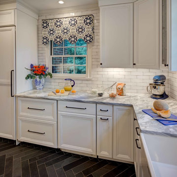
Example of a mid-sized transitional u-shaped slate floor and gray floor eat-in kitchen design in New York with a farmhouse sink, recessed-panel cabinets, white cabinets, marble countertops, white backsplash, brick backsplash, paneled appliances and a peninsula
Example of a mid-sized transitional u-shaped slate floor and gray floor eat-in kitchen design in New York with a farmhouse sink, recessed-panel cabinets, white cabinets, marble countertops, white backsplash, brick backsplash, paneled appliances and a peninsula
Find the right local pro for your project
 TVL Creative Ltd.
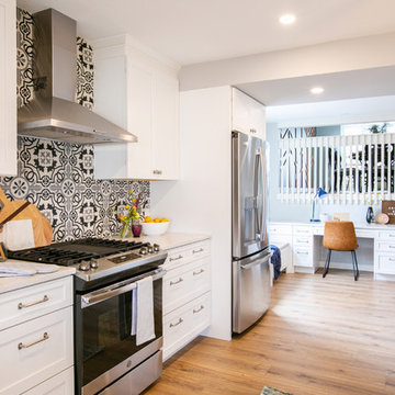
Cramped kitchen be gone! That was the project motto and top priority. The goal was to transform the current layout from multiple smaller spaces into a connected whole that would activate the main level for our clients, a young family of four.
The biggest obstacle was the wall dividing the kitchen and the dining room. Removing this wall was central to opening up and integrating the main living spaces, but the existing ductwork that ran right through the center of the wall posed a design challenge, er design opportunity. The resulting design solution features a central pantry that captures the ductwork and provides valuable storage- especially when compared to the original kitchen's 18" wide pantry cabinet. The pantry also anchors the kitchen island and serves as a visual separation of space between the kitchen and homework area.
Through our design development process, we learned the formal living room was of no service to their lifestyle and therefore space they rarely spent time in. With that in mind, we proposed to eliminate the unused living room and make it the new dining room. Relocating the dining room to this space inherently felt right given the soaring ceiling and ample room for holiday dinners and celebrations. The new dining room was spacious enough for us to incorporate a conversational seating area in the warm, south-facing window alcove.
Now what to do with the old dining room?! To answer that question we took inspiration from our clients' shared profession in education and developed a craft area/homework station for both of their boys. The semi-custom cabinetry of the desk area carries over to the adjacent wall and forms window bench base with storage that we topped with butcher block for a touch of warmth. While the boys are young, the bench drawers are the perfect place for a stash of toys close to the kitchen.
The kitchen begins just beyond the window seat with their refrigerator enclosure. Opposite the refrigerator is the new pantry with twenty linear feet of shelving and space for brooms and a stick vacuum. Extending from the backside of the pantry the kitchen island design incorporates counter seating on the family room side and a cabinetry configuration on the kitchen side with drawer storage, a trashcan center, farmhouse sink, and dishwasher.
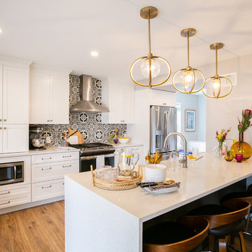
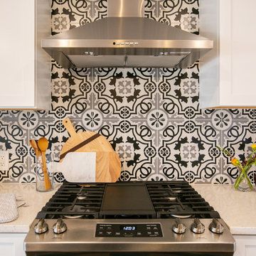
We took careful time in design and execution to align the range and sink because while it might seem like a small detail, it plays an important role in supporting the symmetrical configuration of the back wall of the kitchen. The rear wall design utilizes an appliance garage mirrors the visual impact of the refrigerator enclosure and helps keep the now open kitchen tidy. Between the appliance garage and refrigerator enclosure is the cooking zone with 30" of cabinetry and work surface on either side of the range, a chimney style vent hood, and a bold graphic tile backsplash.
The backsplash is just one of many personal touches we added to the space to reflect our client's modern eclectic style and love of color. Swooping lines of the mid-mod style barstools compliment the pendants and backsplash pattern. A pop of vibrant green on the frame of the pantry door adds a fresh wash of color to an otherwise neutral space. The big show stopper is the custom charcoal gray and copper chevron wall installation in the dining room. This was an idea our clients softly suggested, and we excitedly embraced the opportunity. It is also a kickass solution to the head-scratching design dilemma of how to fill a large and lofty wall.
We are so grateful to bring this design to life for our clients and now dear friends.

 Sweetlake Interior Design LLC
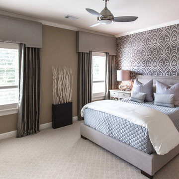
Up the ante of your bachelor's retreat (and alternative rooms) aesthetic by adding a meticulously stylised cornice boards. The cornice boards in this house includes (2) different materials, an upholstered wood top molding and absolutely symmetrical handicraft on the curtains. Also, the (4) animal skin wing-backed chairs square measure superbly adorned with nail-heads that are carried throughout the design. This bachelor retreat features a stunning pendant and hand-tufted ottoman table. This house is warm and welcoming and perfect for intimate conversations amongst family and friends for years to come. Please take note - when using cornices, one should decide what proportion return is required. Return is the distance your material hangs away from the wall. Yes, this additionally affects the proportion. Usually, return is 3½ inches. However, larger or taller windows might need a deeper return to avoid the fabric from getting squashed against the wall. An example of a mid-sized transitional formal dining area in Houston, Texas with dark hardwood floors, more, however totally different, large damask wallpaper on the ceiling, (6) custom upholstered striped fabric, scroll back chairs surrounding a gorgeous, glass top dining table, chandelier, artwork and foliage pull this area along for a really elegant, yet masculine space. As for the guest chambers, we carried the inspiration from the bachelor retreat into the space and fabricated (2) more upholstered cornices and custom window treatments, bedding, pillows, upholstered (with nail-heads used in the dining area chairs) headboard, giant damask wallpaper and brown paint. Styling tips: (A) Use nail-heads on furnishings within the alternative rooms to display a reoccurring motif among the house. (B) Use a similar material from one amongst your upholstered furnishing items on the cornice board for visual uniformity. Photo by: Kenny Fenton


 Robeson Design
Modern Bedroom Design.
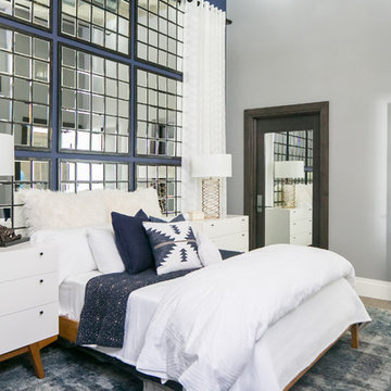
Bedroom in downtown loft with NO windows! This was the challenge Interior Designer Rebecca Robeson faced when beginning this Denver Loft Remodel.
Rebecca began by identifying the focal-point wall and addressing the overall dark feel of the room. She painted 3 walls a soft grey and one wall a dark navy blue. Rebecca applied her creative genius to the space by hanging nine beveled mirrors on the dark wall above the bed as a clever way to fool the eye into thinking the mirrors were windows. To further indulge the concept, Rebecca added crisp white linen panels to mimic window treatments on either side. This design idea created a dramatic symmetrical backdrop for the Bedroom furniture... A spectacular oversized blue and white rug (Aja Rugs) sets a perfect foundation for the queen size bed with two oversize nightstands in crisp white, the Bedroom was complete.
Tech Lighting - Black Whale Lighting
Photos by Ryan Garvin Photography
 Metropolis Drafting and Construction Inc
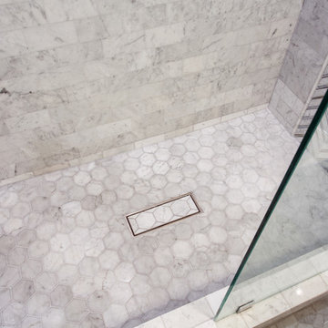
The classical Carrera marble look in a modern layout.
Hex mosaic tiles for the floor and shower pan.
A hidden drain unit with tiles imbedded in it.
Subway layout of 3x6 Carrera tiles with 5/8" pencil liner for the trim lines and corners.
A vertical chevron style Carrera mosaic 12x12 pieces right in the center of the plumbing fixtures to act as the center piece of this bathroom.
Two matching sizes his\hers shampoo niches perfectly positioned in symmetrically opposite the plumbing wall.

 The Red Shutters - Marina Case
Cape Cod; Dennis, MA
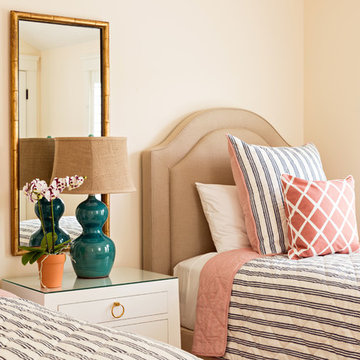
This Cape Cod-style bedroom features a calming and symmetric design, with two twin beds arranged on either side of a shared nightstand. The room's color palette is coastal-inspired, combining soft neutrals with pops of coral and blue.
Each bed has a curved, upholstered headboard in a neutral linen fabric, which adds a touch of softness and traditional elegance. The beds are dressed with striped quilts and coordinated accent pillows, including a large bolster pillow with vertical blue and white stripes and a smaller decorative pillow with a coral-and-white geometric pattern. A coral-colored throw blanket is folded neatly at the foot of each bed, adding a vibrant accent.
The shared nightstand is a clean, modern piece with a glass top and a single drawer, featuring a classic brass ring pull. It is home to a distinctive teal ceramic lamp with a burlap shade, which provides a warm, ambient light. A simple white orchid in a terra-cotta pot adds a natural and fresh element to the space. Above the nightstand, a vertical mirror with a gold bamboo-style frame reflects light and expands the feel of the room. The soft yellow walls and white shutters complete the bright, airy, and inviting coastal feel of the space.
 Alair Homes Plano
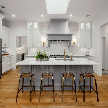
Our clients came to us wanting to maximize the space they had. They were not planning on moving anytime soon, as they loved their neighborhood. They wanted to renovate the front of their house, which included the front atrium, living room, kitchen, and powder bath. They hated their kitchen because it was completely closed off, had low ceilings, was dark and outdated, not to mention the floors were different in each of these rooms! The pantry was in the breakfast area and the kitchen table became a junk catcher, being the first thing you see when coming in from the garage/laundry room. In their living room, they wanted the spaces on either side of the fireplace to be symmetrical, whether that be bookshelves, a wet bar or closed off. Both parents are working professionals with no time and/or desire to design, create and figure this out on their own. They needed help figuring out how to reconfigure their current space in order to maximize what they already had, as they could not see an obvious solution. They could not envision how it would look so the fact that our designers were able to show them their new kitchen in 3D was pertinent.
We removed the pass-through windows that surrounded the atrium and front dining room, as well as the entire kitchen wall, completely opening up those two rooms. We removed a hall that used to lead between the kitchen and the living room since it was a complete waste of space! The ceilings were raised to 10’ in the kitchen and we were able to leave the skylight, letting in that natural light they wanted. We were able to give them a much larger pantry with tons of shelving and increase the size of their laundry room by utilizing the space of their old breakfast nook.
We relocated the door to the garage into their new elongated laundry room, built a wet bar across from their new larger pantry (with a pocket door) and the flow and functionality of these new spaces is just perfect! All new Waypoint cabinets were installed one two main kitchen surrounding walls painted Linen. Calacatta Bianco Polished Porcelain Tile 4x12 was used for the backsplash. A large eat-at island was installed, painted Stone, where the family can now gather for homework, meals, and mingling. The soft champagne bronze hardware and accent lighting really give this white and gray kitchen a soft classic look.
In the living room, we removed the built-in bookshelves to the left of the fireplace and closed off the wet-bar on the other side, giving them more space in their master suite. White Oak wood flooring, stained Putney, was installed throughout the entire new space, giving it the continuity they were looking for.
In the guest bathroom, Carrara white herringbone marble mosaic 12x12 tile was used on the shower floor and niche, while basic marble Bianco polished 12x24 porcelain tile was used on the walls. Luxart polished chrome traditional hardware gives this timeless bathroom the perfect shine.
Our clients are so happy with the new functionality and look of their space. It has definitely changed their lives in a way they could have never imagined!
 VanderHorn Architects
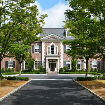
The five bay main block of the façade features a pedimented center bay. Finely detailed dormers with arch top windows sit on a graduated slate roof, anchored by limestone topped chimneys.


 TVL Creative Ltd.
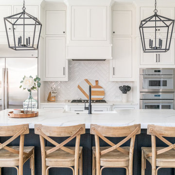
Cramped kitchen be gone! That was the project motto and top priority. The goal was to transform the current layout from multiple smaller spaces into a connected whole that would activate the main level for our clients, a young family of four.
The biggest obstacle was the wall dividing the kitchen and the dining room. Removing this wall was central to opening up and integrating the main living spaces, but the existing ductwork that ran right through the center of the wall posed a design challenge, er design opportunity. The resulting design solution features a central pantry that captures the ductwork and provides valuable storage- especially when compared to the original kitchen's 18" wide pantry cabinet. The pantry also anchors the kitchen island and serves as a visual separation of space between the kitchen and homework area.
Through our design development process, we learned the formal living room was of no service to their lifestyle and therefore space they rarely spent time in. With that in mind, we proposed to eliminate the unused living room and make it the new dining room. Relocating the dining room to this space inherently felt right given the soaring ceiling and ample room for holiday dinners and celebrations. The new dining room was spacious enough for us to incorporate a conversational seating area in the warm, south-facing window alcove.
Now what to do with the old dining room?! To answer that question we took inspiration from our clients' shared profession in education and developed a craft area/homework station for both of their boys. The semi-custom cabinetry of the desk area carries over to the adjacent wall and forms window bench base with storage that we topped with butcher block for a touch of warmth. While the boys are young, the bench drawers are the perfect place for a stash of toys close to the kitchen.
The kitchen begins just beyond the window seat with their refrigerator enclosure. Opposite the refrigerator is the new pantry with twenty linear feet of shelving and space for brooms and a stick vacuum. Extending from the backside of the pantry the kitchen island design incorporates counter seating on the family room side and a cabinetry configuration on the kitchen side with drawer storage, a trashcan center, farmhouse sink, and dishwasher.
We took careful time in design and execution to align the range and sink because while it might seem like a small detail, it plays an important role in supporting the symmetrical configuration of the back wall of the kitchen. The rear wall design utilizes an appliance garage mirrors the visual impact of the refrigerator enclosure and helps keep the now open kitchen tidy. Between the appliance garage and refrigerator enclosure is the cooking zone with 30" of cabinetry and work surface on either side of the range, a chimney style vent hood, and a bold graphic tile backsplash.
The backsplash is just one of many personal touches we added to the space to reflect our client's modern eclectic style and love of color. Swooping lines of the mid-mod style barstools compliment the pendants and backsplash pattern. A pop of vibrant green on the frame of the pantry door adds a fresh wash of color to an otherwise neutral space. The big show stopper is the custom charcoal gray and copper chevron wall installation in the dining room. This was an idea our clients softly suggested, and we excitedly embraced the opportunity. It is also a kickass solution to the head-scratching design dilemma of how to fill a large and lofty wall.
We are so grateful to bring this design to life for our clients and now dear friends.
 Chapman Design Group, Inc.
Mark Hoyle
Originally, this 3700 SF two level eclectic farmhouse from the mid 1980’s underwent design changes to reflect a more colonial style. Now, after being completely renovated with additional 2800 SF living space, it’s combined total of 6500 SF boasts an Energy Star certification of 5 stars.
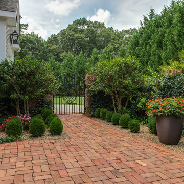
Approaching this completed home, you will meander along a new driveway through the dense buffer of trees until you reach the clearing, and then circle a tiered fountain on axis with the front entry accentuating the symmetrical main structure. Many of the exterior changes included enclosing the front porch and rear screened porch, replacing windows, replacing all the vinyl siding with and fiber cement siding, creating a new front stoop with winding brick stairs and wrought iron railings as will as other additions to the left and rear of the home.
The existing interior was completely fro the studs and included modifying uses of many of the existing rooms such as converting the original dining room into an oval shaped theater with reclining theater seats, fiber-optic starlight ceiling and an 80” television with built-in surround sound. The laundry room increased in size by taking in the porch and received all new cabinets and finishes. The screened porch across the back of the house was enclosed to create a new dining room, enlarged the kitchen, all of which allows for a commanding view of the beautifully landscaped pool. The upper master suite begins by entering a private office then leads to a newly vaulted bedroom, a new master bathroom with natural light and an enlarged closet.
The major portion of the addition space was added to the left side as a part time home for the owner’s brother. This new addition boasts an open plan living, dining and kitchen, a master suite with a luxurious bathroom and walk–in closet, a guest suite, a garage and its own private gated brick courtyard entry and direct access to the well appointed pool patio.
And finally the last part of the project is the sunroom and new lagoon style pool. Tucked tightly against the rear of the home. This room was created to feel like a gazebo including a metal roof and stained wood ceiling, the foundation of this room was constructed with the pool to insure the look as if it is floating on the water. The pool’s negative edge opposite side allows open views of the trees beyond. There is a natural stone waterfall on one side of the pool and a shallow area on the opposite side for lounge chairs to be placed in it along with a hot tub that spills into the pool. The coping completes the pool’s natural shape and continues to the patio utilizing the same stone but separated by Zoysia grass keeping the natural theme. The finishing touches to this backyard oasis is completed utilizing large boulders, Tempest Torches, architectural lighting and abundant variety of landscaping complete the oasis for all to enjoy.
 Old Town Design Group
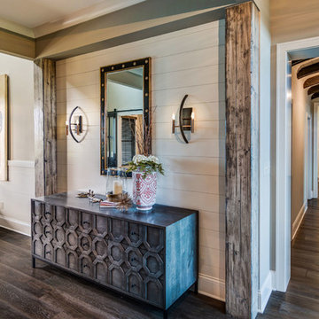
The shiplap takes over the little hallway before entering the great room. It is complemented by a large furniture piece with a bold pattern and symmetrical lighting fixtures.
Photo by: Thomas Graham


 TVL Creative Ltd.
Cramped kitchen be gone! That was the project motto and top priority. The goal was to transform the current layout from multiple smaller spaces into a connected whole that would activate the main level for our clients, a young family of four.
The biggest obstacle was the wall dividing the kitchen and the dining room. Removing this wall was central to opening up and integrating the main living spaces, but the existing ductwork that ran right through the center of the wall posed a design challenge, er design opportunity. The resulting design solution features a central pantry that captures the ductwork and provides valuable storage- especially when compared to the original kitchen's 18" wide pantry cabinet. The pantry also anchors the kitchen island and serves as a visual separation of space between the kitchen and homework area.
Through our design development process, we learned the formal living room was of no service to their lifestyle and therefore space they rarely spent time in. With that in mind, we proposed to eliminate the unused living room and make it the new dining room. Relocating the dining room to this space inherently felt right given the soaring ceiling and ample room for holiday dinners and celebrations. The new dining room was spacious enough for us to incorporate a conversational seating area in the warm, south-facing window alcove.
Now what to do with the old dining room?! To answer that question we took inspiration from our clients' shared profession in education and developed a craft area/homework station for both of their boys. The semi-custom cabinetry of the desk area carries over to the adjacent wall and forms window bench base with storage that we topped with butcher block for a touch of warmth. While the boys are young, the bench drawers are the perfect place for a stash of toys close to the kitchen.
The kitchen begins just beyond the window seat with their refrigerator enclosure. Opposite the refrigerator is the new pantry with twenty linear feet of shelving and space for brooms and a stick vacuum. Extending from the backside of the pantry the kitchen island design incorporates counter seating on the family room side and a cabinetry configuration on the kitchen side with drawer storage, a trashcan center, farmhouse sink, and dishwasher.
We took careful time in design and execution to align the range and sink because while it might seem like a small detail, it plays an important role in supporting the symmetrical configuration of the back wall of the kitchen. The rear wall design utilizes an appliance garage mirrors the visual impact of the refrigerator enclosure and helps keep the now open kitchen tidy. Between the appliance garage and refrigerator enclosure is the cooking zone with 30" of cabinetry and work surface on either side of the range, a chimney style vent hood, and a bold graphic tile backsplash.
The backsplash is just one of many personal touches we added to the space to reflect our client's modern eclectic style and love of color. Swooping lines of the mid-mod style barstools compliment the pendants and backsplash pattern. A pop of vibrant green on the frame of the pantry door adds a fresh wash of color to an otherwise neutral space. The big show stopper is the custom charcoal gray and copper chevron wall installation in the dining room. This was an idea our clients softly suggested, and we excitedly embraced the opportunity. It is also a kickass solution to the head-scratching design dilemma of how to fill a large and lofty wall.
We are so grateful to bring this design to life for our clients and now dear friends.
 Gezit Inc.
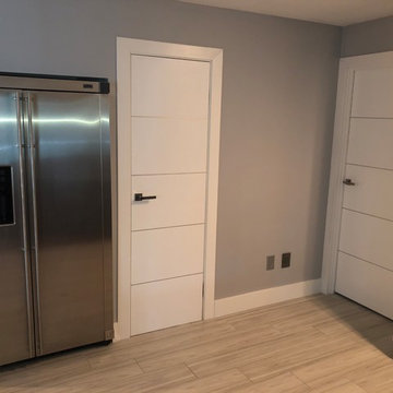
Discover our Palladio Interior Doors! It is a genuine piece of design art in its' simplicity and is perfect for those, who value high quality and practical durability. Polypropylene (PPL) Coat makes the door highly moisture and sunshine resistant and has a realistic wooden pattern. Solid core is made of a high-tech material that provides great sound proof characteristics without weighting the slab. 4H molding design includes four horizontal aluminum moldings. Enjoy The EVO PRO Collection in your Interior with no fear of any scratches or color fading for many years ahead. The most traditional and common door configuration, single swing, is easy to install and comfortable to use. Hinges are cut on a symmetrical distance and allow you to choose the opening direction right on the spot. The door unit consists of a door slab, frame, casing and optional services.
 User
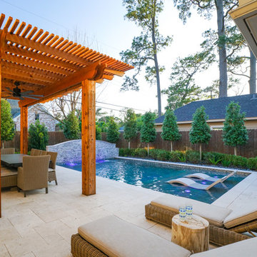
UserWe designed a sleek, rectangular pool with sheer descent waterfall features gracing one end and a large tanning deck on the other for a family with limited yard space. We were also able to include an area for dining, a pergola to provide relief from the sun and an outdoor kitchen nestled between the main house and the addition. Clean, symmetrical landscaping added the finishing touch.
22