
Search results for "Systems increases" in Home Design Ideas
 Guy Ayers, Architect
Reverse Shed Eichler
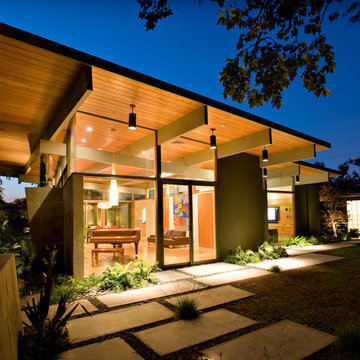
This project is part tear-down, part remodel. The original L-shaped plan allowed the living/ dining/ kitchen wing to be completely re-built while retaining the shell of the bedroom wing virtually intact. The rebuilt entertainment wing was enlarged 50% and covered with a low-slope reverse-shed roof sloping from eleven to thirteen feet. The shed roof floats on a continuous glass clerestory with eight foot transom. Cantilevered steel frames support wood roof beams with eaves of up to ten feet. An interior glass clerestory separates the kitchen and livingroom for sound control. A wall-to-wall skylight illuminates the north wall of the kitchen/family room. New additions at the back of the house add several “sliding” wall planes, where interior walls continue past full-height windows to the exterior, complimenting the typical Eichler indoor-outdoor ceiling and floor planes. The existing bedroom wing has been re-configured on the interior, changing three small bedrooms into two larger ones, and adding a guest suite in part of the original garage. A previous den addition provided the perfect spot for a large master ensuite bath and walk-in closet. Natural materials predominate, with fir ceilings, limestone veneer fireplace walls, anigre veneer cabinets, fir sliding windows and interior doors, bamboo floors, and concrete patios and walks. Landscape design by Bernard Trainor: www.bernardtrainor.com (see “Concrete Jungle” in April 2014 edition of Dwell magazine). Microsoft Media Center installation of the Year, 2008: www.cybermanor.com/ultimate_install.html (automated shades, radiant heating system, and lights, as well as security & sound).


Find the right local pro for your project
 SHKS Architects
Benjamin Benschneider
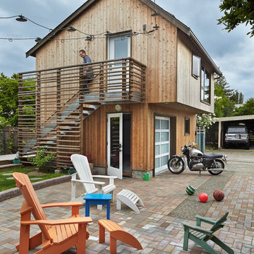
A Seattle family was expecting their third child and hoping to find space for an additional bedroom within their existing one-story home. A small second floor addition was considered but the cost and disruption to the family living space presented serious drawbacks. A new detached garage and DADU (Detached Accessory Dwelling Unit), to be located in the backyard, was proposed to free up the existing basement garage for the new bedroom. The new building is modest and simple, designed with a scale and character to complement the existing house and neighborhood.
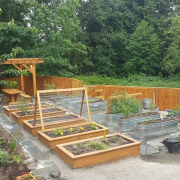
 Cascadia Edible Landscapes
Really fun project featuring:
Drystack retaining walls using 14 tons of Cabinet Gorge wall block
Juniper raised beds, stained
Pergola, stain
Irregular Flagstone Patio 165 sq foot Bluestone featuring many extra large pieces
Cut bluestone risers for main stair case
Raspberry Trellis
Cucumber/squash trellis
Galvanized Horse Trough Planters, both oblong and circular, including a double stacked one in lower area.
200+ foot long fence extension + gate.
Wetland buffer planting of both ornamental and edible varieties of plants
4 zone, complete automatic drip system with micro valve (manual) controls on all beds
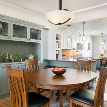
 Bay Build Design, Inc.
Wall opened up between rooms to let in light and increase usable space.
Example of an arts and crafts dining room design in San Francisco
Example of an arts and crafts dining room design in San Francisco
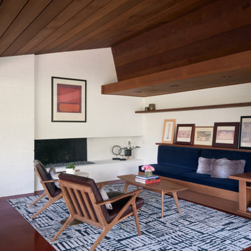
 Klopf Architecture
Nestled in the hills of Orinda, California, this 1951 residence is one of only seven extant homes, now known as “The Magnificent Seven”, designed by architect Olof Dahlstrand, a protégé of Frank Lloyd Wright. With its low-slung rooflines, natural materials, and deep integration with the sloping landscape, the home is a pristine example of mid-century modern design inspired by Wright’s organic principles. Over the years, prior homeowners have emphasized preservation, ensuring that the house remained relatively untouched. Each owner has respected the original architecture and stayed true to Dahlstrand’s intent. When a family of five—two college-aged sons and a middle school-aged daughter—acquired the property, they were captivated by its history, legacy of care, and architectural significance. While they appreciated Dahlstrand’s original vision, they also recognized the need to adapt the home for contemporary living while preserving its design integrity.
The remodel was conceived as a thoughtful response to the past—an effort to bring the house into the 21st century without compromising its soul. The primary mandate was to maintain architectural continuity while improving the functionality, comfort, and livability for a modern family. The design team—architects and contractor alike—worked with a shared reverence for the original architecture, allowing that mindset to guide even the most technical or pragmatic decisions.
A key objective was to increase natural light in the kitchen—a departure from Wrightian principles of enclosed, intimate cooking spaces—while maintaining the home’s architectural language. The kitchen was reconfigured to foster a stronger connection to adjacent living spaces while retaining the underlying concept of spatial separation. One of the most transformative architectural changes was the removal of a ridge beam that was originally planned to remain visible through the kitchen. During construction, the team collaborated on a better solution: a wide-flanged steel beam concealed within the roof envelope. This subtle move preserved the clean lines and ceiling continuity, a modern update carried out with utmost respect for the existing framework.
The home’s original powder room, previously accessible only through the kitchen, was relocated for better flow and privacy. A new powder room was carved out of former kitchen cabinetry—a narrow, interior space that could have felt dark and enclosed. To avoid this, the design extended the line of original transom windows into the new powder room and added a skylight above the vanity. The result is a bright and airy space that feels consistent with the rest of the home. Other updates included the installation of new solid-core interior doors with veneers carefully matched to the original mahogany, enhancing the continuity of the interiors. Even smaller decisions, such as placing the door knobs at 42 inches high, mirrored the original proportions. Every choice reflected a shared belief between the architect, contractor, and client: that new work should serve the integrity of the old.
The home’s extensive interior redwood millwork and paneling was meticulously restored. Where new materials were introduced—such as the replacement redwood soffit paneling—the contractor took pains to find finish nails that matched the original, rather than using modern equivalents. This level of craftsmanship and collaboration defined the project. It extended even to the detailing of a blind door to the new powder room, which had to disappear into the existing redwood board-and-batten wall. It was a team effort: the owner found a suitable handle, the architects devised the custom in-swing mechanism, and the contractor executed it so the door aligned precisely with the battens. Throughout, the homeowners were deeply engaged in the design process. One, a meticulous design enthusiast, focused on aesthetic integrity and historic detail. The other brought a practical and function-driven perspective, ensuring that new fixtures and materials would be durable and require minimal maintenance.
While the home’s location posed no major site challenges, sustainability was a key concern. The team upgraded the roof insulation, installed solar panels with battery storage, and added ductless mini-split cooling systems. Lighting was another area where modern technology was woven into a historic framework: new square LED fixtures echo the original custom perimeter soffit lights, maintaining the design language while offering advanced performance.
A planned expansion of a bedroom into suite with a bathroom had to be shelved due to budget constraints and the high cost of below-grade foundation work. Still, the team focused their efforts on making the most of the existing footprint, resolving constraints through design ingenuity rather than adding square footage. This renovation represents a collaborative achievement in preserving and evolving a historically significant home. Every decision was shaped by a shared ethos among clients, architects, and contractor: to maintain the home’s architectural soul while updating it for contemporary life. The result is a timeless modernist residence that continues Olof Dahlstrand’s legacy, remaining grounded in nature, craftsmanship, and human-scale design.
Klopf Architecture Team: John Klopf, AIA, Klara Kevane, Fernanda Bernardes
Interior Architectural Design: Klopf Architecture
Structural Engineer: Daniel Bastiao
Contractor: Don Larwood, Larwood Construction
Photography: Mariko Reed
Year Completed: 2022
Sponsored
Columbus, OH

Hope Restoration & General Contracting
Columbus Design-Build, Kitchen & Bath Remodeling, Historic Renovations
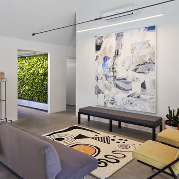
 Studio 804
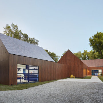
The 722 Ash Street residence consists of a 1500 sf primary house with a contiguous 500 sf accessory dwelling. The project is set in the rich culture of North Lawrence, its rear property line abuts the Lawrence levee trail which runs for nine miles along the north bank of the Kansas River.
North Lawrence is known for its quality soil, large trees, curbless streets and random size parcels before it breaks into larger farms further from the urban center. It is built on the typical orthogonal grid of American development, but it represents the older growth of the city prior to urban planners and zoning regulations. The rumble of freight trains and farm trucks in the shadows of the towering grain elevators are only blocks away. It is home to many who enjoy being only a bridge crossing away from Lawrence’s vibrant downtown but are far enough away to maintain their independence from many of the restrictions on living near the historic district. They can work in their large gardens and toiling in their garages and shops in a manner more rural than urban.
The house on 722 Ash St. is imbued with the character of North Lawrence and the Levee Trail area. The design was inspired by the Midwestern farmstead vernacular of the region. These timeless vernacular qualities house all the accommodations necessary for modern, sustainable living. A unique feature of this house is the Accessory Dwelling Unit permitted in the zoning district. It is a small separate residence on the same lot that can be used for income property or for extended family members. It also supports the city of Lawrence’s goals of increased density close to downtown rather than continued sprawl into the countryside.
The buildings use technology and common-sense design to reduce the building’s footprint and assure the owners low energy use and costs. A 4.9 Kw solar collection system is located on the only south facing gable and the super insulated envelopes (r-62 roof and r-35 walls) of all three forms easily exceeds the standards. Studio 804 continues their long standing pattern of maintaining the highest level of sustainable design while remaining contextually sensitive to the surrounding community. This house, like every Studio 804 project since 2008, is USGBC LEED Platinum Certified.
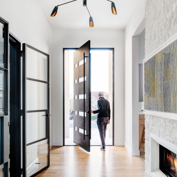

 GF Architecture, LLC
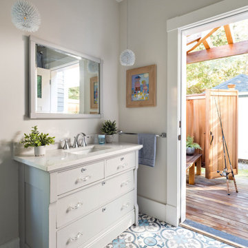
A complete whole house renovation/addition of an existing 1890’s era antique residence renewing all systems, infrastructure, and finishes. Create new primary residence for with modern updates for year around living for the client while being a custodian of historic house that has been a contributor to the legacy of the area for generations. A poorly considered addition that linked to the original 1890’s antique with warren of stairs and corridors was torn down. The replacement addition enhanced the existing living spaces while adding new family room, sun room, prime bedroom suite, outdoor shower, side entry and stair. All the new and existing features are knit together by extending and modifying the existing exterior wrap around porch and house trim details.
 SURROUNDS Landscape Architecture + Construction
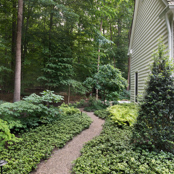
Our client desired a functional, tasteful, and improved environment to compliment their home. The overall goal was to create a landscape that was subtle and not overdone. The client was highly focused on their deck environment that would span across the rear of the house with an area for a Jacuzzi as well. A portion of the deck has a screened in porch due to the naturally buggy environment since the home is situated in the woods and a low area. A mosquito repellent injection system was incorporated into the irrigation system to help with the bug issue. We improved circulation of the driveway, increased the overall curb appeal of the entrance of the home, and created a scaled and proportional outdoor living environment for the clients to enjoy. The client has religious guidelines that needed to be adhered to with the overall function and design of the landscape, which included an arbor over the deck to support a Sukkah and a Green Egg smoker to cook Kosher foods. Two columns were added at the driveway entrance with lights to help define their driveway entrance since it's the end of a long pipe-stem. New light fixtures were also added to the rear of the house.
Our client desired multiple amenities with a limited budget, so everything had to be value engineered through the design and construction process. There is heavy deer pressure on the site, a mosquito issue, low site elevations, flat topography, poor soil, and overall poor drainage of the site. The original driveway was not sized appropriately and the front porch had structural issues, as well as leaked water onto the landing below. The septic tank was also situated close to the rear of the house and had to be contemplated during the design process.
Photography: Morgan Howarth. Landscape Architect: Howard Cohen, Surrounds Inc.
 KURV Architecture DPC (Alex Hughes Architects)
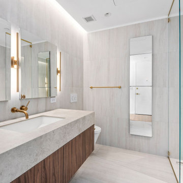
Located in the heart of Manhattan’s Lower East Side, the building was erected on a shallow commercial lot between two 120 year old masonry buildings and a new residential rental building. 330 Grand Street is a mix of 725 SF 1BRs and 1050 SF 2BR apartments. It also contains a 1100 SF two story duplex as well as private and public rooftop space, large private balconies for most units and two large private terraces for the ground floor units.
330 Grand Street was originally designed and approved at the NYC DOB as a prefabricated modular building. During the pandemic, as shipping costs skyrocketed putting the project at risk, we suggested redesigning the building as a reinforced cast-in-place concrete structure. Concrete was readily available and prices had not been affected by the demand increase that many other materials suffered in the pandemic. We took this opportunity to raise floor to ceiling heights, enlarge high performance windows and redistribute the buildings MEPFS and Structural Systems to create very open floor plans.
The challenge was to create a luxurious sensorial living experience with very limited means. In a city with very high construction costs, low cost residential buildings in the area are usually devoid of good quality, design and character. Our approach was to aim high for the end user, prioritizing natural light, open space with long visual perspectives, high ceilings and as always, rejecting the use of predefined building templates.
Our biggest challenge was to ensure that the small spaces feel as clean cut, large and bright as possible. Several unique design decisions were made to ensure low cost and high quality;
Floor plans were laid out so that spaces were wide open and free of clutter from mechanical or structural interruptions. Therefore all infrastructure was placed in lateral demising walls, which in turn act as the unit’s storage and kitchen. The apartments feel wide open, are super quiet and have more storage space than any other comparable apartment in the city.
To solve the problem of the site’s shallow commercial lot which is typically prone to dark interior spaces we focused our attention on the building’s envelope. Instead of the usual small punched window openings, oversized high performance windows were designed to ensure that light penetrated as far as possible into the units. In the smaller 1BR units, the full 50’ depth of the lot is perceived by partitioning spaces with sliding pocket doors that can be retracted to allow deep visual perspectives, making the sight lines in the space feel longer, larger, more ample than normal. In addition to the full height glazing, each unit above the 2nd floor receives a 7 foot covered balcony, adding 120 to 240 sf to each apartment, something unusual in New York City buildings. The space is large enough for a full size dining table, when the weather permits being outside.
We also worked hard to ensure modularity. For example, all kitchen units are all identical throughout the building. The idea of modularity and the economy of the repetitive unit is exercised to the maximum through the building.
Hardware, appliances, flooring, wall coverings and material finishes are all carefully selected to feel bespoke, high quality and unique.
It was important to KURV that the result of this work manifest into something that would deeply connect with the end user and sustain relationships with the consumers of this space.
All images by KURV Architecture ©
 NanaWall
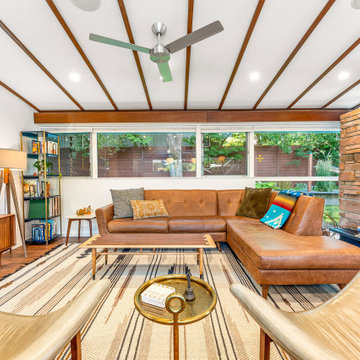
The comprehensive renovation included upgrades to the electrical, plumbing, and heating systems, a bathroom addition, along with a strategic reconfiguration of the layout to honor the home's heritage. It also addressed the exterior spaces, where a poorly added sunroom was removed to restore the original patio. To help reclaim the home’s architectural integrity, the outdated and restrictive slider was replaced by folding glass doors to increase the home's usable space, energy efficiency, and ventilation. A five-panel NanaWall aluminum framed folding glass wall was used in the 16’ wide exterior opening to the patio. The outward swinging folding glass wall was specified with a barefoot-friendly low profile saddle sill and features a convenient swing door panel for easy everyday access.
Sponsored
Columbus, OH
Hope Restoration & General Contracting
Columbus Design-Build, Kitchen & Bath Remodeling, Historic Renovations
 Scott Edwards Architecture
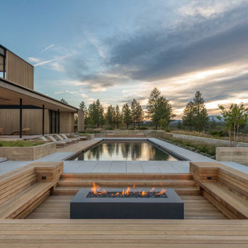
Wood slat elements provide shading from the sun, and the window system is thermally broken; both features work to increase energy efficiency. Wildfire mitigation strategies, crucial for this region, are applied, including landscaping kept away from the house and a 1-hour fire rating construction for the entire building.
 Progressive Design Build
The Challenge
This beautiful waterfront home was begging for an update. Our clients wanted a contemporary design with modern finishes. They craved improved functionality in the kitchen, hardwood flooring in the living areas, and a spacious walk-in closet in the master bathroom. With two children in school, our clients also needed the project completed during their summer vacation – leaving a slim 90 days for the entire remodel. Could we do it? …Challenge accepted!
Our Solution
With their active summer travel schedule, our clients elected to vacate their home for the duration of the project. This was ideal for the intrusive nature of the scope of work.
In preparation, our design team created a project plan to suit our client’s needs. With such a clear timeline, we were able to select and order long-lead items in plenty of time for the project start date.
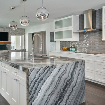
In the kitchen, we rearranged the layout to provide superior ventilation for the cooktop on the exterior wall. We added two large storage cabinets with glass doors, accented by a sleek mosaic backsplash of glass tile. We also incorporated a large contemporary waterfall island into the room. With seating at one end, the island provides both increased functionality and an eye-catching focal point for the center of the room. On the interior wall of the kitchen, we maximized storage with a wall of built-in cabinetry – complete with pullout pantry cabinets, a double oven, and a large stainless refrigerator.
Our clients wisely chose rich, dark-colored wood flooring to add warmth to the contemporary design. After installing the flooring in the kitchen, we brought it into the main living areas as well. In the great room, we wrapped the existing gas fireplace in a neutral stack stone. The effect of the stone on the media and window wall is breathtaking.
In the master bathroom, we expanded the closet by pushing the wall back into the adjacent pass-through hallway. The new walk-in closet now includes an impressive closet organization system.
Returning to the master bathroom, we removed the single vanity and repositioned the toilet, allowing for a new, curb-less glass shower and a his-and-hers vanity. The entire vanity and shower wall is finished in white 12×24 porcelain tile. The vertical glass mosaic accent band and backlit floating mirrors add to the clean, modern style. To the left of the master bathroom entry, we even added a matching make-up area.
Finally, we installed a number of elegant enhancements in the remaining rooms. The clients chose a bronze metal relief accent wall as well as some colorful finishes and artwork for the entry and hallway.
Exceptional Results
Our clients were simply thrilled with the final product! Not only did they return from their summer vacation to a gorgeous home remodel, but we concluded the project a full week ahead of schedule. As a result, the family was able to move in sooner than planned, giving them plenty of time to acclimate to the renovated space before their kids returned to school. Ultimately, we provided the outstanding results and customer experience that our clients had been searching for.
“We met with many other contractors leading up to signing with Progressive Design Build. When we met Mike, we finally felt safe. We had heard so many horror stories about contractors! Progressive was the best move we could have made. They made our dream house become a reality. Vernon was in charge of our project and everything went better than we expected. Our project was completed earlier than expected, too. Our questions and concerns were dealt with quickly and professionally, the job site was always clean, and all subs were friendly and professional. We had a wonderful experience with Progressive Design Build. We’re so grateful we found them.” – The Mader Family
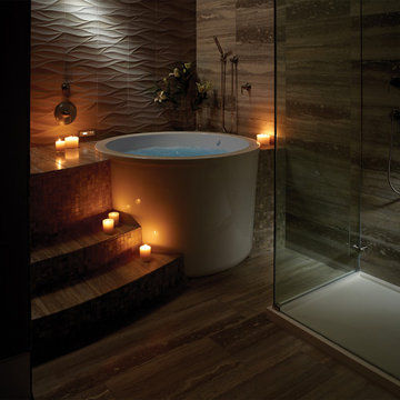
 MTI Baths
Master bath - angle 2. MTI Jasmine 3 freestanding tub. Generously deep and available as soaker or air bath.
Tub and shower base handcrafted in the USA. Stone floor and walls by Artistic Tile. Mosaic risers on steps by Artistic Tile. Grohe faucetry.
 Michael Nash Design, Build & Homes
For this couple, planning to move back to their rambler home in Arlington after living overseas for few years, they were ready to get rid of clutter, clean up their grown-up kids’ boxes, and transform their home into their dream home for their golden years.
The old home included a box-like 8 feet x 10 feet kitchen, no family room, three small bedrooms and two back to back small bathrooms. The laundry room was located in a small dark space of the unfinished basement.
This home is located in a cul-de-sac, on an uphill lot, of a very secluded neighborhood with lots of new homes just being built around them.
The couple consulted an architectural firm in past but never were satisfied with the final plans. They approached Michael Nash Custom Kitchens hoping for fresh ideas.
The backyard and side yard are wooded and the existing structure was too close to building restriction lines. We developed design plans and applied for special permits to achieve our client’s goals.
The remodel includes a family room, sunroom, breakfast area, home office, large master bedroom suite, large walk-in closet, main level laundry room, lots of windows, front porch, back deck, and most important than all an elevator from lower to upper level given them and their close relative a necessary easier access.
The new plan added extra dimensions to this rambler on all four sides. Starting from the front, we excavated to allow a first level entrance, storage, and elevator room. Building just above it, is a 12 feet x 30 feet covered porch with a leading brick staircase. A contemporary cedar rail with horizontal stainless steel cable rail system on both the front porch and the back deck sets off this project from any others in area. A new foyer with double frosted stainless-steel door was added which contains the elevator.
The garage door was widened and a solid cedar door was installed to compliment the cedar siding.
The left side of this rambler was excavated to allow a storage off the garage and extension of one of the old bedrooms to be converted to a large master bedroom suite, master bathroom suite and walk-in closet.
We installed matching brick for a seam-less exterior look.
The entire house was furnished with new Italian imported highly custom stainless-steel windows and doors. We removed several brick and block structure walls to put doors and floor to ceiling windows.
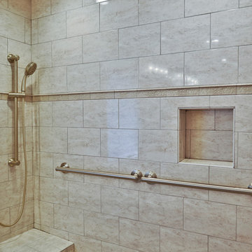
A full walk in shower with barn style frameless glass doors, double vanities covered with selective stone, floor to ceiling porcelain tile make the master bathroom highly accessible.
The other two bedrooms were reconfigured with new closets, wider doorways, new wood floors and wider windows. Just outside of the bedroom, a new laundry room closet was a major upgrade.
A second HVAC system was added in the attic for all new areas.
The back side of the master bedroom was covered with floor to ceiling windows and a door to step into a new deck covered in trex and cable railing. This addition provides a view to wooded area of the home.
By excavating and leveling the backyard, we constructed a two story 15’x 40’ addition that provided the tall ceiling for the family room just adjacent to new deck, a breakfast area a few steps away from the remodeled kitchen. Upscale stainless-steel appliances, floor to ceiling white custom cabinetry and quartz counter top, and fun lighting improved this back section of the house with its increased lighting and available work space. Just below this addition, there is extra space for exercise and storage room. This room has a pair of sliding doors allowing more light inside.
The right elevation has a trapezoid shape addition with floor to ceiling windows and space used as a sunroom/in-home office. Wide plank wood floors were installed throughout the main level for continuity.
The hall bathroom was gutted and expanded to allow a new soaking tub and large vanity. The basement half bathroom was converted to a full bathroom, new flooring and lighting in the entire basement changed the purpose of the basement for entertainment and spending time with grandkids.
Off white and soft tone were used inside and out as the color schemes to make this rambler spacious and illuminated.
Final grade and landscaping, by adding a few trees, trimming the old cherry and walnut trees in backyard, saddling the yard, and a new concrete driveway and walkway made this home a unique and charming gem in the neighborhood.
 Klopf Architecture
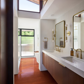
Nestled in the hills of Orinda, California, this 1951 residence is one of only seven extant homes, now known as “The Magnificent Seven”, designed by architect Olof Dahlstrand, a protégé of Frank Lloyd Wright. With its low-slung rooflines, natural materials, and deep integration with the sloping landscape, the home is a pristine example of mid-century modern design inspired by Wright’s organic principles. Over the years, prior homeowners have emphasized preservation, ensuring that the house remained relatively untouched. Each owner has respected the original architecture and stayed true to Dahlstrand’s intent. When a family of five—two college-aged sons and a middle school-aged daughter—acquired the property, they were captivated by its history, legacy of care, and architectural significance. While they appreciated Dahlstrand’s original vision, they also recognized the need to adapt the home for contemporary living while preserving its design integrity.
The remodel was conceived as a thoughtful response to the past—an effort to bring the house into the 21st century without compromising its soul. The primary mandate was to maintain architectural continuity while improving the functionality, comfort, and livability for a modern family. The design team—architects and contractor alike—worked with a shared reverence for the original architecture, allowing that mindset to guide even the most technical or pragmatic decisions.
A key objective was to increase natural light in the kitchen—a departure from Wrightian principles of enclosed, intimate cooking spaces—while maintaining the home’s architectural language. The kitchen was reconfigured to foster a stronger connection to adjacent living spaces while retaining the underlying concept of spatial separation. One of the most transformative architectural changes was the removal of a ridge beam that was originally planned to remain visible through the kitchen. During construction, the team collaborated on a better solution: a wide-flanged steel beam concealed within the roof envelope. This subtle move preserved the clean lines and ceiling continuity, a modern update carried out with utmost respect for the existing framework.
The home’s original powder room, previously accessible only through the kitchen, was relocated for better flow and privacy. A new powder room was carved out of former kitchen cabinetry—a narrow, interior space that could have felt dark and enclosed. To avoid this, the design extended the line of original transom windows into the new powder room and added a skylight above the vanity. The result is a bright and airy space that feels consistent with the rest of the home. Other updates included the installation of new solid-core interior doors with veneers carefully matched to the original mahogany, enhancing the continuity of the interiors. Even smaller decisions, such as placing the door knobs at 42 inches high, mirrored the original proportions. Every choice reflected a shared belief between the architect, contractor, and client: that new work should serve the integrity of the old.
The home’s extensive interior redwood millwork and paneling was meticulously restored. Where new materials were introduced—such as the replacement redwood soffit paneling—the contractor took pains to find finish nails that matched the original, rather than using modern equivalents. This level of craftsmanship and collaboration defined the project. It extended even to the detailing of a blind door to the new powder room, which had to disappear into the existing redwood board-and-batten wall. It was a team effort: the owner found a suitable handle, the architects devised the custom in-swing mechanism, and the contractor executed it so the door aligned precisely with the battens. Throughout, the homeowners were deeply engaged in the design process. One, a meticulous design enthusiast, focused on aesthetic integrity and historic detail. The other brought a practical and function-driven perspective, ensuring that new fixtures and materials would be durable and require minimal maintenance.
While the home’s location posed no major site challenges, sustainability was a key concern. The team upgraded the roof insulation, installed solar panels with battery storage, and added ductless mini-split cooling systems. Lighting was another area where modern technology was woven into a historic framework: new square LED fixtures echo the original custom perimeter soffit lights, maintaining the design language while offering advanced performance.
A planned expansion of a bedroom into suite with a bathroom had to be shelved due to budget constraints and the high cost of below-grade foundation work. Still, the team focused their efforts on making the most of the existing footprint, resolving constraints through design ingenuity rather than adding square footage. This renovation represents a collaborative achievement in preserving and evolving a historically significant home. Every decision was shaped by a shared ethos among clients, architects, and contractor: to maintain the home’s architectural soul while updating it for contemporary life. The result is a timeless modernist residence that continues Olof Dahlstrand’s legacy, remaining grounded in nature, craftsmanship, and human-scale design.
Klopf Architecture Team: John Klopf, AIA, Klara Kevane, Fernanda Bernardes
Interior Architectural Design: Klopf Architecture
Structural Engineer: Daniel Bastiao
Contractor: Don Larwood, Larwood Construction
Photography: Mariko Reed
Year Completed: 2022
 Klopf Architecture
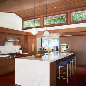
Nestled in the hills of Orinda, California, this 1951 residence is one of only seven extant homes, now known as “The Magnificent Seven”, designed by architect Olof Dahlstrand, a protégé of Frank Lloyd Wright. With its low-slung rooflines, natural materials, and deep integration with the sloping landscape, the home is a pristine example of mid-century modern design inspired by Wright’s organic principles. Over the years, prior homeowners have emphasized preservation, ensuring that the house remained relatively untouched. Each owner has respected the original architecture and stayed true to Dahlstrand’s intent. When a family of five—two college-aged sons and a middle school-aged daughter—acquired the property, they were captivated by its history, legacy of care, and architectural significance. While they appreciated Dahlstrand’s original vision, they also recognized the need to adapt the home for contemporary living while preserving its design integrity.
The remodel was conceived as a thoughtful response to the past—an effort to bring the house into the 21st century without compromising its soul. The primary mandate was to maintain architectural continuity while improving the functionality, comfort, and livability for a modern family. The design team—architects and contractor alike—worked with a shared reverence for the original architecture, allowing that mindset to guide even the most technical or pragmatic decisions.
A key objective was to increase natural light in the kitchen—a departure from Wrightian principles of enclosed, intimate cooking spaces—while maintaining the home’s architectural language. The kitchen was reconfigured to foster a stronger connection to adjacent living spaces while retaining the underlying concept of spatial separation. One of the most transformative architectural changes was the removal of a ridge beam that was originally planned to remain visible through the kitchen. During construction, the team collaborated on a better solution: a wide-flanged steel beam concealed within the roof envelope. This subtle move preserved the clean lines and ceiling continuity, a modern update carried out with utmost respect for the existing framework.
The home’s original powder room, previously accessible only through the kitchen, was relocated for better flow and privacy. A new powder room was carved out of former kitchen cabinetry—a narrow, interior space that could have felt dark and enclosed. To avoid this, the design extended the line of original transom windows into the new powder room and added a skylight above the vanity. The result is a bright and airy space that feels consistent with the rest of the home. Other updates included the installation of new solid-core interior doors with veneers carefully matched to the original mahogany, enhancing the continuity of the interiors. Even smaller decisions, such as placing the door knobs at 42 inches high, mirrored the original proportions. Every choice reflected a shared belief between the architect, contractor, and client: that new work should serve the integrity of the old.
The home’s extensive interior redwood millwork and paneling was meticulously restored. Where new materials were introduced—such as the replacement redwood soffit paneling—the contractor took pains to find finish nails that matched the original, rather than using modern equivalents. This level of craftsmanship and collaboration defined the project. It extended even to the detailing of a blind door to the new powder room, which had to disappear into the existing redwood board-and-batten wall. It was a team effort: the owner found a suitable handle, the architects devised the custom in-swing mechanism, and the contractor executed it so the door aligned precisely with the battens. Throughout, the homeowners were deeply engaged in the design process. One, a meticulous design enthusiast, focused on aesthetic integrity and historic detail. The other brought a practical and function-driven perspective, ensuring that new fixtures and materials would be durable and require minimal maintenance.
While the home’s location posed no major site challenges, sustainability was a key concern. The team upgraded the roof insulation, installed solar panels with battery storage, and added ductless mini-split cooling systems. Lighting was another area where modern technology was woven into a historic framework: new square LED fixtures echo the original custom perimeter soffit lights, maintaining the design language while offering advanced performance.
A planned expansion of a bedroom into suite with a bathroom had to be shelved due to budget constraints and the high cost of below-grade foundation work. Still, the team focused their efforts on making the most of the existing footprint, resolving constraints through design ingenuity rather than adding square footage. This renovation represents a collaborative achievement in preserving and evolving a historically significant home. Every decision was shaped by a shared ethos among clients, architects, and contractor: to maintain the home’s architectural soul while updating it for contemporary life. The result is a timeless modernist residence that continues Olof Dahlstrand’s legacy, remaining grounded in nature, craftsmanship, and human-scale design.
Klopf Architecture Team: John Klopf, AIA, Klara Kevane, Fernanda Bernardes
Interior Architectural Design: Klopf Architecture
Structural Engineer: Daniel Bastiao
Contractor: Don Larwood, Larwood Construction
Photography: Mariko Reed
Year Completed: 2022
 Studio 804
The 722 Ash Street residence consists of a 1500 sf primary house with a contiguous 500 sf accessory dwelling. The project is set in the rich culture of North Lawrence, its rear property line abuts the Lawrence levee trail which runs for nine miles along the north bank of the Kansas River.
North Lawrence is known for its quality soil, large trees, curbless streets and random size parcels before it breaks into larger farms further from the urban center. It is built on the typical orthogonal grid of American development, but it represents the older growth of the city prior to urban planners and zoning regulations. The rumble of freight trains and farm trucks in the shadows of the towering grain elevators are only blocks away. It is home to many who enjoy being only a bridge crossing away from Lawrence’s vibrant downtown but are far enough away to maintain their independence from many of the restrictions on living near the historic district. They can work in their large gardens and toiling in their garages and shops in a manner more rural than urban.
The house on 722 Ash St. is imbued with the character of North Lawrence and the Levee Trail area. The design was inspired by the Midwestern farmstead vernacular of the region. These timeless vernacular qualities house all the accommodations necessary for modern, sustainable living. A unique feature of this house is the Accessory Dwelling Unit permitted in the zoning district. It is a small separate residence on the same lot that can be used for income property or for extended family members. It also supports the city of Lawrence’s goals of increased density close to downtown rather than continued sprawl into the countryside.
The buildings use technology and common-sense design to reduce the building’s footprint and assure the owners low energy use and costs. A 4.9 Kw solar collection system is located on the only south facing gable and the super insulated envelopes (r-62 roof and r-35 walls) of all three forms easily exceeds the standards. Studio 804 continues their long standing pattern of maintaining the highest level of sustainable design while remaining contextually sensitive to the surrounding community. This house, like every Studio 804 project since 2008, is USGBC LEED Platinum Certified.
40