
Search results for "Texture allowing" in Home Design Ideas
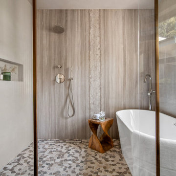

 Dual Concept Design
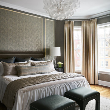
By combining different textures, patterns, and shades of green, this master bedroom feels as good as it looks.
Example of a mid-sized transitional master medium tone wood floor and wallpaper bedroom design in Chicago with multicolored walls
Example of a mid-sized transitional master medium tone wood floor and wallpaper bedroom design in Chicago with multicolored walls
 John Lum Architecture, Inc. AIA
Paul Dyer
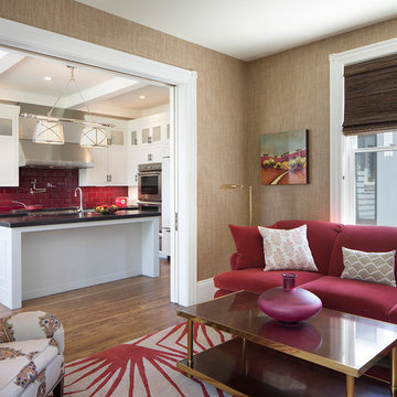
Mid-sized elegant formal and enclosed dark wood floor and brown floor living room photo in San Francisco with white walls, a standard fireplace, a stone fireplace and no tv
Mid-sized elegant formal and enclosed dark wood floor and brown floor living room photo in San Francisco with white walls, a standard fireplace, a stone fireplace and no tv
Find the right local pro for your project

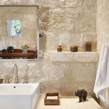
 Ancient Surfaces
Wall Cladding Stone by 'Ancient Surfaces'
Product: Antique 'Mesa' Wall Cladding Stone
Contacts: (212) 461-0245
Email: Sales@ancientsurfaces.com
Website: www.AncientSurfaces.com
The Antique Reclaimed 'Mesa' Limestone Wall Cladding selection is unique in its blend and authenticity, rare in it's hardness and beauty.
Draping your inside and outside walls with the 'Mesa' Stone, gives you a feel of timelessness allowing you to travel back in time into the untouched North Mediterranean domains of fallen Empires and ancient bustling coastal trading villages, where a mercantile class have built some of the most luxurious estates out of the breath taking local stone blocks all along the shoreline of Southern Europe.
This exclusive 'Ancient Surfaces' stone wall cladding blend might just be the missing link needed to transform your home from a logging space to your dream space...
 Storie Collective
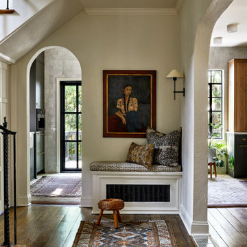
Boho meets Portuguese design in a stunning transformation of this Van Ness tudor in the upper northwest neighborhood of Washington, DC. Our team’s primary objectives were to fill space with natural light, period architectural details, and cohesive selections throughout the main level and primary suite. At the entry, new archways are created to maximize light and flow throughout the main level while ensuring the space feels intimate. A new kitchen layout along with a peninsula grounds the chef’s kitchen while securing its part in the everyday living space. Well-appointed dining and living rooms infuse dimension and texture into the home, and a pop of personality in the powder room round out the main level. Strong raw wood elements, rich tones, hand-formed elements, and contemporary nods make an appearance throughout the newly renovated main level and primary suite of the home.


 Cantoni Irvine
From the street, it’s an impeccably designed English manor. Once inside, the best of that same storied architecture seamlessly meshes with modernism. This blend of styles was exactly the vibe three-decades-running Houston homebuilder Chris Sims, founder and CEO of Sims Luxury Builders, wanted to convey with the $5.2 million show-home in Houston’s coveted Tanglewood neighborhood. “Our goal was to uniquely combine classic and Old World with clean and modern in both the architectural design as well as the interior finishes,” Chris says.
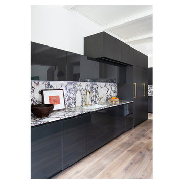
Their aesthetic inspiration is clearly evident in the 8,000-square-foot showcase home’s luxurious gourmet kitchen. It is an exercise in grey and white—and texture. To achieve their vision, the Sims turned to Cantoni. “We had a wonderful experience working with Cantoni several years ago on a client’s home, and were pleased to repeat that success on this project,” Chris says.
Cantoni designer Amy McFall, who was tasked with designing the kitchen, promptly took to the home’s beauty. Situated on a half-acre corner lot with majestic oak trees, it boasts simplistic and elegant interiors that allow the detailed architecture to shine. The kitchen opens directly to the family room, which holds a brick wall, beamed ceilings, and a light-and-bright stone fireplace. The generous space overlooks the outdoor pool. With such a large area to work with, “we needed to give the kitchen its own, intimate feel,” Amy says.
To that end, Amy integrated dark grey, high-gloss lacquer cabinetry from our Atelier Collection. by Aster Cucine with dark grey oak cabinetry, mixing finishes throughout to add depth and texture. Edginess came by way of custom, heavily veined Calacatta Viola marble on both the countertops and backsplash.
The Sims team, meanwhile, insured the layout lent itself to minimalism. “With the inclusion of the scullery and butler’s pantry in the design, we were able to minimize the storage needed in the kitchen itself,” Chris says. “This allowed for the clean, minimalist cabinetry, giving us the creative freedom to go darker with the cabinet color and really make a bold statement in the home.”
It was exactly the look they wanted—textural and interesting. “The juxtaposition of ultra-modern kitchen cabinetry and steel windows set against the textures of the wood floors, interior brick, and trim detailing throughout the downstairs provided a fresh take on blending classic and modern,” Chris says. “We’re thrilled with the result—it is showstopping.”
They were equally thrilled with the design process. “Amy was incredibly responsive, helpful and knowledgeable,” Chris says. “It was a pleasure working with her and the entire Cantoni team.”
Check out the kitchen featured in Modern Luxury Interiors Texas’ annual “Ode to Texas Real Estate” here.
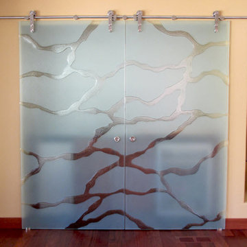
 Cast Glass Images Inc.
Cast Glass privacy screens add character and can still make an impression. The texture and design of glass screens utilizing cast glass can be dramatic or simple - both options can still provide the desired privacy. Featured texture is a combination of two textures "Sand" and "Brushed" on clear glass with a frosted finish.
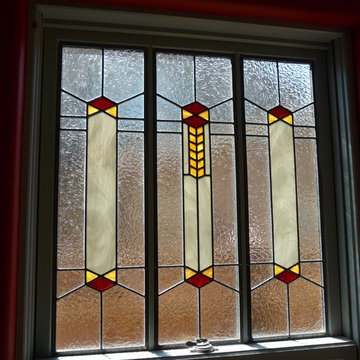
 John Joy Art Glass Studio
John Joy created this top panel to a double hug window to obscure the home next door and highlight the color of the boys room. The textured clear glass back ground glass allow plenty of light to flood the room.
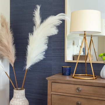
 Amanda V Interiors
We had so much fun with this project! The client wanted a bedroom refresh as they had not done much to it since they had moved in 5 years ago. As a space you are in every single night (and day!), your bedroom should be a place where you can relax and enjoy every minute. We worked with the clients favorite color (navy!) to create a beautiful blue grasscloth textured wall behind their bed to really make their furniture pop and add some dimension to the room. New lamps in their favorite finish (gold!) were added to create additional lighting moments when the shades go down. Adding beautiful sheer window treatments allowed the clients to keep some softness in the room even when the blackout shades were down. Fresh bedding and some new accessories were added to complete the room.
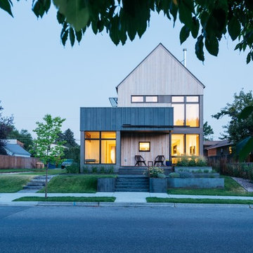
 Intrinsik Architecture
Small scandinavian multicolored two-story wood house exterior idea with a clipped gable roof and a shingle roof
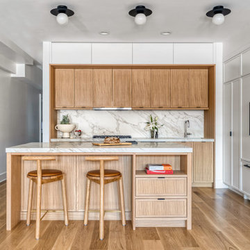
 Comstock Home Renovations LLC
Example of a trendy l-shaped medium tone wood floor and brown floor kitchen design in New York with an undermount sink, shaker cabinets, medium tone wood cabinets, white backsplash, stone slab backsplash, paneled appliances, an island and white countertops
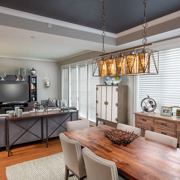

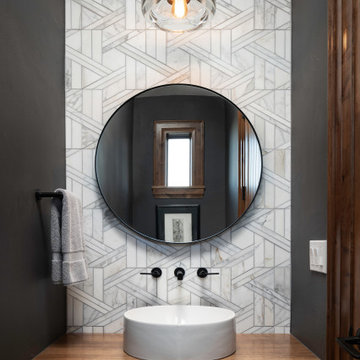
 Rodwin Architecture & Skycastle Construction
Rodwin Architecture & Skycastle Homes
Location: Boulder, Colorado, USA
Interior design, space planning and architectural details converge thoughtfully in this transformative project. A 15-year old, 9,000 sf. home with generic interior finishes and odd layout needed bold, modern, fun and highly functional transformation for a large bustling family. To redefine the soul of this home, texture and light were given primary consideration. Elegant contemporary finishes, a warm color palette and dramatic lighting defined modern style throughout. A cascading chandelier by Stone Lighting in the entry makes a strong entry statement. Walls were removed to allow the kitchen/great/dining room to become a vibrant social center. A minimalist design approach is the perfect backdrop for the diverse art collection. Yet, the home is still highly functional for the entire family. We added windows, fireplaces, water features, and extended the home out to an expansive patio and yard.
The cavernous beige basement became an entertaining mecca, with a glowing modern wine-room, full bar, media room, arcade, billiards room and professional gym.
Bathrooms were all designed with personality and craftsmanship, featuring unique tiles, floating wood vanities and striking lighting.
This project was a 50/50 collaboration between Rodwin Architecture and Kimball Modern
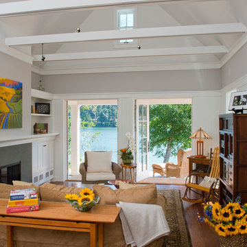
 BC&J Architecture
The Back Bay House is comprised of two main structures, a nocturnal wing and a daytime wing, joined by a glass gallery space. The daytime wing maintains an informal living arrangement that includes the dining space placed in an intimate alcove, a large country kitchen and relaxing seating area which opens to a classic covered porch and on to the water’s edge. The nocturnal wing houses three bedrooms. The master at the water side enjoys views and sounds of the wildlife and the shore while the two subordinate bedrooms soak in views of the garden and neighboring meadow.
To bookend the scale and mass of the house, a whimsical tower was included to the nocturnal wing. The tower accommodates flex space for a bunk room, office or studio space. Materials and detailing of this house are based on a classic cottage vernacular language found in these sorts of buildings constructed in pre-war north america and harken back to a simpler time and scale. Eastern white cedar shingles, white painted trim and moulding collectively add a layer of texture and richness not found in today’s lexicon of detail. The house is 1,628 sf plus a 228 sf tower and a detached, two car garage which employs massing, detail and scale to allow the main house to read as dominant but not overbearing.
Designed by BC&J Architecture.
 Laney LA, Inc.
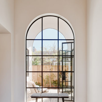
Rather than starting with an outcome in mind, this 1,400 square foot residence began from a polemic place - exploring shared conviction regarding the concentrated power of living with a smaller footprint. From the gabled silhouette to passive ventilation, the home captures the nostalgia for the past with the sustainable practices of the future.
While the exterior materials contrast a calm, minimal palette with the sleek lines of the gabled silhouette, the interior spaces embody a playful, artistic spirit. From the hand painted De Gournay wallpaper in the master bath to the rugged texture of the over-grouted limestone and Portuguese cobblestones, the home is an experience that encapsulates the unexpected and the timeless.
 TKS Design Group
Download our free ebook, Creating the Ideal Kitchen. DOWNLOAD NOW
Lakefront property in the northwest suburbs of Chicago is hard to come by, so when we were hired by this young family with exactly that, we were immediately inspired by not just the unusually large footprint of this 1950’s colonial revival but also the lovely views of the manmade lake it was sited on. The large 5-bedroom home was solidly stuck in the 1980’s, but we saw tons of potential. We started out by updating the existing staircase with a fresh coat of paint and adding new herringbone slate to the entry hall.
The powder room off the entryway also got a refresh - new flooring, new cabinets and fixtures. We ran the new slate right through into this space for some consistency. A fun wallpaper and shiplap trim add a welcoming feel and set the tone for the home.
Next, we tackled the kitchen. Located away from the rest of the first floor, the kitchen felt a little isolated, so we immediately began planning for how to better connect it to the rest of the first floor. We landed on removing the wall between the kitchen and dining room and designed a modified galley style space with separate cooking and clean up zones. The cooking zone consists of the refrigerator, prep sink and cooktop, along with a nice long run of prep space at the island. The cleanup side of the kitchen consists of the main sink and dishwasher. Both areas are situated so that the user can view the lake during prep work and cleanup!
One of the home’s main puzzles was how to incorporate the mudroom and area in front of the patio doors at the back of the house. We already had a breakfast table area, so the space by the patio doors was a bit of a no man’s land. We decided to separate the kitchen proper from what became the new mudroom with a large set of barn doors. That way you can quickly hide any mudroom messes but have easy access to the light coming in through the patio doors as well as the outdoor grilling station. We also love the impact the barn doors add to the overall space.
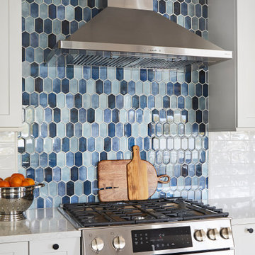
The homeowners’ first words to us were “it’s time to ditch the brown,” so we did! We chose a lovely blue pallet that reflects the home’s location on the lake which is also vibrant yet easy on the eye. Countertops are white quartz, and the natural oak floor works well with the other honey accents. The breakfast table was given a refresh with new chairs, chandelier and window treatments that frame the gorgeous views of the lake out the back.
We coordinated the slate mudroom flooring with that used in the home’s main entrance for a consistent feel. The storage area consists of open and closed storage to allow for some clutter control as needed.
Next on our “to do” list was revamping the dated brown bar area in the neighboring dining room. We eliminated the clutter by adding some closed cabinets and did some easy updates to help the space feel more current. One snag we ran into here was the discovery of a beam above the existing open shelving that had to be modified with a smaller structural beam to allow for our new design to work. This was an unexpected surprise, but in the end we think it was well worth it!
We kept the colors here a bit more muted to blend with the homeowner’s existing furnishings. Open shelving and polished nickel hardware add some simple detail to the new entertainment zone which also looks out onto the lake!
Next we tackled the upstairs starting with the homeowner’s son’s bath. The bath originally had both a tub shower and a separate shower, so we decided to swap out the shower for a new laundry area. This freed up some space downstairs in what used to be the mudroom/laundry room and is much more convenient for daily laundry needs.
We continued the blue palette here with navy cabinetry and the navy tile in the shower. Porcelain floor tile and chrome fixtures keep maintenance to a minimum while matte black mirrors and lighting add some depth the design. A low maintenance runner adds some warmth underfoot and ties the whole space together.
We added a pocket door to the bathroom to minimize interference with the door swings. The left door of the laundry closet is on a 180 degree hinge to allow for easy full access to the machines. Next we tackled the master bath which is an en suite arrangement. The original was typical of the 1980’s with the vanity outside of the bathroom, situated near the master closet. And the brown theme continued here with multiple shades of brown.
Our first move was to segment off the bath and the closet from the master bedroom. We created a short hall from the bedroom to the bathroom with his and hers walk-in closets on the left and right as well as a separate toilet closet outside of the main bathroom for privacy and flexibility.
The original bathroom had a giant soaking tub with steps (dangerous!) as well as a small shower that did not work well for our homeowner who is 6’3”. With other bathtubs in the home, they decided to eliminate the tub and create an oversized shower which takes up the space where the old tub was located. The double vanity is on the opposite wall and a bench is located under the window for morning conversations and a place to set a couple of towels.
The pallet in here is light and airy with a mix of blond wood, creamy porcelain and marble tile, and brass accents. A simple roman shade adds some texture and it’s top-down mechanism allows for light and privacy.
This large whole house remodel gave our homeowners not only the ability to maximize the potential of their home but also created a lovely new frame from which to view their fabulous lake views.
Designed by: Susan Klimala, CKD, CBD
Photography by: Michael Kaskel
For more information on kitchen and bath design ideas go to: www.kitchenstudio-ge.com
Sponsored
Sunbury, OH

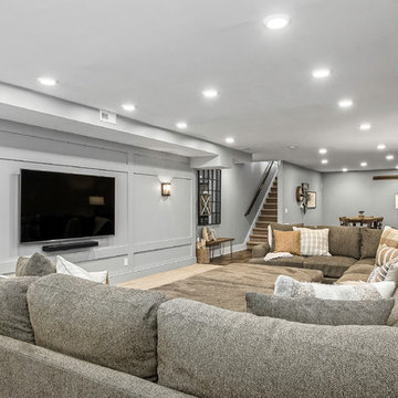
J.Holderby - Renovations
Franklin County's Leading General Contractors - 2X Best of Houzz!
 Balestri Architects
This project combines two existing studio apartments into a compact 800 sqft. live/work space for a young professional couple in the heart of Chelsea, New York.
The design required some creative space planning to meet the Owner’s requested program for an open plan solution with a private master bedroom suite and separate study that also allowed for entertaining small parties, including the ability to provide a sleeping space for guests.
The solution was to identify areas of overlap within the program that could be addressed with dual-function custom millwork pieces. A bar-stool counter at the open kitchen folds out to become a bench and dining table for formal entertaining. A custom desk folds down with a murphy bed to convert a private study into a guest bedroom area. A series of pocket door connecting the spaces provide both privacy to the master bedroom area when closed, and the option for a completely open layout when opened.
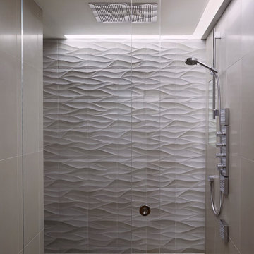
A carefully selected material palette brings a warm, tranquil feel to the space. Reclaimed teak floors run seamlessly through the main spaces to accentuate the open layout. Warm gray lacquered millwork, Centaurus granite slabs, and custom oxidized stainless steel details, give an elegant counterpoint to the natural teak floors. The master bedroom suite and study feature custom Afromosia millwork. The bathrooms are finished with cool toned ceramic tile, custom Afromosia vanities, and minimalist chrome fixtures. Custom LED lighting provides dynamic, energy efficient illumination throughout.
Photography: Mikiko Kikuyama

 Ashton Renovations
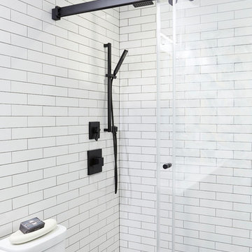
The original ensuite bathroom in this condominium required renovations to replace problematic Kitec plumbing. The layout in the space remained the same, but improvements were made to address certain design challenges with lighting, automation, and space. The aim was to create a modern bathroom design with textured wood features, and the feel of metallic black accents.
A number of prominent changes were made to improve the use of space. The original entry, a left-handed door swinging into the bathroom, was replaced. It interfered with the vanity clear floor space. It also made the use of the bathroom difficult when two users were present. It was changed to a soft closing pocket door. To avoid losing space it was installed by creating a wall cavity on the outside of the bathroom. This door also included frosted glass panels to allow natural light into the space. Double sliding glass shower doors were also installed to address access issues to the shower valve.
Storage improvements included the installation of dual inset medicine cabinets, and pull out drawers within the wall hung vanity. The depth of the medicine cabinets were extended outwards, and this nice detail was finished with a textured wood finish. The addition of the wall hung vanity also created the feeling of more space beneath the units and allowed for under cabinet lighting.
Lighting and automation improvements included the addition of HUE LED lighting. This was done by installing two shower pot lights, a 6” main potlight, and under cabinet lighting. These are all controlled by the Philips Hue App that programs routines, scenes, and other settings.
Some of the other highlights of this modern bathroom include dark grout, which contrasts nicely with the elongated white tile, a thermostatic shower system, herringbone textured porcelain floor tile, and a Schluter Kerdi waterproofing shower system. This bathroom is made most unique though with the choice of wallpaper, which can be described as modern luxury, a graphic take on agate stone patterns with metallic embellishments.
32