
Search results for "Texture allowing" in Home Design Ideas
 Jordan Design Build Group
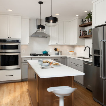
The kitchen was at the top of the list for a total overhaul – the worn oak cabinets, dated appliances, and clunky layout all had to go. Removing the decorative soffits allowed us to take the new cabinetry all the way to the ceiling, adding functional storage and visually extending the room’s height. We reconfigured the layout from a modified U to an L-shape which accomplished several things – it opened up the kitchen to the dining room, redirected circulation, and most importantly, created space for an island. A brand new pantry was created for overflow food storage, bulk items, occasional dishware and small appliances, ensuring that our client’s goal of uncluttered countertops was achievable.
The finish selections and clean lines give a nod to the home’s mid-century bones. The wood island provides warmth and the light quartz countertops, textured backsplash and white cabinets keep the kitchen feeling light and bright. We opted to install open shelving above the sink which provides display space and needed storage without the bulkiness of an overhead cabinet. The matte black faucet, hardware and decorative pendants add another level of visual interest to the modern kitchen. To unify the kitchen and dining room, we replaced the drab kitchen flooring with select red oak hardwoods that were expertly installed and refinished to match the gorgeous wood flooring throughout the home.
 Jaffe Architecture
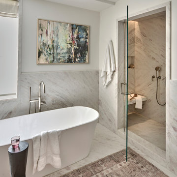
A serene primary bathroom wrapped in bookmatched marble creates a spa-like retreat in this reimagined Lincoln Park duplex. The freestanding soaking tub and walk-in shower with cantilevered bench offer a refined balance of sculptural form and everyday comfort. Subtle layering—textural rug, abstract artwork, and minimal fixtures—elevates the space with quiet luxury.
Find the right local pro for your project
 Jordan Design Build Group
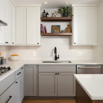
The kitchen was at the top of the list for a total overhaul – the worn oak cabinets, dated appliances, and clunky layout all had to go. Removing the decorative soffits allowed us to take the new cabinetry all the way to the ceiling, adding functional storage and visually extending the room’s height. We reconfigured the layout from a modified U to an L-shape which accomplished several things – it opened up the kitchen to the dining room, redirected circulation, and most importantly, created space for an island. A brand new pantry was created for overflow food storage, bulk items, occasional dishware and small appliances, ensuring that our client’s goal of uncluttered countertops was achievable.
The finish selections and clean lines give a nod to the home’s mid-century bones. The wood island provides warmth and the light quartz countertops, textured backsplash and white cabinets keep the kitchen feeling light and bright. We opted to install open shelving above the sink which provides display space and needed storage without the bulkiness of an overhead cabinet. The matte black faucet, hardware and decorative pendants add another level of visual interest to the modern kitchen. To unify the kitchen and dining room, we replaced the drab kitchen flooring with select red oak hardwoods that were expertly installed and refinished to match the gorgeous wood flooring throughout the home.
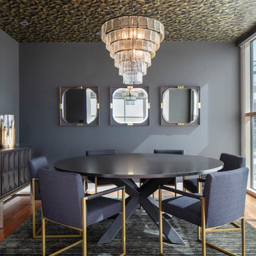
 Lauren Allyn Interiors
Photography: Fine Focus Photography, Tre Dunham
Inspiration for a mid-sized contemporary medium tone wood floor and brown floor enclosed dining room remodel in Austin with black walls and no fireplace
Inspiration for a mid-sized contemporary medium tone wood floor and brown floor enclosed dining room remodel in Austin with black walls and no fireplace
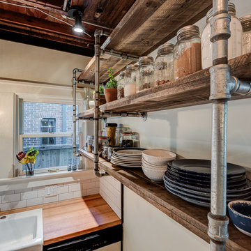
 Darcy Bean Custom Construction Inc.
The floating gas pipe shelves are a great way of bringing industrial beauty to the kitchen while expanding the available shelf space! Apron front sink adds a layer of depth, functionality and design. White subway tile allows for clean lines and butcher block countertops draws all the raw elements together.
Buras Photography
#beauty #design #space #gas #subwaytile #butchersblock #thekitchen #floating #expanding #apron #depth #functionality #countertops #pipes #layers #float #bring #sink #addition #shelves #elements
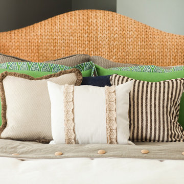
 Melissa Hill Home Design
This client was so much fun to design for. Their project was all about color, texture and creating a master bedroom and guest bedroom that compliments their passion for traveling and eclectic style. We created a seating area in the master bedroom where the family can gather at night to read and spend time quality time. Their desire for deep color and bold pattern allowed us to create a casual space that is both warm and inviting at the end of a long day. Guests often visit and stay for a bit. They wanted to give their family and friends the same cozy feel in their guest bedroom. We were able to use a combination of patterns, textures and colors with our custom-made bedding and pillows. We also love to repurpose where we can and painted furniture is a great place to start. The depth of color used here is a true reflection of our clients' warm and friendly personality that says "welcome to our home."
Custom designed by Hartley and Hill Design
All materials and furnishings in this space are available through Hartley and Hill Design. www.hartleyandhilldesign.com
888-639-0639
Neil Landino Photography

Sponsored
Columbus, OH
Free consultation for landscape design!

Peabody Landscape Group
Columbus' Reliable Landscape Design & Contracting
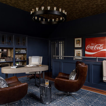
 JK interior living
Raquel Langworthy
Inspiration for a mid-sized eclectic freestanding desk dark wood floor and brown floor study room remodel in New York with blue walls and no fireplace
Inspiration for a mid-sized eclectic freestanding desk dark wood floor and brown floor study room remodel in New York with blue walls and no fireplace
 Tays & Co. Design Studios
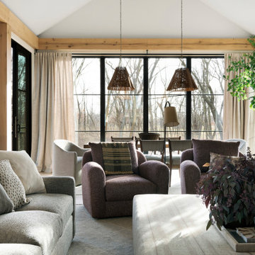
Living room - cottage open concept light wood floor, beige floor and vaulted ceiling living room idea in Minneapolis with white walls
 TKS Design Group
Download our free ebook, Creating the Ideal Kitchen. DOWNLOAD NOW
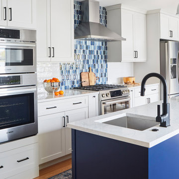
Lakefront property in the northwest suburbs of Chicago is hard to come by, so when we were hired by this young family with exactly that, we were immediately inspired by not just the unusually large footprint of this 1950’s colonial revival but also the lovely views of the manmade lake it was sited on. The large 5-bedroom home was solidly stuck in the 1980’s, but we saw tons of potential. We started out by updating the existing staircase with a fresh coat of paint and adding new herringbone slate to the entry hall.
The powder room off the entryway also got a refresh - new flooring, new cabinets and fixtures. We ran the new slate right through into this space for some consistency. A fun wallpaper and shiplap trim add a welcoming feel and set the tone for the home.
Next, we tackled the kitchen. Located away from the rest of the first floor, the kitchen felt a little isolated, so we immediately began planning for how to better connect it to the rest of the first floor. We landed on removing the wall between the kitchen and dining room and designed a modified galley style space with separate cooking and clean up zones. The cooking zone consists of the refrigerator, prep sink and cooktop, along with a nice long run of prep space at the island. The cleanup side of the kitchen consists of the main sink and dishwasher. Both areas are situated so that the user can view the lake during prep work and cleanup!
One of the home’s main puzzles was how to incorporate the mudroom and area in front of the patio doors at the back of the house. We already had a breakfast table area, so the space by the patio doors was a bit of a no man’s land. We decided to separate the kitchen proper from what became the new mudroom with a large set of barn doors. That way you can quickly hide any mudroom messes but have easy access to the light coming in through the patio doors as well as the outdoor grilling station. We also love the impact the barn doors add to the overall space.
The homeowners’ first words to us were “it’s time to ditch the brown,” so we did! We chose a lovely blue pallet that reflects the home’s location on the lake which is also vibrant yet easy on the eye. Countertops are white quartz, and the natural oak floor works well with the other honey accents. The breakfast table was given a refresh with new chairs, chandelier and window treatments that frame the gorgeous views of the lake out the back.
We coordinated the slate mudroom flooring with that used in the home’s main entrance for a consistent feel. The storage area consists of open and closed storage to allow for some clutter control as needed.
Next on our “to do” list was revamping the dated brown bar area in the neighboring dining room. We eliminated the clutter by adding some closed cabinets and did some easy updates to help the space feel more current. One snag we ran into here was the discovery of a beam above the existing open shelving that had to be modified with a smaller structural beam to allow for our new design to work. This was an unexpected surprise, but in the end we think it was well worth it!
We kept the colors here a bit more muted to blend with the homeowner’s existing furnishings. Open shelving and polished nickel hardware add some simple detail to the new entertainment zone which also looks out onto the lake!
Next we tackled the upstairs starting with the homeowner’s son’s bath. The bath originally had both a tub shower and a separate shower, so we decided to swap out the shower for a new laundry area. This freed up some space downstairs in what used to be the mudroom/laundry room and is much more convenient for daily laundry needs.
We continued the blue palette here with navy cabinetry and the navy tile in the shower. Porcelain floor tile and chrome fixtures keep maintenance to a minimum while matte black mirrors and lighting add some depth the design. A low maintenance runner adds some warmth underfoot and ties the whole space together.
We added a pocket door to the bathroom to minimize interference with the door swings. The left door of the laundry closet is on a 180 degree hinge to allow for easy full access to the machines. Next we tackled the master bath which is an en suite arrangement. The original was typical of the 1980’s with the vanity outside of the bathroom, situated near the master closet. And the brown theme continued here with multiple shades of brown.
Our first move was to segment off the bath and the closet from the master bedroom. We created a short hall from the bedroom to the bathroom with his and hers walk-in closets on the left and right as well as a separate toilet closet outside of the main bathroom for privacy and flexibility.
The original bathroom had a giant soaking tub with steps (dangerous!) as well as a small shower that did not work well for our homeowner who is 6’3”. With other bathtubs in the home, they decided to eliminate the tub and create an oversized shower which takes up the space where the old tub was located. The double vanity is on the opposite wall and a bench is located under the window for morning conversations and a place to set a couple of towels.
The pallet in here is light and airy with a mix of blond wood, creamy porcelain and marble tile, and brass accents. A simple roman shade adds some texture and it’s top-down mechanism allows for light and privacy.
This large whole house remodel gave our homeowners not only the ability to maximize the potential of their home but also created a lovely new frame from which to view their fabulous lake views.
Designed by: Susan Klimala, CKD, CBD
Photography by: Michael Kaskel
For more information on kitchen and bath design ideas go to: www.kitchenstudio-ge.com
 Cantoni Irvine
From the street, it’s an impeccably designed English manor. Once inside, the best of that same storied architecture seamlessly meshes with modernism. This blend of styles was exactly the vibe three-decades-running Houston homebuilder Chris Sims, founder and CEO of Sims Luxury Builders, wanted to convey with the $5.2 million show-home in Houston’s coveted Tanglewood neighborhood. “Our goal was to uniquely combine classic and Old World with clean and modern in both the architectural design as well as the interior finishes,” Chris says.
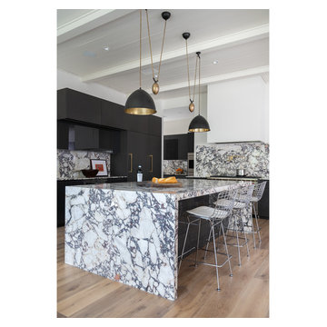
Their aesthetic inspiration is clearly evident in the 8,000-square-foot showcase home’s luxurious gourmet kitchen. It is an exercise in grey and white—and texture. To achieve their vision, the Sims turned to Cantoni. “We had a wonderful experience working with Cantoni several years ago on a client’s home, and were pleased to repeat that success on this project,” Chris says.
Cantoni designer Amy McFall, who was tasked with designing the kitchen, promptly took to the home’s beauty. Situated on a half-acre corner lot with majestic oak trees, it boasts simplistic and elegant interiors that allow the detailed architecture to shine. The kitchen opens directly to the family room, which holds a brick wall, beamed ceilings, and a light-and-bright stone fireplace. The generous space overlooks the outdoor pool. With such a large area to work with, “we needed to give the kitchen its own, intimate feel,” Amy says.
To that end, Amy integrated dark grey, high-gloss lacquer cabinetry from our Atelier Collection. by Aster Cucine with dark grey oak cabinetry, mixing finishes throughout to add depth and texture. Edginess came by way of custom, heavily veined Calacatta Viola marble on both the countertops and backsplash.
The Sims team, meanwhile, insured the layout lent itself to minimalism. “With the inclusion of the scullery and butler’s pantry in the design, we were able to minimize the storage needed in the kitchen itself,” Chris says. “This allowed for the clean, minimalist cabinetry, giving us the creative freedom to go darker with the cabinet color and really make a bold statement in the home.”
It was exactly the look they wanted—textural and interesting. “The juxtaposition of ultra-modern kitchen cabinetry and steel windows set against the textures of the wood floors, interior brick, and trim detailing throughout the downstairs provided a fresh take on blending classic and modern,” Chris says. “We’re thrilled with the result—it is showstopping.”
They were equally thrilled with the design process. “Amy was incredibly responsive, helpful and knowledgeable,” Chris says. “It was a pleasure working with her and the entire Cantoni team.”
Check out the kitchen featured in Modern Luxury Interiors Texas’ annual “Ode to Texas Real Estate” here.
 Crystal Kitchen + Bath
The homeowners were very concerned about over-improving their modest split-level home built in 1961. They liked the “mid-century modern” feel and wanted to enhance that vibe. Top on their wish list was to replace the portable dishwasher with a built-in and add a peninsula for seating and workspace. To keep the labor cost down, the soffits and existing ceiling lighting was left intact. The first option was to keep the existing cabinets; however, the original layout did not allow adequate counter space on either side of the cooktop. After considered the price of new cabinets, they realized the value of having a brand new kitchen.
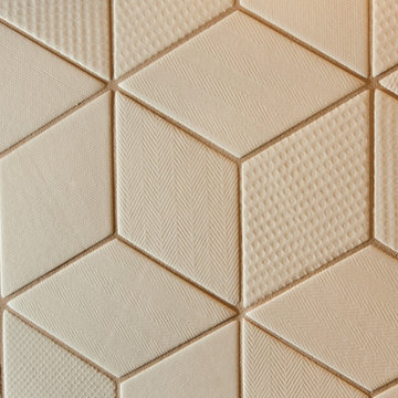
The fun begins in the design phase. We chose the horizontal grain laminate to blend with the color of the existing woodwork in the home. The textured rhomboid shaped tile steals the show when accented with contrasting grout. The kitchen is a little mod and a little hip. And fits in perfectly as today’s “mid-century modern” home.
 TVL Creative Ltd.
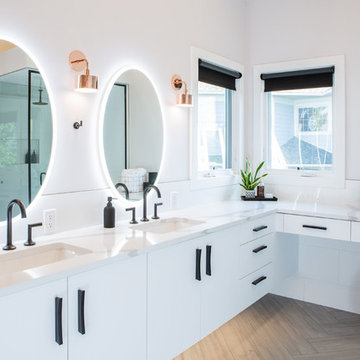
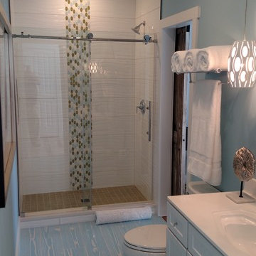
Our clients were looking to erase the 90s from their master bathroom and create a space that blended their contemporary tastes with natural elements. This bathroom had wonderful bones with a high ceiling and plenty of space, but we were able to work with our clients to create a design that better met their needs and utilized the space to its full potential. We wanted to create a sense of warmth in this large master bathroom and adding a fireplace to the space did the trick. By moving the tub location, we were able to create a stunning accent wall of stacked stone that provided a home for the fireplace and a perfectly dramatic backdrop for the new freestanding bathtub. The sculptural copper light fixture helps to soften the stone wall and allowed us to emphasize those vaulted ceiling. Playing with metal finishes is one of our favorite pastimes, and this bathroom was the perfect opportunity to blend sleek matte black plumbing fixtures with a mirrored copper finish on the light fixtures. We tied the vanity wall sconces in with a dramatic sculptural chandelier above the bath tub by using copper finishes on both and allowing the light fixtures to be the shining stars of this space. We selected a clean white finish for the custom vanity cabinets and lit them from below to accentuate their floating design. We then completed the look with a waterfall quartz counter to add an elegant texture to the area and extended the stone onto the shower bench to bring the two elements together. The existing shower had been on the small side, so we expanded it into the room and gave them a more spacious shower complete with a built-in bench and recessed niche. Hard surfaces play an important role in any bathroom design, and we wanted to use this opportunity to create an interesting layer of texture through our tile selections. The bathroom floor utilizes a large-scale plank tile installed in a herringbone pattern, while the shower and walls are tiled in a polished white tile to add a bit of reflectivity. The newly transformed bathroom is now a sophisticated space the brings together sleek contemporary finishes with textured natural elements and provides the perfect retreat from the outside world.

 Alicia Torosian Design
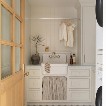
Located in Newport Beach’s coveted Port Streets, this family home was taken down to the studs and completely reimagined to create a layered, detail-rich forever home. We expanded key living spaces — including the kitchen and primary bathroom — to enhance both functionality and everyday luxury.
Throughout the home, thoughtfully curated moments bring personality and warmth. From the beautifully wallpapered dining room to the checkerboard marble laundry room, each space was designed to feel timeless yet distinctive. Living spaces and bathrooms were individually styled using a cohesive palette of blues, greens, and warm browns — creating a sense of flow while allowing each room its own identity.
The result is a thoughtfully tailored home that blends classic design with family-centered living in one of Newport Beach’s most beloved neighborhoods. This home was featured in the 2026 Corona del Mar Home Tour.
 Inspired Closets of Charleston
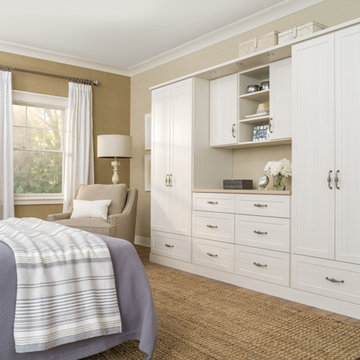
Inspiration for a mid-sized timeless master laminate floor and brown floor bedroom remodel in Charleston with beige walls
 Laney LA, Inc.
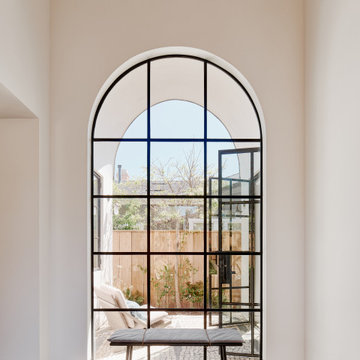
Rather than starting with an outcome in mind, this 1,400 square foot residence began from a polemic place - exploring shared conviction regarding the concentrated power of living with a smaller footprint. From the gabled silhouette to passive ventilation, the home captures the nostalgia for the past with the sustainable practices of the future.
While the exterior materials contrast a calm, minimal palette with the sleek lines of the gabled silhouette, the interior spaces embody a playful, artistic spirit. From the hand painted De Gournay wallpaper in the master bath to the rugged texture of the over-grouted limestone and Portuguese cobblestones, the home is an experience that encapsulates the unexpected and the timeless.
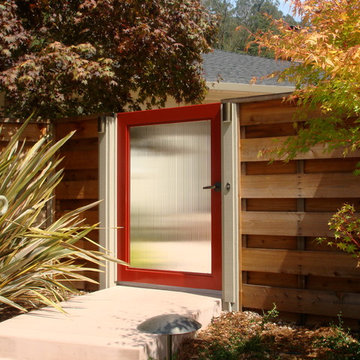
This is an example of a large contemporary partial sun front yard concrete paver garden path in San Francisco for summer.
Sponsored
Columbus, OH
Free consultation for landscape design!
Peabody Landscape Group
Columbus' Reliable Landscape Design & Contracting
 Flooret
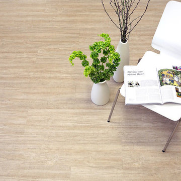
Spacious, cool, open. An abstract mix of stone and wood, Caliza allows the imagination to run and chase new horizons. The light color opens spaces and is the antithesis of “busy”.
The most important specification for determining the durability of vinyl flooring is the thickness of the wear-layer. The best wear-layers are made of thick, clear virgin PVC, which covers the paper print-film that gives the floor its unique appearance. Once the wear-layer wears through, the paper is damaged and the floor will need replacement.
Most vinyl floors come with a 8-12 mil wear-layer (0.2-3 mm). The top commercial specs in the industry are higher, at 20-22 mil (0.5 mm). A select few manufacturers offer a “super” commercial spec of 28 mil (0.7 mm).
For Modin, we decided to set a new standard: 40 mil (1.0 mm) of premium virgin PVC. This allows us to offer an industry-leading 20 year Commercial Warranty (Lifetime Residential), compared to nearly all other commercial vinyl floors’ 10 year Commercial Warranty.
Beyond our superior wear-layer, we also use a patented click mechanism for superior hold, and a ceramic-bead coating.
SIZE MATTERS
Wider and longer planks create a sense of space and luxury. Most vinyl floors come in 6” or 7” widths, and 36” or 48” lengths.
For Modin, we designed our planks to be 9” wide, and 60” long. This extra large size allows our gorgeous designs to be fully expressed.
DETAILS THAT COUNT
We made sure to get all the details right. Real texture, to create the feel of wire-brushed wood. Low sheen level, to ensure a natural look that wears well over time. 4-sided bevels, to more accurately emulate the look of real planks. When added together they help create the unique look that is Modin.
DESIGNS THAT INSPIRE
We spent nearly a year just focusing on our designs, to ensure they provide the right mix of color and depth. Focusing on timeless wire-brush and European Oak styles, as well as more contemporary modern washes, our collection offers truly beautiful design that is both functional and inspiring.
 Flooret
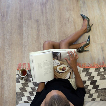
Discerning, intelligent, European. A staff favorite, Noret captures the depth of color and texture that is expected with premium European Oak. A slight tan with a whitewash brush, Noret provides a luxurious template for any refined space.
The most important specification for determining the durability of vinyl flooring is the thickness of the wear-layer. The best wear-layers are made of thick, clear virgin PVC, which covers the paper print-film that gives the floor its unique appearance. Once the wear-layer wears through, the paper is damaged and the floor will need replacement.
Most vinyl floors come with a 8-12 mil wear-layer (0.2-3 mm). The top commercial specs in the industry are higher, at 20-22 mil (0.5 mm). A select few manufacturers offer a “super” commercial spec of 28 mil (0.7 mm).
For Modin, we decided to set a new standard: 40 mil (1.0 mm) of premium virgin PVC. This allows us to offer an industry-leading 20 year Commercial Warranty (Lifetime Residential), compared to nearly all other commercial vinyl floors’ 10 year Commercial Warranty.
Beyond our superior wear-layer, we also use a patented click mechanism for superior hold, and a ceramic-bead coating.
SIZE MATTERS
Wider and longer planks create a sense of space and luxury. Most vinyl floors come in 6” or 7” widths, and 36” or 48” lengths.
For Modin, we designed our planks to be 9” wide, and 60” long. This extra large size allows our gorgeous designs to be fully expressed.
DETAILS THAT COUNT
We made sure to get all the details right. Real texture, to create the feel of wire-brushed wood. Low sheen level, to ensure a natural look that wears well over time. 4-sided bevels, to more accurately emulate the look of real planks. When added together they help create the unique look that is Modin.
DESIGNS THAT INSPIRE
We spent nearly a year just focusing on our designs, to ensure they provide the right mix of color and depth. Focusing on timeless wire-brush and European Oak styles, as well as more contemporary modern washes, our collection offers truly beautiful design that is both functional and inspiring.
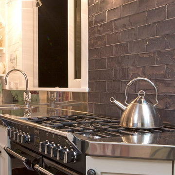
 Kitchen Architecture Ltd
A neutral, organic colour palette was chosen to open up the space, punctuated only by the jet-black stove against dark tiles. The dark tones of the stove ‘block’ heighten the low ceiling and imitates the retained fireplace and blackboard.
Photographer: Tony Gatman
Auckland, New Zealand.
33