
Search results for "Thrilling" in Home Design Ideas
 Williams Contracting, Inc.
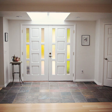
Inspiration for a small zen slate floor and multicolored floor entryway remodel in Seattle with white walls and a white front door
 Edge
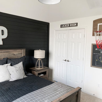
EdgeWe collaborated with Interior Specialist, Aspen Vanhoorebeck from @acozyblessednest, in her teenage boy's bedroom redesign.
Originally Aspen’s 16-year-old son wanted all-black painted bedroom walls. Not especially thrilled on the dark color choice (she hoped the room would easily transition into a guest room when he went to college), Aspen looked for another option. When she found our smooth Timeless Nickel Gap Midnight Black shiplap, she and her son were able to reach a happy medium.
At the end of her project, Aspen shared, "We loved working with UFP-Edge to put the black nickel gap shiplap in my son's room. My favorite part is that it comes pre-cut to fit the wall. It made the project easy enough for anyone to do! Not only do I love it, but my son does too! We’ve gotten so many compliments. I can’t wait for the next project!"
Our UFP-Edge Timeless nickel gap shiplap adds incredible character to any space with its sleek lines and clean finish. The lasting appeal of smooth shiplap provides the perfect design element for a variety of design styles, including both modern farmhouse and transitional. Take your interior design to the next level by installing Timeless shiplap for added dimension and character.
 Stanton Homes
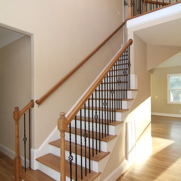
Hardwood staircases are often more popular when located in a central traffic area, such as the foyer.
Mid-sized transitional wooden straight staircase photo in Raleigh with painted risers
Mid-sized transitional wooden straight staircase photo in Raleigh with painted risers
Find the right local pro for your project
 Kathleen Jennison
An Arts & Crafts Bungalow is one of my favorite styles of homes. We have quite a few of them in our Stockton Mid-Town area. And when C&L called us to help them remodel their 1923 American Bungalow, I was beyond thrilled.
As per usual, when we get a new inquiry, we quickly Google the project location while we are talking to you on the phone. My excitement escalated when I saw the Google Earth Image of the sweet Sage Green bungalow in Mid-Town Stockton. "Yes, we would be interested in working with you," I said trying to keep my cool.
But what made it even better was meeting C&L and touring their home, because they are the nicest young couple, eager to make their home period perfect. Unfortunately, it had been slightly molested by some bad house-flippers, and we needed to bring the bathroom back to it "roots."
We knew we had to banish the hideous brown tile and cheap vanity quickly. But C&L complained about the condensation problems and the constant fight with mold. This immediately told me that improper remodeling had occurred and we needed to remedy that right away.
The Before: Frustrations with a Botched Remodel
The bathroom needed to be brought back to period appropriate design with all the functionality of a modern bathroom. We thought of things like marble countertop, white mosaic floor tiles, white subway tile, board and batten molding, and of course a fabulous wallpaper.
This small (and only) bathroom on a tight budget required a little bit of design sleuthing to figure out how we could get the proper look and feel. Our goal was to determine where to splurge and where to economize and how to complete the remodel as quickly as possible because C&L would have to move out while construction was going on.
The Process: Hard Work to Remedy Design and Function
During our initial design study, (which included 2 hours in the owners’ home), we noticed framed images of William Morris Arts and Crafts textile patterns and knew this would be our design inspiration. We presented C&L with three options and they quickly selected the Pimpernel Design Concept.
We had originally selected the Black and Olive colors with a black vanity, mirror, and black and white floor tile. C&L liked it but weren’t quite sure about the black, We went back to the drawing board and decided the William & Co Pimpernel Wallpaper in Bayleaf and Manilla color with a softer gray painted vanity and mirror and white floor tile was more to their liking.
After the Design Concept was approved, we went to work securing the building permit, procuring all the elements, and scheduling our trusted tradesmen to perform the work.
We did uncover some shoddy work by the flippers such as live electrical wires hidden behind the wall, plumbing venting cut-off and buried in the walls (hence the constant dampness), the tub barely balancing on two fence boards across the floor joist, and no insulation on the exterior wall.
All of the previous blunders were fixed and the bathroom put back to its previous glory. We could feel the house thanking us for making it pretty again.
The After Reveal: Cohesive Design Decisions
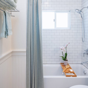
We selected a simple white subway tile for the tub/shower. This is always classic and in keeping with the style of the house.
We selected a pre-fab vanity and mirror, but they look rich with the quartz countertop. There is much more storage in this small vanity than you would think.
The Transformation: A Period Perfect Refresh
We began the remodel just as the pandemic reared and stay-in-place orders went into effect. As C&L were already moved out and living with relatives, we got the go-ahead from city officials to get the work done (after all, how can you shelter in place without a bathroom?).
All our tradesmen were scheduled to work so that only one crew was on the job site at a time. We stayed on the original schedule with only a one week delay.
The end result is the sweetest little bathroom I've ever seen (and I can't wait to start work on C&L's kitchen next).
Thank you for joining me in this project transformation. I hope this inspired you to think about being creative with your design projects, determining what works best in keeping with the architecture of your space, and carefully assessing how you can have the best life in your home.
 TVL Creative Ltd.
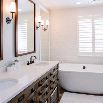
This master bathroom renovation transforms a builder-grade standard into a personalized retreat for our lovely Stapleton clients. Recognizing a need for change, our clients called on us to help develop a space that would capture their aesthetic loves and foster relaxation. Our design focused on establishing an airy and grounded feel by pairing various shades of white, natural wood, and dynamic textures. We replaced the existing ceramic floor tile with wood-look porcelain tile for a warm and inviting look throughout the space. We then paired this with a reclaimed apothecary vanity from Restoration Hardware. This vanity is coupled with a bright Caesarstone countertop and warm bronze faucets from Delta to create a strikingly handsome balance. The vanity mirrors are custom-sized and trimmed with a coordinating bronze frame. Elegant wall sconces dance between the dark vanity mirrors and bright white full height mirrors flanking the bathtub. The tub itself is an oversized freestanding bathtub paired with a tall bronze tub filler. We've created a feature wall with Tile Bar's Billowy Clouds ceramic tile floor to ceiling behind the tub. The wave-like movement of the tiles offers a dramatic texture in a pure white field. We removed the existing shower and extended its depth to create a large new shower. The walls are tiled with a large format high gloss white tile. The shower floor is tiled with marble circles in varying sizes that offer a playful aesthetic in an otherwise minimalist space. We love this pure, airy retreat and are thrilled that our clients get to enjoy it for many years to come!
 Rachiele Custom Sinks
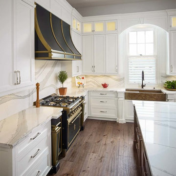
This gorgeous kitchen resides in Austin TX. Our client wanted a clean look with some artistic areas to be the focal points. The sink is one of two focal points in the kitchen. The sink is a copper farmhouse workstation sink featuring interior ledges to hold various cutting boards and a copper drain grid (shown). The apron portion of Rachiele sinks is an opportunity for unique patina artwork. All Rachiele sinks have a lifetime transferable warranty and a stated guarantee: If, for any reason, you are not THRILLED with the quality of my sink, I will (1) promptly and fully refund your money, (2) pay for the return shipping cost and (3) send you a check for $100, in recognition of the inconvenience experienced.
Rachiele has been the leader in kitchen sink design since 1999. Rachiele has over a dozen patents as well as being known for introducing the following elements into kitchen sink design>
1. The workstation sink
2. Rear corner drain location
3. Ergonomically designed sinks
4. Single bowl corner sinks
5. Farmhouse sinks that have a channel behind the apron to allow for retrofit installation without cutting existing cabinetry
6. Workstation sink with two interior ledges
7. Copper sinks with no maintenance self-healing interiors.
8. Rustic Matte stainless - easy to remove scratches and scuffs.
9. Millennia textured stainless - hides scratches, water spots and scuffs.
 Carousel Designs
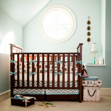
Life's a hoot! These adorable retro owls perched high on their branches are sure to bring fun and frolic to your nursery. Accented in rich chocolate and Tan Minky Chenille you will thrill at all the incredible textures this collection offers. The "way too cool" chevron stripe tops off this fabulous ensemble. Guaranteed to bring lots of smiles and giggles from your little man!
Made in the USA by Carousel Designs.
 Amy Pearson Design
APD was hired to update the kitchen, living room, primary bathroom and bedroom, and laundry room in this suburban townhome. The design brought an aesthetic that incorporated a fresh updated and current take on traditional while remaining timeless and classic. The kitchen layout moved cooking to the exterior wall providing a beautiful range and hood moment. Removing an existing peninsula and re-orienting the island orientation provided a functional floorplan while adding extra storage in the same square footage. A specific design request from the client was bar cabinetry integrated into the stair railing, and we could not be more thrilled with how it came together!
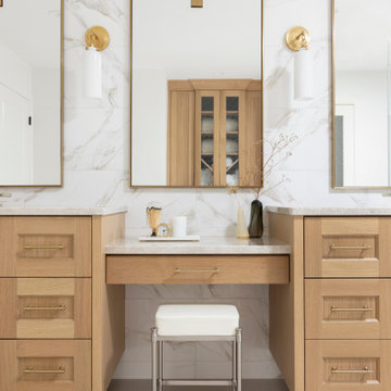
The primary bathroom experienced a major overhaul by relocating both the shower and double vanities and removing an un-used soaker tub. The design added linen storage and seated beauty vanity while expanding the shower to a luxurious size. Dimensional tile at the shower accent wall relates to the dimensional tile at the kitchen backsplash without matching the two spaces to each other while tones of cream, taupe, and warm woods with touches of gray are a cohesive thread throughout.
 Amy Storm & Company
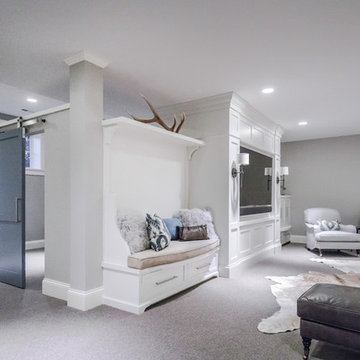
When we started this project, it was just a big open space. Our client wanted to create a space that let the natural light flood in, so her large family, or a youth group or a bunch of teenagers could be in the basement, but not feel like they were in a basement!
The space is not only inviting, but has lots of seating, including a riser (unseen in this photo) that allows for even more seating and still offers a great view of the TV. This has become the families favorite spot to hang out and we could not be more thrilled to hear that!
Joe Kwon Photography
 Renovisions
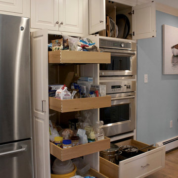
 These homeowners were anxiously ready to remodel their dated 80’s kitchen and reached out to Renovisions to handle the transformation. In this new undertaking we met to discuss plans to brighten the dark room with custom painted white inset cabinets, adding more functional storage, better task lighting and GE Monogram appliances, new hardwood flooring throughout and creating a better flow into the adjacent family room. In order to open up the space, Renovisions suggested creating an angle at the peninsula. Continuing with this approach we replaced the rear door with a new one-light door that swings out instead of in to accommodate new bar stools and a better flow of traffic in and out to the deck outside. Silestone’s quartz countertops in ‘Merope’ were the perfect choice adding a nice contrast yet truly durable and low maintenance. Creating a beautifully unique subway tile niche in linen color at cooktop area and backsplash added an elegant touch to the overall look and homeowners were thrilled with this refreshing look after the Renovision.
Now their newly renovated kitchen is a showcase and nicely outfitted for family and friends.
 Bilotta Kitchen & Home
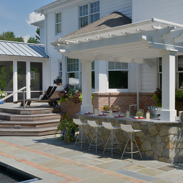
This client needed a place to entertain by the pool. They had already done their “inside” kitchen with Bilotta and so returned to design their outdoor space. All summer they spend a lot of time in their backyard entertaining guests, day and night. But before they had their fully designed outdoor space, whoever was in charge of grilling would feel isolated from everyone else. They needed one cohesive space to prep, mingle, eat and drink, alongside their pool. They did not skimp on a thing – they wanted all the bells and whistles: a big Wolf grill, plenty of weather resistant countertop space for dining (Lapitec - Grigio Cemento, by Eastern Stone), an awning (Durasol Pinnacle II by Gregory Sahagain & Sons, Inc.) that would also keep bright light out of the family room, lights, and an indoor space where they could escape the bugs if needed and even watch TV. The client was thrilled with the outcome - their complete vision for an ideal outdoor entertaining space came to life. Cabinetry is Lynx Professional Storage Line. Refrigerator drawers and sink by Lynx. Faucet is stainless by MGS Nerhas. Bilotta Designer: Randy O’Kane with Clark Neuringer Architects, posthumously. Photo Credit: Peter Krupenye
 Creo Construction
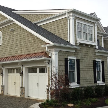
Azek trim, Nu-cedar pvc shakes, standing seam copper roofing.
Large coastal exterior home idea in New York
Large coastal exterior home idea in New York
 Edge
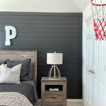
EdgeWe collaborated with Interior Specialist, Aspen Vanhoorebeck from @acozyblessednest, in her teenage boy's bedroom redesign.
Originally Aspen’s 16-year-old son wanted all-black painted bedroom walls. Not especially thrilled on the dark color choice (she hoped the room would easily transition into a guest room when he went to college), Aspen looked for another option. When she found our smooth Timeless Nickel Gap Midnight Black shiplap, she and her son were able to reach a happy medium.
At the end of her project, Aspen shared, "We loved working with UFP-Edge to put the black nickel gap shiplap in my son's room. My favorite part is that it comes pre-cut to fit the wall. It made the project easy enough for anyone to do! Not only do I love it, but my son does too! We’ve gotten so many compliments. I can’t wait for the next project!"
Our UFP-Edge Timeless nickel gap shiplap adds incredible character to any space with its sleek lines and clean finish. The lasting appeal of smooth shiplap provides the perfect design element for a variety of design styles, including both modern farmhouse and transitional. Take your interior design to the next level by installing Timeless shiplap for added dimension and character.
 Sherri Blum | Jack and Jill Interiors, Inc.
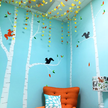
Children’s waiting room interior design project at Princeton University. I was beyond thrilled when contacted by a team of scientists ( psychologists and neurologists ) at Princeton University. This group of professors and graduate students from the Turk-Brown Laboratory are conducting research on the infant’s brain by using functional magnetic resonance imaging (or fMRI), to see how they learn, remember and think. My job was to turn a tiny 7’x10′ windowless study room into an inviting but not too “clinical” waiting room for the mothers or fathers and siblings of the babies being studied.
We needed to ensure a comfortable place for parents to rock and feed their babies while waiting their turn to go back to the laboratory, as well as a place to change the babies if needed. We wanted to stock some shelves with good books and while the room looks complete, we’re still sourcing something interactive to mount to the wall to help entertain toddlers who want something more active than reading or building blocks.
Since there are no windows, I wanted to bring the outdoors inside. Princeton University‘s colors are orange, gray and black and the history behind those colors is very interesting. It seems there are a lot of squirrels on campus and these colors were selected for the three colors of squirrels often seem scampering around the university grounds. The orange squirrels are now extinct, but the gray and black squirrels are abundant, as I found when touring the campus with my son on installation day. Therefore we wanted to reflect this history in the room and decided to paint silhouettes of squirrels in these three colors throughout the room.
While the ceilings are 10′ high in this tiny room, they’re very drab and boring. Given that it’s a drop ceiling, we can’t paint it a fun color as I typically do in my nurseries and kids’ rooms. To distract from the ugly ceiling, I contacted My Custom Creation through their Etsy shop and commissioned them to create a custom butterfly mobile to suspend from the ceiling to create a swath of butterflies moving across the room. Their customer service was impeccable and the end product was exactly what we wanted!
The flooring in the space was simply coated concrete so I decided to use Flor carpet tiles to give it warmth and a grass-like appeal. These tiles are super easy to install and can easily be removed without any residual on the floor. I’ll be using them more often for sure!
See more photos of our commercial interior design job below and contact us if you need a unique space designed for children. We don’t just design nurseries and bedrooms! We’re game for anything!
 Selectblinds
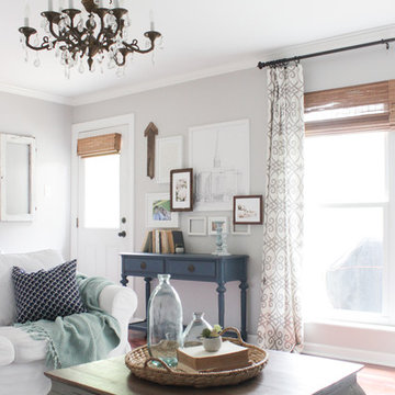
Rachel from Shades Of Blue Interiors has such great style. We were thrilled to work with her on the makeover for the windows in her living and dining room. Her style is a little mix of farmhouse, french country, with rustic touches. We love everything about it. Read the full post, and get more info on the other details here: http://www.shadesofblueinteriors.com/new-cordless-bamboo-shades/
 Sarah Seung-McFarland
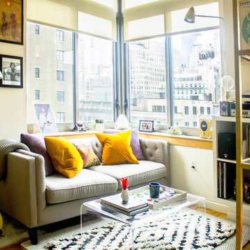
Photo: Sarah Seung McFarland © 2017 Houzz
Example of an eclectic bedroom design in New York
Example of an eclectic bedroom design in New York
 Emerald Designs Ltd.
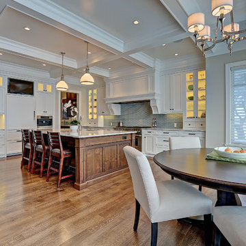
Transitional Kitchen with coffered ceiling
Eat-in kitchen - large transitional l-shaped medium tone wood floor eat-in kitchen idea in Calgary with an undermount sink, shaker cabinets, white cabinets, marble countertops, gray backsplash, glass tile backsplash and an island
Eat-in kitchen - large transitional l-shaped medium tone wood floor eat-in kitchen idea in Calgary with an undermount sink, shaker cabinets, white cabinets, marble countertops, gray backsplash, glass tile backsplash and an island

 TK Building & Design
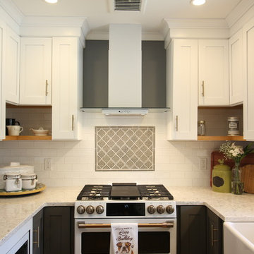
This transitional kitchen brings in clean lines, simple cabinets, warm earth tones accents, and lots of function. This kitchen has a small footprint and had very little storage space. Our clients wanted to add more space, somehow, get the most storage possible, make it feel bright and open, have a desk area, and somewhere that could function as a coffee area. By taking out the doorway into the dining room, we were able to extend the cabinetry into the dining room, giving them their desk area as well as storage and a nice area for guests! A custom appliance garage was made that allows you to have all the necessities right at your hands and gives you the ability to close it up and hide all of the appliances. Trash, spice, tray, and drawer pull outs were added for function, as well as 2 lazy susans, wine storage, and deep drawers for pots and pans.
The homeowner fell in love with the matte white GE Cafe appliances with the brushed bronze accents, and quite frankly, so did we! Once we found those, we knew we wanted to incorporate that metal throughout the kitchen.
New hardwood flooring was installed in the kitchen and finished to match the existing wood in the dining room. We brought the warmth up to eye level with open shelving stained to match.
We love creating with our clients, and this kitchen was no exception! We are thrilled with how everything came together.
 Susan Yeley Homes
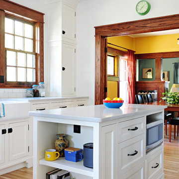
Like most of our projects, we can't gush about this reno—a new kitchen and mudroom, ensuite closet and pantry—without gushing about the people who live there. The best projects, we always say, are the ones in which client, contractor and design team are all present throughout, conception to completion, each bringing their particular expertise to the table and forming a cohesive, trustworthy team that is mutually invested in a smooth and successful process. They listen to each other, give the benefit of the doubt to each other, do what they say they'll do. This project exemplified that kind of team, and it shows in the results.
Most obvious is the opening up of the kitchen to the dining room, decompartmentalizing somewhat a century-old bungalow that was originally quite purposefully compartmentalized. As a result, the kitchen had to become a place one wanted to see clear through from the front door. Inset cabinets and carefully selected details make the functional heart of the house equal in elegance to the more "public" gathering spaces, with their craftsman depth and detail. An old back porch was converted to interior space, creating a mudroom and a much-needed ensuite walk-in closet. A new, larger deck went on: Phase One of an extensive design for outdoor living, that we all hope will be realized over the next few years. Finally, a duplicative back stairwell was repurposed into a walk-in pantry.
Modernizing often means opening spaces up for more casual living and entertaining, and/or making better use of dead space. In this re-conceptualized old house, we did all of that, creating a back-of-the-house that is now bright and cheerful and new, while carefully incorporating meaningful vintage and personal elements.
The best result of all: the clients are thrilled. And everyone who went in to the project came out of it friends.
Contractor: Stumpner Building Services
Cabinetry: Stoll’s Woodworking
Photographer: Gina Rogers
40