
Search results for "Tiny experiment" in Home Design Ideas
 Sklar Studios
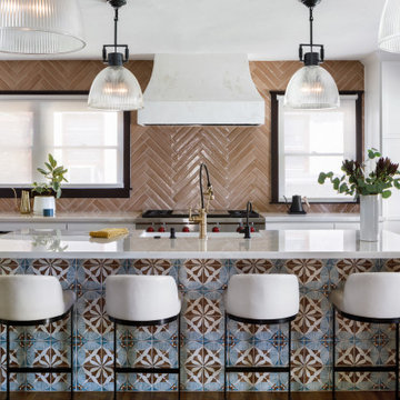
Removal of the walls that separated a once tiny kitchen from the dining room was like that feeling of relief when you unbutton those far too tight pants at the end of the day. It opened up the core of the house, let the daylight flood in, and provided a desired social connection between the cooking, dining, and entertaining experience, plus views to the front yard. One step towards achieving historic status to even apply for the MILS act - all the windows were replaced and returned back to their wood frame glory, and a previously modified window was returned back to it's orginal glass door and window configuration with direct access to the front porch. Existing harwood floors were patched and refinished, structural beams and footings were added as required, and all well worth the effort. The coveted island/ "command station" features a natural quartzite countertop, farmhouse sink, beautiful hand-painted tile, and uber comfortable counter height stools - perfectly proportioned to where the seat back will never get dinged up against the stone top and can tuck completely under the countertop when not in use. Tall, flanking pantries are convenient for everyday items, and deep lower drawers house all the necessities a home chef wants within arms reach.

 CHRISTOPHER STROM ARCHITECTS
Side Street Suite is a contemporary 640-square-foot accessory dwelling unit (ADU) that sits perched among trees in Minneapolis. The homeowner is an empty nester who no longer desired to inhabit a 2,700 square feet home. A unique solution was to build a one-bedroom ADU in the backyard of his rental duplex.
The ADU feels much larger than would seem possible thanks to strategically placed glass on all exterior walls and roof. The home is expanded with unique views which in turn create a dynamic experience of the path of sunlight over the course of the day. The kitchen is compact yet well-appointed, offering most of the amenities of a larger home, albeit in more compact form. The bedroom is flanked by a walk-in closet and a full bathroom containing a combination washer/dryer. Playful, bold colors enliven the interiors: blue stair treads and wood handrail and blue quartz countertop. Exterior materials of composite wood siding and cement board panels were chosen for low-maintenance and durability.
Bikers passing by the property often give the owner a thumbs-up, indicative of neighborhood enthusiasm and support for “building small.”

 Galbiati Arreda
View of the living room with the particular illuminating furniture By Natevo
Vista del salotto con il particolare arredo illuminante Natevo
Example of a mid-sized trendy open concept light wood floor living room design in Milan with white walls
Example of a mid-sized trendy open concept light wood floor living room design in Milan with white walls
Find the right local pro for your project

 Nyhus Design Group
Charming Old World meets new, open space planning concepts. This Ranch Style home turned English Cottage maintains very traditional detailing and materials on the exterior, but is hiding a more transitional floor plan inside. The 49 foot long Great Room brings together the Kitchen, Family Room, Dining Room, and Living Room into a singular experience on the interior. By turning the Kitchen around the corner, the remaining elements of the Great Room maintain a feeling of formality for the guest and homeowner's experience of the home. A long line of windows affords each space fantastic views of the rear yard.
Nyhus Design Group - Architect
Ross Pushinaitis - Photography

 Susan Diana Harris Interior Design
Photographer: Scott Hargis Photo
Japanese bathtub - small modern white tile and porcelain tile limestone floor japanese bathtub idea in Los Angeles with flat-panel cabinets, a bidet, white walls, a vessel sink and limestone countertops
Japanese bathtub - small modern white tile and porcelain tile limestone floor japanese bathtub idea in Los Angeles with flat-panel cabinets, a bidet, white walls, a vessel sink and limestone countertops

 Wilson Kelsey Design
WKD’s 50 years of combined interior design experience, and specialty in historic architectural millwork, has led to many commissions for custom luxury kitchens. This all white kitchen allows our empty nester- CEO- grandmother to do the cooking she loves to do, while conversing with friends and visiting family and grandchildren. Everything is within a few steps, organized to perfection, and with beautiful finishes to give an upscale look. A former breakfast nook was transformed into a “cocktail lounge” where friends can sit and visit while our client cooks.
Photography by Michael Lee
 Cutuli Homes
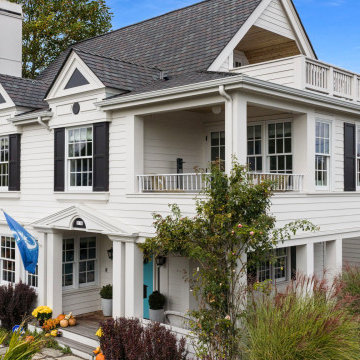
This four-story Seattle remodel showcases the best of custom homebuilding: timeless architectural charm, expanded living space, and thoughtful multigenerational design. General Contractor, Jim Cutuli oversaw every detail, adding two full stories and transforming the home while honoring its character.
The project also includes a beautifully matched mother-in-law home - ADU, crafted with the same level of detail and care. Clients trust Jim for his hands-on approach, honest communication, and ability to balance dreams with budget. Many return for multiple projects because the experience is as exceptional as the final product.
If you’re seeking a builder who listens, collaborates, and brings true craftsmanship to every decision, we’d love to work with you.


 Eric Reinholdt, Architect
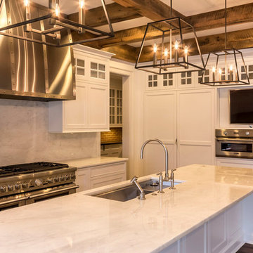
Inspired by local fishing shacks and wharf buildings dotting the coast of Maine, this retreat interweaves large glazed openings with restrained and simple taut-skinned New England shingled cottages.
The cottages are small outbuildings housing single functions - essentially sleeping and living. They're knit into the site via a series of grade level decks, small water features and natural plantings.
The locations of the cottages were carefully planned to reveal different views to the adjacent site from arrival to departure and circulating between each cottage - each is intended to be a unique experience.
Eric Reinholdt - Project Architect/Lead Designer with Elliott + Elliott Architecture
Photo: Tom Crane Photography, Inc.

 Isla Homes
I built this on my property for my aging father who has some health issues. Handicap accessibility was a factor in design. His dream has always been to try retire to a cabin in the woods. This is what he got.
It is a 1 bedroom, 1 bath with a great room. It is 600 sqft of AC space. The footprint is 40' x 26' overall.
The site was the former home of our pig pen. I only had to take 1 tree to make this work and I planted 3 in its place. The axis is set from root ball to root ball. The rear center is aligned with mean sunset and is visible across a wetland.
The goal was to make the home feel like it was floating in the palms. The geometry had to simple and I didn't want it feeling heavy on the land so I cantilevered the structure beyond exposed foundation walls. My barn is nearby and it features old 1950's "S" corrugated metal panel walls. I used the same panel profile for my siding. I ran it vertical to match the barn, but also to balance the length of the structure and stretch the high point into the canopy, visually. The wood is all Southern Yellow Pine. This material came from clearing at the Babcock Ranch Development site. I ran it through the structure, end to end and horizontally, to create a seamless feel and to stretch the space. It worked. It feels MUCH bigger than it is.
I milled the material to specific sizes in specific areas to create precise alignments. Floor starters align with base. Wall tops adjoin ceiling starters to create the illusion of a seamless board. All light fixtures, HVAC supports, cabinets, switches, outlets, are set specifically to wood joints. The front and rear porch wood has three different milling profiles so the hypotenuse on the ceilings, align with the walls, and yield an aligned deck board below. Yes, I over did it. It is spectacular in its detailing. That's the benefit of small spaces.
Concrete counters and IKEA cabinets round out the conversation.
For those who cannot live tiny, I offer the Tiny-ish House.
Photos by Ryan Gamma
Staging by iStage Homes
Design Assistance Jimmy Thornton
 Jill Lewis Architecture
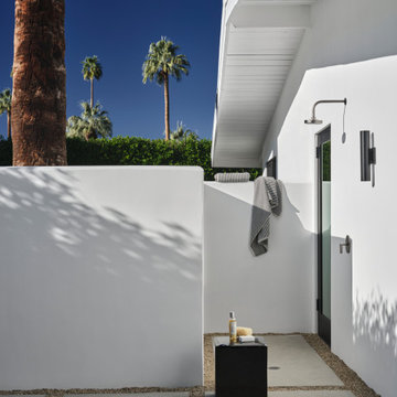
The goal for this mid-century home was to exploit the best features of the property, taking advantage of views, the dramatic light, the potential for an incredible indoor-outdoor experience and the mid-century bones of the house. When we first visited the property, I was struck by the potential for a beautiful mountain view that was currently cut off by a low ceiling height in the main living area. Raising the roof of the main living area became the largest gesture in our scope of work. The former chopped-up side entry and tiny kitchen were combined to make a long, generous kitchen and built-in banquette. The original rhombus-shaped pool was kept, restored and lined with Ann Sacks tiles. In the center of the action, we conceived a large floating desk surface suspended from a black metal screen to define the space and allow filtered light and views to pass between. The clients were drawn to clean lines, pared-down details and highly disciplined palettes of white, grey and matte black. We generally opted for deep, muted colors balanced with crisp white, adding textures to create patterns with the shifting daylight throughout the house. This soothing collection of finishes playing with light and shadow would achieve a peaceful and elegant home that would stand the test of time and honor the landscape of the surrounding area.
Photography: Douglas Friedman

 Angelica Henry Design
This A-frame Loft Bathroom underwent an extensive transformation! Originally an under lit confined space, this room had low ceilings, a bulky tub deck, and dark materials which were anything but light and airy.
The homeowner wanted to take full advantage of this unique A-frame 2nd story bath by opening up the space, instilling a vintage yet fresh quality, and creating a bathroom that would serve as a spa worthy experience.
Challenges included relocating vent pipes, incorporating short side walls and adding architectural detail to this tiny space. Demolition revealed unused space, which allowed increasing ceiling height and square footage. The plan was flipped to take advantage of a niche to house the toilet, and a dormer detail infused much needed character.
A round window draws the eye into the space, and casts light across the room finished with a painted cabinet and natural quartz top. All elements come together to create a refreshingly light space with a vintage twist!
 TKS Design Group
Download our free ebook, Creating the Ideal Kitchen. DOWNLOAD NOW
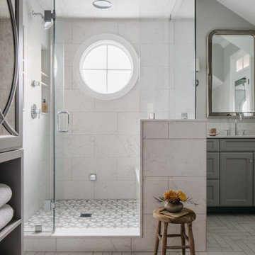
Our clients were in the market for an upgrade from builder grade in their Glen Ellyn bathroom! They came to us requesting a more spa like experience and a designer’s eye to create a more refined space.
A large steam shower, bench and rain head replaced a dated corner bathtub. In addition, we added heated floors for those cool Chicago months and several storage niches and built-in cabinets to keep extra towels and toiletries out of sight. The use of circles in the tile, cabinetry and new window in the shower give this primary bath the character it was lacking, while lowering and modifying the unevenly vaulted ceiling created symmetry in the space. The end result is a large luxurious spa shower, more storage space and improvements to the overall comfort of the room. A nice upgrade from the existing builder grade space!
Photography by @margaretrajic
Photo stylist @brandidevers
Do you have an older home that has great bones but needs an upgrade? Contact us here to see how we can help!

 Advance Design Studio, Ltd.
Jennifer and Dan have lived in their Deer Park Illinois home for 15 years, slowly making minor fixes like painting and decorating; but they had a new plan for their kitchen the entire time. An awkwardly placed garage door, and an island cooktop with a terrible downdraft made a full-scale kitchen remodel an absolute must. Jennifer had many ideas in mind and wanted to work with a company that could provide high-end work, while partnering with a designer that would tailor the kitchen to her ideas.
She was intrigued by the phrase “Common Sense Remodeling” in Advance Design’s feature she discovered while perusing an issue of the community’s Quintessential Barrington Magazine. Doing further research on the company’s website, as she looked through project profiles and read about Advance Design’s “Common Sense Remodeling” philosophy, she promptly scheduled an appointment to see if the people and ideas she read about were truly who they said they were. The more she read, the more she knew that the “Common Sense” approach to remodeling they described was exactly the type of company she was looking for.
The partnership was sealed after an initial consultation with Owner Todd Jurs and Project Designer Michelle Lecinski. They displayed a combination of friendliness, professionalism and respect that was unmatched by any of the other companies Jennifer talked to. She knew that with Advance Design, she would be able to retain the vision that she had in mind with high-quality craftsmanship.
“I reached out to Advance Design because of the ‘Common Sense Remodeling’ tagline,” Jennifer said. “That’s what lingered for me”. “Advance Design was the most respectful- of the house and of my design ideas, and the most professional of the handful of companies that looked at my project”.
Soon after the meeting Jennifer began working with Michelle on the project design. They quickly developed chemistry. Jennifer loved how Michelle researched and located every detail that Jennifer wanted for the kitchen. Between the two of them, every concept and idea was worked through and perfected. “Jennifer had definite ideas about what she wanted the new kitchen to look like, she just didn’t know how to bring it all together. We worked together really well to make her ideas into the practical reality necessary for a well-functioning kitchen, with the look and feel that she had envisioned”, says Michelle.
“Michelle was wonderful in using the CAD system she would show me new drawings every time we changed the layout while working through the design,” Jennifer said. “She was a really wonderful partner in execution, she made sure everything happened quickly and easily.”
The finished design drew out elements of Jennifer’s style and personality. The pair call the look “sophisticated farmhouse” to describe the kitchen renovation to family and friends. The result was a beautifully crafted, authentic-feeling space that satisfied Jennifer’s dreams 15 years in the making. The whole project consisted of a kitchen remodel, mudroom upgrade with powder room, and garage entry relocation. “The projects I personally like the best, are the ones that put the client’s dreams on display,” Project Designer Michelle said. “And this is one of those projects.”
The main focal point of the kitchen is custom zinc and brass ventilation hood with a vintage sheen, which was hand made to order by a small company in Indiana named Vogler Metalworking. “It’s like sculpture, a true work of art”, says Jennifer. Your eye is immediately drawn towards this elegant yet practical hood that eliminated the home’s downdraft problem and added a striking conversation piece at the same time. The carpenters had to use special gloves when transporting and installing it, so they didn’t smudge it with fingerprints. The beautiful hood centers proudly over the stunning black enamel and brass LaCornue Range. “I had a friend who had a LaCornue range and after learning how easy it was to cook perfect meals, I was convinced I wanted to have one”, says Jennifer. This unique, breathtaking combination anchors the entire kitchen and is apparent immediately as you walk into the great room the surrounds the space.
DuraSupreme Crestwood cabinets with a Kendall Panel add function and sophistication. A custom gray paint color paired with a storm blue was developed so that the new kitchen looked like it belonged to the existing space. Unlacquered brass faucets and hardware were important to Jennifer because she wanted the living finishes to age over time. Remarkable brass diamond mesh cabinet door inserts imported from the UK continue to add this one-of-a-kind kitchen renovation; giving it a “you won’t see this everywhere” quality. The use of old railcar flooring for the coffee bar countertop and reclaimed oak for the open shelving gives an authenticity to the space uncommon in kitchens today.
Jennifer and Michelle fell in love with the Limestone Grey Stone while they were investigating unique island countertop ideas. They liked the fact that the limestone as a living finish will age and change over time. Calcutta Miel Quartz countertops made for an excellent pairing around the perimeter, as it’s durable and perfect for cooking preparations. A textured white subway tile backsplash that runs to the ceiling keeps your eye moving towards the open shelving, and to the main focal point of the stunning range hood combination.
“The kitchen functions beautifully, and it’s gorgeous,” beams Jennifer as she gestures with both hands while smiling ear to ear. “The most important thing was I wanted a kitchen that had a wonderful flow, cooked beautiful meals and was a great gathering place for family and friends, and this space does that perfectly! Beauty wise, it turned out exactly how I had envisioned. I felt the function part was the hardest part, and that was nailed”!
Relocating the garage entry to the new mudroom was a huge priority and has finally separated the family’s arriving home functions from their kitchen. Now coats and shoes and bags have their own area for dropping once members arrive home. Matching gray DuraSupreme cabinetry helped create gorgeous, purposeful lockers for the family. A reclaimed vintage sink and custom wall paper were added to the tiny powder room to beautify the once previously only functional space. Advance Design was even able to create a custom space for their dog to sleep while the family is away.
“It was unbelievable that a project of this size was completed in such a short time, and I think that’s because of the large amount of planning and preparation that went into it,” Jennifer marveled, “When we started, we were ready, and everything was prepared”.
When it came to execution, Project Manager Justin Davis and his crew were quick, accessible, and organized. Projects like this kitchen are typically completed in as little as 8-10 weeks. Jennifer’s kitchen however despite the relocation of some challenging HVAC in a soffit and moving of an exterior door was completed remarkably fast in part because the team was working with an existing tile floor that ran throughout the first floor that the client really loved.
“You get to know these people really well because they’re living in your house while you’re living in your house. They were so fast and really good, it didn’t take as long as even planned” reported Jennifer. “I would text Justin and he always responded almost immediately. I got to know all the guys who were working in our house and they were all wonderful people”.
Details in a customized kitchen like this one require skill and care from the people who install it. “All the guys on the job were skilled at what the did. I wanted small details like little feet to look like furniture, that is where their carpentry skill came in to make these all perfect”, said Jennifer. “The tile guys were wonderful. They even let me determine how I wanted the texture with the grout to appear for a salt and pepper look; now that is a very skilled trade person making it custom”.
In Jennifer’s interview, she continued to reference Advance Design’s “Common Sense Remodeling”, so I took a minute to ask her exactly what that phrase meant to her and how it played out in her experience with her project and the Advance Design team. Here is what she said: “I was intrigued about Common Sense Remodeling and in my head that there would be clear costs and prices, great communication between the design team, the execution team and me”, said Jennifer. They did deliver on that, it was so clear about the cost breakdown, what I could expect from everyone who came to my house, and everything that we had ordered. That to me is the Common Sense”!
It’s great to see a client take literally our assertion that a well-planned remodeling project is simply “Common Sense”! She anticipated each step of the way would be clear, concise, and predictable, all the while protecting the outcome due to the careful upfront planning. “Advance Design delivered on their ‘Common Sense Remodeling’ promise,” Jennifer said. “From the design team, to the execution team - everything was straight forward like I imagined. The project turned out exactly how I envisioned, I enjoyed this process and absolutely would recommend Advance Design Studio to anyone.”
 Angelica Henry Design
This A-frame Loft Bathroom underwent an extensive transformation! Originally an under lit confined space, this room had low ceilings, a bulky tub deck, and dark materials which were anything but light and airy.
The homeowner wanted to take full advantage of this unique A-frame 2nd story bath by opening up the space, instilling a vintage yet fresh quality, and creating a bathroom that would serve as a spa worthy experience.
Challenges included relocating vent pipes, incorporating short side walls and adding architectural detail to this tiny space. Demolition revealed unused space, which allowed increasing ceiling height and square footage. The plan was flipped to take advantage of a niche to house the toilet, and a dormer detail infused much needed character.
A round window draws the eye into the space, and casts light across the room finished with a painted cabinet and natural quartz top. All elements come together to create a refreshingly light space with a vintage twist!

 TOC design & construction inc.
DESIGNED BY TOC design
CONSTRUCTION BY TOC design & Construction inc.
PHOTOS BY : Tania Scardellato
I was fortunate to have a young family approach me in desperate need to renovate there only 3 piece bathroom. This space was In dire need of a remodel, with old brown wall to wall tiles and a dated bulky yellow brown single sink vanity.
Storage was a must, lighting a necessity, and proper accessibility to the shower bath area.
We had a tight budget to respect, but a full gut of this bathroom was required. And a good thing too, once we started doing the demolition we noticed that mildew and rotting floors and walls had accumulated throughout the years. Doing it right the first time is no joke when dealing with water and electrical issues.
We discarded all reminisce of old and built from scratch, new walls, new plumbing, new electrical ,new insulation and a new window, a new fan that actually exhausted outside ( I say this laughing as you would be amazed at how many fans are installed but don’t exhaust outside, and you the client would never know unless you go inside the attic space.
Once all the hard stuff was done, the rest is just a matter of smart design. If you have a small bathroom here are some tips to guide you.
10 tips for making a small bathroom feel larger
Is your tiny bathroom cramping your functionality and style, leaving you longing for the enormous bathrooms gracing the pages of design magazines? Even if your bathroom is a fraction of the size, all it takes is some design savvy to make the most of the space you have. Consider these 10 smart tips that will help your bathroom look, feel and function like those larger contenders.
1-Get creative with corners
Space is at a premium in small bathrooms, so it's important to maximize every inch. Corners, for example, provide extra space for shelving, storage units and even hooks. Get creative and install unique design solutions that are not only functional, but also eye-catching. If you love the airiness of floating cabinets, add baskets or decorative boxes under for extra storage. If you are installing floating cabinets insure that they are installed securely to studs or plywood at wall.
2- Let solid colors shine
Busy patterns have a shrinking effect and make small bathrooms seem even smaller. Conversely, light natural hues make a space feel more open. If you're itching to get creative with design, experiment with textures but keep overpowering patterns to a minimum. Tone on tone is the best to achieve this.
3 - Maximize your bathtub
A bathtub takes up a significant portion of the room, but modern, compact options with curved basins, can make the tub feel larger when in use, all while conserving space.
4 - Select a smaller faucet
A faucet is jewelry for the bathroom. And just as accessories can overpower an outfit, a big bulky faucet isn't flattering in a small bath. Single-handle designs conserve counter space, while a wall-mount installation frees it up all together and can create quite the wow-factor, if the budget can accommodate the required changes to plumbing behind the wall.
5 - Make vanity storage simple
If you're in a storage war with your small bathroom, you're not alone in the battle. Toiletries and personal supplies without a place to call home only add clutter and chaos. Store smart with a space-saving vanity, the dual sink vanity shown here, looks quite simple, but in reality it has 4 sets of full extension drawers, and the vanity tower adds extra storage without overpowering the use of space.
6 - Show off the shower
Shower curtains may be pretty, but they interrupt the visual flow of a bathing space and make it feel significantly smaller. In bathrooms with small footprints, opt for a clear glass sliding shower door that doesn't require the clearance of one with a hinged design. Or as shown in this design and for fraction less expensive a half hinged panel installed on a fixed tempered glass panel. If you're embarking on a big remodel, create the illusion of more space by using same tile in the shower that's used throughout; instead of seeing them as two separate zones, the eye will read them as one.
7 - Discover the treasure of hidden storage
Work with a contractor, and you just might find some serious storage potential hidden behind your walls. Whether it's utilizing space between the studs for shallow shelving or a creating a small linen closet by annexing space from an adjacent room, even small additions can make a big difference.
8 - Focal Point
Tile is a beautiful, durable addition to any bathroom. For dainty spaces, consider installing tile at a diagonal to accentuate the focal point or as in this bathroom I used an oversized textured pattern to bring depth to the space at the window wall.
9 - Choose the right lights
Strategically install light to reflect and brighten a small bathroom to make it appear larger. Recessed lighting is an affordable solution for tiny rooms, offering ample light while taking up little space. Wall sconces alongside a mirror also reflect off the walls and make a room feel bright and airy. I always recommend going with LED lighting at 2800 to 3000K.
10 – Accessorize
This is your time to shine in your decorating skills, have fun with your towels, you can change the color scheme daily just by adding pops of color in your accessories, make sure to get items that serve a dual purpose, like baskets, boxes they can always be used as hampers, storing of towels and even a nice display for your guest.


 Jim or Teresa Huffman
Quartersawn oak mission style kitchen finished in our custom blend Russet Oak stain. American Range wall ovens and corner fireplace make this kitchen a show stopper. Stained glass wine cabinet adds a unique touch. Visit our showroom to view this kitchen and experience the appliances first hand.


 Mark S. Garff, Landscape Architect
In south Seattle, a tiny backyard garden needed a makeover to add usability and create a sitting area for entertaining. Raised garden beds for edible plants provide the transition between the existing deck and new patio below, eliminating the need for a railing. A firepit provides the focal point for the new patio. Angles create drama and direct flow to the steel stairs and gate. Installed June, 2014.
Photography: Mark S. Garff ASLA, LLA

 Significant Homes LLC
Charles Hilton Architects, Robert Benson Photography
From grand estates, to exquisite country homes, to whole house renovations, the quality and attention to detail of a "Significant Homes" custom home is immediately apparent. Full time on-site supervision, a dedicated office staff and hand picked professional craftsmen are the team that take you from groundbreaking to occupancy. Every "Significant Homes" project represents 45 years of luxury homebuilding experience, and a commitment to quality widely recognized by architects, the press and, most of all....thoroughly satisfied homeowners. Our projects have been published in Architectural Digest 6 times along with many other publications and books. Though the lion share of our work has been in Fairfield and Westchester counties, we have built homes in Palm Beach, Aspen, Maine, Nantucket and Long Island.
12