
Search results for "Towards material" in Home Design Ideas
 Renovators Supply Manufacturing
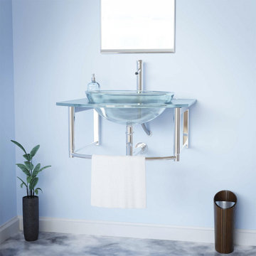
MATERIAL - Tiny Juniper wall mount sink is built using heavy-duty Grade A Vitreous China ceramic material coated with stain and scratch resistant glossy porcelain to give a sleek glazed look to your home, making it glide right in with your style.
DIMENSIONS - Measures 17-1/8 In. Wide x 5-3/4 In. High x 10-1/2 In. Proj. Compact space-saving sink is perfect for small bathrooms. Unique oval pattern is an attractive charm to have - Pretty and Practical Porcelain Sinks!
LAVATORY SINK SPECS- Floating wall mount sink includes overflow to avoid water damage and a pre-drilled faucet single hole towards the left. The package does not include faucet, drain and P-Trap, these are sold separately.
JUNIPER WALL HUNG SINKS - Skillfully designed semicircular floating vessel sink is sure to add style and beauty to your place without occupying much space - Perfect for your small bathroom, half bathroom or for kids washroom.
LAG BOLT SLIP ON INSTALLATION - It includes a Lag Bolt Slip-On installation design. You can easily install within minutes and mount the sink on two bolts without needing any bracket.

 Denise Davies
DENISE DAVIES
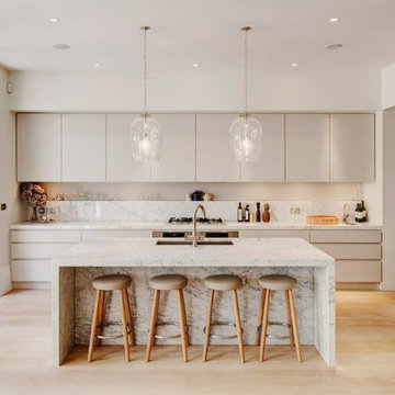
Huge minimalist u-shaped light wood floor and beige floor kitchen photo in New York with an undermount sink, flat-panel cabinets, gray cabinets, marble countertops, stainless steel appliances and an island
Huge minimalist u-shaped light wood floor and beige floor kitchen photo in New York with an undermount sink, flat-panel cabinets, gray cabinets, marble countertops, stainless steel appliances and an island
 Designs by KS
Project: Kitsilano House
Builder: Grenor Homes
About this Project
When our clients asked us to design their new house in the heart of Kitsilano, they wanted a space that showcased their personalities, travels, and experiences. Naturally, our team was instantly excited and eager to make this house a home.
Layout:
Prior to the renovation, the family room was adjacent to the kitchen and the formal living room at the other end of the space; in the middle was the dinning area. We looked at the main floor as an entire space and decided to combine the two living spaces into one and move the dining area towards the kitchen.
The Kitchen:
had always been an L shape with an island; previously there was a kitchen table by the windows. In the space planning period, we decided to eliminate the kitchen table to increase the overall size of the kitchen, giving us a bigger island for casual eating.
The perimeter of the kitchen has many great features; a coffee nook, a freezer column, double ovens, a cooktop with drawers below, an appliance garage in the awkward corner, a pantry with ample storage and free-standing fridge.
The Island also has many key features; a built-in unit for garbage/recycling/compost, a slide out tray underneath the sink for easy access to cleaning products, a dishwasher, and a bank of four drawer. On the outside of the island is an open shelf for cookbooks and display items. Below the countertop overhang is additional hidden storage for the items not accessed frequently.
Dinning Area:
we utilized the pre-existing niche by incorporating floating shelves in an asymmetrical design, which became the perfect area for the clients to display the art collected during their travels.
Bar Area:
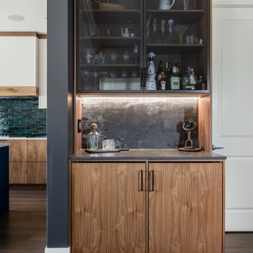
The space between the kitchen and powder room became the perfect place to add a bar. Storage, counter space, and 2 bar fridges brought this little entertaining area to life.
Fireplace:
Using existing fireplace unit we cladded the surround with Dekton material, paneled the wall above with Walnut and a mantel made from Quarkus. These materials repeat them selves through the entire space.
Find the right local pro for your project
 InnovationLand
We are so excited about this stylish Houston patio addition!
It's one of our most recent outdoor living space design projects - and one of our new favorites!
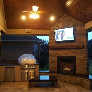
We particularly love the rustic corner fireplace, the beautiful, vaulted pine ceiling and the Restoration Hardware furniture and accessories.
"Even though this space has an outdoor kitchen - often the highlight of our projects - the focus here is beautiful, comfortable outdoor living," says Outdoor Homescapes of Houston owner Wayne Franks. "And I have to say, I think this is one of the most gorgeous spaces we've created for doing that - in style."
"This project was special from the start, as we were creating this space for a friend of Wayne’s who had been a long time mentor to his boys growing up," adds Lisha Maxey, owner of LGH Designs in Houston (she coordinated furniture and finishes for the project). "This client was the principal of their high school and knew all of them very well and Wayne, too. This made it very personal, indeed, and we wanted everything to be perfect!"
The 23- by 16-foot addition, located at the back of the house in Cypress, looks out onto a manmade lake in the homeowners' subdivision. The focal point? A 9-foot-8-inch-high-by-7-foot-wide corner fireplace in Earth Grey rustic ledgestone from Colorstone in Houston. The fireplace features a custom wooden mantel, stone bench seating and a 52-inch Sunbrite outdoor TV.
Another highlight is the flooring - silver travertine tile laid out in a Versailles pattern. "We chose silver travertine in a 'Tumbled' color palette with variations of cream and brown," says Lisha. "So we had those two colors, plus grey, to pull from."
The 7-foot-long, stucco outdoor kitchen island's countertops are also noteworthy - Absolute Black granite in a leathered finish offering a modern look and a dark grey hue that works perfectly with the color palette. The kitchen island also houses an RCS 30-inch grill and fridge.
The seating area includes a sectional couch, coffee table, two swivel chairs and two ottomans - all from Restoration Hardware.
"We used Restoration Hardware's Biscayne sectional, swivel chairs and ottomans in gray, with textured linen weave in Sand and cushions and peacock accent pillows in gray," says Lisha. The coffee table is made of solid teak with a concrete top - as is the matching side table.
"We added a console table, also in teak, behind the sofa. And for accents, we added three Amalfi lanterns from Restoration Hardware in weathered zinc."
A Sunbrella® Heathered area rug (in Gray) was added to anchor the space and visually tie it together.
"The space as a whole leans towards a transitional style, in that it has many traditional cozy comforts and colors, but the furniture gives it a more contemporary look," says Lisha. "The idea from the beginning was to marry these two styles, as our clients wanted a look that would not age and be in vogue for years to come."
On the exterior, you can see how we worked to make the addition blend with the existing home - matching the shingles and stucco and continuing the landscaping.
3D graphic renderings and a virtual video tour allowed the clients to know exactly what the space would look like beforehand.
"It takes a lot of the guesswork out of the process," says Outdoor Homescapes' graphic designer, Kristy Buell Franks. "Floor plans and elevation drawings are good for giving an idea of the overall scope of the project, but it's the 3D renderings that really show what the space is going to look like."
The 3D graphics and video tours also help immensely when choosing finishing materials and furniture, she says: "The clients' choices can be put into the design to allow the clients to see how the materials will work with the existing materials on the house and how the furniture will look in the space."
What do you like about this space? Post a comment and let us know!

 ZeroEnergy Design
This LEED Platinum certified house reflects the homeowner's desire for an exceptionally healthy and comfortable living environment, within a traditional neighborhood.
INFILL SITE. The family, who moved from another area of Wellesley, sought out this property to be within walking distance of the high school and downtown area. An existing structure on the tight lot was removed to make way for the new home. 84% of the construction waste, from both the previous structure and the new home, was diverted from a landfill. ZED designed to preserve the existing mature trees on the perimeter of the property to minimize site impacts, and to maintain the character of the neighborhood as well as privacy on the site.
EXTERIOR EXPRESSION. The street facade of the home relates to the local New England vernacular. The rear uses contemporary language, a nod to the family’s Californian roots, to incorporate a roof deck, solar panels, outdoor living space, and the backyard swimming pool. ZED’s careful planning avoided to the need to face the garage doors towards the street, a common syndrome of a narrow lot.
THOUGHTFUL SPACE. Homes with dual entries can often result in duplicate and unused spaces. In this home, the everyday and formal entry areas are one and the same; the front and garage doors share the entry program of coat closets, mudroom storage with bench for removing your shoes, and a laundry room with generous closets for the children's sporting equipment. The entry area leads directly to the living space, encompassing the kitchen, dining and sitting area areas in an L-shaped open plan arrangement. The kitchen is placed at the south-west corner of the space to allow for a strong connection to the dining, sitting and outdoor living spaces. A fire pit on the deck satisfies the family’s desire for an open flame while a sealed gas fireplace is used indoors - ZED’s preference after omitting gas burning appliances completely from an airtight home. A small study, with a window seat, is conveniently located just off of the living space. A first floor guest bedroom includes an accessible bathroom for aging visitors and can be used as a master suite to accommodate aging in place.
HEALTHY LIVING. The client requested a home that was easy to clean and would provide a respite from seasonal allergies and common contaminants that are found in many indoor spaces. ZED selected easy to clean solid surface flooring throughout, provided ample space for cleaning supplies on each floor, and designed a mechanical system with ventilation that provides a constant supply of fresh outdoor air. ZED selected durable materials, finishes, cabinetry, and casework with low or no volatile organic compounds (VOCs) and no added urea formaldehyde.
YEAR-ROUND COMFORT. The home is super insulated and air-tight, paired with high performance triple-paned windows, to ensure it is draft-free throughout the winter (even when in front of the large windows and doors). ZED designed a right-sized heating and cooling system to pair with the thermally improved building enclosure to ensure year-round comfort. The glazing on the home maximizes passive solar gains, and facilitates cross ventilation and daylighting.
ENERGY EFFICIENT. As one of the most energy efficient houses built to date in Wellesley, the home highlights a practical solution for Massachusetts. First, the building enclosure reduces the largest energy requirement for typical houses (heating). Super-insulation, exceptional air sealing, a thermally broken wall assembly, triple pane windows, and passive solar gain combine for a sizable heating load reduction. Second, within the house only efficient systems consume energy. These include an air source heat pump for heating & cooling, a heat pump hot water heater, LED lighting, energy recovery ventilation, and high efficiency appliances. Lastly, photovoltaics provide renewable energy help offset energy consumption. The result is an 89% reduction in energy use compared to a similar brand new home built to code requirements.
RESILIENT. The home will fare well in extreme weather events. During a winter power outage, heat loss will be very slow due to the super-insulated and airtight envelope– taking multiple days to drop to 60 degrees even with no heat source. An engineered drainage system, paired with careful the detailing of the foundation, will help to keep the finished basement dry. A generator will provide full operation of the all-electric house during a power outage.
OVERALL. The home is a reflection of the family goals and an expression of their values, beautifully enabling health, comfort, safety, resilience, and utility, all while respecting the planet.
ZED - Architect & Mechanical Designer
Bevilacqua Builders Inc - Contractor
Creative Land & Water Engineering - Civil Engineering
Barbara Peterson Landscape - Landscape Design
Nest & Company - Interior Furnishings
Eric Roth Photography - Photography

 Corsini Stark Architects
A free-standing painting and drawing studio, distinctly contemporary but complementary to the existing historic shingle-style residence. Together the sequence from house to deck to courtyard to breezeway to studio interior is a choreography of movement and space, seamlessly integrating site, topography, and horizon.
Images by Steve King Architectural Photography.
 Simply Home Decorating
This beautiful North Vancouver home belongs to a nature-loving and health-conscious couple, Emma and Vince (names changed), their two young children, and their dog, Jasper. When they contacted us about renovating and furnishing their kitchen and family room, we walked in and saw a world of potential waiting to be uncovered.
Before: Larkhall Crescent Home:
Like many original North Vancouver homes, the interior was definitely dated. We encountered late ‘80s finishes in powder pink and teal green, old carpet, and a kitchen that wasn’t maximized to suit this family’s modern-day lifestyle. However, the size of the rooms offered us a ton of space with which to get creative.
Knowing our clients’ love of cooking, need for work spaces (Emma and Vince both work remotely), and growing family, we developed a design concept that would increase usable space, optimize storage, and create intimacy in this large area. As for the style, we were inspired by their European roots, inventing a new and modern take on “Belgian Farmhouse” style. Now, the home is truly one-of-a-kind.
After: Warm & Cozy Family Room:
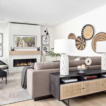
Fresh, bright, and comfortable, this living area has been transformed! We started with the fireplace as a focal point, selecting aged brick tiles for added texture and a crisp wood mantle. The taupe-coloured sectional infuses the room with visual warmth and serves the added purpose of separating the family room from the kitchen.
Emma and Vince were also keen on using non-toxic materials in their home, and we were happy to oblige. To meet their needs, we sourced natural wood elements and sought out Canadian-made products - that adhere to high health standards - whenever possible.
Look closer at the elements of this space, and you will find this stunning, honeycomb-patterned rug in earthy gold, beige, and charcoal tones. It’s plush to the touch and full of visual texture that brings this room’s colour palette together. We sourced these two-tone chairs with caning, petrified wood side table, black sconces, and botanical prints in greyscale from local artist, Heather Johnston.
We topped off the space with this dark wood and rattan console that offers storage facing the kitchen and presents an opportunity to display cherished items. The result is a cozy lounging space brimming with comfort and functionality. It’s perfect for enjoying quality family time, or Emma can simply slide the coffee table away to make room for her morning yoga practice.
Now, let’s turn around and give some attention to the kitchen. Do you remember what the original kitchen looked like? If not, scroll back up, because the transformation is shocking…
Moody & Welcoming Kitchen for Healthy Living:
This kitchen looks very different from how it started, right? Though we didn’t touch any walls, the kitchen has almost doubled in usable space! We created a long, extended island with storage, an outlet for small appliances, and seating for comfortable prep, after-school snacking, or mingling among friends.
On the other side of the island, the family has even more storage and an integrated dishwasher within easy reach of the sink, perfect for quick clean-up. From this angle, you can also see the expansive custom Shaker cabinetry in white and the integrated double ovens. These facilitate their cooking experience and gave us the opportunity to add an additional surprise…
A coffee garage station and more hidden storage! Keeping these items located along the perimeter allows them to be accessed by the family or their guests without someone getting under the cook’s feet. These are the little details that make everyday life easier and more enjoyable.
Moving deeper into the kitchen, the seamless induction cooktop topped with a freestanding concealed hood fan commands attention in a soft yet prominent way. The natural wood accent mirrors the fireplace mantle, and the choice of off-black wood-grain cabinets not only continues our black-and-white colour palette but adds a sense of depth and contrast. The corner sink is located to the right and perfectly positioned with a view of their thriving backyard.
To invite more of this family’s character into the space, we mixed metals for interest — matte black, dark pewter, and warm brass — and created open shelves in white oak for their plants and decor. You can also glimpse the tumbled edge of the backsplash tile, which echoes the rustic brick of the fireplace. It adds that farmhouse charm while still feeling timeless and sophisticated.
Last but not least, we designed this dining banquette in the bay window (with integrated bench storage, of course), where the family can share a meal together, the kids can do homework, or Emma and Vince can work and enjoy a change of scenery from their offices. Like the other spaces in the home, it was designed to be beautiful, multi-functional, and long-lasting.
Praise from Our Clients:
It is clear that we love this home, but what did our clients have to say?
“Lori is a visionary and masters execution to the finest detail all at the same time. When she first met us to know more about who we are and how we live, she could right away envision how we could use the space in our kitchen and living room…The results exceeded our expectations.
Lori and her team were also a delight to work with — coordination with all the trades, fast problem-solving, regular updates, professional and friendly attitude of her entire team — made it the dream team. Thank you SHD for making our space so beautiful!”
In turn, we are so grateful for this family’s trust, their open communication, and for being wonderful people with whom to work. (So, thank you!)


 BARRETT STUDIO architects
After their Niwot, Colorado, home was inundated with floodwater and mud in the historic 2013 flood, the owners brought their “glass is half full” zest for life to the process of restarting their lives in a modest budget-conscious home. It wouldn’t have been possible without the goodwill of neighbors, friends, strangers, donated services, and their own grit and full engagement in the building process.
Water-shed Revival is a 2000 square foot home designed for social engagement, inside-outside living, the joy of cooking, and soaking in the sun and mountain views. The lofty space under the shed roof speaks of farm structures, but with a twist of the modern vis-à-vis clerestory windows and glass walls. Concrete floors act as a passive solar heat sink for a constant sense of thermal comfort, not to mention a relief for muddy pet paw cleanups. Cost-effective structure and material choices, such as corrugated metal and HardiePanel siding, point this home and this couple toward a renewed future.

 Elkay
A winning combination, this stainless steel kitchen sink brings timeless beauty, a seamless drain and a resilient finish to your favorite gathering place. The modern shape is perfect for every kitchen. Lustertone Iconix delivers style for today, tomorrow and every day. Sink: ETRU30179PD Faucet: LKAV1031NK

 Eldorado Stone
Stone: Seashell - Cut Coarse Stone
Cut Coarse Stone is reminiscent of a saw-cut Turkish Limestone. The highly textural and yet contemporary linear-style installs with a clean, dry-stack application. This stone is the perfect scale for an efficient installation, appealing to both commercial and residential exteriors and interiors. The stones include three different heights of 3″, 6″ and 9″ and various lengths from 12″ to 24″. The muted color palette is indicative of natural limestone.
Get a Sample of Seashell: http://www.eldoradostone.com/products/cut-coarse-stone/seashell/

 Coates Design Architecture + Interiors
Coates Design Architects Seattle
Lara Swimmer Photography
Fairbank Construction
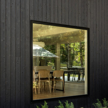
Mid-sized contemporary brown two-story wood house exterior idea in Seattle with a shed roof and a metal roof
Mid-sized contemporary brown two-story wood house exterior idea in Seattle with a shed roof and a metal roof

 Coco Atelier
TER won an honorary mention as a part of the YAC’s Calamity Atelier Competition, in addition to the prestigious A' Design Award for Interior Space & Exhibition Design 2019-2020.
The Calamity Atelier competition was based in the art forest of Arte Sella in northern Italy that was in recent years destroyed by a storm. The focus was to bring back life to the forest through the design of a number of spaces.
Design concept description:
Stability is a universal value one seeks to reach in their lifetime.
Given the recent events that shook the core of Art Sella, the basis of its recovery should be in the form of a stable foundation.
The design concept of TER, Malga Costa’s new restaurant expansion, derives from 3 main ideas:
1. What does a “stable” space feel like? Psychologically and physically.
2. The connection between the forest land and the food that is served at the restaurant.
3. How to integrate this space harmoniously into the forest in a way in which it will live cohesively with the neighboring artwork, nature, and people.
The idea of stability is translated through mass, shape, and materials. Different from most of the forest’s artwork, TER looks like a massive boulder rearing in the forest. The stone exterior makes up the majority of the interior as well, acting as its base material.
With the materials, there is a clear balance of old and new. The old acts as the foundation and pays homage to the area’s roots whereas the new alludes to a burgeoning future. Together, they play a game of layering and develop throughout the space.
The connection between the land and the food comes through the method of cooking in the restaurant- which is campfire cooking. In the center of the plan, there is an open outdoor space that is used to cook foods on an open fire. The plan is designed in a circular motion around the open space in order to fully commit to this concept. Everyone in the four areas of the restaurant can view and enjoy the chefs at work, creating a seemingly interactive dining experience.
The restaurant blends into its surroundings by acting as another rock in the landscape. It is differentiated by the smoke arising from its center, which creates a sense of allure and intrigue. It’s a sight that draws people in toward the center – reestablishing the core essence of Art Sella.

 OMNIA Group Architects
Fresh off the computer comes an OMNIA Group Architects custom designed home in Bucks County, Pennsylvania, nearing completion. The architectural drawings detail the trend towards first floor living. This architectural design features an open casual plan ready for intimate family gatherings and big parties. The luxuriously appointed Master Suite is located on the main level. A huge kitchen forms the hub of family life. Central to dining, casual and formal living spaces, the kitchen features the latest in appliances. The kitchen is separated from the Great Room by a built in bar. The second floor contains three en-suite bedrooms each offering family and guests a boutique hotel like array of amenities. The exterior is appointed with stone and stucco and features the finest in maintenance free yet beautiful materials. Nested into a brilliant sun filled and wooded lot in Bucks County, Pennsylvania, this home is custom designed by OMNIA Group Architects to serve its owners for generations. It is truly a masterpiece.

 Nakamoto Forestry
(via VonDalwig) An existing 1967 complex of three buildings and a pool situated on 13 acres of meadows and wetlands was previously renovated and 2009. The main house was extended and a pool added in that renovation but the addition and pool felt more like a detached limb than an integrated part to the house and the plan adjustments and facade work did little to take advantage of the beautiful property and surroundings. Our approach was to allow the parts – the buildings, the landscape, the pool – to unfold and connect to the whole both inside and out, spatially and programmatically – and to establish relationships between spaces that builds a ‘stage’ allowing a programmatic ‘dance’ for the owners to visually and physically connect to the beautiful exterior setting. We reconfigured the floor plan and exterior openings, directing it towards views and created an exterior pergola that include, rather than exclude, the guest studio while also fulfilling the town pool regulations. The outcome is a subtle framing of multiple platforms that connects in and out.

 K. Dakin Design Inc.
Dakin has been working with the owners of this site realize their dream of cultivating a rich and meaningful landscape around their home. Because of their deep engagement with their land and garden, the landscape has guided the entire design process, from architecture to civil engineering to landscape design.
All architecture on site is oriented toward the garden, a park-like, multi-use environment that includes a walking labyrinth, restored prairie, a Japanese garden, an orchard, vegetable beds, berry brambles, a croquet lawn and a charred wood outdoor shower. Dakin pays special attention to materials at every turn, selecting an antique sugar bowl for the outdoor fire pit, antique Japanese roof tiles to create blue edging, and stepping stones imported from India. In addition to its diversity of garden types, this permacultural paradise is home to chickens, ducks, and bees. A complex irrigation system was designed to draw alternately from wells and cisterns.
Dakin has also had the privilege of creating an arboretum of diverse and rare trees that she based on Olmsted’s design for Central Park. Trees were selected to display a variety of seasonally shifting delights: spring blooms, fall berries, winter branch structure. Mature trees onsite were preserved and sometimes moved to new locations.
 Henrys Painting & Contracting
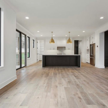
We are excited to transform our living room and kitchen into a stunning open floor plan that promotes functionality and modern aesthetics. Our goal is to create a seamless flow between these two areas to enhance the overall experience of cooking, entertaining, and spending quality time with family and friends. We envision a space that maximizes natural light and uses a mix of contemporary and traditional elements to combine warmth and sophistication. We are drawn to open concept designs that allow for easy interaction and communication between the kitchen and living room, making it perfect for gatherings and socializing. Our color scheme leans towards neutral tones such as greys, whites, and beiges, with pops of color through accent pieces and artwork. We'd like to incorporate a mix of textures and materials, such as hardwood flooring, stone countertops, and stainless steel appliances, to add depth and character to the space.
 USI Design & Remodeling
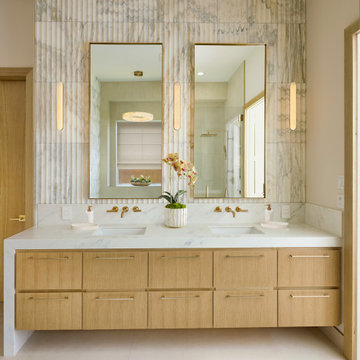
This master bathroom renovation in Frisco was completed for a repeat USI Design & Remodeling client as part of a larger first-floor transformation of the home. The original bathroom reflected a very typical North Texas layout of its era — dark stained cabinetry, granite countertops, compartmentalized vanities, a built-in tub adjoining a framed shower, and separated spaces that no longer aligned with how the homeowners wanted to live. As their aesthetic evolved toward a more transitional and contemporary direction, the goal became less about replacing finishes and more about redefining the experience of the room itself. The project needed to feel calmer, more architectural, and far more intentional in how the space functioned visually and emotionally.
One of the most important changes was removing the original shower curb and pony wall in favor of a fully open curbless shower with ultra-clear ½-inch heavy glass. Achieving that look required recessing the slab, re-floating the shower floor toward a linear drain, and engineering the space so the room would read as visually uninterrupted from end to end. Throughout the project, many of the design decisions were rooted in restraint rather than excess. The oversized 24x48 Porcelanosa flooring carries very little shade variation, creating a quieter visual field, while the cabinetry was executed in rift-sawn white oak specifically because it produces a far more controlled and consistent finish outcome than more common cuts of wood. In luxury projects, consistency itself becomes part of the refinement.
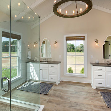
The floating vanity was designed more like custom furniture than traditional cabinetry, utilizing waterfall mitered edges and fully reworked plumbing locations so both homeowners could share in having generous functional countertop space. The original makeup station was repurposed into integrated storage with powered drawers and concealed organization for everyday items such as blow dryers and flat irons. Along the vanity wall, wall-mounted plumbing fixtures were paired with ribbed natural marble surfaces — a detail that required intentional planning long before construction began. Rather than allowing the ribbed material to terminate awkwardly behind the fixtures, the backsplash and stone transitions were specifically designed to resolve those conditions cleanly. Those are the types of details that distinguish highly coordinated design-build work from projects that simply assemble materials together.
While the room contains a significant amount of luxury detailing — from the freestanding tub and geoprism marble focal wall to the custom rift-sawn white oak closet doors and elongated mirrors that leverage the 11-foot ceiling heights — the project was always guided by quiet luxury rather than visual competition. Even the water closet enclosure was handled with restraint through the use of a satin-etched glass door rather than another heavy solid opening. The intent throughout was to create a bathroom that feels restorative and serene rather than overdesigned. In our view, the best luxury spaces are the ones that feel composed long after the initial impression wears off.

 Klopf Architecture
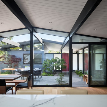
Located in Palo Alto's flood zone, this Eichler home underwent a phased renovation thoughtfully redesigned to accommodate a growing family of five, with an emphasis on school proximity and nearby grandparents. The bedroom wing was completely reconfigured, including a new front addition as a guest suite for grandparents, expanding the house to five bedrooms and three baths. Taller 9-foot ceilings were introduced in some areas, enhancing the overall openness—a lofty goal for an Eichler.
The tranquil courtyard, a favorite spot for the family, was redesigned to allow parents to watch the kids while cooking. The backyard became a relaxing lounging area connected to the living room. Once dark living spaces were modernized by removing a low-hanging beam in the kitchen, adding skylights for natural light, and eliminating the fireplace to create a more functional entertainment space. Finally, new landscaping reflecting the client's heritage and some of the home's architectural elements, creates a harmonious indoor-outdoor flow.
Klopf Architecture Project Team: John Klopf, AIA and Angela Alexander
Interior Architecture: Klopf Architecture
Bathroom Materials and Light Fixture Selection: Lucile Glessner
Landscape Architect: Thuilot and Associates
Photography: ©2024 Mariko Reed
Year Completed: 2024
Location: Palo Alto, CA

 Anjie Cho Architect PLLC
This was a design project inspired by feng shui and healthy living. we used as many non-toxic and organic materials as we could to create a peaceful feng shui home :)
Materials:
Organic and non toxic materials
Anna Sova paint and fabrics & Textiles, natural jute rug-ABC Home, buckwheat purple lavender zafu pillows (meditation cushions), Noguchi chair, custom bamboo sideboard, custom bamboo cabinets, custom Japanese calligraphy, custom Japanese noren, custom organic silk pillows, feng shui fountain, bathroom- decoration, custom organic, non-toxic shower curtain with custom ribbons, paint by Anna Sova- natural organic food-based milk paint, custom mirror with plyboo (bamboo ply), natural custom tatami mats

 Matt Fajkus Architecture
The site descends from the street and is privileged with dynamic natural views toward a creek below and beyond. To incorporate the existing landscape into the daily life of the residents, the house steps down to the natural topography. A continuous and jogging retaining wall from outside to inside embeds the structure below natural grade at the front with flush transitions at its rear facade. All indoor spaces open up to a central courtyard which terraces down to the tree canopy, creating a readily visible and occupiable transitional space between man-made and nature.
The courtyard scheme is simplified by two wings representing common and private zones - connected by a glass dining “bridge." This transparent volume also visually connects the front yard to the courtyard, clearing for the prospect view, while maintaining a subdued street presence. The staircase acts as a vertical “knuckle,” mediating shifting wing angles while contrasting the predominant horizontality of the house.
Crips materiality and detailing, deep roof overhangs, and the one-and-half story wall at the rear further enhance the connection between outdoors and indoors, providing nuanced natural lighting throughout and a meaningful framed procession through the property.
Photography
Charles Davis Smith
149