
Search results for "Towards material" in Home Design Ideas
 Plain & Posh
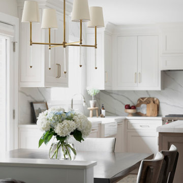
Thse clients came to me for a kitchen refresh. Keeping the existing floor plan but updating as much as possible. After explaining my thoughts, they chose to go with a much larger project. The wall to the garage wash pushed bach 12" to allow for the island to happen. This almost couldn't happen as there is a support post in the garage we had to keep. I designed the last pantry area as on 10" deep, allowing us to conceal that behind the cabinets. Then, we opend up the wall to the dining room to make the rooms one large space. The wall to the family room was also openend up, leaving the half wall to allow for the kitchen eating area. They wanted to incorporate a bar area, without it feeling like a "bar" The fabulous tall custom unit houses their wine collection and then half of the dining room buffet area holds glassware and other bar items. I helped the clients with all of the design choices.We all wanted to keep the space classic, war, functional and with mixed materials. I chose to use the same countertop material for the backsplash, to keep the space feeling as large as possible.
 Nakamoto Forestry
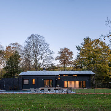
(via VonDalwig) An existing 1967 complex of three buildings and a pool situated on 13 acres of meadows and wetlands was previously renovated and 2009. The main house was extended and a pool added in that renovation but the addition and pool felt more like a detached limb than an integrated part to the house and the plan adjustments and facade work did little to take advantage of the beautiful property and surroundings. Our approach was to allow the parts – the buildings, the landscape, the pool – to unfold and connect to the whole both inside and out, spatially and programmatically – and to establish relationships between spaces that builds a ‘stage’ allowing a programmatic ‘dance’ for the owners to visually and physically connect to the beautiful exterior setting. We reconfigured the floor plan and exterior openings, directing it towards views and created an exterior pergola that include, rather than exclude, the guest studio while also fulfilling the town pool regulations. The outcome is a subtle framing of multiple platforms that connects in and out.


Find the right local pro for your project

 Byggmeister Inc
Photo by Jim Raycroft
The owner of this distinguished Somerville late Victorian wanted not just a new kitchen, but a more efficient and healthier house overall. The challenge wasn’t just to capture the light and view towards the Boston skyline; we also needed to improve the space plan and work flow. Overlaid on those goals, we needed to respect the carefully maintained Victorian character of the rest of the home and bring that sensibility back into the kitchen space.
OPENING THE SPACE
We removed the wall that isolated the sink space to create one unified kitchen area. We relocated the sink to a center island so that we could replace the small window with a large sliding glass door out onto the deck and the view of the skyline.
REPURPOSING MATERIALS
We salvaged and re-used the honey-colored southern yellow pine wainscoting; we matched and extended it to a window seat and laundry room door to create continuity and tie those new elements to the old. The cabinets and counters have traditional styling in light colors to reflect the light from the new sliding doors deep into the space. More light from the rear utility stairs is brought into the space by means of a frosted glass door.
IMPROVING EFFICIENCY
More prosaically, but just as important to the client and the project team, we upgraded the insulation and air-sealing throughout the house to improve the home’s comfort and efficiency.

 Outdoor Lighting Perspectives
Hardscape lighting installed into existing stonework walls. This is an example of how fully integrated "floating" effect for fixtures can be done even in existing hardscape.
This project also included all of the landscape lighting shown, including up-lights for the trees, back yard patio and stair lights, lighting for the sports court, etc.
 Dennis Hill Architect
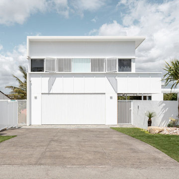
If you look closely, you can still find rare, curb-less, sand-fringed streets in and around Peregian Beach that serve as a reminder of the Sunshine Coast’s past - a time when life moved at a slower pace. Inspired by the humble fibro beach shacks of our history, Lorilet draws from an era when you could arrive home salty and sandy, toss your board aside, and sink into a depth of relaxation rarely achieved in today’s hectic world.
Lorilet is defined by the classic, simple geometry of the traditional "fibro shack." Clad in classic panels and punctuated by subtle accents of colour - a nod to vintage mid-century palettes - the home balances a solid structural presence with soft, textured materiality. From the street, the residence presents as a modest two-storey shack, intentionally disguising its true scale by nesting an entire level of function below street level.
Upon arrival, a turf-block path guides visitors toward the front gate and into the arrival court - a curated, light-filled space where a tiled pool and private alfresco redefine the coastal threshold. Here, the design intent becomes clear: Lorilet is an exploration of sightlines and seamless spatial flow. The home is configured to open entirely from the front courtyard, through the central core, to frame uninterrupted vistas of the western mountain ranges. One can sit by the pool and watch the sun set deep behind the distant ranges, looking straight through the heart of the home. While the primary open-plan living spaces remain uncluttered and intentionally simple, the hidden lower level steps down the site to accommodate three bedrooms, including a private guest suite that opens onto the rear garden. Tucked deep within this level, a wine cellar takes advantage of the natural thermal stability of the earth, providing the perfect environment for storage.
The uppermost level provides a private domain for work and contemplation. A dedicated office yields ocean views - a necessary distraction and a constant reminder of the surf - while the master suite features an integrated ensuite with sweeping views toward the western ranges. Concealed at the highest point of the structure, an elevated viewing platform offers a solitary vantage point to check the morning swell.
Through a focus on setting, occupation, and use, Lorilet explores a narrative of deep connection to both coastal history and its immediate natural environment.

 Matt Fajkus Architecture
The site descends from the street and is privileged with dynamic natural views toward a creek below and beyond. To incorporate the existing landscape into the daily life of the residents, the house steps down to the natural topography. A continuous and jogging retaining wall from outside to inside embeds the structure below natural grade at the front with flush transitions at its rear facade. All indoor spaces open up to a central courtyard which terraces down to the tree canopy, creating a readily visible and occupiable transitional space between man-made and nature.
The courtyard scheme is simplified by two wings representing common and private zones - connected by a glass dining “bridge." This transparent volume also visually connects the front yard to the courtyard, clearing for the prospect view, while maintaining a subdued street presence. The staircase acts as a vertical “knuckle,” mediating shifting wing angles while contrasting the predominant horizontality of the house.
Crips materiality and detailing, deep roof overhangs, and the one-and-half story wall at the rear further enhance the connection between outdoors and indoors, providing nuanced natural lighting throughout and a meaningful framed procession through the property.
Photography
Charles Davis Smith

 Byggmeister Inc
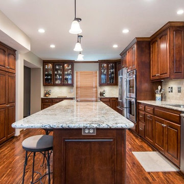
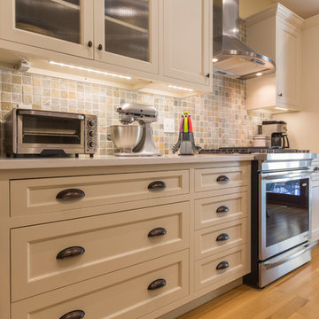
The owner of this distinguished Somerville late Victorian wanted not just a new kitchen, but a more efficient and healthier house overall. The challenge wasn’t just to capture the light and view towards the Boston skyline; we also needed to improve the space plan and work flow. Overlaid on those goals, we needed to respect the carefully maintained Victorian character of the rest of the home and bring that sensibility back into the kitchen space.
OPENING THE SPACE
We removed the wall that isolated the sink space to create one unified kitchen area. We relocated the sink to a center island so that we could replace the small window with a large sliding glass door out onto the deck and the view of the skyline.
REPURPOSING MATERIALS
We salvaged and re-used the honey-colored southern yellow pine wainscoting; we matched and extended it to a window seat and laundry room door to create continuity and tie those new elements to the old. The cabinets and counters have traditional styling in light colors to reflect the light from the new sliding doors deep into the space. More light from the rear utility stairs is brought into the space by means of a frosted glass door.
IMPROVING EFFICIENCY
More prosaically, but just as important to the client and the project team, we upgraded the insulation and air-sealing throughout the house to improve the home’s comfort and efficiency.
Photo by Jim Raycroft
 Dream Coast Builders
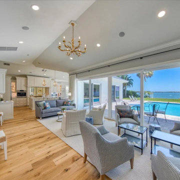
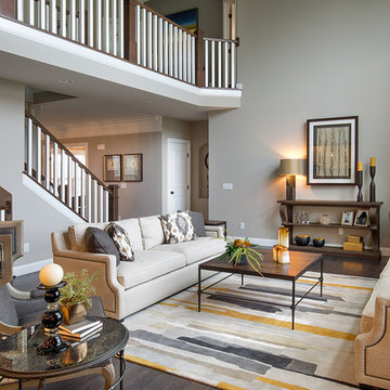
This living space is structured around an open layout with expansive views toward the water, anchored by a full-length sliding glass wall that opens directly onto a paved patio and private in-ground pool. The vaulted ceiling features recessed lighting and a sculptural brass chandelier suspended over the main seating zone. Pale oak plank flooring is installed in a staggered pattern, running wall-to-wall and transitioning into a textured area rug that defines the lounge footprint.
Furniture is arranged for both conversation and outdoor visibility, with paired accent chairs, a two-seat sofa, and dual glass-top coffee tables placed on a continuous axis parallel to the window wall. Upholstery patterns vary subtly between seating types to maintain visual texture without breaking cohesion. The adjacent kitchen features white shaker cabinetry, pendant lighting, and a central island with integrated seating. Overall, the space balances traditional trim detail with updated materials and clean circulation paths throughout.
 Byggmeister Inc
Photo by Jim Raycroft
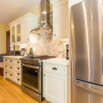
The owner of this distinguished Somerville late Victorian wanted not just a new kitchen, but a more efficient and healthier house overall. The challenge wasn’t just to capture the light and view towards the Boston skyline; we also needed to improve the space plan and work flow. Overlaid on those goals, we needed to respect the carefully maintained Victorian character of the rest of the home and bring that sensibility back into the kitchen space.
OPENING THE SPACE
We removed the wall that isolated the sink space to create one unified kitchen area. We relocated the sink to a center island so that we could replace the small window with a large sliding glass door out onto the deck and the view of the skyline.
REPURPOSING MATERIALS
We salvaged and re-used the honey-colored southern yellow pine wainscoting; we matched and extended it to a window seat and laundry room door to create continuity and tie those new elements to the old. The cabinets and counters have traditional styling in light colors to reflect the light from the new sliding doors deep into the space. More light from the rear utility stairs is brought into the space by means of a frosted glass door.
IMPROVING EFFICIENCY
More prosaically, but just as important to the client and the project team, we upgraded the insulation and air-sealing throughout the house to improve the home’s comfort and efficiency.

 DesignARC
SANTA BARBARA, CA / DUPLEX RESIDENTIAL
This urban infill, artist loft duplex was located in an overlooked, but well-located, light-commercial zone. It was also the first new residential construction built in the area for decades, the project is located within a 10-square-block area zoned for light-commercial and affectionately dubbed the “Funk Zone” by resident artists and city planners.
Only two blocks walking distance to the beach, and a similar distance to the downtown commercial district, this pedestrian-oriented project ideally suits the lifestyles of the owners. Although the two units share equal footprints, the southerly unit features a double-height, north-facing living space. The northerly unit supplants this volume with additional living space. The siting also allows for secure private courtyard entries, maximization of natural light and view-swept, rooftop living space.
The design incorporates a raised plinth required by flood zone restrictions to create a peaceful, intimate environment within the somewhat chaotic surrounding context. The disciplined and restrained approach towards the building’s image was intended to make reference to the much-loved Meridian Studios by George Washington Smith. Two roof-decks with outdoor fireplaces and shade trellises extend outdoor living space, contribute ocean and mountain views and provide both refuge and release.
Cost-effective materials were selected in order to adhere to the strict budget and to relate to the industrial surroundings. Over-sized pivot doors, “industrial” staircases and cabinetry were constructed on-site by the owners to conserve design integrity within the extremely limited budget.
2000 AIA Santa Barbara Chapter Honor Award


 Kraft Custom Construction
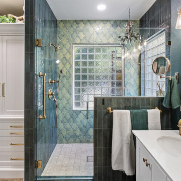
Built from the ground up on 80 acres outside Dallas, Oregon, this new modern ranch house is a balanced blend of natural and industrial elements. The custom home beautifully combines various materials, unique lines and angles, and attractive finishes throughout. The property owners wanted to create a living space with a strong indoor-outdoor connection. We integrated built-in sky lights, floor-to-ceiling windows and vaulted ceilings to attract ample, natural lighting. The master bathroom is spacious and features an open shower room with soaking tub and natural pebble tiling. There is custom-built cabinetry throughout the home, including extensive closet space, library shelving, and floating side tables in the master bedroom. The home flows easily from one room to the next and features a covered walkway between the garage and house. One of our favorite features in the home is the two-sided fireplace – one side facing the living room and the other facing the outdoor space. In addition to the fireplace, the homeowners can enjoy an outdoor living space including a seating area, in-ground fire pit and soaking tub.

 Metta Home
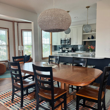
Designed to feel relaxed, welcoming, and deeply connected to the surrounding living spaces, this dining area bridges the kitchen, reading nook, and main living room to support easy gathering and everyday coastal living.
A Jaipur Living indoor/outdoor rug anchors the space with layered color and durability an intentional choice for a home that continues to function as a vacation rental while evolving toward more full-time living for the homeowners. Above, a sculptural beaded fixture from Hudson Valley Lighting introduces softness and texture against the home’s soaring architecture.
In keeping with the spirit of thoughtful renovation, the original dining table was retained and layered into the updated design, while the kitchen appliances were repurposed from the previous kitchen renovation to reduce unnecessary waste and maximize the project budget. The result feels collected rather than overly new balancing functionality, sustainability, and a relaxed coastal warmth.
 Dream Coast Builders
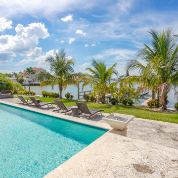
An in-ground pool anchors the backyard layout, bordered by diagonally laid travertine pavers in a lightly textured finish. The pool edge features narrow-format coping stones, and the interior is surfaced with a reflective, aqua-toned tile blend that enhances water clarity under direct sun exposure. A gas fire bowl is installed at one corner, cast in concrete and slightly elevated for visual balance against the flat deck plane.
Beyond the hardscape, a strip of manicured lawn separates the pool from the dock-facing garden. Palms of staggered heights are positioned to offer both shade and visual privacy without obstructing the open water view. Adjustable mesh lounge chairs are arranged along the sun deck, all oriented toward the bay. Low planter beds with symmetrical shrub groupings define the property edge while maintaining permeability. The outdoor zone combines hard material stability with layered softscaping for a balanced, resort-style residential profile.
 Dream Coast Builders
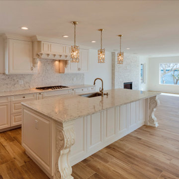
Craftsmanship defines this luxury home kitchen, where a statement island with sculpted corbels and waterfall corners anchors the room. Paneled cabinetry, crown profiles, and a marble-look surface convey high-end kitchen design while maintaining an open-concept kitchen layout to the water-facing living area. Brass-toned fixtures and warm pendants lend a soft glow across the counters, delivering modern house design comfort with timeless proportion. Along the perimeter, custom kitchen cabinetry integrates ventilation and storage, supporting modern kitchen renovation practicality without visual clutter. Wide-plank floors introduce natural texture, guiding movement toward a broad picture window that frames the shoreline—an elegant backdrop for entertaining. The palette and detailing provide contemporary kitchen ideas for a luxury kitchen remodel: durable materials, generous prep space, and designer kitchen decor that feels collected yet composed. Altogether, it offers luxury kitchen inspiration shaped for gracious coastal living.
 Taragano Design and Build
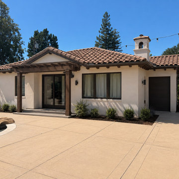
Design rendering for a detached accessory dwelling unit in Contra
Costa County, California, by Taragano Design & Build.
The roof is a single slope pitched toward the neighboring property
line, which keeps the tall wall facing the owner's yard. That
orientation determines everything else. Full height glass and the
transom band go on the high side where the ceiling is tallest and
the view is the client's own garden, not a fence.
Windows are placed to avoid the neighbor entirely on the low side.
On a small lot, privacy in both directions is a design constraint
before it is a courtesy, and it is easier to solve with window
placement than with landscape screening that takes years to fill in.
The soffit is stained wood rather than painted. It is the one warm
material on an otherwise plain building, and it sits where it is
seen from below on approach.
Planting was kept drought tolerant with permeable paths, which
suits both the water constraints most of our clients work within
and the lot coverage limits that apply once a second structure is
added.
Licensed general contractor, CSLB #1143420. Diamond Certified.


 Gappsi
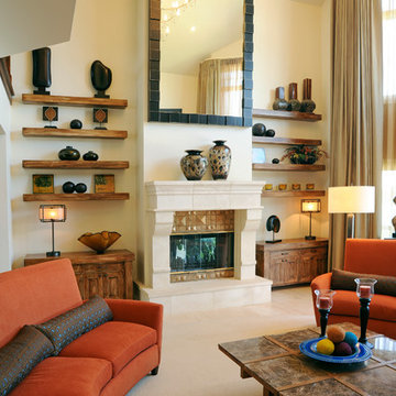
Stucco is a popular building material that is mainly used in residential exterior siding. It is a combination of sand, Portland cement, limestone and sometimes water. Plaster can be applied to wood, block and concrete. When applying stucco to wood framing, it is usually attached to a wire lath that is attached to the structural framing. Wood framing must be protected by a water resistant moisture barrier such as, asphalt building paper or different types of building wraps before the wire lath and stucco are applied. New stucco should cure for thirty days before prime and paint are applied. A common problem found in stucco due to the trapped moisture that migrates towards the stucco surface, it sometimes carries mineral deposits within it. This can cause a discoloration and sometimes adhesion problems. New stucco can sometimes develop cracks during the curing process. As water is eliminated and the stucco hardens, hairline cracks tend to occur. Once you apply the primer and paint with a paint roller it typically fills the narrow cracks. The roller helps push the paint into the cracks. Larger stucco cracks require a stucco patch filler to bridge the gap. When painting new you must include a primer coat and one or two finishing coats. All paints and primers should be used for exterior surfaces.
 Lincoln Lighthill Architect
 employed several discrete updates that collectively transform this existing row house.
At the heart of the home, a section of floor was removed at the top level to open up the existing stair and allow light from a new skylight to penetrate deep into the home. The stair itself received a new maple guardrail and planter, with a Fiddle-leaf fig tree growing up through the opening towards the skylight.
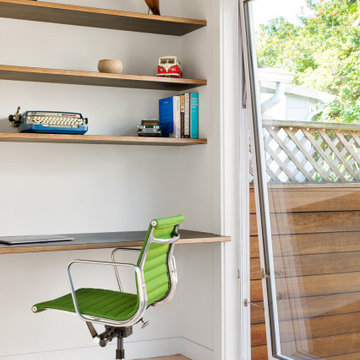
On the top living level, an awkwardly located entrance to a full bathroom directly off the main stair was moved around the corner and out of the way by removing a little used tub from the bathroom, as well as an outdated heater in the back corner. This created a more discrete entrance to the existing, now half-bath, and opened up a space for a wall of pantry cabinets with built-in refrigerator, and an office nook at the rear of the house with a huge new awning window to let in light and air.
Downstairs, the two existing bathrooms were reconfigured and recreated as dedicated master and kids baths. The kids bath uses yellow and white hexagonal Heath tile to create a pixelated celebration of color. The master bath, hidden behind a flush wall of walnut cabinetry, utilizes another Heath tile color to create a calming retreat.
Throughout the home, walnut thin-ply cabinetry creates a strong contrast to the existing maple flooring, while the exposed blond edges of the material tie the two together. Rounded edges on integral pulls and door edges create pinstripe detailing that adds richness and a sense of playfulness to the design.
This project was featured by Houzz: https://tinyurl.com/stn2hcze
 DesignARC
SANTA BARBARA, CA / DUPLEX RESIDENTIAL
This urban infill, artist loft duplex was located in an overlooked, but well-located, light-commercial zone. It was also the first new residential construction built in the area for decades, the project is located within a 10-square-block area zoned for light-commercial and affectionately dubbed the “Funk Zone” by resident artists and city planners.
Only two blocks walking distance to the beach, and a similar distance to the downtown commercial district, this pedestrian-oriented project ideally suits the lifestyles of the owners. Although the two units share equal footprints, the southerly unit features a double-height, north-facing living space. The northerly unit supplants this volume with additional living space. The siting also allows for secure private courtyard entries, maximization of natural light and view-swept, rooftop living space.
The design incorporates a raised plinth required by flood zone restrictions to create a peaceful, intimate environment within the somewhat chaotic surrounding context. The disciplined and restrained approach towards the building’s image was intended to make reference to the much-loved Meridian Studios by George Washington Smith. Two roof-decks with outdoor fireplaces and shade trellises extend outdoor living space, contribute ocean and mountain views and provide both refuge and release.
Cost-effective materials were selected in order to adhere to the strict budget and to relate to the industrial surroundings. Over-sized pivot doors, “industrial” staircases and cabinetry were constructed on-site by the owners to conserve design integrity within the extremely limited budget.
2000 AIA Santa Barbara Chapter Honor Award
152