
Search results for "Two sitting areas" in Home Design Ideas
 AoDK Inc.
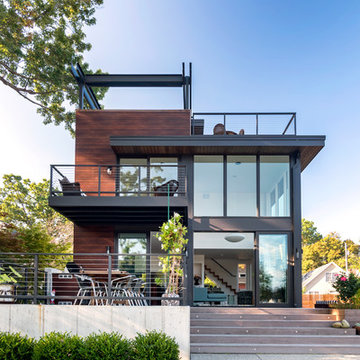
A couple wanted a weekend retreat without spending a majority of their getaway in an automobile. Therefore, a lot was purchased along the Rocky River with the vision of creating a nearby escape less than five miles away from their home. This 1,300 sf 24’ x 24’ dwelling is divided into a four square quadrant with the goal to create a variety of interior and exterior experiences while maintaining a rather small footprint.
Typically, when going on a weekend retreat one has the drive time to decompress. However, without this, the goal was to create a procession from the car to the house to signify such change of context. This concept was achieved through the use of a wood slatted screen wall which must be passed through. After winding around a collection of poured concrete steps and walls one comes to a wood plank bridge and crosses over a Japanese garden leaving all the stresses of the daily world behind.
The house is structured around a nine column steel frame grid, which reinforces the impression one gets of the four quadrants. The two rear quadrants intentionally house enclosed program space but once passed through, the floor plan completely opens to long views down to the mouth of the river into Lake Erie.
On the second floor the four square grid is stacked with one quadrant removed for the two story living area on the first floor to capture heightened views down the river. In a move to create complete separation there is a one quadrant roof top office with surrounding roof top garden space. The rooftop office is accessed through a unique approach by exiting onto a steel grated staircase which wraps up the exterior facade of the house. This experience provides an additional retreat within their weekend getaway, and serves as the apex of the house where one can completely enjoy the views of Lake Erie disappearing over the horizon.
Visually the house extends into the riverside site, but the four quadrant axis also physically extends creating a series of experiences out on the property. The Northeast kitchen quadrant extends out to become an exterior kitchen & dining space. The two-story Northwest living room quadrant extends out to a series of wrap around steps and lounge seating. A fire pit sits in this quadrant as well farther out in the lawn. A fruit and vegetable garden sits out in the Southwest quadrant in near proximity to the shed, and the entry sequence is contained within the Southeast quadrant extension. Internally and externally the whole house is organized in a simple and concise way and achieves the ultimate goal of creating many different experiences within a rationally sized footprint.
Photo: Sergiu Stoian
 Leicht Westchester-Greenwich
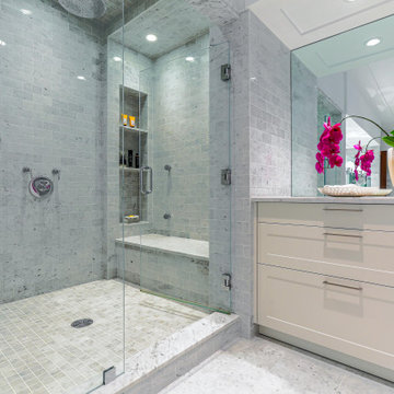
A special LEICHT Westchester | Greenwich project.
Located in Chappaqua, Westchester County, NY. this beautiful project was done in two phases, guest house first and then the main house.
In the main house, we did the kitchen and butler pantry, living area and bar, laundry room; master bathroom and master closet, three bathrooms.
In the guest house, we did the kitchen and bar; laundry; guest bath and master bath.
All LEICHT.
All cabinetry is "CARRE FS" in Frosty White finish color and the wood you see is all TOPOS in walnut color.
2 kitchens 7 bathrooms
Laundry room
Closet
Pantry
We enjoyed every step of the way working on this project. A wonderful family that worked with us in true collaboration to create this beautiful final outcome.
Designer: Leah Diamond – LEICHT Westchester |Greenwich
Photographer: Zdravko Cota
 Haven Design and Construction
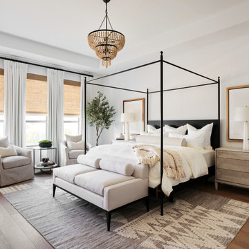
Our team began the master bedroom design by anchoring the room with a dramatic but simple black canopy bed. The next layer was a neutral but textured area rug with a herringbone "zig zag" design that we repeated again in our throw pillows and nightstands. The light wood of the nightstands and woven window shades added subtle contrast and texture. Two seating areas provide ample comfort throughout the bedroom with a small sofa at the end of the bed and comfortable swivel chairs in front of the window. The long simple drapes are anchored by a simple black rod that repeats the black iron element of the canopy bed. The dresser is also black, which carries this color around the room. A black iron chandelier with wooden beads echoes the casually elegant design, while layers of cream bedding and a textural throw complete the design.
Find the right local pro for your project
 Haven Design and Construction
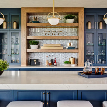
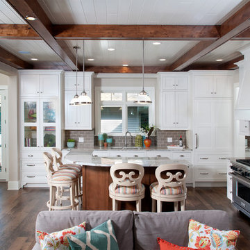
The expansive basement entertainment area features a tv room, a kitchenette and a custom bar for entertaining. The custom entertainment center and bar areas feature bright blue cabinets with white oak accents. Lucite and gold cabinet hardware adds a modern touch. The sitting area features a comfortable sectional sofa and geometric accent pillows that mimic the design of the kitchenette backsplash tile. The kitchenette features a beverage fridge, a sink, a dishwasher and an undercounter microwave drawer. The large island is a favorite hangout spot for the clients' teenage children and family friends. The convenient kitchenette is located on the basement level to prevent frequent trips upstairs to the main kitchen. The custom bar features lots of storage for bar ware, glass display cabinets and white oak display shelves. Locking liquor cabinets keep the alcohol out of reach for the younger generation.
 Visbeen Architects
Forget just one room with a view—Lochley has almost an entire house dedicated to capturing nature’s best views and vistas. Make the most of a waterside or lakefront lot in this economical yet elegant floor plan, which was tailored to fit a narrow lot and has more than 1,600 square feet of main floor living space as well as almost as much on its upper and lower levels. A dovecote over the garage, multiple peaks and interesting roof lines greet guests at the street side, where a pergola over the front door provides a warm welcome and fitting intro to the interesting design. Other exterior features include trusses and transoms over multiple windows, siding, shutters and stone accents throughout the home’s three stories. The water side includes a lower-level walkout, a lower patio, an upper enclosed porch and walls of windows, all designed to take full advantage of the sun-filled site. The floor plan is all about relaxation – the kitchen includes an oversized island designed for gathering family and friends, a u-shaped butler’s pantry with a convenient second sink, while the nearby great room has built-ins and a central natural fireplace. Distinctive details include decorative wood beams in the living and kitchen areas, a dining area with sloped ceiling and decorative trusses and built-in window seat, and another window seat with built-in storage in the den, perfect for relaxing or using as a home office. A first-floor laundry and space for future elevator make it as convenient as attractive. Upstairs, an additional 1,200 square feet of living space include a master bedroom suite with a sloped 13-foot ceiling with decorative trusses and a corner natural fireplace, a master bath with two sinks and a large walk-in closet with built-in bench near the window. Also included is are two additional bedrooms and access to a third-floor loft, which could functions as a third bedroom if needed. Two more bedrooms with walk-in closets and a bath are found in the 1,300-square foot lower level, which also includes a secondary kitchen with bar, a fitness room overlooking the lake, a recreation/family room with built-in TV and a wine bar perfect for toasting the beautiful view beyond.
 Deborah Broockerd/DkB Design Services
Photo byAngie Seckinger
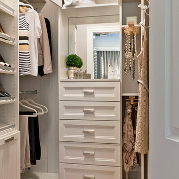
Small walk-in designed for maximum use of space. Custom accessory storage includes double-decker jewelry drawer with velvet inserts, Maple pull-outs behind door for necklaces & scarves, vanity area with mirror, slanted shoe shelves, valet rods & hooks.
 Chambers Interiors & Associates, Inc.
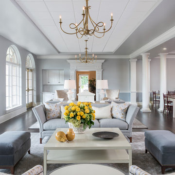
We lit these two large sitting areas adjacent to the dining room with brass chandeliers. The sitting areas comfortably accommodate nine people each. Meanwhile, the dining room seen on the right seats up to 100 members.
Photography by Michael Hunter Photography.
Sponsored
Westerville, OH

Inspired Closets Columbus
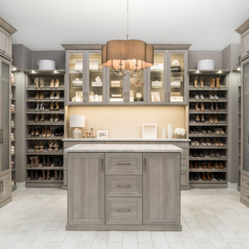
Innovative & Creative Custom Closet Designer Servicing Franklin County
 ODS Architecture
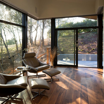
In the hills of San Anselmo in Marin County, this 5,000 square foot existing multi-story home was enlarged to 6,000 square feet with a new dance studio addition with new master bedroom suite and sitting room for evening entertainment and morning coffee. Sited on a steep hillside one acre lot, the back yard was unusable. New concrete retaining walls and planters were designed to create outdoor play and lounging areas with stairs that cascade down the hill forming a wrap-around walkway. The goal was to make the new addition integrate the disparate design elements of the house and calm it down visually. The scope was not to change everything, just the rear façade and some of the side facades.
The new addition is a long rectangular space inserted into the rear of the building with new up-swooping roof that ties everything together. Clad in red cedar, the exterior reflects the relaxed nature of the one acre wooded hillside site. Fleetwood windows and wood patterned tile complete the exterior color material palate.
The sitting room overlooks a new patio area off of the children’s playroom and features a butt glazed corner window providing views filtered through a grove of bay laurel trees. Inside is a television viewing area with wetbar off to the side that can be closed off with a concealed pocket door to the master bedroom. The bedroom was situated to take advantage of these views of the rear yard and the bed faces a stone tile wall with recessed skylight above. The master bath, a driving force for the project, is large enough to allow both of them to occupy and use at the same time.
The new dance studio and gym was inspired for their two daughters and has become a facility for the whole family. All glass, mirrors and space with cushioned wood sports flooring, views to the new level outdoor area and tree covered side yard make for a dramatic turnaround for a home with little play or usable outdoor space previously.
Photo Credit: Paul Dyer Photography.
 Asha Mevlana
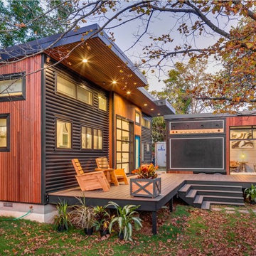
Who lives there: Asha Mevlana and her Havanese dog named Bali
Location: Fayetteville, Arkansas
Size: Main house (400 sq ft), Trailer (160 sq ft.), 1 loft bedroom, 1 bath
What sets your home apart: The home was designed specifically for my lifestyle.
My inspiration: After reading the book, "The Life Changing Magic of Tidying," I got inspired to just live with things that bring me joy which meant scaling down on everything and getting rid of most of my possessions and all of the things that I had accumulated over the years. I also travel quite a bit and wanted to live with just what I needed.
About the house: The L-shaped house consists of two separate structures joined by a deck. The main house (400 sq ft), which rests on a solid foundation, features the kitchen, living room, bathroom and loft bedroom. To make the small area feel more spacious, it was designed with high ceilings, windows and two custom garage doors to let in more light. The L-shape of the deck mirrors the house and allows for the two separate structures to blend seamlessly together. The smaller "amplified" structure (160 sq ft) is built on wheels to allow for touring and transportation. This studio is soundproof using recycled denim, and acts as a recording studio/guest bedroom/practice area. But it doesn't just look like an amp, it actually is one -- just plug in your instrument and sound comes through the front marine speakers onto the expansive deck designed for concerts.
My favorite part of the home is the large kitchen and the expansive deck that makes the home feel even bigger. The deck also acts as a way to bring the community together where local musicians perform. I love having a the amp trailer as a separate space to practice music. But I especially love all the light with windows and garage doors throughout.
Design team: Brian Crabb (designer), Zack Giffin (builder, custom furniture) Vickery Construction (builder) 3 Volve Construction (builder)
Design dilemmas: Because the city wasn’t used to having tiny houses there were certain rules that didn’t quite make sense for a tiny house. I wasn’t allowed to have stairs leading up to the loft, only ladders were allowed. Since it was built, the city is beginning to revisit some of the old rules and hopefully things will be changing.
Photo cred: Don Shreve
 Anderson Design / ErosionZ. Minnesota Landscape.
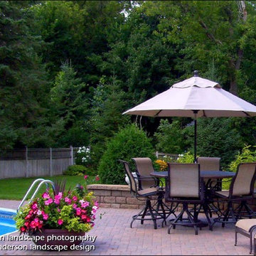
Off to the side of the pool, the sitting and entertaining area was expanded to give ample room for large groups. A sitting wall wraps the outside edge of the setting. Credit: Tad Anderson. All rights exclusively reserved.
 River Valley Landscapes
Before - After many years of having no outdoor living space and dealing with overgrown plants and trees the owner’s decided it was time to revitalize their backyard. They knew they wanted a large sitting area with a wood burning fireplace, room for outdoor dining and a place for the grill. A connecting walk would be needed to get guests from the driveway to the outdoor space. Last but not least, the owners wanted the ability to and a reason for stepping out of their unusable patio doors.
The designers decided from the start the fireplace would be the prominent feature and focal point for the entire project. A large fireplace accented with sitting walls and arbors was positioned to anchor the corner of the patio. Stone was chosen to set the fireplace apart as its own element. Brick was used for the sitting walls and brick accents were added to the fireplace to tie into the house. An inlaid herringbone brick detail was incorporated above the stone mantle to simulate artwork which is typically found above indoor fireplaces. Flagstone was used for the wall caps and hearth to match the patio and thicker flagstone tread stock was used for the mantle and top. The arbors were added to visually balance the pergolas at the opposite side of the patio.
For the patio the designers created a series of offset spaces to help subtly divide the space into two areas, sitting and dining. Two large existing trees also help dictate the shape of the patio. Cut flagstone was chosen for the surface bordered by a double soldier edge of brick. The brick edging also surrounds a decorative gravel area topped with an urn fountain which provides a secondary focal point and the sound of water. Large flagstone treads were used for the steps leading to the previously unused patio doors. Opposite the fireplace a short walk leads to a square transition area with a statue chosen by the owner. The statue provides a strong focal point when entering from the driveway. A longer walk leads from this space along the house to the driveway.
The pergolas and arbors were designed by the landscape designer as part of this project but were ultimately contracted separately by the owner. The larger square pergola was intended as an area for a bench or two separate from the main patio. The longer pergola was added later in the design phase to help provide shade to the interior of the house. The arbors at the fireplace were added to balance out the wood elements at the opposite side while adding additional architectural interest to the fireplace.
While this project was predominantly hardscaping, planting and lighting were also incorporated into the design. Several large existing trees were retained and serious of smaller understory trees were added to help enclose the space. The designer’s took advantage of the large trees to place down lights on the branches to achieve a moonlight effect at night. Additional lighting was used on the pergola, to accent focal points, to up light the smaller trees and around the patio. Massed planting of Japanese forest grass provides bold foliage color for the shady garden. A mulch path leads off behind the fireplace to another garden and a secluded area ideal for a bench or small table and chairs. Additional plantings were added along the rear property line to screen and unsightly fence.
This project has obviously completely changed the way the owners use their backyard. They now have a seamless transition from indoors to outdoors with the use of the patio doors. The large patio allows for entertaining small gatherings outdoors for the first time. The fireplace has definitely become the primary gathering place for family and friends.
 Visbeen Architects
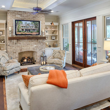
The best of past and present architectural styles combine in this welcoming, farmhouse-inspired design. Clad in low-maintenance siding, the distinctive exterior has plenty of street appeal, with its columned porch, multiple gables, shutters and interesting roof lines. Other exterior highlights included trusses over the garage doors, horizontal lap siding and brick and stone accents. The interior is equally impressive, with an open floor plan that accommodates today’s family and modern lifestyles. An eight-foot covered porch leads into a large foyer and a powder room. Beyond, the spacious first floor includes more than 2,000 square feet, with one side dominated by public spaces that include a large open living room, centrally located kitchen with a large island that seats six and a u-shaped counter plan, formal dining area that seats eight for holidays and special occasions and a convenient laundry and mud room. The left side of the floor plan contains the serene master suite, with an oversized master bath, large walk-in closet and 16 by 18-foot master bedroom that includes a large picture window that lets in maximum light and is perfect for capturing nearby views. Relax with a cup of morning coffee or an evening cocktail on the nearby covered patio, which can be accessed from both the living room and the master bedroom. Upstairs, an additional 900 square feet includes two 11 by 14-foot upper bedrooms with bath and closet and a an approximately 700 square foot guest suite over the garage that includes a relaxing sitting area, galley kitchen and bath, perfect for guests or in-laws.
 Kelly Rogers Interiors
Eric Roth Photography
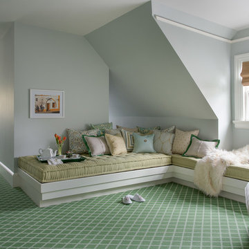
Inspiration for a large timeless guest carpeted and green floor bedroom remodel in Boston with blue walls
Inspiration for a large timeless guest carpeted and green floor bedroom remodel in Boston with blue walls

 Twelve Stones Designs, LLC
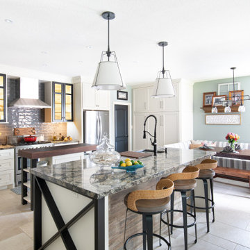
The owners of this kitchen had spent the money to upgrade the finishes in their kitchen upon building the home 12 years ago, but after living in the space for several years they realized how nonfunctional the layout really was. The (then) two preschool aged children had grown into busy, hungry teenagers with many friends who also liked to hang out at the house. So the family needed a more functional kitchen with better traffic flow, space for daily activities revolving around the kitchen at different times of day, and a kitchen that could accommodate cooking for and serving large groups. Furthermore, the dark, traditional finishes no longer reflected the homeowners’ style. They requested a brighter, more relaxed, coastal style that reflected their love of the seaside cities they like to visit.
Originally, the kitchen was U-shaped with a narrow island in the middle. The island created narrow aisles that bottle-necked at the dishwasher, refrigerator, and cooktop areas. There was a pass-through from the foyer into the kitchen, but the owners never liked that the pass-through was also located so close to the powder room. The awkward proximity was unappealing and made guests feel uncomfortable.
The kitchen’s storage was made up of lots of narrow cabinets, apothecary drawers, clipped corner units, and very few drawers. It lacked useful storage for the larger items the family used on a daily basis. And the kitchen’s only pantry was small closet that had only builder-grade, narrow shelving with no illumination to be able to see the contents inside.
Overall, the kitchen’s lighting plan was poorly executed. Only six recessed cans illuminated the entire kitchen and nook areas. The under cabinet lighting was not evenly distributed either. In fact, the builder had mis-placed the under cabinet lighting around the decorative pilasters which made for choppy, dark cubbies. Further, the builder didn’t include any lighting over the sink or the bar area, which meant whoever was doing the dishes was always in their own shadow. That, coupled with the steep overhang of the game room above made the bar area feel like a dim, cavernous space that wasn’t inviting or task oriented. The kitchen looked out into the main living space, but the raised bar and a narrow wall (which held the only large cabinet in the kitchen) created more of a barrier than a relationship to the living room or breakfast nook. In fact, one couldn’t even see the breakfast nook from the cooktop or sink areas due to its orientation. The raised bar top was too narrow to comfortably sit to either dine at or chat from due to the lack of knee space. The the homeowners confided that the kitchen felt more like a dark, dirty prison than place where the family, or their guests, wanted to gather and commune.
The clients' needs and desires were:
➢ to create a kitchen that would be a space the family loved to be in; to relate to the adjacent spaces all around, and to have better flow for entertaining large groups
➢ to remove the walls between the breakfast nook and living area and to be able to utilize the natural light from the windows in both those areas
➢ to incorporate a functional chopping block for prepping fresh food for home cooked meals, an island with a large sink and drain board, 2 pull out trash cans, and seating for at least the 2 teens to eat or do homework
➢ to design a kitchen and breakfast nook with an airy, coastal, relaxed vibe that blended with the rest of the house's coastal theme
➢ to integrate a layered lighting plan which would include ample general illumination, specific task lighting, decorative lighting, and lots of illuminated storage
➢ to design a kitchen with not only more storage for all the husband’s kitchen gadgets and collection of oils and spices, but smart storage, including a coffee/breakfast bar and a place to store and conceal the toaster oven and microwave
➢ to find a way to utilize the large open space between the kitchen, pantry area, and breakfast nook
Twelve Stones Designs achieved the owner's goals by:
➢ removing the walls between the kitchen and living room to allow the natural light to filter in from the adjacent rooms and to create a connection between the kitchen, nook, and living spaces for a sense of unity and communion
➢ removing the existing pantry and designing 3 large pantry style cabinets with LED tape lights and rollout drawers to house lots of kitchen appliances, gadgets, and tons of groceries. We also took the cabinets all the way up to the 9’ ceiling for additional storage for seasonal items and bulk storage.
➢ designing 2 islands - 1 with a gorgeous black walnut chopping block that houses a drawer for chopping and carving knives and a custom double pull out trash unit for point of use utilization - and 1 that houses the dishwasher, a large Blanco Gourmet sink with integrated drain board, woven baskets for fresh root vegetables and kitchen towels, plenty of drawer storage for kitchen items, and bar seating for up to 4 diners.
➢ closing off the space between the kitchen and the powder room to create a beautiful new private alcove for the powder room as well as adding some decorative storage. This also gave us space to include more tall storage near the new range for precision placement of the husband’s extensive oil and spice collection as well as a location for a combo-steam oven the wife wanted for baking and cooking healthy meals.
The project is enhanced functionally by:
➢ incorporated USB and standard receptacles for the kids’ laptops and phone charging in the large island
➢ designing the small island to include additional open shelving for items used on a daily basis such as a variety of bowls, plates, and colanders. This set up also works well for the husband who prefers to “plate” his dinners in restaurant-style fashion before presenting them to the table.
➢ the integration of specific storage units, such as double stacked cutlery drawers, a custom spice pull-out, a Kuerig coffee and tea pod drawer, and custom double stacked utensil drawers
➢ moving the refrigerator to the old oven location - this eliminated the bottle neck as well as created a better relationship to the eating table. It also utilizes the floor space between the pantry, nook, and kitchen
➢ creating a banquet style breakfast nook - this banquette seating not only doubles the amount of seating for large gatherings but it better utilizes the odd space between the kitchen and the previous nook area. It also helps to create a distinct pathway from the mudroom room through the pantry area, kitchen, nook, and living room.
➢ the coffee/breakfast bar area which includes the perfect location for the concealed microwave and toaster oven, convenient storage for the coffee pods and tea accoutrements. Roll-out drawers below also house the smoothie maker, hot water kettle, and a plethora of smoothie-making ingredients such as protein powders, smoothie additives, etc. Furthermore, the drawers below the Keurig house measuring utensil, cutlery, baking supplies and tupperware storage.
➢ incorporating lots of wide drawers and pullouts to accommodate large cookware.
➢ utilizing as much vertical space as possible by building storage to the ceiling which accommodates the family’s abundant amount of serving platters, baking sheets, bakeware, casserole dishes, and additional cutting boards.
The project is enhanced aesthetically by:
➢ new 5-piece Versailles pattern porcelain tile that now seamlessly joins the entire down stairs area together creating a bright, cohesiveness feeling instead of choppy separated spaces - it also adds a coastal feeling
➢ designing a cabinet to conceal the microwave and toaster oven
➢ the coastal influenced light fixtures over the nook table and island
➢ the sandy colors of the Langdon Cambria countertops. The swirling pattern and sparkling quartz pieces remind the homeowner of black-and-tan sandy beaches
➢ the striped banquet seating whose creamy white background and blue-green stripes were the inspiration for the cabinet and wall colors.
➢ All the interior doors were painted black to coordinate with the blacks and grays in the backsplash tile and countertop. This also adds a hint of tailored formality to an otherwise casual space.
➢ the use of WAC's Oculux small aperture LED units for the overhead lighting complimented with Diode LED strips for task lighting under the cabinets and inside the pantry and glass wall cabinets. All of the lighting applications are on separate dimmer switches.
Innovative uses of materials or construction methods by Realty Restoration LLC:
➢ Each 1-1/2” x 3” block of reclaimed end-grain black walnut that makes up the center island chopping block was hand milled and built in the shop. It was designed to look substantial and proportional to the surrounding elements, executed by creating the 4 inch tall top with a solid wood chamfered edge band.
➢ The metal doors on either side of the vent hood were also custom designed for this project and built in the Realty Restoration LLC shop. They are made 1x2, 11-gauge mild steel with ribbed glass. Weighing 60 lbs a piece, heavy duty cabinet hinges were added to support the weight of the door and keep them from sagging.
➢ Under-cabinet receptacles were added along the range wall in order to have a clean, uninterrupted backsplash.
Design obstacles to overcome:
➢ Because we were removing the demising walls between the kitchen and living room, we had to find a way to plumb and vent the new island. We did this by tunneling through the slab (the slab had post tension cables which prevented us from just trenching) to run a new wet vent through a nearby structural wall. We pulled the existing hot and cold lines between upper floor joists and ran them down the structural wall as well and up through a conduit in the tunnel.
➢ Since we were converting from wall overs to a gas range it allowed us to utilize the 220 feed for the wall ovens to provide a new sub panel for all the new kitchen circuits
➢ Due to framing deficiencies inherited from the original build there was a 1-1/2” differential in the floor-to-ceiling height over a 20 foot span; by utilizing the process of cutting and furring coupled with the crown moulding details on the cabinet elevations we were able to mask the problem and provide seamless transitions between the cabinet components.
Evidence of superior craftsmanship:
➢ uniquely designed, one-of-a-kind metal “X” end panels on the large island. The end panels were custom made in the Realty Restoration LLC shop and fitted to the exact dimensions of the island. The welding seams are completely indistinguishable - the posts look like they are cut from a single sheet of metal
➢ square metal posts on the small island were also custom made and designed to compliment and carry through the metal element s throughout the kitchen
➢ the beautiful, oversized end panels on the pantry cabinets which give the breakfast nook a tailored look
➢ integrating a large format 5 piece Versailles tile pattern to seamlessly flow from the existing spaces into the new kitchen space
➢ By constructing a custom cabinet that jogged around a corner we could not remodel (housing the entry way coat closet) we were able to camouflage the adjacent wall offset within the upper and lower cabinets. By designing around the existing jog in the structural walls we accomplished a few things: we were able to find the space to house, and hide, the microwave and toaster oven yet still have a clean cohesive appearance from the kitchen side. Additionally, the owners were able to keep their much needed coat closet and we didn’t have to increase the budget with unnecessary structural work.
 River Valley Landscapes
Before - After many years of having no outdoor living space and dealing with overgrown plants and trees the owner’s decided it was time to revitalize their backyard. They knew they wanted a large sitting area with a wood burning fireplace, room for outdoor dining and a place for the grill. A connecting walk would be needed to get guests from the driveway to the outdoor space. Last but not least, the owners wanted the ability to and a reason for stepping out of their unusable patio doors.
The designers decided from the start the fireplace would be the prominent feature and focal point for the entire project. A large fireplace accented with sitting walls and arbors was positioned to anchor the corner of the patio. Stone was chosen to set the fireplace apart as its own element. Brick was used for the sitting walls and brick accents were added to the fireplace to tie into the house. An inlaid herringbone brick detail was incorporated above the stone mantle to simulate artwork which is typically found above indoor fireplaces. Flagstone was used for the wall caps and hearth to match the patio and thicker flagstone tread stock was used for the mantle and top. The arbors were added to visually balance the pergolas at the opposite side of the patio.
For the patio the designers created a series of offset spaces to help subtly divide the space into two areas, sitting and dining. Two large existing trees also help dictate the shape of the patio. Cut flagstone was chosen for the surface bordered by a double soldier edge of brick. The brick edging also surrounds a decorative gravel area topped with an urn fountain which provides a secondary focal point and the sound of water. Large flagstone treads were used for the steps leading to the previously unused patio doors. Opposite the fireplace a short walk leads to a square transition area with a statue chosen by the owner. The statue provides a strong focal point when entering from the driveway. A longer walk leads from this space along the house to the driveway.
The pergolas and arbors were designed by the landscape designer as part of this project but were ultimately contracted separately by the owner. The larger square pergola was intended as an area for a bench or two separate from the main patio. The longer pergola was added later in the design phase to help provide shade to the interior of the house. The arbors at the fireplace were added to balance out the wood elements at the opposite side while adding additional architectural interest to the fireplace.
While this project was predominantly hardscaping, planting and lighting were also incorporated into the design. Several large existing trees were retained and serious of smaller understory trees were added to help enclose the space. The designer’s took advantage of the large trees to place down lights on the branches to achieve a moonlight effect at night. Additional lighting was used on the pergola, to accent focal points, to up light the smaller trees and around the patio. Massed planting of Japanese forest grass provides bold foliage color for the shady garden. A mulch path leads off behind the fireplace to another garden and a secluded area ideal for a bench or small table and chairs. Additional plantings were added along the rear property line to screen and unsightly fence.
This project has obviously completely changed the way the owners use their backyard. They now have a seamless transition from indoors to outdoors with the use of the patio doors. The large patio allows for entertaining small gatherings outdoors for the first time. The fireplace has definitely become the primary gathering place for family and friends.
 Bosler Earth Design
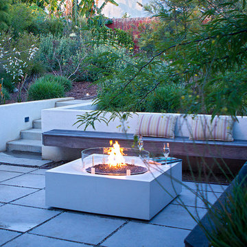
Fire pit with seating area in front of retaining wall.
©Daniel Bosler Photography
Small trendy backyard concrete paver drought-tolerant patio photo in Los Angeles with a fire pit
Small trendy backyard concrete paver drought-tolerant patio photo in Los Angeles with a fire pit
 By Design Interiors Inc
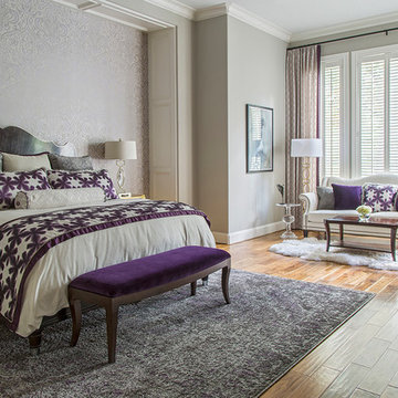
Creating a cozy yet elegant sanctuary in this large space definitely posed a design. An edgy damask patterned wall paper serves as the perfect backdrop for the stunning wood bed with chrome accents. Custom bedding and pillows were made with a assortment of fabrics mixing silvers, golds, creams, and pops of deep purple.
Erika Barczak, By Design Interiors Inc.
Photo Credit: Daniel Angulo www.danielangulo.com
Builder: Kichi Creek Builders


 The Closet Doctor
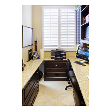
One homeowner of a particular model home in the Sun City Roseville development that came with a rather large space for a laundry room, was faced with this dilemma recently. After relocating her washer and dryer into the garage and setting up a make shift office of her own in the laundry room, the homeowner realized that, although she succeeded in turning the space into a somewhat functional work area, it just wasn’t up to par for all of her wants and needs. Hoping to come up some new small home office ideas that would squeeze all of her needs into the tiny space, she decided to seek help from a home organization specialist and sat down with The Closet Doctor. There were several requirements and obstacles that made the development of an office design which satisfied the homeowner particularly difficult. One was the need for two workstations which would have enough desk space for each person to sit comfortably and not be on top of each other. Another obstacle was the new design had to work around a cut-out in the corner of the wall, which contained built-in shelves for the components of a nearby entertainment center. Finally, the designer also had to be sure to incorporate “lots of legal sized filing drawers” into its new design.
The Closet Doctor went to work and was able to design a solution that, not only met all of the homeowner’s needs, but was attractive, and within her budget. The new built-in design included two work areas that were spacious and each with its own overhead cabinet, storage drawer, and single letter size file drawer for active projects. In between the two overhead cabinets, additional open shelving allowed for display items as well as space for a small TV in the center. Extra storage and organization space was also put behind doors for a clean and neat look. In addition, in order to maintain as much space as possible, the cabinets on the end and left side wall were made just deep enough to fit legal size lateral file drawers. Finally, the built in component shelves were left open in the corner for easy access, with the desk top passing in front of the space at the same height as one of the shelves, which gave the corner a neat and organized appearance as well. To top it off, low energy under cabinet LED lights with a dimmer switch were installed in order to illuminate the work area.
The Client loved the result of her home improvement project, in both the look and functionality of the new design compared to the “temporary setup” she had in place before. With the additional storage space and organization that the new built in office unit provided, the satisfied homeowner was able to achieve the clean and organized look as well as optimum functionality that she preferred.
 Alair Homes Plano
Our clients wanted to increase the size of their kitchen, which was small, in comparison to the overall size of the home. They wanted a more open livable space for the family to be able to hang out downstairs. They wanted to remove the walls downstairs in the front formal living and den making them a new large den/entering room. They also wanted to remove the powder and laundry room from the center of the kitchen, giving them more functional space in the kitchen that was completely opened up to their den. The addition was planned to be one story with a bedroom/game room (flex space), laundry room, bathroom (to serve as the on-suite to the bedroom and pool bath), and storage closet. They also wanted a larger sliding door leading out to the pool.
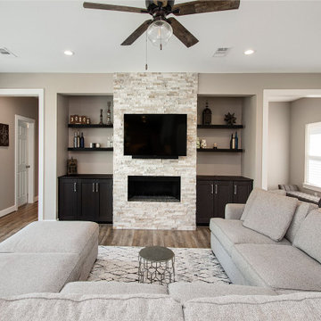
We demoed the entire kitchen, including the laundry room and powder bath that were in the center! The wall between the den and formal living was removed, completely opening up that space to the entry of the house. A small space was separated out from the main den area, creating a flex space for them to become a home office, sitting area, or reading nook. A beautiful fireplace was added, surrounded with slate ledger, flanked with built-in bookcases creating a focal point to the den. Behind this main open living area, is the addition. When the addition is not being utilized as a guest room, it serves as a game room for their two young boys. There is a large closet in there great for toys or additional storage. A full bath was added, which is connected to the bedroom, but also opens to the hallway so that it can be used for the pool bath.
The new laundry room is a dream come true! Not only does it have room for cabinets, but it also has space for a much-needed extra refrigerator. There is also a closet inside the laundry room for additional storage. This first-floor addition has greatly enhanced the functionality of this family’s daily lives. Previously, there was essentially only one small space for them to hang out downstairs, making it impossible for more than one conversation to be had. Now, the kids can be playing air hockey, video games, or roughhousing in the game room, while the adults can be enjoying TV in the den or cooking in the kitchen, without interruption! While living through a remodel might not be easy, the outcome definitely outweighs the struggles throughout the process.
 BUNNYFiSH studio
Photos by Francis and Francis Photography
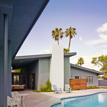
The Anderson Residence is ‘practically’ a new home in one of Las Vegas midcentury modern neighborhoods McNeil. The house is the current home of Ian Anderson the local Herman Miller dealer and Shanna Anderson of Leeland furniture family. When Ian first introduced CSPA studio to the project it was burned down house. Turns out that the house is a 1960 midcentury modern sister of two homes that was destroyed by arson in a dispute between landlord and tenant. Once inside the burned walls it was quite clear what a wonderful house it once was. Great care was taken to try and restore the house to a similar splendor. The reality is the remodel didn’t involve much of the original house, by the time the fire damage was remediated there wasn’t much left. The renovation includes an additional 1000 SF of office, guest bedroom, laundry, mudroom, guest toilet outdoor shower and a garage. The roof line was raised in order to accommodate a forced air mechanical system, but care was taken to keep the lines long and low (appearing) to match the midcentury modern style.
The House is an H-shape. Typically houses of this time period would have small rooms with long narrow hallways. However in this case with the walls burned out one can see from one side of the house to other creating a huge feeling space. It was decided to totally open the East side of the house and make the kitchen which gently spills into the living room and wood burning fireplace the public side. New windows and a huge 16’ sliding door were added all the way around the courtyard so that one can see out and across into the private side. On the west side of the house the long thin hallway is opened up by the windows to the courtyard and the long wall offers an opportunity for a gallery style art display. The long hallway opens to two bedrooms, shared bathroom and master bedroom. The end of the hallway opens to a casual living room and the swimming pool area.
The house has no formal dining room but a 15’ custom crafted table by Ian’s sculptor father that is an extension of the kitchen island.
The H-shape creates two covered areas, one is the front entry courtyard, fenced in by a Brazilian walnut enclosure and crowned by a steel art installation by Ian’s father. The rear covered courtyard is a breezy spot for chilling out on a hot desert day.
The pool was re-finished and a shallow soaking deck added. A new barbeque and covered patio added. Some of the large plant material was salvaged and nursed back to health and a complete new desert landscape was re-installed to bring the exterior to life.
22