
Search results for "Typical challenges" in Home Design Ideas
 Alison Kandler Interior Design
Kitchen
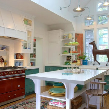
Cottage chic kitchen photo in Los Angeles with shaker cabinets and green cabinets
Cottage chic kitchen photo in Los Angeles with shaker cabinets and green cabinets
 Vetter Architects
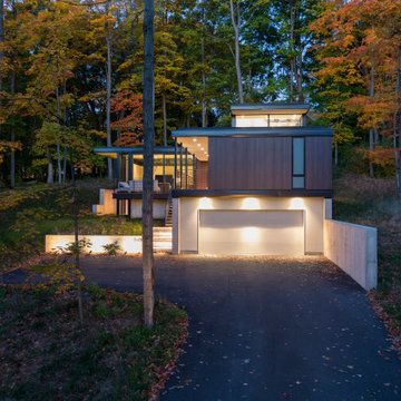
The client’s request was quite common - a typical 2800 sf builder home with 3 bedrooms, 2 baths, living space, and den. However, their desire was for this to be “anything but common.” The result is an innovative update on the production home for the modern era, and serves as a direct counterpoint to the neighborhood and its more conventional suburban housing stock, which focus views to the backyard and seeks to nullify the unique qualities and challenges of topography and the natural environment.
The Terraced House cautiously steps down the site’s steep topography, resulting in a more nuanced approach to site development than cutting and filling that is so common in the builder homes of the area. The compact house opens up in very focused views that capture the natural wooded setting, while masking the sounds and views of the directly adjacent roadway. The main living spaces face this major roadway, effectively flipping the typical orientation of a suburban home, and the main entrance pulls visitors up to the second floor and halfway through the site, providing a sense of procession and privacy absent in the typical suburban home.
Clad in a custom rain screen that reflects the wood of the surrounding landscape - while providing a glimpse into the interior tones that are used. The stepping “wood boxes” rest on a series of concrete walls that organize the site, retain the earth, and - in conjunction with the wood veneer panels - provide a subtle organic texture to the composition.
The interior spaces wrap around an interior knuckle that houses public zones and vertical circulation - allowing more private spaces to exist at the edges of the building. The windows get larger and more frequent as they ascend the building, culminating in the upstairs bedrooms that occupy the site like a tree house - giving views in all directions.
The Terraced House imports urban qualities to the suburban neighborhood and seeks to elevate the typical approach to production home construction, while being more in tune with modern family living patterns.
Overview:
Elm Grove
Size:
2,800 sf,
3 bedrooms, 2 bathrooms
Completion Date:
September 2014
Services:
Architecture, Landscape Architecture
Interior Consultants: Amy Carman Design
 Vetter Architects
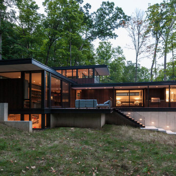
The client’s request was quite common - a typical 2800 sf builder home with 3 bedrooms, 2 baths, living space, and den. However, their desire was for this to be “anything but common.” The result is an innovative update on the production home for the modern era, and serves as a direct counterpoint to the neighborhood and its more conventional suburban housing stock, which focus views to the backyard and seeks to nullify the unique qualities and challenges of topography and the natural environment.
The Terraced House cautiously steps down the site’s steep topography, resulting in a more nuanced approach to site development than cutting and filling that is so common in the builder homes of the area. The compact house opens up in very focused views that capture the natural wooded setting, while masking the sounds and views of the directly adjacent roadway. The main living spaces face this major roadway, effectively flipping the typical orientation of a suburban home, and the main entrance pulls visitors up to the second floor and halfway through the site, providing a sense of procession and privacy absent in the typical suburban home.
Clad in a custom rain screen that reflects the wood of the surrounding landscape - while providing a glimpse into the interior tones that are used. The stepping “wood boxes” rest on a series of concrete walls that organize the site, retain the earth, and - in conjunction with the wood veneer panels - provide a subtle organic texture to the composition.
The interior spaces wrap around an interior knuckle that houses public zones and vertical circulation - allowing more private spaces to exist at the edges of the building. The windows get larger and more frequent as they ascend the building, culminating in the upstairs bedrooms that occupy the site like a tree house - giving views in all directions.
The Terraced House imports urban qualities to the suburban neighborhood and seeks to elevate the typical approach to production home construction, while being more in tune with modern family living patterns.
Overview:
Elm Grove
Size:
2,800 sf,
3 bedrooms, 2 bathrooms
Completion Date:
September 2014
Services:
Architecture, Landscape Architecture
Interior Consultants: Amy Carman Design
Find the right local pro for your project
 Verner Architects
Paul Dyer Photography
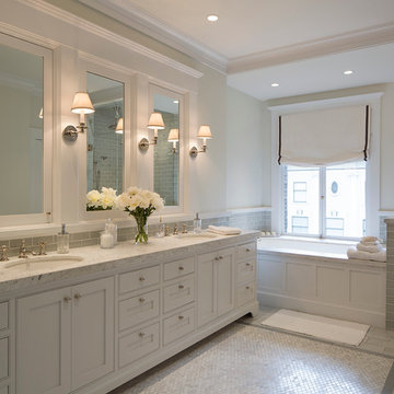
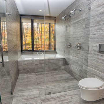
Inspiration for a timeless gray tile and glass tile mosaic tile floor corner shower remodel in San Francisco with an undermount sink, white cabinets, an undermount tub, gray walls and recessed-panel cabinets
Inspiration for a timeless gray tile and glass tile mosaic tile floor corner shower remodel in San Francisco with an undermount sink, white cabinets, an undermount tub, gray walls and recessed-panel cabinets
 Dwell Designed Construction
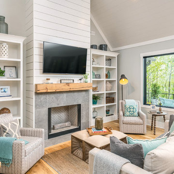
Example of a cottage medium tone wood floor and brown floor living room design in Other with gray walls, a standard fireplace and a tile fireplace
 OLSON LEWIS + Architects
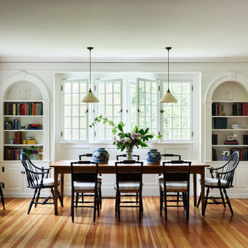
Large dining room with built-in bookcases and paneled walls and windows.
Great room - large coastal medium tone wood floor and brown floor great room idea in Manchester with white walls
Great room - large coastal medium tone wood floor and brown floor great room idea in Manchester with white walls
 KURV Architecture DPC (Alex Hughes Architects)
Located in the heart of Manhattan’s Lower East Side, the building was erected on a shallow commercial lot between two 120 year old masonry buildings and a new residential rental building. 330 Grand Street is a mix of 725 SF 1BRs and 1050 SF 2BR apartments. It also contains a 1100 SF two story duplex as well as private and public rooftop space, large private balconies for most units and two large private terraces for the ground floor units.
330 Grand Street was originally designed and approved at the NYC DOB as a prefabricated modular building. During the pandemic, as shipping costs skyrocketed putting the project at risk, we suggested redesigning the building as a reinforced cast-in-place concrete structure. Concrete was readily available and prices had not been affected by the demand increase that many other materials suffered in the pandemic. We took this opportunity to raise floor to ceiling heights, enlarge high performance windows and redistribute the buildings MEPFS and Structural Systems to create very open floor plans.
The challenge was to create a luxurious sensorial living experience with very limited means. In a city with very high construction costs, low cost residential buildings in the area are usually devoid of good quality, design and character. Our approach was to aim high for the end user, prioritizing natural light, open space with long visual perspectives, high ceilings and as always, rejecting the use of predefined building templates.
Our biggest challenge was to ensure that the small spaces feel as clean cut, large and bright as possible. Several unique design decisions were made to ensure low cost and high quality;
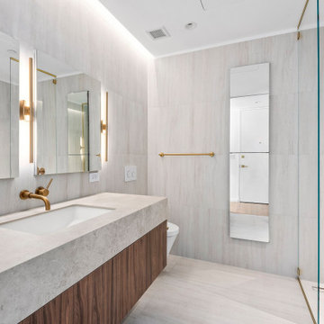
Floor plans were laid out so that spaces were wide open and free of clutter from mechanical or structural interruptions. Therefore all infrastructure was placed in lateral demising walls, which in turn act as the unit’s storage and kitchen. The apartments feel wide open, are super quiet and have more storage space than any other comparable apartment in the city.
To solve the problem of the site’s shallow commercial lot which is typically prone to dark interior spaces we focused our attention on the building’s envelope. Instead of the usual small punched window openings, oversized high performance windows were designed to ensure that light penetrated as far as possible into the units. In the smaller 1BR units, the full 50’ depth of the lot is perceived by partitioning spaces with sliding pocket doors that can be retracted to allow deep visual perspectives, making the sight lines in the space feel longer, larger, more ample than normal. In addition to the full height glazing, each unit above the 2nd floor receives a 7 foot covered balcony, adding 120 to 240 sf to each apartment, something unusual in New York City buildings. The space is large enough for a full size dining table, when the weather permits being outside.
We also worked hard to ensure modularity. For example, all kitchen units are all identical throughout the building. The idea of modularity and the economy of the repetitive unit is exercised to the maximum through the building.
Hardware, appliances, flooring, wall coverings and material finishes are all carefully selected to feel bespoke, high quality and unique.
It was important to KURV that the result of this work manifest into something that would deeply connect with the end user and sustain relationships with the consumers of this space.
All images by KURV Architecture ©


 Zola European Windows
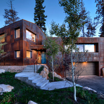
Located in, Summit Park, Park City UT lies one of the most efficient houses in the country. The Summit Haus – designed and built by Chris Price of PCD+B, is an exploration in design and construction of advanced high performance housing. Seeing a rising demand for sustainable housing along with rising Carbon emissions leading to global warming, this house strives to show that sensible, good design can create spaces adequate for today’s housing demands while adhering to strict standards. The house was designed to meet the very rigid Passiv House rating system – 90% more efficient than a typical home in the area.
The house itself was intended to nestle neatly into the 45 degree sloped site and to take full advantage of the limited solar access and views. The views range from short, highly wooded views to a long corridor out towards the Uinta Mountain range towards the east. The house was designed and built based off Passiv Haus standards, and the framing and ventilation became critical elements to maintain such minimal energy requirements.
Zola triple-pane, tilt-and-turn Thermo uPVC windows contribute substantially to the home’s energy efficiency, and takes advantage of the beautiful surrounding of the location, including forrest views from the deck off of the kitchen.
Photographer: Douglas Burke
 Kimberlee Marie Interiors
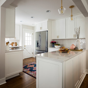
When my clients purchased this charming 1940's home in the Seattle neighborhood of Wedgwood, they were amazed by how intact the original kitchen was. It was like a perfect time capsule. The color palette was avocado green and buttercream yellow. The highlights were an original retro built-in banquette and vintage oven! The challenge we faced (besides the awesome but dated finishes) was the closed floor plan typical in this era of homes and the lack of storage. So, we opened the kitchen to the adjacent dining and living room, bringing it up to speed with modern-day living. In opening it up, we also walled off a doorway that went from the kitchen to the hallway, but it was completely unnecessary and allowed us to gain an entire wall of cabinets that didn't exist previously.
For the finishes, we kept it classic with mostly gray and white but brought in a little flare and interest with the herringbone backsplash and brushed brass finishes because who doesn't love a little gold? Also, we added color with the finishing details like the rug and countertop decor because those things are a great way to add interest and warmth to a space and can be easily changed when it's time for a fresh new look.
 Phoebe Howard
Laurey Glenn
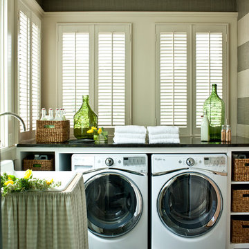
Inspiration for a large cottage slate floor laundry room remodel in Nashville with white cabinets, a side-by-side washer/dryer, open cabinets, black countertops, a drop-in sink and gray walls
Inspiration for a large cottage slate floor laundry room remodel in Nashville with white cabinets, a side-by-side washer/dryer, open cabinets, black countertops, a drop-in sink and gray walls

 TKS Design Group
Free ebook, Creating the Ideal Kitchen. DOWNLOAD NOW
The Klimala’s and their three kids are no strangers to moving, this being their fifth house in the same town over the 20-year period they have lived there. “It must be the 7-year itch, because every seven years, we seem to find ourselves antsy for a new project or a new environment. I think part of it is being a designer, I see my own taste evolve and I want my environment to reflect that. Having easy access to wonderful tradesmen and a knowledge of the process makes it that much easier”.
This time, Klimala’s fell in love with a somewhat unlikely candidate. The 1950’s ranch turned cape cod was a bit of a mutt, but it’s location 5 minutes from their design studio and backing up to the high school where their kids can roll out of bed and walk to school, coupled with the charm of its location on a private road and lush landscaping made it an appealing choice for them.
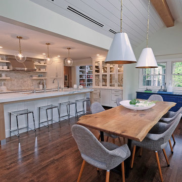
“The bones of the house were really charming. It was typical 1,500 square foot ranch that at some point someone added a second floor to. Its sloped roofline and dormered bedrooms gave it some charm.” With the help of architect Maureen McHugh, Klimala’s gutted and reworked the layout to make the house work for them. An open concept kitchen and dining room allows for more frequent casual family dinners and dinner parties that linger. A dingy 3-season room off the back of the original house was insulated, given a vaulted ceiling with skylights and now opens up to the kitchen. This room now houses an 8’ raw edge white oak dining table and functions as an informal dining room. “One of the challenges with these mid-century homes is the 8’ ceilings. I had to have at least one room that had a higher ceiling so that’s how we did it” states Klimala.
The kitchen features a 10’ island which houses a 5’0” Galley Sink. The Galley features two faucets, and double tiered rail system to which accessories such as cutting boards and stainless steel bowls can be added for ease of cooking. Across from the large sink is an induction cooktop. “My two teen daughters and I enjoy cooking, and the Galley and induction cooktop make it so easy.” A wall of tall cabinets features a full size refrigerator, freezer, double oven and built in coffeemaker. The area on the opposite end of the kitchen features a pantry with mirrored glass doors and a beverage center below.
The rest of the first floor features an entry way, a living room with views to the front yard’s lush landscaping, a family room where the family hangs out to watch TV, a back entry from the garage with a laundry room and mudroom area, one of the home’s four bedrooms and a full bath. There is a double sided fireplace between the family room and living room. The home features pops of color from the living room’s peach grass cloth to purple painted wall in the family room. “I’m definitely a traditionalist at heart but because of the home’s Midcentury roots, I wanted to incorporate some of those elements into the furniture, lighting and accessories which also ended up being really fun. We are not formal people so I wanted a house that my kids would enjoy, have their friends over and feel comfortable.”
The second floor houses the master bedroom suite, two of the kids’ bedrooms and a back room nicknamed “the library” because it has turned into a quiet get away area where the girls can study or take a break from the rest of the family. The area was originally unfinished attic, and because the home was short on closet space, this Jack and Jill area off the girls’ bedrooms houses two large walk-in closets and a small sitting area with a makeup vanity. “The girls really wanted to keep the exposed brick of the fireplace that runs up the through the space, so that’s what we did, and I think they feel like they are in their own little loft space in the city when they are up there” says Klimala.
Designed by: Susan Klimala, CKD, CBD
Photography by: Carlos Vergara
For more information on kitchen and bath design ideas go to: www.kitchenstudio-ge.com
 HEYDT DESIGNS
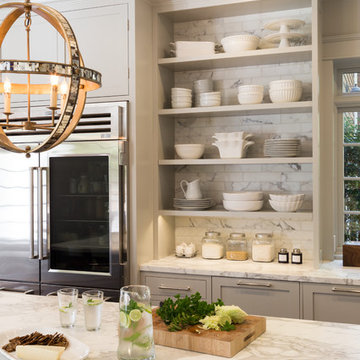
David Duncan Livingston
Inspiration for a large coastal medium tone wood floor eat-in kitchen remodel in San Francisco with open cabinets, white backsplash, stainless steel appliances and an island
Inspiration for a large coastal medium tone wood floor eat-in kitchen remodel in San Francisco with open cabinets, white backsplash, stainless steel appliances and an island
 Dichotomy Interiors
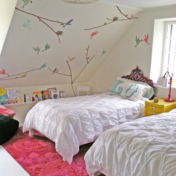
megan oldenburger
Kids' bedroom - contemporary girl kids' bedroom idea in New York with white walls
Kids' bedroom - contemporary girl kids' bedroom idea in New York with white walls
 Vetter Architects
The client’s request was quite common - a typical 2800 sf builder home with 3 bedrooms, 2 baths, living space, and den. However, their desire was for this to be “anything but common.” The result is an innovative update on the production home for the modern era, and serves as a direct counterpoint to the neighborhood and its more conventional suburban housing stock, which focus views to the backyard and seeks to nullify the unique qualities and challenges of topography and the natural environment.
The Terraced House cautiously steps down the site’s steep topography, resulting in a more nuanced approach to site development than cutting and filling that is so common in the builder homes of the area. The compact house opens up in very focused views that capture the natural wooded setting, while masking the sounds and views of the directly adjacent roadway. The main living spaces face this major roadway, effectively flipping the typical orientation of a suburban home, and the main entrance pulls visitors up to the second floor and halfway through the site, providing a sense of procession and privacy absent in the typical suburban home.
Clad in a custom rain screen that reflects the wood of the surrounding landscape - while providing a glimpse into the interior tones that are used. The stepping “wood boxes” rest on a series of concrete walls that organize the site, retain the earth, and - in conjunction with the wood veneer panels - provide a subtle organic texture to the composition.
The interior spaces wrap around an interior knuckle that houses public zones and vertical circulation - allowing more private spaces to exist at the edges of the building. The windows get larger and more frequent as they ascend the building, culminating in the upstairs bedrooms that occupy the site like a tree house - giving views in all directions.
The Terraced House imports urban qualities to the suburban neighborhood and seeks to elevate the typical approach to production home construction, while being more in tune with modern family living patterns.
Overview:
Elm Grove
Size:
2,800 sf,
3 bedrooms, 2 bathrooms
Completion Date:
September 2014
Services:
Architecture, Landscape Architecture
Interior Consultants: Amy Carman Design
 Vetter Architects
The client’s request was quite common - a typical 2800 sf builder home with 3 bedrooms, 2 baths, living space, and den. However, their desire was for this to be “anything but common.” The result is an innovative update on the production home for the modern era, and serves as a direct counterpoint to the neighborhood and its more conventional suburban housing stock, which focus views to the backyard and seeks to nullify the unique qualities and challenges of topography and the natural environment.
The Terraced House cautiously steps down the site’s steep topography, resulting in a more nuanced approach to site development than cutting and filling that is so common in the builder homes of the area. The compact house opens up in very focused views that capture the natural wooded setting, while masking the sounds and views of the directly adjacent roadway. The main living spaces face this major roadway, effectively flipping the typical orientation of a suburban home, and the main entrance pulls visitors up to the second floor and halfway through the site, providing a sense of procession and privacy absent in the typical suburban home.
Clad in a custom rain screen that reflects the wood of the surrounding landscape - while providing a glimpse into the interior tones that are used. The stepping “wood boxes” rest on a series of concrete walls that organize the site, retain the earth, and - in conjunction with the wood veneer panels - provide a subtle organic texture to the composition.
The interior spaces wrap around an interior knuckle that houses public zones and vertical circulation - allowing more private spaces to exist at the edges of the building. The windows get larger and more frequent as they ascend the building, culminating in the upstairs bedrooms that occupy the site like a tree house - giving views in all directions.
The Terraced House imports urban qualities to the suburban neighborhood and seeks to elevate the typical approach to production home construction, while being more in tune with modern family living patterns.
Overview
Elm Grove
Size
2,800 sf
3 bedrooms, 2 bathrooms
Completion Date
September 2014
Services
Architecture, Landscape Architecture
Interior Consultants: Amy Carman Design
Steve Gotter
 Vetter Architects
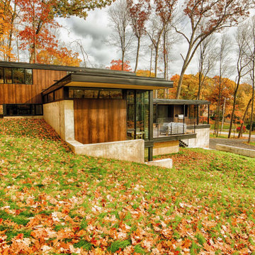
The client’s request was quite common - a typical 2800 sf builder home with 3 bedrooms, 2 baths, living space, and den. However, their desire was for this to be “anything but common.” The result is an innovative update on the production home for the modern era, and serves as a direct counterpoint to the neighborhood and its more conventional suburban housing stock, which focus views to the backyard and seeks to nullify the unique qualities and challenges of topography and the natural environment.
The Terraced House cautiously steps down the site’s steep topography, resulting in a more nuanced approach to site development than cutting and filling that is so common in the builder homes of the area. The compact house opens up in very focused views that capture the natural wooded setting, while masking the sounds and views of the directly adjacent roadway. The main living spaces face this major roadway, effectively flipping the typical orientation of a suburban home, and the main entrance pulls visitors up to the second floor and halfway through the site, providing a sense of procession and privacy absent in the typical suburban home.
Clad in a custom rain screen that reflects the wood of the surrounding landscape - while providing a glimpse into the interior tones that are used. The stepping “wood boxes” rest on a series of concrete walls that organize the site, retain the earth, and - in conjunction with the wood veneer panels - provide a subtle organic texture to the composition.
The interior spaces wrap around an interior knuckle that houses public zones and vertical circulation - allowing more private spaces to exist at the edges of the building. The windows get larger and more frequent as they ascend the building, culminating in the upstairs bedrooms that occupy the site like a tree house - giving views in all directions.
The Terraced House imports urban qualities to the suburban neighborhood and seeks to elevate the typical approach to production home construction, while being more in tune with modern family living patterns.
Overview:
Elm Grove
Size:
2,800 sf,
3 bedrooms, 2 bathrooms
Completion Date:
September 2014
Services:
Architecture, Landscape Architecture
Interior Consultants: Amy Carman Design
 Lauren Rubin Architecture
david gilbert
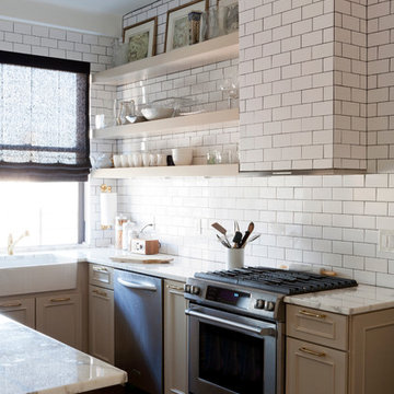
Transitional u-shaped eat-in kitchen photo in New York with a farmhouse sink, marble countertops, white backsplash, stainless steel appliances, beige cabinets, subway tile backsplash and raised-panel cabinets
Transitional u-shaped eat-in kitchen photo in New York with a farmhouse sink, marble countertops, white backsplash, stainless steel appliances, beige cabinets, subway tile backsplash and raised-panel cabinets
 Vetter Architects
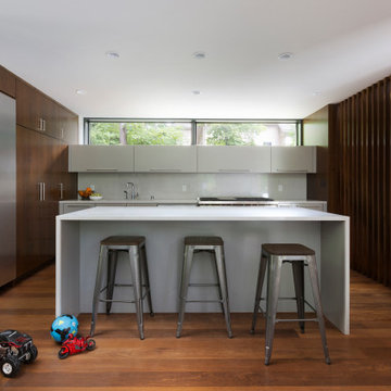
The client’s request was quite common - a typical 2800 sf builder home with 3 bedrooms, 2 baths, living space, and den. However, their desire was for this to be “anything but common.” The result is an innovative update on the production home for the modern era, and serves as a direct counterpoint to the neighborhood and its more conventional suburban housing stock, which focus views to the backyard and seeks to nullify the unique qualities and challenges of topography and the natural environment.
The Terraced House cautiously steps down the site’s steep topography, resulting in a more nuanced approach to site development than cutting and filling that is so common in the builder homes of the area. The compact house opens up in very focused views that capture the natural wooded setting, while masking the sounds and views of the directly adjacent roadway. The main living spaces face this major roadway, effectively flipping the typical orientation of a suburban home, and the main entrance pulls visitors up to the second floor and halfway through the site, providing a sense of procession and privacy absent in the typical suburban home.
Clad in a custom rain screen that reflects the wood of the surrounding landscape - while providing a glimpse into the interior tones that are used. The stepping “wood boxes” rest on a series of concrete walls that organize the site, retain the earth, and - in conjunction with the wood veneer panels - provide a subtle organic texture to the composition.
The interior spaces wrap around an interior knuckle that houses public zones and vertical circulation - allowing more private spaces to exist at the edges of the building. The windows get larger and more frequent as they ascend the building, culminating in the upstairs bedrooms that occupy the site like a tree house - giving views in all directions.
The Terraced House imports urban qualities to the suburban neighborhood and seeks to elevate the typical approach to production home construction, while being more in tune with modern family living patterns.
Overview:
Elm Grove
Size:
2,800 sf,
3 bedrooms, 2 bathrooms
Completion Date:
September 2014
Services:
Architecture, Landscape Architecture
Interior Consultants: Amy Carman Design
 TKS Design Group
Free ebook, Creating the Ideal Kitchen. DOWNLOAD NOW
This young family of four came in right after closing on their house and with a new baby on the way. Our goal was to complete the project prior to baby’s arrival so this project went on the expedite track. The beautiful 1920’s era brick home sits on a hill in a very picturesque neighborhood, so we were eager to give it the kitchen it deserves. The clients’ dream kitchen included pro-style appliances, a large island with seating for five and a kitchen that feels appropriate to the home’s era but that also is fresh and modern. They explicitly stated they did not want a “cookie cutter” design, so we took that to heart.
The key challenge was to fit in all of the items on their wish given the room’s constraints. We eliminated an existing breakfast area and bay window and incorporated that area into the kitchen. The bay window was bricked in, and to compensate for the loss of seating, we widened the opening between the kitchen and formal dining room for more of an open concept plan.
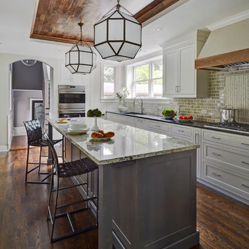
The ceiling in the original kitchen is about a foot lower than the rest of the house, and once it was determined that it was to hide pipes and other mechanicals, we reframed a large tray over the island and left the rest of the ceiling as is. Clad in walnut planks, the tray provides an interesting feature and ties in with the custom walnut and plaster hood.
The space feels modern yet appropriate to its Tudor roots. The room boasts large family friendly appliances, including a beverage center and cooktop/double oven combination. Soft white inset cabinets paired with a slate gray island provide a gentle backdrop to the multi-toned island top, a color echoed in the backsplash tile. The handmade subway tile has a textured pattern at the cooktop, and large pendant lights add more than a bit of drama to the room.
Designed by: Susan Klimala, CKD, CBD
Photography by: Mike Kaskel
For more information on kitchen and bath design ideas go to: www.kitchenstudio-ge.com
4