
Search results for "Typical challenges" in Home Design Ideas
 Tracey Stephens Design, LLC
Wing Wong, Memories TTL
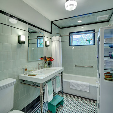
Bathroom - small craftsman green tile and ceramic tile porcelain tile bathroom idea in New York with a console sink, a two-piece toilet and green walls
Bathroom - small craftsman green tile and ceramic tile porcelain tile bathroom idea in New York with a console sink, a two-piece toilet and green walls

 Advance Design Studio, Ltd.
Jennifer and Dan have lived in their Deer Park Illinois home for 15 years, slowly making minor fixes like painting and decorating; but they had a new plan for their kitchen the entire time. An awkwardly placed garage door, and an island cooktop with a terrible downdraft made a full-scale kitchen remodel an absolute must. Jennifer had many ideas in mind and wanted to work with a company that could provide high-end work, while partnering with a designer that would tailor the kitchen to her ideas.
She was intrigued by the phrase “Common Sense Remodeling” in Advance Design’s feature she discovered while perusing an issue of the community’s Quintessential Barrington Magazine. Doing further research on the company’s website, as she looked through project profiles and read about Advance Design’s “Common Sense Remodeling” philosophy, she promptly scheduled an appointment to see if the people and ideas she read about were truly who they said they were. The more she read, the more she knew that the “Common Sense” approach to remodeling they described was exactly the type of company she was looking for.
The partnership was sealed after an initial consultation with Owner Todd Jurs and Project Designer Michelle Lecinski. They displayed a combination of friendliness, professionalism and respect that was unmatched by any of the other companies Jennifer talked to. She knew that with Advance Design, she would be able to retain the vision that she had in mind with high-quality craftsmanship.
“I reached out to Advance Design because of the ‘Common Sense Remodeling’ tagline,” Jennifer said. “That’s what lingered for me”. “Advance Design was the most respectful- of the house and of my design ideas, and the most professional of the handful of companies that looked at my project”.
Soon after the meeting Jennifer began working with Michelle on the project design. They quickly developed chemistry. Jennifer loved how Michelle researched and located every detail that Jennifer wanted for the kitchen. Between the two of them, every concept and idea was worked through and perfected. “Jennifer had definite ideas about what she wanted the new kitchen to look like, she just didn’t know how to bring it all together. We worked together really well to make her ideas into the practical reality necessary for a well-functioning kitchen, with the look and feel that she had envisioned”, says Michelle.
“Michelle was wonderful in using the CAD system she would show me new drawings every time we changed the layout while working through the design,” Jennifer said. “She was a really wonderful partner in execution, she made sure everything happened quickly and easily.”
The finished design drew out elements of Jennifer’s style and personality. The pair call the look “sophisticated farmhouse” to describe the kitchen renovation to family and friends. The result was a beautifully crafted, authentic-feeling space that satisfied Jennifer’s dreams 15 years in the making. The whole project consisted of a kitchen remodel, mudroom upgrade with powder room, and garage entry relocation. “The projects I personally like the best, are the ones that put the client’s dreams on display,” Project Designer Michelle said. “And this is one of those projects.”
The main focal point of the kitchen is custom zinc and brass ventilation hood with a vintage sheen, which was hand made to order by a small company in Indiana named Vogler Metalworking. “It’s like sculpture, a true work of art”, says Jennifer. Your eye is immediately drawn towards this elegant yet practical hood that eliminated the home’s downdraft problem and added a striking conversation piece at the same time. The carpenters had to use special gloves when transporting and installing it, so they didn’t smudge it with fingerprints. The beautiful hood centers proudly over the stunning black enamel and brass LaCornue Range. “I had a friend who had a LaCornue range and after learning how easy it was to cook perfect meals, I was convinced I wanted to have one”, says Jennifer. This unique, breathtaking combination anchors the entire kitchen and is apparent immediately as you walk into the great room the surrounds the space.
DuraSupreme Crestwood cabinets with a Kendall Panel add function and sophistication. A custom gray paint color paired with a storm blue was developed so that the new kitchen looked like it belonged to the existing space. Unlacquered brass faucets and hardware were important to Jennifer because she wanted the living finishes to age over time. Remarkable brass diamond mesh cabinet door inserts imported from the UK continue to add this one-of-a-kind kitchen renovation; giving it a “you won’t see this everywhere” quality. The use of old railcar flooring for the coffee bar countertop and reclaimed oak for the open shelving gives an authenticity to the space uncommon in kitchens today.
Jennifer and Michelle fell in love with the Limestone Grey Stone while they were investigating unique island countertop ideas. They liked the fact that the limestone as a living finish will age and change over time. Calcutta Miel Quartz countertops made for an excellent pairing around the perimeter, as it’s durable and perfect for cooking preparations. A textured white subway tile backsplash that runs to the ceiling keeps your eye moving towards the open shelving, and to the main focal point of the stunning range hood combination.
“The kitchen functions beautifully, and it’s gorgeous,” beams Jennifer as she gestures with both hands while smiling ear to ear. “The most important thing was I wanted a kitchen that had a wonderful flow, cooked beautiful meals and was a great gathering place for family and friends, and this space does that perfectly! Beauty wise, it turned out exactly how I had envisioned. I felt the function part was the hardest part, and that was nailed”!
Relocating the garage entry to the new mudroom was a huge priority and has finally separated the family’s arriving home functions from their kitchen. Now coats and shoes and bags have their own area for dropping once members arrive home. Matching gray DuraSupreme cabinetry helped create gorgeous, purposeful lockers for the family. A reclaimed vintage sink and custom wall paper were added to the tiny powder room to beautify the once previously only functional space. Advance Design was even able to create a custom space for their dog to sleep while the family is away.
“It was unbelievable that a project of this size was completed in such a short time, and I think that’s because of the large amount of planning and preparation that went into it,” Jennifer marveled, “When we started, we were ready, and everything was prepared”.
When it came to execution, Project Manager Justin Davis and his crew were quick, accessible, and organized. Projects like this kitchen are typically completed in as little as 8-10 weeks. Jennifer’s kitchen however despite the relocation of some challenging HVAC in a soffit and moving of an exterior door was completed remarkably fast in part because the team was working with an existing tile floor that ran throughout the first floor that the client really loved.
“You get to know these people really well because they’re living in your house while you’re living in your house. They were so fast and really good, it didn’t take as long as even planned” reported Jennifer. “I would text Justin and he always responded almost immediately. I got to know all the guys who were working in our house and they were all wonderful people”.
Details in a customized kitchen like this one require skill and care from the people who install it. “All the guys on the job were skilled at what the did. I wanted small details like little feet to look like furniture, that is where their carpentry skill came in to make these all perfect”, said Jennifer. “The tile guys were wonderful. They even let me determine how I wanted the texture with the grout to appear for a salt and pepper look; now that is a very skilled trade person making it custom”.
In Jennifer’s interview, she continued to reference Advance Design’s “Common Sense Remodeling”, so I took a minute to ask her exactly what that phrase meant to her and how it played out in her experience with her project and the Advance Design team. Here is what she said: “I was intrigued about Common Sense Remodeling and in my head that there would be clear costs and prices, great communication between the design team, the execution team and me”, said Jennifer. They did deliver on that, it was so clear about the cost breakdown, what I could expect from everyone who came to my house, and everything that we had ordered. That to me is the Common Sense”!
It’s great to see a client take literally our assertion that a well-planned remodeling project is simply “Common Sense”! She anticipated each step of the way would be clear, concise, and predictable, all the while protecting the outcome due to the careful upfront planning. “Advance Design delivered on their ‘Common Sense Remodeling’ promise,” Jennifer said. “From the design team, to the execution team - everything was straight forward like I imagined. The project turned out exactly how I envisioned, I enjoyed this process and absolutely would recommend Advance Design Studio to anyone.”
 Amazing Spaces
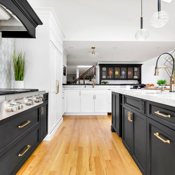
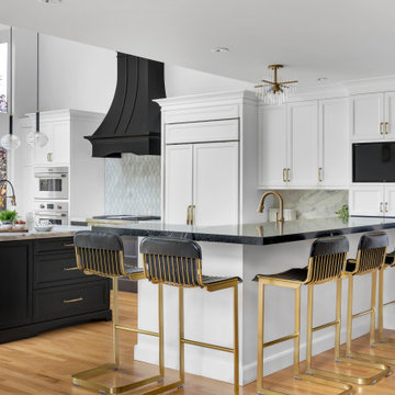
The existing U-shaped kitchen was tucked away in a small corner while the dining table was swimming in a room much too large for its size. The client’s needs and the architecture of the home made it apparent that the perfect design solution for the home was to swap the spaces.
The homeowners entertain frequently and wanted the new layout to accommodate a lot of counter seating, a bar/buffet for serving hors d’oeuvres, an island with prep sink, and all new appliances. They had a strong preference that the hood be a focal point and wanted to go beyond a typical white color scheme even though they wanted white cabinets.
While moving the kitchen to the dining space gave us a generous amount of real estate to work with, two of the exterior walls are occupied with full-height glass creating a challenge how best to fulfill their wish list. We used one available wall for the needed tall appliances, taking advantage of its height to create the hood as a focal point. We opted for both a peninsula and island instead of one large island in order to maximize the seating requirements and create a barrier when entertaining so guests do not flow directly into the work area of the kitchen. This also made it possible to add a second sink as requested. Lastly, the peninsula sets up a well-defined path to the new dining room without feeling like you are walking through the kitchen. We used the remaining fourth wall for the bar/buffet.
Black cabinetry adds strong contrast in several areas of the new kitchen. Wire mesh wall cabinet doors at the bar and gold accents on the hardware, light fixtures, faucets and furniture add further drama to the concept. The focal point is definitely the black hood, looking both dramatic and cohesive at the same time.
Find the right local pro for your project
 Vetter Architects
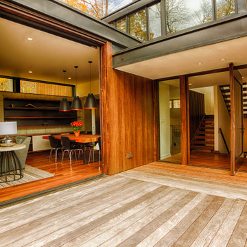
The client’s request was quite common - a typical 2800 sf builder home with 3 bedrooms, 2 baths, living space, and den. However, their desire was for this to be “anything but common.” The result is an innovative update on the production home for the modern era, and serves as a direct counterpoint to the neighborhood and its more conventional suburban housing stock, which focus views to the backyard and seeks to nullify the unique qualities and challenges of topography and the natural environment.
The Terraced House cautiously steps down the site’s steep topography, resulting in a more nuanced approach to site development than cutting and filling that is so common in the builder homes of the area. The compact house opens up in very focused views that capture the natural wooded setting, while masking the sounds and views of the directly adjacent roadway. The main living spaces face this major roadway, effectively flipping the typical orientation of a suburban home, and the main entrance pulls visitors up to the second floor and halfway through the site, providing a sense of procession and privacy absent in the typical suburban home.
Clad in a custom rain screen that reflects the wood of the surrounding landscape - while providing a glimpse into the interior tones that are used. The stepping “wood boxes” rest on a series of concrete walls that organize the site, retain the earth, and - in conjunction with the wood veneer panels - provide a subtle organic texture to the composition.
The interior spaces wrap around an interior knuckle that houses public zones and vertical circulation - allowing more private spaces to exist at the edges of the building. The windows get larger and more frequent as they ascend the building, culminating in the upstairs bedrooms that occupy the site like a tree house - giving views in all directions.
The Terraced House imports urban qualities to the suburban neighborhood and seeks to elevate the typical approach to production home construction, while being more in tune with modern family living patterns.
Overview:
Elm Grove
Size:
2,800 sf,
3 bedrooms, 2 bathrooms
Completion Date:
September 2014
Services:
Architecture, Landscape Architecture
Interior Consultants: Amy Carman Design
 Arise Art Group
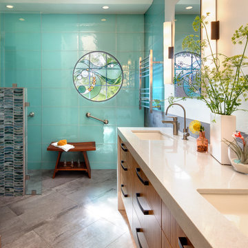
These clients have a high sense of design and have always built their own homes. They just downsized into a typical town home and needed this new space to stand out but also be accommodating of aging in place. The client, Jim, has a handful of challenges ahead of him with dealing with Parkinson and all of it symptoms. We optimized the shower, enlarging it by eliminating the tub and not using a shower door. We were able to do a curbless shower, reducing the likelihood of falling. We used larger tiles in the bathroom and shower but added the anti slip porcelain. I included a built-in seat in the shower and a stand-alone bench on the other side. We used a separate hand shower and easy to grab handles.
A natural palette peppered with some aqua and green breathes fresh, new life into a re-imagined UTC town home. Choosing materials and finishes that have higher contrast helps make the change from flooring to wall, as well as cabinet to counter, more obvious. Large glass wall tiles make the bathroom seem much larger. A flush installation of drywall to tile is easy on the eye while showing the attention to detail.
A modern custom floating vanity allows for walker wheels if needed. Personal touches like adding a filter faucet at the sink makes his trips to take medicine a bit easier.
One of my favorite things in design for any project is lighting. Not only can lighting add to the look and feel of the space, but it can also create a safer environment. Installing different types of lighting, including scones on either side of the mirror, recessed can lights both inside and outside of the shower, and LED strip lighting under the floating vanity, keep this modern bathroom current and very functional. Because of the skylight and the round window, light is allowed in to play with the different colors in the glass and the shapes around the room, which created a bright and playful bathroom.
It is not often that I get to play with stain-glass, but this existing circular window, that we could NOT change, needed some love. We used a local craftsman that allowed us to design a playful stain-glass piece for the inside of the bathroom window, reminding them of their front door in their custom home years ago.
 Carolina V. Gentry, RID
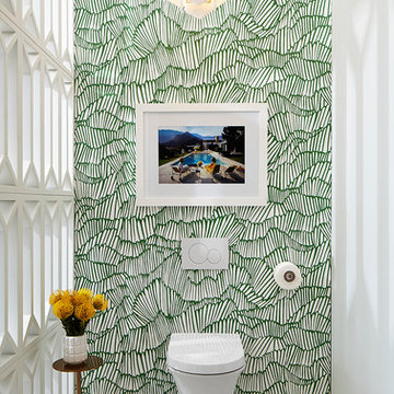
Timeless Palm Springs glamour meets modern in Pulp Design Studios' bathroom design created for the DXV Design Panel 2016. The design is one of four created by an elite group of celebrated designers for DXV's national ad campaign. Faced with the challenge of creating a beautiful space from nothing but an empty stage, Beth and Carolina paired mid-century touches with bursts of colors and organic patterns. The result is glamorous with touches of quirky fun -- the definition of splendid living.
 Bruns Architecture
Tricia Shay Photography
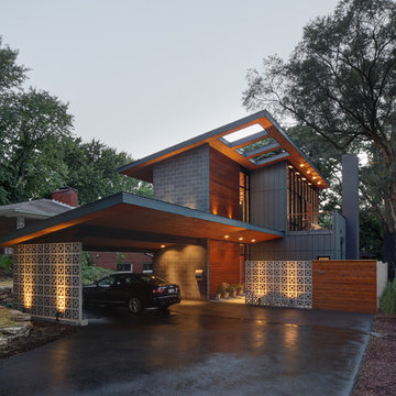
Inspiration for a mid-sized contemporary gray two-story mixed siding house exterior remodel in Milwaukee with a shed roof
Inspiration for a mid-sized contemporary gray two-story mixed siding house exterior remodel in Milwaukee with a shed roof


 Matthew Caughy Interiors
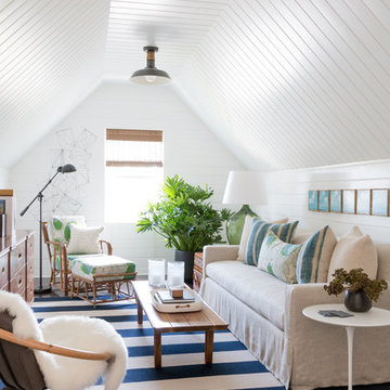
Family room - mid-sized coastal dark wood floor family room idea in New York with white walls
 Advance Design Studio, Ltd.
This 1930's Barrington Hills farmhouse was in need of some TLC when it was purchased by this southern family of five who planned to make it their new home. The renovation taken on by Advance Design Studio's designer Scott Christensen and master carpenter Justin Davis included a custom porch, custom built in cabinetry in the living room and children's bedrooms, 2 children's on-suite baths, a guest powder room, a fabulous new master bath with custom closet and makeup area, a new upstairs laundry room, a workout basement, a mud room, new flooring and custom wainscot stairs with planked walls and ceilings throughout the home.
The home's original mechanicals were in dire need of updating, so HVAC, plumbing and electrical were all replaced with newer materials and equipment. A dramatic change to the exterior took place with the addition of a quaint standing seam metal roofed farmhouse porch perfect for sipping lemonade on a lazy hot summer day.
In addition to the changes to the home, a guest house on the property underwent a major transformation as well. Newly outfitted with updated gas and electric, a new stacking washer/dryer space was created along with an updated bath complete with a glass enclosed shower, something the bath did not previously have. A beautiful kitchenette with ample cabinetry space, refrigeration and a sink was transformed as well to provide all the comforts of home for guests visiting at the classic cottage retreat.
The biggest design challenge was to keep in line with the charm the old home possessed, all the while giving the family all the convenience and efficiency of modern functioning amenities. One of the most interesting uses of material was the porcelain "wood-looking" tile used in all the baths and most of the home's common areas. All the efficiency of porcelain tile, with the nostalgic look and feel of worn and weathered hardwood floors. The home’s casual entry has an 8" rustic antique barn wood look porcelain tile in a rich brown to create a warm and welcoming first impression.
Painted distressed cabinetry in muted shades of gray/green was used in the powder room to bring out the rustic feel of the space which was accentuated with wood planked walls and ceilings. Fresh white painted shaker cabinetry was used throughout the rest of the rooms, accentuated by bright chrome fixtures and muted pastel tones to create a calm and relaxing feeling throughout the home.
Custom cabinetry was designed and built by Advance Design specifically for a large 70” TV in the living room, for each of the children’s bedroom’s built in storage, custom closets, and book shelves, and for a mudroom fit with custom niches for each family member by name.
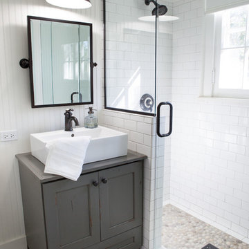
The ample master bath was fitted with double vanity areas in white. A generous shower with a bench features classic white subway tiles and light blue/green glass accents, as well as a large free standing soaking tub nestled under a window with double sconces to dim while relaxing in a luxurious bath. A custom classic white bookcase for plush towels greets you as you enter the sanctuary bath.
Joe Nowak
 Robert Frank Interiors
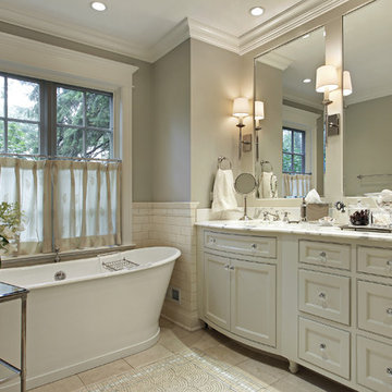
The challenge for this project was that, while the homeowner desired all of the luxury amenities of a deluxe master bath, space was extremely limited. Therefore efficient space planning was critical in achieving the final design. Use of custom painted cabinetry and carrara marble countertops were the basis for this compact yet luxurious bathroom design. Careful attention was given to the tone of the finishes in order to keep this eastern-exposure bathroom light and bright. White trim and crown moulding was used in contrast to the putty colored walls. In keeping with the era of the home, a hand-glazed white ceramic subway tile was used in the soaking tub alcove. Nickel plated bath, lavatory, tub and shower fixtures in the vintage style were used alongside modern amenities such as recessed halogen lighting, electric towel warmers and radiant-heated tile flooring.
 TKS Design Group
Free ebook, Creating the Ideal Kitchen. DOWNLOAD NOW
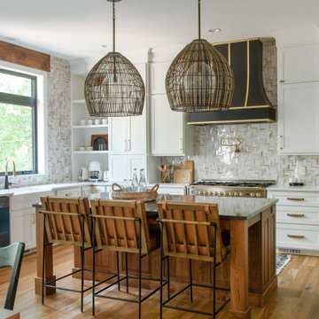
The Klimala’s and their three kids are no strangers to moving, this being their fifth house in the same town over the 20-year period they have lived there. “It must be the 7-year itch, because every seven years, we seem to find ourselves antsy for a new project or a new environment. I think part of it is being a designer, I see my own taste evolve and I want my environment to reflect that. Having easy access to wonderful tradesmen and a knowledge of the process makes it that much easier”.
This time, Klimala’s fell in love with a somewhat unlikely candidate. The 1950’s ranch turned cape cod was a bit of a mutt, but it’s location 5 minutes from their design studio and backing up to the high school where their kids can roll out of bed and walk to school, coupled with the charm of its location on a private road and lush landscaping made it an appealing choice for them.
“The bones of the house were really charming. It was typical 1,500 square foot ranch that at some point someone added a second floor to. Its sloped roofline and dormered bedrooms gave it some charm.” With the help of architect Maureen McHugh, Klimala’s gutted and reworked the layout to make the house work for them. An open concept kitchen and dining room allows for more frequent casual family dinners and dinner parties that linger. A dingy 3-season room off the back of the original house was insulated, given a vaulted ceiling with skylights and now opens up to the kitchen. This room now houses an 8’ raw edge white oak dining table and functions as an informal dining room. “One of the challenges with these mid-century homes is the 8’ ceilings. I had to have at least one room that had a higher ceiling so that’s how we did it” states Klimala.
The kitchen features a 10’ island which houses a 5’0” Galley Sink. The Galley features two faucets, and double tiered rail system to which accessories such as cutting boards and stainless steel bowls can be added for ease of cooking. Across from the large sink is an induction cooktop. “My two teen daughters and I enjoy cooking, and the Galley and induction cooktop make it so easy.” A wall of tall cabinets features a full size refrigerator, freezer, double oven and built in coffeemaker. The area on the opposite end of the kitchen features a pantry with mirrored glass doors and a beverage center below.
The rest of the first floor features an entry way, a living room with views to the front yard’s lush landscaping, a family room where the family hangs out to watch TV, a back entry from the garage with a laundry room and mudroom area, one of the home’s four bedrooms and a full bath. There is a double sided fireplace between the family room and living room. The home features pops of color from the living room’s peach grass cloth to purple painted wall in the family room. “I’m definitely a traditionalist at heart but because of the home’s Midcentury roots, I wanted to incorporate some of those elements into the furniture, lighting and accessories which also ended up being really fun. We are not formal people so I wanted a house that my kids would enjoy, have their friends over and feel comfortable.”
The second floor houses the master bedroom suite, two of the kids’ bedrooms and a back room nicknamed “the library” because it has turned into a quiet get away area where the girls can study or take a break from the rest of the family. The area was originally unfinished attic, and because the home was short on closet space, this Jack and Jill area off the girls’ bedrooms houses two large walk-in closets and a small sitting area with a makeup vanity. “The girls really wanted to keep the exposed brick of the fireplace that runs up the through the space, so that’s what we did, and I think they feel like they are in their own little loft space in the city when they are up there” says Klimala.
Designed by: Susan Klimala, CKD, CBD
Photography by: Carlos Vergara
For more information on kitchen and bath design ideas go to: www.kitchenstudio-ge.com

 Crown Point Cabinetry
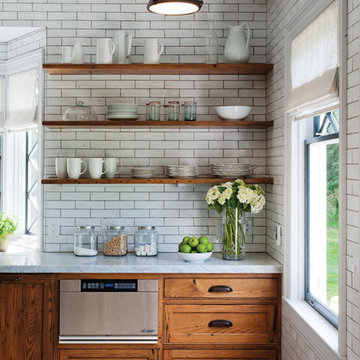
Everyday dishes are displayed on three understated shelves, also crafted from Reclaimed Chestnut.
Photo Credit: Crown Point Cabinetry
Kitchen - rustic kitchen idea in Burlington with recessed-panel cabinets, medium tone wood cabinets, granite countertops, white backsplash, subway tile backsplash and stainless steel appliances
Kitchen - rustic kitchen idea in Burlington with recessed-panel cabinets, medium tone wood cabinets, granite countertops, white backsplash, subway tile backsplash and stainless steel appliances
 Dura Supreme Cabinetry
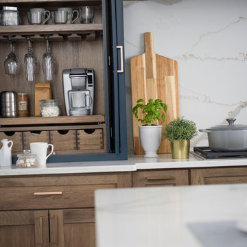
This modern farmhouse kitchen features a beautiful combination of Navy Blue painted and gray stained Hickory cabinets that’s sure to be an eye-catcher. The elegant “Morel” stain blends and harmonizes the natural Hickory wood grain while emphasizing the grain with a subtle gray tone that beautifully coordinated with the cool, deep blue paint.
The “Gale Force” SW 7605 blue paint from Sherwin-Williams is a stunning deep blue paint color that is sophisticated, fun, and creative. It’s a stunning statement-making color that’s sure to be a classic for years to come and represents the latest in color trends. It’s no surprise this beautiful navy blue has been a part of Dura Supreme’s Curated Color Collection for several years, making the top 6 colors for 2017 through 2020.
Beyond the beautiful exterior, there is so much well-thought-out storage and function behind each and every cabinet door. The two beautiful blue countertop towers that frame the modern wood hood and cooktop are two intricately designed larder cabinets built to meet the homeowner’s exact needs.
The larder cabinet on the left is designed as a beverage center with apothecary drawers designed for housing beverage stir sticks, sugar packets, creamers, and other misc. coffee and home bar supplies. A wine glass rack and shelves provides optimal storage for a full collection of glassware while a power supply in the back helps power coffee & espresso (machines, blenders, grinders and other small appliances that could be used for daily beverage creations. The roll-out shelf makes it easier to fill clean and operate each appliance while also making it easy to put away. Pocket doors tuck out of the way and into the cabinet so you can easily leave open for your household or guests to access, but easily shut the cabinet doors and conceal when you’re ready to tidy up.
Beneath the beverage center larder is a drawer designed with 2 layers of multi-tasking storage for utensils and additional beverage supplies storage with space for tea packets, and a full drawer of K-Cup storage. The cabinet below uses powered roll-out shelves to create the perfect breakfast center with power for a toaster and divided storage to organize all the daily fixings and pantry items the household needs for their morning routine.
On the right, the second larder is the ultimate hub and center for the homeowner’s baking tasks. A wide roll-out shelf helps store heavy small appliances like a KitchenAid Mixer while making them easy to use, clean, and put away. Shelves and a set of apothecary drawers help house an assortment of baking tools, ingredients, mixing bowls and cookbooks. Beneath the counter a drawer and a set of roll-out shelves in various heights provides more easy access storage for pantry items, misc. baking accessories, rolling pins, mixing bowls, and more.
The kitchen island provides a large worktop, seating for 3-4 guests, and even more storage! The back of the island includes an appliance lift cabinet used for a sewing machine for the homeowner’s beloved hobby, a deep drawer built for organizing a full collection of dishware, a waste recycling bin, and more!
All and all this kitchen is as functional as it is beautiful!
Request a FREE Dura Supreme Brochure Packet:
http://www.durasupreme.com/request-brochure
 O’Hara Interiors
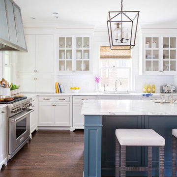
Martha O'Hara Interiors, Interior Design & Photo Styling | John Kraemer & Sons, Remodel | Troy Thies, Photography
Please Note: All “related,” “similar,” and “sponsored” products tagged or listed by Houzz are not actual products pictured. They have not been approved by Martha O’Hara Interiors nor any of the professionals credited. For information about our work, please contact design@oharainteriors.com.
 Markalunas Architecture and Design, LLC
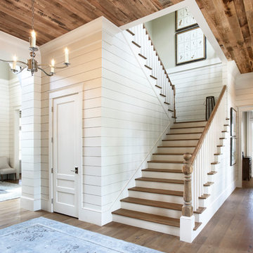
Lake Front Country Estate Front Hall, design by Tom Markalunas, built by Resort Custom Homes. Photography by Rachael Boling.
Inspiration for a huge timeless wooden u-shaped staircase remodel in Other with painted risers
Inspiration for a huge timeless wooden u-shaped staircase remodel in Other with painted risers
 Vetter Architects
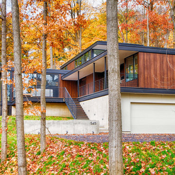
The client’s request was quite common - a typical 2800 sf builder home with 3 bedrooms, 2 baths, living space, and den. However, their desire was for this to be “anything but common.” The result is an innovative update on the production home for the modern era, and serves as a direct counterpoint to the neighborhood and its more conventional suburban housing stock, which focus views to the backyard and seeks to nullify the unique qualities and challenges of topography and the natural environment.
The Terraced House cautiously steps down the site’s steep topography, resulting in a more nuanced approach to site development than cutting and filling that is so common in the builder homes of the area. The compact house opens up in very focused views that capture the natural wooded setting, while masking the sounds and views of the directly adjacent roadway. The main living spaces face this major roadway, effectively flipping the typical orientation of a suburban home, and the main entrance pulls visitors up to the second floor and halfway through the site, providing a sense of procession and privacy absent in the typical suburban home.
Clad in a custom rain screen that reflects the wood of the surrounding landscape - while providing a glimpse into the interior tones that are used. The stepping “wood boxes” rest on a series of concrete walls that organize the site, retain the earth, and - in conjunction with the wood veneer panels - provide a subtle organic texture to the composition.
The interior spaces wrap around an interior knuckle that houses public zones and vertical circulation - allowing more private spaces to exist at the edges of the building. The windows get larger and more frequent as they ascend the building, culminating in the upstairs bedrooms that occupy the site like a tree house - giving views in all directions.
The Terraced House imports urban qualities to the suburban neighborhood and seeks to elevate the typical approach to production home construction, while being more in tune with modern family living patterns.
Overview:
Elm Grove
Size:
2,800 sf,
3 bedrooms, 2 bathrooms
Completion Date:
September 2014
Services:
Architecture, Landscape Architecture
Interior Consultants: Amy Carman Design
 Renovisions
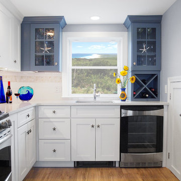
To create a unique kitchen, we take inspiration from the personality of our clients; it’s a collaborative effort to develop the exact look and feel that best suits their lifestyles.
The challenge of this kitchen was to re-build the existing kitchen and adjoining full bath, creating a much better flow with plenty of storage for this active family (as they often entertain seaside).
The two-toned cabinetry in both white and laguna blue reflected a true beach-feel adorned with a terrific choice of starfish and shell shaped hardware to draw attention to this creative and beautifully transformed seaside kitchen.
We remind our clients that in order to be unique, do something unique! And this is nicely demonstrated in both the layout, color scheme and backsplash design details. Our client selected several hand painted decorative ocean creatures for the backsplash, drawing from colors in the room, and this created a truly unique conversation piece!
A glint of sparkle from the white quartz countertops brings you closer to the beach in this impressive oceanfront home.
From flooring to ceiling, we created a picture perfect beautiful beach house kitchen that is not only functional but provides a relaxed and inviting feel for these seaside owners.
 Amazing Spaces
The existing U-shaped kitchen was tucked away in a small corner while the dining table was swimming in a room much too large for its size. The client’s needs and the architecture of the home made it apparent that the perfect design solution for the home was to swap the spaces.
The homeowners entertain frequently and wanted the new layout to accommodate a lot of counter seating, a bar/buffet for serving hors d’oeuvres, an island with prep sink, and all new appliances. They had a strong preference that the hood be a focal point and wanted to go beyond a typical white color scheme even though they wanted white cabinets.
While moving the kitchen to the dining space gave us a generous amount of real estate to work with, two of the exterior walls are occupied with full-height glass creating a challenge how best to fulfill their wish list. We used one available wall for the needed tall appliances, taking advantage of its height to create the hood as a focal point. We opted for both a peninsula and island instead of one large island in order to maximize the seating requirements and create a barrier when entertaining so guests do not flow directly into the work area of the kitchen. This also made it possible to add a second sink as requested. Lastly, the peninsula sets up a well-defined path to the new dining room without feeling like you are walking through the kitchen. We used the remaining fourth wall for the bar/buffet.
Black cabinetry adds strong contrast in several areas of the new kitchen. Wire mesh wall cabinet doors at the bar and gold accents on the hardware, light fixtures, faucets and furniture add further drama to the concept. The focal point is definitely the black hood, looking both dramatic and cohesive at the same time.

 Barbara Grushow Designs Inc.
Jim Bartsch Photography
Bathroom - mid-sized transitional master white tile and subway tile mosaic tile floor and gray floor bathroom idea in Los Angeles with a wall-mount sink, gray walls, a hinged shower door and a niche
Bathroom - mid-sized transitional master white tile and subway tile mosaic tile floor and gray floor bathroom idea in Los Angeles with a wall-mount sink, gray walls, a hinged shower door and a niche
3