
Search results for "Typical challenges" in Home Design Ideas

 Advance Design Studio, Ltd.
Jennifer and Dan have lived in their Deer Park Illinois home for 15 years, slowly making minor fixes like painting and decorating; but they had a new plan for their kitchen the entire time. An awkwardly placed garage door, and an island cooktop with a terrible downdraft made a full-scale kitchen remodel an absolute must. Jennifer had many ideas in mind and wanted to work with a company that could provide high-end work, while partnering with a designer that would tailor the kitchen to her ideas.
She was intrigued by the phrase “Common Sense Remodeling” in Advance Design’s feature she discovered while perusing an issue of the community’s Quintessential Barrington Magazine. Doing further research on the company’s website, as she looked through project profiles and read about Advance Design’s “Common Sense Remodeling” philosophy, she promptly scheduled an appointment to see if the people and ideas she read about were truly who they said they were. The more she read, the more she knew that the “Common Sense” approach to remodeling they described was exactly the type of company she was looking for.
The partnership was sealed after an initial consultation with Owner Todd Jurs and Project Designer Michelle Lecinski. They displayed a combination of friendliness, professionalism and respect that was unmatched by any of the other companies Jennifer talked to. She knew that with Advance Design, she would be able to retain the vision that she had in mind with high-quality craftsmanship.
“I reached out to Advance Design because of the ‘Common Sense Remodeling’ tagline,” Jennifer said. “That’s what lingered for me”. “Advance Design was the most respectful- of the house and of my design ideas, and the most professional of the handful of companies that looked at my project”.
Soon after the meeting Jennifer began working with Michelle on the project design. They quickly developed chemistry. Jennifer loved how Michelle researched and located every detail that Jennifer wanted for the kitchen. Between the two of them, every concept and idea was worked through and perfected. “Jennifer had definite ideas about what she wanted the new kitchen to look like, she just didn’t know how to bring it all together. We worked together really well to make her ideas into the practical reality necessary for a well-functioning kitchen, with the look and feel that she had envisioned”, says Michelle.
“Michelle was wonderful in using the CAD system she would show me new drawings every time we changed the layout while working through the design,” Jennifer said. “She was a really wonderful partner in execution, she made sure everything happened quickly and easily.”
The finished design drew out elements of Jennifer’s style and personality. The pair call the look “sophisticated farmhouse” to describe the kitchen renovation to family and friends. The result was a beautifully crafted, authentic-feeling space that satisfied Jennifer’s dreams 15 years in the making. The whole project consisted of a kitchen remodel, mudroom upgrade with powder room, and garage entry relocation. “The projects I personally like the best, are the ones that put the client’s dreams on display,” Project Designer Michelle said. “And this is one of those projects.”
The main focal point of the kitchen is custom zinc and brass ventilation hood with a vintage sheen, which was hand made to order by a small company in Indiana named Vogler Metalworking. “It’s like sculpture, a true work of art”, says Jennifer. Your eye is immediately drawn towards this elegant yet practical hood that eliminated the home’s downdraft problem and added a striking conversation piece at the same time. The carpenters had to use special gloves when transporting and installing it, so they didn’t smudge it with fingerprints. The beautiful hood centers proudly over the stunning black enamel and brass LaCornue Range. “I had a friend who had a LaCornue range and after learning how easy it was to cook perfect meals, I was convinced I wanted to have one”, says Jennifer. This unique, breathtaking combination anchors the entire kitchen and is apparent immediately as you walk into the great room the surrounds the space.
DuraSupreme Crestwood cabinets with a Kendall Panel add function and sophistication. A custom gray paint color paired with a storm blue was developed so that the new kitchen looked like it belonged to the existing space. Unlacquered brass faucets and hardware were important to Jennifer because she wanted the living finishes to age over time. Remarkable brass diamond mesh cabinet door inserts imported from the UK continue to add this one-of-a-kind kitchen renovation; giving it a “you won’t see this everywhere” quality. The use of old railcar flooring for the coffee bar countertop and reclaimed oak for the open shelving gives an authenticity to the space uncommon in kitchens today.
Jennifer and Michelle fell in love with the Limestone Grey Stone while they were investigating unique island countertop ideas. They liked the fact that the limestone as a living finish will age and change over time. Calcutta Miel Quartz countertops made for an excellent pairing around the perimeter, as it’s durable and perfect for cooking preparations. A textured white subway tile backsplash that runs to the ceiling keeps your eye moving towards the open shelving, and to the main focal point of the stunning range hood combination.
“The kitchen functions beautifully, and it’s gorgeous,” beams Jennifer as she gestures with both hands while smiling ear to ear. “The most important thing was I wanted a kitchen that had a wonderful flow, cooked beautiful meals and was a great gathering place for family and friends, and this space does that perfectly! Beauty wise, it turned out exactly how I had envisioned. I felt the function part was the hardest part, and that was nailed”!
Relocating the garage entry to the new mudroom was a huge priority and has finally separated the family’s arriving home functions from their kitchen. Now coats and shoes and bags have their own area for dropping once members arrive home. Matching gray DuraSupreme cabinetry helped create gorgeous, purposeful lockers for the family. A reclaimed vintage sink and custom wall paper were added to the tiny powder room to beautify the once previously only functional space. Advance Design was even able to create a custom space for their dog to sleep while the family is away.
“It was unbelievable that a project of this size was completed in such a short time, and I think that’s because of the large amount of planning and preparation that went into it,” Jennifer marveled, “When we started, we were ready, and everything was prepared”.
When it came to execution, Project Manager Justin Davis and his crew were quick, accessible, and organized. Projects like this kitchen are typically completed in as little as 8-10 weeks. Jennifer’s kitchen however despite the relocation of some challenging HVAC in a soffit and moving of an exterior door was completed remarkably fast in part because the team was working with an existing tile floor that ran throughout the first floor that the client really loved.
“You get to know these people really well because they’re living in your house while you’re living in your house. They were so fast and really good, it didn’t take as long as even planned” reported Jennifer. “I would text Justin and he always responded almost immediately. I got to know all the guys who were working in our house and they were all wonderful people”.
Details in a customized kitchen like this one require skill and care from the people who install it. “All the guys on the job were skilled at what the did. I wanted small details like little feet to look like furniture, that is where their carpentry skill came in to make these all perfect”, said Jennifer. “The tile guys were wonderful. They even let me determine how I wanted the texture with the grout to appear for a salt and pepper look; now that is a very skilled trade person making it custom”.
In Jennifer’s interview, she continued to reference Advance Design’s “Common Sense Remodeling”, so I took a minute to ask her exactly what that phrase meant to her and how it played out in her experience with her project and the Advance Design team. Here is what she said: “I was intrigued about Common Sense Remodeling and in my head that there would be clear costs and prices, great communication between the design team, the execution team and me”, said Jennifer. They did deliver on that, it was so clear about the cost breakdown, what I could expect from everyone who came to my house, and everything that we had ordered. That to me is the Common Sense”!
It’s great to see a client take literally our assertion that a well-planned remodeling project is simply “Common Sense”! She anticipated each step of the way would be clear, concise, and predictable, all the while protecting the outcome due to the careful upfront planning. “Advance Design delivered on their ‘Common Sense Remodeling’ promise,” Jennifer said. “From the design team, to the execution team - everything was straight forward like I imagined. The project turned out exactly how I envisioned, I enjoyed this process and absolutely would recommend Advance Design Studio to anyone.”
 TKS Design Group
Free ebook, Creating the Ideal Kitchen. DOWNLOAD NOW
The Klimala’s and their three kids are no strangers to moving, this being their fifth house in the same town over the 20-year period they have lived there. “It must be the 7-year itch, because every seven years, we seem to find ourselves antsy for a new project or a new environment. I think part of it is being a designer, I see my own taste evolve and I want my environment to reflect that. Having easy access to wonderful tradesmen and a knowledge of the process makes it that much easier”.
This time, Klimala’s fell in love with a somewhat unlikely candidate. The 1950’s ranch turned cape cod was a bit of a mutt, but it’s location 5 minutes from their design studio and backing up to the high school where their kids can roll out of bed and walk to school, coupled with the charm of its location on a private road and lush landscaping made it an appealing choice for them.
“The bones of the house were really charming. It was typical 1,500 square foot ranch that at some point someone added a second floor to. Its sloped roofline and dormered bedrooms gave it some charm.” With the help of architect Maureen McHugh, Klimala’s gutted and reworked the layout to make the house work for them. An open concept kitchen and dining room allows for more frequent casual family dinners and dinner parties that linger. A dingy 3-season room off the back of the original house was insulated, given a vaulted ceiling with skylights and now opens up to the kitchen. This room now houses an 8’ raw edge white oak dining table and functions as an informal dining room. “One of the challenges with these mid-century homes is the 8’ ceilings. I had to have at least one room that had a higher ceiling so that’s how we did it” states Klimala.
The kitchen features a 10’ island which houses a 5’0” Galley Sink. The Galley features two faucets, and double tiered rail system to which accessories such as cutting boards and stainless steel bowls can be added for ease of cooking. Across from the large sink is an induction cooktop. “My two teen daughters and I enjoy cooking, and the Galley and induction cooktop make it so easy.” A wall of tall cabinets features a full size refrigerator, freezer, double oven and built in coffeemaker. The area on the opposite end of the kitchen features a pantry with mirrored glass doors and a beverage center below.
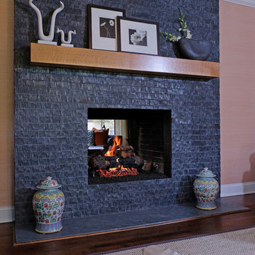
The rest of the first floor features an entry way, a living room with views to the front yard’s lush landscaping, a family room where the family hangs out to watch TV, a back entry from the garage with a laundry room and mudroom area, one of the home’s four bedrooms and a full bath. There is a double sided fireplace between the family room and living room. The home features pops of color from the living room’s peach grass cloth to purple painted wall in the family room. “I’m definitely a traditionalist at heart but because of the home’s Midcentury roots, I wanted to incorporate some of those elements into the furniture, lighting and accessories which also ended up being really fun. We are not formal people so I wanted a house that my kids would enjoy, have their friends over and feel comfortable.”
The second floor houses the master bedroom suite, two of the kids’ bedrooms and a back room nicknamed “the library” because it has turned into a quiet get away area where the girls can study or take a break from the rest of the family. The area was originally unfinished attic, and because the home was short on closet space, this Jack and Jill area off the girls’ bedrooms houses two large walk-in closets and a small sitting area with a makeup vanity. “The girls really wanted to keep the exposed brick of the fireplace that runs up the through the space, so that’s what we did, and I think they feel like they are in their own little loft space in the city when they are up there” says Klimala.
Designed by: Susan Klimala, CKD, CBD
Photography by: Carlos Vergara
For more information on kitchen and bath design ideas go to: www.kitchenstudio-ge.com
 Studio Dearborn
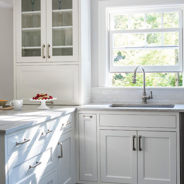
A young colonial in the heart of Rye New York had everything going for it, except a dark and poorly laid out kitchen. The clients tapped Sarah Robertson of Studio Dearborn to help them layout a new kitchen in their challenging, dog leg shaped room. A small breakfast peninsula and working island helped pull together the oddly shaped kitchen into a streamlined, light filled space with all the storage amenities typical of a Studio Dearborn kitchen. The bar area, with undercounter refrigeration for wine and beverages, also features a locking cabinet for liquor and open wine storage. Desk area has file drawer and Docking Drawer charging drawer. Countertops: White Macauba, Rye Marble and Stone, Rye NY. Hardware: Studio Pulls from Hickory Hardware. Sinks: Kraus. Lighting: Currey & Co. Faucet: Kohler Artifacts Backsplash tile: Casablanca Tile and Stone, Harrison NY. Photography: Adam Kane Macchia
Find the right local pro for your project
 Drewett Works
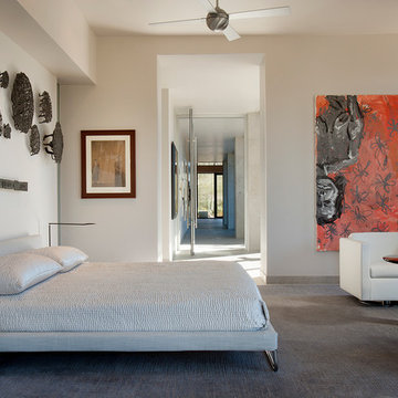
Believe it or not, this award-winning home began as a speculative project. Typically speculative projects involve a rather generic design that would appeal to many in a style that might be loved by the masses. But the project’s developer loved modern architecture and his personal residence was the first project designed by architect C.P. Drewett when Drewett Works launched in 2001. Together, the architect and developer envisioned a fictitious art collector who would one day purchase this stunning piece of desert modern architecture to showcase their magnificent collection.
The primary views from the site were southwest. Therefore, protecting the interior spaces from the southwest sun while making the primary views available was the greatest challenge. The views were very calculated and carefully managed. Every room needed to not only capture the vistas of the surrounding desert, but also provide viewing spaces for the potential collection to be housed within its walls.
The core of the material palette is utilitarian including exposed masonry and locally quarried cantera stone. An organic nature was added to the project through millwork selections including walnut and red gum veneers.
The eventual owners saw immediately that this could indeed become a home for them as well as their magnificent collection, of which pieces are loaned out to museums around the world. Their decision to purchase the home was based on the dimensions of one particular wall in the dining room which was EXACTLY large enough for one particular painting not yet displayed due to its size. The owners and this home were, as the saying goes, a perfect match!
Project Details | Desert Modern for the Magnificent Collection, Estancia, Scottsdale, AZ
Architecture: C.P. Drewett, Jr., AIA, NCARB | Drewett Works, Scottsdale, AZ
Builder: Shannon Construction | Phoenix, AZ
Interior Selections: Janet Bilotti, NCIDQ, ASID | Naples, FL
Custom Millwork: Linear Fine Woodworking | Scottsdale, AZ
Photography: Dino Tonn | Scottsdale, AZ
Awards: 2014 Gold Nugget Award of Merit
Feature Article: Luxe. Interiors and Design. Winter 2015, “Lofty Exposure”
 Advance Design Studio, Ltd.
Jennifer and Dan have lived in their Deer Park Illinois home for 15 years, slowly making minor fixes like painting and decorating; but they had a new plan for their kitchen the entire time. An awkwardly placed garage door, and an island cooktop with a terrible downdraft made a full-scale kitchen remodel an absolute must. Jennifer had many ideas in mind and wanted to work with a company that could provide high-end work, while partnering with a designer that would tailor the kitchen to her ideas.
She was intrigued by the phrase “Common Sense Remodeling” in Advance Design’s feature she discovered while perusing an issue of the community’s Quintessential Barrington Magazine. Doing further research on the company’s website, as she looked through project profiles and read about Advance Design’s “Common Sense Remodeling” philosophy, she promptly scheduled an appointment to see if the people and ideas she read about were truly who they said they were. The more she read, the more she knew that the “Common Sense” approach to remodeling they described was exactly the type of company she was looking for.
The partnership was sealed after an initial consultation with Owner Todd Jurs and Project Designer Michelle Lecinski. They displayed a combination of friendliness, professionalism and respect that was unmatched by any of the other companies Jennifer talked to. She knew that with Advance Design, she would be able to retain the vision that she had in mind with high-quality craftsmanship.
“I reached out to Advance Design because of the ‘Common Sense Remodeling’ tagline,” Jennifer said. “That’s what lingered for me”. “Advance Design was the most respectful- of the house and of my design ideas, and the most professional of the handful of companies that looked at my project”.
Soon after the meeting Jennifer began working with Michelle on the project design. They quickly developed chemistry. Jennifer loved how Michelle researched and located every detail that Jennifer wanted for the kitchen. Between the two of them, every concept and idea was worked through and perfected. “Jennifer had definite ideas about what she wanted the new kitchen to look like, she just didn’t know how to bring it all together. We worked together really well to make her ideas into the practical reality necessary for a well-functioning kitchen, with the look and feel that she had envisioned”, says Michelle.
“Michelle was wonderful in using the CAD system she would show me new drawings every time we changed the layout while working through the design,” Jennifer said. “She was a really wonderful partner in execution, she made sure everything happened quickly and easily.”
The finished design drew out elements of Jennifer’s style and personality. The pair call the look “sophisticated farmhouse” to describe the kitchen renovation to family and friends. The result was a beautifully crafted, authentic-feeling space that satisfied Jennifer’s dreams 15 years in the making. The whole project consisted of a kitchen remodel, mudroom upgrade with powder room, and garage entry relocation. “The projects I personally like the best, are the ones that put the client’s dreams on display,” Project Designer Michelle said. “And this is one of those projects.”
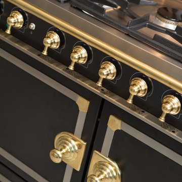
The main focal point of the kitchen is custom zinc and brass ventilation hood with a vintage sheen, which was hand made to order by a small company in Indiana named Vogler Metalworking. “It’s like sculpture, a true work of art”, says Jennifer. Your eye is immediately drawn towards this elegant yet practical hood that eliminated the home’s downdraft problem and added a striking conversation piece at the same time. The carpenters had to use special gloves when transporting and installing it, so they didn’t smudge it with fingerprints. The beautiful hood centers proudly over the stunning black enamel and brass LaCornue Range. “I had a friend who had a LaCornue range and after learning how easy it was to cook perfect meals, I was convinced I wanted to have one”, says Jennifer. This unique, breathtaking combination anchors the entire kitchen and is apparent immediately as you walk into the great room the surrounds the space.
DuraSupreme Crestwood cabinets with a Kendall Panel add function and sophistication. A custom gray paint color paired with a storm blue was developed so that the new kitchen looked like it belonged to the existing space. Unlacquered brass faucets and hardware were important to Jennifer because she wanted the living finishes to age over time. Remarkable brass diamond mesh cabinet door inserts imported from the UK continue to add this one-of-a-kind kitchen renovation; giving it a “you won’t see this everywhere” quality. The use of old railcar flooring for the coffee bar countertop and reclaimed oak for the open shelving gives an authenticity to the space uncommon in kitchens today.
Jennifer and Michelle fell in love with the Limestone Grey Stone while they were investigating unique island countertop ideas. They liked the fact that the limestone as a living finish will age and change over time. Calcutta Miel Quartz countertops made for an excellent pairing around the perimeter, as it’s durable and perfect for cooking preparations. A textured white subway tile backsplash that runs to the ceiling keeps your eye moving towards the open shelving, and to the main focal point of the stunning range hood combination.
“The kitchen functions beautifully, and it’s gorgeous,” beams Jennifer as she gestures with both hands while smiling ear to ear. “The most important thing was I wanted a kitchen that had a wonderful flow, cooked beautiful meals and was a great gathering place for family and friends, and this space does that perfectly! Beauty wise, it turned out exactly how I had envisioned. I felt the function part was the hardest part, and that was nailed”!
Relocating the garage entry to the new mudroom was a huge priority and has finally separated the family’s arriving home functions from their kitchen. Now coats and shoes and bags have their own area for dropping once members arrive home. Matching gray DuraSupreme cabinetry helped create gorgeous, purposeful lockers for the family. A reclaimed vintage sink and custom wall paper were added to the tiny powder room to beautify the once previously only functional space. Advance Design was even able to create a custom space for their dog to sleep while the family is away.
“It was unbelievable that a project of this size was completed in such a short time, and I think that’s because of the large amount of planning and preparation that went into it,” Jennifer marveled, “When we started, we were ready, and everything was prepared”.
When it came to execution, Project Manager Justin Davis and his crew were quick, accessible, and organized. Projects like this kitchen are typically completed in as little as 8-10 weeks. Jennifer’s kitchen however despite the relocation of some challenging HVAC in a soffit and moving of an exterior door was completed remarkably fast in part because the team was working with an existing tile floor that ran throughout the first floor that the client really loved.
“You get to know these people really well because they’re living in your house while you’re living in your house. They were so fast and really good, it didn’t take as long as even planned” reported Jennifer. “I would text Justin and he always responded almost immediately. I got to know all the guys who were working in our house and they were all wonderful people”.
Details in a customized kitchen like this one require skill and care from the people who install it. “All the guys on the job were skilled at what the did. I wanted small details like little feet to look like furniture, that is where their carpentry skill came in to make these all perfect”, said Jennifer. “The tile guys were wonderful. They even let me determine how I wanted the texture with the grout to appear for a salt and pepper look; now that is a very skilled trade person making it custom”.
In Jennifer’s interview, she continued to reference Advance Design’s “Common Sense Remodeling”, so I took a minute to ask her exactly what that phrase meant to her and how it played out in her experience with her project and the Advance Design team. Here is what she said: “I was intrigued about Common Sense Remodeling and in my head that there would be clear costs and prices, great communication between the design team, the execution team and me”, said Jennifer. They did deliver on that, it was so clear about the cost breakdown, what I could expect from everyone who came to my house, and everything that we had ordered. That to me is the Common Sense”!
It’s great to see a client take literally our assertion that a well-planned remodeling project is simply “Common Sense”! She anticipated each step of the way would be clear, concise, and predictable, all the while protecting the outcome due to the careful upfront planning. “Advance Design delivered on their ‘Common Sense Remodeling’ promise,” Jennifer said. “From the design team, to the execution team - everything was straight forward like I imagined. The project turned out exactly how I envisioned, I enjoyed this process and absolutely would recommend Advance Design Studio to anyone.”
 Align Design LLC
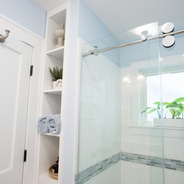
This project was focused on eeking out space for another bathroom for this growing family. The three bedroom, Craftsman bungalow was originally built with only one bathroom, which is typical for the era. The challenge was to find space without compromising the existing storage in the home. It was achieved by claiming the closet areas between two bedrooms, increasing the original 29" depth and expanding into the larger of the two bedrooms. The result was a compact, yet efficient bathroom. Classic finishes are respectful of the vernacular and time period of the home.
 down2earth Interior Design, LLC.
It is not uncommon for down2earth interior design to be tasked with the challenge of combining an existing kitchen and dining room into one open space that is great for communal cooking and entertaining. But what happens when that request is only the beginning? In this kitchen, our clients had big dreams for their space that went well beyond opening up the plan and included flow, organization, a timeless aesthetic, and partnering with local vendors.
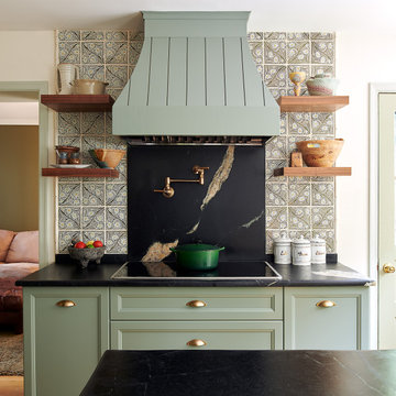
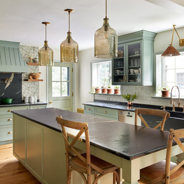
Although the family wanted all the modern conveniences afforded them by a total kitchen renovation, they also wanted it to look timeless and fit in with the aesthetic of their 100 year old home. So all design decisions were made with an eye towards timelessness, from the profile of the cabinet doors, to the handmade backsplash tiles, to the choice of soapstone for countertops, which is a beautiful material that is naturally heat resistant. The soapstone was strategically positioned so that the most stunning veins would be on display across the island top and on the wall behind the cooktop. Even the green color of the cabinet, and the subtle green-greys of the trim were specifically chosen for their softness so they will not look stark or trendy in this classic home.
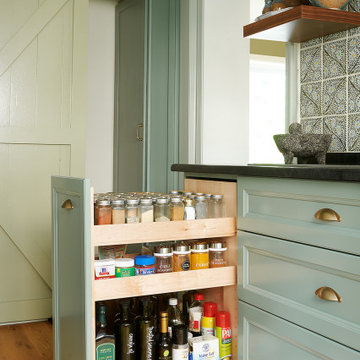
To address issues of flow, the clients really analyzed how they cook, entertain, and eat. We went well beyond the typical “kitchen triangle” to make sure all the hot spots of the kitchen were in the most functional locations within the space. Once we located the “big moves” we really dug down into the details. Some noteworthy ones include a whole wall of deep pantries with pull outs so all food storage is in one place, knives stored in a drawer right over the cutting boards, trash located right behind the sink, and pots, pans, cookie sheets located right by the oven, and a pullout for the Kitchenaid mixer. There are also pullouts that serve as dedicated storage next to the oven for oils, spices, and utensils, and a microwave located in the island which will facilitate aging in place if that becomes an objective in the future. A broom and cleaning supply storage closet at the top of the basement stairs coordinates with the kitchen cabinets so it will look nice if on view, or it can be hidden behind barn doors that tuck just a bit behind the oven. Storage for platters and a bar are located near the dining room so they will be on hand for entertaining.
As a couple deeply invested in their local community, it was important to the homeowners to work with as many local vendors as possible. From flooring to woodwork to tile to countertops, choosing the right materials to make this project come together was a real collaborative effort. Their close community connections also inspired these empty nesters to stay in their home and update it to their needs, rather than relocating. The space can now accommodate their growing family that might consist of children’s spouses, grandkids, and furry friends alike.


 Stonepocket Unique Landscapes
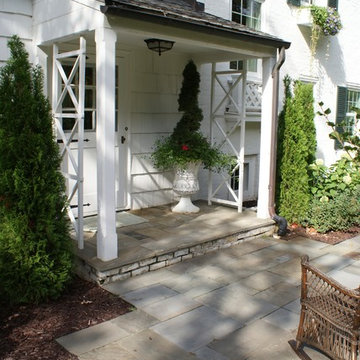
Landscape by Stonepocket located in Minnetonka, Minnesota Creating a elegant landscape to blend with a home with such character and charm was a challenge in controlled resistant. Did not want the landscape to overwhelm the home, nor did I want a typical landscape for this style that usually involves a box hedge. Utilizing light in the front to create a perennial garden give the home a sense of place. Keep the planting mostly to whites and greens in the back unifies the space.
photos by Stonepocket, Inc
 NICHEdg
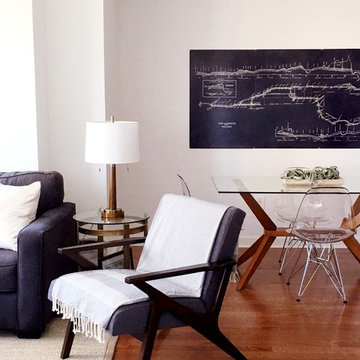
The great room is now bright, open and stylishly designed to fit our client's needs. The eclectic mix of various design styles creates a unique sanctuary for him to watch TV, relax after a long day and/or entertain guests. The floor planning solved the common challenge our clients typically face with open floor plan residences - creating a cohesive design with specific functions in each space.
Photo: NICHEdg
 down2earth Interior Design, LLC.
It is not uncommon for down2earth interior design to be tasked with the challenge of combining an existing kitchen and dining room into one open space that is great for communal cooking and entertaining. But what happens when that request is only the beginning? In this kitchen, our clients had big dreams for their space that went well beyond opening up the plan and included flow, organization, a timeless aesthetic, and partnering with local vendors.
Although the family wanted all the modern conveniences afforded them by a total kitchen renovation, they also wanted it to look timeless and fit in with the aesthetic of their 100 year old home. So all design decisions were made with an eye towards timelessness, from the profile of the cabinet doors, to the handmade backsplash tiles, to the choice of soapstone for countertops, which is a beautiful material that is naturally heat resistant. The soapstone was strategically positioned so that the most stunning veins would be on display across the island top and on the wall behind the cooktop. Even the green color of the cabinet, and the subtle green-greys of the trim were specifically chosen for their softness so they will not look stark or trendy in this classic home.
To address issues of flow, the clients really analyzed how they cook, entertain, and eat. We went well beyond the typical “kitchen triangle” to make sure all the hot spots of the kitchen were in the most functional locations within the space. Once we located the “big moves” we really dug down into the details. Some noteworthy ones include a whole wall of deep pantries with pull outs so all food storage is in one place, knives stored in a drawer right over the cutting boards, trash located right behind the sink, and pots, pans, cookie sheets located right by the oven, and a pullout for the Kitchenaid mixer. There are also pullouts that serve as dedicated storage next to the oven for oils, spices, and utensils, and a microwave located in the island which will facilitate aging in place if that becomes an objective in the future. A broom and cleaning supply storage closet at the top of the basement stairs coordinates with the kitchen cabinets so it will look nice if on view, or it can be hidden behind barn doors that tuck just a bit behind the oven. Storage for platters and a bar are located near the dining room so they will be on hand for entertaining.
As a couple deeply invested in their local community, it was important to the homeowners to work with as many local vendors as possible. From flooring to woodwork to tile to countertops, choosing the right materials to make this project come together was a real collaborative effort. Their close community connections also inspired these empty nesters to stay in their home and update it to their needs, rather than relocating. The space can now accommodate their growing family that might consist of children’s spouses, grandkids, and furry friends alike.
 Bilotta Kitchen & Home
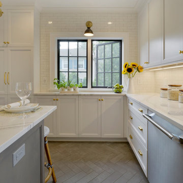
For this kitchen, designed by Peter Bittner, the client had a very clear idea of what she wanted right from the start. She did her research. The mother of a fast growing, young family, she wanted something as efficient as it was beautiful – on the simple, yet elegant side. Her requests were straightforward: white and light grey Bilotta cabinetry in a transitional style so as not to compete with the detailing inside her 1950s Tudor-style home; a heated tile floor (By Rye Ridge Tile); stainless appliances; white subway tile backsplash by Walker Zanger (again to keep it clean and not compete with its surroundings); and seating at the island for snacks and homework. The “pop” suggested by Peter was done through the satin brass hardware and lighting fixtures. The real challenge with this space was to fit as much as possible into the existing footprint which was overall on the smaller side. The solution was eliminating a doorway (with a swinging door that opened into the kitchen) and stairs from the kitchen to the basement. By moving the stairs and doorway, the usable space increased considerably. The typical working triangle became the focus for one side of the kitchen and the island overhang and seating became available on the other side. To make up for the limited amount of wall cabinets Peter designed shallow pantry-style cabinets along the back wall. Quartz Countertops by Rom Stone Fabrication. Designer: Peter Bittner Photographer: Peter Krupenye
 down2earth Interior Design, LLC.
It is not uncommon for down2earth interior design to be tasked with the challenge of combining an existing kitchen and dining room into one open space that is great for communal cooking and entertaining. But what happens when that request is only the beginning? In this kitchen, our clients had big dreams for their space that went well beyond opening up the plan and included flow, organization, a timeless aesthetic, and partnering with local vendors.
Although the family wanted all the modern conveniences afforded them by a total kitchen renovation, they also wanted it to look timeless and fit in with the aesthetic of their 100 year old home. So all design decisions were made with an eye towards timelessness, from the profile of the cabinet doors, to the handmade backsplash tiles, to the choice of soapstone for countertops, which is a beautiful material that is naturally heat resistant. The soapstone was strategically positioned so that the most stunning veins would be on display across the island top and on the wall behind the cooktop. Even the green color of the cabinet, and the subtle green-greys of the trim were specifically chosen for their softness so they will not look stark or trendy in this classic home.
To address issues of flow, the clients really analyzed how they cook, entertain, and eat. We went well beyond the typical “kitchen triangle” to make sure all the hot spots of the kitchen were in the most functional locations within the space. Once we located the “big moves” we really dug down into the details. Some noteworthy ones include a whole wall of deep pantries with pull outs so all food storage is in one place, knives stored in a drawer right over the cutting boards, trash located right behind the sink, and pots, pans, cookie sheets located right by the oven, and a pullout for the Kitchenaid mixer. There are also pullouts that serve as dedicated storage next to the oven for oils, spices, and utensils, and a microwave located in the island which will facilitate aging in place if that becomes an objective in the future. A broom and cleaning supply storage closet at the top of the basement stairs coordinates with the kitchen cabinets so it will look nice if on view, or it can be hidden behind barn doors that tuck just a bit behind the oven. Storage for platters and a bar are located near the dining room so they will be on hand for entertaining.
As a couple deeply invested in their local community, it was important to the homeowners to work with as many local vendors as possible. From flooring to woodwork to tile to countertops, choosing the right materials to make this project come together was a real collaborative effort. Their close community connections also inspired these empty nesters to stay in their home and update it to their needs, rather than relocating. The space can now accommodate their growing family that might consist of children’s spouses, grandkids, and furry friends alike.
 Eden LA Furniture and Interiors
Modern living with ocean breezes
__
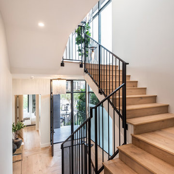
This is another development project EdenLA assisted the client to finish quickly and for top dollar. The fun challenge of more contemporary spaces is how to make them warm and inviting while still maintaining the overall masculine appeal of their architecture. Water features, playful custom abstract art, unique furniture layouts, and warm stone and cabinetry decisions all helped to achieve that in this space. Beach Life Construction implemented the architect's indoor-outdoor flow on the top floor beautifully as well.
__
Kim Pritchard Photography
 Bilotta Kitchen & Home
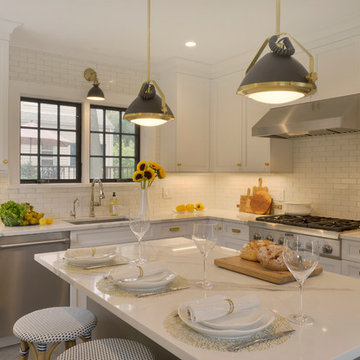
For this kitchen, designed by Peter Bittner, the client had a very clear idea of what she wanted right from the start. She did her research. The mother of a fast growing, young family, she wanted something as efficient as it was beautiful – on the simple, yet elegant side. Her requests were straightforward: white and light grey Bilotta cabinetry in a transitional style so as not to compete with the detailing inside her 1950s Tudor-style home; a heated tile floor (By Rye Ridge Tile); stainless appliances; white subway tile backsplash by Walker Zanger (again to keep it clean and not compete with its surroundings); and seating at the island for snacks and homework. The “pop” suggested by Peter was done through the satin brass hardware and lighting fixtures. The real challenge with this space was to fit as much as possible into the existing footprint which was overall on the smaller side. The solution was eliminating a doorway (with a swinging door that opened into the kitchen) and stairs from the kitchen to the basement. By moving the stairs and doorway, the usable space increased considerably. The typical working triangle became the focus for one side of the kitchen and the island overhang and seating became available on the other side. To make up for the limited amount of wall cabinets Peter designed shallow pantry-style cabinets along the back wall. Quartz Countertops by Rom Stone Fabrication. Designer: Peter Bittner Photographer: Peter Krupenye
 Drewett Works
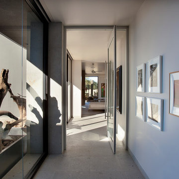
Believe it or not, this award-winning home began as a speculative project. Typically speculative projects involve a rather generic design that would appeal to many in a style that might be loved by the masses. But the project’s developer loved modern architecture and his personal residence was the first project designed by architect C.P. Drewett when Drewett Works launched in 2001. Together, the architect and developer envisioned a fictitious art collector who would one day purchase this stunning piece of desert modern architecture to showcase their magnificent collection.
The primary views from the site were southwest. Therefore, protecting the interior spaces from the southwest sun while making the primary views available was the greatest challenge. The views were very calculated and carefully managed. Every room needed to not only capture the vistas of the surrounding desert, but also provide viewing spaces for the potential collection to be housed within its walls.
The core of the material palette is utilitarian including exposed masonry and locally quarried cantera stone. An organic nature was added to the project through millwork selections including walnut and red gum veneers.
The eventual owners saw immediately that this could indeed become a home for them as well as their magnificent collection, of which pieces are loaned out to museums around the world. Their decision to purchase the home was based on the dimensions of one particular wall in the dining room which was EXACTLY large enough for one particular painting not yet displayed due to its size. The owners and this home were, as the saying goes, a perfect match!
Project Details | Desert Modern for the Magnificent Collection, Estancia, Scottsdale, AZ
Architecture: C.P. Drewett, Jr., AIA, NCARB | Drewett Works, Scottsdale, AZ
Builder: Shannon Construction | Phoenix, AZ
Interior Selections: Janet Bilotti, NCIDQ, ASID | Naples, FL
Custom Millwork: Linear Fine Woodworking | Scottsdale, AZ
Photography: Dino Tonn | Scottsdale, AZ
Awards: 2014 Gold Nugget Award of Merit
Feature Article: Luxe. Interiors and Design. Winter 2015, “Lofty Exposure”
 Stonepocket Unique Landscapes
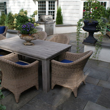
Landscape by Stonepocket located in Minnetonka, Minnesota Creating a elegant landscape to blend with a home with such character and charm was a challenge in controlled resistant. Did not want the landscape to overwhelm the home, nor did I want a typical landscape for this style that usually involves a box hedge. Utilizing light in the front to create a perennial garden give the home a sense of place. Keep the planting mostly to whites and greens in the back unifies the space.
photos by Stonepocket, Inc
 Stonepocket Unique Landscapes
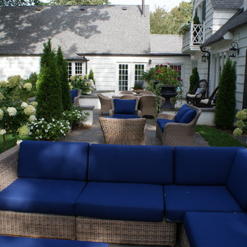
Landscape by Stonepocket located in Minnetonka, Minnesota Creating a elegant landscape to blend with a home with such character and charm was a challenge in controlled resistant. Did not want the landscape to overwhelm the home, nor did I want a typical landscape for this style that usually involves a box hedge. Utilizing light in the front to create a perennial garden give the home a sense of place. Keep the planting mostly to whites and greens in the back unifies the space.
photos by Stonepocket, Inc
 Paradise Found Construction
The homes in Heritage Hills in Chapel Hill, NC are representative of the popularity and explosive growth of American Home Ownership that occurred during the economic expansion that followed the end of WW II. They were designed and built to foster the benefits and sense of “community”, where families could come together and share theirs and their children’s lives. They are typically in very desirable locations within their larger communities, and remodeling them with modern amenities, increasing the performance and efficiency of them, and having them Green Certified (independent third-party verified) makes them extremely attractive to buyers, and helps to raise other property values within the neighborhood.
Green Certified Remodeled Homes offer significant value and advantage in the marketplace over similar homes in their area, which is especially important as a new, younger era of home buyers enter the market. Current trends suggest that younger (as well as many “seasoned”) homeowners are interested in smaller, more efficient (and thus affordable) homes situated closer to shopping, their work, entertainment opportunities, and access to the economic and environmental benefits of mass transit.
These older homes also offer an additional value that is continuing to gain visibility and appreciation in the market place. They were built from lumber from slower-growth trees (denser and harder wood), and as such offer superior structural support compared to the same home built using lumber from today’s faster-growing (softer and less-dense wood) trees.
Robin and Kent had lived in their 2-story Gambrel Roof home in Heritage Hills since 1994. The house was structurally sound, due in large part to the old-growth (and denser) yellow pine that was used in its framing. They loved the quiet neighborhood, its sense of community and amenities, and their home. It suited their life-style and needs; and they had decided that they would remain in the home. It was showing its age, and was in need of general repairs and maintenance, and its energy, water, and indoor air quality performance was continuing to increase their ongoing cost of ownership.
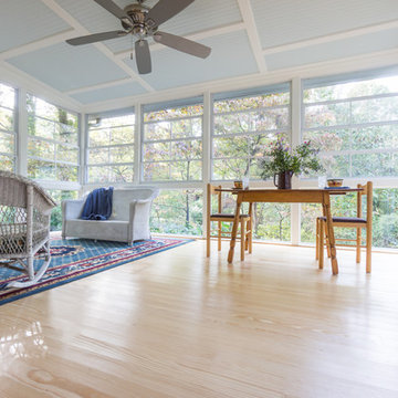
Robin loved the screen porch that looked out on their private and nicely landscaped back yard, but she wanted to be able to use it in the colder months of the year. She was unsatisfied with the kitchen and the mud room / laundry room, and the darkness of other living spaces. A previous water leak in the laundry room had resulted in a large patch of mold that had compromised flooring, wall board, and insulation and contributed to the homes reduced indoor air quality.
The home lacked insulation in the crawl, and inadequate insulation in the attic. The single HVAC unit had been replaced a few years earlier with a more efficient unit, but with a single programmable thermostat control on the first floor and aging and un-insulated ducting, the second floor was often over-heated in the summer months.
The original wood windows had begun to deteriorate and were drafty and inefficient, and the original wood-burning fireplace was an open conduit for escaping conditioned air as well as an inlet for wood-smoke smelling air being pulled into the home. The siding had been replaced a few years earlier with a cement-fiber product, but the exterior wood trim was compromised and beginning to look unsightly. Its original architecture had been altered over the years in ways that presented ongoing maintenance and durability issues, as well as disrupting the elegance of the original design.
Kent has worked for over 30 years in the Environmental Sciences field, and is considered to be a national expert in understanding the sources of, and human exposure to pollutants in indoor environments. He had always been very conscious and cautious about the effects on indoor air quality that the construction, furnishings, and products used in home had on him and his family.
Project Goals
Increase the performance of their home by improving energy efficiency by at least 40% and lowering their natural gas and electric utility costs.
Increase the performance of their home by reducing water usage by at least 40% and lowering the water utility costs.
Increase the comfort of their home that was being compromised by an inadequate HVAC design, inadequate insulation, inefficient and compromised wood windows, and copious air intrusions and drafts.
Improve the healthiness of the homes indoor air quality that was being compromised by an open wood-burning fireplace, and prior water intrusion that had allowed colonies of mold to thrive.
Create a new Kitchen, Family Room, Home Office, Mudroom, and Laundry Room that featured some of the latest designs and trends and harmonized with the rest of the homes charm.
Increase the usefulness and aesthetics of the screened porch by creating a warm and inviting semi-conditioned 3-Season Room that extended the times during the year that it was comfortable.
Introduce day-lighting into areas of the home that were dark and uninviting.
Brighten and harmonize all of the interior finishes.
Protect and restore the exterior of the home with superior-performing products and finishes.
Achieve Gold Level Green Home Certification in conformance with the ICC 700-2012 National Green Building Standards (NGBS).
 Align Design LLC
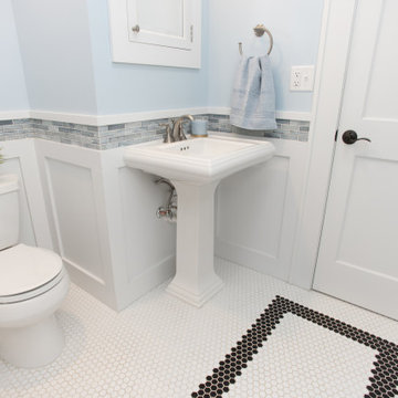
This project was focused on eeking out space for another bathroom for this growing family. The three bedroom, Craftsman bungalow was originally built with only one bathroom, which is typical for the era. The challenge was to find space without compromising the existing storage in the home. It was achieved by claiming the closet areas between two bedrooms, increasing the original 29" depth and expanding into the larger of the two bedrooms. The result was a compact, yet efficient bathroom. Classic finishes are respectful of the vernacular and time period of the home.
 Studio Dearborn
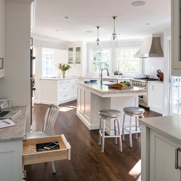
A young colonial in the heart of Rye New York had everything going for it, except a dark and poorly laid out kitchen. The clients tapped Sarah Robertson of Studio Dearborn to help them layout a new kitchen in their challenging, dog leg shaped room. A small breakfast peninsula and working island helped pull together the oddly shaped kitchen into a streamlined, light filled space with all the storage amenities typical of a Studio Dearborn kitchen. The bar area, with undercounter refrigeration for wine and beverages, also features a locking cabinet for liquor and open wine storage. Desk area has file drawer and Docking Drawer charging drawer. Countertops: White Macauba, Rye Marble and Stone, Rye NY. Hardware: Studio Pulls from Hickory Hardware. Sinks: Kraus. Lighting: Currey & Co. Faucet: Kohler Artifacts Backsplash tile: Casablanca Tile and Stone, Harrison NY. Photography: Adam Kane Macchia
20