
Search results for "Upward lighting" in Home Design Ideas
 Distinctive Interior Designs
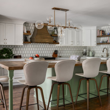
We designed and delivered a perfectly hidden kitchen laundry and, can you believe, it adds tremendous style to this new open space Moorestown, New Jersey kitchen?! Besides figuring out what to do with the washer and dryer, the client asked for a large table island, fun green accenting, and wood details.
To truly understand the challenge we had with this project, please look at the befores first — a small space condo kitchen that had a stacked washer & dryer fully exposed. Solutions: knock out a wall to open things up to the dining room, and somehow enclose the washer and dryer. Besides now having a tremendously functional open space kitchen with an electic mix of modern and transitional that is ‘perfectly Theresa’, the laundry space now adds style. It’s amazing how the caning on the doors became a statement element!
How fun! We truly managed to hide a washer & dryer in plain sight and add beauty!
 Melissa Hill Home Design
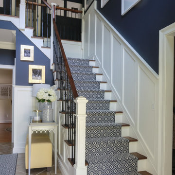
As the entryway to the home, we wanted this foyer to be a truly refined welcome to each of its guests. As guests enter they will be greeted with this polished and inviting entry, which contrasts dark colors against stunning tall white millwork along the walls. As a designer there is always the challenge of working with aspects of a room that your clients are not going to be changing. For us this was the flooring, to which we fitted with a custom cut L shaped rug that would allow us to tie together the foyer to the stairs and better coincide with the rest of our designs. We added a touch of bright color in the side table with gold and light yellow elements, while still tying things together with the blue and white detailed vase that mirrors the rug design. As the eye travels up the stairs the iron wrought spindles wonderfully accent the stairway’s dark wood railings. Further upward and this captivating grand chandelier accentuates the whole room. The star of the show, this breathtaking chandelier is enhanced by a beautiful ceiling medallion that we had painted within in gold to capture the elegance and light from this chandelier. As a first impression of the household, this foyer space is truly an introduction to the refinement and dignity of this home, and the people within it.
Custom designed by Hartley and Hill Design. All materials and furnishings in this space are available through Hartley and Hill Design. www.hartleyandhilldesign.com 888-639-0639 ***Note: We recently went back to our client's home, and replaced the marble tiles with a herringbone hardwood floor.
 Petoskey Home Staging
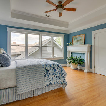
Example of a classic medium tone wood floor and brown floor bedroom design in Chicago with blue walls
Find the right local pro for your project
 Barley|Pfeiffer Architecture
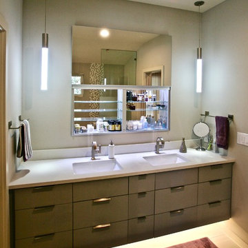
This 60's Style Ranch home was recently remodeled to withhold the Barley Pfeiffer standard. This home features large 8' vaulted ceilings, accented with stunning premium white oak wood. The large steel-frame windows and front door allow for the infiltration of natural light; specifically designed to let light in without heating the house. The fireplace is original to the home, but has been resurfaced with hand troweled plaster. Special design features include the rising master bath mirror to allow for additional storage.
Photo By: Alan Barley
 Haus Interior Design
**Featured in Home & Design Magazine!
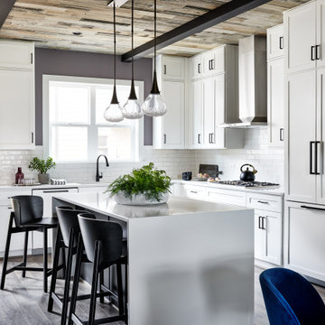
The inspiration for this unique project draws on the clients’ love of Paris and the city’s vibrant romanticism and mix of architectural styles. Our challenge was to elevate builder-grade finishes in a newly-constructed townhome to create an urban retreat with aged patina for this young couple. Soft industrial elements were layered over Old-World inspired details on nearly every surface for maximum impact. We added rustic wood ceilings and industrial beams to create drama, texture, and value throughout.
A Parisian-inspired glass/iron wall divider relieves the open concept floor plan, creating a more intimate seating space. Oversized pendants of steel, blown glass, horsehair and faux horn provide soft illumination while drawing the eye upward to architectural ceiling details. Custom midnight blue built-ins create a library that frames the entry and study. The deep and dramatic color palette of paint and wallpaper that adorns the walls is a vibrant mix of cobalt, citron, teal and smoky lavender. Light pours into the rooms from the large windows, reflects off the oversized acid-wash mirror, and forms dramatic shadows on the walls, setting the mood for this home.
 The Brooklyn Studio
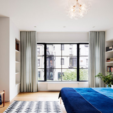
This residence was a complete gut renovation of a 4-story row house in Park Slope, and included a new rear extension and penthouse addition. The owners wished to create a warm, family home using a modern language that would act as a clean canvas to feature rich textiles and items from their world travels. As with most Brooklyn row houses, the existing house suffered from a lack of natural light and connection to exterior spaces, an issue that Principal Brendan Coburn is acutely aware of from his experience re-imagining historic structures in the New York area. The resulting architecture is designed around moments featuring natural light and views to the exterior, of both the private garden and the sky, throughout the house, and a stripped-down language of detailing and finishes allows for the concept of the modern-natural to shine.
Upon entering the home, the kitchen and dining space draw you in with views beyond through the large glazed opening at the rear of the house. An extension was built to allow for a large sunken living room that provides a family gathering space connected to the kitchen and dining room, but remains distinctly separate, with a strong visual connection to the rear garden. The open sculptural stair tower was designed to function like that of a traditional row house stair, but with a smaller footprint. By extending it up past the original roof level into the new penthouse, the stair becomes an atmospheric shaft for the spaces surrounding the core. All types of weather – sunshine, rain, lightning, can be sensed throughout the home through this unifying vertical environment. The stair space also strives to foster family communication, making open living spaces visible between floors. At the upper-most level, a free-form bench sits suspended over the stair, just by the new roof deck, which provides at-ease entertaining. Oak was used throughout the home as a unifying material element. As one travels upwards within the house, the oak finishes are bleached to further degrees as a nod to how light enters the home.
The owners worked with CWB to add their own personality to the project. The meter of a white oak and blackened steel stair screen was designed by the family to read “I love you” in Morse Code, and tile was selected throughout to reference places that hold special significance to the family. To support the owners’ comfort, the architectural design engages passive house technologies to reduce energy use, while increasing air quality within the home – a strategy which aims to respect the environment while providing a refuge from the harsh elements of urban living.
This project was published by Wendy Goodman as her Space of the Week, part of New York Magazine’s Design Hunting on The Cut.
Photography by Kevin Kunstadt
 The Brooklyn Studio
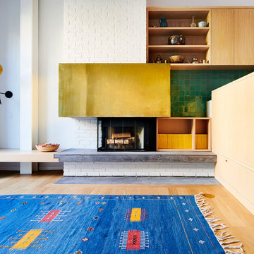
This residence was a complete gut renovation of a 4-story row house in Park Slope, and included a new rear extension and penthouse addition. The owners wished to create a warm, family home using a modern language that would act as a clean canvas to feature rich textiles and items from their world travels. As with most Brooklyn row houses, the existing house suffered from a lack of natural light and connection to exterior spaces, an issue that Principal Brendan Coburn is acutely aware of from his experience re-imagining historic structures in the New York area. The resulting architecture is designed around moments featuring natural light and views to the exterior, of both the private garden and the sky, throughout the house, and a stripped-down language of detailing and finishes allows for the concept of the modern-natural to shine.
Upon entering the home, the kitchen and dining space draw you in with views beyond through the large glazed opening at the rear of the house. An extension was built to allow for a large sunken living room that provides a family gathering space connected to the kitchen and dining room, but remains distinctly separate, with a strong visual connection to the rear garden. The open sculptural stair tower was designed to function like that of a traditional row house stair, but with a smaller footprint. By extending it up past the original roof level into the new penthouse, the stair becomes an atmospheric shaft for the spaces surrounding the core. All types of weather – sunshine, rain, lightning, can be sensed throughout the home through this unifying vertical environment. The stair space also strives to foster family communication, making open living spaces visible between floors. At the upper-most level, a free-form bench sits suspended over the stair, just by the new roof deck, which provides at-ease entertaining. Oak was used throughout the home as a unifying material element. As one travels upwards within the house, the oak finishes are bleached to further degrees as a nod to how light enters the home.
The owners worked with CWB to add their own personality to the project. The meter of a white oak and blackened steel stair screen was designed by the family to read “I love you” in Morse Code, and tile was selected throughout to reference places that hold special significance to the family. To support the owners’ comfort, the architectural design engages passive house technologies to reduce energy use, while increasing air quality within the home – a strategy which aims to respect the environment while providing a refuge from the harsh elements of urban living.
This project was published by Wendy Goodman as her Space of the Week, part of New York Magazine’s Design Hunting on The Cut.
Photography by Kevin Kunstadt
Sponsored
Fredericksburg, OH

High Point Cabinets
Columbus' Experienced Custom Cabinet Builder | 4x Best of Houzz Winner
 UB Kitchens - Kitchen Design and Cabinets
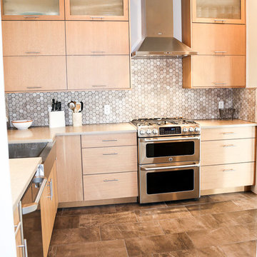
Mid-sized trendy l-shaped porcelain tile and beige floor enclosed kitchen photo in Austin with a farmhouse sink, flat-panel cabinets, beige cabinets, solid surface countertops, beige backsplash, mosaic tile backsplash, stainless steel appliances, no island and beige countertops
 Hazley Builders | Architects
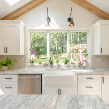
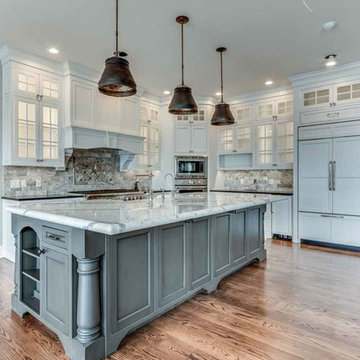
This sun-drenched kitchen addition in West Chester, PA showcases the seamless blend of transitional design and natural warmth. Dramatic vaulted ceilings with exposed white oak beams draw the eye upward while skylights and a large window flood the space with natural light. White shaker cabinetry keeps the palette bright and timeless, while the contrasting gray island grounds the room and provides generous seating for casual entertaining. Leather-finish marble countertops add subtle texture throughout, and the light hardwood floors echo the warmth of the wood beams overhead. Sliding glass doors at the far end of the kitchen extend the living space outdoors, a key feature requested by the homeowners to make entertaining effortless. Renovated by Hazley Builders | Architects, this L-shaped kitchen addition in Chester County, PA, exemplifies how detailed craftsmanship can transform a home's everyday experience.
 DJK Custom Homes
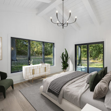
A refined and serene guest bedroom grounded in modern luxury. Vaulted ceilings with exposed beams draw the eye upward, while expansive black-framed windows flood the room with natural light and frame uninterrupted woodland views. Soft neutral bedding layered with textured fabrics brings warmth and sophistication, complemented by rich green accents that add depth to the palette. Light oak flooring anchors the space with an organic feel. A sculptural chandelier, sleek wall sconces, and thoughtfully curated décor finish the room with an effortless, high-end elegance.
 Maya Axt Interiors
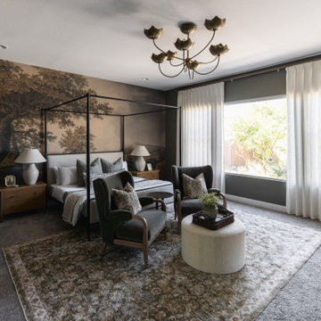
For this primary bedroom redesign, the client envisioned a retreat that would provide a sense of escape and tranquility. The room was designed with a moody atmosphere, blending deep, rich colors that envelop the space in a cocoon of comfort. Color drenching was used on the walls, creating a seamless flow of hues that added depth and warmth. A stunning mural wallpaper became a focal point, its intricate design bringing an artistic, yet serene element to the room. To elevate the ambiance, a statement light fixture was carefully selected, adding a touch of luxury and drawing attention upward. Every element was thoughtfully curated to transform the space into a peaceful sanctuary, offering both beauty and relaxation in equal measure.
 HouseHome
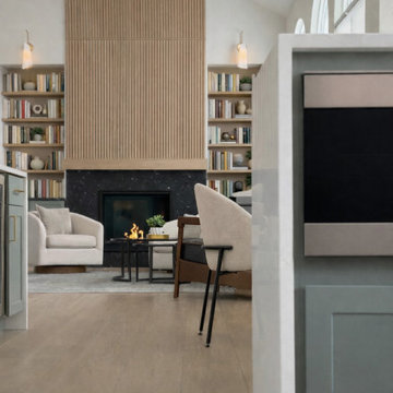
At HouseHome, we believe the most successful homes are the ones that feel both timeless and deeply personal. This Highlands Ranch renovation is a perfect expression of transitional design—where modern sophistication meets warm, livable comfort.
Designed for a joyful homeowner seeking elevated everyday living, this kitchen and family room transformation blends natural textures, clean architectural lines, and curated materials into a cohesive, luxurious retreat.
The Design Vision: Modern Warmth, Effortless Living. This project reimagines the heart of the home with a focus on balance—light and dark, structure and softness, elegance and ease.
A dramatic fireplace anchors the family room, wrapped in richly textured black stone that creates depth and contrast. Above, vertical white oak slatting introduces warmth and architectural rhythm, drawing the eye upward and enhancing the room’s height—an intentional nod to Colorado’s expansive landscapes.
Custom built-ins frame the space with a tailored, symmetrical aesthetic, offering both functionality and quiet luxury. Styled with books, ceramics, and organic greenery, they create a lived-in sophistication that feels inviting, never staged.
Elevated Materials & Craftsmanship means that every detail in this renovation was selected to deliver both beauty and longevity: Natural stone surfaces with bold veining bring organic movement and durability to the kitchen. Custom cabinetry in soft, muted tones grounds the space while maintaining a light, airy feel with warm wood accents soften modern lines and add a sense of craftsmanship.
Layered lighting, including sculptural chandeliers and soft ambient fixtures, creates a welcoming glow day to night. The waterfall-edge island becomes a sculptural centerpiece—perfect for gathering, entertaining, and everyday moments.
A Seamless Indoor Experience, especially for Colorado living is all about connection—to nature, to light, to lifestyle. This home embraces that philosophy with an open, flowing layout that connects kitchen, dining, and family spaces effortlessly.
Soft neutral furnishings, natural textures, and thoughtful sightlines create a calming, cohesive environment designed for both quiet mornings and lively evenings.
The HouseHome Difference -- this project reflects our commitment to designing homes that feel as good as they look. At HouseHome, we specialize in luxury kitchen renovations, custom family room design, and full-home transformations across Colorado.
We don’t just design spaces—we craft experiences tailored to how you live.
 Neumann & Rudy Architecture
**Spatial Composition & Architectural Volume**
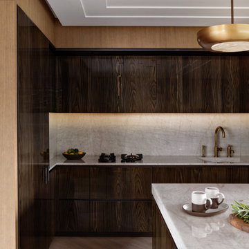
The kitchen is organized as a tightly disciplined L-configuration, with a perimeter run terminating against a full-height flanking volume of pale oak that functions less as cabinetry than as a piece of architecture — a plinth-like wall plane that crops the composition and establishes a deliberate foreground register. The photograph is constructed around this layered depth: a near-field vertical panel in figured, high-gloss timber, a middle ground of stone counter and backsplash, and a partial view of the island's marble slab entering from the right, its mitred waterfall edge implying a broader room beyond the frame. Overhead, a recessed coffer with a slender illuminated reveal introduces a subtractive geometry that lightens the ceiling plane and visually widens the volume, while a bronze-toned reveal band above the upper cabinetry acts as a horizontal datum, resolving the tall casework into a controlled cornice line. The millwork is resolutely frameless and handleless — grain-matched, push-latch or channel-pull, with a single elongated vertical bar as the sole legible hardware gesture — producing an unbroken rhythm of vertical joints that reads as continuous paneling rather than a sequence of doors. Sightlines are horizontal and calm, with the sink and cooktop absorbed into the counter plane so that no appliance disrupts the elevation's monolithic character.
**Materiality, Color & Texture**
The palette is a study in tonal wood contrast: a light, straight-grained rift-cut white oak with cool, slightly greyed undertones on the flanking wall and upper wall plane, set against a deeply fumed or shou-sugi-ban-inflected timber — likely charred cedar or ebonized ash — whose cathedral figuring erupts across the cabinet fronts in swirling, almost calligraphic pattern. The dark casework carries a lacquered or oiled sheen high enough to register soft specular reflection, an unexpected gloss that animates the grain and prevents the mass from reading as flat or inert. Countertops and the full-height backsplash are executed in a pale calcite or quartzite with a scratched, hairline-veined surface and a warm ivory-to-buff cast, honed rather than polished so that light diffuses rather than bounces. Metals are exclusively unlacquered brass in varying states of patina — the gooseneck faucet, cross-handle valves and pot-filler read as aged, almost archaeological, their warm amber oxidation echoed by the burnished spun-brass pendant. Accessory objects sustain the discipline: a dark turned-wood fruit bowl with citrus supplying the only chromatic accent, matte stoneware mugs in a two-tone glaze, and a raw olivewood board with sage — organic, low-saturation, tactile counterpoints to the machined precision of the joinery.
**Lighting, Atmosphere & Style Profile**
Illumination is almost entirely architectural and indirect. A concealed linear source beneath the upper cabinets grazes the stone backsplash, throwing a soft luminous gradient that dissolves upward and makes the slab appear internally lit — the room's principal light event and its emotional center. This is reinforced by the ceiling's perimeter reveal, which washes the plane without visible fixtures, and by the alabaster-diffused brass pendant, whose disc of translucent stone glows with a low-kelvin warmth entirely consonant with the metalwork below. Daylight appears to enter obliquely from beyond the frame, modelling the oak wall in a gentle falloff; the overall exposure is low-key and chiaroscuro-adjacent, with deep, velvety shadow permitted in the lower casework. The resulting atmosphere is hushed, cellar-cool yet materially warm — contemplative rather than performative. Stylistically, the project synthesizes into a refined **warm minimalism with distinct Japandi inheritance**: the reductive planarity and joint discipline of European modernist cabinetry married to a Japanese sensibility for charred timber, grain expression, and the elevation of patina and imperfection. It is a kitchen conceived as a quiet interior landscape — appliance-suppressed, ornament-free, and dependent for its richness entirely on the intrinsic character of its materials.


 Klopf Architecture
The Roger Lee designed house from 1962 was purchased by the current homeowners in almost original condition, as the previous owners elected to defer most maintenance projects over the years. The clients were able to see beyond the dated materials and finishes, single-paned glass and uninsulated walls and they approached Klopf Architecture to help them expand and update the entire home, one the family could settle into and enjoy for years to come. It was important that the new designs were aligned with Lee's original intent not only because of the client's appreciation for mid-century modern architecture, but also because the house was deemed historical. The Stanford Real Estate Office requires a stringent design review which safeguards the integrity of the community, which Klopf Architecture was happy to oblige going into their updated designs.
As with many original mid-century modern homes, the house was scaled to the 1960s lifestyle where rooms were smaller and openings to views were limited and tightly framed. The original conditions defined the direction the family of four would take in updating the house and making it comfortable for their modern lifestyle. Klopf designed a full gut remodel and major addition to bring the house into the 21st century and provide the living area needed for the client's family. The newly expanded house added just about 1,100 sf to create an airy, comfortable and family friendly house, taking full advantage of the beautiful southwestern views that extend out to the hills beyond. The enclosed garage created an additional 240 sf of covered space for long-term storage.
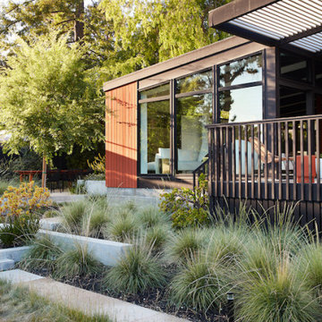
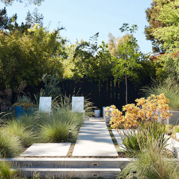
A cracked swimming pool created an eyesore taking up a majority of the backyard landscape, so it was one of the first elements to go during the transformation. Working with Outer Space Landscape Architects, the family asked for a mix of relaxing outdoor patio spaces that eventually blend into the native landscaping, extending their views outward toward the natural greenery of the trees beyond their property. Filling in the old pool was a smart way to expand the living spaces outward. The orientation of the house was designed to enjoy the views, but the original architecture provided the first homeowners with mere glimpses of the landscape outside.
Klopf was able to broaden those views, continuing and extending on the original architecture to take full advantage of the unobstructed natural views across the rear facade of the house. Small horizontal openings in the primary bedroom and office were replaced with much taller windows that now follow the angled roof line upward, extending across almost all of the facade. We worked with Western Windows, whose designs included an oblique-shaped, operable casement that allowed our design to rise with the slope. A new corner office added to the primary suite, offers a bright and functional work-from-home solution that looks out at the distant views and added natural light from the expanded window configuration that now wraps around the corner.
The existing lower level was designed by Lee as a utilitarian space, serving as a wet pool room with a drain in the center of the floor, bathroom, laundry and storage areas. Without the need for a pool room, Klopf was able to convert the area into a much more comfortable and functional living space with a new family room and guest suite. The new spaces enjoy easy access to a new outdoor patio through floor to ceiling, full-width glass sliders.
Continuing along the rear facade, a previously exposed deck extending from the living room and hallway provided access to the backyard through a single set of stairs leading toward the side of the house which made sense when the pool was in place. The new deck was re-envisioned as an extension of the main living room and now serves as a second outdoor living room. A new slatted pergola above provides the homeowners welcome relief from the hot afternoon sun. A second set of stairs now creates a better connection to the redesigned lower level. Klopf was able to reconfigure the spaces, extending the living room outward toward the views, where the family now claims it as the heart of the home, spending a large majority of their time outdoors.
Back inside, the original wood-burning Malm fireplace was beautifully restored and a gas burner installed to comply with California's strict air standards. It now rests in front of a wall of Heath accent tiles where a dated red brick wall used to stand. A new taller window brings more light and views into the refreshed interior living room. The original glass doors opposite the fireplace were replaced by larger sliders that when fully opened, create a seamless transition to the new outdoor living area so the two spaces feel like one connected space. The original utilitarian kitchen was needlessly tucked into the far back corner and closed-off, out of sight from the living room, so the clients asked Klopf to open it up and expand the kitchen forward so it felt more connected. Today the much larger kitchen is connected to the living area where a short wall with a cutout offers a visual glimpse into the kitchen and a handy pass-through counter for serving guests. A new breakfast nook was also added to create another spot where the family can gather for casual meals. Just outside, a new built-in outdoor grill and prep area extends the kitchen outside and connects to a new outdoor dining spot nestled amongst the trees, taking advantage of the views out back.
Klopf was able to expand the other two bedrooms, add a new laundry room and half-bath and convert the carport to an enclosed garage to add more storage areas which was lost when the pool house was converted to the family and guest room.
To maintain a historical connection to the original designs, the exterior siding was repeated on all exterior walls, a full-height stained glass window at the front entryway restored, and an interior slatted screen element repeated outside at the exterior entry courtyard and over the new outdoor living room to create a shade trellis. The new house stands proudly and shines against it's new landscaping features, while respecting and expanding on the original intent of Roger Lee's designs epitomizing the comforts of indoor-outdoor living in Northern California.
Completion year: 2020
Klopf Architecture project team: John Klopf, Klara Kevane, Noel Andrade
Contractor: ORB Construction, Brendan O'Reilly
Structural engineer: Sezen and Moon
Landscape architect: Outer space
Furnishings and decoration: Urbanism Designs
Photographer: Mariko Reed
 Bluethumb Landscape
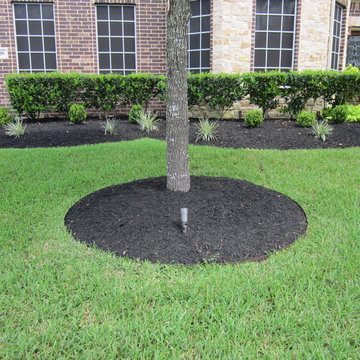
Uplight, Light fixture pointed upwards to cast a nice soft light to accentuate landscaping.
Inspiration for a small traditional landscaping in Houston.
Inspiration for a small traditional landscaping in Houston.
 Klopf Architecture
The Roger Lee designed house from 1962 was purchased by the current homeowners in almost original condition, as the previous owners elected to defer most maintenance projects over the years. The clients were able to see beyond the dated materials and finishes, single-paned glass and uninsulated walls and they approached Klopf Architecture to help them expand and update the entire home, one the family could settle into and enjoy for years to come. It was important that the new designs were aligned with Lee's original intent not only because of the client's appreciation for mid-century modern architecture, but also because the house was deemed historical. The Stanford Real Estate Office requires a stringent design review which safeguards the integrity of the community, which Klopf Architecture was happy to oblige going into their updated designs.
As with many original mid-century modern homes, the house was scaled to the 1960s lifestyle where rooms were smaller and openings to views were limited and tightly framed. The original conditions defined the direction the family of four would take in updating the house and making it comfortable for their modern lifestyle. Klopf designed a full gut remodel and major addition to bring the house into the 21st century and provide the living area needed for the client's family. The newly expanded house added just about 1,100 sf to create an airy, comfortable and family friendly house, taking full advantage of the beautiful southwestern views that extend out to the hills beyond. The enclosed garage created an additional 240 sf of covered space for long-term storage.
A cracked swimming pool created an eyesore taking up a majority of the backyard landscape, so it was one of the first elements to go during the transformation. Working with Outer Space Landscape Architects, the family asked for a mix of relaxing outdoor patio spaces that eventually blend into the native landscaping, extending their views outward toward the natural greenery of the trees beyond their property. Filling in the old pool was a smart way to expand the living spaces outward. The orientation of the house was designed to enjoy the views, but the original architecture provided the first homeowners with mere glimpses of the landscape outside.
Klopf was able to broaden those views, continuing and extending on the original architecture to take full advantage of the unobstructed natural views across the rear facade of the house. Small horizontal openings in the primary bedroom and office were replaced with much taller windows that now follow the angled roof line upward, extending across almost all of the facade. We worked with Western Windows, whose designs included an oblique-shaped, operable casement that allowed our design to rise with the slope. A new corner office added to the primary suite, offers a bright and functional work-from-home solution that looks out at the distant views and added natural light from the expanded window configuration that now wraps around the corner.
The existing lower level was designed by Lee as a utilitarian space, serving as a wet pool room with a drain in the center of the floor, bathroom, laundry and storage areas. Without the need for a pool room, Klopf was able to convert the area into a much more comfortable and functional living space with a new family room and guest suite. The new spaces enjoy easy access to a new outdoor patio through floor to ceiling, full-width glass sliders.
Continuing along the rear facade, a previously exposed deck extending from the living room and hallway provided access to the backyard through a single set of stairs leading toward the side of the house which made sense when the pool was in place. The new deck was re-envisioned as an extension of the main living room and now serves as a second outdoor living room. A new slatted pergola above provides the homeowners welcome relief from the hot afternoon sun. A second set of stairs now creates a better connection to the redesigned lower level. Klopf was able to reconfigure the spaces, extending the living room outward toward the views, where the family now claims it as the heart of the home, spending a large majority of their time outdoors.
Back inside, the original wood-burning Malm fireplace was beautifully restored and a gas burner installed to comply with California's strict air standards. It now rests in front of a wall of Heath accent tiles where a dated red brick wall used to stand. A new taller window brings more light and views into the refreshed interior living room. The original glass doors opposite the fireplace were replaced by larger sliders that when fully opened, create a seamless transition to the new outdoor living area so the two spaces feel like one connected space. The original utilitarian kitchen was needlessly tucked into the far back corner and closed-off, out of sight from the living room, so the clients asked Klopf to open it up and expand the kitchen forward so it felt more connected. Today the much larger kitchen is connected to the living area where a short wall with a cutout offers a visual glimpse into the kitchen and a handy pass-through counter for serving guests. A new breakfast nook was also added to create another spot where the family can gather for casual meals. Just outside, a new built-in outdoor grill and prep area extends the kitchen outside and connects to a new outdoor dining spot nestled amongst the trees, taking advantage of the views out back.
Klopf was able to expand the other two bedrooms, add a new laundry room and half-bath and convert the carport to an enclosed garage to add more storage areas which was lost when the pool house was converted to the family and guest room.
To maintain a historical connection to the original designs, the exterior siding was repeated on all exterior walls, a full-height stained glass window at the front entryway restored, and an interior slatted screen element repeated outside at the exterior entry courtyard and over the new outdoor living room to create a shade trellis. The new house stands proudly and shines against it's new landscaping features, while respecting and expanding on the original intent of Roger Lee's designs epitomizing the comforts of indoor-outdoor living in Northern California.
Completion year: 2020
Klopf Architecture project team: John Klopf, Klara Kevane, Noel Andrade
Contractor: ORB Construction, Brendan O'Reilly
Structural engineer: Sezen and Moon
Landscape architect: Outer space
Furnishings and decoration: Urbanism Designs
Photographer: Mariko Reed
 DJK Custom Homes
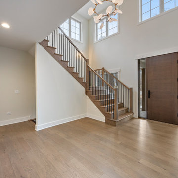
A bright and inviting entryway defined by clean lines, natural light, and warm wood tones. This double-height foyer features wide-plank white oak flooring that flows seamlessly into a striking open staircase with wood treads and black iron balusters. A modern sculptural chandelier draws the eye upward, complementing the expansive windows that flood the space with light. The rich wood front door, flanked by sidelights, adds warmth and contrast against the soft neutral walls. Designed with simplicity and elegance in mind, this entry balances modern and transitional elements for a timeless first impression.
Sponsored
Fredericksburg, OH
High Point Cabinets
Columbus' Experienced Custom Cabinet Builder | 4x Best of Houzz Winner
 Bluethumb Landscape
Uplight, Light fixture pointed upwards to cast a nice soft light to accentuate landscaping.
Small traditional exterior home idea in Houston
Small traditional exterior home idea in Houston
 Tomecek Studio Architecture
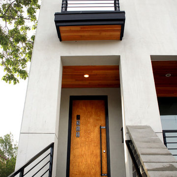
Project by Studio H:T principal in charge Brad Tomecek (now with Tomecek Studio Architecture). This project tests the theory of bringing high quality design to a prefabricated factory setting. Enrolled in the LEED-Home Pilot, this residence completed certification. The modular home was conceived as two boxes that slide above one another to create outdoor living space and a lower covered rear entry. The passive solar design invites large amounts of light from the south while minimizing openings to the east and west. Factory construction saves both time and costs while reducing waste and using a controlled labor force.
Built in a factory north of Denver, the home arrived by flatbed truck in two pieces and was craned into place in about 4 hours providing a fast, sustainable, cost effective alternative to traditional homebuilding techniques. Upgraded lighting fixtures, plumbing fixtures, doors, door hardware, windows, tile and bamboo flooring were incorporated into the design. 80% of the residence was completed in the factory in less than 3 weeks and other items were finished on site including the exterior stucco, garage, metal railing and stair.
Stack-Slide-Stitch describes the conceptual process of how to tie together two distinct modular boxes. Stack refers to setting one modular directly on top of the other. Slide refers to the action that creates an upper southern deck area while simultaneously providing a covered rear entry area. The stitching or interlocking occurs with the upward extension of the lower volume with the front deck walls and with the rear two story vertical.
 Cedarstone Group Inc.
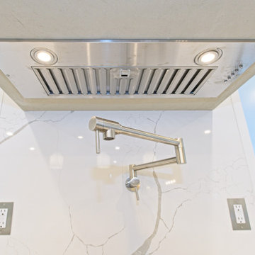
This upward close-up reveals the metal ventilation insert and built-in lights beneath the custom plaster hood. Below, a folding wall-mounted pot filler sits against the pale veined backsplash. The detail brings the hood’s working components, faucet joints and surrounding finishes into clear view.
The Hurdy Estates renovation in North York, Toronto, by Cedarstone Group Inc. opened the bungalow by removing a central load-bearing wall. New flooring, refreshed interiors and glass stair railings connect the kitchen, dining and living areas.
Explore structural renovations, open-concept remodels and custom home interiors at cedarstonereno.com.
40