
Search results for "Utility" in Home Design Ideas
 Advance Design Studio, Ltd.
After six years of living in their Huntley IL home, Chris and Meghan were tired of their dark, dingy, outdated kitchen and it was finally time for a long-anticipated change. “The kitchen is the place where we live, it’s where we do everything,” Meghan said. “It was important that it be a space where we wanted to be.” Meghan loves cooking and enjoys including their girls in healthy meal prepping, this led them to want a brighter, more enjoyable kitchen with increased functionality and improved storage.
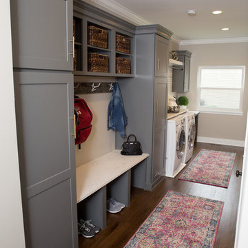
For Chris especially, the laundry room was an entirely dysfunctional eyesore. “We had a washer and a dryer, but it was all kind-of cobbled together!” Chris said. “There were always laundry piles everywhere, we weren’t really sure what we wanted to do in there, but it was time for us to make a change.” The mess of the space was stressful every time they walked in the door from the garage each day. Kids’ backpacks and shoes piled up haphazardly in the makeshift boot-bench closet left the family feeling disorganized and stressed. They needed space for folding clothes and locker cubbies to help keep the family organized.
Having known Christine and Todd in the Huntley community for years, Chris and Meghan were familiar with their work. “We already trusted them personally and having seen their projects for years we knew they did top notch work. After we reviewed the initial round of designs, we knew that hiring them was definitely the right choice,” Meghan and Chris said. Although Chris had done a lot of work in their home himself, the kitchen and laundry room renovation was such a large undertaking that he didn’t want to steal time away from his family to spend what would surely be many long weekends doing the job himself. “That would not have been a wise choice for us,” Chris laughed.
“Our designer, Michelle was very, very, easy to work with; anything we wanted to see or weren’t sure about, she went above and beyond to make this easy for us. She was easy to get hold of and always quick to respond,” the couple said. Michelle pulled ideas that mirrored the couple’s taste and style and was adept at directing the couple to limited choices that didn’t overwhelm them and kept the process moving. “I have a hard time making decisions. Michelle made the decision-making process so easy. I loved how she listened to what I liked and then presented three great options for me to choose from,” Meghan said.
The main objectives for the kitchen were better storage solutions, they wanted the space to reflect their lifestyle and taste, and they wanted it to last for years with low maintenance. One of the first steps in creating a more functional kitchen was relocating the refrigerator, creating an improved workflow for the busy family.
“We didn’t know that we could even move the refrigerator to a new location where it is now, that was something that we never would have thought of,” Chris said. “The new refrigerator location makes the kitchen feel so much bigger. We didn’t add any space, but our whole kitchen with the new design just seems like it’s so much larger than before!” Meghan said.
The perimeter mist colored cabinets helped warm and brighten the entire room, while the graphite colored cabinets on the island added contrast. Using this fresh, clean color palette satisfied the couple’s desire for a bright space that was the exact opposite of what they had before. Organization accessories were also added to the cabinets such as a spice drawer tray and roll outs to create hidden convenience.
“I absolutely love the hidden spices – it makes cooking so much more enjoyable!” Chris said. “And all the pull outs, and the double trash bin, who would think you could get so excited about organization!” the couple said in unison.
One thing they hated in their original kitchen was how dark the space felt. Added lighting on the ceiling with the new light fixtures combined with the lighter cabinetry colors throughout solved this problem. “Our new kitchen has this warm, almost cozy feeling that our old kitchen never had, it’s just a space that I love spending my time in now,” Meghan said. The light airy feeling was accentuated with the use of floating white shelves on either side of the decorative range hood. “We have so much cabinetry space, the new design is amazing we actually have more storage space than we will ever need,” Meghan said.
The island was extended to create more work surface and added space for stool seating. “The new island changes how we live. Now the kids can be in the kitchen with us, doing homework, eating breakfast, and the three of us have special dinners there when Chris is working late,” Meghan said.
The Carrara Marmi Quartz countertops were chosen because they are, not only beautiful, but are made from hard-working material that doesn’t require maintenance. The white subway tile backsplash that wraps to the ceiling behind the focal point cooktop range/hood compliments the crisp white countertops perfectly, while brushed brass hardware and light fixtures keep the design fresh and new.
The couple had a few fears at the beginning of the project, as most homeowners do. Their biggest fear was being out of their kitchen and laundry room for an extended time. The crew made it very easy for the family to work in a limited space keeping the washer and dryer hooked up the majority of the time, and also getting appliances working with minimal downtime.
“They above and beyond accommodated us to get us through the process,” Meghan said. “They did a great job making sure we were as comfortable as possible throughout the process,” Chris added.
“Our project manager DJ did a great job. He was very good at updating us on schedule changes, getting guys in as quickly as possible. Everyone that stepped in the house was nice and did great work,” said Chris. They thought Advance’s carpenter was phenomenal and were impressed when he took a conceptual idea from a photograph and worked with designer Michelle to create a one of a kind range/hood that has become the topic of conversation with friends and family who visit the new kitchen. “He was in our house literally every day for several weeks. He was easy to work with and good at what he did,” Meghan and Chris said.
The focal point of the kitchen; a hand-crafted, custom-built ventilation hood was clad with handpicked reclaimed barnwood. Advance Design’s carpenter built the framework and the cladding to create a one-of-a-kind design element that the couple loves.
“I think it was especially fun for him to create something unique from scratch, showcasing his talent in this area,” Meghan said. “I love that my kitchen is not like everyone else’s. I got to pick out the wood on my hood and watch it being built and was able to choose what pieces of wood went where on it. It’s totally unique.”
Red Oak flooring was toothed-in throughout the kitchen and the rest of the first floor anywhere changes were made. Then the whole floor was refinished to tone down the orange undertones in the existing floor stain, ultimately changing the color complexion of the entire first floor. The result is a completely new feeling to the entire home.
Renovating the laundry room was extremely important to Meghan and Chris, but they had trouble visualizing what the possibilities were for the seemingly small space. Michelle produced beautiful 3D illustrations that helped them envision the space in a whole new way.
“I must have told Michelle 100 times that I am a visual person, seeing the designs in 3D made it so easy to make decisions and see what we could really do with our space,” Meghan said.
A dividing wall and doorway were removed between the existing laundry room and hallway formerly containing a coat closet, providing space to design specialized graphite colored cabinetry matching the kitchen island to house custom storage cubbies for each family member. Adding the tall utility cabinetry in the new laundry area helped solve the storage issue, tucking away cleaning supplies, household items, and even the cat got its own cubby.
“I love how everything is now hidden in its own space. I can’t tell you how much I hated coming home and seeing everything sitting around on counters,” Chris said.
Electrical outlets were planned for the inside of utility cabinets, so devices could charge in hidden locations. Stacking the washer and dryer allowed for wider countertop space to provide a folding area and a special space for clothes to hang. “The way I do laundry has been completely transformed! I can actually fold clothes and hang them now right out of the washer and dryer,” Meghan said.
“The end result in the kitchen and the laundry/mud room was an updated light and bright space, with a smarter work flow that better meets the needs of this family,” Michelle said.
“I would totally recommend Advance Design,” Meghan said. “Sometimes I sit and just look at my kitchen and laundry room and think ‘Wow, I can’t believe I get to live here!’ It’s an understatement to say we love our new space.”
 Merits Design Group, Inc.
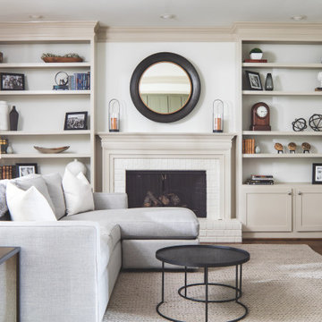
Inspiration for a transitional open concept dark wood floor family room remodel in Atlanta with white walls and a tv stand
 Dean Home Supply + Service Co.
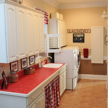
Example of a large cottage single-wall dedicated laundry room design in DC Metro with raised-panel cabinets, white cabinets, beige walls, a side-by-side washer/dryer and a drop-in sink
Find the right local pro for your project
 Stellar Woodwerks, LLC
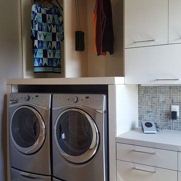
Utility room - mid-sized contemporary l-shaped light wood floor utility room idea in Las Vegas with flat-panel cabinets, white cabinets, quartz countertops, a side-by-side washer/dryer, an undermount sink and gray walls
 Innovative Design Build
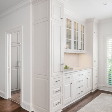
Our clients wanted to utilize this particular area of their home and really give it a function. It has been many things over the years: bonus room, dining area, etc. The kitchen is the natural gathering spot. They wanted to create a space that was an extension of the kitchen for entertaining and serving family and friends.
Architect, Cynthia Karegeannes was hired to draw up plans for a mudroom to corral the couple’s two dogs and stash the pet’s leashes, treats, etc. A large butler pantry was imagined with a full size refrigerator, prep sink, dishwasher and custom cabinetry to have items handy for entertaining. Innovative Construction, helped finalize the details and implemented the plans for the new addition. Interior Designer, Beth Weltlich with The House Dressing worked with homeowners, to select materials and finishes to unify the areas of the existing kitchen and the new spaces. A custom banquette was created with room under the staircase so that all of the space could be utilized. Furniture and accessories are still in the works as the homeowners let the area evolve to see exactly what their needs are. A collaborative effort-for sure!
The challenges included creating three separate areas (mudroom, banquette and butler pantry) with storage and versatility in one existing space. Having this additional space that was not always utilized, the homeowners feel the new addition will become an integral part of the families' living area.
 Isla Homes
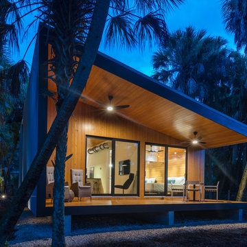
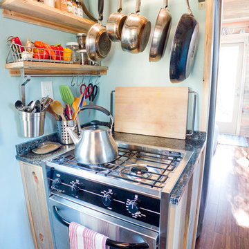
I built this on my property for my aging father who has some health issues. Handicap accessibility was a factor in design. His dream has always been to try retire to a cabin in the woods. This is what he got.
It is a 1 bedroom, 1 bath with a great room. It is 600 sqft of AC space. The footprint is 40' x 26' overall.
The site was the former home of our pig pen. I only had to take 1 tree to make this work and I planted 3 in its place. The axis is set from root ball to root ball. The rear center is aligned with mean sunset and is visible across a wetland.
The goal was to make the home feel like it was floating in the palms. The geometry had to simple and I didn't want it feeling heavy on the land so I cantilevered the structure beyond exposed foundation walls. My barn is nearby and it features old 1950's "S" corrugated metal panel walls. I used the same panel profile for my siding. I ran it vertical to math the barn, but also to balance the length of the structure and stretch the high point into the canopy, visually. The wood is all Southern Yellow Pine. This material came from clearing at the Babcock Ranch Development site. I ran it through the structure, end to end and horizontally, to create a seamless feel and to stretch the space. It worked. It feels MUCH bigger than it is.
I milled the material to specific sizes in specific areas to create precise alignments. Floor starters align with base. Wall tops adjoin ceiling starters to create the illusion of a seamless board. All light fixtures, HVAC supports, cabinets, switches, outlets, are set specifically to wood joints. The front and rear porch wood has three different milling profiles so the hypotenuse on the ceilings, align with the walls, and yield an aligned deck board below. Yes, I over did it. It is spectacular in its detailing. That's the benefit of small spaces.
Concrete counters and IKEA cabinets round out the conversation.
For those who could not live in a tiny house, I offer the Tiny-ish House.
Photos by Ryan Gamma
Staging by iStage Homes
Design assistance by Jimmy Thornton
 Dibello Architects, PLLC
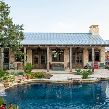
The 3,400 SF, 3 – bedroom, 3 ½ bath main house feels larger than it is because we pulled the kids’ bedroom wing and master suite wing out from the public spaces and connected all three with a TV Den.
Convenient ranch house features include a porte cochere at the side entrance to the mud room, a utility/sewing room near the kitchen, and covered porches that wrap two sides of the pool terrace.
We designed a separate icehouse to showcase the owner’s unique collection of Texas memorabilia. The building includes a guest suite and a comfortable porch overlooking the pool.
The main house and icehouse utilize reclaimed wood siding, brick, stone, tie, tin, and timbers alongside appropriate new materials to add a feeling of age.

Sponsored
Sunbury, OH

J.Holderby - Renovations
Franklin County's Leading General Contractors - 2X Best of Houzz!

 Blackline Renovations
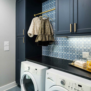
The homeowner was used to functioning with a stacked washer and dryer. As part of the primary suite addition and kitchen remodel, we relocated the laundry utilities. The new side-by-side configuration was optimal to create a large folding space for the homeowner.
Now, function and beauty are found in the new laundry room. A neutral black countertop was designed over the washer and dryer, providing a durable folding space. A full-height linen cabinet is utilized for broom/vacuum storage. The hand-painted decorative tile backsplash provides a beautiful focal point while also providing waterproofing for the drip-dry hanging rod. Bright brushed brass hardware pop against the blues used in the space.
 HAUS | Architecture For Modern Lifestyles
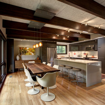
Description: Interior Renovation of Mid-Century Modern Kitchen - Interior Architecture/Renderings/Photography: HAUS | Architecture
Mid-sized 1960s l-shaped light wood floor eat-in kitchen photo in Indianapolis with an undermount sink, flat-panel cabinets, gray cabinets, quartz countertops, white backsplash, ceramic backsplash and stainless steel appliances
Mid-sized 1960s l-shaped light wood floor eat-in kitchen photo in Indianapolis with an undermount sink, flat-panel cabinets, gray cabinets, quartz countertops, white backsplash, ceramic backsplash and stainless steel appliances

 Dibello Architects, PLLC
The 3,400 SF, 3 – bedroom, 3 ½ bath main house feels larger than it is because we pulled the kids’ bedroom wing and master suite wing out from the public spaces and connected all three with a TV Den.
Convenient ranch house features include a porte cochere at the side entrance to the mud room, a utility/sewing room near the kitchen, and covered porches that wrap two sides of the pool terrace.
We designed a separate icehouse to showcase the owner’s unique collection of Texas memorabilia. The building includes a guest suite and a comfortable porch overlooking the pool.
The main house and icehouse utilize reclaimed wood siding, brick, stone, tie, tin, and timbers alongside appropriate new materials to add a feeling of age.
 FINNE Architects
Benjamin Benschneider
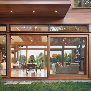
Example of a mid-sized minimalist two-story wood exterior home design in Seattle
Example of a mid-sized minimalist two-story wood exterior home design in Seattle
Sponsored
Sunbury, OH
J.Holderby - Renovations
Franklin County's Leading General Contractors - 2X Best of Houzz!

 Align Design LLC
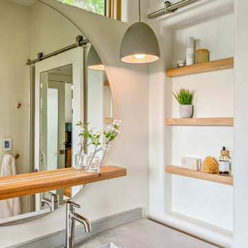
A niche in the wall next to the sink disappears when the closet door slides in front of it.
Small danish home design photo in Other
Small danish home design photo in Other
 Jordana Nicholson
Photo: Jordana Nicholson © 2016 Houzz
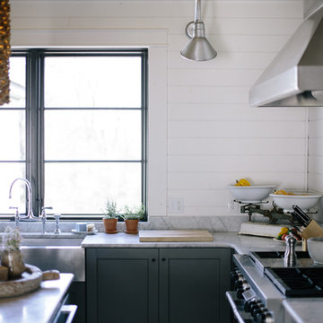
Inspiration for a country kitchen remodel in Nashville with a farmhouse sink, shaker cabinets, blue cabinets, marble countertops, stainless steel appliances and an island
Inspiration for a country kitchen remodel in Nashville with a farmhouse sink, shaker cabinets, blue cabinets, marble countertops, stainless steel appliances and an island
 Misiaszek Turpin pllc
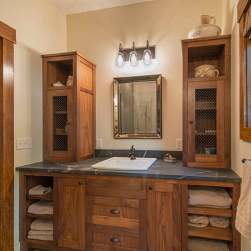
The 800 square-foot guest cottage is located on the footprint of a slightly smaller original cottage that was built three generations ago. With a failing structural system, the existing cottage had a very low sloping roof, did not provide for a lot of natural light and was not energy efficient. Utilizing high performing windows, doors and insulation, a total transformation of the structure occurred. A combination of clapboard and shingle siding, with standout touches of modern elegance, welcomes guests to their cozy retreat.
The cottage consists of the main living area, a small galley style kitchen, master bedroom, bathroom and sleeping loft above. The loft construction was a timber frame system utilizing recycled timbers from the Balsams Resort in northern New Hampshire. The stones for the front steps and hearth of the fireplace came from the existing cottage’s granite chimney. Stylistically, the design is a mix of both a “Cottage” style of architecture with some clean and simple “Tech” style features, such as the air-craft cable and metal railing system. The color red was used as a highlight feature, accentuated on the shed dormer window exterior frames, the vintage looking range, the sliding doors and other interior elements.
Photographer: John Hession
 Dibello Architects, PLLC
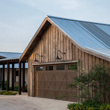
The 3,400 SF, 3 – bedroom, 3 ½ bath main house feels larger than it is because we pulled the kids’ bedroom wing and master suite wing out from the public spaces and connected all three with a TV Den.
Convenient ranch house features include a porte cochere at the side entrance to the mud room, a utility/sewing room near the kitchen, and covered porches that wrap two sides of the pool terrace.
We designed a separate icehouse to showcase the owner’s unique collection of Texas memorabilia. The building includes a guest suite and a comfortable porch overlooking the pool.
The main house and icehouse utilize reclaimed wood siding, brick, stone, tie, tin, and timbers alongside appropriate new materials to add a feeling of age.
 TVL Creative Ltd.
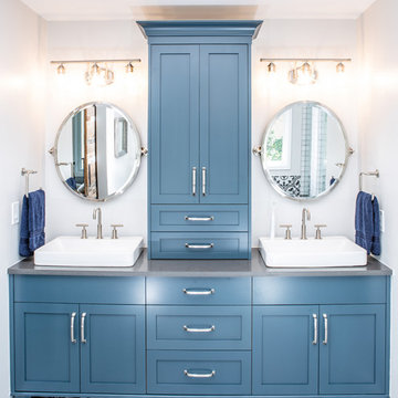
This project is an incredible transformation and the perfect example of successful style mixing! This client, and now a good friend of TVL (as they all become), is a wonderfully eclectic and adventurous one with immense interest in texture play, pops of color, and unique applications. Our scope in this home included a full kitchen renovation, main level powder room renovation, and a master bathroom overhaul. Taking just over a year to complete from the first design phases to final photos, this project was so insanely fun and packs an amazing amount of fun details and lively surprises. The original kitchen was large and fairly functional. However, the cabinetry was dated, the lighting was inefficient and frankly ugly, and the space was lacking personality in general. Our client desired maximized storage and a more personalized aesthetic. The existing cabinets were short and left the nice height of the space under-utilized. We integrated new gray shaker cabinets from Waypoint Living Spaces and ran them to the ceiling to really exaggerate the height of the space and to maximize usable storage as much as possible. The upper cabinets are glass and lit from within, offering display space or functional storage as the client needs. The central feature of this space is the large cobalt blue range from Viking as well as the custom made reclaimed wood range hood floating above. The backsplash along this entire wall is vertical slab of marble look quartz from Pental Surfaces. This matches the expanse of the same countertop that wraps the room. Flanking the range, we installed cobalt blue lantern penny tile from Merola Tile for a playful texture that adds visual interest and class to the entire room. We upgraded the lighting in the ceiling, under the cabinets, and within cabinets--we also installed accent sconces over each window on the sink wall to create cozy and functional illumination. The deep, textured front Whitehaven apron sink is a dramatic nod to the farmhouse aesthetic from KOHLER, and it's paired with the bold and industrial inspired Tournant faucet, also from Kohler. We finalized this space with other gorgeous appliances, a super sexy dining table and chair set from Room & Board, the Paxton dining light from Pottery Barn and a small bar area and pantry on the far end of the space. In the small powder room on the main level, we converted a drab builder-grade space into a super cute, rustic-inspired washroom. We utilized the Bonner vanity from Signature Hardware and paired this with the cute Ashfield faucet from Pfister. The most unique statements in this room include the water-drop light over the vanity from Shades Of Light, the copper-look porcelain floor tile from Pental Surfaces and the gorgeous Cashmere colored Tresham toilet from Kohler. Up in the master bathroom, elegance abounds. Using the same footprint, we upgraded everything in this space to reflect the client's desire for a more bright, patterned and pretty space. Starting at the entry, we installed a custom reclaimed plank barn door with bold large format hardware from Rustica Hardware. In the bathroom, the custom slate blue vanity from Tharp Cabinet Company is an eye catching statement piece. This is paired with gorgeous hardware from Amerock, vessel sinks from Kohler, and Purist faucets also from Kohler. We replaced the old built-in bathtub with a new freestanding soaker from Signature Hardware. The floor tile is a bold, graphic porcelain tile with a classic color scheme. The shower was upgraded with new tile and fixtures throughout: new clear glass, gorgeous distressed subway tile from the Castle line from TileBar, and a sophisticated shower panel from Vigo. We finalized the space with a small crystal chandelier and soft gray paint. This project is a stunning conversion and we are so thrilled that our client can enjoy these personalized spaces for years to come. Special thanks to the amazing Ian Burks of Burks Wurks Construction for bringing this to life!
 Deborah Roides Interior Design
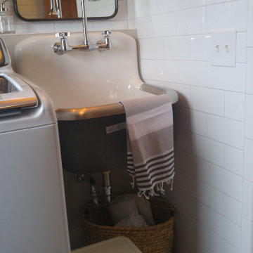
Farmhouse first floor laundry room and bath combination. Concrete tile floors set the stage and ship lap and subway tile walls add dimension and utility to the space. The Kohler Bannon sink is the showstopper. Black shaker cabinets add storage and function.
56