
Search results for "Visually expanded" in Home Design Ideas
 Denver Design Group
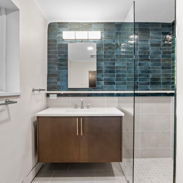
Floor-to-ceiling tile extends seamlessly behind the vanity to draw the eye upward, anchored by an integrated quartz shelf for everyday essentials and display.

 austin outdoor design
fire pit creates a visual and physical connection from the sunken sitting area to the modern play house at the end of the backyard. the tigerwood ceiling opens itself to a spacious ipe deck that leads down to conversation pit surrounding the fire or the outdoor kitchen patio. the space provides entertainment space for both the young and the old.
designed & built by austin outdoor design
photo by ryann ford

 Kass Wilson
Interior designer Debby Hall wanted to create the illusion that the space is larger than it appears, opting for horizontal stripes.
Enclosed dining room - small transitional enclosed dining room idea in Atlanta
Enclosed dining room - small transitional enclosed dining room idea in Atlanta
Find the right local pro for your project
 Kass Wilson
Subtle colors and a tiny metallic stripe emphasize the elegance and formality of the traditional furnishings.
Example of a small transitional enclosed dining room design in Atlanta with beige walls
Example of a small transitional enclosed dining room design in Atlanta with beige walls
 Kass Wilson
This dining room now feels more spacious and open, welcoming guests with open arms.
Inspiration for a small transitional enclosed dining room remodel in Atlanta with metallic walls
Inspiration for a small transitional enclosed dining room remodel in Atlanta with metallic walls

 Nar Design Group
This home remodel is a celebration of curves and light. Starting from humble beginnings as a basic builder ranch style house, the design challenge was maximizing natural light throughout and providing the unique contemporary style the client’s craved.
The Entry offers a spectacular first impression and sets the tone with a large skylight and an illuminated curved wall covered in a wavy pattern Porcelanosa tile.
The chic entertaining kitchen was designed to celebrate a public lifestyle and plenty of entertaining. Celebrating height with a robust amount of interior architectural details, this dynamic kitchen still gives one that cozy feeling of home sweet home. The large “L” shaped island accommodates 7 for seating. Large pendants over the kitchen table and sink provide additional task lighting and whimsy. The Dekton “puzzle” countertop connection was designed to aid the transition between the two color countertops and is one of the homeowner’s favorite details. The built-in bistro table provides additional seating and flows easily into the Living Room.
A curved wall in the Living Room showcases a contemporary linear fireplace and tv which is tucked away in a niche. Placing the fireplace and furniture arrangement at an angle allowed for more natural walkway areas that communicated with the exterior doors and the kitchen working areas.
The dining room’s open plan is perfect for small groups and expands easily for larger events. Raising the ceiling created visual interest and bringing the pop of teal from the Kitchen cabinets ties the space together. A built-in buffet provides ample storage and display.
The Sitting Room (also called the Piano room for its previous life as such) is adjacent to the Kitchen and allows for easy conversation between chef and guests. It captures the homeowner’s chic sense of style and joie de vivre.

 Windhill+Co.
We gave this rather dated farmhouse some dramatic upgrades that brought together the feminine with the masculine, combining rustic wood with softer elements. In terms of style her tastes leaned toward traditional and elegant and his toward the rustic and outdoorsy. The result was the perfect fit for this family of 4 plus 2 dogs and their very special farmhouse in Ipswich, MA. Character details create a visual statement, showcasing the melding of both rustic and traditional elements without too much formality. The new master suite is one of the most potent examples of the blending of styles. The bath, with white carrara honed marble countertops and backsplash, beaded wainscoting, matching pale green vanities with make-up table offset by the black center cabinet expand function of the space exquisitely while the salvaged rustic beams create an eye-catching contrast that picks up on the earthy tones of the wood. The luxurious walk-in shower drenched in white carrara floor and wall tile replaced the obsolete Jacuzzi tub. Wardrobe care and organization is a joy in the massive walk-in closet complete with custom gliding library ladder to access the additional storage above. The space serves double duty as a peaceful laundry room complete with roll-out ironing center. The cozy reading nook now graces the bay-window-with-a-view and storage abounds with a surplus of built-ins including bookcases and in-home entertainment center. You can’t help but feel pampered the moment you step into this ensuite. The pantry, with its painted barn door, slate floor, custom shelving and black walnut countertop provide much needed storage designed to fit the family’s needs precisely, including a pull out bin for dog food. During this phase of the project, the powder room was relocated and treated to a reclaimed wood vanity with reclaimed white oak countertop along with custom vessel soapstone sink and wide board paneling. Design elements effectively married rustic and traditional styles and the home now has the character to match the country setting and the improved layout and storage the family so desperately needed. And did you see the barn? Photo credit: Eric Roth
Sponsored
Columbus, OH

Snider & Metcalf Interior Design, LTD
Leading Interior Designers in Columbus, Ohio & Ponte Vedra, Florida

 CG&S Design-Build
The new design expanded the footprint of the home to 1,271 square feet for the first level and 1,156 for the new second level. A new entry with a quarter turn stair leads you into the original living space. The old guest bedroom that was once accessed through the dining room is now connected to the front living space by pocket doors. The new open concept creates a continuous flow from the living space through the dining into the kitchen.
Photo by Tre Dunham

 User
UserWalk-in closet - mid-sized country gender-neutral light wood floor and brown floor walk-in closet idea in Boston with open cabinets and white cabinets
 TVL Creative Ltd.
This 1910 West Highlands home was so compartmentalized that you couldn't help to notice you were constantly entering a new room every 8-10 feet. There was also a 500 SF addition put on the back of the home to accommodate a living room, 3/4 bath, laundry room and back foyer - 350 SF of that was for the living room. Needless to say, the house needed to be gutted and replanned.
Kitchen+Dining+Laundry-Like most of these early 1900's homes, the kitchen was not the heartbeat of the home like they are today. This kitchen was tucked away in the back and smaller than any other social rooms in the house. We knocked out the walls of the dining room to expand and created an open floor plan suitable for any type of gathering. As a nod to the history of the home, we used butcherblock for all the countertops and shelving which was accented by tones of brass, dusty blues and light-warm greys. This room had no storage before so creating ample storage and a variety of storage types was a critical ask for the client. One of my favorite details is the blue crown that draws from one end of the space to the other, accenting a ceiling that was otherwise forgotten.
Primary Bath-This did not exist prior to the remodel and the client wanted a more neutral space with strong visual details. We split the walls in half with a datum line that transitions from penny gap molding to the tile in the shower. To provide some more visual drama, we did a chevron tile arrangement on the floor, gridded the shower enclosure for some deep contrast an array of brass and quartz to elevate the finishes.
Powder Bath-This is always a fun place to let your vision get out of the box a bit. All the elements were familiar to the space but modernized and more playful. The floor has a wood look tile in a herringbone arrangement, a navy vanity, gold fixtures that are all servants to the star of the room - the blue and white deco wall tile behind the vanity.
Full Bath-This was a quirky little bathroom that you'd always keep the door closed when guests are over. Now we have brought the blue tones into the space and accented it with bronze fixtures and a playful southwestern floor tile.
Living Room & Office-This room was too big for its own good and now serves multiple purposes. We condensed the space to provide a living area for the whole family plus other guests and left enough room to explain the space with floor cushions. The office was a bonus to the project as it provided privacy to a room that otherwise had none before.

 Osprey Custom Homes
Hallway - huge transitional dark wood floor and brown floor hallway idea in Orlando with beige walls

 Bartelt. The Remodeling Resource
The remodeled kitchen expanded into the oversized dining room, making space for a large island, double ovens, ample storage, custom cabinetry, and a large range top, perfect for entertaining.
A coffered ceiling adds character and elegance. Recessed lighting, pendants, and in- and under-cabinet lighting offer a warm glow and provide task lighting for meal prep.
The room is a mix of rustic and refined, with a distressed cherry island top and a coffered ceiling and white cabinetry.
Photo Credit: David Bader
Interior Design Partner: Becky Howley

 Carl Mayfield Architectural Photographer
To capture the window to the right and the entire island this kitchen was photographed in three images and stitched together in Autopano Giga.
Copyright Carl Mayfield Photography



 WA Country Builders
Joel Barbitta
Transitional white one-story mixed siding exterior home idea in Perth
Transitional white one-story mixed siding exterior home idea in Perth

 emma delon
Maximizing the functionality of this space, and coordinating the new kitchen with the beautiful remodel completed previously by the client were the two most important aspects of this project. The existing spaces are elegantly decorated with an open plan, dark hardwood floors, and natural stone accents. The new, lighter, more open kitchen flows beautifully into the client’s existing dining room space. Satin nickel hardware blends with the stainless steel appliances and matches the satin nickel details throughout the home. The fully integrated refrigerator next to the narrow pull-out pantry cabinet, take up less visual weight than a traditional stainless steel appliance and the two combine to provide fantastic storage. The glass cabinet doors and decorative lighting beautifully highlight the client’s glassware and dishes. Finished with white subway tile, Dreamy Marfil quartz countertops, and a warm natural wood blind; the space warm, inviting, elegant, and extremely functional.
copyright 2013 marilyn peryer photography

 Fiberon Decking
Built-in deck components are becoming more popular as people expand their indoor living to the great outdoors. The bench seating and planters were constructed using the same material as the deck, Fiberon's composite decking - the ProTect Advantage line in 'Chestnut'. Planter boxes, like these, add visual interest and can soften the angles of a deck or patio. Fill planters with colorful flowers, tall ornamental grasses for privacy, or fresh herbs or vegetables that are only steps away from the outdoor kitchen!
 Nar Design Group
This home remodel is a celebration of curves and light. Starting from humble beginnings as a basic builder ranch style house, the design challenge was maximizing natural light throughout and providing the unique contemporary style the client’s craved.
The Entry offers a spectacular first impression and sets the tone with a large skylight and an illuminated curved wall covered in a wavy pattern Porcelanosa tile.
The chic entertaining kitchen was designed to celebrate a public lifestyle and plenty of entertaining. Celebrating height with a robust amount of interior architectural details, this dynamic kitchen still gives one that cozy feeling of home sweet home. The large “L” shaped island accommodates 7 for seating. Large pendants over the kitchen table and sink provide additional task lighting and whimsy. The Dekton “puzzle” countertop connection was designed to aid the transition between the two color countertops and is one of the homeowner’s favorite details. The built-in bistro table provides additional seating and flows easily into the Living Room.
A curved wall in the Living Room showcases a contemporary linear fireplace and tv which is tucked away in a niche. Placing the fireplace and furniture arrangement at an angle allowed for more natural walkway areas that communicated with the exterior doors and the kitchen working areas.
The dining room’s open plan is perfect for small groups and expands easily for larger events. Raising the ceiling created visual interest and bringing the pop of teal from the Kitchen cabinets ties the space together. A built-in buffet provides ample storage and display.
The Sitting Room (also called the Piano room for its previous life as such) is adjacent to the Kitchen and allows for easy conversation between chef and guests. It captures the homeowner’s chic sense of style and joie de vivre.

Sponsored
Columbus, OH
Snider & Metcalf Interior Design, LTD
Leading Interior Designers in Columbus, Ohio & Ponte Vedra, Florida

 Pinnacle Lighting Group
Inspiration for a mid-sized transitional backyard stone patio remodel with a fire pit and no cover

 KS Designs LLC
This guest bath has a light and airy feel with an organic element and pop of color. The custom vanity is in a midtown jade aqua-green PPG paint Holy Glen. It provides ample storage while giving contrast to the white and brass elements. A playful use of mixed metal finishes gives the bathroom an up-dated look. The 3 light sconce is gold and black with glass globes that tie the gold cross handle plumbing fixtures and matte black hardware and bathroom accessories together. The quartz countertop has gold veining that adds additional warmth to the space. The acacia wood framed mirror with a natural interior edge gives the bathroom an organic warm feel that carries into the curb-less shower through the use of warn toned river rock. White subway tile in an offset pattern is used on all three walls in the shower and carried over to the vanity backsplash. The shower has a tall niche with quartz shelves providing lots of space for storing shower necessities. The river rock from the shower floor is carried to the back of the niche to add visual interest to the white subway shower wall as well as a black Schluter edge detail. The shower has a frameless glass rolling shower door with matte black hardware to give the this smaller bathroom an open feel and allow the natural light in. There is a gold handheld shower fixture with a cross handle detail that looks amazing against the white subway tile wall. The white Sherwin Williams Snowbound walls are the perfect backdrop to showcase the design elements of the bathroom.
Photography by LifeCreated.

 Lorin Hill, Architect
A traditional home in the Claremont Hills of Berkeley is enlarged and fully renovated to fit the lives of a young couple and their growing family. The existing partial upper floor was fully expanded to create three additional bedrooms, a hall bath, laundry room and updated master suite, with the intention that the expanded house volume harmoniously integrates with the architectural character of the existing home. A new central staircase brings in a tremendous amount of daylight to the heart of the ground floor while also providing a strong visual connection between the floors. The new stair includes access to an expanded basement level with storage and recreation spaces for the family. Main level spaces were also extensively upgraded with the help of noted San Francisco interior designer Grant K. Gibson. Photos by Kathryn MacDonald.
1