
Search results for "Visually expanded" in Home Design Ideas
 Noble Architects, LLC
Showcase Photographers
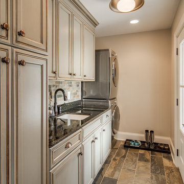
Laundry room - country single-wall laundry room idea in Nashville with an undermount sink, beige walls and a stacked washer/dryer
Laundry room - country single-wall laundry room idea in Nashville with an undermount sink, beige walls and a stacked washer/dryer
 Finesse, Inc.
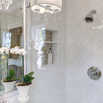
Light and reflective surfaces visually expand the space in this fresh bathroom remodel with a classic traditional feel.
Photos by Jessica Abler, Los Angeles, CA
 Lee Kimball
This 1940’s Colonial style home in Boston’s Jamaica Plain had strong bones and rich character but lacked the space, modern conveniences, and storage that our clients desired. While they wished to retain the look of the exterior, as well as some of the home’s unique original features,, the kitchen and dining room needed to be reimagined in design, layout, and functionality.
Key considerations were the compact size of the home and a smaller lot that didn’t give our client the flexibility of an addition. Without adding on to the existing floor plan, we needed to find a way to gain vital extra space in the kitchen, which, with walls enclosing it on all sides, was dark and disconnected from the rest of the house. Our design team coordinated with our client to reconfigure the space by opening up the wall between the dining room and the kitchen to add a few extra inches – just enough to create an open flow between the two rooms. With the removal of that wall, the formerly dark kitchen was flooded with the natural light coming from the existing dining room windows, making the entire space feel brighter and more cohesive.
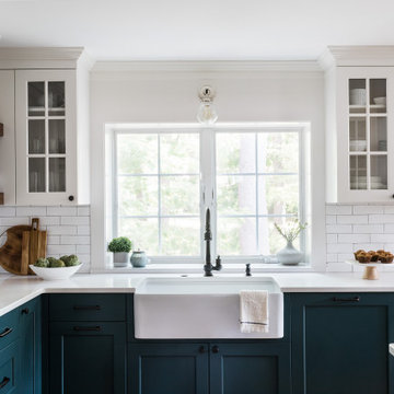
The original kitchen dated back to the mid-20th century and lacked, among other conveniences, a dishwasher, enough storage, or even countertop space for food prep. In redesigning the kitchen, we visually expanded the space by incorporating white upper cabinetry, open shelving, and white subway tiles extending from the backsplash to the ceiling. A new, larger window featuring a deep stone sill brought in even more light, and the appliances and apron sink were selected to retain the traditional look of the home while delivering modern functionality.
Considering how our client would use this space, we focused on creating a purposeful workspace and storage, ensuring that there was ample countertop space and cabinetry between the sink and range. A multi-purpose cabinet and countertop which serves as a microwave station and food service area were added to the backside of the dining room wall, packing a lot of utility into a small space.
Prior to this renovation, our client had painted the dining room in Mount Saint Anne by Benjamin Moore, a tranquil blue-gray that suited the room well and allowed the original built-in corner cabinetry to stand out, highlighting the home’s charm. With the newly opened floor plan extending into the kitchen, we selected a deep custom color for the base cabinets, Yorktowne Green by Benjamin Moore, to complement the dining room and pull all of the elements together in a cohesive space.
This transformation was remarkable, both functionally and visually. The kitchen is now a bright and inviting space that flows seamlessly into the rest of the house. The homeowners are thrilled with the results, and the small changes we incorporated that made a big difference in the overall feel and functionality of the space.
Find the right local pro for your project
 WINN Design+Build
Stacy Zarin Goldberg
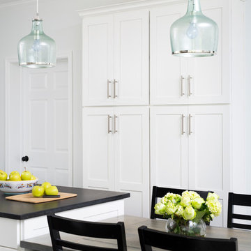
Mid-sized elegant l-shaped dark wood floor and brown floor eat-in kitchen photo in DC Metro with a farmhouse sink, shaker cabinets, white cabinets, granite countertops, gray backsplash, ceramic backsplash, stainless steel appliances and an island
Mid-sized elegant l-shaped dark wood floor and brown floor eat-in kitchen photo in DC Metro with a farmhouse sink, shaker cabinets, white cabinets, granite countertops, gray backsplash, ceramic backsplash, stainless steel appliances and an island
 NIELSEN DYE DESIGN, INC.
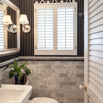
This bathroom was the only room left from the original 1940s home after a complete renovation of the home done in 1989. This bathroom is the first floor powder room for guests. We decided to keep the shower to enhance the value and to give beachgoers somewhere to shower off. We used traditional English styling as a motivation, which included marble mosaic flooring and walls with a pedestal sink. The polished nickel hardware glistens against the black and white stone and white lacquer woodwork. Accenting and visually expanding the small room is a wall size antique incised silver mirror from France dated 1840. The sconces are Hotel Silver and Crystal. Storage closet with slatted doors completes the Caribbean-English feel to this luxurious guest bathroom.
 Swift Creek Cabinets & Design
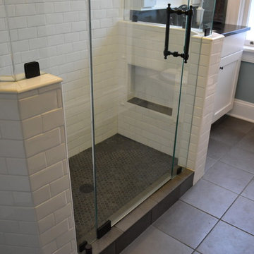
Keeping the shower floor the same color as the main bathroom floor helps visually expand the space, creating a more open and seamless feel. By continuing the flooring into the shower, visual breaks are minimized and the entire room feels larger.
Notice the angled half walls at the shower—this detail plays an important role in softening what would otherwise feel like a tight space. It also allowed us to gain additional depth in the shower. Without those angles, the shower would have been approximately 6 inches shallower due to underlying structural and layout constraints.
Achieving this look with a traditional curb can be challenging. Most tile installers today prefer using a stone curb, which often creates a clear separation between the bathroom floor and the shower floor—breaking that seamless effect.
The most effective way to maintain a continuous look is with a curbless (zero-entry) shower. This allows the flooring to flow uninterrupted, creating a clean, modern design.
At the time this project was completed, curbless systems like Schluter were not widely available. Today, with systems like Schluter’s zero-entry shower solutions, achieving this seamless, continuous look is much more accessible and reliable.
The result is a bathroom that feels larger, cleaner, and thoughtfully designed—both visually and functionally.
 27 Diamonds Interior Design
www.27diamonds.com
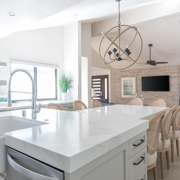
Example of a mid-sized trendy u-shaped light wood floor and brown floor open concept kitchen design in Orange County with a farmhouse sink, recessed-panel cabinets, gray cabinets, quartz countertops, white backsplash, marble backsplash, stainless steel appliances, an island and white countertops
Example of a mid-sized trendy u-shaped light wood floor and brown floor open concept kitchen design in Orange County with a farmhouse sink, recessed-panel cabinets, gray cabinets, quartz countertops, white backsplash, marble backsplash, stainless steel appliances, an island and white countertops


 Lee Kimball
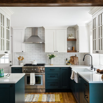
This 1940’s Colonial style home in Boston’s Jamaica Plain had strong bones and rich character but lacked the space, modern conveniences, and storage that our clients desired. While they wished to retain the look of the exterior, as well as some of the home’s unique original features,, the kitchen and dining room needed to be reimagined in design, layout, and functionality.
Key considerations were the compact size of the home and a smaller lot that didn’t give our client the flexibility of an addition. Without adding on to the existing floor plan, we needed to find a way to gain vital extra space in the kitchen, which, with walls enclosing it on all sides, was dark and disconnected from the rest of the house. Our design team coordinated with our client to reconfigure the space by opening up the wall between the dining room and the kitchen to add a few extra inches – just enough to create an open flow between the two rooms. With the removal of that wall, the formerly dark kitchen was flooded with the natural light coming from the existing dining room windows, making the entire space feel brighter and more cohesive.
The original kitchen dated back to the mid-20th century and lacked, among other conveniences, a dishwasher, enough storage, or even countertop space for food prep. In redesigning the kitchen, we visually expanded the space by incorporating white upper cabinetry, open shelving, and white subway tiles extending from the backsplash to the ceiling. A new, larger window featuring a deep stone sill brought in even more light, and the appliances and apron sink were selected to retain the traditional look of the home while delivering modern functionality.
Considering how our client would use this space, we focused on creating a purposeful workspace and storage, ensuring that there was ample countertop space and cabinetry between the sink and range. A multi-purpose cabinet and countertop which serves as a microwave station and food service area were added to the backside of the dining room wall, packing a lot of utility into a small space.
Prior to this renovation, our client had painted the dining room in Mount Saint Anne by Benjamin Moore, a tranquil blue-gray that suited the room well and allowed the original built-in corner cabinetry to stand out, highlighting the home’s charm. With the newly opened floor plan extending into the kitchen, we selected a deep custom color for the base cabinets, Yorktowne Green by Benjamin Moore, to complement the dining room and pull all of the elements together in a cohesive space.
This transformation was remarkable, both functionally and visually. The kitchen is now a bright and inviting space that flows seamlessly into the rest of the house. The homeowners are thrilled with the results, and the small changes we incorporated that made a big difference in the overall feel and functionality of the space.
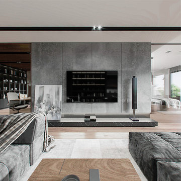
 Grandeur Hills Group,Inc.
The main idea of this interior design concept is space. The dining room does look very spacious despite the eclectic design style. Black and white colors and their many shades go well with each other and at the same time perfectly contrast.
Against the gray background of the interior, the white floor and large windows through which daylight enters the interior of the dining room do look great. The correct functional grouping of all the dining room furniture pieces visually expands the dining room.
Don’t miss the chance to turn your dining room into a jewel of NYC by calling the top Grandeur Hills Group interior designers!
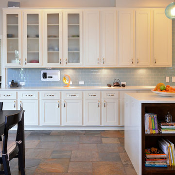
 Donovan Lord Design
Edict Inc - Completely remodeled and expanded kitchen from smaller galley style kitchen. Expanded into unused bedroom, added windows at end of kitchen to visually expand the space.
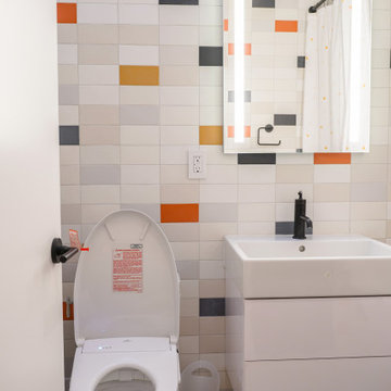 Grandeur Hills Group,Inc.
Despite its small size, this bathroom does not look cramped thanks to the small amount of furniture and sanitary ware. In addition, the dominant color in the bathroom is white, which tends to visually expand small spaces.
The high-quality lighting also enhances the sense of space and freedom in the bathroom. The multi-colored walls make the ambience in the bathroom welcoming, cozy, and warm.
Try to make your own bathroom look stylish and beautiful too. Add a bit of high style to it together with our best interior designers!
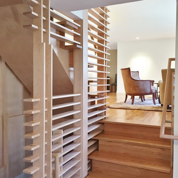
 BZ Architects
The previous layout of the main floor of this split level house separated each space from the other, resulting in a design which did not take advantage of either the existing space or potential views.
Our response was to modulate the degree of openness between the rooms and spaces using architectural elements. At the entry, an open, lattice-like divider replaces a full-height wall, physically and visually expanding the foyer. In the kitchen, strategically placed partial-height cabinets supplant full-height walls between the living room and kitchen and act as a visual barrier between the two, allowing the kitchen to become a destination rather than a corridor.
Removing the wall between the kitchen and dining room provides for better interaction between host and guest while a series of south-facing skylights over a new island help to blur the line between the interior and exterior.
 J. Stephens Interiors
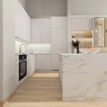
Modern form is married with elegant function in this open-floor-plan apartment in the heart of Chelsea, NYC. Award-winning interior designer, Jo Ann Alston, transformed the outdated elements of this upscale unit to create a timeless, yet modern aesthetic, with clean, natural lines that bespeak both luxury and ease. This charmingly functional kitchen now serves as the focal point for cooking, convening, and entertaining, for the whole family and their numerous guests.
Careful planning and selection were required to effectively work within the parameters of the open floor plan to create a seamless flow from the kitchen to the living room. Modern cabinetry, strategically hidden appliances, and ingeniously concealed lighting and elevations all coalesce to create uninterrupted sight lines that engender a sense of harmony and aesthetic intrigue.
The existing cabinets, countertops, and appliances were all replaced, the wood flooring was refinished, and an elegant bar area was incorporated into the dining room, doubling as a bar for entertaining and a buffet for serving meals. In the kitchen, European, high-gloss lacquer was selected for the minimalist-modern cabinetry and coordinated with flooring and Dekton countertops, whose practicality and functionality are especially well-suited for NYC apartment homeowners with a penchant for entertaining.
For the sight lines from the living room to the kitchen to be seamless and uninterrupted, the refrigerator is concealed within the cabinetry and the range is hidden from sight behind the island. A dramatic light fixture above the dining room island and tasteful uplighting and downlighting offer especially compelling views of the kitchen when viewed from the living room, while glass cabinets with brass trim and accent lighting visually expand the width of the space.
Touches of luxury such as the brass faucet and brass-framed glass cabinets visually harmonize with the colors in the waterfall designed Dekton countertop, the game-stopper feature of the large kitchen island. A clean, light-wood back splash at the bar corresponds effortlessly with the newly refinished wood flooring, further enhancing the soft and natural vibe of the entire apartment.
This elegant stroke of design genius is proof positive that you need not compromise timeless elegance for practical, modern features in an uncluttered, even minimalist environment. The brilliance of this design is not limited to its balanced and graceful aesthetic appeal. It also includes the great many benefits coordinated between designer and client to ensure there would also be plenty of room for storage of kitchen items, abundant countertop space, and designated areas for enjoying company together comfortably throughout the space.
Anyone who walks through this space in the heart of Chelsea is bound to feel both inspired and at ease. This is the result of careful planning and attention to the smallest details that culminate in comfort, style, and design excellence.

Sponsored
Columbus, OH

Snider & Metcalf Interior Design, LTD
Leading Interior Designers in Columbus, Ohio & Ponte Vedra, Florida
 BZ Architects
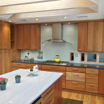
The previous layout of the main floor of this split level house separated each space from the other, resulting in a design which did not take advantage of either the existing space or potential views.
Our response was to modulate the degree of openness between the rooms and spaces using architectural elements. At the entry, an open, lattice-like divider replaces a full-height wall, physically and visually expanding the foyer. In the kitchen, strategically placed partial-height cabinets supplant full-height walls between the living room and kitchen and act as a visual barrier between the two, allowing the kitchen to become a destination rather than a corridor.
Removing the wall between the kitchen and dining room provides for better interaction between host and guest while a series of south-facing skylights over a new island help to blur the line between the interior and exterior.
 BZ Architects
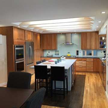
The previous layout of the main floor of this split level house separated each space from the other, resulting in a design which did not take advantage of either the existing space or potential views.
Our response was to modulate the degree of openness between the rooms and spaces using architectural elements. At the entry, an open, lattice-like divider replaces a full-height wall, physically and visually expanding the foyer. In the kitchen, strategically placed partial-height cabinets supplant full-height walls between the living room and kitchen and act as a visual barrier between the two, allowing the kitchen to become a destination rather than a corridor.
Removing the wall between the kitchen and dining room provides for better interaction between host and guest while a series of south-facing skylights over a new island help to blur the line between the interior and exterior.
 BZ Architects
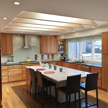
The previous layout of the main floor of this split level house separated each space from the other, resulting in a design which did not take advantage of either the existing space or potential views.
Our response was to modulate the degree of openness between the rooms and spaces using architectural elements. At the entry, an open, lattice-like divider replaces a full-height wall, physically and visually expanding the foyer. In the kitchen, strategically placed partial-height cabinets supplant full-height walls between the living room and kitchen and act as a visual barrier between the two, allowing the kitchen to become a destination rather than a corridor.
Removing the wall between the kitchen and dining room provides for better interaction between host and guest while a series of south-facing skylights over a new island help to blur the line between the interior and exterior.
 Jaeger & Ernst Custom Cabinetmakers
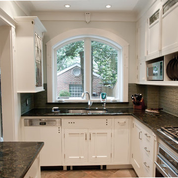
The sliding doors were removed and the hot water radiator relocated to enrich the functionality and beauty of the kitchen. Glass tiles, leaded glass doors, polished granite, interior cabinet lighting, new ceiling lighting along with cabinets that reach the ceiling were designed to visually expand the space. Reflective surfaces assist in expanding the space, as do glass doors because the mind peers beyond the door's face surface. White cabinets and trim with just enough detail and accent so as not to numb the emotion with a hospital quality further expands the sense of the kitchen space. Creativity and an ability to think "outside the box" are necessary for these gems we describe as "row" homes. Restoration when done well is exciting; it's refreshing and delightful. We can not disassociate our emotions from our environments. Why should we? We should strive to be happy within beauty. Part of the Arts and Crafts Movement in America used as its' motto: the Beautiful, the Useful and the Enduring. For an artisan craftsman or designer the motto holds true today. Jaeger & Ernst cabinetmakers, 434-973-7018
Photographer: Greg Jaeger


 Davis Construction Services LLC
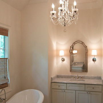
Tradtional Master bathroom featuring dual vanities. Detailed mirror is flanked by two versatile polished nickel sconces topped with paper shades. The faucet echoes the polished nickel of the sconces, and the crystal knobs on the vanity are reflected in the crystal adorning the chandelier. The pedestal bath is a solid cast iron and also features a polished nickel telephone faucet. For privacy, homeowners opted for a "top down bottom up" woven wood shade. The floor are honed 12x12 white marble laid on a diagonal to visually expand the space. The countertop is a honed Carrera with a beveled edge and backsplash.
 Teague Hunziker Photography
©Teague Hunziker
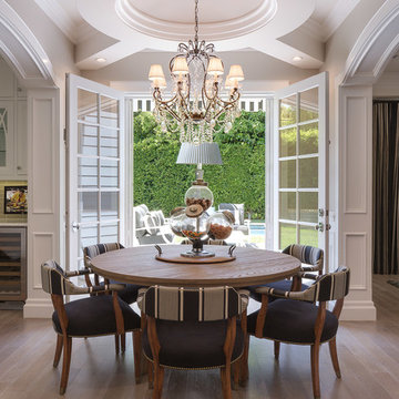
Elegant light wood floor dining room photo in Other with beige walls
Elegant light wood floor dining room photo in Other with beige walls
 Betty Wasserman Art & Interiors
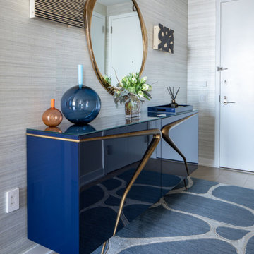
Our NYC studio designed this gorgeous condo for a family of four with the goal of maximizing space in a modest amount of square footage. A custom sectional in the living room was created to accommodate the family without feeling overcrowded, while the son's bedroom features a custom Murphy bed to optimize space during the day. To fulfill the daughter's wish for fairy lighting, an entire wall of them was installed behind her bed, casting a beautiful glow at night. In the kitchen, we added plenty of cabinets below the island for maximum efficiency. Storage units were incorporated in the bedroom and living room to house the TV and showcase decorative items. Additionally, the tub in the powder room was removed to create an additional closet for much-needed storage space.
7