
Search results for "Visually expanded" in Home Design Ideas
 Davis Construction Services LLC
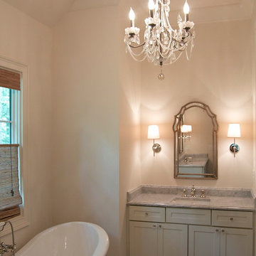
Tradtional Master bathroom featuring dual vanities. Detailed mirror is flanked by two versatile polished nickel sconces topped with paper shades. The faucet echoes the polished nickel of the sconces, and the crystal knobs on the vanity are reflected in the crystal adorning the chandelier. The pedestal bath is a solid cast iron and also features a polished nickel telephone faucet. For privacy, homeowners opted for a "top down bottom up" woven wood shade. The floor are honed 12x12 white marble laid on a diagonal to visually expand the space. The countertop is a honed Carrera with a beveled edge and backsplash.
 J. Stephens Interiors
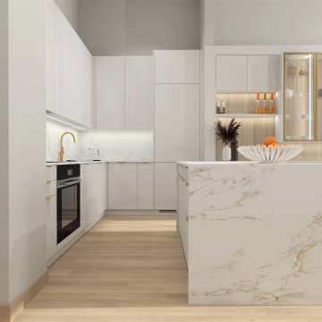
Modern form is married with elegant function in this open-floor-plan apartment in the heart of Chelsea, NYC. Award-winning interior designer, Jo Ann Alston, transformed the outdated elements of this upscale unit to create a timeless, yet modern aesthetic, with clean, natural lines that bespeak both luxury and ease. This charmingly functional kitchen now serves as the focal point for cooking, convening, and entertaining, for the whole family and their numerous guests.
Careful planning and selection were required to effectively work within the parameters of the open floor plan to create a seamless flow from the kitchen to the living room. Modern cabinetry, strategically hidden appliances, and ingeniously concealed lighting and elevations all coalesce to create uninterrupted sight lines that engender a sense of harmony and aesthetic intrigue.
The existing cabinets, countertops, and appliances were all replaced, the wood flooring was refinished, and an elegant bar area was incorporated into the dining room, doubling as a bar for entertaining and a buffet for serving meals. In the kitchen, European, high-gloss lacquer was selected for the minimalist-modern cabinetry and coordinated with flooring and Dekton countertops, whose practicality and functionality are especially well-suited for NYC apartment homeowners with a penchant for entertaining.
For the sight lines from the living room to the kitchen to be seamless and uninterrupted, the refrigerator is concealed within the cabinetry and the range is hidden from sight behind the island. A dramatic light fixture above the dining room island and tasteful uplighting and downlighting offer especially compelling views of the kitchen when viewed from the living room, while glass cabinets with brass trim and accent lighting visually expand the width of the space.
Touches of luxury such as the brass faucet and brass-framed glass cabinets visually harmonize with the colors in the waterfall designed Dekton countertop, the game-stopper feature of the large kitchen island. A clean, light-wood back splash at the bar corresponds effortlessly with the newly refinished wood flooring, further enhancing the soft and natural vibe of the entire apartment.
This elegant stroke of design genius is proof positive that you need not compromise timeless elegance for practical, modern features in an uncluttered, even minimalist environment. The brilliance of this design is not limited to its balanced and graceful aesthetic appeal. It also includes the great many benefits coordinated between designer and client to ensure there would also be plenty of room for storage of kitchen items, abundant countertop space, and designated areas for enjoying company together comfortably throughout the space.
Anyone who walks through this space in the heart of Chelsea is bound to feel both inspired and at ease. This is the result of careful planning and attention to the smallest details that culminate in comfort, style, and design excellence.
 Designline
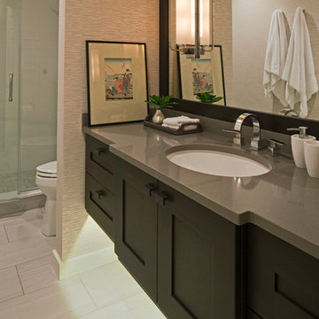
The guest bath was completly renovated. The floating vanity with ligting below and large mirror framed to match help to visually expand the narrow space. A pair of sconces are mounted on the mirror. The subtle pattern of the wallpaper adds softness and texture. Asian art is from the owner's collection.
Custom Vanity by Quality Custom Cabinetry
Sconces by Visual Comfort
Wallcovering by Kravet
Anne Gummerson
Find the right local pro for your project
 BZ Architects
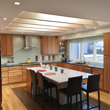
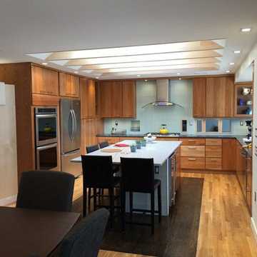
The previous layout of the main floor of this split level house separated each space from the other, resulting in a design which did not take advantage of either the existing space or potential views.
Our response was to modulate the degree of openness between the rooms and spaces using architectural elements. At the entry, an open, lattice-like divider replaces a full-height wall, physically and visually expanding the foyer. In the kitchen, strategically placed partial-height cabinets supplant full-height walls between the living room and kitchen and act as a visual barrier between the two, allowing the kitchen to become a destination rather than a corridor.
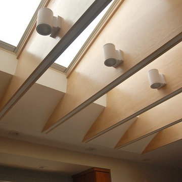
Removing the wall between the kitchen and dining room provides for better interaction between host and guest while a series of south-facing skylights over a new island help to blur the line between the interior and exterior.
 2HANDS STUDIO
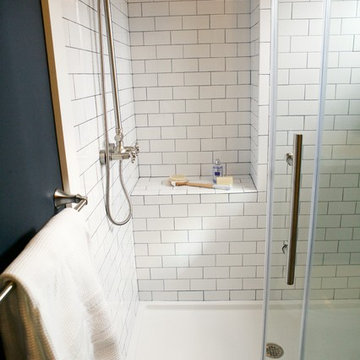
Bathroom remodel on the 1st floor unit of a late 1800's Victorian home. Exiting vanity and toilet were located where shower now resides. Relocating plumbing fixtures for better flow and more space and painting the walls in a deep navy expanded the space. Bathroom is located off of the kitchen and therefore we carried the flooring into the room to help visually expand the space.
Photography by Kristina Kosinski
 BZ Architects
The previous layout of the main floor of this split level house separated each space from the other, resulting in a design which did not take advantage of either the existing space or potential views.
Our response was to modulate the degree of openness between the rooms and spaces using architectural elements. At the entry, an open, lattice-like divider replaces a full-height wall, physically and visually expanding the foyer. In the kitchen, strategically placed partial-height cabinets supplant full-height walls between the living room and kitchen and act as a visual barrier between the two, allowing the kitchen to become a destination rather than a corridor.
Removing the wall between the kitchen and dining room provides for better interaction between host and guest while a series of south-facing skylights over a new island help to blur the line between the interior and exterior.
 BZ Architects
The previous layout of the main floor of this split level house separated each space from the other, resulting in a design which did not take advantage of either the existing space or potential views.
Our response was to modulate the degree of openness between the rooms and spaces using architectural elements. At the entry, an open, lattice-like divider replaces a full-height wall, physically and visually expanding the foyer. In the kitchen, strategically placed partial-height cabinets supplant full-height walls between the living room and kitchen and act as a visual barrier between the two, allowing the kitchen to become a destination rather than a corridor.
Removing the wall between the kitchen and dining room provides for better interaction between host and guest while a series of south-facing skylights over a new island help to blur the line between the interior and exterior.


 2HANDS STUDIO
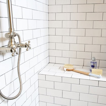
Bathroom remodel on the 1st floor unit of a late 1800's Victorian home. Exiting vanity and toilet were located where shower now resides. Relocating plumbing fixtures for better flow and more space and painting the walls in a deep navy expanded the space. Bathroom is located off of the kitchen and therefore we carried the flooring into the room to help visually expand the space.
Photography by Kristina Kosinski
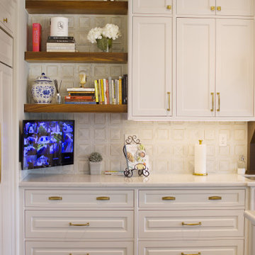
 Le Gourmet Kitchen Ltd.
Cabinetry features inset door profiles, traditional detailing, and a tailored, furniture-like finish. Sleek hardware provides a modern complement while maintaining the timeless character of the space. The split island design adds visual rhythm and movement, preventing the layout from feeling monolithic and improving flow around key work zones. The mirrored pantry wall visually expands the room and reflects natural light, making the space feel larger and more open.
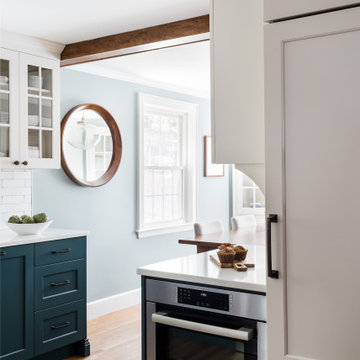
 Lee Kimball
This 1940’s Colonial style home in Boston’s Jamaica Plain had strong bones and rich character but lacked the space, modern conveniences, and storage that our clients desired. While they wished to retain the look of the exterior, as well as some of the home’s unique original features,, the kitchen and dining room needed to be reimagined in design, layout, and functionality.
Key considerations were the compact size of the home and a smaller lot that didn’t give our client the flexibility of an addition. Without adding on to the existing floor plan, we needed to find a way to gain vital extra space in the kitchen, which, with walls enclosing it on all sides, was dark and disconnected from the rest of the house. Our design team coordinated with our client to reconfigure the space by opening up the wall between the dining room and the kitchen to add a few extra inches – just enough to create an open flow between the two rooms. With the removal of that wall, the formerly dark kitchen was flooded with the natural light coming from the existing dining room windows, making the entire space feel brighter and more cohesive.
The original kitchen dated back to the mid-20th century and lacked, among other conveniences, a dishwasher, enough storage, or even countertop space for food prep. In redesigning the kitchen, we visually expanded the space by incorporating white upper cabinetry, open shelving, and white subway tiles extending from the backsplash to the ceiling. A new, larger window featuring a deep stone sill brought in even more light, and the appliances and apron sink were selected to retain the traditional look of the home while delivering modern functionality.
Considering how our client would use this space, we focused on creating a purposeful workspace and storage, ensuring that there was ample countertop space and cabinetry between the sink and range. A multi-purpose cabinet and countertop which serves as a microwave station and food service area were added to the backside of the dining room wall, packing a lot of utility into a small space.
Prior to this renovation, our client had painted the dining room in Mount Saint Anne by Benjamin Moore, a tranquil blue-gray that suited the room well and allowed the original built-in corner cabinetry to stand out, highlighting the home’s charm. With the newly opened floor plan extending into the kitchen, we selected a deep custom color for the base cabinets, Yorktowne Green by Benjamin Moore, to complement the dining room and pull all of the elements together in a cohesive space.
This transformation was remarkable, both functionally and visually. The kitchen is now a bright and inviting space that flows seamlessly into the rest of the house. The homeowners are thrilled with the results, and the small changes we incorporated that made a big difference in the overall feel and functionality of the space.
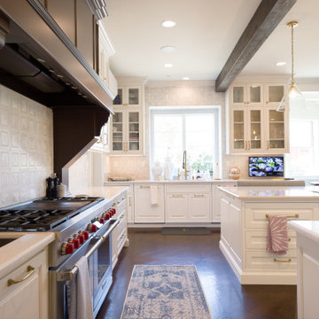 Le Gourmet Kitchen Ltd.
Cabinetry features inset door profiles, traditional detailing, and a tailored, furniture-like finish. Sleek hardware provides a modern complement while maintaining the timeless character of the space. The split island design adds visual rhythm and movement, preventing the layout from feeling monolithic and improving flow around key work zones. The mirrored pantry wall visually expands the room and reflects natural light, making the space feel larger and more open.
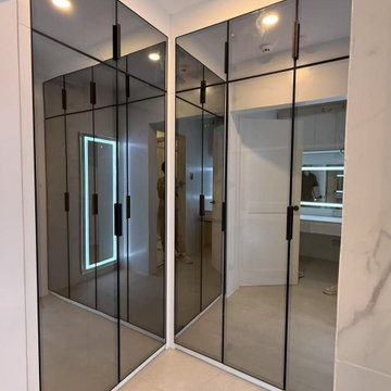
 George Group Cabinetry
Luxury corner walk-in wardrobe design featuring floor-to-ceiling smoked tinted glass cabinet doors with slim black metal grid framing, replacing solid panels to create a lighter, more spacious visual effect while protecting stored garments from dust. Internal custom configuration includes full-height hanging sections, storage drawers and overhead top cabinets to accommodate seasonal clothing, handbags and accessories efficiently. Neutral light floor tiles complement minimalist cabinet styling, mirrored reflection visually expands the narrow corridor space, offering high-end boutique-style storage solution widely specified for master bedroom ensuites in premium Philippine residential projects.
 2HANDS STUDIO
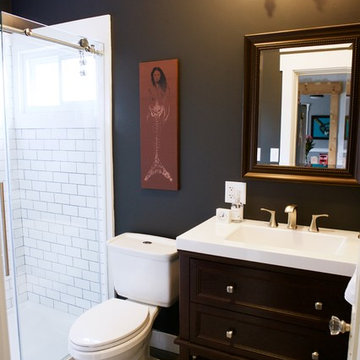
Bathroom remodel on the 1st floor unit of a late 1800's Victorian home. Exiting vanity and toilet were located where shower now resides. Relocating plumbing fixtures for better flow and more space and painting the walls in a deep navy expanded the space. Bathroom is located off of the kitchen and therefore we carried the flooring into the room to help visually expand the space.
Photography by Kristina Kosinski

Sponsored
Columbus, OH

Snider & Metcalf Interior Design, LTD
Leading Interior Designers in Columbus, Ohio & Ponte Vedra, Florida
 Lee Kimball
This 1940’s Colonial style home in Boston’s Jamaica Plain had strong bones and rich character but lacked the space, modern conveniences, and storage that our clients desired. While they wished to retain the look of the exterior, as well as some of the home’s unique original features,, the kitchen and dining room needed to be reimagined in design, layout, and functionality.
Key considerations were the compact size of the home and a smaller lot that didn’t give our client the flexibility of an addition. Without adding on to the existing floor plan, we needed to find a way to gain vital extra space in the kitchen, which, with walls enclosing it on all sides, was dark and disconnected from the rest of the house. Our design team coordinated with our client to reconfigure the space by opening up the wall between the dining room and the kitchen to add a few extra inches – just enough to create an open flow between the two rooms. With the removal of that wall, the formerly dark kitchen was flooded with the natural light coming from the existing dining room windows, making the entire space feel brighter and more cohesive.
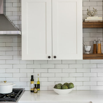
The original kitchen dated back to the mid-20th century and lacked, among other conveniences, a dishwasher, enough storage, or even countertop space for food prep. In redesigning the kitchen, we visually expanded the space by incorporating white upper cabinetry, open shelving, and white subway tiles extending from the backsplash to the ceiling. A new, larger window featuring a deep stone sill brought in even more light, and the appliances and apron sink were selected to retain the traditional look of the home while delivering modern functionality.
Considering how our client would use this space, we focused on creating a purposeful workspace and storage, ensuring that there was ample countertop space and cabinetry between the sink and range. A multi-purpose cabinet and countertop which serves as a microwave station and food service area were added to the backside of the dining room wall, packing a lot of utility into a small space.
Prior to this renovation, our client had painted the dining room in Mount Saint Anne by Benjamin Moore, a tranquil blue-gray that suited the room well and allowed the original built-in corner cabinetry to stand out, highlighting the home’s charm. With the newly opened floor plan extending into the kitchen, we selected a deep custom color for the base cabinets, Yorktowne Green by Benjamin Moore, to complement the dining room and pull all of the elements together in a cohesive space.
This transformation was remarkable, both functionally and visually. The kitchen is now a bright and inviting space that flows seamlessly into the rest of the house. The homeowners are thrilled with the results, and the small changes we incorporated that made a big difference in the overall feel and functionality of the space.
 SERGIO HALFON | Architecture & Interior Design
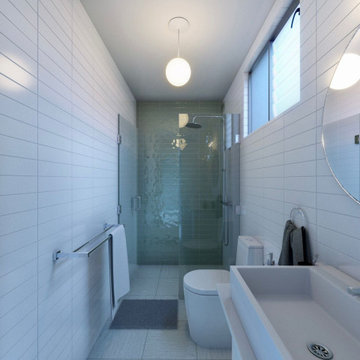
This project transformed a narrow and outdated bathroom into a bright, functional, and contemporary space. The design focused on improving spatial clarity, enhancing natural light, and creating visual continuity through a restrained material palette.
Light-toned wall tiles were used to visually expand the space, while a frameless glass shower enclosure preserves openness and allows light to flow throughout the room. Carefully selected fixtures and clean geometric forms reinforce a calm and timeless aesthetic.
The result is a bathroom that feels more spacious, coherent, and architecturally refined within the existing footprint.
Location: Oaxaca, Mexico
 JayMarc Homes
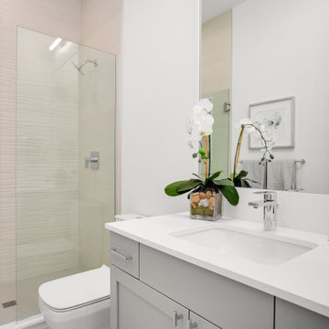
The Atwater's Guest Bathroom showcases a sophisticated and elegant design. The gray cabinets add a touch of modernity, complemented by the sleek white countertops that offer a clean and crisp look. The silver sinks and undermount sink contribute to the overall polished aesthetic. The textured white shower wall adds visual interest and texture to the space, creating a luxurious showering experience. A white toilet seamlessly blends with the rest of the design, while the silver hardware adds a touch of sophistication. Potted plants bring a refreshing and natural element to the bathroom, enhancing the overall ambiance. A large mirror reflects light and visually expands the space, making it feel more open and inviting. The combination of gray, white, and silver creates a harmonious and timeless atmosphere in the Atwater's Guest Bathroom.
 2HANDS STUDIO
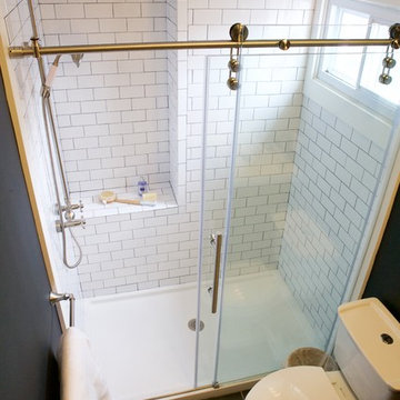
Bathroom remodel on the 1st floor unit of a late 1800's Victorian home. Exiting vanity and toilet were located where shower now resides. Relocating plumbing fixtures for better flow and more space and painting the walls in a deep navy expanded the space. Bathroom is located off of the kitchen and therefore we carried the flooring into the room to help visually expand the space.
Photography by Kristina Kosinski


 RSS Construction
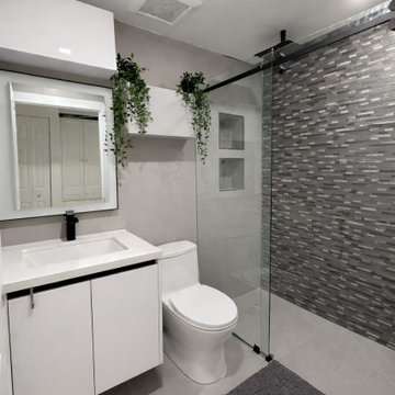
This project involved converting a dated bathtub in a small bathroom into a modern, fully waterproofed curbless shower system designed for both aesthetics and functionality.
The new walk-in shower features a seamless curbless entry, enhancing accessibility while visually expanding the footprint of the space. A full-height linear gray mosaic accent wall adds depth and texture, complemented by large-format porcelain tile throughout for a clean, cohesive look.
The shower system includes a ceiling-mounted rain head for a spa-like experience, paired with a wall-mounted handheld shower for versatility and convenience. Matte black fixtures were selected to create contrast against the neutral palette and reinforce the contemporary design language.
A floating vanity, frameless glass enclosure, and integrated wall niches complete the layout, maximizing usable space without compromising visual simplicity.
This remodel demonstrates how strategic design and precision installation can dramatically upgrade a compact bathroom into a modern, open, and highly functional environment.
 Lightology
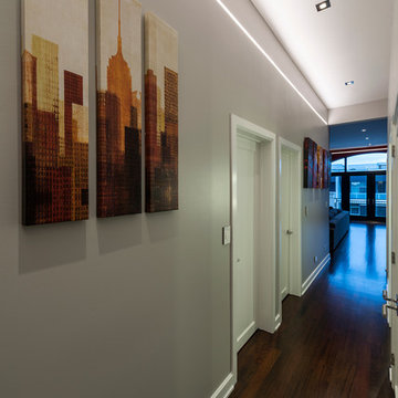
Reveal projects an indirect glow onto ceilings and floors to deliver flush mount cove and toe-kick lighting. This 24VDC linear LED system features a shallow .5 inch deep plaster-in aluminum extrusion no thicker than drywall that houses a single row of high CRI, commercial grade white LED Soft Strip. System mounts directly to studs without joist modification and plasters into .5 inch or thicker drywall. Reveal is sold in 1 foot 2.5 watt increments up to 40 feet and may be field-cut. Also available in a 5 watt per foot version as well as a Red-Blue-Green RGB version. LED Soft Strip may be cut every 2.4 inches. 2.5 watt Reveal runs up to 40 feet on a single Class 2, 96 watt power supply. Available in Amber White 2400K with 80 plus CRI, Warm White 2700K with 85 plus CRI, or Very Warm White 3000K with 85 plus CRI. LEDs consume 2.5 watts per foot and 42 lumens per system watt, delivering 116 lumens per foot for Reveal 2WDC. System includes Reveal channels, end caps, LED Soft Strip, special junction box and all mounting hardware. Power supply options include a Class 2 24 volt 0-10 96 or 192 watt, sold separately. Dimmable with a Lightolier Sunrise ZP600FAM120, Leviton IP710-DL dimmer. sold separately. Dimming systems include Lutron Radio Ra2 with Grafik Eye, RRD-10ND and GRX-TVI; Grafik Eye QS with Grafik Eye, QSGRJ-XP and GRX-TVI; Diva with Grafik Eye, DVTV and PP20; Nova T with Grafik Eye, NTFTV-WH and PP20, sold separately. Fixture includes a 5 year warranty. Made in USA.
 Bushman Dreyfus Architects
Virginia AIA Merit Award for Excellence in Residential Design | What appeared to be a simple, worn-out, early 20th century stucco cottage was to be modestly renovated as a weekend retreat. But when the contractor and architects began pulling away the interior wall finishes, they discovered a log cabin at its core (believed to date as far back as the 1780’s) and a newer addition (circa 1920’s) at the rear where the site slopes down. Initial plans were scrapped, and a new project was born that honors the original construction while accommodating new infrastructure and the clients’ modern tastes.
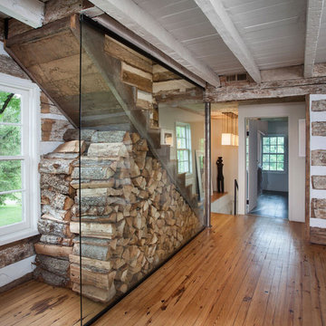
The attic stair enclosure was removed in deference to – and in order to visually expand – the original one-room log cabin. Wood floors, partially ravaged by termites, were repaired and refinished. The interventions of new steel structure, simple black iron handrail and glass stair guard provide a distinct counterpoint to the rusticity of the original construction, while the color palette of warm, natural tones harmonizes the composition.
10