
Search results for "Visually expanded" in Home Design Ideas
 Jaeger & Ernst Custom Cabinetmakers
log cabin mantel wall design
Integrated Wall 2255.1
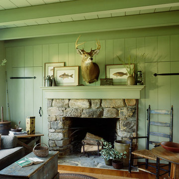
The skilled custom design cabinetmaker can help a small room with a fireplace to feel larger by simplifying details, and by limiting the number of disparate elements employed in the design. A wood storage room, and a general storage area are incorporated on either side of this fireplace, in a manner that expands, rather than interrupts, the limited wall surface. Restrained design makes the most of two storage opportunities, without disrupting the focal area of the room. The mantel is clean and a strong horizontal line helping to expand the visual width of the room.
The renovation of this small log cabin was accomplished in collaboration with architect, Bethany Puopolo. A log cabin’s aesthetic requirements are best addressed through simple design motifs. Different styles of log structures suggest different possibilities. The eastern seaboard tradition of dovetailed, square log construction, offers us cabin interiors with a different feel than typically western, round log structures.
 Change Your Bathroom©
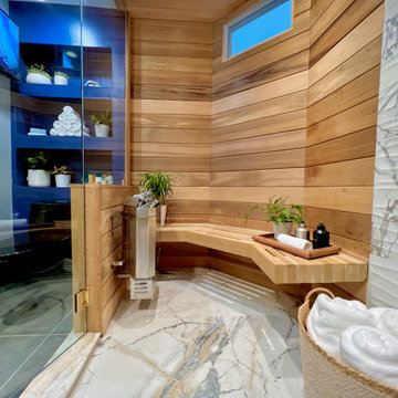
This transformation started with a builder grade bathroom and was expanded into a sauna wet room. With cedar walls and ceiling and a custom cedar bench, the sauna heats the space for a relaxing dry heat experience. The goal of this space was to create a sauna in the secondary bathroom and be as efficient as possible with the space. This bathroom transformed from a standard secondary bathroom to a ergonomic spa without impacting the functionality of the bedroom.
This project was super fun, we were working inside of a guest bedroom, to create a functional, yet expansive bathroom. We started with a standard bathroom layout and by building out into the large guest bedroom that was used as an office, we were able to create enough square footage in the bathroom without detracting from the bedroom aesthetics or function. We worked with the client on her specific requests and put all of the materials into a 3D design to visualize the new space.
Houzz Write Up: https://www.houzz.com/magazine/bathroom-of-the-week-stylish-spa-retreat-with-a-real-sauna-stsetivw-vs~168139419
The layout of the bathroom needed to change to incorporate the larger wet room/sauna. By expanding the room slightly it gave us the needed space to relocate the toilet, the vanity and the entrance to the bathroom allowing for the wet room to have the full length of the new space.
This bathroom includes a cedar sauna room that is incorporated inside of the shower, the custom cedar bench follows the curvature of the room's new layout and a window was added to allow the natural sunlight to come in from the bedroom. The aromatic properties of the cedar are delightful whether it's being used with the dry sauna heat and also when the shower is steaming the space. In the shower are matching porcelain, marble-look tiles, with architectural texture on the shower walls contrasting with the warm, smooth cedar boards. Also, by increasing the depth of the toilet wall, we were able to create useful towel storage without detracting from the room significantly.
This entire project and client was a joy to work with.
 Advance Design Studio, Ltd.
Mike and Anne of Barrington Hills desperately needed to update and renovate both their kid’s hall bath and guest bath, and in their 1980’s home each project presented a different set of unique challenges to overcome. When they set out to identify the right remodeling company to partner with, it was important to find a company that could help them to visualize design solutions for the bath renovations. When they came across Advance Design Studio’s website, they were immediately drawn to the solution-oriented remodeling process and the family friendly company.
They say they chose Advance Design because of the integrated approach of “Common Sense Remodeling”, making the design, project management and construction all happen in one place. When they met with Project Designer Michelle Lecinski, they knew they chose the right company. “Michelle’s excellent work on the initial designs made it easy to proceed with Advance Design Studio,” Mike said.
Like most homeowners anticipating a big renovation project, they had some healthy fears; with two bathrooms being remodeled at the same time they worried about timeframes and staying within budget. With the help of Michelle, and the “Common Sense” guidelines, they were confident that Advance Design would stay true, orchestrating all the moving parts to stay within both the estimated timeline and budget.
The guest bath offered the biggest design challenge. A dormer obstruction made the already cramped shower awkward to access. Mike and Anne also wanted the shower size to be expanded, making it more accommodating. Working with Advance’s construction expert DJ Yurik, Michelle relocated the shower concealing the original dormer and creating a larger, more comfortable and aesthetically pleasing guest shower.
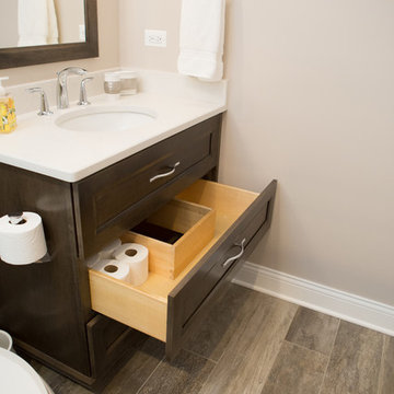
The unsightly and not at all user-friendly closet was removed and replaced with elegant White Maple Dura Supreme cabinetry with much improved function featuring dual tall linen cabinets, a special makeup area and two sinks, providing a dual vanity which was extremely important for better guest use.
The Fossil Brown quartz countertop is in pleasing contrast to the white cabinetry, and coordinates nicely with the mocha porcelain tile gracing the shower for an accent. The decorative glazed turquoise tile backsplash, tile border, and bottle niche adds a taste of marine green to the room, while marble-looking porcelain tile makes guests feel they are staying in a 5-star hotel. Polished nickel Kohler plumbing fixtures were chosen to add a touch of sophistication. This renovated guest bath is comfortable and elegant, and Anne and Mike’s house guests may never want to leave!
“The end result was updated and restyled bathrooms that the client will enjoy and increase the value of their home,” Designer Michelle said.
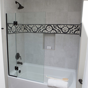
The children’s hall bath had its own set of challenges. The current placement of the sink was not conducive to the best use of the existing space, nor did it allow for any visual interest, something Advance’s designers always work to achieve even within the tight confines of a small bath. Advance removed the linen closet and used the gain in wall space to create a dramatic focal point on the vanity wall. They also took additional space that wasn’t being used for new Storm Gray Dura Supreme tall built-in linen cabinets, creating functional storage space that the former bath lacked. A customized glass splash panel was created for the bath, and the high ceilings with skylights were accented with a custom-made track lighting fixture featuring industrial pipe and cage materials.
Authentic cement encaustic tile was used wall to wall surrounding the vanity to create a dramatic and interesting back drop for the new elegant and stately furniture-like double sink wall. Hand-made encaustic tile originated in Western Europe beginning in the 1850’s and reminded Mike and Anne of tile they had seen and loved from their travels overseas. Today, encaustic tile has made a re-appearance in today’s modern bath design with its wide array of appealing patterns and artistic use of color.
Oil rubbed bronze Kohler fixtures echo the black accents in the beautiful tile pattern and reflect the matte black of the unique lighting detail. Easy to maintain Blanca Arabescato Quartz countertops add practicality and natural beauty and compliments the warm wood porcelain tile floors. This handsome bath has generated praise from friends and family even before it’s complete unveiling as photos of the space leaked out on social media! It’s not only completely functional to use, but especially pretty to look at.
“Advance Design Studio did a terrific job for us. We really appreciated how easy it was to work with them on a complex project of the complete remodeling of two bathrooms. They very capably handled all the details from design, to project management, to construction. It is a great group of people to work with and we would welcome the opportunity to work with them again anytime,” Mike said.
Find the right local pro for your project
 Jennifer Grey Interiors Design & Color Specialist
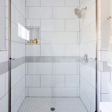
To maximize the look of this fairly compact bathroom, we added large white 12x24 rectangular wall tile in the shower to expand the space visually, with an added band of vintage style penny tile fully wrapping around and inside the shower, in effort of creating the look of a larger space. For the shampoo niche, hex tile was added for visual contrast, which is also repeated on the shower floor.
Photography by Amy Bartlam
 TVL Creative Ltd.
This 1910 West Highlands home was so compartmentalized that you couldn't help to notice you were constantly entering a new room every 8-10 feet. There was also a 500 SF addition put on the back of the home to accommodate a living room, 3/4 bath, laundry room and back foyer - 350 SF of that was for the living room. Needless to say, the house needed to be gutted and replanned.
Kitchen+Dining+Laundry-Like most of these early 1900's homes, the kitchen was not the heartbeat of the home like they are today. This kitchen was tucked away in the back and smaller than any other social rooms in the house. We knocked out the walls of the dining room to expand and created an open floor plan suitable for any type of gathering. As a nod to the history of the home, we used butcherblock for all the countertops and shelving which was accented by tones of brass, dusty blues and light-warm greys. This room had no storage before so creating ample storage and a variety of storage types was a critical ask for the client. One of my favorite details is the blue crown that draws from one end of the space to the other, accenting a ceiling that was otherwise forgotten.
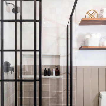
Primary Bath-This did not exist prior to the remodel and the client wanted a more neutral space with strong visual details. We split the walls in half with a datum line that transitions from penny gap molding to the tile in the shower. To provide some more visual drama, we did a chevron tile arrangement on the floor, gridded the shower enclosure for some deep contrast an array of brass and quartz to elevate the finishes.
Powder Bath-This is always a fun place to let your vision get out of the box a bit. All the elements were familiar to the space but modernized and more playful. The floor has a wood look tile in a herringbone arrangement, a navy vanity, gold fixtures that are all servants to the star of the room - the blue and white deco wall tile behind the vanity.
Full Bath-This was a quirky little bathroom that you'd always keep the door closed when guests are over. Now we have brought the blue tones into the space and accented it with bronze fixtures and a playful southwestern floor tile.
Living Room & Office-This room was too big for its own good and now serves multiple purposes. We condensed the space to provide a living area for the whole family plus other guests and left enough room to explain the space with floor cushions. The office was a bonus to the project as it provided privacy to a room that otherwise had none before.
 TVL Creative Ltd.
This 1910 West Highlands home was so compartmentalized that you couldn't help to notice you were constantly entering a new room every 8-10 feet. There was also a 500 SF addition put on the back of the home to accommodate a living room, 3/4 bath, laundry room and back foyer - 350 SF of that was for the living room. Needless to say, the house needed to be gutted and replanned.
Kitchen+Dining+Laundry-Like most of these early 1900's homes, the kitchen was not the heartbeat of the home like they are today. This kitchen was tucked away in the back and smaller than any other social rooms in the house. We knocked out the walls of the dining room to expand and created an open floor plan suitable for any type of gathering. As a nod to the history of the home, we used butcherblock for all the countertops and shelving which was accented by tones of brass, dusty blues and light-warm greys. This room had no storage before so creating ample storage and a variety of storage types was a critical ask for the client. One of my favorite details is the blue crown that draws from one end of the space to the other, accenting a ceiling that was otherwise forgotten.
Primary Bath-This did not exist prior to the remodel and the client wanted a more neutral space with strong visual details. We split the walls in half with a datum line that transitions from penny gap molding to the tile in the shower. To provide some more visual drama, we did a chevron tile arrangement on the floor, gridded the shower enclosure for some deep contrast an array of brass and quartz to elevate the finishes.
Powder Bath-This is always a fun place to let your vision get out of the box a bit. All the elements were familiar to the space but modernized and more playful. The floor has a wood look tile in a herringbone arrangement, a navy vanity, gold fixtures that are all servants to the star of the room - the blue and white deco wall tile behind the vanity.
Full Bath-This was a quirky little bathroom that you'd always keep the door closed when guests are over. Now we have brought the blue tones into the space and accented it with bronze fixtures and a playful southwestern floor tile.
Living Room & Office-This room was too big for its own good and now serves multiple purposes. We condensed the space to provide a living area for the whole family plus other guests and left enough room to explain the space with floor cushions. The office was a bonus to the project as it provided privacy to a room that otherwise had none before.
 Altura Architects
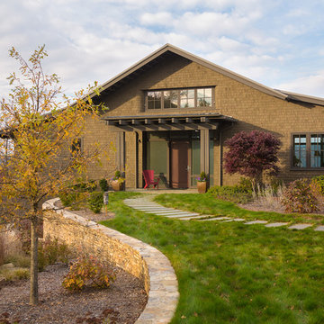
Tucked into a hillside, this mountain modern house looks to blend in with its surroundings and take advantage of spectacular mountain views. Outdoor terraces and porches connect and expand the living areas to the landscape, while thoughtful placement of windows provide a visual connection to the outdoors. The home’s green building features include solar hot water panels, rainwater cisterns, high-efficiency insulation and FSC certified cedar shingles and interior doors. The home is Energy Star and GreenBuilt NC certified.

Sponsored
Columbus, OH

Snider & Metcalf Interior Design, LTD
Leading Interior Designers in Columbus, Ohio & Ponte Vedra, Florida
 Ann Lowengart Interiors
The three-level Mediterranean revival home started as a 1930s summer cottage that expanded downward and upward over time. We used a clean, crisp white wall plaster with bronze hardware throughout the interiors to give the house continuity. A neutral color palette and minimalist furnishings create a sense of calm restraint. Subtle and nuanced textures and variations in tints add visual interest. The stair risers from the living room to the primary suite are hand-painted terra cotta tile in gray and off-white. We used the same tile resource in the kitchen for the island's toe kick.
 TVL Creative Ltd.
This 1910 West Highlands home was so compartmentalized that you couldn't help to notice you were constantly entering a new room every 8-10 feet. There was also a 500 SF addition put on the back of the home to accommodate a living room, 3/4 bath, laundry room and back foyer - 350 SF of that was for the living room. Needless to say, the house needed to be gutted and replanned.
Kitchen+Dining+Laundry-Like most of these early 1900's homes, the kitchen was not the heartbeat of the home like they are today. This kitchen was tucked away in the back and smaller than any other social rooms in the house. We knocked out the walls of the dining room to expand and created an open floor plan suitable for any type of gathering. As a nod to the history of the home, we used butcherblock for all the countertops and shelving which was accented by tones of brass, dusty blues and light-warm greys. This room had no storage before so creating ample storage and a variety of storage types was a critical ask for the client. One of my favorite details is the blue crown that draws from one end of the space to the other, accenting a ceiling that was otherwise forgotten.
Primary Bath-This did not exist prior to the remodel and the client wanted a more neutral space with strong visual details. We split the walls in half with a datum line that transitions from penny gap molding to the tile in the shower. To provide some more visual drama, we did a chevron tile arrangement on the floor, gridded the shower enclosure for some deep contrast an array of brass and quartz to elevate the finishes.
Powder Bath-This is always a fun place to let your vision get out of the box a bit. All the elements were familiar to the space but modernized and more playful. The floor has a wood look tile in a herringbone arrangement, a navy vanity, gold fixtures that are all servants to the star of the room - the blue and white deco wall tile behind the vanity.
Full Bath-This was a quirky little bathroom that you'd always keep the door closed when guests are over. Now we have brought the blue tones into the space and accented it with bronze fixtures and a playful southwestern floor tile.
Living Room & Office-This room was too big for its own good and now serves multiple purposes. We condensed the space to provide a living area for the whole family plus other guests and left enough room to explain the space with floor cushions. The office was a bonus to the project as it provided privacy to a room that otherwise had none before.
 StoneUnlimited Kitchen and Bath Remodeling
When deciding to either keep a tub and shower or take out the tub and expand the shower in the master bathroom is solely dependent on a homeowner's preference. Although having a tub in the master bathroom is still a desired feature for home buyer's, especially for those who have or are excepting children, there's no definitive proof that having a tub is going to guarantee a higher rate of return on the investment.
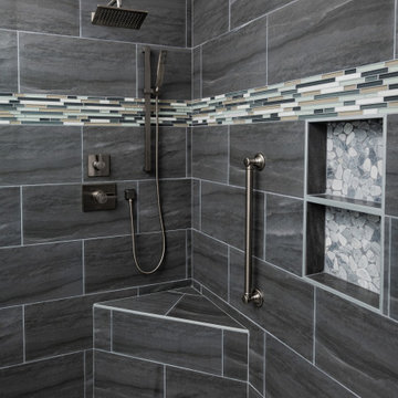
This chic and modern shower is easily accessible. The expanded room provides the ability to move around freely without constraint and makes showering more welcoming and relaxing. This shower is a great addition and can be highly beneficial in the future to any individuals who are elderly, wheelchair bound or have mobility impairments. Fixtures and furnishings such as the grab bar, a bench and hand shower also makes the shower more user friendly.
The decision to take out the tub and make the shower larger has visually transformed this master bathroom and created a spacious feel. The shower is a wonderful upgrade and has added value and style to our client's beautiful home.
Check out the before and after photographs as well as the video!
Here are some of the materials that were used for this transformation:
12x24 Porcelain Lara Dark Grey
6" Shower band of Keystone Interlocking Mosaic Tile
Delta fixtures throughout
Ranier Quartz vanity countertops
 J. Stephens Interiors
Hamptons-Inspired Kitchen
One cannot help but feel a distinct sense of serenity and timeless beauty when entering this Hamptons-style kitchen. Bathed in natural light and shimmering with inspired accents and details, this complete kitchen transformation is at once elegant and inviting. Plans and elevations were conceived to create balance and function without sacrificing harmony and visual intrigue.
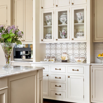
A metal custom hood, with an eye-catching brass band and impeccably balanced cabinets on either side, provides a strong focal point for the kitchen, which can be viewed from the adjacent living room. Brass faucets, hardware and light fixtures complement and draw further attention to this anchoring element. A wall of glass cabinetry enhances the existing windows and pleasantly expands the sense of openness in the space.
Taj Mahal quartzite blends gracefully with the cabinet finishes. Cream-tone, herringbone tiles are custom-cut into different patterns to create a sense of visual movement as the eyes move across the room. An elegant, marble-top island paired with sumptuous, leather-covered stools, not only offers extra counterspace, but also an ideal gathering place for loved ones to enjoy.
This unforgettable kitchen gem shines even brighter with the addition of glass cabinets, designed to display the client’s collection of Portmeirion china. Careful consideration was given to the selection of stone for the countertops, as well as the color of paint for the cabinets, to highlight this inspiring collection.
Breakfast room
A thoughtfully blended mix of furniture styles introduces a splash of European charm to this Hamptons-style kitchen, with French, cane-back chairs providing a sense of airy elegance and delight.
A performance velvet adorns the banquette, which is piled high with lush cushions for optimal comfort while lounging in the room. Another layer of texture is achieved with a wool area rug that defines and accentuates this gorgeous breakfast nook with sprawling views of the outdoors.
Finishing features include drapery fabric and Brunschwig and Fils Bird and Thistle paper, whose natural, botanic pattern combines with the beautiful vistas of the backyard to inspire a sense of being in a botanical, outdoor wonderland.
 Advance Design Studio, Ltd.
Mike and Michelle of Lake Barrington knew they needed extra space. Their home was becoming too crowded for their family with blossoming teenagers, so a basement renovation offered the perfect solution for more space for the kids and more room to entertain for the adults.
“Our project consisted of expanding our laundry room, putting in a first floor wet bar so we had adult space upstairs, while also renovating our basement for a family-friendly and teen-functional area as well,” Michelle says.
They found Advance Design Studio through a neighbor who gave a glowing recommendation, giving Michelle and Mike the confidence they needed to move forward with a major home renovation. They felt like they knew Advance Design before they even worked together. When they met with the owner Todd Jurs and designer Nicole Ryan, Mike and Michelle knew they were getting a trustworthy, dependable team that could create the project they had been dreaming about for 7 years.
Having virtually no natural light to work with, one of the biggest design challenges was creating a basement that did not feel dark and depressing. The Advance team got to work creating architectural archways and custom detailed dry-stack stone columns artfully designed into the space, adding a dramatic element that made the space feel less like a basement or more like a relaxing family room. Color 3D renderings were created to portray what the space would look like so Mike and Michelle could visualize the space in advance.
Detailed trim and crown moldings grace the built in buffet and wet bar making for an amazingly functional space that lacks nothing in style and visual interest. Cherry wood cabinetry by Dura Supreme is featured in the space with a “Cocoa Brown” finish and includes beautiful mirrored glass doors embellished with unique elliptical mullion details. A built-in microwave, dishwasher and mini fridge add practicality to the ample entertainment mecca. An under mounted sink finishes the space joined with a intricate mosaic tile backsplash and “Ventisca Polished” quartz countertops.
The basement is absolutely perfect for hosting friends and family with expertly designed key areas such as a game space for the kids, a movie area for the family, an ample workout room with luxurious full bath, and even built in wine storage. The family absolutely loves the new basement living space, and has already enjoyed numerous family movie nights and sleep-overs with friends.
While custom cabinets made by Dura Supreme were used to create unique spaces that lived up to Mike and Michelle’s expectations., heated flooring under the 16”x16” “Mongolian Spring” tile was installed giving all tiled areas of the basement a much cozier feel, eliminating that cold hard surface most of us hate in our basements!
The new basement must-have requirement list included a new bath space, which was incorporated adjacent to the work out room. The sleek shower door and cabinets in the new bathroom make guests and family feel like they are in an elegant hotel. The new guest bath features 4”x36” “Silver Screen” honed marble tile in a brick pattern on the shower walls and 2”x2” “Chenille” limestone tile in a hexagon mosaic pattern on the shower floor.
“I came in with very specific requirements for our three project areas,” Michelle says. “There was not one time that I felt like I was asking for something that was not going to turn out how I anticipated.”
Tying in multiple rooms during a renovation if you have can do it makes a lot of sense and saves money in the long run. A fully functional laundry room as well was a must on this family’s wish list. Michelle wanted to add space to the existing cramped and awkward laundry room, and Mike wanted to make sure they could still park a car in the garage. Reconfiguring interior walls required borrowing unused space cleverly from the garage in order to enlarge the laundry room space.
Drawers under the stairs added beautiful hidden storage created almost magically out of dead space. White painted Dura Supreme cabinets bring additional light into the small space; while the 16”x16” cleft slate tile flooring provides excellent contrast and the naturally earthy feel Michelle wanted. Quartz countertops with a 3”x12” “Debut Dew” subway tile backsplash add elegance to the now upliftingly bright laundry room.
The extra space makes doing laundry much more pleasurable and the added storage is a great for all those little things like winter hats and gloves, umbrellas and the like. “The Advance Design project team was phenomenal to work with,” Michelle says. “They came in, shared the plans with us and walked us through the expectations. We always knew what was coming next.”
Converting an existing closet space, the wet bar upstairs was challenging because they wanted a functional area that didn’t look or feel like cabinets just sticking out of a closet. So the Advance team transformed this ordinary closet space into a stunning wet bar that architecturally appears as if it’s always been there. Traditional, elegant hand carved custom molding matching the adjacent fireplace ties the new entertainment bar area in nicely with the existing family room and kitchen area.
Featuring a built in wine refrigerator, Dura Supreme cabinetry in deep cherry wood elegantly displays wine bottles and etched glass mullion doors that fill with soft light in the evening hours. Cambria “Windermere” quartz countertops with a sophisticated hammered copper sink and a glimmering backsplash round out the stunning wet bar. Hosting parties and family functions has become much more enjoyable now that they have a dedicated beverage serving area large enough to include hors devours.
All three projects were designed and constructed together at the same time, making for a cohesive project that was administered smoothly and easily both for the design team and for the family. Disruption to the home was minimal as each phase was completed in each project conclusively, and design and meeting time for the homeowner was efficient and organized making for an enjoyable process.
“Advance Design was great to work with,” Michelle says. “I would highly recommend them to anyone considering a home improvement project. They took the time at the beginning to understand our needs, our budget, and our vision for our home. The field team was great, attentive, on time, cleaned up each day and made the overall experience very positive. We couldn't be happier with the finished product.”
With the help of our talented, award winning design team you can create the basement, laundry room, or any other home renovation that you have been dreaming of. With our “Common Sense Remodeling” approach, the process of renovating you home has never been easier. Contact us today at 847-836-2600 or schedule an appointment to talk with us about that kitchen remodeling project.
Joe Nowak
 Spire North
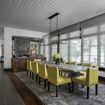
Tucked away in the backwoods of Torch Lake, this home marries “rustic” with the sleek elegance of modern. The combination of wood, stone and metal textures embrace the charm of a classic farmhouse. Although this is not your average farmhouse. The home is outfitted with a high performing system that seamlessly works with the design and architecture.
The tall ceilings and windows allow ample natural light into the main room. Spire Integrated Systems installed Lutron QS Wireless motorized shades paired with Hartmann & Forbes windowcovers to offer privacy and block harsh light. The custom 18′ windowcover’s woven natural fabric complements the organic esthetics of the room. The shades are artfully concealed in the millwork when not in use.
Spire installed B&W in-ceiling speakers and Sonance invisible in-wall speakers to deliver ambient music that emanates throughout the space with no visual footprint. Spire also installed a Sonance Landscape Audio System so the homeowner can enjoy music outside.
Each system is easily controlled using Savant. Spire personalized the settings to the homeowner’s preference making controlling the home efficient and convenient.


 Lorin Hill, Architect
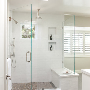
A traditional home in the Claremont Hills of Berkeley is enlarged and fully renovated to fit the lives of a young couple and their growing family. The existing partial upper floor was fully expanded to create three additional bedrooms, a hall bath, laundry room and updated master suite, with the intention that the expanded house volume harmoniously integrates with the architectural character of the existing home. A new central staircase brings in a tremendous amount of daylight to the heart of the ground floor while also providing a strong visual connection between the floors. The new stair includes access to an expanded basement level with storage and recreation spaces for the family. Main level spaces were also extensively upgraded with the help of noted San Francisco interior designer Grant K. Gibson. Photos by Kathryn MacDonald.
 TVL Creative Ltd.
This 1910 West Highlands home was so compartmentalized that you couldn't help to notice you were constantly entering a new room every 8-10 feet. There was also a 500 SF addition put on the back of the home to accommodate a living room, 3/4 bath, laundry room and back foyer - 350 SF of that was for the living room. Needless to say, the house needed to be gutted and replanned.
Kitchen+Dining+Laundry-Like most of these early 1900's homes, the kitchen was not the heartbeat of the home like they are today. This kitchen was tucked away in the back and smaller than any other social rooms in the house. We knocked out the walls of the dining room to expand and created an open floor plan suitable for any type of gathering. As a nod to the history of the home, we used butcherblock for all the countertops and shelving which was accented by tones of brass, dusty blues and light-warm greys. This room had no storage before so creating ample storage and a variety of storage types was a critical ask for the client. One of my favorite details is the blue crown that draws from one end of the space to the other, accenting a ceiling that was otherwise forgotten.
Primary Bath-This did not exist prior to the remodel and the client wanted a more neutral space with strong visual details. We split the walls in half with a datum line that transitions from penny gap molding to the tile in the shower. To provide some more visual drama, we did a chevron tile arrangement on the floor, gridded the shower enclosure for some deep contrast an array of brass and quartz to elevate the finishes.
Powder Bath-This is always a fun place to let your vision get out of the box a bit. All the elements were familiar to the space but modernized and more playful. The floor has a wood look tile in a herringbone arrangement, a navy vanity, gold fixtures that are all servants to the star of the room - the blue and white deco wall tile behind the vanity.
Full Bath-This was a quirky little bathroom that you'd always keep the door closed when guests are over. Now we have brought the blue tones into the space and accented it with bronze fixtures and a playful southwestern floor tile.
Living Room & Office-This room was too big for its own good and now serves multiple purposes. We condensed the space to provide a living area for the whole family plus other guests and left enough room to explain the space with floor cushions. The office was a bonus to the project as it provided privacy to a room that otherwise had none before.
 Change Your Bathroom©
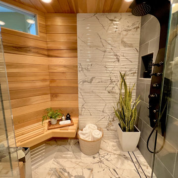
This transformation started with a builder grade bathroom and was expanded into a sauna wet room. With cedar walls and ceiling and a custom cedar bench, the sauna heats the space for a relaxing dry heat experience. The goal of this space was to create a sauna in the secondary bathroom and be as efficient as possible with the space. This bathroom transformed from a standard secondary bathroom to a ergonomic spa without impacting the functionality of the bedroom.
This project was super fun, we were working inside of a guest bedroom, to create a functional, yet expansive bathroom. We started with a standard bathroom layout and by building out into the large guest bedroom that was used as an office, we were able to create enough square footage in the bathroom without detracting from the bedroom aesthetics or function. We worked with the client on her specific requests and put all of the materials into a 3D design to visualize the new space.
Houzz Write Up: https://www.houzz.com/magazine/bathroom-of-the-week-stylish-spa-retreat-with-a-real-sauna-stsetivw-vs~168139419
The layout of the bathroom needed to change to incorporate the larger wet room/sauna. By expanding the room slightly it gave us the needed space to relocate the toilet, the vanity and the entrance to the bathroom allowing for the wet room to have the full length of the new space.
This bathroom includes a cedar sauna room that is incorporated inside of the shower, the custom cedar bench follows the curvature of the room's new layout and a window was added to allow the natural sunlight to come in from the bedroom. The aromatic properties of the cedar are delightful whether it's being used with the dry sauna heat and also when the shower is steaming the space. In the shower are matching porcelain, marble-look tiles, with architectural texture on the shower walls contrasting with the warm, smooth cedar boards. Also, by increasing the depth of the toilet wall, we were able to create useful towel storage without detracting from the room significantly.
This entire project and client was a joy to work with.
 Randy Angell Designs
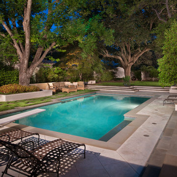
The subtle changes begin as soon as you walk out the back door of the house. The existing decking had a lot of what we call "tweeners"; areas that are overly generous walkways, yet not large enough to house furniture. The awkwardly small bluestone patio was expanded to accommodate a generous seating area. This was done by pushing the step-down closer to the pool.
Our talented stone mason carefully married the new bluestone into the existing portion of the patio, resulting in an imperceptible difference between the two.
As you descend the new bluestone steps to the pool level, your bare feet will be thankful for the new smooth-finished, limestone-colored concrete, with a hand cut pattern carefully etched into it's surface.
The old red brick decking was so hot that the owners could not walk around the pool with their bare feet. The brick coping was also replaced with an eased edge, Pennsylvania Premier Stone which matches the new step treads throughout the project.
Between the house and the pool, a large raised planter was reconfigured, giving additional space to the pool deck for a shaded lounge chair area. Across the pool, a bank of rather tall painted brick retaining walls were cut down, shortened and moved. This lessened the visual impact of the walls (which were overwhelming in the space) and also opened up a new seating area, nestled under the arms of the massive Pecan tree at the back of the property.
Rather than continuing solid decking around the entire pool, the area near these walls has been transformed to large stone stepper pads set in a sea of beautiful St. Augustine lawn. This creates a visually softened area that is still suited to setting tables and chairs when the guest list calls for additional seating.
The spa area is possibly the most dramatic change on this project. Yet more raised planter walls divided this area into awkward spaces, unsuited for proper furniture placement. The planters were removed, new stone decks added, and once again expertly married into the existing decks, opening the area to house a large dining table and a newly built-in BBQ area.
The spa itself was re-imagined with the bluestone coping and painted brick veneer. The most impressive addition though is the new handmade glazed tiles that surround the existing cast stone water feature. This water feature was almost unnoticeable against the painted brick wall, but now the dramatic arch and pop of color draw the eye to this quaint little corner of the property.
Originally designed by one of the most notable landscape architects in town, this once impressive project had faltered in recent years. The pool and spa still functioned well, and the client wanted to keep it intact. In addition, they wanted to keep as much of the existing landscape as possible. But, the surrounding decks, walls and steps were fair game.
At first glance, one might think that our changes were simple material changes. However, upon closer inspection, one can see the subtle-yet-transformative changes that came together to update this classic pool in a tasteful, timeless manner, as well as to improve the flow and usability of the deck areas, while softening the feel of this massive hardscape.


 Pool Environments, Inc.
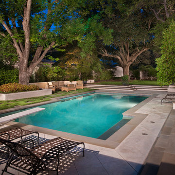
Originally designed by one of the most notable landscape architects in town, this once impressive project had faltered in recent years. The pool and spa still functioned well, and the client wanted to keep it intact. In addition, they wanted to keep as much of the existing landscaping as possible. The surrounding decks, walls, and steps were fair game. At first glance, one might think that our changes were simple material changes. Upon closer inspection, however, one can see the subtle, yet transformative changes that come together to update this classic pool in a tasteful, timeless manner, and improve the flow and usability of the deck areas, while softening the feel of the massive hardscape.
The subtle changes begin as soon as you walk out the back door of the house. The existing decking had a lot of what we call “tweeners”; areas that are overly generous walkways, yet not large enough to house furniture. The awkwardly small bluestone patio was expanded to accommodate a generous seating area, by pushing the step-down closer to the pool. Our talented stone mason carefully married the new bluestone into the existing, resulting in an imperceptible difference between the two. As you descend the new bluestone steps to the pool level, your bare feet will be thankful for the new smooth-finished limestone colored concrete, with a hand cut pattern carefully etched into its surface. The old red brick decking was so hot that the owners could not walk around the pool in bare feet. The brick coping was also replaced with an eased edge Pennsylvania Premier Stone which matches the new step treads throughout the project. Between the house and the pool, a large raised planter was reconfigured, giving additional space to the pool deck for a shaded lounge chair area.
Across the pool, a bank of rather tall painted brick retaining walls were cut down, shortened, and moved. This lessened the visual impact of the walls, which were rather overwhelming in the space, as well as opening up a new seating area, nestled under the arms of the massive pecan at the back of the property. Rather than continuing solid decking around the entire pool, the area near these walls has been transformed to large stone stepper pads set in a sea of beautiful St. Augustine lawn. This creates a visually softened area that is still suited to setting tables and chairs when the guest list calls for additional seating.
The spa area is quite possibly the most dramatic change on this project. Yet more raised planter walls divided this area into awkward spaces, unsuited to proper furniture placement. The planters were removed, new stone decks, once again expertly married into the existing, opening the area to house a large dining table and new built in bbq area. The spa itself was re-imagined with the bluestone coping, and painted brick veneer. The most impressive addition though is the new handmade glazed tiles that surround the existing cast stone water feature. This water feature was almost unnoticeable against the painted brick wall, but now the dramatic arch and pop of color draw the eye to this quaint little corner of the property.
 TVL Creative Ltd.
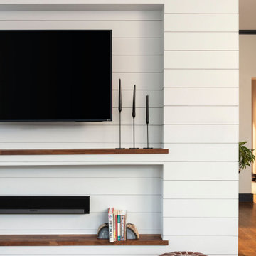
This 1910 West Highlands home was so compartmentalized that you couldn't help to notice you were constantly entering a new room every 8-10 feet. There was also a 500 SF addition put on the back of the home to accommodate a living room, 3/4 bath, laundry room and back foyer - 350 SF of that was for the living room. Needless to say, the house needed to be gutted and replanned.
Kitchen+Dining+Laundry-Like most of these early 1900's homes, the kitchen was not the heartbeat of the home like they are today. This kitchen was tucked away in the back and smaller than any other social rooms in the house. We knocked out the walls of the dining room to expand and created an open floor plan suitable for any type of gathering. As a nod to the history of the home, we used butcherblock for all the countertops and shelving which was accented by tones of brass, dusty blues and light-warm greys. This room had no storage before so creating ample storage and a variety of storage types was a critical ask for the client. One of my favorite details is the blue crown that draws from one end of the space to the other, accenting a ceiling that was otherwise forgotten.
Primary Bath-This did not exist prior to the remodel and the client wanted a more neutral space with strong visual details. We split the walls in half with a datum line that transitions from penny gap molding to the tile in the shower. To provide some more visual drama, we did a chevron tile arrangement on the floor, gridded the shower enclosure for some deep contrast an array of brass and quartz to elevate the finishes.
Powder Bath-This is always a fun place to let your vision get out of the box a bit. All the elements were familiar to the space but modernized and more playful. The floor has a wood look tile in a herringbone arrangement, a navy vanity, gold fixtures that are all servants to the star of the room - the blue and white deco wall tile behind the vanity.
Full Bath-This was a quirky little bathroom that you'd always keep the door closed when guests are over. Now we have brought the blue tones into the space and accented it with bronze fixtures and a playful southwestern floor tile.
Living Room & Office-This room was too big for its own good and now serves multiple purposes. We condensed the space to provide a living area for the whole family plus other guests and left enough room to explain the space with floor cushions. The office was a bonus to the project as it provided privacy to a room that otherwise had none before.
 LiLu Interiors
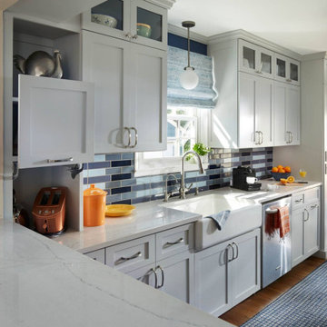
When LiLu was called on by a long-time client to help remodel her kitchen in a charming 1930s St. Paul home, the Design Team knew the space needed to be expanded, lightened, and brightened. First they removed the wall separating the kitchen and dining room. A breakfast bar was added and the window seat was refreshed to offer more inviting places for people to mingle. Crown molding and recessed lighting were installed to create visual height. All the cabinets were painted a light gray, with bold pops of blue, orange, and even some indigo throughout. And yet what makes this kitchen a perfect fit for our home cook client are the storage spaces unique positioned throughout. From shelving above that houses our client’s many cookbooks, to the custom cabinets that hideaway appliances and cookware alike, every detail was considered when making this kitchen both useful and unique.
-----
Project designed by Minneapolis interior design studio LiLu Interiors. They serve the Minneapolis-St. Paul area including Wayzata, Edina, and Rochester, and they travel to the far-flung destinations that their upscale clientele own second homes in.
------
For more about LiLu Interiors, click here: https://www.liluinteriors.com/
----
To learn more about this project, click here:
https://www.liluinteriors.com/blog/portfolio-items/culinary-delight/
37