
Search results for "Visually expanded" in Home Design Ideas
 Whitefish Architecture
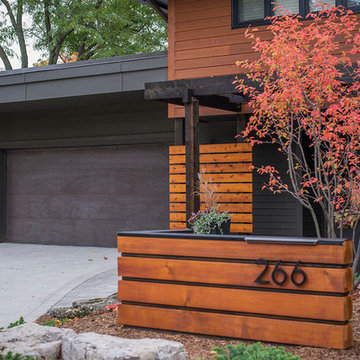
This garage addition and rehabilitation of a mid century modern home expands and enhances the original while respecting the scale and low, linear feel.
All exterior finishes are updated with the exception of the stone. A new entrance creates layers of screening to invite inquiry as well as create privacy and a sense of place. The garage is downplayed with dark materials to allow it to recede relative to the main house, which is deliberately brighter, warmer, and varied to remain the visual focus.
Lead Designer - Alex Jenkins
Designer - Valerie Wright
Photography - Steve Edgar
 DSC DesignWorks
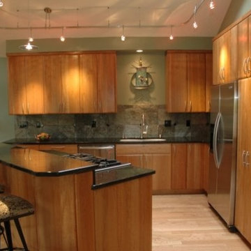
 This thirty year old duplex was awkwardly designed from in'ts conception. Initially divided into many smaller spaces, we opened the kitchen up into the family room and visually, as well as functionally, expanded the size of the house. The kitchen and the entertainment center were build with solid cherry faces and plenty of room for storage.
 CHRISTOPHER STROM ARCHITECTS
Sommerhus is a private retreat for two empty-nesters. The clients purchased the previous cabin after falling in love with its location on a private, lakefront peninsula. However, this beautiful site was a challenging site to build on, due to its position sandwiched between the lake and protected wet land. The clients disliked the old cabin because it could only be used in the summer months, due to its lack of both insulation and heat. In addition, it was too small for their needs. They wanted to build a new, larger retreat, but were met with yet another constraint: the new cabin would be limited to the previous cabin’s small footprint. Thus, they decided to approach an architect to design their dream cabin.
As the clients described, “We visited Denmark for a family wedding in 2015, and while biking near Gilleleje, a fishing village on the Baltic Sea, we fell in love with the aesthetic of ‘Sommerhus’: dark exteriors, clean, simple lines, and lots of windows.” We set out to design a cabin that fit this aesthetic while also meeting the site’s constraints.
The clients were committed to keeping all existing trees on their site. In addition, zoning codes required the new retreat to stay within the previous cabin's small footprint. Thus, to maximize the square footage of the cabin without removing trees or expanding the footprint, the new structure had to grow vertically. At the same time, the clients wanted to be good neighbors. To them, this meant that their cabin should disappear into the woods, especially when viewed from the lake. To accomplish both these requests, the architect selected a dark exterior metal façade that would visually retreat into the trees. The metal siding is a modern, low-maintenance, and cost-effective solution, especially when compared to traditional wood siding. Warm wood on the soffits of the large roof overhang contrast with the metal siding. Sommerhus's resulting exterior is just as the clients’ requested: boldly modern yet respectful of the serene surroundings.
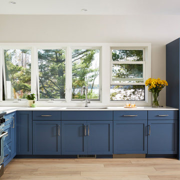
The homeowners desired a beach-house-inspired interior, full of light and warmth, in contrast to the dark exterior. As the homeowner explained, “I wanted it to feel like a porch inside.” To achieve this, the living room has two walls of sliding glass doors that connect to the wrap-around porch. This creates a beautiful, indoor-outdoor living space. The crisp and bright kitchen also connects to the porch with the window that opens to an outdoor counter - perfect for passing food and drinks to those lounging on the porch. The kitchen is open to the rest of the first-floor entertaining space, and brings a playful, beach-house feel to the cabin.
After the completion of the project, the homeowners remarked, “Working with Christopher and Eric [of CSA] was a wonderful experience. We absolutely love our home, and each season on the lake is more special than the last.”
Find the right local pro for your project
 Ann Lowengart Interiors
The three-level Mediterranean revival home started as a 1930s summer cottage that expanded downward and upward over time. We used a clean, crisp white wall plaster with bronze hardware throughout the interiors to give the house continuity. A neutral color palette and minimalist furnishings create a sense of calm restraint. Subtle and nuanced textures and variations in tints add visual interest. The stair risers from the living room to the primary suite are hand-painted terra cotta tile in gray and off-white. We used the same tile resource in the kitchen for the island's toe kick.
 BC&J Architecture
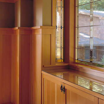
The 2,800 square foot Rockaway Beach Residence is a significant remodel and addition to a small beach cottage built in the 1920’s. The owner’s desire for the building was to maintain a visual connection to the water and Seattle beyond and expand upon the nature of the shingled cottages found along the water’s edge in Puget Sound in the early part of the 20th century.
The two bedroom house includes daytime living spaces on the ground level including a sunroom where one can view both Mt. Baker and Mt. Rainier on a clear day. The second floor includes bedrooms with views, a gallery space over the dining room below, owner’s office and grandchildren’s loft.
Fine attention to craft was taken in preparing the unusual roof shapes and gracious trim assemblies.
Designed by BC&J Architecture.
 Lori Ramsay Design
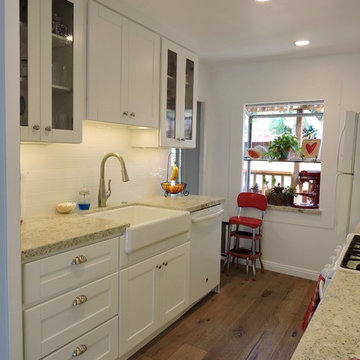
This lovely kitchen lives larger than it's compact square footage. By removing the wall to the right side of the kitchen and expanding the cabinets along that wall we created additional storage as well as a visual opening of the small kitchen.
 Ann Lowengart Interiors
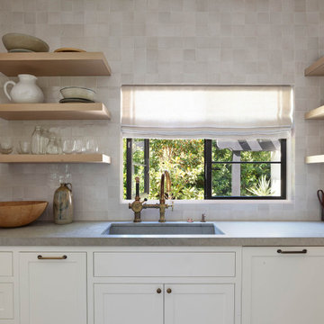
The three-level Mediterranean revival home started as a 1930s summer cottage that expanded downward and upward over time. We used a clean, crisp white wall plaster with bronze hardware throughout the interiors to give the house continuity. A neutral color palette and minimalist furnishings create a sense of calm restraint. Subtle and nuanced textures and variations in tints add visual interest. The stair risers from the living room to the primary suite are hand-painted terra cotta tile in gray and off-white. We used the same tile resource in the kitchen for the island's toe kick.


 Randy Trainor
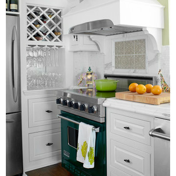
This kitchen is in a small 100 year old home in the center of the historic district of town. Maximizing the use of available space and imbuing this well-used, functioning kitchen with rich detail and elegance were the two most important aspects of the project. Except for being able to borrow a small amount of space from an adjacent hallway to accommodate the depth of the refrigerator, pantry and drawers on one end wall, there was no other way to expand the footprint of the kitchen.
Since we had already remodeled and upgraded the décor in most of the rest of the house and since the kitchen opened into the dining room, we wanted to create a “little jewel box” of a kitchen that was dressy enough to blend with the surrounding areas.
Extensive use of Calcutta marble and a mirror-backed cabinet with glass doors provide the desired sparkle and elegance while the existing oak floor and a thick mahogany countertop visually warm the room. Custom cabinets provide the necessary storage, and we found the perfect antique rug to add color. Hand painted tiles above the stove, the custom hood, and an elegant faucet underscore the theme. “Fun” elements include the imported French stool and the portrait of the homeowner’s cats placed just above their feeding area.
 Jordan Design Build Group
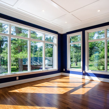
JDBG is wrapping up work on an expansive 2-story sunroom addition that also included modifications to the existing home’s interior and significant exterior improvements as well. The original project brief was to provide a conditioned 4-season sunroom addition where the homeowners could relax and enjoy their wooded views. As we delved deeper into our client’s overall objectives, it became clear that this would be no ordinary sunroom addition. The resulting 16’x25’ sunroom is a showstopper with 10’ high ceilings and wall to wall windows offering expansive views of the surrounding landscape.
As we recommend with most addition projects, the process started with our Preliminary Design Study to determine project goals, design concepts, project feasibility and associated budget estimates. During this process, our design team worked to ensure that both interior and exterior were fully integrated. We conducted in-depth programming to identify key goals and needs which would inform the design and performed a field survey and zoning analysis to identify any constraints that could impact the plans. The next step was to develop conceptual designs that addressed the program requirements.
Using a combination of 3-D massing, interior/exterior renderings, precedent imaging and space planning, the design concept was revised and refined. At the end of the study we had an approved schematic design and comprehensive budget estimates for the 2-story addition and were ready to move into design development, construction documentation, trade coordination, and final pricing. A complex project such as this involves architectural and interior design, structural and civil engineering, landscape design and environmental considerations. Multiple trades and subs are engaged during construction, from HVAC to electrical and plumbing, framers, carpenters and masons, roofers and painters just to name a few. JDBG was there every step of the way to ensure quality construction.
Other notable features of the renovation included expanding the home’s existing dining room, incorporating a custom ‘dish room,’ and providing fully conditioned storage and his & her workrooms on the lower level. A new front portico will visually connect the old and new structures and a brand new roof, shutters and paint will further transform the exterior. Thoughtful planning was also given to the landscape, including a back deck, stone patio and walkways, plantings and exterior lighting. Stay tuned for more photos as this sunroom addition nears completion.
 Robeson Design
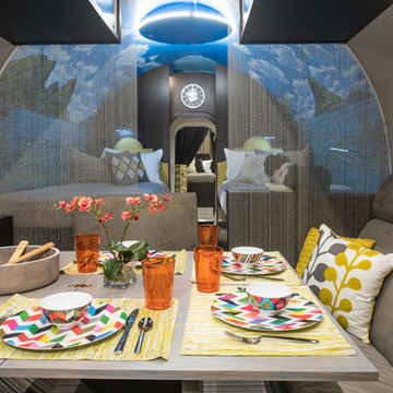
Create a colorful dining area by layering place mats, printed dishes and bright glassware. To frame this area while keeping an open concept, we used the keychain curtains that add visual interest and keep the room sophisticated.
 Project Guru
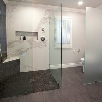
The previously enclosed shower and toilet now reside behind stationary glass partitions, expanding the space visually and enhancing the stark white to black contrast of the materials.
 Ann Lowengart Interiors
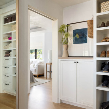
The three-level Mediterranean revival home started as a 1930s summer cottage that expanded downward and upward over time. We used a clean, crisp white wall plaster with bronze hardware throughout the interiors to give the house continuity. A neutral color palette and minimalist furnishings create a sense of calm restraint. Subtle and nuanced textures and variations in tints add visual interest. The stair risers from the living room to the primary suite are hand-painted terra cotta tile in gray and off-white. We used the same tile resource in the kitchen for the island's toe kick.
 Cantoni Los Angeles
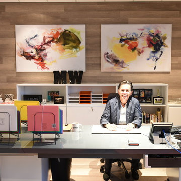
While Cantoni’s Founder & CEO, Michael Wilkov (aka MW) was away at the fall 2014 High Point Market, Cantoni’s Dallas Visuals Team came out to play…spearheading the secret operation known as “MW’s Office Makeover,” Anne Mancuso gathered her troops to give the big boss’ office a serious and much needed facelift in just 4 days! To read the full story, visit the Cantoni Blog here: http://cantoni.com/blog/2014/11/office-makeover/
Photos by David DeLeon
Sponsored
Columbus, OH

Snider & Metcalf Interior Design, LTD
Leading Interior Designers in Columbus, Ohio & Ponte Vedra, Florida
 Cantoni Dallas
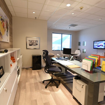
While Cantoni’s Founder & CEO, Michael Wilkov (aka MW) was away at the fall 2014 High Point Market, Cantoni’s Dallas Visuals Team came out to play…spearheading the secret operation known as “MW’s Office Makeover,” Anne Mancuso gathered her troops to give the big boss’ office a serious and much needed facelift in just 4 days! To read the full story, visit the Cantoni Blog here: http://cantoni.com/blog/2014/11/office-makeover/
Photos by David DeLeon
 Nar Design Group
This home remodel is a celebration of curves and light. Starting from humble beginnings as a basic builder ranch style house, the design challenge was maximizing natural light throughout and providing the unique contemporary style the client’s craved.
The Entry offers a spectacular first impression and sets the tone with a large skylight and an illuminated curved wall covered in a wavy pattern Porcelanosa tile.
The chic entertaining kitchen was designed to celebrate a public lifestyle and plenty of entertaining. Celebrating height with a robust amount of interior architectural details, this dynamic kitchen still gives one that cozy feeling of home sweet home. The large “L” shaped island accommodates 7 for seating. Large pendants over the kitchen table and sink provide additional task lighting and whimsy. The Dekton “puzzle” countertop connection was designed to aid the transition between the two color countertops and is one of the homeowner’s favorite details. The built-in bistro table provides additional seating and flows easily into the Living Room.
A curved wall in the Living Room showcases a contemporary linear fireplace and tv which is tucked away in a niche. Placing the fireplace and furniture arrangement at an angle allowed for more natural walkway areas that communicated with the exterior doors and the kitchen working areas.
The dining room’s open plan is perfect for small groups and expands easily for larger events. Raising the ceiling created visual interest and bringing the pop of teal from the Kitchen cabinets ties the space together. A built-in buffet provides ample storage and display.
The Sitting Room (also called the Piano room for its previous life as such) is adjacent to the Kitchen and allows for easy conversation between chef and guests. It captures the homeowner’s chic sense of style and joie de vivre.

 Gardner/Fox Associates, Inc
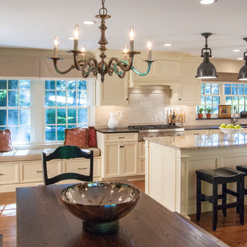
The kitchen’s expanded footprint and attractive new finishes have helped it to become much more functional and enjoyable. ubtle furniture detailing on the central island provides a wonderful focal point, while also picking up on style cues from the rest of the home.

Sponsored
Columbus, OH
Snider & Metcalf Interior Design, LTD
Leading Interior Designers in Columbus, Ohio & Ponte Vedra, Florida
 Ann Lowengart Interiors
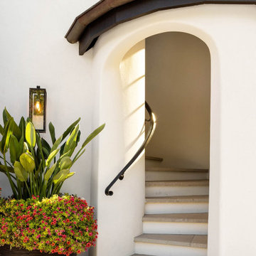
The three-level Mediterranean revival home started as a 1930s summer cottage that expanded downward and upward over time. We used a clean, crisp white wall plaster with bronze hardware throughout the interiors to give the house continuity. A neutral color palette and minimalist furnishings create a sense of calm restraint. Subtle and nuanced textures and variations in tints add visual interest. The stair risers from the living room to the primary suite are hand-painted terra cotta tile in gray and off-white. We used the same tile resource in the kitchen for the island's toe kick.
 Cantoni Irvine
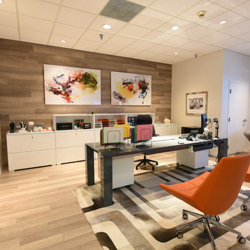
While Cantoni’s Founder & CEO, Michael Wilkov (aka MW) was away at the fall 2014 High Point Market, Cantoni’s Dallas Visuals Team came out to play…spearheading the secret operation known as “MW’s Office Makeover,” Anne Mancuso gathered her troops to give the big boss’ office a serious and much needed facelift in just 4 days! To read the full story, visit the Cantoni Blog here: http://cantoni.com/blog/2014/11/office-makeover/
Photos by David DeLeon
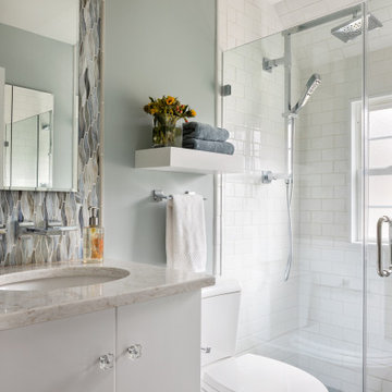
 Thyme & Place Design LLC
Description: What once was an ugly duckling is now a beautiful swan. The old bathtub has been replaced with curbless shower which eliminates the trip over entrance. A new diffused glass vinyl clad window replaced the old wood sash window which was covered by a shower curtain, adding much needed natural light to the space. Bright white larger format subway tile is used to enlarge the visual space of the shower reflecting the light from the window. A boho inspired mosaic floor tile flows into the curbless shower expanding the feel of this small 36 square foot bath. A recessed medicine cabinet is placed in a wave patterned glass tile feature that runs from the counter top to the ceiling. For added ease of care, the vanity floats 10" above the floor with motion sensor lights for night time. The shower set features a angular shower column with multi function large format shower head and hand held shower both pressure and temperature controlled. Towels are kept at hand on a floating shelf above the commode.
65