
Search results for "Visually expanded" in Home Design Ideas
 Ann Lowengart Interiors
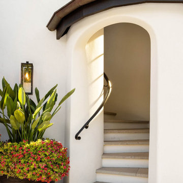
The three-level Mediterranean revival home started as a 1930s summer cottage that expanded downward and upward over time. We used a clean, crisp white wall plaster with bronze hardware throughout the interiors to give the house continuity. A neutral color palette and minimalist furnishings create a sense of calm restraint. Subtle and nuanced textures and variations in tints add visual interest. The stair risers from the living room to the primary suite are hand-painted terra cotta tile in gray and off-white. We used the same tile resource in the kitchen for the island's toe kick.
 Thyme & Place Design LLC
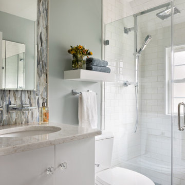
Description: What once was an ugly duckling is now a beautiful swan. The old bathtub has been replaced with curbless shower which eliminates the trip over entrance. A new diffused glass vinyl clad window replaced the old wood sash window which was covered by a shower curtain, adding much needed natural light to the space. Bright white larger format subway tile is used to enlarge the visual space of the shower reflecting the light from the window. A boho inspired mosaic floor tile flows into the curbless shower expanding the feel of this small 36 square foot bath. A recessed medicine cabinet is placed in a wave patterned glass tile feature that runs from the counter top to the ceiling. For added ease of care, the vanity floats 10" above the floor with motion sensor lights for night time. The shower set features a angular shower column with multi function large format shower head and hand held shower both pressure and temperature controlled. Towels are kept at hand on a floating shelf above the commode.
 Cantoni Irvine
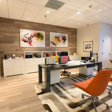
While Cantoni’s Founder & CEO, Michael Wilkov (aka MW) was away at the fall 2014 High Point Market, Cantoni’s Dallas Visuals Team came out to play…spearheading the secret operation known as “MW’s Office Makeover,” Anne Mancuso gathered her troops to give the big boss’ office a serious and much needed facelift in just 4 days! To read the full story, visit the Cantoni Blog here: http://cantoni.com/blog/2014/11/office-makeover/
Photos by David DeLeon
Find the right local pro for your project
 BC&J Architecture
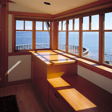
The 2,800 square foot Rockaway Beach Residence is a significant remodel and addition to a small beach cottage built in the 1920’s. The owner’s desire for the building was to maintain a visual connection to the water and Seattle beyond and expand upon the nature of the shingled cottages found along the water’s edge in Puget Sound in the early part of the 20th century.
The two bedroom house includes daytime living spaces on the ground level including a sunroom where one can view both Mt. Baker and Mt. Rainier on a clear day. The second floor includes bedrooms with views, a gallery space over the dining room below, owner’s office and grandchildren’s loft.
Fine attention to craft was taken in preparing the unusual roof shapes and gracious trim assemblies.
Designed by BC&J Architecture.
 Bianchi Design
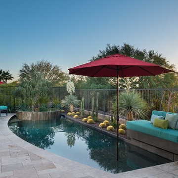
When it comes to small spaces every inch counts! The key to making them work is to think of traffic flow, and how you’re going to arrange furniture for ease of access and comfort. This gives credence to the form over function motto!
For this project we knew we were expanding the indoor outdoor flow by removing a wall of the house, creating a pocket door, so the interior living room was going to merge perfectly with the new exterior living room.
The first element of the design we worked out was a built-in Banco seating around a central fire pit, with cushions and exterior fabrics, that even has a one piece cover that can snap in place. This will protect the fabrics in place while the couple travels, without having to drag them through the house to the garage for storage.
The second critical factor of the design was implementing an outdoor kitchen just off camera, built-in to a patio Column, so that it becomes a serving bar and the appliances are behind the bar not out in the public space.
Across the water, the vanishing edge spa was the visual draw, reflecting a fruitless olive tree, all enjoyed from the fire pit seating area.
The back edge of the pool features a knife edge tile to granite interface without a coping, to minimize the line between water and landscape.
Last but not least, the sweeping arc curvature of the pools leading edge was done so as to ease traffic flow from the entertaining and fire seating area to the spa, and to soften the otherwise rectangular lines of the yard.
 STATEMENTS IN Tile/Lighting/Kitchens/Flooring
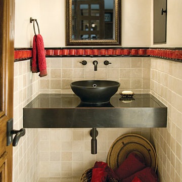
A bold red ribbon of glazed tile adds pizzaz to this transitional powder room. Tumbled travertine lends texture and warmth, while the floating vanity expands the visual space of the room. Photo by Christopher Martinez Photography.
 LiLu Interiors
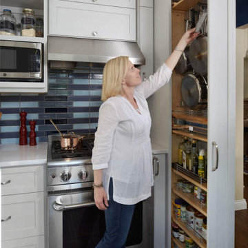
When LiLu was called on by a long-time client to help remodel her kitchen in a charming 1930s St. Paul home, the Design Team knew the space needed to be expanded, lightened, and brightened. First they removed the wall separating the kitchen and dining room. A breakfast bar was added and the window seat was refreshed to offer more inviting places for people to mingle. Crown molding and recessed lighting were installed to create visual height. All the cabinets were painted a light gray, with bold pops of blue, orange, and even some indigo throughout. And yet what makes this kitchen a perfect fit for our home cook client are the storage spaces unique positioned throughout. From shelving above that houses our client’s many cookbooks, to the custom cabinets that hideaway appliances and cookware alike, every detail was considered when making this kitchen both useful and unique.
-----
Project designed by Minneapolis interior design studio LiLu Interiors. They serve the Minneapolis-St. Paul area including Wayzata, Edina, and Rochester, and they travel to the far-flung destinations that their upscale clientele own second homes in.
-----
For more about LiLu Interiors, click here: https://www.liluinteriors.com/
---
To learn more about this project, click here:
https://www.liluinteriors.com/blog/portfolio-items/culinary-delight/
Sponsored
Columbus, OH

Snider & Metcalf Interior Design, LTD
Leading Interior Designers in Columbus, Ohio & Ponte Vedra, Florida
 Randy Trainor
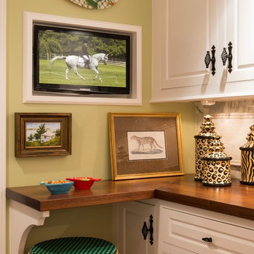
This kitchen is in a small 100 year old home in the center of the historic district of town. Maximizing the use of available space and imbuing this well-used, functioning kitchen with rich detail and elegance were the two most important aspects of the project. Except for being able to borrow a small amount of space from an adjacent hallway to accommodate the depth of the refrigerator, pantry and drawers on one end wall, there was no other way to expand the footprint of the kitchen.
Since we had already remodeled and upgraded the décor in most of the rest of the house and since the kitchen opened into the dining room, we wanted to create a “little jewel box” of a kitchen that was dressy enough to blend with the surrounding areas.
Extensive use of Calcutta marble and a mirror-backed cabinet with glass doors provide the desired sparkle and elegance while the existing oak floor and a thick mahogany countertop visually warm the room. Custom cabinets provide the necessary storage, and we found the perfect antique rug to add color. Hand painted tiles above the stove, the custom hood, and an elegant faucet underscore the theme. “Fun” elements include the imported French stool and the portrait of the homeowner’s cats placed just above their feeding area.
 Hamilton-Gray Design, Inc.
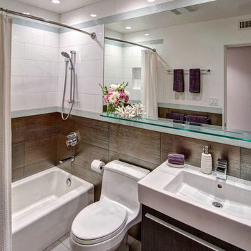
Objectives:
Provide landing space
Accommodate storage
Lighten up a windowless room
Trick the eye to expand the room
Design challenges:
Limitation of 5'x8' room envelope
Visually enlarging the space
Working with a moderate budget
Design solutions:
Install long glass shelf between tile surfaces
Usurp partial storage from adjacent linen closet
Wall mount sink cabinet
Use of textured tile and mirror providing reflective surfaces
Special features:
Mix of textured tile with a punch of silver below eye level
Provision of storage in small room
Clean contemporary and eye catching
Photo Credit: Preview First
 RoomService 360
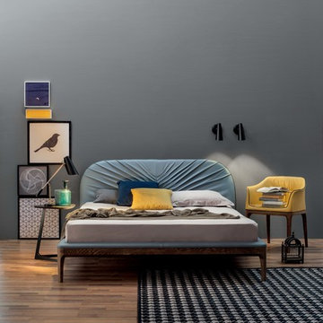
Founded in 1975 by Gianni Tonin, the Italian modern furniture company Tonin Casa has long been viewed by European designers as one of the best interior design firms in the business, but it is only within the last five years that the company expanded their market outside Italy. As an authorized dealer of Tonin Casa contemporary furnishings, room service 360° is able to offer an extensive line of Tonin Casa designs.
Tonin Casa furniture features a wide range of distinctive styles to ensure the right selection for any contemporary home. The room service 360° collection includes a broad array of chairs, nightstands, consoles, television stands, dining tables, coffee tables and mirrors. Quality materials, including an extensive use of tempered glass, mark Tonin Casa furnishings with style and sophistication.
Tonin Casa modern furniture combines style and function by merging modern technology with the Italian tradition of innovative style and quality craftsmanship. Each piece complements homes styled in the modern style, yet each piece offers visual style on its own as well, with imaginative designs that are sure to add a note of distinction to any contemporary home.
 Bianchi Design
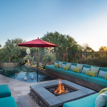
When it comes to small spaces every inch counts! The key to making them work is to think of traffic flow, and how you’re going to arrange furniture for ease of access and comfort. This gives credence to the form over function motto!
For this project we knew we were expanding the indoor outdoor flow by removing a wall of the house, creating a pocket door, so the interior living room was going to merge perfectly with the new exterior living room.
The first element of the design we worked out was a built-in Banco seating around a central fire pit, with cushions and exterior fabrics, that even has a one piece cover that can snap in place. This will protect the fabrics in place while the couple travels, without having to drag them through the house to the garage for storage.
The second critical factor of the design was implementing an outdoor kitchen just off camera, built-in to a patio Column, so that it becomes a serving bar and the appliances are behind the bar not out in the public space.
Across the water, the vanishing edge spa was the visual draw, reflecting a fruitless olive tree, all enjoyed from the fire pit seating area.
The back edge of the pool features a knife edge tile to granite interface without a coping, to minimize the line between water and landscape.
Last but not least, the sweeping arc curvature of the pools leading edge was done so as to ease traffic flow from the entertaining and fire seating area to the spa, and to soften the otherwise rectangular lines of the yard.
 Sha Studio Inc.
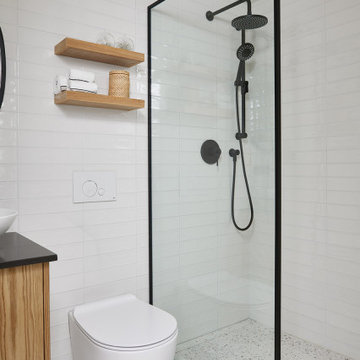
A 'slow-designed' bathroom that places importance on using sustainable materials while supporting the community at large. It is our belief that beautiful bathrooms don't have to cost our earth. Our goal with this project was to use materials that were kinder to our planet while still offering a design impact through aesthetics. We scouted for tile suppliers who are conscious of their environmental impact and found a Canadian maker of the terrazzo tile. It is a mix of marble, granite and natural stone aggregate hand cast in a cement base. We then paired that with a ceramic tile, one of the most eco-friendly options and partnered with local tradespeople to craft this highly functional and statement-making bathroom.
 Jennifer Grey Interiors Design & Color Specialist
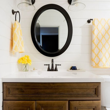
After an unfortunate flood, this bathroom was ripped out taken down to the studs, giving us a completely blank slate to work with. To maximize this fairly compact guest bathroom, we added horizontal shiplap paneling to the walls to expand the space visually. The front of the tub was also wrapped in shiplap for added continuity. Hex tile flooring provides pattern and movement against the white painted shiplap walls. And the soft gray rectangular wall tile in the shower repeats the horizontal effect, all in effort of creating the look of a larger space.
Photography by Amy Bartlam


 CHRISTOPHER STROM ARCHITECTS
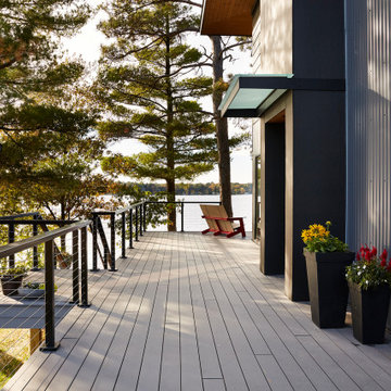
Sommerhus is a private retreat for two empty-nesters. The clients purchased the previous cabin after falling in love with its location on a private, lakefront peninsula. However, this beautiful site was a challenging site to build on, due to its position sandwiched between the lake and protected wet land. The clients disliked the old cabin because it could only be used in the summer months, due to its lack of both insulation and heat. In addition, it was too small for their needs. They wanted to build a new, larger retreat, but were met with yet another constraint: the new cabin would be limited to the previous cabin’s small footprint. Thus, they decided to approach an architect to design their dream cabin.
As the clients described, “We visited Denmark for a family wedding in 2015, and while biking near Gilleleje, a fishing village on the Baltic Sea, we fell in love with the aesthetic of ‘Sommerhus’: dark exteriors, clean, simple lines, and lots of windows.” We set out to design a cabin that fit this aesthetic while also meeting the site’s constraints.
The clients were committed to keeping all existing trees on their site. In addition, zoning codes required the new retreat to stay within the previous cabin's small footprint. Thus, to maximize the square footage of the cabin without removing trees or expanding the footprint, the new structure had to grow vertically. At the same time, the clients wanted to be good neighbors. To them, this meant that their cabin should disappear into the woods, especially when viewed from the lake. To accomplish both these requests, the architect selected a dark exterior metal façade that would visually retreat into the trees. The metal siding is a modern, low-maintenance, and cost-effective solution, especially when compared to traditional wood siding. Warm wood on the soffits of the large roof overhang contrast with the metal siding. Sommerhus's resulting exterior is just as the clients’ requested: boldly modern yet respectful of the serene surroundings.
The homeowners desired a beach-house-inspired interior, full of light and warmth, in contrast to the dark exterior. As the homeowner explained, “I wanted it to feel like a porch inside.” To achieve this, the living room has two walls of sliding glass doors that connect to the wrap-around porch. This creates a beautiful, indoor-outdoor living space. The crisp and bright kitchen also connects to the porch with the window that opens to an outdoor counter - perfect for passing food and drinks to those lounging on the porch. The kitchen is open to the rest of the first-floor entertaining space, and brings a playful, beach-house feel to the cabin.
After the completion of the project, the homeowners remarked, “Working with Christopher and Eric [of CSA] was a wonderful experience. We absolutely love our home, and each season on the lake is more special than the last.”
 The Baywood Design/Build Group, Inc.
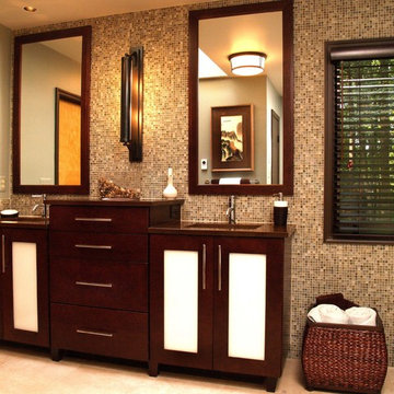
A dynamic contemporary master bath with an Asian feel . This bathroom expands the space visually and psychologically.
Example of a large trendy master multicolored tile and mosaic tile ceramic tile and beige floor bathroom design in Baltimore with flat-panel cabinets, dark wood cabinets, multicolored walls and an undermount sink
Example of a large trendy master multicolored tile and mosaic tile ceramic tile and beige floor bathroom design in Baltimore with flat-panel cabinets, dark wood cabinets, multicolored walls and an undermount sink
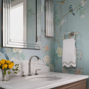
 Deep River Partners
Fulfilling a vision of the future to gather an expanding family, the open home is designed for multi-generational use, while also supporting the everyday lifestyle of the two homeowners. The home is flush with natural light and expansive views of the landscape in an established Wisconsin village. Charming European homes, rich with interesting details and fine millwork, inspired the design for the Modern European Residence. The theming is rooted in historical European style, but modernized through simple architectural shapes and clean lines that steer focus to the beautifully aligned details. Ceiling beams, wallpaper treatments, rugs and furnishings create definition to each space, and fabrics and patterns stand out as visual interest and subtle additions of color. A brighter look is achieved through a clean neutral color palette of quality natural materials in warm whites and lighter woods, contrasting with color and patterned elements. The transitional background creates a modern twist on a traditional home that delivers the desired formal house with comfortable elegance.
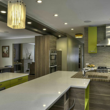
 VESTA
VESTAThis home is located in the in the heart of Northcenter and situated on an oversized
lot with a tremendous view of a landscaped backyard garden. The client’s desire
was to open the back kitchen wall to take advantage of the garden view and to
incorporate the kitchen into the rest of the home. By adding a 3’-0” deep addition at
the sink wall and increasing the overall size of the windows, we were able to expand
the views and to open the floor plan to create a functional island. The island in turn,
added space for food prep & a prep sink along with casual seating. By removing the
adjoining Dining Room wall, we created an open floor plan that enhanced the
Owners everyday living experiences. Adding a Dining Buffet added storage, a buffet
space and a visual break while maintaining the open feel. By using warm horizontal
walnut tones, it allowed a reference back to the original mid-century feel of the
décor of the home. Adding playful highlights of apple green, we took advantage of a
palette that brought the outside back in.


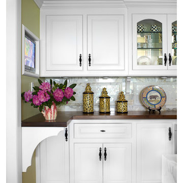 Randy Trainor
This kitchen is in a small 100 year old home in the center of the historic district of town. Maximizing the use of available space and imbuing this well-used, functioning kitchen with rich detail and elegance were the two most important aspects of the project. Except for being able to borrow a small amount of space from an adjacent hallway to accommodate the depth of the refrigerator, pantry and drawers on one end wall, there was no other way to expand the footprint of the kitchen.
Since we had already remodeled and upgraded the décor in most of the rest of the house and since the kitchen opened into the dining room, we wanted to create a “little jewel box” of a kitchen that was dressy enough to blend with the surrounding areas.
Extensive use of Calcutta marble and a mirror-backed cabinet with glass doors provide the desired sparkle and elegance while the existing oak floor and a thick mahogany countertop visually warm the room. Custom cabinets provide the necessary storage, and we found the perfect antique rug to add color. Hand painted tiles above the stove, the custom hood, and an elegant faucet underscore the theme. “Fun” elements include the imported French stool and the portrait of the homeowner’s cats placed just above their feeding area.

 Klopf Architecture
Malibu Glass Box House by Klopf Architecture
Following the devastating Woolsey Fire of 2018, the site in Malibu offered a unique opportunity to rebuild not just a home, but a new architectural composition that highlighted the property’s potential while navigating strict fire-rebuild codes in the area. Designed by Klopf Architecture, this project embraced a set of limitations and translated them into an architectural asset.
The city’s fire-rebuild process required the new structure to remain close to the original footprint, size and bulk, a constraint that ultimately clarified the architectural direction. Perched near the front of a long, narrow lot, the new home frames and overlooks a private, park-like rear expanse, an uncommon luxury especially in this part of Malibu .
Without a fixed program, the design process allowed for a different kind of creative focus allowing Klopf Architecture the opportunity to explore how a modernist home could best respond to this site. The team approached the project not with a list of requirements, but with a question: How might a modernist live here? What spatial qualities would inspire calm, connection, and a sense of wonder in this setting? The process became less about problem-solving and more about architectural storytelling—letting the site, the light, and the principles of modern design guide the form and flow of the home.
The response emerged in the form of a glass-box pavilion, an open, Mid-Century Modern inspired living, dining, and kitchen space that floats at the edge of the property’s natural descent. Connected to the more enclosed, private areas of the home by a glass-walled hallway, the living pavilion becomes a distinct centerpiece of the design. It opens on all four sides to the landscape with decks and patios on the flanks, an internal garden and water feature to the north, and a dramatic unguarded view of the expansive backyard and ocean horizon to the south.
Because of the mandated footprint, careful planning was required to ensure every space could still engage with light, landscape, or both. Strategic voids in the form of atriums and courtyards allow daylight to filter deep into the home’s core, while offering moments of surprise and retreat. These design gestures allow natural light to filter deep into the interior, creating a sense of brightness and openness throughout the day. At the same time, they expand the perceptual boundaries between inside and out, making the home feel more expansive while anchoring its connection to the surrounding landscape.
The siting of the house is what gives it its unique character. Rather than receding into the backyard like the neighboring homes, the house holds a slight prominence. From the central living pavilion, stepping down into the landscape feels more like entering a secluded park where a separate existing accessory structure, trail, and recreational areas await. The home’s modest street presence gives way to this unfolding drama of space, view, and nature.
Fire-resilient materials and assemblies are integrated seamlessly throughout including triple-pane glazing, under-slab and roof insulation, and locally sourced fire-rated cladding ensure the house not only meets Calfornia’s rigorous wildland-urban interface (WUI) standards, but feels effortlessly aligned with them. While technical decisions like fire-hardening and mechanical systems presented some construction challenges, particularly around the cantilevered glass box, the team found a functional compromise that preserved the integrity of the design.
Inside, a restrained palette and exposed post and beam design celebrate the ethos of mid-century modernism. A central circulation spine extends from the entry to the rear glass wall, offering a continuous visual link from street to ocean. Spaces such as the library and office, though more intimate in scale, are never cut off from nature as each opens to its own unique courtyard or garden view.
Though born out of a strict regulatory framework and developed without a specific client, the rebuild design unfolded with remarkable clarity. Grounded in site logic, refined by limitations and an emphasis on timeless spatial relationships – light, proportion, and a strong connection to nature, the resulting design feels both effortless and uplifting. The home lives lightly on the land, opens generously to its surroundings, and strikes a careful balance between privacy, openness, and calm. For Klopf Architecture, it stands as a compelling case study in how site, code, and circumstantial constraints can inspire enduring, modernist architecture. With years of experience reimagining mid-century modern design for how people live today, the firm took the project’s limitations as an opportunity. The result is a home shaped by open, flowing spaces, strong indoor-outdoor connections, and a calm, clear sense of structure. It’s a good reminder that even with strict constraints, there’s still room for architecture to breathe—and for modernism to keep moving forward.
Klopf Architecture project team: Geoff Campen, John Klopf, AIA, and Sherry Tan
Structural Engineer: ZFA
Contractor: Maison D’Artiste
Photography: ©2025 Mariko Reed
Year Completed: 2023
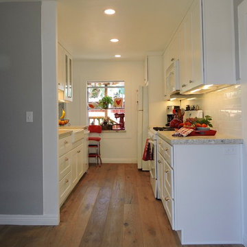
 Lori Ramsay Design
This lovely kitchen lives larger than it's compact square footage. By removing the wall to the right side of the kitchen and expanding the cabinets along that wall we created additional storage as well as a visual opening of the small kitchen.
66