
Search results for "Visually expanded" in Home Design Ideas
 Clever Design & Remodeling
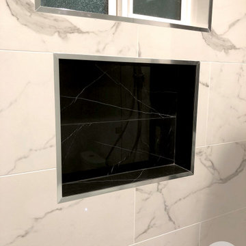
Bedroom and bathroom addition in Sunnyvale, CA - For this project we added on an additional bathroom and bedroom to the existing home to expand the owners living space. The owner had impecable style and wanted a bold and striking black and white modern bathroom. Custom accent tiles added in the shower create visual interest and highlight the gorgeous modern shower fixtures.
 Bend Furniture & Design
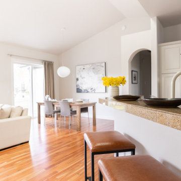
Small space luxury abounds in this sweet Bend bungalow and truly exemplifies the concept of less is more. A light and bright color palette on both the walls and furnishings expands the space and creates visual calm which offers a perfect backdrop for the artist/homeowner’s collection of art and pottery.
 Crystal Kitchen + Bath
The goal for this 1939 Tudor-style story-and-a-half home was to create a kitchen that offered the conveniences, storage, and performance of a modern workspace while preserving the warmth, craftsmanship, and vintage charm that made the home special. The client, an avid home cook, wanted the room to feel as though it had always belonged to the house, with thoughtful upgrades that respected the original architecture rather than competing with it. Just as important, she needed a more efficient layout with enough storage for small appliances, so everyday cooking would no longer require carrying items up from the lower level.
Several existing conditions shaped the design approach. The kitchen retained original, amber-stained birch woodwork that the client wished to keep, and the compact footprint was interrupted by six doorways and two windows, none of which were to be moved, altered, or replaced. A previous flooring update had left the door casings undercut too short, creating visible gaps where the casing met the floor. The existing vintage 40-inch range also lacked proper ventilation, yet the client wished to accommodate a refrigerator, dishwasher, cooktop, double ovens, built-in microwave, and effective venting above the cooktop into the new kitchen layout.
To honor the original millwork, beaded inset-style cherry cabinetry was selected in a soft, hand-rubbed finish that will deepen over time and develop a natural patina. Charcoal-gray soapstone countertops complement the cabinetry while reinforcing the historic character of the home with an organic, timeworn texture. The former breakfast nook was transformed into a butler’s pantry, adding valuable base cabinet storage and expanded work surfaces for frequently used small appliances. Also in the butler’s pantry, a single upper cabinet was paired with open shelves to give an open, airy feeling while adding character and practical storage. A classic single-bowl apron-front workstation sink contributes both period-appropriate character and practical prep and cleanup function.
Because the home’s openings were such a defining feature, the design worked within the existing architecture instead of altering it. Custom plinth blocks were created for each doorway to extend the original casing gracefully down to the new natural red oak flooring, resolving the earlier construction issue while adding a detail that feels authentic to the age of the house. Despite the number of door and window openings, the new layout provides a significantly more functional, built-in kitchen with an improved work triangle for serious cooking.
Appliance placement was carefully planned to deliver the requested performance without overwhelming the small room. Three cooking functions (double ovens & microwave) were consolidated into one location with a GE Café double oven featuring Advantium Technology, while the client’s compact 31-inch refrigerator was reused to preserve space. A sleek 30-inch induction cooktop provides efficient cooking, and a Vent-A-Hood ARS ductless vent hood supplies needed ventilation without requiring a duct run to the exterior.
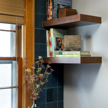
The finish palette balances richness, texture, and historical sensitivity. A deeply textured navy backsplash tile adds depth and dramatic shadow play against the soapstone, while wallpaper in the back entry echoes the tile’s geometric pattern to visually connect the adjoining spaces. Oil-rubbed bronze cabinet hardware and light fixtures enhance the warmth of the cherry cabinetry and complete the antique-inspired feel.
Lighting was layered to make the compact kitchen brighter, more useful, and more inviting. Vintage-style semi-flush ceiling fixtures establish the overall tone, while dimmable puck lights highlight select areas and undercabinet task lighting keeps work surfaces well illuminated.
The completed kitchen now feels both highly functional and deeply rooted in the home’s history. Rich cherry cabinetry, velvety soapstone, natural red oak flooring, navy tile, bronze accents, and carefully preserved birch trim work together to create a warm, cohesive space that celebrates timeless craftsmanship. By increasing storage, improving workflow, integrating modern appliances, and respecting the Tudor home’s original character, the design achieves the client’s vision: a kitchen that feels personal, practical, historically appropriate, and as though it has always been there.
Find the right local pro for your project
 The Amendola Group, Inc.
This Gristmill Lane project’s stunning pool and patio area showcase exceptional masonry craftsmanship. Expanding the area’s use long into the late fall season, an outdoor fireplace and large pavilion area feature stonework chosen to complement the home. An intricate paver walkway greets guests to the home while hinting at the visual surprises that await.
 EAG Studio
Refined Continuity: Bridging Classical Architecture and Modern Living
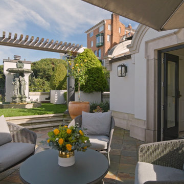
This comprehensive remodel of a grand Cow Hollow residence reimagines a historically expressive envelope through a lens of contemporary livability, precision detailing, and material restraint. The design approach carefully balances the home’s classical proportions and ornamental heritage with a refined, modern sensibility—evident in the disciplined palette of warm neutrals, soft plasters, pale oak flooring, and tailored millwork. Circulation has been clarified and subtly expanded to enhance spatial flow, while openings are leveraged to capture light, garden outlooks, and distant water views. Throughout, architectural interventions are executed with a high level of craft, ensuring that new insertions—whether cabinetry, railings, or apertures—read as seamless continuations of the original structure rather than applied elements.
The kitchen serves as the operational and visual anchor of the home, conceived as a sculptural yet highly functional environment. Custom rift-cut cabinetry, softened through a desaturated finish, is paired with honed stone surfaces and integrated brass hardware to create a quiet, tactile richness. A monolithic island establishes a central gathering point, while perimeter work zones are carefully layered with concealed storage, integrated appliances, and open, backlit shelving that elevates everyday objects into curated displays. The adjacent bar and entertaining areas extend this language, reinforcing a cohesive hospitality-driven program. In parallel, the primary bathroom is designed as a serene, spa-like retreat, where bookmatched stone, frameless glass enclosures, and finely detailed metalwork converge. The composition prioritizes symmetry, clarity, and light—balancing generous volumes with intimate moments through integrated lighting, custom vanities, and a restrained material hierarchy.
The library and ancillary living spaces introduce a more intimate scale, anchored by bespoke built-ins that combine closed storage with illuminated display niches, creating depth and rhythm along the walls. Here, material transitions and furniture integration are handled with particular nuance, allowing the architecture to support both quiet retreat and social gathering. A continuous language of custom railings—executed in refined metal profiles—threads through the interior and extends outward, where the exterior gate and garden elements have been reinterpreted to align with the home’s renewed identity. The entry sequence is now defined by a calibrated interplay of solidity and transparency, with sculptural metalwork and landscape integration establishing a sense of arrival that is both secure and elegant. Collectively, the project reflects a holistic transformation—one that elevates performance, livability, and aesthetic clarity while preserving the inherent dignity of the original architecture.
 User
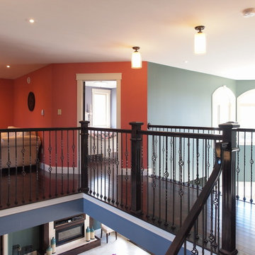
UserLighting horizontal surfaces expands and brightens space, bouncing light back onto ceiling. Close-to-ceiling lights reflect light off ceiling for added brightness. A rows of lights in a long space creates visual interest. - Deborah Nicholson Lighting and Interiors
 Vanity Art LLC
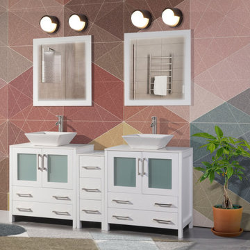
Adding storage to a tiny bathroom is one of the best ways to hide clutter. It also creates a visually larger, more expansive bathroom. This bathroom vanity features smart drawers and shelving that make use of every square inch in the cabinet. Nothing brightens and expands a small space better than a mirror. This vanity set includes a mirror to add style and also create a bigger bathroom effect. The single/double sink elegant bathroom vanity set has ample storage capacity and high-cost performance which fits perfectly with any bathroom decor.
Features:
Soft-closing doors and drawers prevent slamming
Full-width storage shelf, ideal for towels and accessories
Rectangular and practical white ceramic vessel sink
Dove-Tailed Drawers
Brushed nickel handles/hardware
Constructed of high-quality oak wood
Rich and durable finish
Dripless edge profile

Sponsored
Columbus, OH

Snider & Metcalf Interior Design, LTD
Leading Interior Designers in Columbus, Ohio & Ponte Vedra, Florida
 VESTA
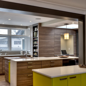
VESTAThis home is located in the in the heart of Northcenter and situated on an oversized lot with a tremendous view of a landscaped backyard garden. The client’s desire was to open the back kitchen wall to take advantage of the garden view and to incorporate the kitchen into the rest of the home. By adding a 3’-0” deep addition at the sink wall and increasing the overall size of the windows, Vesta was able to expand the views and to open the floor plan to create a functional island. The island in turn, added space for food prep & prep sink along with casual seating. By removing the adjoining Dining Room wall, Vesta created an open floor plan that enhanced the Owners everyday living experiences. The new Dining Buffet added storageand a visual break while maintaining the open feel. By using warm horizontal walnut tones, it allowed a reference back to the original mid-century feel of the décor of the home. Adding playful highlights of apple green, we took advantage of a palette that brought the natural outside elements back into the environment.
 CHRISTOPHER STROM ARCHITECTS
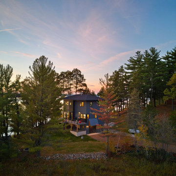
Sommerhus is a private retreat for two empty-nesters. The clients purchased the previous cabin after falling in love with its location on a private, lakefront peninsula. However, this beautiful site was a challenging site to build on, due to its position sandwiched between the lake and protected wet land. The clients disliked the old cabin because it could only be used in the summer months, due to its lack of both insulation and heat. In addition, it was too small for their needs. They wanted to build a new, larger retreat, but were met with yet another constraint: the new cabin would be limited to the previous cabin’s small footprint. Thus, they decided to approach an architect to design their dream cabin.
As the clients described, “We visited Denmark for a family wedding in 2015, and while biking near Gilleleje, a fishing village on the Baltic Sea, we fell in love with the aesthetic of ‘Sommerhus’: dark exteriors, clean, simple lines, and lots of windows.” We set out to design a cabin that fit this aesthetic while also meeting the site’s constraints.
The clients were committed to keeping all existing trees on their site. In addition, zoning codes required the new retreat to stay within the previous cabin's small footprint. Thus, to maximize the square footage of the cabin without removing trees or expanding the footprint, the new structure had to grow vertically. At the same time, the clients wanted to be good neighbors. To them, this meant that their cabin should disappear into the woods, especially when viewed from the lake. To accomplish both these requests, the architect selected a dark exterior metal façade that would visually retreat into the trees. The metal siding is a modern, low-maintenance, and cost-effective solution, especially when compared to traditional wood siding. Warm wood on the soffits of the large roof overhang contrast with the metal siding. Sommerhus's resulting exterior is just as the clients’ requested: boldly modern yet respectful of the serene surroundings.
The homeowners desired a beach-house-inspired interior, full of light and warmth, in contrast to the dark exterior. As the homeowner explained, “I wanted it to feel like a porch inside.” To achieve this, the living room has two walls of sliding glass doors that connect to the wrap-around porch. This creates a beautiful, indoor-outdoor living space. The crisp and bright kitchen also connects to the porch with the window that opens to an outdoor counter - perfect for passing food and drinks to those lounging on the porch. The kitchen is open to the rest of the first-floor entertaining space, and brings a playful, beach-house feel to the cabin.
After the completion of the project, the homeowners remarked, “Working with Christopher and Eric [of CSA] was a wonderful experience. We absolutely love our home, and each season on the lake is more special than the last.”
 Christopher D. Marshall Architect, LLC
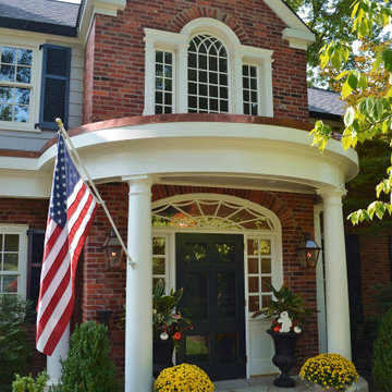
The existing entry hall was narrow, and uninviting. The front porch was bland. The solution was to expand the entry hall out four feet with a two story piece that allowed for a new straight run of stairs, a larger foyer at the entry door with sidelights and a fanlight window above. A Palladian window was added at the stair landing with a window seat.. A new semi circular porch with a stone floor marks the main entry for the house.
Existing Dining Room bay had a low ceiling which separated it from the main room. We removed the old bay and added a taller rectangular bay window with engaged columns to complement the entry porch.
The new dining bay, front porch and new vertical brick element fit the scale of the large front facade and most importantly give it visual delight!
 DSC DesignWorks
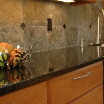
This thirty year old duplex was awkwardly designed from in'ts conception. Initially divided into many smaller spaces, we opened the kitchen up into the family room and visually, as well as functionally, expanded the size of the house. The kitchen and the entertainment center were build with solid cherry faces and plenty of room for storage.
 Harmony Design Northwest
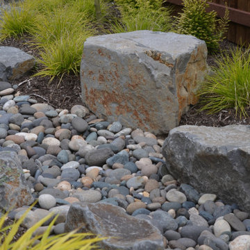
Transforming the blank canvas of a basic builder’s backyard into a captivating retreat, we turned a grass-dominated space into an effortlessly elegant low-maintenance haven with a distinct Asian flair. At the heart of this metamorphosis is the expanded patio and walkway, featuring offset architectural pavers that not only captivate the eye but also contribute to a dynamic sense of flow throughout the elongated backyard.
A key focal point is the thoughtfully designed rain garden, adorned with strategically placed boulders that manages stormwater runoff in an aesthetically pleasing way.
The carefully curated plant palette plays a pivotal role in achieving the desired aesthetic. The deliberate choice of low grasses and foliage-forward perennials, coupled with the inclusion of small evergreen plants and vibrant Japanese maples, creates a harmonious blend of colors, shapes, and sizes. This contrasting arrangement not only ensures visual interest year-round but also infuses the space with a timeless allure inspired by Asian design principles.
The result is a backyard oasis that transcends the ordinary, offering a serene escape with minimal upkeep requirements. The strategic combination of hardscape elements, lush greenery, and carefully selected plants transforms this space into a sanctuary where the beauty of nature meets the sophistication of thoughtful design.
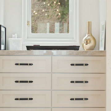 EAG Studio
Refined Continuity: Bridging Classical Architecture and Modern Living
This comprehensive remodel of a grand Cow Hollow residence reimagines a historically expressive envelope through a lens of contemporary livability, precision detailing, and material restraint. The design approach carefully balances the home’s classical proportions and ornamental heritage with a refined, modern sensibility—evident in the disciplined palette of warm neutrals, soft plasters, pale oak flooring, and tailored millwork. Circulation has been clarified and subtly expanded to enhance spatial flow, while openings are leveraged to capture light, garden outlooks, and distant water views. Throughout, architectural interventions are executed with a high level of craft, ensuring that new insertions—whether cabinetry, railings, or apertures—read as seamless continuations of the original structure rather than applied elements.
The kitchen serves as the operational and visual anchor of the home, conceived as a sculptural yet highly functional environment. Custom rift-cut cabinetry, softened through a desaturated finish, is paired with honed stone surfaces and integrated brass hardware to create a quiet, tactile richness. A monolithic island establishes a central gathering point, while perimeter work zones are carefully layered with concealed storage, integrated appliances, and open, backlit shelving that elevates everyday objects into curated displays. The adjacent bar and entertaining areas extend this language, reinforcing a cohesive hospitality-driven program. In parallel, the primary bathroom is designed as a serene, spa-like retreat, where bookmatched stone, frameless glass enclosures, and finely detailed metalwork converge. The composition prioritizes symmetry, clarity, and light—balancing generous volumes with intimate moments through integrated lighting, custom vanities, and a restrained material hierarchy.
The library and ancillary living spaces introduce a more intimate scale, anchored by bespoke built-ins that combine closed storage with illuminated display niches, creating depth and rhythm along the walls. Here, material transitions and furniture integration are handled with particular nuance, allowing the architecture to support both quiet retreat and social gathering. A continuous language of custom railings—executed in refined metal profiles—threads through the interior and extends outward, where the exterior gate and garden elements have been reinterpreted to align with the home’s renewed identity. The entry sequence is now defined by a calibrated interplay of solidity and transparency, with sculptural metalwork and landscape integration establishing a sense of arrival that is both secure and elegant. Collectively, the project reflects a holistic transformation—one that elevates performance, livability, and aesthetic clarity while preserving the inherent dignity of the original architecture.
Sponsored
Columbus, OH
Snider & Metcalf Interior Design, LTD
Leading Interior Designers in Columbus, Ohio & Ponte Vedra, Florida

 Klopf Architecture
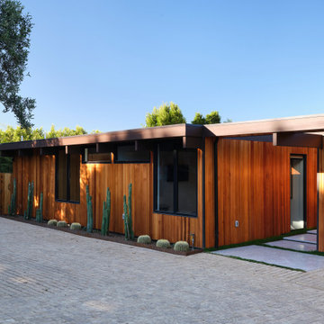
Malibu Glass Box House by Klopf Architecture
Following the devastating Woolsey Fire of 2018, the site in Malibu offered a unique opportunity to rebuild not just a home, but a new architectural composition that highlighted the property’s potential while navigating strict fire-rebuild codes in the area. Designed by Klopf Architecture, this project embraced a set of limitations and translated them into an architectural asset.
The city’s fire-rebuild process required the new structure to remain close to the original footprint, size and bulk, a constraint that ultimately clarified the architectural direction. Perched near the front of a long, narrow lot, the new home frames and overlooks a private, park-like rear expanse, an uncommon luxury especially in this part of Malibu .
Without a fixed program, the design process allowed for a different kind of creative focus allowing Klopf Architecture the opportunity to explore how a modernist home could best respond to this site. The team approached the project not with a list of requirements, but with a question: How might a modernist live here? What spatial qualities would inspire calm, connection, and a sense of wonder in this setting? The process became less about problem-solving and more about architectural storytelling—letting the site, the light, and the principles of modern design guide the form and flow of the home.
The response emerged in the form of a glass-box pavilion, an open, Mid-Century Modern inspired living, dining, and kitchen space that floats at the edge of the property’s natural descent. Connected to the more enclosed, private areas of the home by a glass-walled hallway, the living pavilion becomes a distinct centerpiece of the design. It opens on all four sides to the landscape with decks and patios on the flanks, an internal garden and water feature to the north, and a dramatic unguarded view of the expansive backyard and ocean horizon to the south.
Because of the mandated footprint, careful planning was required to ensure every space could still engage with light, landscape, or both. Strategic voids in the form of atriums and courtyards allow daylight to filter deep into the home’s core, while offering moments of surprise and retreat. These design gestures allow natural light to filter deep into the interior, creating a sense of brightness and openness throughout the day. At the same time, they expand the perceptual boundaries between inside and out, making the home feel more expansive while anchoring its connection to the surrounding landscape.
The siting of the house is what gives it its unique character. Rather than receding into the backyard like the neighboring homes, the house holds a slight prominence. From the central living pavilion, stepping down into the landscape feels more like entering a secluded park where a separate existing accessory structure, trail, and recreational areas await. The home’s modest street presence gives way to this unfolding drama of space, view, and nature.
Fire-resilient materials and assemblies are integrated seamlessly throughout including triple-pane glazing, under-slab and roof insulation, and locally sourced fire-rated cladding ensure the house not only meets Calfornia’s rigorous wildland-urban interface (WUI) standards, but feels effortlessly aligned with them. While technical decisions like fire-hardening and mechanical systems presented some construction challenges, particularly around the cantilevered glass box, the team found a functional compromise that preserved the integrity of the design.
Inside, a restrained palette and exposed post and beam design celebrate the ethos of mid-century modernism. A central circulation spine extends from the entry to the rear glass wall, offering a continuous visual link from street to ocean. Spaces such as the library and office, though more intimate in scale, are never cut off from nature as each opens to its own unique courtyard or garden view.
Though born out of a strict regulatory framework and developed without a specific client, the rebuild design unfolded with remarkable clarity. Grounded in site logic, refined by limitations and an emphasis on timeless spatial relationships – light, proportion, and a strong connection to nature, the resulting design feels both effortless and uplifting. The home lives lightly on the land, opens generously to its surroundings, and strikes a careful balance between privacy, openness, and calm. For Klopf Architecture, it stands as a compelling case study in how site, code, and circumstantial constraints can inspire enduring, modernist architecture. With years of experience reimagining mid-century modern design for how people live today, the firm took the project’s limitations as an opportunity. The result is a home shaped by open, flowing spaces, strong indoor-outdoor connections, and a calm, clear sense of structure. It’s a good reminder that even with strict constraints, there’s still room for architecture to breathe—and for modernism to keep moving forward.
Klopf Architecture project team: Geoff Campen, John Klopf, AIA, and Sherry Tan
Structural Engineer: ZFA
Contractor: Maison D’Artiste
Photography: ©2025 Mariko Reed
Year Completed: 2023
 StoneUnlimited Kitchen and Bath Remodeling
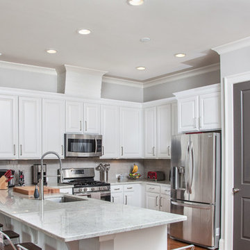
This kitchen transformation by StoneUnlimited Kitchen and Bath showcases how lowering a bar top can expand your space. Some of the features that this kitchen had prior to the renovation included: dark countertops, travertine style backsplash and a raised bar top that obscured the view. Installing Colonial Cream Granite brightened up the room; working in balance with the horizontal layout of the Dove Gray subway tile. The visual impact of lowering the bar top has opened up the kitchen, making it appear larger. The added working space and seating surrounding the counter, has made this eat-in kitchen a great space to gather.
This Stoneunlimited Kitchen and Bath Remodel included:
Countertops: Colonial Cream Granite with 1/4" Bevel edge supported by 4 traditional wood corbels
Tile Backsplash: 3” x 6” glazed ceramic – Dove Gray Crackled subway tiles
Cabinets: Pre-Existing cabinets were painted with Sherwin Williams Paint and hardware was replaced with Ascendra Pulls in brushed nickel finish
 Jordan Design Build Group
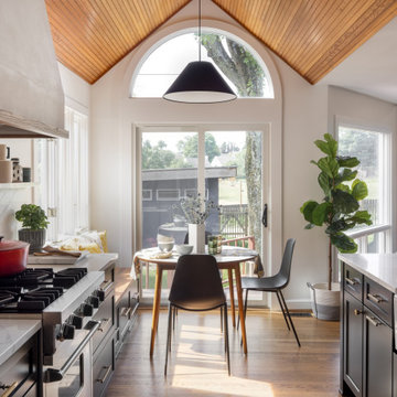
Expanding and updating the kitchen was our top priority – the new layout was designed to straddle the original house and the addition, creating work zones rather than the traditional work triangle. The modified galley layout more than doubled their countertop area and storage space. Extending the kitchen into the addition took full advantage of the vaulted ceilings and light-filled space. To improve flow and connectivity, we opened up a wall between the old kitchen and the front entry hall providing a straight path from front door to the new mudroom/drop zone and kitchen beyond. A door from the dining room into the kitchen was shifted to allow for a more generous kitchen.
The beautifully veined Calacatta Eiffel quartz counters and backsplash provide visual contrast with the black cabinetry and keep the space from feeling too heavy. A continuous ledge and floating shelves replace traditional uppers for a more open and modern feel. Stained wood is used throughout, from the bench top, to shelving, trim and custom millwork; it brings in a natural element and helps unite all of the spaces. A hood with a custom Venetian plaster finish is flanked by vintage inspired sconces and provides a stunning focal point in the room. A deep nook is home to a ‘bubble box’ that dispenses cold sparkling or still water on demand – the marble tile backsplash further differentiates this beverage zone. The brushed brass hardware stands out against the dark cabinets and adds a touch of warmth. With seating for three at the counter and the inclusion of a breakfast area banquette (with drawers), the home is ideal for family time and relaxed gatherings with friends.

Sponsored
Columbus, OH
Snider & Metcalf Interior Design, LTD
Leading Interior Designers in Columbus, Ohio & Ponte Vedra, Florida
 JandB Kitchen Designs
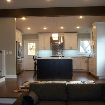
WE DID EXTENSIVE STRUCTURAL MODS. IN THIS KITCHEN.....REMOVED WALL (WHERE BEAM IS) SEPARATING KITCHEN FROM D/R.....THEN EXPANDED INTO D/R AREA!.....TREMENDOUSLY OPENED UP VISUAL AS YOU ENTER HOUSE.....REAR DOOR USED TO BE WINDOWS.....NOW IT OPENS UP TO RAISED DECK.....THERE WERE SEVERAL SOFFITS IN KITCHEN THAT MADE IT SEEM SO MUCH SMALLER AND HID FLOW OF CATHEDRAL CEILING.....TOOK EM ALL OUT!.....NOTE ISLAND WITH DIFFERENT CAB. COLOR AND DIFFERENT TOP.....HOW ABOUT THE CHANDELIER IN THE KITCHEN!!
 Infinite Home
A Kitchen Made for Gathering
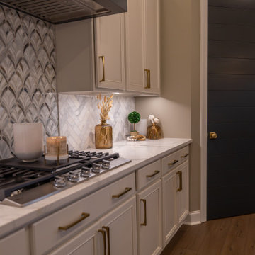
The kitchen was already a well-loved space, so instead of starting from scratch, we gave it a thoughtful refresh by refinishing the existing cabinets, making a few modifications, and updating the color for a fresh, elevated look. To add extra dimension and warmth, we installed cubbies with LED lighting above the cabinets; this not only served to give the space some visual variety but also helped open the space up and give it a more airy feeling when you walk in. The island was expanded to create more space for gathering. To tie it all together, we paired the perfect countertop stone with a mosaic backsplash that adds timeless character.
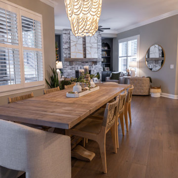 Infinite Home
A Kitchen Made for Gathering
The kitchen was already a well-loved space, so instead of starting from scratch, we gave it a thoughtful refresh by refinishing the existing cabinets, making a few modifications, and updating the color for a fresh, elevated look. To add extra dimension and warmth, we installed cubbies with LED lighting above the cabinets; this not only served to give the space some visual variety but also helped open the space up and give it a more airy feeling when you walk in. The island was expanded to create more space for gathering. To tie it all together, we paired the perfect countertop stone with a mosaic backsplash that adds timeless character.
67