
Search results for "Visually expanded" in Home Design Ideas
 Michael Nash Design, Build & Homes
2011 CHRYSALIS AWARD WINNER, ADDITION $100,000-$250,000
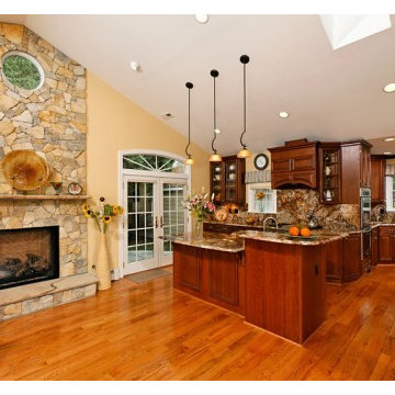
The owners of this small rambler in Arlington were tired of living in cramped quarters. The home’s kitchen was only 8’ x 11’ and they wanted to add a family room. Because the home is built on a slab, with no basement, the decision was made to expand out into the backyard.
Their contractor, Michael Nash Design, Build & Homes, proposed an addition to back of the home, which would also be built on a slab to match the existing elevation. To make room, they had to remove the home’s original patio and then remove the 30’ wall running across the back of the home.
In their place, a new 16’x32’ addition was built with high cathedral ceilings, skylights and French doors topped with arched transoms. An archway and decorative columns were put in place to connect the old and new areas.
The new kitchen starts in the old kitchen area and wraps its way into the new addition, ending with a large two-tier island and prep sink topped with exotic granite. The main sink is in the corner of the old kitchen, easily accessible from both ends of the work area.
Beautiful custom-made cabinets include a wooden range hood and floor-to-ceiling pantry with wine rack. Stainless steel Energy Star appliances include a professional-quality gas cooktop and double wall ovens.
The kitchen flows into the new family room via an open concept design. A beautiful floor-to-ceiling natural stone fire place located in the middle of the back wall serves as a visual separation for the space. A round window is uniquely embedded in the stone work near the ceiling.
Wide plank oak flooring runs the length of the room, providing a uniform look throughout the space. Opposite the kitchen is the home’s new family room, with comfortable leather seating and plenty of windows to brighten up the space. A new stone patio off the kitchen provides the finishing touch to this remodel. In the end, the project provided the homeowners with the space they wanted and plenty of amenities to make family time or entertaining guests a pleasure.
 Whitefish Architecture
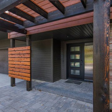
This garage addition and rehabilitation of a mid century modern home expands and enhances the original while respecting the scale and low, linear feel.
All exterior finishes are updated with the exception of the stone. A new entrance creates layers of screening to invite inquiry as well as create privacy and a sense of place. The garage is downplayed with dark materials to allow it to recede relative to the main house, which is deliberately brighter, warmer, and varied to remain the visual focus.
Lead Designer - Alex Jenkins
Designer - Valerie Wright
Photography - Steve Edgar
Lead Designer - Alex Jenkins
Designer - Valerie Wright
Photography - Steve Edgar
 The Amendola Group, Inc.
This Gristmill Lane project’s stunning pool and patio area showcase exceptional masonry craftsmanship. Expanding the area’s use long into the late fall season, an outdoor fireplace and large pavilion area feature stonework chosen to complement the home. An intricate paver walkway greets guests to the home while hinting at the visual surprises that await.
Find the right local pro for your project
 Whitefish Architecture
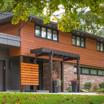
This garage addition and rehabilitation of a mid century modern home expands and enhances the original while respecting the scale and low, linear feel.
All exterior finishes are updated with the exception of the stone. A new entrance creates layers of screening to invite inquiry as well as create privacy and a sense of place. The garage is downplayed with dark materials to allow it to recede relative to the main house, which is deliberately brighter, warmer, and varied to remain the visual focus.
Lead Designer - Alex Jenkins
Designer - Valerie Wright
Photography - Steve Edgar
 Jordan Design Build Group
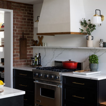
Expanding and updating the kitchen was our top priority – the new layout was designed to straddle the original house and the addition, creating work zones rather than the traditional work triangle. The modified galley layout more than doubled their countertop area and storage space. Extending the kitchen into the addition took full advantage of the vaulted ceilings and light-filled space. To improve flow and connectivity, we opened up a wall between the old kitchen and the front entry hall providing a straight path from front door to the new mudroom/drop zone and kitchen beyond. A door from the dining room into the kitchen was shifted to allow for a more generous kitchen.
The beautifully veined Calacatta Eiffel quartz counters and backsplash provide visual contrast with the black cabinetry and keep the space from feeling too heavy. A continuous ledge and floating shelves replace traditional uppers for a more open and modern feel. Stained wood is used throughout, from the bench top, to shelving, trim and custom millwork; it brings in a natural element and helps unite all of the spaces. A hood with a custom Venetian plaster finish is flanked by vintage inspired sconces and provides a stunning focal point in the room. A deep nook is home to a ‘bubble box’ that dispenses cold sparkling or still water on demand – the marble tile backsplash further differentiates this beverage zone. The brushed brass hardware stands out against the dark cabinets and adds a touch of warmth. With seating for three at the counter and the inclusion of a breakfast area banquette (with drawers), the home is ideal for family time and relaxed gatherings with friends.
 Altura Architects
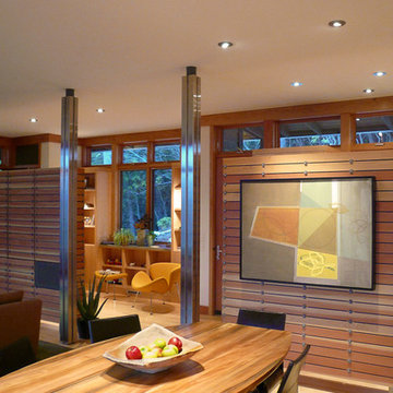
Sustainable design and green design are exemplified in this 4,600 square foot mountain modern home through site placement, recycled content materials, low toxic finishes and certified sustainable wood. Windows along the south wall provide passive solar heating, forest views and a visual connection to the outdoors. Terraces and porches surround the living spaces to provide expanded living area. Clean lines and natural materials create a balance of modern style and casual living.
 Beautiful Backyard Living
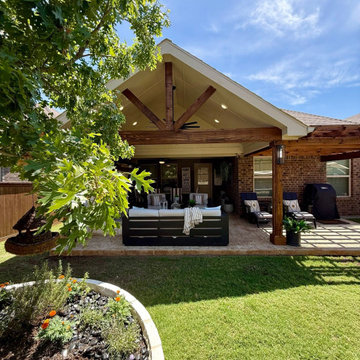
We recently completed a full outdoor living renovation for a homeowner in Celina, Texas, turning their backyard into a stylish and functional retreat. This project brought together multiple elements to create a seamless, well-designed space. We started with expanding the current space with a stamped and stained concrete patio. From there, we designed and built a Gable Roof Patio Cover and added a matching pergola, giving the homeowners both shade and open-air flexibility for entertaining or relaxing. To elevate the comfort level, we included electrical wiring for recessed lighting, ceiling fan, and beautiful lighting on the post to make the space enjoyable well into the evening hours.
The upgrades didn’t stop there. We added plenty of space for outdoor gatherings, and built a beautiful fireplace to anchor the space with warmth and ambiance. A decorative privacy wall was also added for comfort and visual appeal. To enhance the yard we added a stone tree ring that ties in the natural landscape with the finished design. The end result is a backyard that feels like an extension of the home—perfectly suited for family time, entertaining, or quiet evenings by the fire.
Sponsored
Columbus, OH

Snider & Metcalf Interior Design, LTD
Leading Interior Designers in Columbus, Ohio & Ponte Vedra, Florida
 Sosna Inc
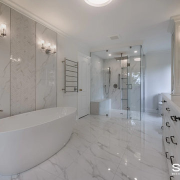
Our returning clients, middle-aged professionals, reached out to us to remodel their bathrooms as they transition from raising children to focusing on their own comfort and living space. They asked us to modernize their ensuite and shared bathroom, both of which had become outdated and impractical for their current needs.
In the ensuite bathroom, we removed a partition wall to redesign and expand the shower and toilet areas, creating a spacious open-concept layout. We added custom cabinetry with pull-out pantries, finished in a bright paint, and a large linear perimeter for ample storage and countertop space. The countertops and backsplash feature dusk veining, paired with brushed nickel sinks, faucets, and cabinet hardware, giving the space a contemporary yet timeless update. A new curbless glass enclosure adds a striking focal point, while the removal of an underused angled jetted tub creates space for an elegant freestanding tub.
In the shared bathroom, we replaced the tub with a modern curbed shower and enhanced the aesthetic with large, colorful porcelain floor tiles that tie together the artistic essence of the home.
The result is a significantly more functional and visually appealing space that reflects our clients' unique style and needs.
 Powell Construction
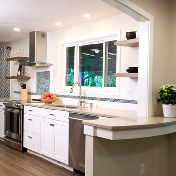
We greatly expanded the opening into the dining room, which made a big difference, by visually connecting the two rooms and opening up the space dramatically. We graced the opening with an arch and a counter that can be used as a buffet.
 Michael Nash Design, Build & Homes
2011 CHRYSALIS AWARD WINNER, ADDITION $100,000-$250,000
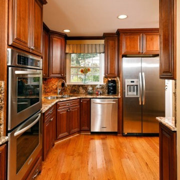
The owners of this small rambler in Arlington were tired of living in cramped quarters. The home’s kitchen was only 8’ x 11’ and they wanted to add a family room. Because the home is built on a slab, with no basement, the decision was made to expand out into the backyard.
Their contractor, Michael Nash Design, Build & Homes, proposed an addition to back of the home, which would also be built on a slab to match the existing elevation. To make room, they had to remove the home’s original patio and then remove the 30’ wall running across the back of the home.
In their place, a new 16’x32’ addition was built with high cathedral ceilings, skylights and French doors topped with arched transoms. An archway and decorative columns were put in place to connect the old and new areas.
The new kitchen starts in the old kitchen area and wraps its way into the new addition, ending with a large two-tier island and prep sink topped with exotic granite. The main sink is in the corner of the old kitchen, easily accessible from both ends of the work area.
Beautiful custom-made cabinets include a wooden range hood and floor-to-ceiling pantry with wine rack. Stainless steel Energy Star appliances include a professional-quality gas cooktop and double wall ovens.
The kitchen flows into the new family room via an open concept design. A beautiful floor-to-ceiling natural stone fire place located in the middle of the back wall serves as a visual separation for the space. A round window is uniquely embedded in the stone work near the ceiling.
Wide plank oak flooring runs the length of the room, providing a uniform look throughout the space. Opposite the kitchen is the home’s new family room, with comfortable leather seating and plenty of windows to brighten up the space. A new stone patio off the kitchen provides the finishing touch to this remodel. In the end, the project provided the homeowners with the space they wanted and plenty of amenities to make family time or entertaining guests a pleasure.
 VESTA
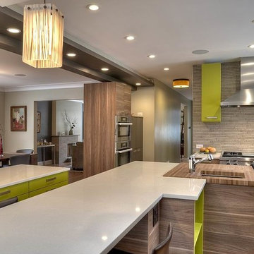
VESTAThis home is located in the in the heart of Northcenter and situated on an oversized lot with a tremendous view of a landscaped backyard garden. The client’s desire was to open the back kitchen wall to take advantage of the garden view and to incorporate the kitchen into the rest of the home. By adding a 3’-0” deep addition at the sink wall and increasing the overall size of the windows, Vesta was able to expand the views and to open the floor plan to create a functional island. The island in turn, added space for food prep & prep sink along with casual seating. By removing the adjoining Dining Room wall, Vesta created an open floor plan that enhanced the Owners everyday living experiences. The new Dining Buffet added storageand a visual break while maintaining the open feel. By using warm horizontal walnut tones, it allowed a reference back to the original mid-century feel of the décor of the home. Adding playful highlights of apple green, we took advantage of a palette that brought the natural outside elements back into the environment.
 Sosna Inc
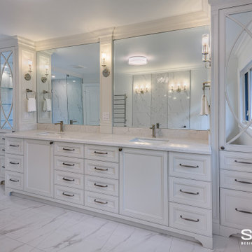
Our returning clients, middle-aged professionals, reached out to us to remodel their bathrooms as they transition from raising children to focusing on their own comfort and living space. They asked us to modernize their ensuite and shared bathroom, both of which had become outdated and impractical for their current needs.
In the ensuite bathroom, we removed a partition wall to redesign and expand the shower and toilet areas, creating a spacious open-concept layout. We added custom cabinetry with pull-out pantries, finished in a bright paint, and a large linear perimeter for ample storage and countertop space. The countertops and backsplash feature dusk veining, paired with brushed nickel sinks, faucets, and cabinet hardware, giving the space a contemporary yet timeless update. A new curbless glass enclosure adds a striking focal point, while the removal of an underused angled jetted tub creates space for an elegant freestanding tub.
In the shared bathroom, we replaced the tub with a modern curbed shower and enhanced the aesthetic with large, colorful porcelain floor tiles that tie together the artistic essence of the home.
The result is a significantly more functional and visually appealing space that reflects our clients' unique style and needs.
 EAG Studio
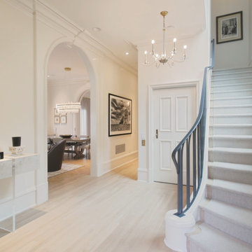
Refined Continuity: Bridging Classical Architecture and Modern Living
This comprehensive remodel of a grand Cow Hollow residence reimagines a historically expressive envelope through a lens of contemporary livability, precision detailing, and material restraint. The design approach carefully balances the home’s classical proportions and ornamental heritage with a refined, modern sensibility—evident in the disciplined palette of warm neutrals, soft plasters, pale oak flooring, and tailored millwork. Circulation has been clarified and subtly expanded to enhance spatial flow, while openings are leveraged to capture light, garden outlooks, and distant water views. Throughout, architectural interventions are executed with a high level of craft, ensuring that new insertions—whether cabinetry, railings, or apertures—read as seamless continuations of the original structure rather than applied elements.
The kitchen serves as the operational and visual anchor of the home, conceived as a sculptural yet highly functional environment. Custom rift-cut cabinetry, softened through a desaturated finish, is paired with honed stone surfaces and integrated brass hardware to create a quiet, tactile richness. A monolithic island establishes a central gathering point, while perimeter work zones are carefully layered with concealed storage, integrated appliances, and open, backlit shelving that elevates everyday objects into curated displays. The adjacent bar and entertaining areas extend this language, reinforcing a cohesive hospitality-driven program. In parallel, the primary bathroom is designed as a serene, spa-like retreat, where bookmatched stone, frameless glass enclosures, and finely detailed metalwork converge. The composition prioritizes symmetry, clarity, and light—balancing generous volumes with intimate moments through integrated lighting, custom vanities, and a restrained material hierarchy.
The library and ancillary living spaces introduce a more intimate scale, anchored by bespoke built-ins that combine closed storage with illuminated display niches, creating depth and rhythm along the walls. Here, material transitions and furniture integration are handled with particular nuance, allowing the architecture to support both quiet retreat and social gathering. A continuous language of custom railings—executed in refined metal profiles—threads through the interior and extends outward, where the exterior gate and garden elements have been reinterpreted to align with the home’s renewed identity. The entry sequence is now defined by a calibrated interplay of solidity and transparency, with sculptural metalwork and landscape integration establishing a sense of arrival that is both secure and elegant. Collectively, the project reflects a holistic transformation—one that elevates performance, livability, and aesthetic clarity while preserving the inherent dignity of the original architecture.

Sponsored
Columbus, OH
Snider & Metcalf Interior Design, LTD
Leading Interior Designers in Columbus, Ohio & Ponte Vedra, Florida
 Capital Kitchen & Bath
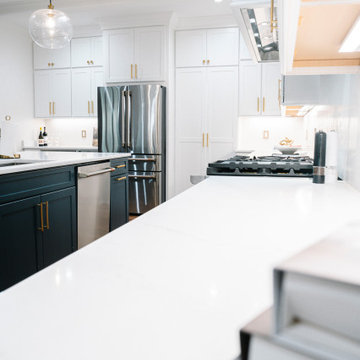
This kitchen remodel is the definition of elevated everyday living, where clean lines, warm textures, and intentional function come together in a space designed to truly perform.
The quartz countertops & full height backsplash give the entire kitchen a clean, luminous feel while providing durable, low-maintenance performance for real everyday living.
A large statement island was created by expanding the kitchen footprint and eliminating the unused formal dining room. The island adds generous prep space, comfortable seating, and the perfect gathering spot for morning coffee or evening entertaining.
Tucked seamlessly into the cabinetry is a hidden walk-in pantry with wet bar & storage galore, keeping the kitchen's visual lines beautifully uncluttered.
And for effortless hosting, a dedicated beverage station- in the kitchen- featuring an ice maker and refrigerator creates a functional mini-hub for drinks, snacks, and celebrations.
Modern. Functional. Timeless. This is more than a kitchen remodel, it’s a space designed to make daily life feel beautiful and effortless.
 Modern Outdoor
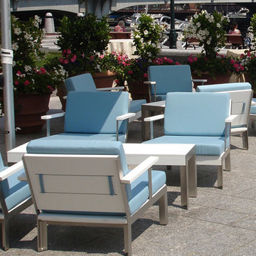
Casual yet elegant, the Etra Collection by Modern Outdoor offers a modern aesthetic that is constructed for outdoor use while being suitable for indoor settings. Etra’s visual inspiration is derived from its architectural-based frame system. Designed using structural angle steel that is mitered and ground, a clean and seamless surface gives Etra its pure appeal.
Frame Options:
• 304 stainless steel that is brushed and electropolished
• marine-grade 316 stainless steel that is brushed and electropolished for use within one mile of salt air, available for an upcharge
• powder coated carbon steel in our standard silver finish
• custom powder coat colors, available for an upcharge
Surface Options:
• sustainably harvested ipe – a beautiful South American hardwood that is three times as dense as teak — naturally resistant to rot, insects, UV exposure, ice, salt, abrasion and splintering – all without the need for toxic chemicals — considered a 25+ year wood
• marine-grade polyboard – a UV stabilized high-density polyethylene material that is non-corrosive and chip resistant – available in six colors for expanded design choices
Fabric Options:
• six standard colors of 100% solution dyed acrylic treated for outdoor use are offered
• custom fabrics and COM service are also available
Cushion Options:
• our standard foam cushions are made from outdoor appropriate high-resiliency (HR) foam
• for clients that prefer less maintenance, a flow-through foam that allows water and moisture to escape the cushion is also available for an upcharge
Etra is a full-breadth line with dining, bar height, lounge, cafe, patio and pool setting pieces included. The pieces are readily customizable for individual client needs.
 Ann Lowengart Interiors
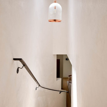
The three-level Mediterranean revival home started as a 1930s summer cottage that expanded downward and upward over time. We used a clean, crisp white wall plaster with bronze hardware throughout the interiors to give the house continuity. A neutral color palette and minimalist furnishings create a sense of calm restraint. Subtle and nuanced textures and variations in tints add visual interest. The stair risers from the living room to the primary suite are hand-painted terra cotta tile in gray and off-white. We used the same tile resource in the kitchen for the island's toe kick.
 Capital Kitchen & Bath
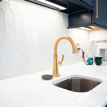
This kitchen remodel is the definition of elevated everyday living, where clean lines, warm textures, and intentional function come together in a space designed to truly perform.
The quartz countertops & full height backsplash give the entire kitchen a clean, luminous feel while providing durable, low-maintenance performance for real everyday living.
A large statement island was created by expanding the kitchen footprint and eliminating the unused formal dining room. The island adds generous prep space, comfortable seating, and the perfect gathering spot for morning coffee or evening entertaining.
Tucked seamlessly into the cabinetry is a hidden walk-in pantry with wet bar & storage galore, keeping the kitchen's visual lines beautifully uncluttered.
And for effortless hosting, a dedicated beverage station- in the kitchen- featuring an ice maker and refrigerator creates a functional mini-hub for drinks, snacks, and celebrations.
Modern. Functional. Timeless. This is more than a kitchen remodel, it’s a space designed to make daily life feel beautiful and effortless.


 Klopf Architecture
Malibu Glass Box House by Klopf Architecture
Following the devastating Woolsey Fire of 2018, the site in Malibu offered a unique opportunity to rebuild not just a home, but a new architectural composition that highlighted the property’s potential while navigating strict fire-rebuild codes in the area. Designed by Klopf Architecture, this project embraced a set of limitations and translated them into an architectural asset.
The city’s fire-rebuild process required the new structure to remain close to the original footprint, size and bulk, a constraint that ultimately clarified the architectural direction. Perched near the front of a long, narrow lot, the new home frames and overlooks a private, park-like rear expanse, an uncommon luxury especially in this part of Malibu .
Without a fixed program, the design process allowed for a different kind of creative focus allowing Klopf Architecture the opportunity to explore how a modernist home could best respond to this site. The team approached the project not with a list of requirements, but with a question: How might a modernist live here? What spatial qualities would inspire calm, connection, and a sense of wonder in this setting? The process became less about problem-solving and more about architectural storytelling—letting the site, the light, and the principles of modern design guide the form and flow of the home.
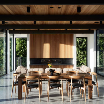
The response emerged in the form of a glass-box pavilion, an open, Mid-Century Modern inspired living, dining, and kitchen space that floats at the edge of the property’s natural descent. Connected to the more enclosed, private areas of the home by a glass-walled hallway, the living pavilion becomes a distinct centerpiece of the design. It opens on all four sides to the landscape with decks and patios on the flanks, an internal garden and water feature to the north, and a dramatic unguarded view of the expansive backyard and ocean horizon to the south.
Because of the mandated footprint, careful planning was required to ensure every space could still engage with light, landscape, or both. Strategic voids in the form of atriums and courtyards allow daylight to filter deep into the home’s core, while offering moments of surprise and retreat. These design gestures allow natural light to filter deep into the interior, creating a sense of brightness and openness throughout the day. At the same time, they expand the perceptual boundaries between inside and out, making the home feel more expansive while anchoring its connection to the surrounding landscape.
The siting of the house is what gives it its unique character. Rather than receding into the backyard like the neighboring homes, the house holds a slight prominence. From the central living pavilion, stepping down into the landscape feels more like entering a secluded park where a separate existing accessory structure, trail, and recreational areas await. The home’s modest street presence gives way to this unfolding drama of space, view, and nature.
Fire-resilient materials and assemblies are integrated seamlessly throughout including triple-pane glazing, under-slab and roof insulation, and locally sourced fire-rated cladding ensure the house not only meets Calfornia’s rigorous wildland-urban interface (WUI) standards, but feels effortlessly aligned with them. While technical decisions like fire-hardening and mechanical systems presented some construction challenges, particularly around the cantilevered glass box, the team found a functional compromise that preserved the integrity of the design.
Inside, a restrained palette and exposed post and beam design celebrate the ethos of mid-century modernism. A central circulation spine extends from the entry to the rear glass wall, offering a continuous visual link from street to ocean. Spaces such as the library and office, though more intimate in scale, are never cut off from nature as each opens to its own unique courtyard or garden view.
Though born out of a strict regulatory framework and developed without a specific client, the rebuild design unfolded with remarkable clarity. Grounded in site logic, refined by limitations and an emphasis on timeless spatial relationships – light, proportion, and a strong connection to nature, the resulting design feels both effortless and uplifting. The home lives lightly on the land, opens generously to its surroundings, and strikes a careful balance between privacy, openness, and calm. For Klopf Architecture, it stands as a compelling case study in how site, code, and circumstantial constraints can inspire enduring, modernist architecture. With years of experience reimagining mid-century modern design for how people live today, the firm took the project’s limitations as an opportunity. The result is a home shaped by open, flowing spaces, strong indoor-outdoor connections, and a calm, clear sense of structure. It’s a good reminder that even with strict constraints, there’s still room for architecture to breathe—and for modernism to keep moving forward.
Klopf Architecture project team: Geoff Campen, John Klopf, AIA, and Sherry Tan
Structural Engineer: ZFA
Contractor: Maison D’Artiste
Photography: ©2025 Mariko Reed
Year Completed: 2023
 Ground One Landscape Design + Build
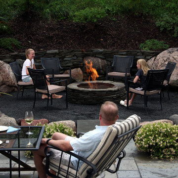
Ground One designed and built a deck off the back of the house for casual sitting, mirroring the house’s front porch. This deck and the screened porch steps descend to a patio terrace. To expand the entertaining space and accommodate the setback restrictions for a permitted gas firepit, we excavated the lot’s back slope to gain bonus space and create a rustic campfire spot. Large boulders found on the site during house construction are incorporated into a retaining wall. Colonial bluestone fills the gaps between these large accent stones and surrounds the firepit. Additional boulders hold up the patio and a slab of bluestone bridges the terrace and patio, preserving the overall drainage pattern. Bluestone is the common thread throughout the project, but it is used in different forms; clean lines closer to the house transition to a more weathered look as you move toward the natural area. The swale is a variety of boulder sizes and river rock to create a more visually-compelling creekbed.
The firepit patio is comfortable for just two people, but can also accommodate a larger group. It is close to the dining space, but physical separation allows for entertaining in different configurations: pre-dinner cocktails around the fire, a roaring flame as backdrop during dinner, kids roasting marshmallows while the adults linger within sight at the dining table, or the gang huddled around a bonfire.
 Manchester Design Group
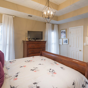
With this layout you'd think we expanded the space. No. I simply changed the layout, added long drapes to add visual height. Also I used a white matisse drape to reflect the light for a bright and airy feel while the texture added interest so white wouldn't appear so plain. There's no doubt the gold accents reflect the new modern vibe. And last but not least changing the hardware on the existing chest of drawers and night stands made an impeccable impact on the style but not the budget.
68