
Search results for "Vital elements" in Home Design Ideas
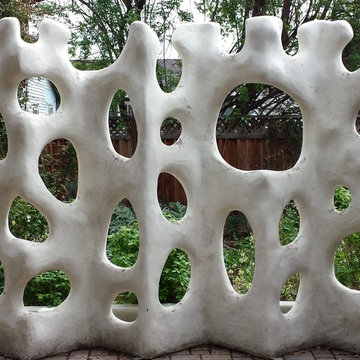
 Stonesculpt
Opus,
While I’m a classically trained master stone carver, as an artist and sculptor I work in a variety of materials to express my conceptually driven ideas in novel sculptural form, experimenting with texture, materials, color, or interactive elements. I try to realize the potential of art as my unique, vital contribution to society or your home.
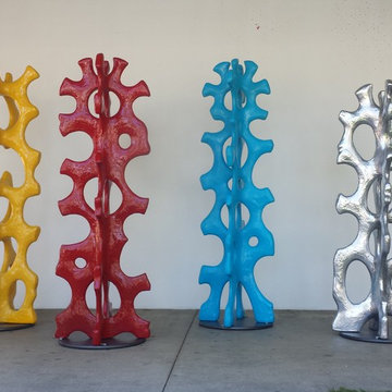 Stonesculpt
Diversity Totems,
While I’m a classically trained master stone carver, as an artist and sculptor I work in a variety of materials to express my conceptually driven ideas in novel sculptural form, experimenting with texture, materials, color, or interactive elements. I try to realize the potential of art as my unique, vital contribution to society or your home.


Find the right local pro for your project
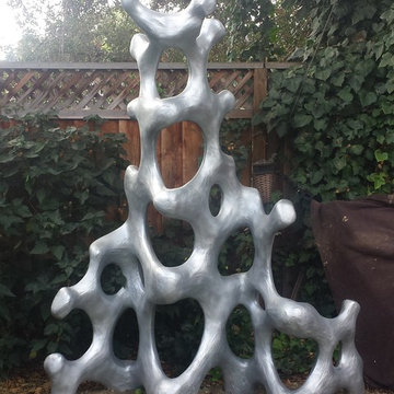 Stonesculpt
Geno.
While I’m a classically trained master stone carver, as an artist and sculptor I work in a variety of materials to express my conceptually driven ideas in novel sculptural form, experimenting with texture, materials, color, or interactive elements. I try to realize the potential of art as my unique, vital contribution to society or your home.
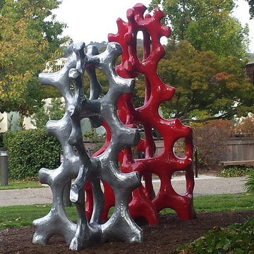 Stonesculpt
Queen & Pawn,
While I’m a classically trained master stone carver, as an artist and sculptor I work in a variety of materials to express my conceptually driven ideas in novel sculptural form, experimenting with texture, materials, color, or interactive elements. I try to realize the potential of art as my unique, vital contribution to society or your home.

 Soucie Horner, Ltd.
From its English-style conservatory to its wealth of French doors, this impressive family home - at once stately, yet welcoming - ushers the vitality of its premiere urban setting into historically-inspired interiors. Here, soaring ceilings, inlaid floors, and marble-wrapped, walnut-paneled, and mirror-clad walls honor the luxurious traditions of classic European interior architecture. Naturally, symmetry is its muse, evinced through a striking collection of fine furnishings, splendid rugs, art, and accessories - augmented, all, by unexpectedly fresh bursts of color and playfully retro silhouettes. Formal without intimidation -or apology- it personifies the very finest in gracious city living.
Photos by Nathan Kirkman http://nathankirkman.com/

 J. Stephens Interiors
This ASID Award-winning sunroom inspires a sense of freshness and vitality. Artful furniture selections, whose curvilinear lines gracefully juxtapose the strong geometric lines of trusses and beams, reflect a measured study of shapes and materials that intermingle impeccably amidst a neutral color palette brushed with celebrations of coral and master millwork. Radiant-heated flooring and reclaimed wood lend warmth and comfort. Combining English, Spanish and fresh modern elements, this sunroom offers captivating views and easy access to the outside dining area, serving both form and function with inspiring gusto. A double-height ceiling with recessed LED lighting concealed in the beams seems at times to be the only thing tethering this airy expression of beauty and design excellence from floating directly into the sky.

Sponsored
Columbus, OH

Wannemacher Interiors
Customized Award-Winning Interior Design Solutions in Franklin Cnty OH

 User
UserThe Clients contacted Cecil Baker + Partners to reconfigure and remodel the top floor of a prominent Philadelphia high-rise into an urban pied-a-terre. The forty-five story apartment building, overlooking Washington Square Park and its surrounding neighborhoods, provided a modern shell for this truly contemporary renovation. Originally configured as three penthouse units, the 8,700 sf interior, as well as 2,500 square feet of terrace space, was to become a single residence with sweeping views of the city in all directions.
The Client’s mission was to create a city home for collecting and displaying contemporary glass crafts. Their stated desire was to cast an urban home that was, in itself, a gallery. While they enjoy a very vital family life, this home was targeted to their urban activities - entertainment being a central element.
The living areas are designed to be open and to flow into each other, with pockets of secondary functions. At large social events, guests feel free to access all areas of the penthouse, including the master bedroom suite. A main gallery was created in order to house unique, travelling art shows.
Stemming from their desire to entertain, the penthouse was built around the need for elaborate food preparation. Cooking would be visible from several entertainment areas with a “show” kitchen, provided for their renowned chef. Secondary preparation and cleaning facilities were tucked away.
The architects crafted a distinctive residence that is framed around the gallery experience, while also incorporating softer residential moments. Cecil Baker + Partners embraced every element of the new penthouse design beyond those normally associated with an architect’s sphere, from all material selections, furniture selections, furniture design, and art placement.
Barry Halkin and Todd Mason Photography
 User
UserThe Clients contacted Cecil Baker + Partners to reconfigure and remodel the top floor of a prominent Philadelphia high-rise into an urban pied-a-terre. The forty-five story apartment building, overlooking Washington Square Park and its surrounding neighborhoods, provided a modern shell for this truly contemporary renovation. Originally configured as three penthouse units, the 8,700 sf interior, as well as 2,500 square feet of terrace space, was to become a single residence with sweeping views of the city in all directions.
The Client’s mission was to create a city home for collecting and displaying contemporary glass crafts. Their stated desire was to cast an urban home that was, in itself, a gallery. While they enjoy a very vital family life, this home was targeted to their urban activities - entertainment being a central element.
The living areas are designed to be open and to flow into each other, with pockets of secondary functions. At large social events, guests feel free to access all areas of the penthouse, including the master bedroom suite. A main gallery was created in order to house unique, travelling art shows.
Stemming from their desire to entertain, the penthouse was built around the need for elaborate food preparation. Cooking would be visible from several entertainment areas with a “show” kitchen, provided for their renowned chef. Secondary preparation and cleaning facilities were tucked away.
The architects crafted a distinctive residence that is framed around the gallery experience, while also incorporating softer residential moments. Cecil Baker + Partners embraced every element of the new penthouse design beyond those normally associated with an architect’s sphere, from all material selections, furniture selections, furniture design, and art placement.
Barry Halkin and Todd Mason Photography
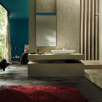
 International Bath and Tile
Harmony of heart and mind
The bathroom collection from renowned designer Philippe Starck combines unique design with a highly sensual water experience, with low consumption. Axor Starck Organic also guarantees responsible use of the vital element of water. This is borne out by a revolutionary control concept and numerous functional and ecological qualities. The collection therefore appeals to both heart and intellect in equal measure and also blends in with a variety of style worlds.
http://www.hansgrohe-int.com/assets/global/ax_axor-starck-organic-bathroom-mixer-ambiente_1154x650_rdax_730x411.jpg

 Pretorius Studio
The project is a series of mural panels painted in the artist’s studio and installed on all walls of a dining room. The imagery is of soft landscape with classical architectural elements, loosely based on an Arcadian 18th century French wallpaper scenic.
The murals are painted in grisaille, a traditional technique which uses a monochromatic palette of grey to create depth. In this case the artist used the soft painterly style of Fragonard and Boucher to create the lush landscape in the same grey palette. The freshness and vitality of the brushwork distinguishes these murals from printed wall covering. Silver leaf detailing on the pilasters adds a luminous effect.
This project won an Acanthus Award for excellence from the Institute of Classical Architecture and Art in 2014.
 Cheery Curtains
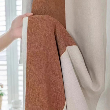
Chenille eyelet ready made curtains are available for sale, offering a luxurious and heavyweight option for your window decor. With a stripe design, these ready-made curtains add a touch of elegance and style to any room. Pink chenille curtains add a soft and feminine touch, bringing a sense of warmth and charm to the decor. Blue chenille curtains offer a cool and soothing effect, adding a touch of tranquility and elegance to your rooms. Green chenille curtains bring a sense of freshness and nature to your space, creating a calming and serene atmosphere. The orange chenille curtains exude vitality and enthusiasm, injecting a lively and energetic element into the space.
 Pretorius Studio
The project is a series of mural panels painted in the artist’s studio and installed on all walls of a dining room. The imagery is of soft landscape with classical architectural elements, loosely based on an Arcadian 18th century French wallpaper scenic.
The murals are painted in grisaille, a traditional technique which uses a monochromatic palette of grey to create depth. In this case the artist used the soft painterly style of Fragonard and Boucher to create the lush landscape in the same grey palette. The freshness and vitality of the brushwork distinguishes these murals from printed wall covering. Silver leaf detailing on the pilasters adds a luminous effect.
This project won an Acanthus Award for excellence from the Institute of Classical Architecture and Art in 2014.
Sponsored
Columbus, OH

Trish Takacs Design
Award Winning & Highly Skilled Kitchen & Bath Designer in Columbus
 Cheery Curtains
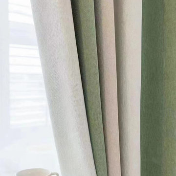
Chenille eyelet ready made curtains are available for sale, offering a luxurious and heavyweight option for your window decor. With a stripe design, these ready-made curtains add a touch of elegance and style to any room. Pink chenille curtains add a soft and feminine touch, bringing a sense of warmth and charm to the decor. Blue chenille curtains offer a cool and soothing effect, adding a touch of tranquility and elegance to your rooms. Green chenille curtains bring a sense of freshness and nature to your space, creating a calming and serene atmosphere. The orange chenille curtains exude vitality and enthusiasm, injecting a lively and energetic element into the space.
 Soucie Horner, Ltd.
From its English-style conservatory to its wealth of French doors, this impressive family home - at once stately, yet welcoming - ushers the vitality of its premiere urban setting into historically-inspired interiors. Here, soaring ceilings, inlaid floors, and marble-wrapped, walnut-paneled, and mirror-clad walls honor the luxurious traditions of classic European interior architecture. Naturally, symmetry is its muse, evinced through a striking collection of fine furnishings, splendid rugs, art, and accessories - augmented, all, by unexpectedly fresh bursts of color and playfully retro silhouettes. Formal without intimidation -or apology- it personifies the very finest in gracious city living.
Photos by Nathan Kirkman http://nathankirkman.com/
 Pretorius Studio
The project is a series of mural panels painted in the artist’s studio and installed on all walls of a dining room. The imagery is of soft landscape with classical architectural elements, loosely based on an Arcadian 18th century French wallpaper scenic.
The murals are painted in grisaille, a traditional technique which uses a monochromatic palette of grey to create depth. In this case the artist used the soft painterly style of Fragonard and Boucher to create the lush landscape in the same grey palette. The freshness and vitality of the brushwork distinguishes these murals from printed wall covering. Silver leaf detailing on the pilasters adds a luminous effect.
This project won an Acanthus Award for excellence from the Institute of Classical Architecture and Art in 2014.
 Meditch Murphey Architects
Michael Moran
Deck - large contemporary three-story stucco white deck idea in DC Metro
Deck - large contemporary three-story stucco white deck idea in DC Metro

 Fredman Design Group
Designers gave the house a wood-and-steel façade that blends traditional and industrial elements.Photography by Eric Hausman
Designers gave the house a wood-and-steel façade that blends traditional and industrial elements. This home’s noteworthy steel shipping container construction material, offers a streamlined aesthetic and industrial vibe, with sustainable attributes and strength. Recycled shipping containers are fireproof, impervious to water and stronger than traditional building materials. Inside, muscular concrete walls, burnished cedar beams and custom oak cabinetry give the living spaces definition, decorative might, and storage and seating options.
For more than 40 years, Fredman Design Group has been in the business of Interior Design. Throughout the years, we’ve built long-lasting relationships with our clients through our client-centric approach. When creating designs, our decisions depend on the personality of our clients—their dreams and their aspirations. We manifest their lifestyle by incorporating elements of design with those of our clients to create a unique environment, down to the details of the upholstery and accessories. We love it when a home feels finished and lived in, with various layers and textures.
While each of our clients and their stories has varied over the years, they’ve come to trust us with their projects—whether it’s a single room to the larger complete renovation, addition, or new construction.
They value the collaborative team that is behind each project, embracing the diversity that each designer is able to bring to their project through their love of art, travel, fashion, nature, history, architecture or film—ultimately falling in love with the nurturing environments we create for them.
We are grateful for the opportunity to tell each of clients’ stories through design. What story can we help you tell?
Call us today to schedule your complimentary consultation - 312-587-9184
 Soucie Horner, Ltd.
From its English-style conservatory to its wealth of French doors, this impressive family home - at once stately, yet welcoming - ushers the vitality of its premiere urban setting into historically-inspired interiors. Here, soaring ceilings, inlaid floors, and marble-wrapped, walnut-paneled, and mirror-clad walls honor the luxurious traditions of classic European interior architecture. Naturally, symmetry is its muse, evinced through a striking collection of fine furnishings, splendid rugs, art, and accessories - augmented, all, by unexpectedly fresh bursts of color and playfully retro silhouettes. Formal without intimidation -or apology- it personifies the very finest in gracious city living.
Photos by Nathan Kirkman http://nathankirkman.com/
 Gallery KBNY
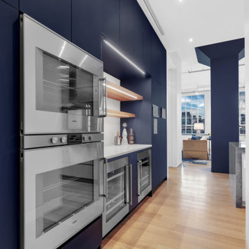
Located in the Sky Lofts building in Tribeca (once home to the most expensive apartment sale in NYC), our clients were ready to renovate and modernize their centerpiece kitchen. Due to the unique nature of loft renovations (high ceilings, columns, creative and skillful lighting applications, among other factors), Gallery’s expertise in loft spaces was vital to our clients. In addition to the loft particularities, it’s important in a kitchen of this size to ensure that all the elements have been laid out with purpose from a functional perspective and a design perspective.
CENTERPIECE KITCHEN
Color was an important design element in this kitchen. This is evident in the striking blues and grays of the marble countertops and backsplash, as well as the dark navy hue of the built-in cabinets. White lower cabinets create two-tone contrast, while glass cabinets and a long wood open shelf make the most of the available height.
The built-in cabinets also include built-in appliances: an espresso maker, coffee machine, two side-by-side wine fridges, and even an integrated refrigerator paneled to match the cabinetry for an essentially seamless look. The cabinets are all push-to-open, eliminating knobs to complete the overall sleek, contemporary style.
The marble backsplash is also book-matched, meaning the slabs of stone have been cut and polished to match each other, creating a mirroring effect that further contributes to the cohesive, contemporary aesthetic of this apartment.
BUILDING CONSIDERATIONS
Functional factors are another vital component to New York City apartment building renovations. In this particular project, we had to consider how to get large slabs of stone into the loft without having to cut them up. When working with slabs, and especially when the design is as sleek and contemporary as this one, it’s vital to eliminate seams as much as possible. Elevators and stairs are often not large enough to handle large slabs of stone, which means there are only two other options: cutting the stone and putting it back together on site (but this will create a seam, so it’s not always an option) or using a crane to bring it in through a window.
Higher-end buildings tend to have more restrictions and management companies with stricter renovation guidelines – with good reason. A good relationship with the super and staff of the building is absolutely essential; effective communication with everyone involved will result in an ideal outcome for all parties.
ARTFUL LOGISTICS
Seemingly minor elements such as apartment protections are also just as crucial. While every renovation will require protections in hallways, common spaces, zip walls, and perhaps the floors, those protections are doubled when renovating in an apartment that’s currently occupied. In the case of this particular client, who owned a great deal of valuable artwork in addition to their furniture and other belongings, Gallery exacted their own form of art when putting the protections in place and maneuvering around them with skill.
SOME HIGHLIGHTS
- Unique marble slabs (Azul Macauba quartzite and Calacatta Diamond quartzite) for the countertops and backsplash
- Book-matched backsplash
- Gaggenau appliances
- Glass cabinets with built-in lighting
- Custom millwork for the cabinets
4