
Search results for "Well placed shot" in Home Design Ideas
 Closet Factory (Fort Lauderdale)
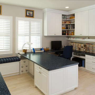
Whether crafting is a hobby or a full-time occupation, it requires space and organization. Any space in your home can be transformed into a fun and functional craft room – whether it’s a guest room, empty basement, laundry room or small niche. Replete with built-in cabinets and desks, or islands for sewing centers, you’re no longer relegated to whatever empty room is available for your creative crafting space. An ideal outlet to spark your creativity, a well-designed craft room will provide you with access to all of your tools and supplies as well as a place to spread out and work comfortably. Designed to cleverly fit into any unused space, a custom craft room is the perfect place for scrapbooking, sewing, and painting for everyone.

 TKS Design Group
Download our free ebook, Creating the Ideal Kitchen. DOWNLOAD NOW
Lakefront property in the northwest suburbs of Chicago is hard to come by, so when we were hired by this young family with exactly that, we were immediately inspired by not just the unusually large footprint of this 1950’s colonial revival but also the lovely views of the manmade lake it was sited on. The large 5-bedroom home was solidly stuck in the 1980’s, but we saw tons of potential. We started out by updating the existing staircase with a fresh coat of paint and adding new herringbone slate to the entry hall.
The powder room off the entryway also got a refresh - new flooring, new cabinets and fixtures. We ran the new slate right through into this space for some consistency. A fun wallpaper and shiplap trim add a welcoming feel and set the tone for the home.
Next, we tackled the kitchen. Located away from the rest of the first floor, the kitchen felt a little isolated, so we immediately began planning for how to better connect it to the rest of the first floor. We landed on removing the wall between the kitchen and dining room and designed a modified galley style space with separate cooking and clean up zones. The cooking zone consists of the refrigerator, prep sink and cooktop, along with a nice long run of prep space at the island. The cleanup side of the kitchen consists of the main sink and dishwasher. Both areas are situated so that the user can view the lake during prep work and cleanup!
One of the home’s main puzzles was how to incorporate the mudroom and area in front of the patio doors at the back of the house. We already had a breakfast table area, so the space by the patio doors was a bit of a no man’s land. We decided to separate the kitchen proper from what became the new mudroom with a large set of barn doors. That way you can quickly hide any mudroom messes but have easy access to the light coming in through the patio doors as well as the outdoor grilling station. We also love the impact the barn doors add to the overall space.
The homeowners’ first words to us were “it’s time to ditch the brown,” so we did! We chose a lovely blue pallet that reflects the home’s location on the lake which is also vibrant yet easy on the eye. Countertops are white quartz, and the natural oak floor works well with the other honey accents. The breakfast table was given a refresh with new chairs, chandelier and window treatments that frame the gorgeous views of the lake out the back.
We coordinated the slate mudroom flooring with that used in the home’s main entrance for a consistent feel. The storage area consists of open and closed storage to allow for some clutter control as needed.
Next on our “to do” list was revamping the dated brown bar area in the neighboring dining room. We eliminated the clutter by adding some closed cabinets and did some easy updates to help the space feel more current. One snag we ran into here was the discovery of a beam above the existing open shelving that had to be modified with a smaller structural beam to allow for our new design to work. This was an unexpected surprise, but in the end we think it was well worth it!
We kept the colors here a bit more muted to blend with the homeowner’s existing furnishings. Open shelving and polished nickel hardware add some simple detail to the new entertainment zone which also looks out onto the lake!
Next we tackled the upstairs starting with the homeowner’s son’s bath. The bath originally had both a tub shower and a separate shower, so we decided to swap out the shower for a new laundry area. This freed up some space downstairs in what used to be the mudroom/laundry room and is much more convenient for daily laundry needs.
We continued the blue palette here with navy cabinetry and the navy tile in the shower. Porcelain floor tile and chrome fixtures keep maintenance to a minimum while matte black mirrors and lighting add some depth the design. A low maintenance runner adds some warmth underfoot and ties the whole space together.
We added a pocket door to the bathroom to minimize interference with the door swings. The left door of the laundry closet is on a 180 degree hinge to allow for easy full access to the machines. Next we tackled the master bath which is an en suite arrangement. The original was typical of the 1980’s with the vanity outside of the bathroom, situated near the master closet. And the brown theme continued here with multiple shades of brown.
Our first move was to segment off the bath and the closet from the master bedroom. We created a short hall from the bedroom to the bathroom with his and hers walk-in closets on the left and right as well as a separate toilet closet outside of the main bathroom for privacy and flexibility.
The original bathroom had a giant soaking tub with steps (dangerous!) as well as a small shower that did not work well for our homeowner who is 6’3”. With other bathtubs in the home, they decided to eliminate the tub and create an oversized shower which takes up the space where the old tub was located. The double vanity is on the opposite wall and a bench is located under the window for morning conversations and a place to set a couple of towels.
The pallet in here is light and airy with a mix of blond wood, creamy porcelain and marble tile, and brass accents. A simple roman shade adds some texture and it’s top-down mechanism allows for light and privacy.
This large whole house remodel gave our homeowners not only the ability to maximize the potential of their home but also created a lovely new frame from which to view their fabulous lake views.
Designed by: Susan Klimala, CKD, CBD
Photography by: Michael Kaskel
For more information on kitchen and bath design ideas go to: www.kitchenstudio-ge.com
 Sheila Rich Interiors, LLC
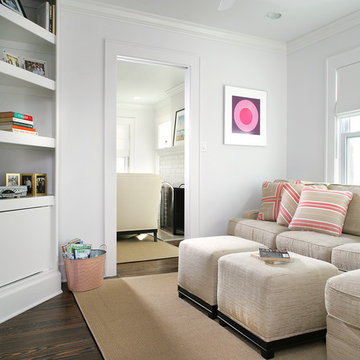
Pocket doors allow the multi-functional family room to become a private main floor fifth bedroom for weekend guests. Ottomans are used in lieu of a coffee table, offering extra seating as well as surface space and allowing better traffic flow.
The proportionally-sized custom wall unit with strategically placed angles and touch-latch doors (eliminating protrusions) leaves just enough functional floor space for the queen-size mattress to open comfortably.
Find the right local pro for your project
 TKS Design Group
Free ebook, Creating the Ideal Kitchen. DOWNLOAD NOW
One of my favorite things to work on is older homes with a bit of history because I find it an interesting challenge to marry the historical architectural features of a home with modern design elements that work well for my client’s current lifestyle.
This home was particularly fun because it was the second kitchen we had done for this family and was quite a departure from the style of the first kitchen.
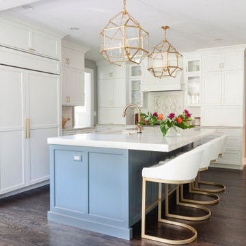
The before shot of the kitchen shows a view from the family room. See the dropped ceiling? We were curious, was this just part of the design or was the dropped ceiling there to hide mechanicals? Well we soon found out that it was mostly decorative (yay!), and with the exception of a little bit of work to some plumbing from an upstairs bathroom and rerouting of the ventilation system within the original floor joists, we were in the clear, phew! The shot of the completed kitchen from roughly the same vantage point shows how much taller the ceilings are. It makes a huge difference in the feel of the space. Dark and gloomy turned fresh and light!
Another serious consideration was what do we do with the skinny transom window above the refrigerator. After much back and forth, we decided to eliminate it and do some open shelving instead. This ended up being one of the nicest areas in the room. I am calling it the “fun zone” because it houses all the barware, wine cubbies and a bar fridge — the perfect little buffet spot for entertaining. It is flanked on either side by pull out pantries that I’m sure will get a ton of use. Since the neighboring room has literally three walls of almost full height windows, the kitchen gets plenty of light.
The gold shelving brackets, large pendant fixtures over the island and the tile mural behind the range all pay subtle homage to the home’s prairie style architecture and bring a bit of sparkle to the room.
Even though the room is quite large, the work triangle is very tight with the large Subzero fridge, sink and range all nearby for easy maneuvering during meal prep. There is seating for four at the island, and work aisles are generous.
Designed by: Susan Klimala, CKD, CBD
Photography by: LOMA Studios
For more information on kitchen and bath design ideas go to: www.kitchenstudio-ge.com
 TKS Design Group
Download our free ebook, Creating the Ideal Kitchen. DOWNLOAD NOW
Lakefront property in the northwest suburbs of Chicago is hard to come by, so when we were hired by this young family with exactly that, we were immediately inspired by not just the unusually large footprint of this 1950’s colonial revival but also the lovely views of the manmade lake it was sited on. The large 5-bedroom home was solidly stuck in the 1980’s, but we saw tons of potential. We started out by updating the existing staircase with a fresh coat of paint and adding new herringbone slate to the entry hall.
The powder room off the entryway also got a refresh - new flooring, new cabinets and fixtures. We ran the new slate right through into this space for some consistency. A fun wallpaper and shiplap trim add a welcoming feel and set the tone for the home.
Next, we tackled the kitchen. Located away from the rest of the first floor, the kitchen felt a little isolated, so we immediately began planning for how to better connect it to the rest of the first floor. We landed on removing the wall between the kitchen and dining room and designed a modified galley style space with separate cooking and clean up zones. The cooking zone consists of the refrigerator, prep sink and cooktop, along with a nice long run of prep space at the island. The cleanup side of the kitchen consists of the main sink and dishwasher. Both areas are situated so that the user can view the lake during prep work and cleanup!
One of the home’s main puzzles was how to incorporate the mudroom and area in front of the patio doors at the back of the house. We already had a breakfast table area, so the space by the patio doors was a bit of a no man’s land. We decided to separate the kitchen proper from what became the new mudroom with a large set of barn doors. That way you can quickly hide any mudroom messes but have easy access to the light coming in through the patio doors as well as the outdoor grilling station. We also love the impact the barn doors add to the overall space.
The homeowners’ first words to us were “it’s time to ditch the brown,” so we did! We chose a lovely blue pallet that reflects the home’s location on the lake which is also vibrant yet easy on the eye. Countertops are white quartz, and the natural oak floor works well with the other honey accents. The breakfast table was given a refresh with new chairs, chandelier and window treatments that frame the gorgeous views of the lake out the back.
We coordinated the slate mudroom flooring with that used in the home’s main entrance for a consistent feel. The storage area consists of open and closed storage to allow for some clutter control as needed.
Next on our “to do” list was revamping the dated brown bar area in the neighboring dining room. We eliminated the clutter by adding some closed cabinets and did some easy updates to help the space feel more current. One snag we ran into here was the discovery of a beam above the existing open shelving that had to be modified with a smaller structural beam to allow for our new design to work. This was an unexpected surprise, but in the end we think it was well worth it!
We kept the colors here a bit more muted to blend with the homeowner’s existing furnishings. Open shelving and polished nickel hardware add some simple detail to the new entertainment zone which also looks out onto the lake!
Next we tackled the upstairs starting with the homeowner’s son’s bath. The bath originally had both a tub shower and a separate shower, so we decided to swap out the shower for a new laundry area. This freed up some space downstairs in what used to be the mudroom/laundry room and is much more convenient for daily laundry needs.
We continued the blue palette here with navy cabinetry and the navy tile in the shower. Porcelain floor tile and chrome fixtures keep maintenance to a minimum while matte black mirrors and lighting add some depth the design. A low maintenance runner adds some warmth underfoot and ties the whole space together.
We added a pocket door to the bathroom to minimize interference with the door swings. The left door of the laundry closet is on a 180 degree hinge to allow for easy full access to the machines. Next we tackled the master bath which is an en suite arrangement. The original was typical of the 1980’s with the vanity outside of the bathroom, situated near the master closet. And the brown theme continued here with multiple shades of brown.
Our first move was to segment off the bath and the closet from the master bedroom. We created a short hall from the bedroom to the bathroom with his and hers walk-in closets on the left and right as well as a separate toilet closet outside of the main bathroom for privacy and flexibility.
The original bathroom had a giant soaking tub with steps (dangerous!) as well as a small shower that did not work well for our homeowner who is 6’3”. With other bathtubs in the home, they decided to eliminate the tub and create an oversized shower which takes up the space where the old tub was located. The double vanity is on the opposite wall and a bench is located under the window for morning conversations and a place to set a couple of towels.
The pallet in here is light and airy with a mix of blond wood, creamy porcelain and marble tile, and brass accents. A simple roman shade adds some texture and it’s top-down mechanism allows for light and privacy.
This large whole house remodel gave our homeowners not only the ability to maximize the potential of their home but also created a lovely new frame from which to view their fabulous lake views.
Designed by: Susan Klimala, CKD, CBD
Photography by: Michael Kaskel
For more information on kitchen and bath design ideas go to: www.kitchenstudio-ge.com
 Cusp Interiors
Already a beauty, this classic Edwardian had a few open opportunities for transformation when we came along. Our clients had a vision of what they wanted for their space and we were able to bring it all to life.
First up - transform the ignored Powder Bathroom into a showstopper. In collaboration with decorative artists, we created a dramatic and moody moment while incorporating the home's traditional elements and mixing in contemporary silhouettes.
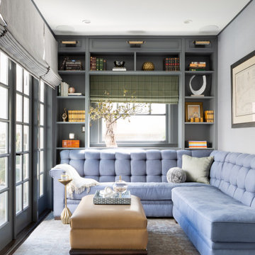
Next on the list, we reimagined a sitting room off the heart of the home to a more functional, comfortable, and inviting space. The result was a handsome Den with custom built-in bookcases to showcase family photos and signature reading as well three times the seating capacity than before. Now our clients have a space comfortable enough to watch football and classy enough to host a whiskey tasting.
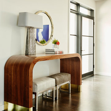
We rounded out this project with a bit of sprucing in the Foyer and Stairway. A favorite being the alluring bordeaux bench fitted just right to fit in a niche by the stairs. Perfect place to perch and admire our client's captivating art collection.
 Carolina V. Gentry, RID
This forever home, perfect for entertaining and designed with a place for everything, is a contemporary residence that exudes warmth, functional style, and lifestyle personalization for a family of five. Our busy lawyer couple, with three close-knit children, had recently purchased a home that was modern on the outside, but dated on the inside. They loved the feel, but knew it needed a major overhaul. Being incredibly busy and having never taken on a renovation of this scale, they knew they needed help to make this space their own. Upon a previous client referral, they called on Pulp to make their dreams a reality. Then ensued a down to the studs renovation, moving walls and some stairs, resulting in dramatic results. Beth and Carolina layered in warmth and style throughout, striking a hard-to-achieve balance of livable and contemporary. The result is a well-lived in and stylish home designed for every member of the family, where memories are made daily.


 Spire Integrated Systems Inc.
Awarded "Best Smart Home of the Year" by EH.
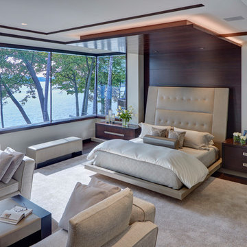
Spire outfitted this beautiful Michigan home with the best in high quality luxury technology. The homeowners enjoy the complete control of their home, from lighting and shading to entertainment and security, through the Savant Control System.
Homeowners and guests can easily create “scenes” to manage their days and social gatherings. Lutron shades help maintain light, climate and privacy to balance the inside and outside views. Outdoor entertaining is easy with the Sonance Landscape Audio System, Lutron light controls for pools and fountains and Savant control of outdoor fire pits.
The fully managed Whyreboot network allows for uninterrupted system control. To maintain security, Holovision doors and gates are equipped with Doorbird system to notify residents of visitors and to give control to open and close doors and gates. Music lovers can enjoy the highest level in audio from Meridian 7200 speakers in the lower level, as well as, Sonance in wall and in ceiling speakers throughout the home. In order for the homeowners to enjoy different music and entertainment in various rooms, 14 zones of video and 26 zones of audio were necessary.
Spire added many special touches to this amazing home. The master bathroom boasts a MirrorTV so owners can enjoy some entertainment while preparing for the day. A floor lift in the kitchen and dining room allows for entertainment, but can be tucked away when distractions are not wanted. A floor lift in the bedroom makes watching TV convenient, but can be put away when not in use. A fingerprint lock was placed at the bar for peace of mind.
Spire’s expertise and commitment to detail were key to the intricate design concepts throughout the home. Spire worked closely with design teams to ensure under cabinet lighting was just right.
 Anthony Wilder Design/Build, Inc.
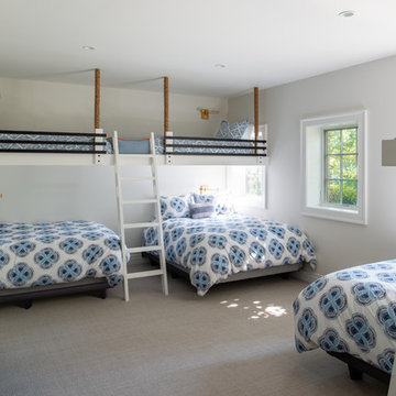
flooring is beige, low-pile, Berber-style carpet, treated with stain guard. The resulting “beachy” look resembles the place where the waves meet the sand.
Each bed and ladder are custom built from poplar wood, a durable wood that holds well the white paint shade chosen. The wood and finish can withstand heavy use and still look good, but it’s also easy to touch-up in case of dings over the years.
 TKS Design Group
Free ebook, Creating the Ideal Kitchen. DOWNLOAD NOW
One of my favorite things to work on is older homes with a bit of history because I find it an interesting challenge to marry the historical architectural features of a home with modern design elements that work well for my client’s current lifestyle.
This home was particularly fun because it was the second kitchen we had done for this family and was quite a departure from the style of the first kitchen.
The before shot of the kitchen shows a view from the family room. See the dropped ceiling? We were curious, was this just part of the design or was the dropped ceiling there to hide mechanicals? Well we soon found out that it was mostly decorative (yay!), and with the exception of a little bit of work to some plumbing from an upstairs bathroom and rerouting of the ventilation system within the original floor joists, we were in the clear, phew! The shot of the completed kitchen from roughly the same vantage point shows how much taller the ceilings are. It makes a huge difference in the feel of the space. Dark and gloomy turned fresh and light!
Another serious consideration was what do we do with the skinny transom window above the refrigerator. After much back and forth, we decided to eliminate it and do some open shelving instead. This ended up being one of the nicest areas in the room. I am calling it the “fun zone” because it houses all the barware, wine cubbies and a bar fridge — the perfect little buffet spot for entertaining. It is flanked on either side by pull out pantries that I’m sure will get a ton of use. Since the neighboring room has literally three walls of almost full height windows, the kitchen gets plenty of light.
The gold shelving brackets, large pendant fixtures over the island and the tile mural behind the range all pay subtle homage to the home’s prairie style architecture and bring a bit of sparkle to the room.
Even though the room is quite large, the work triangle is very tight with the large Subzero fridge, sink and range all nearby for easy maneuvering during meal prep. There is seating for four at the island, and work aisles are generous.
Designed by: Susan Klimala, CKD, CBD
Photography by: LOMA Studios
For more information on kitchen and bath design ideas go to: www.kitchenstudio-ge.com
 Carolina V. Gentry, RID
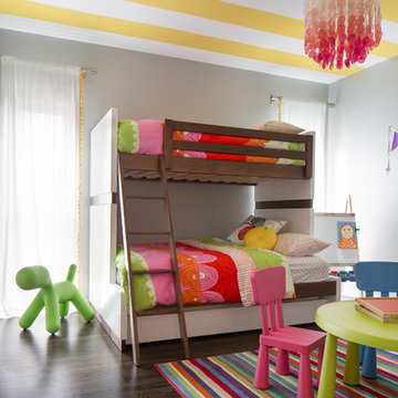
This forever home, perfect for entertaining and designed with a place for everything, is a contemporary residence that exudes warmth, functional style, and lifestyle personalization for a family of five. Our busy lawyer couple, with three close-knit children, had recently purchased a home that was modern on the outside, but dated on the inside. They loved the feel, but knew it needed a major overhaul. Being incredibly busy and having never taken on a renovation of this scale, they knew they needed help to make this space their own. Upon a previous client referral, they called on Pulp to make their dreams a reality. Then ensued a down to the studs renovation, moving walls and some stairs, resulting in dramatic results. Beth and Carolina layered in warmth and style throughout, striking a hard-to-achieve balance of livable and contemporary. The result is a well-lived in and stylish home designed for every member of the family, where memories are made daily.
 Guggenheim Architecture + Design Studio
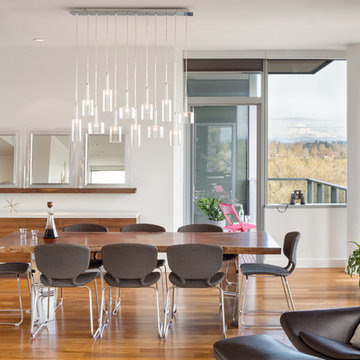
With sweeping views of the Willamette river and Mt. Hood, this Atwater Place condo was designed with a balance of minimalism and livability in mind. A complete kitchen remodel brought a dark interior kitchen to the light and a full furnishings package welcomed Los Angeles transplants home to their new modern and bright residence. Our clients, a retired camera operator for both feature films and television and a producer/production manager on numerous television series including Weeds and The Middle, relocated from their traditionally-styled LA bungalow to Portland in the Summer of 2014. The couple sought a design departure from their long-term California residence and a fresh start for their new life in the South Waterfront.
With only two pieces of sentimental furniture and a handful of artwork included in the plan, we set out to create a comfortable and clean-lined furnishings package complimenting the broad southeast views. Organically shaped upholstery pieces juxtaposed with angular steel and wood tables create a soft balance in the open floor plan. Several custom pieces, including a dining table designed by our studio and a custom hand-blown glass chandelier crafted by Scott Schiesel with Lightlite compliment timeless pieces from Knoll, Herman Miller, and B&B Italia.
The kitchen is designed to reflect light and create brilliance in a space that is otherwise naturally dark. A material balance of stainless steel, back painted glass, quartz composite, lacquer, and mirror all play their part in creating a vibrant cooking environment. We collectively decided to forgo the traditional island pendant for a linear commercial fixture that provides tremendous light to the prep surface and creates an unexpected architectural element. The mirrored prep island creates the illusion of open space while concealing casework and wine storage on the working side of the kitchen.
It is worth noting that this project was designed and installed almost entirely while our clients were still living in LA and wrapping up professional obligations and selling their home. This afforded us the tremendous opportunity to send our clients to showrooms not available in Portland to view key pieces before final specification. Textiles and finish samples were approved via mail and communication took place over e-mail, telephone, and an occasional office visit. This unique process lead to a successful result and a beautifully balanced living environment.
Josh Partee Photography
 InnovationLand
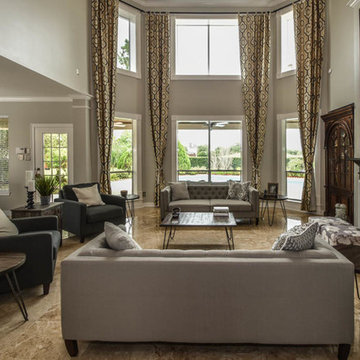
In this beautiful Houston remodel, we took on the exterior AND interior - with a new outdoor kitchen, patio cover and balcony outside and a Mid-Century Modern redesign on the inside:
"This project was really unique, not only in the extensive scope of it, but in the number of different elements needing to be coordinated with each other," says Outdoor Homescapes of Houston owner Wayne Franks. "Our entire team really rose to the challenge."
OUTSIDE
The new outdoor living space includes a 14 x 20-foot patio addition with an outdoor kitchen and balcony.
We also extended the roof over the patio between the house and the breezeway (the new section is 26 x 14 feet).
On the patio and balcony, we laid about 1,100-square foot of new hardscaping in the place of pea gravel. The new material is a gorgeous, honed-and-filled Nysa travertine tile in a Versailles pattern. We used the same tile for the new pool coping, too.
We also added French doors leading to the patio and balcony from a lower bedroom and upper game room, respectively:
The outdoor kitchen above features Southern Cream cobblestone facing and a Titanium granite countertop and raised bar.
The 8 x 12-foot, L-shaped kitchen island houses an RCS 27-inch grill, plus an RCS ice maker, lowered power burner, fridge and sink.
The outdoor ceiling is tongue-and-groove pine boards, done in the Minwax stain "Jacobean."
INSIDE
Inside, we repainted the entire house from top to bottom, including baseboards, doors, crown molding and cabinets. We also updated the lighting throughout.
"Their style before was really non-existent," says Lisha Maxey, senior designer with Outdoor Homescapes and owner of LGH Design Services in Houston.
"They did what most families do - got items when they needed them, worrying less about creating a unified style for the home."
Other than a new travertine tile floor the client had put in 6 months earlier, the space had never been updated. The drapery had been there for 15 years. And the living room had an enormous leather sectional couch that virtually filled the entire room.
In its place, we put all new, Mid-Century Modern furniture from World Market. The drapery fabric and chandelier came from High Fashion Home.
All the other new sconces and chandeliers throughout the house came from Pottery Barn and all décor accents from World Market.
The couple and their two teenaged sons got bedroom makeovers as well.
One of the sons, for instance, started with childish bunk beds and piles of books everywhere.
"We gave him a grown-up space he could enjoy well into his high school years," says Lisha.
The new bed is also from World Market.
We also updated the kitchen by removing all the old wallpaper and window blinds and adding new paint and knobs and pulls for the cabinets. (The family plans to update the backsplash later.)
The top handrail on the stairs got a coat of black paint, and we added a console table (from Kirkland's) in the downstairs hallway.
In the dining room, we painted the cabinet and mirror frames black and added new drapes, but kept the existing furniture and flooring.
"I'm just so pleased with how it turned out - especially Lisha's coordination of all the materials and finishes," says Wayne. "But as a full-service outdoor design team, this is what we do, and our all our great reviews are telling us we're doing it well."


 Thyme & Place Design LLC
The clients, a young professional couple had lived with this bathroom in their townhome for 6 years. They finally could not take it any longer. The designer was tasked with turning this ugly duckling into a beautiful swan without relocating walls, doors, fittings, or fixtures in this principal bathroom. The client wish list included, better storage, improved lighting, replacing the tub with a shower, and creating a sparkling personality for this uninspired space using any color way except white.
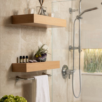
The designer began the transformation with the wall tile. Large format rectangular tiles were installed floor to ceiling on the vanity wall and continued behind the toilet and into the shower. The soft variation in tile pattern is very soothing and added to the Zen feeling of the room. One partner is an avid gardener and wanted to bring natural colors into the space. The same tile is used on the floor in a matte finish for slip resistance and in a 2” mosaic of the same tile is used on the shower floor. A lighted tile recess was created across the entire back wall of the shower beautifully illuminating the wall. Recycled glass tiles used in the niche represent the color and shape of leaves. A single glass panel was used in place of a traditional shower door.
Continuing the serene colorway of the bath, natural rift cut white oak was chosen for the vanity and the floating shelves above the toilet. A white quartz for the countertop, has a small reflective pattern like the polished chrome of the fittings and hardware. Natural curved shapes are repeated in the arch of the faucet, the hardware, the front of the toilet and shower column. The rectangular shape of the tile is repeated in the drawer fronts of the cabinets, the sink, the medicine cabinet, and the floating shelves.
The shower column was selected to maintain the simple lines of the fittings while providing a temperature, pressure balance shower experience with a multi-function main shower head and handheld head. The dual flush toilet and low flow shower are a water saving consideration. The floating shelves provide decorative and functional storage. The asymmetric design of the medicine cabinet allows for a full view in the mirror with the added function of a tri view mirror when open. Built in LED lighting is controllable from 2500K to 4000K. The interior of the medicine cabinet is also mirrored and electrified to keep the countertop clear of necessities. Additional lighting is provided with recessed LED fixtures for the vanity area as well as in the shower. A motion sensor light installed under the vanity illuminates the room with a soft glow at night.
The transformation is now complete. No longer an ugly duckling and source of unhappiness, the new bathroom provides a much-needed respite from the couples’ busy lives. It has created a retreat to recharge and replenish, two very important components of wellness.
 Boutique Closets & Cabinetry
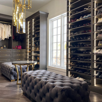
This modern walk-in closet is perfectly designed to this couples everyday storage needs. With plenty of space for them to both get ready as well as plenty of drawers and hanging space. The couches down the middle offer a nice place to lounge while deciding what to wear or changing shoes. The gold accents give the space a luxious, modern finish.
 Middlefork Luxury Home Builders
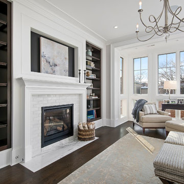
This six-bedroom home — all with en-suite bathrooms — is a brand new home on one of Lincoln Park's most desirable streets. The neo-Georgian, brick and limestone façade features well-crafted detailing both inside and out. The lower recreation level is expansive, with 9-foot ceilings throughout. The first floor houses elegant living and dining areas, as well as a large kitchen with attached great room, and the second floor holds an expansive master suite with a spa bath and vast walk-in closets. A grand, elliptical staircase ascends throughout the home, concluding in a sunlit penthouse providing access to an expansive roof deck and sweeping views of the city..
Nathan Kirkman
 TKS Design Group
Download our free ebook, Creating the Ideal Kitchen. DOWNLOAD NOW
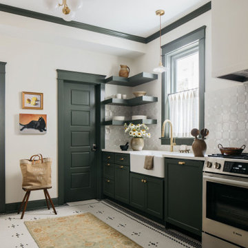
This unit, located in a 4-flat owned by TKS Owners Jeff and Susan Klimala, was remodeled as their personal pied-à-terre, and doubles as an Airbnb property when they are not using it. Jeff and Susan were drawn to the location of the building, a vibrant Chicago neighborhood, 4 blocks from Wrigley Field, as well as to the vintage charm of the 1890’s building. The entire 2 bed, 2 bath unit was renovated and furnished, including the kitchen, with a specific Parisian vibe in mind.
Although the location and vintage charm were all there, the building was not in ideal shape -- the mechanicals -- from HVAC, to electrical, plumbing, to needed structural updates, peeling plaster, out of level floors, the list was long. Susan and Jeff drew on their expertise to update the issues behind the walls while also preserving much of the original charm that attracted them to the building in the first place -- heart pine floors, vintage mouldings, pocket doors and transoms.
Because this unit was going to be primarily used as an Airbnb, the Klimalas wanted to make it beautiful, maintain the character of the building, while also specifying materials that would last and wouldn’t break the budget. Susan enjoyed the hunt of specifying these items and still coming up with a cohesive creative space that feels a bit French in flavor.
Parisian style décor is all about casual elegance and an eclectic mix of old and new. Susan had fun sourcing some more personal pieces of artwork for the space, creating a dramatic black, white and moody green color scheme for the kitchen and highlighting the living room with pieces to showcase the vintage fireplace and pocket doors.
Photographer: @MargaretRajic
Photo stylist: @Brandidevers
Do you have a new home that has great bones but just doesn’t feel comfortable and you can’t quite figure out why? Contact us here to see how we can help!

Sponsored
Delaware, OH

Buckeye Basements, Inc.
Central Ohio's Basement Finishing ExpertsBest Of Houzz '13-'21
 Groundscapes, Inc.
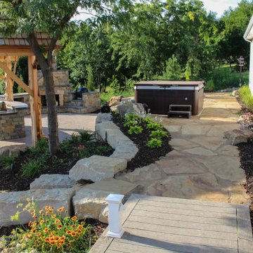
Extremely well cut outdoor kitchen set, hand laid patio tiles, and rock formations. Beautiful chimney hot tub, and seating arrangement is surrounded by well placed trees, mulch, and flowers.

 Beth Dotolo, ASID, RID, NCIDQ
This forever home, perfect for entertaining and designed with a place for everything, is a contemporary residence that exudes warmth, functional style, and lifestyle personalization for a family of five. Our busy lawyer couple, with three close-knit children, had recently purchased a home that was modern on the outside, but dated on the inside. They loved the feel, but knew it needed a major overhaul. Being incredibly busy and having never taken on a renovation of this scale, they knew they needed help to make this space their own. Upon a previous client referral, they called on Pulp to make their dreams a reality. Then ensued a down to the studs renovation, moving walls and some stairs, resulting in dramatic results. Beth and Carolina layered in warmth and style throughout, striking a hard-to-achieve balance of livable and contemporary. The result is a well-lived in and stylish home designed for every member of the family, where memories are made daily.
 Byggmeister Inc
Photo by Mike Casey
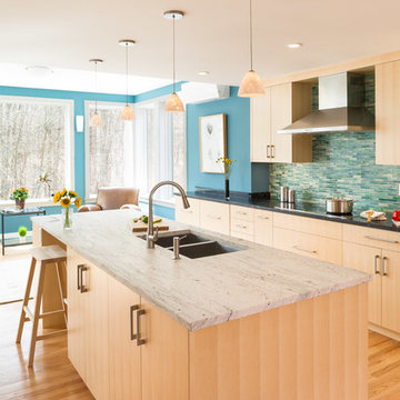
Cramped, uncomfortable, and out of date: when the owners of this home approached us about renovating their kitchen and adjoining sunroom, these were high on their list of complaints.
OPENING UP THE KITCHEN
Our plan kept the kitchen in the same location but took down the walls between both the dining room and the sunroom to create an expansive multi-purpose space with spectacular views to conservation land along the back of the property. We removed the powder room and in its place created a window-lined hallway to the living room—opening up direct access between these two previously disconnected spaces. We then built a new half bath between these two rooms, with a door along the back hallway. The result is a more private powder room that is easier to access than before.
Significantly improved cabinetry provides ample storage for both human and canine needs. An island countertop is functional and pleasant, enabling the owners to prep for and clean up from dinner all while enjoying the view of the woods behind their house.
CREATING COMFORT
We also completely rebuilt the sunroom, thickening the framing to allow for extra insulation and raising the roof to accommodate a higher ceiling and tall windows that let in as much natural light as the skylights they replaced, but much less of the solar gain that had made the room so intolerable in the summer.
We improved visual connections between spaces and admitted more natural light by converting the framing of the main stairway from full to half walls. We also insulated the attic and replaced an aging, inefficient central air conditioning system with ductless minisplit heat pumps, which can also be used as supplemental heat.
All in all, this was our kind of project: we made the home more attractive, more comfortable, and more energy-efficient—all over the course of a single, well-integrated project.
18