
Search results for "Well trained dating" in Home Design Ideas
 Edmond Kitchen & Bath LLC
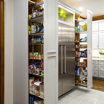
This creative transitional space was transformed from a very dated layout that did not function well for our homeowners - who enjoy cooking for both their family and friends. They found themselves cooking on a 30" by 36" tiny island in an area that had much more potential. A completely new floor plan was in order. An unnecessary hallway was removed to create additional space and a new traffic pattern. New doorways were created for access from the garage and to the laundry. Just a couple of highlights in this all Thermador appliance professional kitchen are the 10 ft island with two dishwashers (also note the heated tile area on the functional side of the island), double floor to ceiling pull-out pantries flanking the refrigerator, stylish soffited area at the range complete with burnished steel, niches and shelving for storage. Contemporary organic pendants add another unique texture to this beautiful, welcoming, one of a kind kitchen! Photos by David Cobb Photography.
 FineLine Kitchens, Inc.
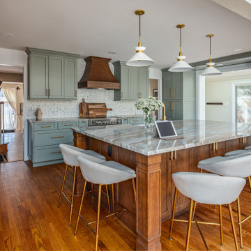
Hi everyone, I'm Sarah and Ogun we are here with fine line kitchens. So we are a couple working together. I do the interior design and remodeling of the space material selection meeting with the clients. And I handled operations outside, you know meaning all the construction work that is taking place the inside. The houses that we work in. I handle all the aspects of the construction, so today's project is very special. We're in Vienna and the client had a very big family. It's a family of seven that lives here. So we had a few aspects that we needed to keep in mind while designing this one. Having everybody be able to sit on the island. So we wanted plenty of seating all the way around. We didn't want anybody standing or anything like that. So what we did is we maximize the space. The center island is the biggest part of the kitchen. We use a natural stone to kind of give it a beautiful texture versus quartz. It's kind of standard white or kind of fabricated, so I wanted something very natural. We did this because I took my inspiration from the outside, so the inspiration if you look at the view right in front of me is there are so many greens there's a lot of brass accents and I wanted to bring this. Into this kitchen while designing it for my clients. She is very warm very. She wanted a very homey, comfy kind of look for the kitchen. So that's what we did today. As you can see, the cabinets are sage green, very light, so I still think it's a neutral, but it's a lighter color that again brings the outside in and we combine that with the oak right behind me so it's a slightly warm oak. It's not very dark. It's not very light. It's a medium brown and the same color went on the island. To kind of tie these two in and the backsplash, my favorite part is where you can see a little bit of design. It is, in my opinion still classic, but includes a pattern so the outside part is as we said in the beginning, is handled by my husband. I'd like him to speak a little bit about that. Thanks, Sarah, I want to talk to you guys a little bit about the construction part of this project. Originally this kitchen was located mostly in this area. They had their stove there sing. It was more of a peninsula layout in Sarah's and the customer vision they wanted. They wanted to get rid of the peninsula and they want to be able to have a huge island that can at least sit seven people because they're familiar with seven. So we wanted to make sure that we can achieve this design and bring it to life so that they can be happy with this layout. Some of the challenges we had, the house, the home being, you know, old home. There were a lot of you know the older electrical and plumbing that had to be replaced. We had to relocate the stove from here to this area. Over here we had put a nice foot fan that we had to relocate all the ductwork and the plumbing. Was being on the peninsula area. We had to relocate it to the center islands. So we achieved all this and kind of like bring it to bring in this kitchen up to date it looks beautiful. That's true, so yes, the old layout did not function for my clients because everything was kind of gathered on one side of the kitchen. So there was like a peninsula right there. So the end of this island kind of continued straight. And that was just the L shape. Kind of where everything was and there used to be another big table here, so they were using only kind of half of the space. So like I said at the beginning, our vision was to kind of feed everybody at the island, create some symmetry. 'cause I love that. So as you can see behind me, this is kind of the focal point symmetrical. Everything is kind of even we wanted to also panel the fridge here so it mimics the pantry and another size. So when you're looking at it, it is bringing again that symmetry back again. I hope you enjoyed this kitchen and this video and I'll see you soon. So how do you think this project turned out? It's nice. I like the color. I think it turned out nice. It's kind of like a little bit different color than what we always do. So I realize. Are you giving me a little bit of credit here that I did something different? Are you proud? I'm so proud of you. Other than that I like it. That they have kind of like a two sink. So if this was our kitchen, if we ever like you can have your own. I can have mine if we ever get into a fight then this can be like my own kitchen. Why are we gonna bring in a fight right now? So I'm cooking anyway. You're grilling most of the time, So what are you even talking about? My kitchen? That's my kitchen. You can just take the small sink. That's fine. It's always good to have your own space right there, so anyways. Thank you guys for watching. We hope to see you soon and if you have any questions please click the link below. It'll lead you to our website, house, YouTube and all of the social media is so nice to have you guys. We'll see you soon. Thanks bye bye-bye.
 Haven Design and Construction
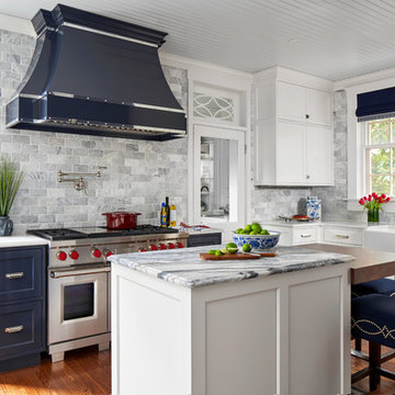
This 1902 San Antonio home was beautiful both inside and out, except for the kitchen, which was dark and dated. The original kitchen layout consisted of a breakfast room and a small kitchen separated by a wall. There was also a very small screened in porch off of the kitchen. The homeowners dreamed of a light and bright new kitchen and that would accommodate a 48" gas range, built in refrigerator, an island and a walk in pantry. At first, it seemed almost impossible, but with a little imagination, we were able to give them every item on their wish list. We took down the wall separating the breakfast and kitchen areas, recessed the new Subzero refrigerator under the stairs, and turned the tiny screened porch into a walk in pantry with a gorgeous blue and white tile floor. The french doors in the breakfast area were replaced with a single transom door to mirror the door to the pantry. The new transoms make quite a statement on either side of the 48" Wolf range set against a marble tile wall. A lovely banquette area was created where the old breakfast table once was and is now graced by a lovely beaded chandelier. Pillows in shades of blue and white and a custom walnut table complete the cozy nook. The soapstone island with a walnut butcher block seating area adds warmth and character to the space. The navy barstools with chrome nailhead trim echo the design of the transoms and repeat the navy and chrome detailing on the custom range hood. A 42" Shaws farmhouse sink completes the kitchen work triangle. Off of the kitchen, the small hallway to the dining room got a facelift, as well. We added a decorative china cabinet and mirrored doors to the homeowner's storage closet to provide light and character to the passageway. After the project was completed, the homeowners told us that "this kitchen was the one that our historic house was always meant to have." There is no greater reward for what we do than that.
Find the right local pro for your project
 DHD Architecture and Interior Design
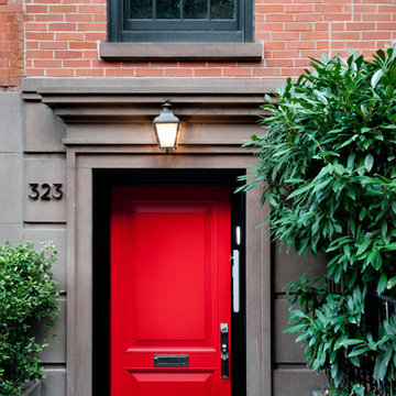
Located in stylish Chelsea, this updated five-floor townhouse incorporates both a bold, modern aesthetic and sophisticated, polished taste. Palettes range from vibrant and playful colors in the family and kids’ spaces to softer, rich tones in the master bedroom and formal dining room. DHD interiors embraced the client’s adventurous taste, incorporating dynamic prints and striking wallpaper into each room, and a stunning floor-to-floor stair runner. Lighting became one of the most crucial elements as well, as ornate vintage fixtures and eye-catching sconces are featured throughout the home.
Photography: Emily Andrews
Architect: Robert Young Architecture
3 Bedrooms / 4,000 Square Feet
 ZeroEnergy Design
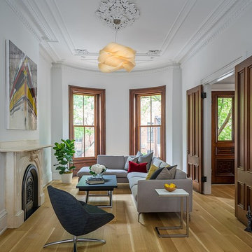
This renovated brick rowhome in Boston’s South End offers a modern aesthetic within a historic structure, creative use of space, exceptional thermal comfort, a reduced carbon footprint, and a passive stream of income.
DESIGN PRIORITIES. The goals for the project were clear - design the primary unit to accommodate the family’s modern lifestyle, rework the layout to create a desirable rental unit, improve thermal comfort and introduce a modern aesthetic. We designed the street-level entry as a shared entrance for both the primary and rental unit. The family uses it as their everyday entrance - we planned for bike storage and an open mudroom with bench and shoe storage to facilitate the change from shoes to slippers or bare feet as they enter their home. On the main level, we expanded the kitchen into the dining room to create an eat-in space with generous counter space and storage, as well as a comfortable connection to the living space. The second floor serves as master suite for the couple - a bedroom with a walk-in-closet and ensuite bathroom, and an adjacent study, with refinished original pumpkin pine floors. The upper floor, aside from a guest bedroom, is the child's domain with interconnected spaces for sleeping, work and play. In the play space, which can be separated from the work space with new translucent sliding doors, we incorporated recreational features inspired by adventurous and competitive television shows, at their son’s request.
MODERN MEETS TRADITIONAL. We left the historic front facade of the building largely unchanged - the security bars were removed from the windows and the single pane windows were replaced with higher performing historic replicas. We designed the interior and rear facade with a vision of warm modernism, weaving in the notable period features. Each element was either restored or reinterpreted to blend with the modern aesthetic. The detailed ceiling in the living space, for example, has a new matte monochromatic finish, and the wood stairs are covered in a dark grey floor paint, whereas the mahogany doors were simply refinished. New wide plank wood flooring with a neutral finish, floor-to-ceiling casework, and bold splashes of color in wall paint and tile, and oversized high-performance windows (on the rear facade) round out the modern aesthetic.
RENTAL INCOME. The existing rowhome was zoned for a 2-family dwelling but included an undesirable, single-floor studio apartment at the garden level with low ceiling heights and questionable emergency egress. In order to increase the quality and quantity of space in the rental unit, we reimagined it as a two-floor, 1 or 2 bedroom, 2 bathroom apartment with a modern aesthetic, increased ceiling height on the lowest level and provided an in-unit washer/dryer. The apartment was listed with Jackie O'Connor Real Estate and rented immediately, providing the owners with a source of passive income.
ENCLOSURE WITH BENEFITS. The homeowners sought a minimal carbon footprint, enabled by their urban location and lifestyle decisions, paired with the benefits of a high-performance home. The extent of the renovation allowed us to implement a deep energy retrofit (DER) to address air tightness, insulation, and high-performance windows. The historic front facade is insulated from the interior, while the rear facade is insulated on the exterior. Together with these building enclosure improvements, we designed an HVAC system comprised of continuous fresh air ventilation, and an efficient, all-electric heating and cooling system to decouple the house from natural gas. This strategy provides optimal thermal comfort and indoor air quality, improved acoustic isolation from street noise and neighbors, as well as a further reduced carbon footprint. We also took measures to prepare the roof for future solar panels, for when the South End neighborhood’s aging electrical infrastructure is upgraded to allow them.
URBAN LIVING. The desirable neighborhood location allows the both the homeowners and tenant to walk, bike, and use public transportation to access the city, while each charging their respective plug-in electric cars behind the building to travel greater distances.
OVERALL. The understated rowhouse is now ready for another century of urban living, offering the owners comfort and convenience as they live life as an expression of their values.
Eric Roth Photo
 Progressive Design Build
The Challenge
This beautiful waterfront home was begging for an update. Our clients wanted a contemporary design with modern finishes. They craved improved functionality in the kitchen, hardwood flooring in the living areas, and a spacious walk-in closet in the master bathroom. With two children in school, our clients also needed the project completed during their summer vacation – leaving a slim 90 days for the entire remodel. Could we do it? …Challenge accepted!
Our Solution
With their active summer travel schedule, our clients elected to vacate their home for the duration of the project. This was ideal for the intrusive nature of the scope of work.
In preparation, our design team created a project plan to suit our client’s needs. With such a clear timeline, we were able to select and order long-lead items in plenty of time for the project start date.
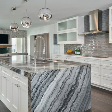
In the kitchen, we rearranged the layout to provide superior ventilation for the cooktop on the exterior wall. We added two large storage cabinets with glass doors, accented by a sleek mosaic backsplash of glass tile. We also incorporated a large contemporary waterfall island into the room. With seating at one end, the island provides both increased functionality and an eye-catching focal point for the center of the room. On the interior wall of the kitchen, we maximized storage with a wall of built-in cabinetry – complete with pullout pantry cabinets, a double oven, and a large stainless refrigerator.
Our clients wisely chose rich, dark-colored wood flooring to add warmth to the contemporary design. After installing the flooring in the kitchen, we brought it into the main living areas as well. In the great room, we wrapped the existing gas fireplace in a neutral stack stone. The effect of the stone on the media and window wall is breathtaking.
In the master bathroom, we expanded the closet by pushing the wall back into the adjacent pass-through hallway. The new walk-in closet now includes an impressive closet organization system.
Returning to the master bathroom, we removed the single vanity and repositioned the toilet, allowing for a new, curb-less glass shower and a his-and-hers vanity. The entire vanity and shower wall is finished in white 12×24 porcelain tile. The vertical glass mosaic accent band and backlit floating mirrors add to the clean, modern style. To the left of the master bathroom entry, we even added a matching make-up area.
Finally, we installed a number of elegant enhancements in the remaining rooms. The clients chose a bronze metal relief accent wall as well as some colorful finishes and artwork for the entry and hallway.
Exceptional Results
Our clients were simply thrilled with the final product! Not only did they return from their summer vacation to a gorgeous home remodel, but we concluded the project a full week ahead of schedule. As a result, the family was able to move in sooner than planned, giving them plenty of time to acclimate to the renovated space before their kids returned to school. Ultimately, we provided the outstanding results and customer experience that our clients had been searching for.
“We met with many other contractors leading up to signing with Progressive Design Build. When we met Mike, we finally felt safe. We had heard so many horror stories about contractors! Progressive was the best move we could have made. They made our dream house become a reality. Vernon was in charge of our project and everything went better than we expected. Our project was completed earlier than expected, too. Our questions and concerns were dealt with quickly and professionally, the job site was always clean, and all subs were friendly and professional. We had a wonderful experience with Progressive Design Build. We’re so grateful we found them.” – The Mader Family
 Dacotah Studio
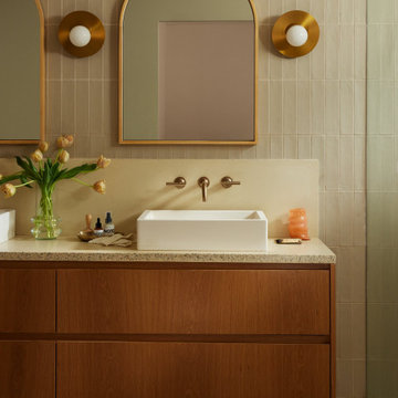
This home was very dated and in some much needed reconfiguration and upgrading, so that's exactly what we did! Removing and moving walls, reframing rooms, removing and adding closets, taking over a small kitchen for a primary en suite and enlarging many of the door opening with beautiful sliding and bi-folding doors. This project was a labor of love with many custom touches and material selections that has now made this a modern and well appointed home for it's new owners.



 Change Your Bathroom©
The goal of this project was to upgrade the builder grade finishes and create an ergonomic space that had a contemporary feel. This bathroom transformed from a standard, builder grade bathroom to a contemporary urban oasis. This was one of my favorite projects, I know I say that about most of my projects but this one really took an amazing transformation. By removing the walls surrounding the shower and relocating the toilet it visually opened up the space. Creating a deeper shower allowed for the tub to be incorporated into the wet area. Adding a LED panel in the back of the shower gave the illusion of a depth and created a unique storage ledge. A custom vanity keeps a clean front with different storage options and linear limestone draws the eye towards the stacked stone accent wall.
Houzz Write Up: https://www.houzz.com/magazine/inside-houzz-a-chopped-up-bathroom-goes-streamlined-and-swank-stsetivw-vs~27263720
The layout of this bathroom was opened up to get rid of the hallway effect, being only 7 foot wide, this bathroom needed all the width it could muster. Using light flooring in the form of natural lime stone 12x24 tiles with a linear pattern, it really draws the eye down the length of the room which is what we needed. Then, breaking up the space a little with the stone pebble flooring in the shower, this client enjoyed his time living in Japan and wanted to incorporate some of the elements that he appreciated while living there. The dark stacked stone feature wall behind the tub is the perfect backdrop for the LED panel, giving the illusion of a window and also creates a cool storage shelf for the tub. A narrow, but tasteful, oval freestanding tub fit effortlessly in the back of the shower. With a sloped floor, ensuring no standing water either in the shower floor or behind the tub, every thought went into engineering this Atlanta bathroom to last the test of time. With now adequate space in the shower, there was space for adjacent shower heads controlled by Kohler digital valves. A hand wand was added for use and convenience of cleaning as well. On the vanity are semi-vessel sinks which give the appearance of vessel sinks, but with the added benefit of a deeper, rounded basin to avoid splashing. Wall mounted faucets add sophistication as well as less cleaning maintenance over time. The custom vanity is streamlined with drawers, doors and a pull out for a can or hamper.
A wonderful project and equally wonderful client. I really enjoyed working with this client and the creative direction of this project.
Brushed nickel shower head with digital shower valve, freestanding bathtub, curbless shower with hidden shower drain, flat pebble shower floor, shelf over tub with LED lighting, gray vanity with drawer fronts, white square ceramic sinks, wall mount faucets and lighting under vanity. Hidden Drain shower system. Atlanta Bathroom.
 Kristin Hoaglund Design
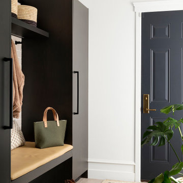
This beautiful French Provincial home is set on 10 acres, nestled perfectly in the oak trees. The original home was built in 1974 and had two large additions added; a great room in 1990 and a main floor master suite in 2001. This was my dream project: a full gut renovation of the entire 4,300 square foot home! I contracted the project myself, and we finished the interior remodel in just six months. The exterior received complete attention as well. The 1970s mottled brown brick went white to completely transform the look from dated to classic French. Inside, walls were removed and doorways widened to create an open floor plan that functions so well for everyday living as well as entertaining. The white walls and white trim make everything new, fresh and bright. It is so rewarding to see something old transformed into something new, more beautiful and more functional.
 CONTENT Architecture
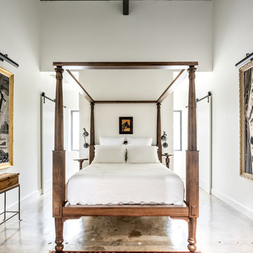
This project encompasses the renovation of two aging metal warehouses located on an acre just North of the 610 loop. The larger warehouse, previously an auto body shop, measures 6000 square feet and will contain a residence, art studio, and garage. A light well puncturing the middle of the main residence brightens the core of the deep building. The over-sized roof opening washes light down three masonry walls that define the light well and divide the public and private realms of the residence. The interior of the light well is conceived as a serene place of reflection while providing ample natural light into the Master Bedroom. Large windows infill the previous garage door openings and are shaded by a generous steel canopy as well as a new evergreen tree court to the west. Adjacent, a 1200 sf building is reconfigured for a guest or visiting artist residence and studio with a shared outdoor patio for entertaining. Photo by Peter Molick, Art by Karin Broker
 Jordan Design Build Group
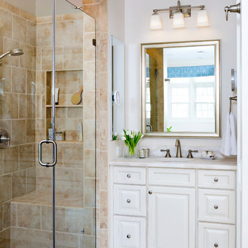
For this renovation, the basic layout functioned well for the homeowners, but the bathroom was feeling dated and in need of an overhaul. We replaced a bulky tub deck with a more scaled back and refined surround, complete with a paneled front to match the custom his and hers vanities. A wing wall was removed to allow light in and create a more open feel. A prefabricated shower pan and dated sliders were replaced with a custom tiled shower and frameless glass. We used a combination of natural travertine and porcelain tiles to provide visual warmth to the expansive bathroom. The antiqued/glazed vanities and the exotic quartzite countertops with their subtle coloration and veining further convey the homeowner’s classic style. Stacy Zarin Goldberg Photography
 TVL Creative Ltd.
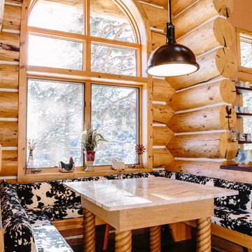
This project's final result exceeded even our vision for the space! This kitchen is part of a stunning traditional log home in Evergreen, CO. The original kitchen had some unique touches, but was dated and not a true reflection of our client. The existing kitchen felt dark despite an amazing amount of natural light, and the colors and textures of the cabinetry felt heavy and expired. The client wanted to keep with the traditional rustic aesthetic that is present throughout the rest of the home, but wanted a much brighter space and slightly more elegant appeal. Our scope included upgrades to just about everything: new semi-custom cabinetry, new quartz countertops, new paint, new light fixtures, new backsplash tile, and even a custom flue over the range. We kept the original flooring in tact, retained the original copper range hood, and maintained the same layout while optimizing light and function. The space is made brighter by a light cream primary cabinetry color, and additional feature lighting everywhere including in cabinets, under cabinets, and in toe kicks. The new kitchen island is made of knotty alder cabinetry and topped by Cambria quartz in Oakmoor. The dining table shares this same style of quartz and is surrounded by custom upholstered benches in Kravet's Cowhide suede. We introduced a new dramatic antler chandelier at the end of the island as well as Restoration Hardware accent lighting over the dining area and sconce lighting over the sink area open shelves. We utilized composite sinks in both the primary and bar locations, and accented these with farmhouse style bronze faucets. Stacked stone covers the backsplash, and a handmade elk mosaic adorns the space above the range for a custom look that is hard to ignore. We finished the space with a light copper paint color to add extra warmth and finished cabinetry with rustic bronze hardware. This project is breathtaking and we are so thrilled our client can enjoy this kitchen for many years to come!
 DesignARC
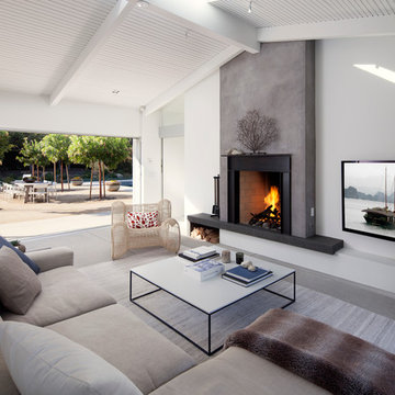
Inspired by DesignARC's Greenworth House, the owners of this 1960's single-story ranch house desired a fresh take on their out-dated, well-worn Montecito residence. Hailing from Toronto Canada, the couple is at ease in urban, loft-like spaces and looked to create a pared-down dwelling that could become their home.
Photo Credit: Jim Bartsch Photography


 TKS Design Group
Download our free ebook, Creating the Ideal Kitchen. DOWNLOAD NOW
Lakefront property in the northwest suburbs of Chicago is hard to come by, so when we were hired by this young family with exactly that, we were immediately inspired by not just the unusually large footprint of this 1950’s colonial revival but also the lovely views of the manmade lake it was sited on. The large 5-bedroom home was solidly stuck in the 1980’s, but we saw tons of potential. We started out by updating the existing staircase with a fresh coat of paint and adding new herringbone slate to the entry hall.
The powder room off the entryway also got a refresh - new flooring, new cabinets and fixtures. We ran the new slate right through into this space for some consistency. A fun wallpaper and shiplap trim add a welcoming feel and set the tone for the home.
Next, we tackled the kitchen. Located away from the rest of the first floor, the kitchen felt a little isolated, so we immediately began planning for how to better connect it to the rest of the first floor. We landed on removing the wall between the kitchen and dining room and designed a modified galley style space with separate cooking and clean up zones. The cooking zone consists of the refrigerator, prep sink and cooktop, along with a nice long run of prep space at the island. The cleanup side of the kitchen consists of the main sink and dishwasher. Both areas are situated so that the user can view the lake during prep work and cleanup!
One of the home’s main puzzles was how to incorporate the mudroom and area in front of the patio doors at the back of the house. We already had a breakfast table area, so the space by the patio doors was a bit of a no man’s land. We decided to separate the kitchen proper from what became the new mudroom with a large set of barn doors. That way you can quickly hide any mudroom messes but have easy access to the light coming in through the patio doors as well as the outdoor grilling station. We also love the impact the barn doors add to the overall space.
The homeowners’ first words to us were “it’s time to ditch the brown,” so we did! We chose a lovely blue pallet that reflects the home’s location on the lake which is also vibrant yet easy on the eye. Countertops are white quartz, and the natural oak floor works well with the other honey accents. The breakfast table was given a refresh with new chairs, chandelier and window treatments that frame the gorgeous views of the lake out the back.
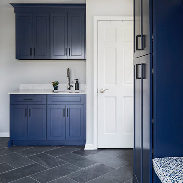
We coordinated the slate mudroom flooring with that used in the home’s main entrance for a consistent feel. The storage area consists of open and closed storage to allow for some clutter control as needed.
Next on our “to do” list was revamping the dated brown bar area in the neighboring dining room. We eliminated the clutter by adding some closed cabinets and did some easy updates to help the space feel more current. One snag we ran into here was the discovery of a beam above the existing open shelving that had to be modified with a smaller structural beam to allow for our new design to work. This was an unexpected surprise, but in the end we think it was well worth it!
We kept the colors here a bit more muted to blend with the homeowner’s existing furnishings. Open shelving and polished nickel hardware add some simple detail to the new entertainment zone which also looks out onto the lake!
Next we tackled the upstairs starting with the homeowner’s son’s bath. The bath originally had both a tub shower and a separate shower, so we decided to swap out the shower for a new laundry area. This freed up some space downstairs in what used to be the mudroom/laundry room and is much more convenient for daily laundry needs.
We continued the blue palette here with navy cabinetry and the navy tile in the shower. Porcelain floor tile and chrome fixtures keep maintenance to a minimum while matte black mirrors and lighting add some depth the design. A low maintenance runner adds some warmth underfoot and ties the whole space together.
We added a pocket door to the bathroom to minimize interference with the door swings. The left door of the laundry closet is on a 180 degree hinge to allow for easy full access to the machines. Next we tackled the master bath which is an en suite arrangement. The original was typical of the 1980’s with the vanity outside of the bathroom, situated near the master closet. And the brown theme continued here with multiple shades of brown.
Our first move was to segment off the bath and the closet from the master bedroom. We created a short hall from the bedroom to the bathroom with his and hers walk-in closets on the left and right as well as a separate toilet closet outside of the main bathroom for privacy and flexibility.
The original bathroom had a giant soaking tub with steps (dangerous!) as well as a small shower that did not work well for our homeowner who is 6’3”. With other bathtubs in the home, they decided to eliminate the tub and create an oversized shower which takes up the space where the old tub was located. The double vanity is on the opposite wall and a bench is located under the window for morning conversations and a place to set a couple of towels.
The pallet in here is light and airy with a mix of blond wood, creamy porcelain and marble tile, and brass accents. A simple roman shade adds some texture and it’s top-down mechanism allows for light and privacy.
This large whole house remodel gave our homeowners not only the ability to maximize the potential of their home but also created a lovely new frame from which to view their fabulous lake views.
Designed by: Susan Klimala, CKD, CBD
Photography by: Michael Kaskel
For more information on kitchen and bath design ideas go to: www.kitchenstudio-ge.com
 TVL Creative Ltd.
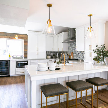
This kitchen took a tired, 80’s builder kitchen and revamped it into a personalized gathering space for our wonderful client. The existing space was split up by the dated configuration of eat-in kitchen table area to one side and cramped workspace on the other. It didn’t just under-serve our client’s needs; it flat out discouraged them from using the space. Our client desired an open kitchen with a central gathering space where family and friends could connect. To open things up, we removed the half wall separating the kitchen from the dining room and the wall that blocked sight lines to the family room and created a narrow hallway to the kitchen. The old oak cabinets weren't maximizing storage and were dated and dark. We used Waypoint Living Spaces cabinets in linen white to brighten up the room. On the east wall, we created a hutch-like stack that features an appliance garage that keeps often used countertop appliance on hand but out of sight. The hutch also acts as a transition from the cooking zone to the coffee and wine area. We eliminated the north window that looked onto the entry walkway and activated this wall as storage with refrigerator enclosure and pantry. We opted to leave the east window as-is and incorporated it into the new kitchen layout by creating a window well for growing plants and herbs. The countertops are Pental Quartz in Carrara. The sleek cabinet hardware is from our friends at Amerock in a gorgeous satin champagne bronze. One of the most striking features in the space is the pattern encaustic tile from Tile Shop. The pop of blue in the backsplash adds personality and contrast to the champagne accents. The reclaimed wood cladding surrounding the large east-facing window introduces a quintessential Colorado vibe, and the natural texture balances the crisp white cabinetry and geometric patterned tile. Minimalist modern lighting fixtures from Mitzi by Hudson Valley Lighting provide task lighting over the sink and at the wine/ coffee station. The visual lightness of the sink pendants maintains the openness and visual connection between the kitchen and dining room. Together the elements make for a sophisticated yet casual vibe-- a comfortable chic kitchen. We love the way this space turned out and are so happy that our clients now have such a bright and welcoming gathering space as the heart of their home!
 Casework Inter Design
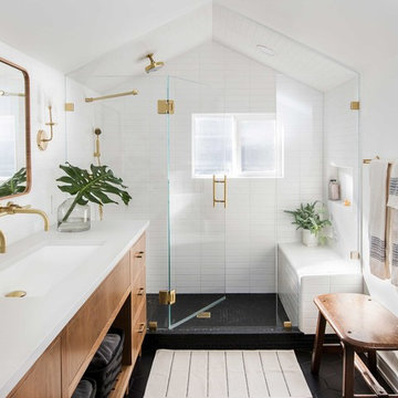
When Casework first met this 550 square foot attic space in a 1912 Seattle Craftsman home, it was dated and not functional. The homeowners wanted to transform their existing master bedroom and bathroom to include more practical closet and storage space as well as add a nursery. The renovation created a purposeful division of space for a growing family, including a cozy master with built-in bench storage, a spacious his and hers dressing room, open and bright master bath with brass and black details, and a nursery perfect for a growing child. Through clever built-ins and a minimal but effective color palette, Casework was able to turn this wasted attic space into a comfortable, inviting and purposeful sanctuary.
 TVL Creative Ltd.
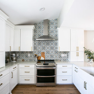
This kitchen took a tired, 80’s builder kitchen and revamped it into a personalized gathering space for our wonderful client. The existing space was split up by the dated configuration of eat-in kitchen table area to one side and cramped workspace on the other. It didn’t just under-serve our client’s needs; it flat out discouraged them from using the space. Our client desired an open kitchen with a central gathering space where family and friends could connect. To open things up, we removed the half wall separating the kitchen from the dining room and the wall that blocked sight lines to the family room and created a narrow hallway to the kitchen. The old oak cabinets weren't maximizing storage and were dated and dark. We used Waypoint Living Spaces cabinets in linen white to brighten up the room. On the east wall, we created a hutch-like stack that features an appliance garage that keeps often used countertop appliance on hand but out of sight. The hutch also acts as a transition from the cooking zone to the coffee and wine area. We eliminated the north window that looked onto the entry walkway and activated this wall as storage with refrigerator enclosure and pantry. We opted to leave the east window as-is and incorporated it into the new kitchen layout by creating a window well for growing plants and herbs. The countertops are Pental Quartz in Carrara. The sleek cabinet hardware is from our friends at Amerock in a gorgeous satin champagne bronze. One of the most striking features in the space is the pattern encaustic tile from Tile Shop. The pop of blue in the backsplash adds personality and contrast to the champagne accents. The reclaimed wood cladding surrounding the large east-facing window introduces a quintessential Colorado vibe, and the natural texture balances the crisp white cabinetry and geometric patterned tile. Minimalist modern lighting fixtures from Mitzi by Hudson Valley Lighting provide task lighting over the sink and at the wine/ coffee station. The visual lightness of the sink pendants maintains the openness and visual connection between the kitchen and dining room. Together the elements make for a sophisticated yet casual vibe-- a comfortable chic kitchen. We love the way this space turned out and are so happy that our clients now have such a bright and welcoming gathering space as the heart of their home!

Sponsored
Delaware, OH

Buckeye Basements, Inc.
Central Ohio's Basement Finishing ExpertsBest Of Houzz '13-'21
 Spaces Designed, Interior Design Studio, LLC
“We could never have envisioned what could be” – Steiner Ranch Homeowner and Client
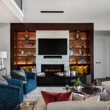
It is an especially fulfilling Project for an Interior Designer when the outcome exceeds Client expectations, and imagination. This remodeling project required instilling modern sensibilities, openness, styles and textures into a dated house that was past its prime. Strategically, the goal was to tear down where it made sense without doing a complete teardown.
Starting with the soul of the home, the kitchen, we expanded out room by room to create a cohesiveness and flow that invites, supports and provides the warmth and relaxation that only a home can.
In the Kitchen, we started by removing the wooden beams and adding bright recessed lighting. We removed the old limestone accent wall and moved the sink and cooktop from the island on to the countertop – the key goal was to create room for the family to gather around the kitchen. We replaced all appliances with modern Energy Star ones, along with adding a wine rack.
The first order of business for the Living Room was to brighten it up by adding more lighting and replacing an unused section with a glass door to the backyard. Multi-section windows were replaced with large no-split glass overlooking the backyard. Once more, the limestone accent was removed to create a clean, modern look. Replacing the dated wooden staircase with the clean lines of a metal, wire and wooded staircase added interest and freshness. An odd bend in the staircase was removed to clean things up.
The Master Bedroom went from what looked like a motel room with green carpet and cheap blinds to an oasis of luxury and charm. A section of the wraparound doors were closed off to increase privacy, accentuate the best view from the bedroom and to add usable space. Artwork, rug, contemporary bed and other accent pieces brought together the seamless look across the home.
The Master Bathroom remodel started by replacing the standard windows with a single glass pane that enhanced the view of the outdoors. The dated shower was replaced by a walk-in shower and soaking tub to create the ultimate at-home spa experience. Lighted LED mirrors frame His & Hers sinks and bathe them in a soft light.
The flooring was upgraded throughout the house to reflect the contemporary color scheme.
Each of the smaller bedrooms were similarly upgraded to match the clean and modern décor of the rest of the house.
After such a transformation inside, it was only appropriate that the exterior needed an upgrade as well. All of the legacy limestone accents were replaced by stucco and the color scheme extended from the interior of the house to the gorgeous wrap around balconies, trim, garage doors etc. to complete the inside outside transformation.
 TKS Design Group
Download our free ebook, Creating the Ideal Kitchen. DOWNLOAD NOW
Lakefront property in the northwest suburbs of Chicago is hard to come by, so when we were hired by this young family with exactly that, we were immediately inspired by not just the unusually large footprint of this 1950’s colonial revival but also the lovely views of the manmade lake it was sited on. The large 5-bedroom home was solidly stuck in the 1980’s, but we saw tons of potential. We started out by updating the existing staircase with a fresh coat of paint and adding new herringbone slate to the entry hall.
The powder room off the entryway also got a refresh - new flooring, new cabinets and fixtures. We ran the new slate right through into this space for some consistency. A fun wallpaper and shiplap trim add a welcoming feel and set the tone for the home.
Next, we tackled the kitchen. Located away from the rest of the first floor, the kitchen felt a little isolated, so we immediately began planning for how to better connect it to the rest of the first floor. We landed on removing the wall between the kitchen and dining room and designed a modified galley style space with separate cooking and clean up zones. The cooking zone consists of the refrigerator, prep sink and cooktop, along with a nice long run of prep space at the island. The cleanup side of the kitchen consists of the main sink and dishwasher. Both areas are situated so that the user can view the lake during prep work and cleanup!
One of the home’s main puzzles was how to incorporate the mudroom and area in front of the patio doors at the back of the house. We already had a breakfast table area, so the space by the patio doors was a bit of a no man’s land. We decided to separate the kitchen proper from what became the new mudroom with a large set of barn doors. That way you can quickly hide any mudroom messes but have easy access to the light coming in through the patio doors as well as the outdoor grilling station. We also love the impact the barn doors add to the overall space.
The homeowners’ first words to us were “it’s time to ditch the brown,” so we did! We chose a lovely blue pallet that reflects the home’s location on the lake which is also vibrant yet easy on the eye. Countertops are white quartz, and the natural oak floor works well with the other honey accents. The breakfast table was given a refresh with new chairs, chandelier and window treatments that frame the gorgeous views of the lake out the back.
We coordinated the slate mudroom flooring with that used in the home’s main entrance for a consistent feel. The storage area consists of open and closed storage to allow for some clutter control as needed.
Next on our “to do” list was revamping the dated brown bar area in the neighboring dining room. We eliminated the clutter by adding some closed cabinets and did some easy updates to help the space feel more current. One snag we ran into here was the discovery of a beam above the existing open shelving that had to be modified with a smaller structural beam to allow for our new design to work. This was an unexpected surprise, but in the end we think it was well worth it!
We kept the colors here a bit more muted to blend with the homeowner’s existing furnishings. Open shelving and polished nickel hardware add some simple detail to the new entertainment zone which also looks out onto the lake!
Next we tackled the upstairs starting with the homeowner’s son’s bath. The bath originally had both a tub shower and a separate shower, so we decided to swap out the shower for a new laundry area. This freed up some space downstairs in what used to be the mudroom/laundry room and is much more convenient for daily laundry needs.
We continued the blue palette here with navy cabinetry and the navy tile in the shower. Porcelain floor tile and chrome fixtures keep maintenance to a minimum while matte black mirrors and lighting add some depth the design. A low maintenance runner adds some warmth underfoot and ties the whole space together.
We added a pocket door to the bathroom to minimize interference with the door swings. The left door of the laundry closet is on a 180 degree hinge to allow for easy full access to the machines. Next we tackled the master bath which is an en suite arrangement. The original was typical of the 1980’s with the vanity outside of the bathroom, situated near the master closet. And the brown theme continued here with multiple shades of brown.
Our first move was to segment off the bath and the closet from the master bedroom. We created a short hall from the bedroom to the bathroom with his and hers walk-in closets on the left and right as well as a separate toilet closet outside of the main bathroom for privacy and flexibility.
The original bathroom had a giant soaking tub with steps (dangerous!) as well as a small shower that did not work well for our homeowner who is 6’3”. With other bathtubs in the home, they decided to eliminate the tub and create an oversized shower which takes up the space where the old tub was located. The double vanity is on the opposite wall and a bench is located under the window for morning conversations and a place to set a couple of towels.
The pallet in here is light and airy with a mix of blond wood, creamy porcelain and marble tile, and brass accents. A simple roman shade adds some texture and it’s top-down mechanism allows for light and privacy.
This large whole house remodel gave our homeowners not only the ability to maximize the potential of their home but also created a lovely new frame from which to view their fabulous lake views.
Designed by: Susan Klimala, CKD, CBD
Photography by: Michael Kaskel
For more information on kitchen and bath design ideas go to: www.kitchenstudio-ge.com
 Kristin Hoaglund Design
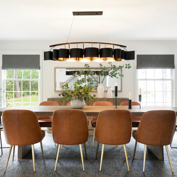
This beautiful French Provincial home is set on 10 acres, nestled perfectly in the oak trees. The original home was built in 1974 and had two large additions added; a great room in 1990 and a main floor master suite in 2001. This was my dream project: a full gut renovation of the entire 4,300 square foot home! I contracted the project myself, and we finished the interior remodel in just six months. The exterior received complete attention as well. The 1970s mottled brown brick went white to completely transform the look from dated to classic French. Inside, walls were removed and doorways widened to create an open floor plan that functions so well for everyday living as well as entertaining. The white walls and white trim make everything new, fresh and bright. It is so rewarding to see something old transformed into something new, more beautiful and more functional.
3