
Search results for "Window between cabinets" in Home Design Ideas
 Addhouse
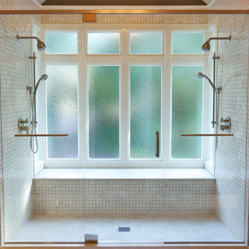
Double shower in bay window. The bench is cantilevered out over the exterior wall below.
Design, color scheme, lighting, and installation by Addhouse.
Photo by Monkeyboy Productions
 Mansfield + O'Neil
Photographer: Paul Dyer
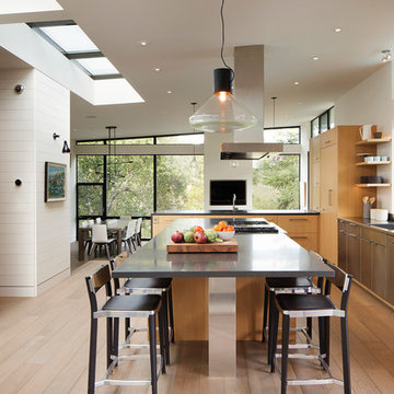
Eat-in kitchen - contemporary medium tone wood floor eat-in kitchen idea in San Francisco with flat-panel cabinets, light wood cabinets, stainless steel appliances, an island, an integrated sink and stainless steel countertops
Eat-in kitchen - contemporary medium tone wood floor eat-in kitchen idea in San Francisco with flat-panel cabinets, light wood cabinets, stainless steel appliances, an island, an integrated sink and stainless steel countertops
 TKS Design Group
Free ebook, Creating the Ideal Kitchen. DOWNLOAD NOW
Our clients and their three teenage kids had outgrown the footprint of their existing home and felt they needed some space to spread out. They came in with a couple of sets of drawings from different architects that were not quite what they were looking for, so we set out to really listen and try to provide a design that would meet their objectives given what the space could offer.
We started by agreeing that a bump out was the best way to go and then decided on the size and the floor plan locations of the mudroom, powder room and butler pantry which were all part of the project. We also planned for an eat-in banquette that is neatly tucked into the corner and surrounded by windows providing a lovely spot for daily meals.
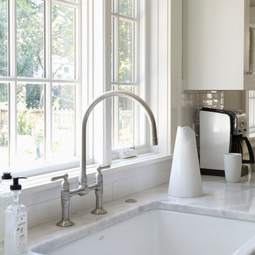
The kitchen itself is L-shaped with the refrigerator and range along one wall, and the new sink along the exterior wall with a large window overlooking the backyard. A large island, with seating for five, houses a prep sink and microwave. A new opening space between the kitchen and dining room includes a butler pantry/bar in one section and a large kitchen pantry in the other. Through the door to the left of the main sink is access to the new mudroom and powder room and existing attached garage.
White inset cabinets, quartzite countertops, subway tile and nickel accents provide a traditional feel. The gray island is a needed contrast to the dark wood flooring. Last but not least, professional appliances provide the tools of the trade needed to make this one hardworking kitchen.
Designed by: Susan Klimala, CKD, CBD
Photography by: Mike Kaskel
For more information on kitchen and bath design ideas go to: www.kitchenstudio-ge.com
Find the right local pro for your project

 Twelve Stones Designs, LLC
The owners of this kitchen had spent the money to upgrade the finishes in their kitchen upon building the home 12 years ago, but after living in the space for several years they realized how nonfunctional the layout really was. The (then) two preschool aged children had grown into busy, hungry teenagers with many friends who also liked to hang out at the house. So the family needed a more functional kitchen with better traffic flow, space for daily activities revolving around the kitchen at different times of day, and a kitchen that could accommodate cooking for and serving large groups. Furthermore, the dark, traditional finishes no longer reflected the homeowners’ style. They requested a brighter, more relaxed, coastal style that reflected their love of the seaside cities they like to visit.
Originally, the kitchen was U-shaped with a narrow island in the middle. The island created narrow aisles that bottle-necked at the dishwasher, refrigerator, and cooktop areas. There was a pass-through from the foyer into the kitchen, but the owners never liked that the pass-through was also located so close to the powder room. The awkward proximity was unappealing and made guests feel uncomfortable.
The kitchen’s storage was made up of lots of narrow cabinets, apothecary drawers, clipped corner units, and very few drawers. It lacked useful storage for the larger items the family used on a daily basis. And the kitchen’s only pantry was small closet that had only builder-grade, narrow shelving with no illumination to be able to see the contents inside.
Overall, the kitchen’s lighting plan was poorly executed. Only six recessed cans illuminated the entire kitchen and nook areas. The under cabinet lighting was not evenly distributed either. In fact, the builder had mis-placed the under cabinet lighting around the decorative pilasters which made for choppy, dark cubbies. Further, the builder didn’t include any lighting over the sink or the bar area, which meant whoever was doing the dishes was always in their own shadow. That, coupled with the steep overhang of the game room above made the bar area feel like a dim, cavernous space that wasn’t inviting or task oriented. The kitchen looked out into the main living space, but the raised bar and a narrow wall (which held the only large cabinet in the kitchen) created more of a barrier than a relationship to the living room or breakfast nook. In fact, one couldn’t even see the breakfast nook from the cooktop or sink areas due to its orientation. The raised bar top was too narrow to comfortably sit to either dine at or chat from due to the lack of knee space. The the homeowners confided that the kitchen felt more like a dark, dirty prison than place where the family, or their guests, wanted to gather and commune.
The clients' needs and desires were:
➢ to create a kitchen that would be a space the family loved to be in; to relate to the adjacent spaces all around, and to have better flow for entertaining large groups
➢ to remove the walls between the breakfast nook and living area and to be able to utilize the natural light from the windows in both those areas
➢ to incorporate a functional chopping block for prepping fresh food for home cooked meals, an island with a large sink and drain board, 2 pull out trash cans, and seating for at least the 2 teens to eat or do homework
➢ to design a kitchen and breakfast nook with an airy, coastal, relaxed vibe that blended with the rest of the house's coastal theme
➢ to integrate a layered lighting plan which would include ample general illumination, specific task lighting, decorative lighting, and lots of illuminated storage
➢ to design a kitchen with not only more storage for all the husband’s kitchen gadgets and collection of oils and spices, but smart storage, including a coffee/breakfast bar and a place to store and conceal the toaster oven and microwave
➢ to find a way to utilize the large open space between the kitchen, pantry area, and breakfast nook
Twelve Stones Designs achieved the owner's goals by:
➢ removing the walls between the kitchen and living room to allow the natural light to filter in from the adjacent rooms and to create a connection between the kitchen, nook, and living spaces for a sense of unity and communion
➢ removing the existing pantry and designing 3 large pantry style cabinets with LED tape lights and rollout drawers to house lots of kitchen appliances, gadgets, and tons of groceries. We also took the cabinets all the way up to the 9’ ceiling for additional storage for seasonal items and bulk storage.
➢ designing 2 islands - 1 with a gorgeous black walnut chopping block that houses a drawer for chopping and carving knives and a custom double pull out trash unit for point of use utilization - and 1 that houses the dishwasher, a large Blanco Gourmet sink with integrated drain board, woven baskets for fresh root vegetables and kitchen towels, plenty of drawer storage for kitchen items, and bar seating for up to 4 diners.
➢ closing off the space between the kitchen and the powder room to create a beautiful new private alcove for the powder room as well as adding some decorative storage. This also gave us space to include more tall storage near the new range for precision placement of the husband’s extensive oil and spice collection as well as a location for a combo-steam oven the wife wanted for baking and cooking healthy meals.
The project is enhanced functionally by:
➢ incorporated USB and standard receptacles for the kids’ laptops and phone charging in the large island
➢ designing the small island to include additional open shelving for items used on a daily basis such as a variety of bowls, plates, and colanders. This set up also works well for the husband who prefers to “plate” his dinners in restaurant-style fashion before presenting them to the table.
➢ the integration of specific storage units, such as double stacked cutlery drawers, a custom spice pull-out, a Kuerig coffee and tea pod drawer, and custom double stacked utensil drawers
➢ moving the refrigerator to the old oven location - this eliminated the bottle neck as well as created a better relationship to the eating table. It also utilizes the floor space between the pantry, nook, and kitchen
➢ creating a banquet style breakfast nook - this banquette seating not only doubles the amount of seating for large gatherings but it better utilizes the odd space between the kitchen and the previous nook area. It also helps to create a distinct pathway from the mudroom room through the pantry area, kitchen, nook, and living room.
➢ the coffee/breakfast bar area which includes the perfect location for the concealed microwave and toaster oven, convenient storage for the coffee pods and tea accoutrements. Roll-out drawers below also house the smoothie maker, hot water kettle, and a plethora of smoothie-making ingredients such as protein powders, smoothie additives, etc. Furthermore, the drawers below the Keurig house measuring utensil, cutlery, baking supplies and tupperware storage.
➢ incorporating lots of wide drawers and pullouts to accommodate large cookware.
➢ utilizing as much vertical space as possible by building storage to the ceiling which accommodates the family’s abundant amount of serving platters, baking sheets, bakeware, casserole dishes, and additional cutting boards.
The project is enhanced aesthetically by:
➢ new 5-piece Versailles pattern porcelain tile that now seamlessly joins the entire down stairs area together creating a bright, cohesiveness feeling instead of choppy separated spaces - it also adds a coastal feeling
➢ designing a cabinet to conceal the microwave and toaster oven
➢ the coastal influenced light fixtures over the nook table and island
➢ the sandy colors of the Langdon Cambria countertops. The swirling pattern and sparkling quartz pieces remind the homeowner of black-and-tan sandy beaches
➢ the striped banquet seating whose creamy white background and blue-green stripes were the inspiration for the cabinet and wall colors.
➢ All the interior doors were painted black to coordinate with the blacks and grays in the backsplash tile and countertop. This also adds a hint of tailored formality to an otherwise casual space.
➢ the use of WAC's Oculux small aperture LED units for the overhead lighting complimented with Diode LED strips for task lighting under the cabinets and inside the pantry and glass wall cabinets. All of the lighting applications are on separate dimmer switches.
Innovative uses of materials or construction methods by Realty Restoration LLC:
➢ Each 1-1/2” x 3” block of reclaimed end-grain black walnut that makes up the center island chopping block was hand milled and built in the shop. It was designed to look substantial and proportional to the surrounding elements, executed by creating the 4 inch tall top with a solid wood chamfered edge band.
➢ The metal doors on either side of the vent hood were also custom designed for this project and built in the Realty Restoration LLC shop. They are made 1x2, 11-gauge mild steel with ribbed glass. Weighing 60 lbs a piece, heavy duty cabinet hinges were added to support the weight of the door and keep them from sagging.
➢ Under-cabinet receptacles were added along the range wall in order to have a clean, uninterrupted backsplash.
Design obstacles to overcome:
➢ Because we were removing the demising walls between the kitchen and living room, we had to find a way to plumb and vent the new island. We did this by tunneling through the slab (the slab had post tension cables which prevented us from just trenching) to run a new wet vent through a nearby structural wall. We pulled the existing hot and cold lines between upper floor joists and ran them down the structural wall as well and up through a conduit in the tunnel.
➢ Since we were converting from wall overs to a gas range it allowed us to utilize the 220 feed for the wall ovens to provide a new sub panel for all the new kitchen circuits
➢ Due to framing deficiencies inherited from the original build there was a 1-1/2” differential in the floor-to-ceiling height over a 20 foot span; by utilizing the process of cutting and furring coupled with the crown moulding details on the cabinet elevations we were able to mask the problem and provide seamless transitions between the cabinet components.
Evidence of superior craftsmanship:
➢ uniquely designed, one-of-a-kind metal “X” end panels on the large island. The end panels were custom made in the Realty Restoration LLC shop and fitted to the exact dimensions of the island. The welding seams are completely indistinguishable - the posts look like they are cut from a single sheet of metal
➢ square metal posts on the small island were also custom made and designed to compliment and carry through the metal element s throughout the kitchen
➢ the beautiful, oversized end panels on the pantry cabinets which give the breakfast nook a tailored look
➢ integrating a large format 5 piece Versailles tile pattern to seamlessly flow from the existing spaces into the new kitchen space
➢ By constructing a custom cabinet that jogged around a corner we could not remodel (housing the entry way coat closet) we were able to camouflage the adjacent wall offset within the upper and lower cabinets. By designing around the existing jog in the structural walls we accomplished a few things: we were able to find the space to house, and hide, the microwave and toaster oven yet still have a clean cohesive appearance from the kitchen side. Additionally, the owners were able to keep their much needed coat closet and we didn’t have to increase the budget with unnecessary structural work.
 Case Architects & Remodelers
Project Developer John Audet
Designer Kate Adams
Photography by Stacy Zarin Goldberg
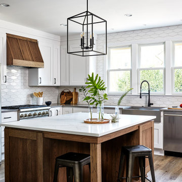
Example of a mid-sized transitional u-shaped medium tone wood floor and brown floor eat-in kitchen design in DC Metro with stainless steel appliances, an island, a farmhouse sink, shaker cabinets, white cabinets, quartz countertops, white backsplash and gray countertops
Example of a mid-sized transitional u-shaped medium tone wood floor and brown floor eat-in kitchen design in DC Metro with stainless steel appliances, an island, a farmhouse sink, shaker cabinets, white cabinets, quartz countertops, white backsplash and gray countertops
 Foley Fiore Architecture
Sam Gray Photography
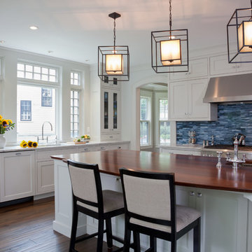
Inspiration for a transitional kitchen remodel in Boston with an undermount sink, beaded inset cabinets, white cabinets, wood countertops, blue backsplash, stainless steel appliances and matchstick tile backsplash
Inspiration for a transitional kitchen remodel in Boston with an undermount sink, beaded inset cabinets, white cabinets, wood countertops, blue backsplash, stainless steel appliances and matchstick tile backsplash
 Kuche+Cucina
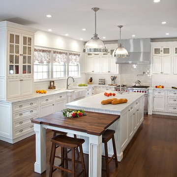
1st Place, National Design Award Winning Kitchen.
Remodeling in Warwick, NY. From a dark, un-inspiring kitchen (see before photos), to a bright, white, custom kitchen. Dark wood floors, white carrera marble counters, solid wood island-table and much more.
Photos - Ken Lauben
Sponsored
Delaware, OH

Buckeye Basements, Inc.
Central Ohio's Basement Finishing ExpertsBest Of Houzz '13-'21
 Moore Architects, PC
SCW Interiors
Hoachlander Davis Photography
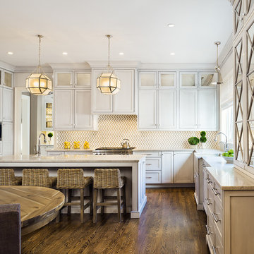
Example of a transitional u-shaped dark wood floor eat-in kitchen design in DC Metro with a farmhouse sink, shaker cabinets, white cabinets, beige backsplash and an island
Example of a transitional u-shaped dark wood floor eat-in kitchen design in DC Metro with a farmhouse sink, shaker cabinets, white cabinets, beige backsplash and an island

 Sexton Development
Large french country u-shaped dark wood floor enclosed kitchen photo in Chicago with a farmhouse sink, raised-panel cabinets, beige cabinets, white backsplash, paneled appliances, an island, quartz countertops and glass tile backsplash
 Dana Benson Construction
Interior Design by Ross Cassidy
Project Coordination by Elana Makovsky Parver
Photography by Bethany Nauert
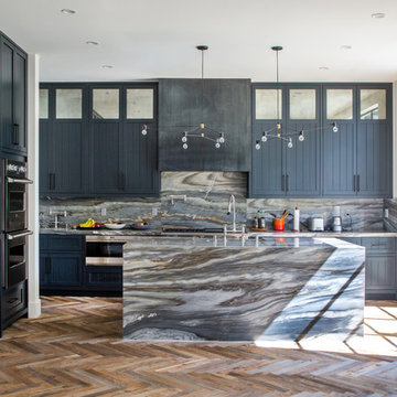
Trendy kitchen photo in Los Angeles with black cabinets, an island and marble backsplash
Trendy kitchen photo in Los Angeles with black cabinets, an island and marble backsplash
 Urbanology Designs
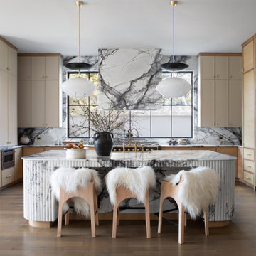
A captivating transformation in the coveted neighborhood of University Park, Dallas
The heart of this home lies in the kitchen, where we embarked on a design endeavor that would leave anyone speechless. By opening up the main kitchen wall, we created a magnificent window system that floods the space with natural light and offers a breathtaking view of the picturesque surroundings. Suspended from the ceiling, a steel-framed marble vent hood floats a few inches from the window, showcasing a mesmerizing Lilac Marble. The same marble is skillfully applied to the backsplash and island, featuring a bold combination of color and pattern that exudes elegance.
Adding to the kitchen's allure is the Italian range, which not only serves as a showstopper but offers robust culinary features for even the savviest of cooks. However, the true masterpiece of the kitchen lies in the honed reeded marble-faced island. Each marble strip was meticulously cut and crafted by artisans to achieve a half-rounded profile, resulting in an island that is nothing short of breathtaking. This intricate process took several months, but the end result speaks for itself.
To complement the grandeur of the kitchen, we designed a combination of stain-grade and paint-grade cabinets in a thin raised panel door style. This choice adds an elegant yet simple look to the overall design. Inside each cabinet and drawer, custom interiors were meticulously designed to provide maximum functionality and organization for the day-to-day cooking activities. A vintage Turkish runner dating back to the 1960s, evokes a sense of history and character.
The breakfast nook boasts a stunning, vivid, and colorful artwork created by one of Dallas' top artist, Kyle Steed, who is revered for his mastery of his craft. Some of our favorite art pieces from the inspiring Haylee Yale grace the coffee station and media console, adding the perfect moment to pause and loose yourself in the story of her art.
The project extends beyond the kitchen into the living room, where the family's changing needs and growing children demanded a new design approach. Accommodating their new lifestyle, we incorporated a large sectional for family bonding moments while watching TV. The living room now boasts bolder colors, striking artwork a coffered accent wall, and cayenne velvet curtains that create an inviting atmosphere. Completing the room is a custom 22' x 15' rug, adding warmth and comfort to the space. A hidden coat closet door integrated into the feature wall adds an element of surprise and functionality.
This project is not just about aesthetics; it's about pushing the boundaries of design and showcasing the possibilities. By curating an out-of-the-box approach, we bring texture and depth to the space, employing different materials and original applications. The layered design achieved through repeated use of the same material in various forms, shapes, and locations demonstrates that unexpected elements can create breathtaking results.
The reason behind this redesign and remodel was the homeowners' desire to have a kitchen that not only provided functionality but also served as a beautiful backdrop to their cherished family moments. The previous kitchen lacked the "wow" factor they desired, prompting them to seek our expertise in creating a space that would be a source of joy and inspiration.
Inspired by well-curated European vignettes, sculptural elements, clean lines, and a natural color scheme with pops of color, this design reflects an elegant organic modern style. Mixing metals, contrasting textures, and utilizing clean lines were key elements in achieving the desired aesthetic. The living room introduces bolder moments and a carefully chosen color scheme that adds character and personality.
The client's must-haves were clear: they wanted a show stopping centerpiece for their home, enhanced natural light in the kitchen, and a design that reflected their family's dynamic. With the transformation of the range wall into a wall of windows, we fulfilled their desire for abundant natural light and breathtaking views of the surrounding landscape.
Our favorite rooms and design elements are numerous, but the kitchen remains a standout feature. The painstaking process of hand-cutting and crafting each reeded panel in the island to match the marble's veining resulted in a labor of love that emanates warmth and hospitality to all who enter.
In conclusion, this tastefully lux project in University Park, Dallas is an extraordinary example of a full gut remodel that has surpassed all expectations. The meticulous attention to detail, the masterful use of materials, and the seamless blend of functionality and aesthetics create an unforgettable space. It serves as a testament to the power of design and the transformative impact it can have on a home and its inhabitants.
Project by Texas' Urbanology Designs. Their North Richland Hills-based interior design studio serves Dallas, Highland Park, University Park, Fort Worth, and upscale clients nationwide.
 Twelve Stones Designs, LLC
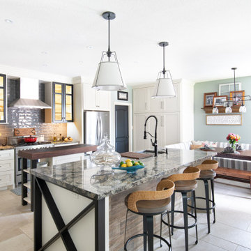
The owners of this kitchen had spent the money to upgrade the finishes in their kitchen upon building the home 12 years ago, but after living in the space for several years they realized how nonfunctional the layout really was. The (then) two preschool aged children had grown into busy, hungry teenagers with many friends who also liked to hang out at the house. So the family needed a more functional kitchen with better traffic flow, space for daily activities revolving around the kitchen at different times of day, and a kitchen that could accommodate cooking for and serving large groups. Furthermore, the dark, traditional finishes no longer reflected the homeowners’ style. They requested a brighter, more relaxed, coastal style that reflected their love of the seaside cities they like to visit.
Originally, the kitchen was U-shaped with a narrow island in the middle. The island created narrow aisles that bottle-necked at the dishwasher, refrigerator, and cooktop areas. There was a pass-through from the foyer into the kitchen, but the owners never liked that the pass-through was also located so close to the powder room. The awkward proximity was unappealing and made guests feel uncomfortable.
The kitchen’s storage was made up of lots of narrow cabinets, apothecary drawers, clipped corner units, and very few drawers. It lacked useful storage for the larger items the family used on a daily basis. And the kitchen’s only pantry was small closet that had only builder-grade, narrow shelving with no illumination to be able to see the contents inside.
Overall, the kitchen’s lighting plan was poorly executed. Only six recessed cans illuminated the entire kitchen and nook areas. The under cabinet lighting was not evenly distributed either. In fact, the builder had mis-placed the under cabinet lighting around the decorative pilasters which made for choppy, dark cubbies. Further, the builder didn’t include any lighting over the sink or the bar area, which meant whoever was doing the dishes was always in their own shadow. That, coupled with the steep overhang of the game room above made the bar area feel like a dim, cavernous space that wasn’t inviting or task oriented. The kitchen looked out into the main living space, but the raised bar and a narrow wall (which held the only large cabinet in the kitchen) created more of a barrier than a relationship to the living room or breakfast nook. In fact, one couldn’t even see the breakfast nook from the cooktop or sink areas due to its orientation. The raised bar top was too narrow to comfortably sit to either dine at or chat from due to the lack of knee space. The the homeowners confided that the kitchen felt more like a dark, dirty prison than place where the family, or their guests, wanted to gather and commune.
The clients' needs and desires were:
➢ to create a kitchen that would be a space the family loved to be in; to relate to the adjacent spaces all around, and to have better flow for entertaining large groups
➢ to remove the walls between the breakfast nook and living area and to be able to utilize the natural light from the windows in both those areas
➢ to incorporate a functional chopping block for prepping fresh food for home cooked meals, an island with a large sink and drain board, 2 pull out trash cans, and seating for at least the 2 teens to eat or do homework
➢ to design a kitchen and breakfast nook with an airy, coastal, relaxed vibe that blended with the rest of the house's coastal theme
➢ to integrate a layered lighting plan which would include ample general illumination, specific task lighting, decorative lighting, and lots of illuminated storage
➢ to design a kitchen with not only more storage for all the husband’s kitchen gadgets and collection of oils and spices, but smart storage, including a coffee/breakfast bar and a place to store and conceal the toaster oven and microwave
➢ to find a way to utilize the large open space between the kitchen, pantry area, and breakfast nook
Twelve Stones Designs achieved the owner's goals by:
➢ removing the walls between the kitchen and living room to allow the natural light to filter in from the adjacent rooms and to create a connection between the kitchen, nook, and living spaces for a sense of unity and communion
➢ removing the existing pantry and designing 3 large pantry style cabinets with LED tape lights and rollout drawers to house lots of kitchen appliances, gadgets, and tons of groceries. We also took the cabinets all the way up to the 9’ ceiling for additional storage for seasonal items and bulk storage.
➢ designing 2 islands - 1 with a gorgeous black walnut chopping block that houses a drawer for chopping and carving knives and a custom double pull out trash unit for point of use utilization - and 1 that houses the dishwasher, a large Blanco Gourmet sink with integrated drain board, woven baskets for fresh root vegetables and kitchen towels, plenty of drawer storage for kitchen items, and bar seating for up to 4 diners.
➢ closing off the space between the kitchen and the powder room to create a beautiful new private alcove for the powder room as well as adding some decorative storage. This also gave us space to include more tall storage near the new range for precision placement of the husband’s extensive oil and spice collection as well as a location for a combo-steam oven the wife wanted for baking and cooking healthy meals.
The project is enhanced functionally by:
➢ incorporated USB and standard receptacles for the kids’ laptops and phone charging in the large island
➢ designing the small island to include additional open shelving for items used on a daily basis such as a variety of bowls, plates, and colanders. This set up also works well for the husband who prefers to “plate” his dinners in restaurant-style fashion before presenting them to the table.
➢ the integration of specific storage units, such as double stacked cutlery drawers, a custom spice pull-out, a Kuerig coffee and tea pod drawer, and custom double stacked utensil drawers
➢ moving the refrigerator to the old oven location - this eliminated the bottle neck as well as created a better relationship to the eating table. It also utilizes the floor space between the pantry, nook, and kitchen
➢ creating a banquet style breakfast nook - this banquette seating not only doubles the amount of seating for large gatherings but it better utilizes the odd space between the kitchen and the previous nook area. It also helps to create a distinct pathway from the mudroom room through the pantry area, kitchen, nook, and living room.
➢ the coffee/breakfast bar area which includes the perfect location for the concealed microwave and toaster oven, convenient storage for the coffee pods and tea accoutrements. Roll-out drawers below also house the smoothie maker, hot water kettle, and a plethora of smoothie-making ingredients such as protein powders, smoothie additives, etc. Furthermore, the drawers below the Keurig house measuring utensil, cutlery, baking supplies and tupperware storage.
➢ incorporating lots of wide drawers and pullouts to accommodate large cookware.
➢ utilizing as much vertical space as possible by building storage to the ceiling which accommodates the family’s abundant amount of serving platters, baking sheets, bakeware, casserole dishes, and additional cutting boards.
The project is enhanced aesthetically by:
➢ new 5-piece Versailles pattern porcelain tile that now seamlessly joins the entire down stairs area together creating a bright, cohesiveness feeling instead of choppy separated spaces - it also adds a coastal feeling
➢ designing a cabinet to conceal the microwave and toaster oven
➢ the coastal influenced light fixtures over the nook table and island
➢ the sandy colors of the Langdon Cambria countertops. The swirling pattern and sparkling quartz pieces remind the homeowner of black-and-tan sandy beaches
➢ the striped banquet seating whose creamy white background and blue-green stripes were the inspiration for the cabinet and wall colors.
➢ All the interior doors were painted black to coordinate with the blacks and grays in the backsplash tile and countertop. This also adds a hint of tailored formality to an otherwise casual space.
➢ the use of WAC's Oculux small aperture LED units for the overhead lighting complimented with Diode LED strips for task lighting under the cabinets and inside the pantry and glass wall cabinets. All of the lighting applications are on separate dimmer switches.
Innovative uses of materials or construction methods by Realty Restoration LLC:
➢ Each 1-1/2” x 3” block of reclaimed end-grain black walnut that makes up the center island chopping block was hand milled and built in the shop. It was designed to look substantial and proportional to the surrounding elements, executed by creating the 4 inch tall top with a solid wood chamfered edge band.
➢ The metal doors on either side of the vent hood were also custom designed for this project and built in the Realty Restoration LLC shop. They are made 1x2, 11-gauge mild steel with ribbed glass. Weighing 60 lbs a piece, heavy duty cabinet hinges were added to support the weight of the door and keep them from sagging.
➢ Under-cabinet receptacles were added along the range wall in order to have a clean, uninterrupted backsplash.
Design obstacles to overcome:
➢ Because we were removing the demising walls between the kitchen and living room, we had to find a way to plumb and vent the new island. We did this by tunneling through the slab (the slab had post tension cables which prevented us from just trenching) to run a new wet vent through a nearby structural wall. We pulled the existing hot and cold lines between upper floor joists and ran them down the structural wall as well and up through a conduit in the tunnel.
➢ Since we were converting from wall overs to a gas range it allowed us to utilize the 220 feed for the wall ovens to provide a new sub panel for all the new kitchen circuits
➢ Due to framing deficiencies inherited from the original build there was a 1-1/2” differential in the floor-to-ceiling height over a 20 foot span; by utilizing the process of cutting and furring coupled with the crown moulding details on the cabinet elevations we were able to mask the problem and provide seamless transitions between the cabinet components.
Evidence of superior craftsmanship:
➢ uniquely designed, one-of-a-kind metal “X” end panels on the large island. The end panels were custom made in the Realty Restoration LLC shop and fitted to the exact dimensions of the island. The welding seams are completely indistinguishable - the posts look like they are cut from a single sheet of metal
➢ square metal posts on the small island were also custom made and designed to compliment and carry through the metal element s throughout the kitchen
➢ the beautiful, oversized end panels on the pantry cabinets which give the breakfast nook a tailored look
➢ integrating a large format 5 piece Versailles tile pattern to seamlessly flow from the existing spaces into the new kitchen space
➢ By constructing a custom cabinet that jogged around a corner we could not remodel (housing the entry way coat closet) we were able to camouflage the adjacent wall offset within the upper and lower cabinets. By designing around the existing jog in the structural walls we accomplished a few things: we were able to find the space to house, and hide, the microwave and toaster oven yet still have a clean cohesive appearance from the kitchen side. Additionally, the owners were able to keep their much needed coat closet and we didn’t have to increase the budget with unnecessary structural work.
 Lincoln Wood Products, Inc.
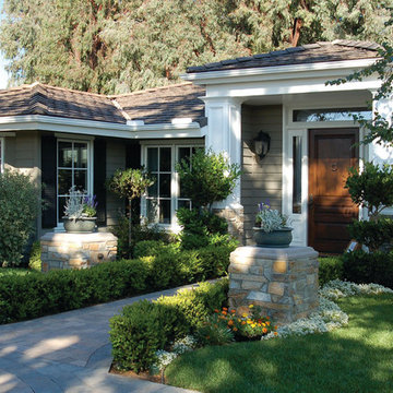
Inspiration for a timeless one-story wood exterior home remodel in Los Angeles
Sponsored
Columbus, OH

Hope Restoration & General Contracting
Columbus Design-Build, Kitchen & Bath Remodeling, Historic Renovations
 Visbeen Architects
The Parkgate was designed from the inside out to give homage to the past. It has a welcoming wraparound front porch and, much like its ancestors, a surprising grandeur from floor to floor. The stair opens to a spectacular window with flanking bookcases, making the family space as special as the public areas of the home. The formal living room is separated from the family space, yet reconnected with a unique screened porch ideal for entertaining. The large kitchen, with its built-in curved booth and large dining area to the front of the home, is also ideal for entertaining. The back hall entry is perfect for a large family, with big closets, locker areas, laundry home management room, bath and back stair. The home has a large master suite and two children's rooms on the second floor, with an uncommon third floor boasting two more wonderful bedrooms. The lower level is every family’s dream, boasting a large game room, guest suite, family room and gymnasium with 14-foot ceiling. The main stair is split to give further separation between formal and informal living. The kitchen dining area flanks the foyer, giving it a more traditional feel. Upon entering the home, visitors can see the welcoming kitchen beyond.
Photographer: David Bixel
Builder: DeHann Homes
 Dura Supreme Cabinetry
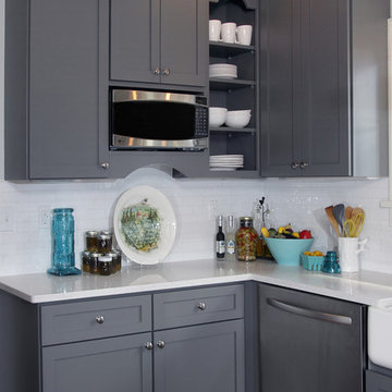
This gray and transitional kitchen remodel bridges the gap between contemporary style and traditional style. The dark gray cabinetry, light gray walls, and white subway tile backsplash make for a beautiful, neutral canvas for the bold teal blue and yellow décor accented throughout the design.
Designer Gwen Adair of Cabinet Supreme by Adair did a fabulous job at using grays to create a neutral backdrop to bring out the bright, vibrant colors that the homeowners love so much.
This Milwaukee, WI kitchen is the perfect example of Dura Supreme's recent launch of gray paint finishes, it has been interesting to see these new cabinetry colors suddenly flowing across our manufacturing floor, destined for homes around the country. We've already seen an enthusiastic acceptance of these new colors as homeowners started immediately selecting our various shades of gray paints, like this example of “Storm Gray”, for their new homes and remodeling projects!
Dura Supreme’s “Storm Gray” is the darkest of our new gray painted finishes (although our current “Graphite” paint finish is a charcoal gray that is almost black). For those that like the popular contrast between light and dark finishes, Storm Gray pairs beautifully with lighter painted and stained finishes.
Request a FREE Dura Supreme Brochure Packet:
http://www.durasupreme.com/request-brochure
 ScavulloDesign Interiors
Matthew Millman
Elegant kitchen photo in San Francisco with a farmhouse sink, shaker cabinets, white cabinets, beige backsplash and subway tile backsplash
Elegant kitchen photo in San Francisco with a farmhouse sink, shaker cabinets, white cabinets, beige backsplash and subway tile backsplash
 Fieldstone Windows & Doors Ltd.
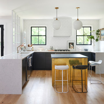
The black kitchen window in this project complement the modern style of this home. We worked with designer Christine Dovey on this project, and the client opted for metal clad wood double hung windows. The black windows also provide a contrast to the beautiful white subway tiles and matches the black lower cabinets.
photo credit: Stephani Buchman

 Klopf Architecture
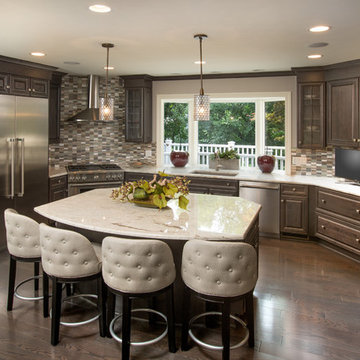
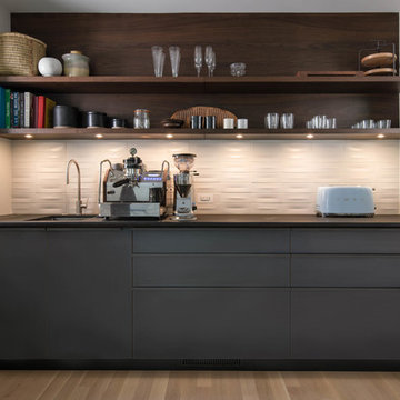
Klopf Architecture’s client, a family of four with young children, wanted to update their recently purchased home to meet their growing needs across generations. It was essential to maintain the mid-century modern style throughout the project but most importantly, they wanted more natural light brought into the dark kitchen and cramped bathrooms while creating a smoother connection between the kitchen, dining and family room.
The kitchen was expanded into the dining area, using part of the original kitchen area as a butler's pantry. With the main kitchen brought out into an open space with new larger windows and two skylights the space became light, open, and airy. Custom cabinetry from Henrybuilt throughout the kitchen and butler's pantry brought functionality to the space. Removing the wall between the kitchen and dining room, and widening the opening from the dining room to the living room created a more open and natural flow between the spaces.
New redwood siding was installed in the entry foyer to match the original siding in the family room so it felt original to the house and consistent between the spaces. Oak flooring was installed throughout the house enhancing the movement between the new kitchen and adjacent areas.
The two original bathrooms felt dark and cramped so they were expanded and also feature larger windows, modern fixtures and new Heath tile throughout. Custom vanities also from Henrybuilt bring a unified look and feel from the kitchen into the new bathrooms. Designs included plans for a future in-law unit to accommodate the needs of an older generation.
The house is much brighter, feels more unified with wider open site lines that provide the family with a better transition and seamless connection between spaces.
This mid-century modern remodel is a 2,743 sf, 4 bedroom/3 bath home located in Lafayette, CA.
Klopf Architecture Project Team: John Klopf and Angela Todorova
Contractor: Don Larwood
Structural Engineer: Sezen & Moon Structural Engineering, Inc.
Landscape Designer: n/a
Photography ©2018 Scott Maddern
Location: Lafayette, CA
Year completed: 2018
Link to photos: https://www.dropbox.com/sh/aqxfwk7wdot9jja/AADWuIcsHHE-AGPfq13u5htda?dl=0
 Alair Homes Plano
Our clients were living in a Northwood Hills home in Dallas that was built in 1968. Some updates had been done but none really to the main living areas in the front of the house. They love to entertain and do so frequently but the layout of their house wasn’t very functional. There was a galley kitchen, which was mostly shut off to the rest of the home. They were not using the formal living and dining room in front of your house, so they wanted to see how this space could be better utilized. They wanted to create a more open and updated kitchen space that fits their lifestyle. One idea was to turn part of this space into an office, utilizing the bay window with the view out of the front of the house. Storage was also a necessity, as they entertain often and need space for storing those items they use for entertaining. They would also like to incorporate a wet bar somewhere!
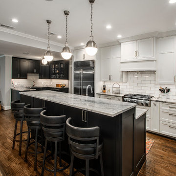
We demoed the brick and paneling from all of the existing walls and put up drywall. The openings on either side of the fireplace and through the entryway were widened and the kitchen was completely opened up. The fireplace surround is changed to a modern Emser Esplanade Trail tile, versus the chunky rock it was previously. The ceiling was raised and leveled out and the beams were removed throughout the entire area. Beautiful Olympus quartzite countertops were installed throughout the kitchen and butler’s pantry with white Chandler cabinets and Grace 4”x12” Bianco tile backsplash. A large two level island with bar seating for guests was built to create a little separation between the kitchen and dining room. Contrasting black Chandler cabinets were used for the island, as well as for the bar area, all with the same 6” Emtek Alexander pulls. A Blanco low divide metallic gray kitchen sink was placed in the center of the island with a Kohler Bellera kitchen faucet in vibrant stainless. To finish off the look three Iconic Classic Globe Small Pendants in Antiqued Nickel pendant lights were hung above the island. Black Supreme granite countertops with a cool leathered finish were installed in the wet bar, The backsplash is Choice Fawn gloss 4x12” tile, which created a little different look than in the kitchen. A hammered copper Hayden square sink was installed in the bar, giving it that cool bar feel with the black Chandler cabinets. Off the kitchen was a laundry room and powder bath that were also updated. They wanted to have a little fun with these spaces, so the clients chose a geometric black and white Bella Mori 9x9” porcelain tile. Coordinating black and white polka dot wallpaper was installed in the laundry room and a fun floral black and white wallpaper in the powder bath. A dark bronze Metal Mirror with a shelf was installed above the porcelain pedestal sink with simple floating black shelves for storage.
Their butlers pantry, the added storage space, and the overall functionality has made entertaining so much easier and keeps unwanted things out of sight, whether the guests are sitting at the island or at the wet bar! The clients absolutely love their new space and the way in which has transformed their lives and really love entertaining even more now!
 Becker Building & Remodeling Inc.
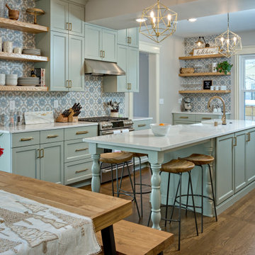
Wall between kitchen and dining was removed for easy flow and combining of spaces. Extra doorway to mudroom removed. All new cabinets, pantry, ref,wall micro (not shown). Engr quartz countertops, tile splash, natural oak floating shelves, site finished red oak stained floors.
13