
Search results for "Your own study" in Home Design Ideas
 Wall Bed Place
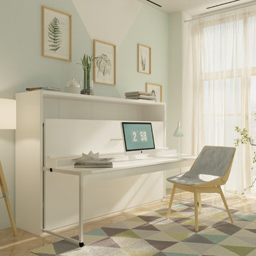
Do you have a small apartment or studio and need space saving furniture ideas? Do you have a den or office that needs to double as a guestroom? A Murphy Bed system might be just what you’re looking for! This style looks like a glossy lacquered wall in your room and when closed takes up very little space. When you want to study or work on your computer, just open the cabinet and drop down a desk! There’s plenty of room for office work, study books or even craft projects to fit on this roomy desk. When you’re tired and want to get some sleep, just open it all the way and the desk drops down, instantly giving you a twin bed ready to crawl into! In the morning, it all closes up, giving you an uncluttered, open area for your studio or apartment. If you’re using it in a study, you can keep the desk open and just open the bed for guests when they sleep over. This Murphy Bed system is constructed from the highest quality materials and the mechanism is technologically new gas springs, that open and close with no effort. Having a Murphy Bed System is like having a room in a box.
 Advance Design Studio, Ltd.
Jennifer and Dan have lived in their Deer Park Illinois home for 15 years, slowly making minor fixes like painting and decorating; but they had a new plan for their kitchen the entire time. An awkwardly placed garage door, and an island cooktop with a terrible downdraft made a full-scale kitchen remodel an absolute must. Jennifer had many ideas in mind and wanted to work with a company that could provide high-end work, while partnering with a designer that would tailor the kitchen to her ideas.
She was intrigued by the phrase “Common Sense Remodeling” in Advance Design’s feature she discovered while perusing an issue of the community’s Quintessential Barrington Magazine. Doing further research on the company’s website, as she looked through project profiles and read about Advance Design’s “Common Sense Remodeling” philosophy, she promptly scheduled an appointment to see if the people and ideas she read about were truly who they said they were. The more she read, the more she knew that the “Common Sense” approach to remodeling they described was exactly the type of company she was looking for.
The partnership was sealed after an initial consultation with Owner Todd Jurs and Project Designer Michelle Lecinski. They displayed a combination of friendliness, professionalism and respect that was unmatched by any of the other companies Jennifer talked to. She knew that with Advance Design, she would be able to retain the vision that she had in mind with high-quality craftsmanship.
“I reached out to Advance Design because of the ‘Common Sense Remodeling’ tagline,” Jennifer said. “That’s what lingered for me”. “Advance Design was the most respectful- of the house and of my design ideas, and the most professional of the handful of companies that looked at my project”.
Soon after the meeting Jennifer began working with Michelle on the project design. They quickly developed chemistry. Jennifer loved how Michelle researched and located every detail that Jennifer wanted for the kitchen. Between the two of them, every concept and idea was worked through and perfected. “Jennifer had definite ideas about what she wanted the new kitchen to look like, she just didn’t know how to bring it all together. We worked together really well to make her ideas into the practical reality necessary for a well-functioning kitchen, with the look and feel that she had envisioned”, says Michelle.
“Michelle was wonderful in using the CAD system she would show me new drawings every time we changed the layout while working through the design,” Jennifer said. “She was a really wonderful partner in execution, she made sure everything happened quickly and easily.”
The finished design drew out elements of Jennifer’s style and personality. The pair call the look “sophisticated farmhouse” to describe the kitchen renovation to family and friends. The result was a beautifully crafted, authentic-feeling space that satisfied Jennifer’s dreams 15 years in the making. The whole project consisted of a kitchen remodel, mudroom upgrade with powder room, and garage entry relocation. “The projects I personally like the best, are the ones that put the client’s dreams on display,” Project Designer Michelle said. “And this is one of those projects.”
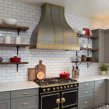
The main focal point of the kitchen is custom zinc and brass ventilation hood with a vintage sheen, which was hand made to order by a small company in Indiana named Vogler Metalworking. “It’s like sculpture, a true work of art”, says Jennifer. Your eye is immediately drawn towards this elegant yet practical hood that eliminated the home’s downdraft problem and added a striking conversation piece at the same time. The carpenters had to use special gloves when transporting and installing it, so they didn’t smudge it with fingerprints. The beautiful hood centers proudly over the stunning black enamel and brass LaCornue Range. “I had a friend who had a LaCornue range and after learning how easy it was to cook perfect meals, I was convinced I wanted to have one”, says Jennifer. This unique, breathtaking combination anchors the entire kitchen and is apparent immediately as you walk into the great room the surrounds the space.
DuraSupreme Crestwood cabinets with a Kendall Panel add function and sophistication. A custom gray paint color paired with a storm blue was developed so that the new kitchen looked like it belonged to the existing space. Unlacquered brass faucets and hardware were important to Jennifer because she wanted the living finishes to age over time. Remarkable brass diamond mesh cabinet door inserts imported from the UK continue to add this one-of-a-kind kitchen renovation; giving it a “you won’t see this everywhere” quality. The use of old railcar flooring for the coffee bar countertop and reclaimed oak for the open shelving gives an authenticity to the space uncommon in kitchens today.
Jennifer and Michelle fell in love with the Limestone Grey Stone while they were investigating unique island countertop ideas. They liked the fact that the limestone as a living finish will age and change over time. Calcutta Miel Quartz countertops made for an excellent pairing around the perimeter, as it’s durable and perfect for cooking preparations. A textured white subway tile backsplash that runs to the ceiling keeps your eye moving towards the open shelving, and to the main focal point of the stunning range hood combination.
“The kitchen functions beautifully, and it’s gorgeous,” beams Jennifer as she gestures with both hands while smiling ear to ear. “The most important thing was I wanted a kitchen that had a wonderful flow, cooked beautiful meals and was a great gathering place for family and friends, and this space does that perfectly! Beauty wise, it turned out exactly how I had envisioned. I felt the function part was the hardest part, and that was nailed”!
Relocating the garage entry to the new mudroom was a huge priority and has finally separated the family’s arriving home functions from their kitchen. Now coats and shoes and bags have their own area for dropping once members arrive home. Matching gray DuraSupreme cabinetry helped create gorgeous, purposeful lockers for the family. A reclaimed vintage sink and custom wall paper were added to the tiny powder room to beautify the once previously only functional space. Advance Design was even able to create a custom space for their dog to sleep while the family is away.
“It was unbelievable that a project of this size was completed in such a short time, and I think that’s because of the large amount of planning and preparation that went into it,” Jennifer marveled, “When we started, we were ready, and everything was prepared”.
When it came to execution, Project Manager Justin Davis and his crew were quick, accessible, and organized. Projects like this kitchen are typically completed in as little as 8-10 weeks. Jennifer’s kitchen however despite the relocation of some challenging HVAC in a soffit and moving of an exterior door was completed remarkably fast in part because the team was working with an existing tile floor that ran throughout the first floor that the client really loved.
“You get to know these people really well because they’re living in your house while you’re living in your house. They were so fast and really good, it didn’t take as long as even planned” reported Jennifer. “I would text Justin and he always responded almost immediately. I got to know all the guys who were working in our house and they were all wonderful people”.
Details in a customized kitchen like this one require skill and care from the people who install it. “All the guys on the job were skilled at what the did. I wanted small details like little feet to look like furniture, that is where their carpentry skill came in to make these all perfect”, said Jennifer. “The tile guys were wonderful. They even let me determine how I wanted the texture with the grout to appear for a salt and pepper look; now that is a very skilled trade person making it custom”.
In Jennifer’s interview, she continued to reference Advance Design’s “Common Sense Remodeling”, so I took a minute to ask her exactly what that phrase meant to her and how it played out in her experience with her project and the Advance Design team. Here is what she said: “I was intrigued about Common Sense Remodeling and in my head that there would be clear costs and prices, great communication between the design team, the execution team and me”, said Jennifer. They did deliver on that, it was so clear about the cost breakdown, what I could expect from everyone who came to my house, and everything that we had ordered. That to me is the Common Sense”!
It’s great to see a client take literally our assertion that a well-planned remodeling project is simply “Common Sense”! She anticipated each step of the way would be clear, concise, and predictable, all the while protecting the outcome due to the careful upfront planning. “Advance Design delivered on their ‘Common Sense Remodeling’ promise,” Jennifer said. “From the design team, to the execution team - everything was straight forward like I imagined. The project turned out exactly how I envisioned, I enjoyed this process and absolutely would recommend Advance Design Studio to anyone.”

 Your Western Decor.
This wall mount hat and coat rack is made of solid wood, genuine hair on cowhide and embossed leathers. Add a custom name, business or any text on the plasma cut playbill nameplate. This piece is made from aged barn wood and augmented with cast iron stars and hooks.
Custom hides and leathers are available. Shown here in embossed crocodile leather and brindle hair on cowhide and embossed crocodile leather and tri-color hair on cowhide. Ask about available options if interested in creating your own look.
· Rack measures 32″ W x 15″ T. 20 lbs.
· Made of aged barn wood and genuine leathers.
· Custom made to order in the USA.
Find the right local pro for your project
 Valentini Kids Furniture Brooklyn NY
Modern Wall Unit Exential Y16 by Spar
Made in Italy
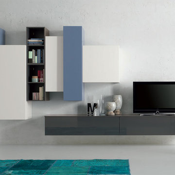
Exential by Spar is an italian modular wall unit line that could be an excellent design solution for any modern or contemporary styled living room, especially if the space is limited. Individual units allow to make a large TV area and functionally organize only those areas you need, which is impossible to do with the joint wall unit compositions. This italian entertainment center will complement your home and the areas of your daily life, not only as an aesthetic, but also as a functional addition, featuring an abundance of storage space, both hidden and exposed, to aid you with the organization of all your belongings, bringing the elegance into your interior. An original modern look of this wall unit composition is also achieved by a different depth of the wall mounted units.
The Wall Unit Composition Exential Y16 is shown in the next colors/finishes:
Structure - White and Gray Smoke Gloss, Blue and Gray Smoke Matt lacquers;
Front - White and Gray Smoke Gloss, Blue Matt lacquers.
PLEASE NOTE: The Exential is a modular wall unit line offering a wide variety of units in different sizes. You can order this wall unit either as a complete composition, as shown in the main picture, or build your own composition according to your own dimensions and preferences. Please contact our office about details on the customization of this wall unit.
MATERIAL/CONSTRUCTION:
Structure: Made with particle board of wood, covered with E1 melamine finishes or high gloss lacquer
Drawers: Made with panels of wood particles in E1-coated finish PVC beech. Metal runners with fine race to fall
Glass: 4mm glass
The starting price is for the Exential Wall Unit Composition Y16 as shown in the main picture.
Dimensions:
Wall Unit Composition: W136" x D17.7" x H72"
 Lorraine G Vale, ASID Allied
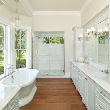
One of the main features of the space is the natural lighting. The windows allow someone to feel they are in their own private oasis. The wide plank European oak floors, with a brushed finish, contribute to the warmth felt in this bathroom, along with warm neutrals, whites and grays. The counter tops are a stunning Calcatta Latte marble as is the basket weaved shower floor, 1x1 square mosaics separating each row of the large format, rectangular tiles, also marble. Lighting is key in any bathroom and there is more than sufficient lighting provided by Ralph Lauren, by Circa Lighting. Classic, custom designed cabinetry optimizes the space by providing plenty of storage for toiletries, linens and more. Holger Obenaus Photography did an amazing job capturing this light filled and luxurious master bathroom. Built by Novella Homes and designed by Lorraine G Vale
Holger Obenaus Photography
 All Marble Tiles
Carrara Marble Tiles and Bathroom Tiles
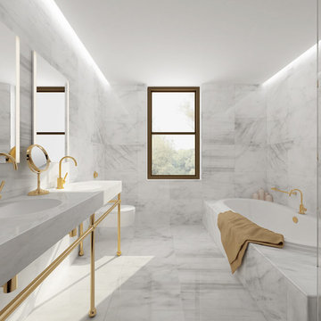
We all love a bathroom backdrop that creates the most serene ambience in which we can soak ourselves after a long day of work. Nothing gives your bathroom that posh look like snow white Carrara marble tiles. It is sold in different textures and density in the market; you have the option of making the selection that suits your style.
There are so many ways to carpet your bathroom with Carrara marble tile. Since the bathroom tiles are non-porous in nature, they cannot soak in water. This makes them perfect to cover your walls with them and provide that warm ambience as you take a shower. Carrara stone does not retain odors as well thus you are perfectly safe using your shampoo or liquid body wash however you want without worrying.
Carrara marble tile bathroom walls offer a perfect white backdrop in which you can add details like silvery faucets, flower vases or candelabras when having romantic moments with your spouse. Because stone can be polished to a glimmer, using Carrara bathroom tiles on the walls reflects light off making the entire room look illuminated and fresh. And the plush white look doesn’t have to end with the walls; your own drop-in tab can also be decorated with Carrara marble tiles to complete the sophisticated hotel-style look.
Marble is also perfect on floors especially when you want to do away with the rugs. Bathroom rugs tend to soak and look ugly on the floor or get dump and give off nauseating odors. Polished Carrara marble is all you do to make the floor neat and shiny. And because they don’t get dump, they maintain their temperatures and feel warm whenever you walk on them.
Installing these tiles is a smooth job and stone can easily be cut using hand-held tile cutters. Laying the tiles yourself also gives you the freedom to try different patterns on the walls and floor. Moreover, you can also try out mosaic formats to achieve a different look but you have to consult someone if you are not sure about mosaics. Make sure you use non-slippery grout sealers so your Carrara bathroom design remains safe even when walking bare foot.
Investing in Carrara marble tiles is a one-time opportunity that will last for as long as possible. There is little maintenance on the stone marble and it cleans up easily and doesn’t corrode either. If you are tired of your current bathroom look, invest in this option for a change.
http://AllMarbleTiles.com
 Your Story by Design
larry arnal photography
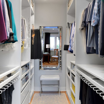
Example of a small transitional gender-neutral beige floor walk-in closet design in Toronto with open cabinets and white cabinets
Example of a small transitional gender-neutral beige floor walk-in closet design in Toronto with open cabinets and white cabinets


 Dynamic Garage Door
Getting your homeowner's association board to approve your new custom garage doors can seem daunting. Dynamic Garage Door as a custom design and manufacturing firm has come across this situation quite frequently with a phenomenal success approval rate!
In order to get approval for your custom garage door approval there are a few basic points you must understand. First off, your HOA is committed to preserving the neighborhood's curb appeal integrity by focusing on the impact your new custom garage doors might have on your house and the houses of your neighbors. It is important to understand that your curb appeal decisions will impact your home and neighborhood alike. Too many companies offer semi-custom wood doors without the true understanding of the client's need and the essence of their home's architectural style. The garage door design you choose needs to comply with neighborhood regulations while complement your home's architecture. At Dynamic Garage Door, our designers are well-rounded in the garage door industry and so we can suggest or develop designs that will reinforce the natural appearance of your home's style. If you can prove to your HOA that you've done your homework and that the garage door design you chose will complement not only your home but the neighborhood you'll be surprised when your proposal is marked with the approval stamp!
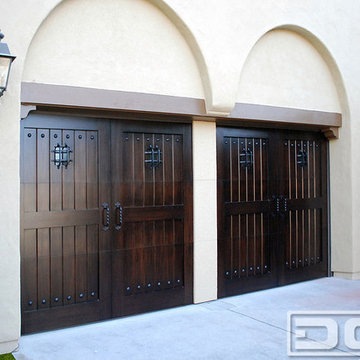
This garage door is actually a single double-car door not two as it appears. The reason is that this garage used to have two separate doors with a post in the middle. The post in the middle made it difficult to use the garage on a daily basis so the post was removed to facilitate the use of the garage. The HOA wasn't too happy about the removal of the post as it was an essential part of the arches located right above the garage doors. You can clearly see how that would have been disruptive if the homeowner went with a regular wood door and not one custom designed and manufactured by Dynamic Garage Door.
This garage door was specifically designed to address the HOA's concern about the center post removal and the effect it would have on the curb appeal of the home with the incomplete double arch look. So we addressed this by crafting the door with a false center post in the middle that was textured and painted the same color of the house to give off that illusion that the post is still there. Overall, it gives the home a complete finished appearance with two independent-looking doors and original post. The homeowner got the entire width of the opening to use at the push of a button so having a larger car won't be a problem anymore. The neighbors are all happy and no one seems to notice the center post is actually fake!
Got an interesting garage door project you want our designers to review and price out for you? Give us a call at (855) 343-DOOR
 Kristin McCue
Sean Dooley Photography
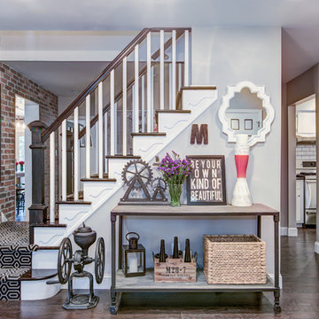
Staircase - transitional wooden l-shaped staircase idea in Philadelphia with wooden risers
Staircase - transitional wooden l-shaped staircase idea in Philadelphia with wooden risers
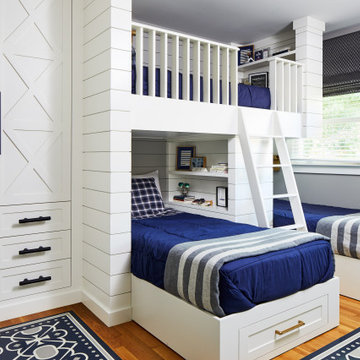
 Laura Fox Interior Design, LLC
This room for three growing boys now gives each of them a private area of their own for sleeping, studying, and displaying their prized possessions. By arranging the beds this way, we were also able to gain a second (much needed) closet/ wardrobe space. Painting the floors gave the idea of a fun rug being there, but without shifting around and getting destroyed by the boys.
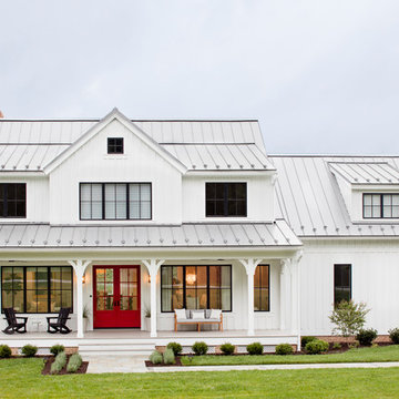
Inspiration for a country white two-story wood and board and batten exterior home remodel in Baltimore with a metal roof
 Advance Design Studio, Ltd.
Jennifer and Dan have lived in their Deer Park Illinois home for 15 years, slowly making minor fixes like painting and decorating; but they had a new plan for their kitchen the entire time. An awkwardly placed garage door, and an island cooktop with a terrible downdraft made a full-scale kitchen remodel an absolute must. Jennifer had many ideas in mind and wanted to work with a company that could provide high-end work, while partnering with a designer that would tailor the kitchen to her ideas.
She was intrigued by the phrase “Common Sense Remodeling” in Advance Design’s feature she discovered while perusing an issue of the community’s Quintessential Barrington Magazine. Doing further research on the company’s website, as she looked through project profiles and read about Advance Design’s “Common Sense Remodeling” philosophy, she promptly scheduled an appointment to see if the people and ideas she read about were truly who they said they were. The more she read, the more she knew that the “Common Sense” approach to remodeling they described was exactly the type of company she was looking for.
The partnership was sealed after an initial consultation with Owner Todd Jurs and Project Designer Michelle Lecinski. They displayed a combination of friendliness, professionalism and respect that was unmatched by any of the other companies Jennifer talked to. She knew that with Advance Design, she would be able to retain the vision that she had in mind with high-quality craftsmanship.
“I reached out to Advance Design because of the ‘Common Sense Remodeling’ tagline,” Jennifer said. “That’s what lingered for me”. “Advance Design was the most respectful- of the house and of my design ideas, and the most professional of the handful of companies that looked at my project”.
Soon after the meeting Jennifer began working with Michelle on the project design. They quickly developed chemistry. Jennifer loved how Michelle researched and located every detail that Jennifer wanted for the kitchen. Between the two of them, every concept and idea was worked through and perfected. “Jennifer had definite ideas about what she wanted the new kitchen to look like, she just didn’t know how to bring it all together. We worked together really well to make her ideas into the practical reality necessary for a well-functioning kitchen, with the look and feel that she had envisioned”, says Michelle.
“Michelle was wonderful in using the CAD system she would show me new drawings every time we changed the layout while working through the design,” Jennifer said. “She was a really wonderful partner in execution, she made sure everything happened quickly and easily.”
The finished design drew out elements of Jennifer’s style and personality. The pair call the look “sophisticated farmhouse” to describe the kitchen renovation to family and friends. The result was a beautifully crafted, authentic-feeling space that satisfied Jennifer’s dreams 15 years in the making. The whole project consisted of a kitchen remodel, mudroom upgrade with powder room, and garage entry relocation. “The projects I personally like the best, are the ones that put the client’s dreams on display,” Project Designer Michelle said. “And this is one of those projects.”
The main focal point of the kitchen is custom zinc and brass ventilation hood with a vintage sheen, which was hand made to order by a small company in Indiana named Vogler Metalworking. “It’s like sculpture, a true work of art”, says Jennifer. Your eye is immediately drawn towards this elegant yet practical hood that eliminated the home’s downdraft problem and added a striking conversation piece at the same time. The carpenters had to use special gloves when transporting and installing it, so they didn’t smudge it with fingerprints. The beautiful hood centers proudly over the stunning black enamel and brass LaCornue Range. “I had a friend who had a LaCornue range and after learning how easy it was to cook perfect meals, I was convinced I wanted to have one”, says Jennifer. This unique, breathtaking combination anchors the entire kitchen and is apparent immediately as you walk into the great room the surrounds the space.
DuraSupreme Crestwood cabinets with a Kendall Panel add function and sophistication. A custom gray paint color paired with a storm blue was developed so that the new kitchen looked like it belonged to the existing space. Unlacquered brass faucets and hardware were important to Jennifer because she wanted the living finishes to age over time. Remarkable brass diamond mesh cabinet door inserts imported from the UK continue to add this one-of-a-kind kitchen renovation; giving it a “you won’t see this everywhere” quality. The use of old railcar flooring for the coffee bar countertop and reclaimed oak for the open shelving gives an authenticity to the space uncommon in kitchens today.
Jennifer and Michelle fell in love with the Limestone Grey Stone while they were investigating unique island countertop ideas. They liked the fact that the limestone as a living finish will age and change over time. Calcutta Miel Quartz countertops made for an excellent pairing around the perimeter, as it’s durable and perfect for cooking preparations. A textured white subway tile backsplash that runs to the ceiling keeps your eye moving towards the open shelving, and to the main focal point of the stunning range hood combination.
“The kitchen functions beautifully, and it’s gorgeous,” beams Jennifer as she gestures with both hands while smiling ear to ear. “The most important thing was I wanted a kitchen that had a wonderful flow, cooked beautiful meals and was a great gathering place for family and friends, and this space does that perfectly! Beauty wise, it turned out exactly how I had envisioned. I felt the function part was the hardest part, and that was nailed”!
Relocating the garage entry to the new mudroom was a huge priority and has finally separated the family’s arriving home functions from their kitchen. Now coats and shoes and bags have their own area for dropping once members arrive home. Matching gray DuraSupreme cabinetry helped create gorgeous, purposeful lockers for the family. A reclaimed vintage sink and custom wall paper were added to the tiny powder room to beautify the once previously only functional space. Advance Design was even able to create a custom space for their dog to sleep while the family is away.
“It was unbelievable that a project of this size was completed in such a short time, and I think that’s because of the large amount of planning and preparation that went into it,” Jennifer marveled, “When we started, we were ready, and everything was prepared”.
When it came to execution, Project Manager Justin Davis and his crew were quick, accessible, and organized. Projects like this kitchen are typically completed in as little as 8-10 weeks. Jennifer’s kitchen however despite the relocation of some challenging HVAC in a soffit and moving of an exterior door was completed remarkably fast in part because the team was working with an existing tile floor that ran throughout the first floor that the client really loved.
“You get to know these people really well because they’re living in your house while you’re living in your house. They were so fast and really good, it didn’t take as long as even planned” reported Jennifer. “I would text Justin and he always responded almost immediately. I got to know all the guys who were working in our house and they were all wonderful people”.
Details in a customized kitchen like this one require skill and care from the people who install it. “All the guys on the job were skilled at what the did. I wanted small details like little feet to look like furniture, that is where their carpentry skill came in to make these all perfect”, said Jennifer. “The tile guys were wonderful. They even let me determine how I wanted the texture with the grout to appear for a salt and pepper look; now that is a very skilled trade person making it custom”.
In Jennifer’s interview, she continued to reference Advance Design’s “Common Sense Remodeling”, so I took a minute to ask her exactly what that phrase meant to her and how it played out in her experience with her project and the Advance Design team. Here is what she said: “I was intrigued about Common Sense Remodeling and in my head that there would be clear costs and prices, great communication between the design team, the execution team and me”, said Jennifer. They did deliver on that, it was so clear about the cost breakdown, what I could expect from everyone who came to my house, and everything that we had ordered. That to me is the Common Sense”!
It’s great to see a client take literally our assertion that a well-planned remodeling project is simply “Common Sense”! She anticipated each step of the way would be clear, concise, and predictable, all the while protecting the outcome due to the careful upfront planning. “Advance Design delivered on their ‘Common Sense Remodeling’ promise,” Jennifer said. “From the design team, to the execution team - everything was straight forward like I imagined. The project turned out exactly how I envisioned, I enjoyed this process and absolutely would recommend Advance Design Studio to anyone.”
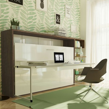 Wall Bed Place
Do you have a small apartment or studio and need space saving furniture ideas? Do you have a den or office that needs to double as a guestroom? A Murphy Bed system might be just what you’re looking for! This style looks like a glossy lacquered wall in your room and when closed takes up very little space. When you want to study or work on your computer, just open the cabinet and drop down a desk! There’s plenty of room for office work, study books or even craft projects to fit on this roomy desk. When you’re tired and want to get some sleep, just open it all the way and the desk drops down, instantly giving you a twin bed ready to crawl into! In the morning, it all closes up, giving you an uncluttered, open area for your studio or apartment. If you’re using it in a study, you can keep the desk open and just open the bed for guests when they sleep over. This Murphy Bed system is constructed from the highest quality materials and the mechanism is technologically new gas springs, that open and close with no effort. Having a Murphy Bed System is like having a room in a box.
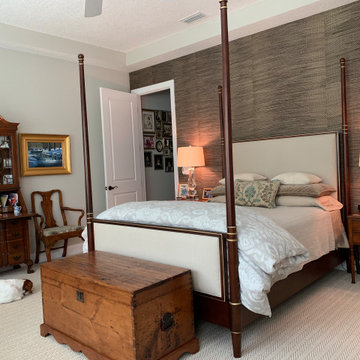
Sponsored
Columbus, OH

Snider & Metcalf Interior Design, LTD
Leading Interior Designers in Columbus, Ohio & Ponte Vedra, Florida
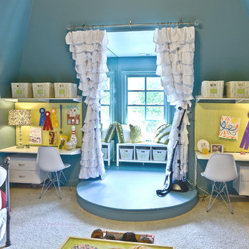
 Organized Living
Professional Organizer, Amanda LeBlanc, created this beautiful playroom for her children. She used Organized Living freedomRail organizing systems because they are “easy to install and provide freedom to adjust as they grow.” See more ways Amanda uses Organized Living to organize her home and life: http://youtu.be/MsfCY_iRDb8
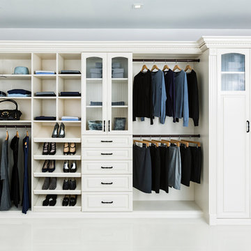
 Closet Factory
A reach-in closet - one of our specialties - works hard to store many of our most important possessions and with one of our custom closet organizers, you can literally double your storage.
Most reach-in closets start with a single hanging rod and shelf above it. Imagine adding multiple rods, custom-built trays, shelving, and cabinets that will utilize even the hard-to-reach areas behind the walls. Your closet organizer system will have plenty of space for your shoes, accessories, laundry, and valuables. We can do that, and more.
Please browse our gallery of custom closet organizers and start visualizing ideas for your own closet, and let your designer know which ones appeal to you the most. Have fun and keep in mind – this is just the beginning of all the storage solutions and customization we offer.
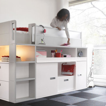
 Furniture Fashion
For a new take on the traditional bunk bed, look no further than this amazing modern piece. It flaunts clean lines and has ample storage for all your child’s toys. It is a must-have for those limited for space or those with a couple of kids. It is also a fun and reasonable investment for those with ample space. Dimix is designed to fit into both small and large rooms. It comes in a selection of colors and will give your kid’s room a personalized and fresh look.
The Dimix Bunk Bed by Gautier has a guardrail to prevent your child from falling out of bed. It is perfect for children who are transitioning from baby cots to full-size beds. It has large storage compartments on its lower part. They are comprised of 3 drawers, 2 closed compartments, and 1 slide-out desktop. Add a tiny chair to the desktop and create the perfect study zone for your little one. Space might be an issue for big families but Dimix offers your little one a perfect spot for a good night’s rest and plenty of storage space.
A bunk bed is an important part of many childhoods. It is a wonderful space-saver that has created many memories. While you are most likely to find one in a youth hostel or a summer camp, it can still be fashionable at home. It creates a fun and comfortable place for children and the young at heart.
Which is your favorite hue?
 ZeroEnergy Design
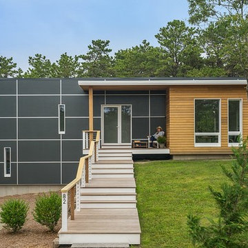
This modern green home offers both a vacation destination on Cape Cod near local family members and an opportunity for rental income.
FAMILY ROOTS. A West Coast couple living in the San Francisco Bay Area sought a permanent East Coast vacation home near family members living on Cape Cod. As academic professionals focused on sustainability, they sought a green, energy efficient home that was well-aligned with their values. With no green homes available for sale on Cape Cod, they decided to purchase land near their family and build their own.
SLOPED SITE. Comprised of a 3/4 acre lot nestled in the pines, the steeply sloping terrain called for a plan that embraced and took advantage of the slope. Of equal priority was optimizing solar exposure, preserving privacy from abutters, and creating outdoor living space. The design accomplished these goals with a simple, rectilinear form, offering living space on the both entry and lower/basement levels. The stepped foundation allows for a walk-out basement level with light-filled living space on the down-hill side of the home. The traditional basement on the eastern, up-hill side houses mechanical equipment and a home gym. The house welcomes natural light throughout, captures views of the forest, and delivers entertainment space that connects indoor living space to outdoor deck and dining patio.
MODERN VISION. The clean building form and uncomplicated finishes pay homage to the modern architectural legacy on the outer Cape. Durable and economical fiber cement panels, fixed with aluminum channels, clad the primary form. Cedar clapboards provide a visual accent at the south-facing living room, which extends a single roof plane to cover the entry porch.
SMART USE OF SPACE. On the entry level, the “L”-shaped living, dining, and kitchen space connects to the exterior living, dining, and grilling spaces to effectively double the home’s summertime entertainment area. Placed at the western end of the entry level (where it can retain privacy but still claim expansive downhill views) is the master suite with a built-in study. The lower level has two guest bedrooms, a second full bathroom, and laundry. The flexibility of the space—crucial in a house with a modest footprint—emerges in one of the guest bedrooms, which doubles as home office by opening the barn-style double doors to connect it to the bright, airy open stair leading up to the entry level. Thoughtful design, generous ceiling heights and large windows transform the modest 1,100 sf* footprint into a well-lit, spacious home. *(total finished space is 1800 sf)
RENTAL INCOME. The property works for its owners by netting rental income when the owners are home in San Francisco. The house especially caters to vacationers bound for nearby Mayo Beach and includes an outdoor shower adjacent to the lower level entry door. In contrast to the bare bones cottages that are typically available on the Cape, this home offers prospective tenants a modern aesthetic, paired with luxurious and green features. Durable finishes inside and out will ensure longevity with the heavier use that comes with a rental property.
COMFORT YEAR-ROUND. The home is super-insulated and air-tight, with mechanical ventilation to provide continuous fresh air from the outside. High performance triple-paned windows complement the building enclosure and maximize passive solar gain while ensuring a warm, draft-free winter, even when sitting close to the glass. A properly sized air source heat pump offers efficient heating & cooling, and includes a carefully designed the duct distribution system to provide even comfort throughout the house. The super-insulated envelope allows us to significantly reduce the equipment capacity, duct size, and airflow quantities, while maintaining unparalleled thermal comfort.
ENERGY EFFICIENT. The building’s shell and mechanical systems play instrumental roles in the home’s exceptional performance. The building enclosure reduces the most significant energy glutton: heating. Continuous super-insulation, thorough air sealing, triple-pane windows, and passive solar gain work together to yield a miniscule heating load. All active energy consumers are extremely efficient: an air source heat pump for heating and cooling, a heat pump hot water heater, LED lighting, energy recovery ventilation (ERV), and high efficiency appliances. The result is a home that uses 70% less energy than a similar new home built to code requirements.
OVERALL. The home embodies the owners’ goals and values while comprehensively enabling thermal comfort, energy efficiency, a vacation respite, and supplementary income.
PROJECT TEAM
ZeroEnergy Design - Architect & Mechanical Designer
A.F. Hultin & Co. - Contractor
Pamet Valley Landscape Design - Landscape & Masonry
Lisa Finch - Original Artwork
European Architectural Supply - Windows
Eric Roth Photography - Photography

Sponsored
Columbus, OH

Hope Restoration & General Contracting
Columbus Design-Build, Kitchen & Bath Remodeling, Historic Renovations
 Laura Engen Interior Design
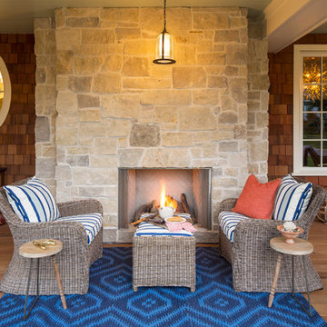
Make the most of outdoor living and add a fireplace to your porch so you can enjoy the space year-round!
Built by Great Neighborhood Homes, Photography by Troy Thies, Landscaping by Moms Landscaping
 Pennsylvania Landscape & Nursery Association
PA Landscape Group INC
Project Entry: Mountainside Living
2014 PLNA Awards for Landscape Excellence Winner
Category: Hardscaping-Residential $120,000&over
Award Level: Silver
Photo Description:
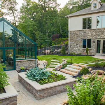
This residence sits on a mountain side, sloping wooded property. Water was an issue flowing down the mountain, so many rocked swales divert the flow. The area which we are presenting is the rear of the house that will be used to entertain family and friends, a place to unwind in the evenings and weekends.
We designed the outdoor areas to meet the needs and desires of the owners. When one walks through the breezeway not only to see an expansive valley view, but a relaxing fireplace and living area below where relaxing begins. Walk down the stairway of natural cut stone, you wonder through a landscaped garden onto the living area patio. Looking to your left is the pool with ample hardscape pool deck; large enough for a party or just the intimacy of two. Separating, yet joining the two areas is the grilling island, bar and outdoor wood burning oven. On the other side of the living area we go down a few steps to the raised planters and conservatory/greenhouse where plant are enjoyed from seedling to flower, or one can read a good book. Each area has it’s own personality for conversation or contemplation. The area is surrounded with plantings to provide color or to silhouette on the gray winter sky.
 Susan Yeley Homes
This gem of a house was built in the 1950s, when its neighborhood undoubtedly felt remote. The university footprint has expanded in the 70 years since, however, and today this home sits on prime real estate—easy biking and reasonable walking distance to campus.
When it went up for sale in 2017, it was largely unaltered. Our clients purchased it to renovate and resell, and while we all knew we'd need to add square footage to make it profitable, we also wanted to respect the neighborhood and the house’s own history. Swedes have a word that means “just the right amount”: lagom. It is a guiding philosophy for us at SYH, and especially applied in this renovation. Part of the soul of this house was about living in just the right amount of space. Super sizing wasn’t a thing in 1950s America. So, the solution emerged: keep the original rectangle, but add an L off the back.
With no owner to design with and for, SYH created a layout to appeal to the masses. All public spaces are the back of the home--the new addition that extends into the property’s expansive backyard. A den and four smallish bedrooms are atypically located in the front of the house, in the original 1500 square feet. Lagom is behind that choice: conserve space in the rooms where you spend most of your time with your eyes shut. Put money and square footage toward the spaces in which you mostly have your eyes open.
In the studio, we started calling this project the Mullet Ranch—business up front, party in the back. The front has a sleek but quiet effect, mimicking its original low-profile architecture street-side. It’s very Hoosier of us to keep appearances modest, we think. But get around to the back, and surprise! lofted ceilings and walls of windows. Gorgeous.
21