Software
Houzz Logo Print
joann_yurchesyn

Need a "pull it all together color" for our kitchen.

13 years ago
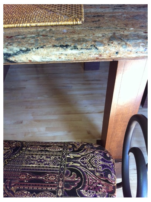
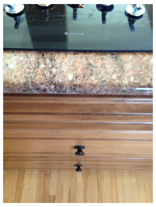
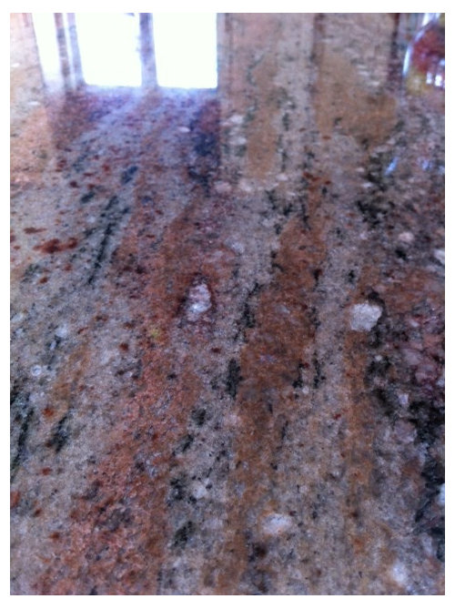
We have a lot of elements happening in our South facing kitchen, most of which would be too costly too change, nor do we feel that we need to. The challenge here is that with so much happening (in the cabinetry, granite, floor, backsplash) what color would work here to pull the look all together? I want to repeat, We cannot afford to change the granite tops, cabinetry, or backsplash tilework, nor the light birch floors at least not that this point. Our trimwork is painted in OC-8 Elephant Tusk and all adjoining colors are Benjamin Moore Affinity. Coastal Path AF-380, and Battenburg AF-70. Any suggestions would be great!!

Comments (66)

  • 13 years ago
    soft, sagey green is beautiful with the buttery cream cupboards and dark wine colors. If you are a person who prefers blues to greens, you could go with a muted colonial blue-grey
  • 13 years ago
    Hush AF 95 is almost the same color as my cabinets! Perhaps that would work?
  • 13 years ago
    I take it you do not like green at all. That's OK. You don't have to.

    I think the lack of contrast would be boring considering the wall is 18' tall...BUT hte most important thing you can do is make yourself happy. Pick a color you like and go for it.

    I would try the color boards first though. :-)
  • 13 years ago
    I like the Hush. I see the big problem being that stark contrast with the plum and the upper cabinets.
  • 13 years ago
    You did say your kitchen was south facing. Buy some samples of the brown and red that you liked, as well as a neutral and some poster board and test the colors. It's the only way to know for sure. Clear out all the clutter, take down the window shade. Place the boards around at different spots and see what pops (I hate that term but can't think of a better one.)
  • 13 years ago
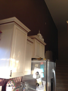
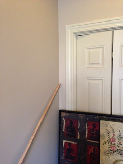
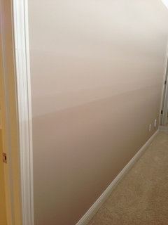
    Actually Janishill, green is my favorite color and windingcreek_creations suggested a soft sagey green w/the cabinets. (I would love some specific suggestions). I have some green in my granite and within the window seating so it's definitely not out of the question. I would be totally open to this, but it would have to work well with Coastal Path and Battenburg because this is an open concept home with no stops and starts in the walls. They all merge at one point or another at visual corners and all the colors can be seen simultaneously from any vantage point. YES, the kitchen is at the back of the house and is South facing so receives plenty of natural light throughout the day . My eyes have really been opened up here about the light, dark, light, dark aspect of kitchen, (thanks to Winterriver). This is why I'm thinking a light color that's very matchey, matchey with the cabinets would work . Attached is pic of the wall that goes up to the second floor (Freshly painted in Affinity Coastal Path). Another of the Benjamin Moore Hush which is in our entrance hallway as of two days ago.
  • 13 years ago
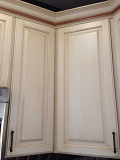
    Also our two tone cabinetry. They have a sort of white wash finish.
  • 13 years ago
    I have included links tp the colors in both of my previous posts! Maybe you didn't know all you have to do is hover over them then click. :-)

    Here they are again from my first post:

    1) Timeless, elegant, the perfect color: http://www.benjaminmoore.com/en-us/paint-color/shadesofspring

    2) Bold, saturated color: http://www.benjaminmoore.com/en-us/paint-color/avocado

    3) Energetic: http://www.benjaminmoore.com/en-us/paint-color/tequilalime


    And here are the ones from my second post:

    This is my number 1 choice in the Affinity colors: http://www.benjaminmoore.com/en-us/paint-color/wasabi

    This is my 2nd: http://www.benjaminmoore.com/en-us/paint-color/agave

    This would be my 3rd choice: http://www.benjaminmoore.com/en-us/paint-color/butteredyam

    Shades of Spring would be the best choice , however teh other ones will work nicely if you prefer them.
  • PRO
    13 years ago
    Hi Joann,

    I think grey would be the best solution for your space. It's neutral, but warm. It will bring out the color from your cabinetry and counters, helping unite everything you have going on in your kitchen, including the stainless steel appliances.

    Benjamin Moore has a great selection of grey paint colors to choose from. My suggestions would be either-

    1.) vintage pewter
    2.) gray gardens
    3.) rainstorm

    Thanks for sharing and good luck selecting a paint color. You've got some other great suggestions above!
  • 13 years ago
    Hi, thanks for the suggestions. I cannot find any of the above grays in either the Classic or Preview fan decks by Benjamin Moore. Are they Sherwin Williams maybe?
  • 13 years ago
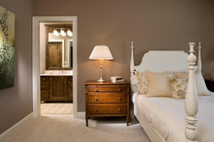
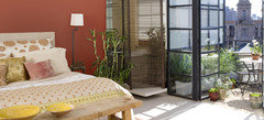
    Hi Joann---have not had time to read but a few of the comments above, and to be honest, I never would have thought about using green in this space. Rather a cool mocha/gray hue---darker than your cabs but lighter than the backsplash and the dark veining of the granite. I'm attaching a photo for inspiration. Look at all the colors, how similar they are to your kitchen, and how they all work together---including the artwork at the far left---those colors can be used as accents in your space. I hope this information is helpful to you. Your room caught my eye, ALL of your selections are Stellar-Well Done!!! Good Luck. :) [houzz=
    Bedroom · More Info
    ]
  • PRO
    13 years ago
    You were right on about light paint (hush or the 380) and cabinet matchey - go with your gut! Think the boards are best way to go tho - paint some and put 'em up in that space - you will probably know immediately!
  • 13 years ago
    I should mention here that I hired a designer for consultation on the paint colors. She choose Coastal Path for the kitchen, upstairs loft and Dining room in our home. We were totally onboard and painted the upstairs in the Coastal Path right away. The problem is, I read a fleshy pink undertone in the Coastal Path under any kind of artificial light, yellow or white! So I didn't want that on the vaulted wall because it would be regrettable in the end. Plus, it's not a wall that easily reprinted. You need twelve ft. Staging to do it. ; ( Hence, the hush. I love a warm neutral in a kitchen but its hard to avoid that flesh tone when you're not a color person!
  • 13 years ago
    Natalie that room color sample is beautiful!!
  • 13 years ago
    I thought of another BM color - Chameleon. It looks green, it looks beige. It is truly a chameleon: http://www.benjaminmoore.com/en-us/paint-color/chameleon#ce_s=chamele
  • 13 years ago
    I think if it's green it needs to be greyer and softer. On my monitor the green in the granite looks almost like a forest green. You might try http://www.benjaminmoore.com/en-us/paint-color/landscape

    Your head is probably spinning right now. You might want to take a step back. Clear your mind of all color advice.

    Get one of those color brochures with a lot of different colors on it. At HD it's like Mid-tones, Lights, Darks. Tape it to that tall wall by your cabinets then stand back and look at it. There will be a few colors that pop out at you. Those are the colors the room wants to be.

    Note those then look at shades of those colors. Hopefully one of them will coordinate with everything else you have happening.
  • 13 years ago
    : ))) Thanks Carpe Diem. I have a few days before the painters hit that wall. I will have to try that. I really appreciate your insight. We are brand new in this state and I have nobody here to ask their opinion of over a cup of Java. And .... my husband is color blind. Lol!
  • 13 years ago
    Color blind---so is my husband! LOL!
  • 13 years ago
    Well at least he won't be arguing with your choice. ;^) Where are you located?
  • 13 years ago
    No. He always says I make good color choices, but little does he realize that I consult other color junkies before settling on anything!! We are in Iowa now, (Des Moines to be specific). We just moved here from the Blue Ridge Mountains of Virginia! Big change!

    : ))
  • 13 years ago
    Lots of great suggestions. i know green is your favorite color, but unfortunately with all the colors you have going on in your kitchen, adding color is not an option. With all the colors green would probably make it more Christmasy:)and you will have to maybe put more money into renovating. Would recommend to remove your back splash in your kitchen and put some tile you can get for very cheap (especially on craigslist.com LOCALLY)or just color that space in with lighter paint and start painting the whole wall including ceiling with that same color. That would make your kitchen much lighter and spacious. Do love the island and all the colors, stick with more natural tons. Don't go to red, green, orange etc. Go with lighter grays, or which ever lighter colors you have that interface with your granite counters. If you do have couple dollars saved up in the kitchen budget would recommend looking at more nicer modern stools for the island. That's all what i can suggest. GOOD LUCK!

    Examples:
    [houzz=
    Transitional kitchen · More Info
    ]
    [houzz=
    Beautiful Kitchen Tile Backsplash · More Info
    ]
    [houzz=
    Danenberg Design · More Info
    ]
    [houzz=
    kitchen · More Info
    ]
    love the last example, colors seem more to your kitchen, dark granite counters and the black splash matching the appliances (just beautiful:)).
  • 13 years ago
    look at Benjamin Moore -- Sanctuary. It's an Affinity color -- lighter and crisper than the plum shade you have now, which does not provide enough contrast with the backsplash. Beautiful with the cabinetry and really looks good with the bronze/copper color. Rereshing, but not too girly, and has a smoky grey brown undertone rather than pink. I would change the Roman Shade to a dark matchstick or a light/neutral background fabric with a small one color print in the wine/red color you show in the curretn shade and some artwork I saw. Bronze/copper/red/ smoky purple sophisticated combo that looks good with cabinets and light floors.
  • 13 years ago
    Really itz looking cool n gorgeious...love it...For entrance exam go through http://www.entranceindia.com/ ...
  • 13 years ago
    Really itz looking cool n gorgeious...love it...For entrance exam go through http://www.entranceindia.com/ ...
  • 13 years ago
    after looking at all the pictures and reading the suggestions, I still say a sage or light mossy green would make a great backdrop. Just my opinion. I do my own painting, so if I don't like a color, its just the cost of a gallon of paint and I change it. Paying someone else to do it makes it a bigger decision
  • 13 years ago
    I'm going to paint the entire rest of the room, except that wall, first. Once painted, I'll post a picture from the loft above, ....... I think that will help interpret the right color better.
  • 13 years ago
    Ok, more than half our living room and soon, half the kitchen will be painted in the Battenburg. It's looking very minimalist, almost stark but taking a great direction I think, ..... I got the idea that Benjamin Moore Mexicana would be interesting but cannot find my Affinity fan. I know it's dark but now that the rest of the space is this big neutral, I think I have to hit that wall with some major color. Gray, dark dark chocolate, deep sage, and red are springing back into mind... Pictures are forthcoming.
  • 13 years ago
    Joann...I have to ask ~ did you even look at the greens?
  • 13 years ago
    that mexicana could work. look at the bedroom pic on the bm site. I think it has a lot of similar colors to your kitchen.
  • 13 years ago
    YES, definitely did look at the greens. Agave is still in the running.
  • 13 years ago
    Carpe Diem, do you mean this bedroom from the BM site?:
  • PRO
    13 years ago
    last modified: 13 years ago
    The backsplash looks like a coppery color. The granite has rust colored veining. I would consider a coppery/rusty/terra cotta color with some brown which would compliment the granite and cabinet color beautifully.
    It would warm up the gray in the granite and stainless steel appliances.
  • PRO
    13 years ago
    Hi J, wow, I just read through all of the posts here, how nice of everyone, and I have a different take: your kitchen materials are rich and varied yet they all share a bronze coloring so why not try a bronze metallic paint? Yes, it sounds crazy but seek a sample of bronze paint which matches your current bronze. Could be fun!
  • 13 years ago
    Great ideas both. I don't know if a metallic paint would fly here however. It's an open "beach house style design, and the wall is meeting the Coastal Path at the top of the stairwell so they need to flow together beautifully; besides that wall is 18 ft high. It might be too much to introduce a metallic wall! Tres McKinney, I can totally see your point, and I guess that's where my selecting Mexicana idea came from. I am a little impaired w/color and therefore depend on luck and the advice of others to see and understand it. I would like to ask you to select a specific color from the Benjamin Moore palette that embodies that coppery/rusty/terra cotta color so I can understand where you're coming from. .
  • PRO
    13 years ago
    Autumn Bronze and Tulsa Twilight (deep gray) appeared as complementary hues to Coastal Path when I entered them into the search engine. Regarding metallics, I know it's wild and crazy but sometimes that's what speaks to someone. If you imagine a rocky coastline with tans, grays, bronzes with the sunsetting to add dimension and sparkle...obviously I like metallics, hee-hee. You have a beautiful home and no matter which direction you go (so many great options), I hope you post your final choice photos!
  • 13 years ago
    http://www.benjaminmoore.com/en-us/for-your-home/rooms-by-color/contemporary-orange-bedroom

    This one was the pic.

    I think agave is too yellow. Unless my monitor to off, the green in the granite is more blue/grey.
    These would be better.

    Etched glass:
    http://www.benjaminmoore.com/en-us/paint-color/etchedglass
    Winchester sage:
    http://www.benjaminmoore.com/en-us/paint-color/winchestersage
  • 13 years ago
    http://www.benjaminmoore.com/en-us/for-your-home/rooms-by-color/contemporary-orange-bedroom

    This one was the pic.

    I think agave is too yellow. Unless my monitor to off, the green in the granite is more blue/grey.
    These would be better.

    Etched glass:
    http://www.benjaminmoore.com/en-us/paint-color/etchedglass
    Winchester sage:
    http://www.benjaminmoore.com/en-us/paint-color/winchestersage
  • 13 years ago
    I looked at the Agave again, .... You're right, ... it's too yellow!!
  • 13 years ago
    the winchester sage and etched glass both work perfect with my existing colors, .. but it's not my taste at all!
  • 13 years ago
    Xpuhas- The Sanctuary is "REALLY" stepping out of the safe zone for me. Perhaps I'm terrified of mauve/purplish/plum hues because the previous owner painted almost the entire house in this realm (mostly Barney Purple). I see your vision here though and it makes total sense to me, ..... Tomorrow the rest of the jewel tones will be gone from the main living room, kitchen area and I'm hopeful that I will have a clear vision for that wall once that happens. Thanks to all for the wonderful responses and stirring up the creative juices!!
  • 13 years ago
    last modified: 13 years ago
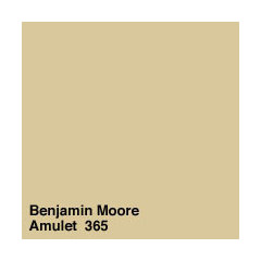
    I would like to get your opinions on AF Amulet for the kitchen. The idea here being to make the cabinets blend with the wall and therefore create more unity with the other elements, the ceramic, and stone countertops and warmer wood tones. It's an Affinity color so will blend well wit the Coastal Path and Battenburg. Any comments?
  • 13 years ago
    It should blend with the cabinets nicely.
  • 13 years ago
    Thanks Janishill! Been going crazy here trying to pull something together before the painter returns.
  • 13 years ago
    I still think one of these greens would look better though. :-D

    1) Timeless, elegant: http://www.benjaminmoore.com/en-us/paint-color/shadesofspring
    2) Bold, saturated color: http://www.benjaminmoore.com/en-us/paint-color/avocado
    3) Energetic: http://www.benjaminmoore.com/en-us/paint-color/tequilalime
  • 13 years ago
    The amulet is pretty. Nice golden tones, it shouldn't skew pink.
  • 13 years ago
    We found a perfect color after hours and hours (and hours) of looking at chips for this kitchen, we painted some of our walls with it, but came to find that it's a perfect match w/the cabinetry but just a touch too light and our fear is that it will look washed out in our south facing space on that towering wall. The next color on the chip is far too intense (bridgewater tan). So the question is, what color, or better yet, is there a color that is the same as OAKWOOD MANOR i(Benjamin Moore 1095), but with darker hue/w/more saturation? It's so perfect!! Also, can you ask them at the paint store to play with the saturation level. ie. I want this color, but 15 or 25% deeper?
  • 13 years ago
    We found a perfect color after hours and hours (and hours) of looking at chips for this kitchen, we painted some of our walls with it, but came to find that it's a perfect match w/the cabinetry but just a touch too light and our fear is that it will look washed out in our south facing space on that towering wall. The next color on the chip is far too intense (bridgewater tan). So the question is, what color, or better yet, is there a color that is the same as OAKWOOD MANOR i(Benjamin Moore 1095), but with darker hue/w/more saturation? It's so perfect!! Also, can you ask them at the paint store to play with the saturation level. ie. I want this color, but 15 or 25% deeper?
  • 13 years ago
    well number one - live with it a day or two and see if you still feel it looks washed out.

    you can ask the folks at the store what to suggest but I'm not sure they'll understand what you mean. oI would buy a sample of the bridgewater tan and mix some of it in with the oakwood manor until you find exactly the color you want, then take it back to the store and have them do a color match.

    That's how I got the color for my bathroom. I went one tone darker than the bedroom and it was too bright so I mixed in about 50/50 of the bedroom color with the darker color and it hit the mark perfectly.

    Good luck. I know this has been a quest for you!
  • PRO
    13 years ago
    Great idea from Rio plus remember that a large area of paint will appear lighter than the small chip, with some obvious exceptions. Happy Thanksgiving!
  • 13 years ago
    Thanks Everyone!! Happy Thanksgiving and God Bless.