Software
Houzz Logo Print
nightowlrn

Kitchen counter advice

12 years ago
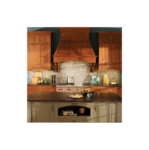
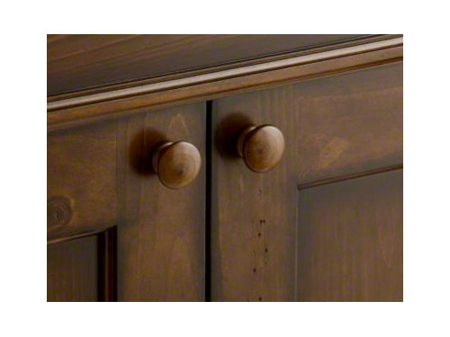
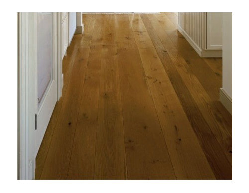
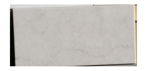
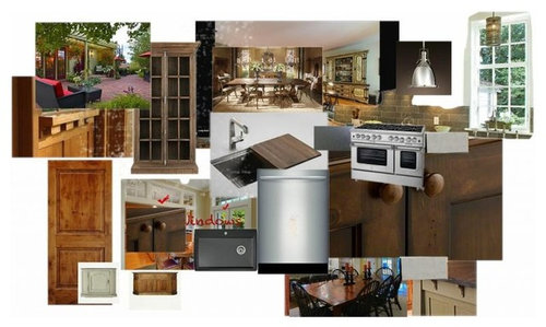
Hello. We are in the process of selecting kitchen items and the backspash and counters for the perimeter and island are challenging for me. About us - Craftsmanish. While our kitchens are neat and not cluttered, we don't want the showcase, white on white perfect kitchen look either. Our decorating leans toward modern craftsman. Trim will be white of some sort. Doors will be knotty alder. The appliances will most likely be SS. Most likely a 48 Bluestar with 54 inch SS hood, Bosch DW, cooler unknown. We do not like the look of cabinet surfaced appliances. The island color we are drawn to is photo 1. The perimeter cabinets will be knotty alder the tone of photo 2. The floor tone will be photo 3 to match the lightest tone in the stained perimeter cabs. The final photo is our furniture on the left and design ideas towards the right.

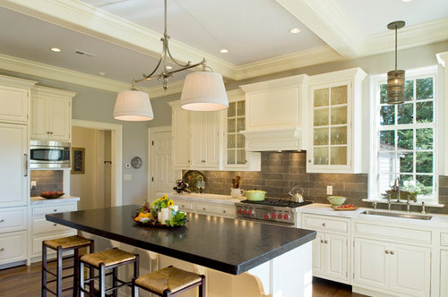
Photo 1 island color

Craftsman Kitchen by Howard Lake Cabinets & Cabinetry Dura Supreme Cabinetry

Photo 2 perimeter knotty alder

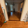
Photo 3 floor tone

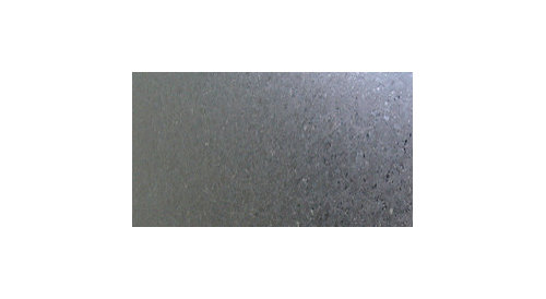
We are drawn to the matte finish and look of London Grey Caesarstone and Cambrian Black Antique or Virginia Mist honed. Because the cabinets will be dark, I am concerned that a white counter and white backspash will create a cold, white stripe. Alternately, if we go black on the perimeter, I am afraid it will be a big, dark, hold.

Here is the Caesarstone and Cambrian Black

I am trying to chase down the backspash I like. The inspiration photo is this.

Closest I have come is this limestone

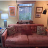
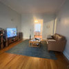
Photos of our furniture and kitchen thoughts.

What would YOU do? Thank you for your help.

Comments (18)

  • 12 years ago

    Your floors and cabinets are dark so I think you need to keep your counters and BS light for contrast and relief. Notice the BS in your inspiration is against cream cabinets. Putting this BS above dark floors, dark cabs and dark counters will make it feel like a cave. And this BS won't stand out against dark cabs. I don't think it will look like a "white stripe" to have lighter BS and counters. In your inspiration pic it does not look like a "gray stripe." I would do a counter and BS in light warm tones, not gray...I don't like gray with the wood tones you have chosen unless it is more of a "greige" with more warm tones than gray. It will be a very pretty kitchen!

  • 12 years ago

    Seems like the perimeter cabinets need a lighter counter color and probably warmer in tone. Perhaps something in the lighter brown range-- for example Caesarstone Shitake, Linen or Dreamy Marfil.

    Agree that the b/s choice doesn't seem to work with those perimeter cabs but might if you reverse the island and perimeter color scheme.

    You really do need to match up samples next to each other to see how they work together an work in your space/lighting. If anything is already there (like the flooring) it might be helpful to fix that decision and work the rest of the elements from there.

  • 12 years ago

    This is a new build, so the decisions have to be made pretty much together. I am sure I will have some input about the exact cabinet and floor stain when that time comes.

    We are pretty set with the stained perimeter cabs and painted island. We are really hard on things and this is a working kitchen, so we figure bumps and bruises on the stained wood are more forgiving than chipped paint ....

    What if the cabs were a bit lighter stain? My concern is I don't want the wood floor to blend into the cabinets and I don't want a dark wood floor due to that little bit of extra upkeep - dog hair, scratches, dust, etc.

    Will keep looking for counter surfaces and backsplashes. Thanks for pointing out the concerns.

    This post was edited by nightowlrn on Sun, Jan 19, 14 at 12:32

  • 12 years ago

    Here is something close. Lighter cabinets though. I wish I had a better eye for these things...

  • 12 years ago

    Did you consider hiring a designer to help you pull together your ideas?

  • 12 years ago

    Not yet Zeitgast. I can if I decide I can't figure it out. I thought this board was for folks to get the opinions of others.

    Here is a look with a honed mist and limestone - I wouldn't want the accent line.

  • 12 years ago

    Since you are going for craftsman, you may want to use your picture for general inspiration but look at ceramic tile.
    McIntones Ceramic tile at Compete Tile Collection has a full complement of colors in the larger elongated format you are interested in and the tile is variegated.

    Here is a link that might be useful: McIntones

  • 12 years ago

    Also at Compete Tile Collection

    Here is a link that might be useful: Prodigy

  • 12 years ago

    Your inspiration appears to be the opposite of what you are planning, at least so far. Here is a link with dark cabinets and lighter bs and counter tops. Maybe you can find something you like that would help people here help you.

    Here is a link that might be useful: Houzz

  • 12 years ago

    Thanks. I will look at the links.

    ETA -- IES -- Thank you. I love the Prodigy tiles. hum .... thinking, thinking ...

    This is exactly why I came here! I appreciate designers, but I need a direction first. I have been reading here and I believe many people have excellent eye for design, not just someone who does it for a living. I have two friends who got pushed into a white/grey kitchen by designers despite their desire to have anything but. I am finding why -- designing around wood grain and color is challenging.

    This post was edited by nightowlrn on Sun, Jan 19, 14 at 21:32

  • 12 years ago

    Yup you are indeed correct and it helps to have a clear vision of what you want which you certainly do. I only asked b/c I recently hired one after many months of finding what I liked. It was really helpful to both of us that I had gone on that journey first. I found that I was anchoring on too many individual elements that I liked and struggled to find the right harmony-- not sure if its analogous to your own situation or not. There is a phenomenon called the " paradox of choice" which has to do with decision making-- the more choices the harder it is to choose.

    Having said all that i do like that last pic. I think the soft tone and matte or honed texture work well together with the warm and even tone of the wood. The b/s picks up the veins in the stone. Agree I don't necessarily like the accent but it does add visual interest. Good luck!

    This post was edited by zeitgast on Sun, Jan 19, 14 at 13:10

  • 12 years ago

    Hoping you have checked out the gallery section of the Kitchen forum here on Garden Web. Lots of ideas to be found there.

    ML

  • 12 years ago

    Don't go lighter with your cabinets. I think the color is beautiful.

  • 12 years ago

    Thank you Msrose. I like the richness as well. The builder says making my alder look like this shouldn't be a problem. But, if it all sticks out like a sore thumb, I can go lighter. I have been playing with EIF's prodigy ceramics. I may need to go to NY ..

  • 12 years ago

    For anyone interested in what I would like the cabinets to look like -- it is a Kohler sink. Made of knotty pine. Medallian makes a similar in alder, but this one has a rich red tone to it.

    This post was edited by nightowlrn on Sun, Jan 19, 14 at 19:56

  • 12 years ago

    IES -- You have created a monster!

  • 12 years ago

    I love your cabinets. Are you staying with the same wood knobs? I would, but am asking as they soften the look and are a key to keeping your elements in a softer range..

    This is from experience and a big mistake. I have much lighter natural cabinets and a large window in my kitchen. A dark gray tile with natural stone insets called to me. When finished the room became dark and disliked it since. Lived with it for 4 years and have a torn out BS as I write waiting for the new light selection to be installed. Even with the huge window, everything felt dark.

    I'm not sure of your decor style nor am I one of the wise decor gals here. Just a kitchen user with a personal take. Your cabinets offer so much for using a wide range of styles and colors. But I would stay light as many others have mentioned. I think it would honor your cabinets more.

  • 12 years ago

    Nightowlrn, I think we have similar taste! I love your choices. Regarding the concerns about the kitchen being dark, think about lighting, natural light via windows and electric light. Lighting is so important in a kitchen. Think about undercabinet lighting and make sure it is easy to switch on and off.
    Similar to your concept, my finished kitchen has dark stained perimeter cabinets and a painted island. Actually, the island color in your inspiration photo is quite similar to my island.
    I am not convinced your flooring picture is too dark, the bottom half of picture is in shadow, if your floor will be the light tone at the top of the photo, I think it is fine. (My floors are natural ash)
    RE countertops, originally, I wanted Cambria Torquay, ( think Ceaserstone London grey wasnt out yet) and a walnut butcherblock on my island. I decided that the Torquay was too cold a tone, and considered Corian Rain Cloud but my husband didnt like the feel of Corian. Eventually we went with leathered, not polished,Madre Perla quartzite. We love it. I think the non-polished surface works for the natural, rustic feel of our kitchen. Think about textures. What is the vibe you are going for, you say 'craftsmanish'/ 'modern craftsman'. I get that. Mine is rustic modern or farmhouse modern. Maybe I am your new england version?
    Are you typically drawn to warm or cool tones? My home needs to cocoon me in warm neutrals. It has to be my sanctuary from a busy world a busy life.
    I also eventually decided that 2 colors of cabinets and 2 countertops would be too much for me so I used the same stone on my island. This is a matter of choice, but for me this was an excellent one, and heart wrenching as I didnt want to give up the butcherblock!. The dark counter on the island would have been a mistake, it would have been a light sucker.
    I adore the greeny red tiles in your second to last mockup- they are gorgeous. I like the colorful mosaic too, as Tim Gunn would say, 'that's a lot of look'[.