

Yellow help!!
Hello.
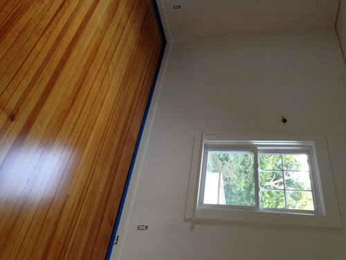
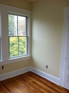
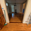
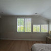
My husband and I want to paint the small bedroom in our house a pale yellow, since the room will (hopefully) be a nursery some day. However, we're having the hardest time finding a color that works with our newly refinished old growth Douglas Fir floors. I've attached a picture (please forgive the blue tape, which I had not yet removed) showing the floors in the morning. The room has northern and western windows, so the sun comes pouring in in the afternoons.
Can someone explain what sort of undertones we should be looking at to achieve that nice pale yellow wall color without making the floors look even more yellow/orange? We're using BM paint and thus far had been focusing on the historic colors, but they all appear to be too gold or peach/pink. The ceiling and trim are BM White Dove.
Any input is greatly appreciated!!
Comments (59)
 13 years ago
That gray has a lot of blue which is why it looks so good with the floor. Blue and orange are complementary colors, so they make each other sing.
aliciaandbilly
Original Author13 years ago*sigh*...hence why the Urban Nature does such a lovely job showing off the reds in our master bedroom.
So in continuing my Color 101 lesson today, since I'm wanting to do yellow walls in a room with yellow/orange/slightly red floors, I should focus on a color scheme of analogous colors - i.e. keeping with red/orange yellows and away from the green yellows?
Sorry to be so dense about this - guess I just got lucky with our other 2 bedrooms!
Related Professionals
Pittsburg Interior Designers & Decorators · Marquette Interior Designers & Decorators · Willmar Interior Designers & Decorators · Anchorage Interior Designers & Decorators · Pine Bluff Kitchen & Bathroom Designers · Fort Myers Kitchen & Bathroom Designers · York Kitchen & Bathroom Designers · Clarksville Kitchen & Bathroom Designers · Enfield Kitchen & Bathroom Designers · Fort Dodge Kitchen & Bathroom Designers · Trenton Kitchen & Bathroom Designers · Allentown Kitchen & Bathroom Designers · Bainbridge Furniture & Accessories · Baton Rouge Furniture & Accessories · Palm Desert Furniture & Accessories PRO13 years ago
The difference I see between the following is due to color family, and not undertone, right?
Yes. It's that simple. There's nothing hidden, nothing "under" anything. Every manufacturer of everything on the planet uses a hue family premised color order system.
Every color is ordered into a color family and it's usually pretty easy follow the spectral order (R, YR, Y, GY, G, BG, B, PB, P, RP) and figure out what hue family a color belongs to.
Once you know the hue family, you can then work out color relationships. Color relationships are where color schemes come from. Fundamental color wheel stuff.
Unless the brand makes the huge mistake of letting someone who does not understand the importance of spectral order REorder their collection -- pull out all the near neutrals, for example, into a separate category.
Which happens all the time. And it's a mistake.
Spectral order, hue families, for color is as simple as the ABC's. But no one teaches it and few know about it - even the people who work in the paint store fail to notice the order of hue families in the color displays they restock and look at every single frickin' day.
Which is why every so often you'll stumble on a blogger who rants about how confusing the paint displays are and how they think they could make them better.
I feel embarrassed for those folks because they think they're "breaking through" with some sort of color genius implying that the paint companies have it all wrong, or the tile store doesn't "know color" when in actuality all they're doing is exposing how much of an expert they're not.
- PRO13 years ago
SW 6141 Softer Tan (looks more gray)
SW 6134 Netsuke (looks more green)
SW 6127 Ivoire (looks more yellow)
SW 6120 Believable Buff (looks more tan)Looks more gray - grayness is a separate attribute from hue family. Whether a color is fully saturated like a primary yellow or toned down like Softer Tan, it's still in the same hue family. Only it's saturation/tone/grayness is different.
Depending on the color mix, if there's a factor of black in the color formula, toned down yellows may shift and show an edge of greeness in some light exposures. Doesn't change the fact that it's still inherently hue family yellow, though. Doesn't mean you should be looking at the formula either - only the dried, final finish color and how it looks is what matters.
Softer Tan belongs to the yellow hue family.
Netsuke is the yellow hue family.
Ivoire is the yellow hue family
Believeable Buff is the yellow hue familyIf you pull SW color strips #17 thru #24 and look at them in numerical order you'll see a spectral order progression starting with yellow-red, yellow, green-yellow, green.
#17, #18, and #19 for example. #18 has Believeable on it. In between #17 and #19 you can see how it could swing yellow-red to yellow. I call Believeable yellow.
- PRO13 years ago
There are some wonderful reds in the floor as well, which I really want to bring out, and I didn't know what sort of yellows would best accomplish that.
Snooks pointed this out already. The blue and orange flooring harmonize because of the complementary relationship.
To compliment the red aspect of the flooring, test a green-yellow or a yellow that has the potential to shift and show an edge of greeness, like Netsuke or Convivial Yellow from SW.
- PRO13 years ago
So in continuing my Color 101 lesson today, since I'm wanting to do yellow walls in a room with yellow/orange/slightly red floors, I should focus on a color scheme of analogous colors - i.e. keeping with red/orange yellows and away from the green yellows?
This is different from the objective above. So, now if the goal is yellow/buttery walls and to not highlight the red aspect of the floor, then yes, you are correct. Analogous colors.
Meaning test a few yellows that drift closer to yellow-red vs. green-yellow. Like BenM Pale Yellow.
- 13 years ago
I hope I'm not stepping on your toes here, aliciaandbilly, but I sure would like to ask a couple more questions. Can you forgive me?
I think I understand hue, and I think I learned if from seeing how the color is organized at paint displays in the stores, in my decks, where it is most helpful, or on the websites.
But saturation/tone/grayness....
Are these synonyms? Is brightness the opposite of grayness? Does it imply more of the white color element and less of the black?
I like to use gray as an example. Many grays go purple or blue on the wall. What is the word for this tendency or trait?
My house doesn't get much sun, and wall color that seems invisible or indistinguishable in sunlight can get quite intense in here. The blues and greens and that tendency of gray to go violet is notable. What is the word for that behavior?
SW website has a tool where you can start with one color and then go "lighter" , "more red", "more yellow", etc. It has helped me feel more comfortable about choosing color.
- PRO13 years ago
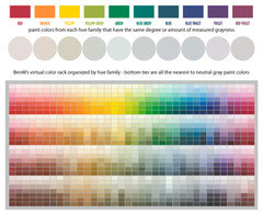
I think I understand hue, and I think I learned if from seeing how the color is organized at paint displays in the stores, in my decks, where it is most helpful, or on the websites.
Yep. Here's an image that supports what you've noticed on your own.
- PRO13 years ago
But saturation/tone/grayness....
Are these synonyms? Is brightness the opposite of grayness? Does it imply more of the white color element and less of the black?
Saturated/tone/grayness - depending upon the color system, these terms are sometimes distinguishable from each other. Generally speaking, in everyday terms, yes, they can be considered synonyms.
Is brightness the opposite of grayness?
Brightness is actually, formally a property of light. In terms of paint colors the correct term to use is lightness. HOWEVER, in general everyday terms we often use the word "brightness" to describe how the vividness or pure saturation of a color *feels* not necessarily how it *looks*. Splitting of hairs.
In everyday terms, I could agree that brightness describes the opposite of how grayness feels.
Does it imply more of the white color element and less of the black?
I'd say no. Lightness, whiteness, blackness. All three are measurable and plottable attributes of color.
Light/dark value is not the same as grayscale value.
Lightness (a.k.a. LRV) vs. grayscale (a.k.a. grayness) is one of THE most complex and complicated aspects of color to understand. So, give yourself time and some space to grasp it.
A good place to start peel into it and understand it, is to learn about whiteness and blackness as measurable and plottable attributes of color. The NCS, Natural Color Order System, is premised upon lightness and blackness as much as hue families and is where I'd start to learn more.
- PRO13 years ago
I like to use gray as an example. Many grays go purple or blue on the wall. What is the word for this tendency or trait?
Formal color order and everyday color jargon often collide.
And the 'notion' of gray is ground zero.
Gray is formally achromatic, neutral, colorless.
However, in everyday terms people call all different colors "gray".
There are very few paint colors that are truly close to being truly neutral. Everything else, every other color is indeed a color.
A color that belongs to a hue family. In your example, it's not a gray that's going purple. It's not a gray that's going blue. It's not a gray with a purple undertone, nor a gray with a blue undertone.
It was a color of purple to begin with. It was a color of blue to begin with. Colors that were grayed down so close to a true neutral/colorless gray that it was difficult to still see any traces of their original hue parents.
Where color comes from and how it works is essentially very easy. What's getting in the way of people being able to see and understand the pure spectral simplicity of how color per se works and works in relationships is a multitude of rogue methods that are not rooted in established theories.
- PRO13 years ago
My house doesn't get much sun, and wall color that seems invisible or indistinguishable in sunlight can get quite intense in here. The blues and greens and that tendency of gray to go violet is notable. What is the word for that behavior?
There is spectral distribution and spectral reflection.
Spectral distribution is the whole enchilada, the whole bundle of light wavelengths beaming into a space.
Spectral reflection is the bundle of wavelengths with which a color reflects or responds to the incoming light beams.
Bright sunlight (bright used in the correct context ;-D) is infamous for 'washing out' color. That's because that very full and robust bundle of light wavelengths is tapping every single one of the color's wavelengths with which it has to respond to the light. So, in very, very simplistic terms what is white light but a bundling of all the wavelengths of light.
The more wavelengths in a color tapped to respond, the closer to white light characteristics that color gets - so it looks whited or washed out instead of singularly colorful like blue or green.
In dimmer environs, the bundle of incoming light wavelengths is filtered or edited. That's why it's dim, right? It's not as full, robust, or evenly distributed as brighter light. Filtered light like northern light, for example, will often be biased to one or a few wavelengths of color like blue or green.
If a color is responding to the light as bluer or greener, that means the quality of light falling on it, requiring it to reflect and respond, is also biased greener or bluer.
This post was edited by funcolors on Mon, Oct 21, 13 at 19:51
- PRO13 years ago
SW website has a tool where you can start with one color and then go "lighter" , "more red", "more yellow", etc. It has helped me feel more comfortable about choosing color.
Online color is very different from in real life color and the two do not align or match.
Playing around with those websites can be helpful for understanding how color characteristics can be moved and shifted. But I hesitate to call them "tools".
- 13 years ago
Thank you so very much, FunC. How do you come to know so much about color?
Alicia, please excuse the almost highjack. I thought this discussion might be helpful to you, too?
This post was edited by jamies on Mon, Oct 21, 13 at 20:05
- 13 years ago
I was reading recently that paint companies use green in their yellow to make them brighter.
Funcolors makes a good point about objective. Complementary colors are a more vibrant combination, they are opposites that heighten each other. An analogous color scheme, on the other hand, is a calming interaction of colors.
So with a soft yellow for a baby's room in mind, or even a guest room or an office, analogous might be a good choice. It can be subtle before getting into peach. You might not even notice it that much without holding it next to a clearer yellow swatch, because it just looks yellow. Explore both with large samples. You also might try painting one wall first before committing.
Looking at creams rather than yellow is also a good point, as yellows are much stronger once they go up.
This post was edited by snookums2 on Mon, Oct 21, 13 at 22:11
- PRO13 years ago
I was reading recently that paint companies use green in their yellow to make them brighter.
Interesting. Usually pure yellow colorant, and there are many different flavors, is rather vivid. Adding any other color component typically deadens vividness. But, hey, could be true, I dunno.
jamies, I've worked with color in some discipline for about 20 years. Most of what I know comes from being there when color printers were first introduced to the market. Altho I am biased, graphic design and photography is the seat of the best and brightest color expertise. Coming in third would be quilters. Quilters because many of them are by default good with math. So, color math comes easily to them.
Many don't understand how important math is to color and color order - I certainly never saw it coming. Altho, you cannot color by numbers alone, the numbers and subsequent order can be the thread that unravels many a color conundrum.
 13 years ago
Alicia, I have used BM Straw #2154-50 and BM Filtered Sunlight #2154-60 with Brazilian cherry wood flooring that has similar colors to yours. We loved both colors.
 13 years ago
Our home office was formerly yellow, and it was hard to find a yellow both DH and I could agree on to repaint it.
Some colors I somewhat liked:
Valspar Lemon Cream
BM Hawthorne Yellow
SW Hubbard Squash- 13 years ago
I have wood colors about that color and have used EK Buttercream and Wyndham Cream. I love both of them, in the sunlight and by candlelight. They make me very happy. Restoration Hardware Butter and SW Tealight also have strong fans. Have fun!
- 13 years ago
i had reddish brown brazilian walnut floors in my last house and went with a kelly moore color called Angel's Wings which was a super pale yellow maybe with a touch of orange. i thought it was pretty and good for kid's rooms.
- 13 years ago
I have old heart pine floors (similar color)in a small bedroom, also with north and west lighting. We used Benjamin Moore Man on the Moon. I didn't want anything peachy and this color is a nice soft pale yellow. Hope that helps.
aliciaandbilly
Original Author13 years agoThank you all so much for all of the advice and suggestions!!! I now have a much better understanding of how to articulate what I could only previously describe as "just a little off" when looking at the samples I had thus far.
Just one more question Funcolors regarding hues. A lot of the colors I had tried previously and am now considering fall within the BM Historic and Off White colors, which do not seem to follow the standard hue arrangement as seen in the Classic and Color Preview fan decks. I've been looking on the BM website Color Gallery and when you search for a particular color they show you some color combo options, similar colors and other shades. Would you say the other shades are correctly indicating the hues? For example according to the other shades listed for the Man on the Moon color that Gigibozo used, its hue leans towards a green yellow.
Gigibozo - what beautiful floors and a great color. I will definitely check out that color and some of the other off whites as May Flower suggested. Can you tell me what white you used for your trim? Just wondering how close it is to the white dove that we used.
Jamies - no worries on the questions. It's all very fascinating information and helpful to know the science and logic behind what for me had always just been a gut reaction. Good luck finding your colors!!
Thank you all again. I'm pretty sure I have an exciting weekend ahead of playing around with green to orange hues to see what works best. Thankfully I'm no longer trying to get the walls painted before the radiators go back in so time is on my side.
- 13 years ago
aliciaandbilly,
The white that we used was custom blended for us to match our kitchen cabinets. It was mixed with a Sherwin Williams base and is a bright white, definitely brighter than White Dove. - PRO13 years ago
Just one more question Funcolors regarding hues. A lot of the colors I had tried previously and am now considering fall within the BM Historic and Off White colors, which do not seem to follow the standard hue arrangement as seen in the Classic and Color Preview fan decks. I've been looking on the BM website Color Gallery and when you search for a particular color they show you some color combo options, similar colors and other shades. Would you say the other shades are correctly indicating the hues? For example according to the other shades listed for the Man on the Moon color that Gigibozo used, its hue leans towards a green yellow.
The color options they show you are math based, computer generated kinda thing. There aren't human eyeballs making those color judgements. When they say colors are similar, those colors meet a standard. They fall within a set range of acceptable difference, or to a set delta.
So, yes, from a mathematics point of view you can't get more correct for indicating hues. I don't know what color standards BenM is working with but usually that delta is so small, so tight that a human observer with average to above-average color acuity will find the matches/options offered agreeable.
But not always.
With architectural, color acuity varies person to person, it's color in 3 dimensional terms, not just 2 dimensional, etc. That's why I say you cannot color by numbers alone.
Whenever they pull out specialty collections like, for a designer, or The Historical Colors and the Off-White, it makes it harder because we don't have the extra help of having the colors in spectral order.
Overall, Ben Moore has one of the least sophisticated color systems. However, in front of both Classic and Preview fandecks there is an index that lists the paint color numbers in ranges and what hue family that range of colors belongs to. i.e. Red 2000 - 2010 (Preview) or Toned Oranges/Golds 001 - 252 (Classic)
Here's how to maximize what they do give you. Online, look up Man on the Moon and get its similar colors/shades options. Choose the color options from the Preview and Classic fandecks so you can cross-reference the hue family indexes provided in the very front of the fandecks.
Even tho Historical and Off-Whites aren't ordered by hue family, you can look up colors BenM color math says is close, and then eyeball, compare the chips to help you determine hue family for any uncategorized, out-of-spectral-order colors.
And from there, it's a matter of testing the color in the space/light to see what it does, how it looks. Again, can't color by numbers alone. Testing in the space is yet another opportunity to assess the color perceptually.
Hope that's the info you were looking for. . .
- 13 years ago
Wow...lots of color information to absorb here...I will have to print it out and do some serious studying! Thanks funcolors!
aliciaandbilly
Original Author13 years agoYES!!! Thank you so much. Given that both the Hepplewhite Ivory and Windham Cream are coming across as very peachy/pink during daylight hours, I figured being able to accurately identify the hue family of those colors would help us identify what hues we should steer towards/away from to achieve the look we're wanting. Thank you, thank you, thank you!
- 13 years ago
Those floors are going to bounce their warm orangey light around too so maybe that's why you're getting something you see as more peachy. I don't have those colors in front of me but do not remember them looking so pronounced that you are seeing a lot of peach/pink rather than a warm yellow.
You can also see more clearly what a color is comprised of by looking at it against a bright white. I also compare and include other yellows. You will see a decided veer to its "undertone" quality. (I know FC does not like comparing to white, lol, but I do find it useful).
Love the one gigi posted. That's the type of yellow I was thinking, that you might be going for. On my monitor it has a bit of red in it.
This post was edited by snookums2 on Tue, Oct 22, 13 at 15:55
- PRO13 years ago
Given that both the Hepplewhite Ivory and Windham Cream are coming across as very peachy/pink during daylight hours, I figured being able to accurately identify the hue family of those colors would help us identify what hues we should steer towards/away from to achieve the look we're wanting
Precisely how to use the info correctly. Each data point collected about a color like hue family or LRV, etc. helps you create benchmarks to use in comparison and assessment. You end up working out your own set of color standards that makes sense to you in your space.
Device or measured data points of color can be handy if you know how to use them. For some people it's too confusing and they just get in the way. They prefer to work intuitively, perceptually instead.
Either way is okay, if it ain't broke don't fix it.
But oftentimes, especially if someone works with color on a long-term project, day in day out, they get to a point where instinctively they know in their gut there's more to this color thing than their raw talent.
They pick up on patterns and other stuff. Once they reach a certain point of comfort and familiarity with a collection of colors, bigger color thoughts and questions encroach both the right and left brain.
I just read a blog post that kind of dissed the detailed "how-to's" of color. I thought it made the person who wrote it sound like a ding-bat. On one hand can't beat the drum of how color is your life's passion and completely enveloping craft and on the other be totally flippant and dismissive about how color happens.
There needs to be a balance between running on raw talent and the technically fundamental. Too heavily weighted either way is not a good thing.
aliciaandbilly
Original Author13 years agoThat's a very good point snookums2 about the floors bouncing light off of the paint. For whatever reason it hadn't occurred to me that the influence of the wall color on the appearance of the floor could be a two way street.
But you're spot on that gigi's color is the look we're trying to achieve. Here's to hoping Man on the Moon or something similar will have the same look in our home!!
- PRO13 years ago
(I know FC does not like comparing to white, lol, but I do find it useful).
Totally. White is evil for all things color assessment.
But it's not like correct color tools can be found on every street corner either. So, whaddya gonna do. (shrug)
 13 years ago
Great floors!
I have orangey golden oak floors that are colored similarly (but less fabulous) with retro orange mahogany trim and used Ben Moore "light yellow". It's a nice clean yellow, like a crayon-box light yellow. I like it with my oranges.
I don't like dingy colors so pretty much everything I pick out would be appropriate in a nursery. Or Easter egg hunt. :)
- 13 years ago
You might try BM's Golden Straw. It has a beige/brown undertone ----or looks like it does, if that doesn't actually exist! A really, really light yellow is BM's Linen. It is listed as a white, but everything depends upon the light in the room.
- 13 years ago
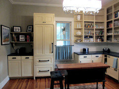
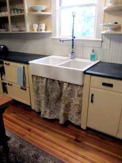
It looks as though you have quite a few good suggestions already, but I wanted to put a word in for BM Vellum. It's a tad toward the peachy-yellow side, if I had to nail it down, but I found green undertones looked a bit too contemporary or cold for our 1920's house. We have quartersawn heart pine floors that look very similar to yours, and I tested many yellows for our kitchen cabinets. Granted, we have only northern and eastern light in there, but Vellum was perfect. I was afraid it was too much yellow just after I painted, but once other elements were in the room, it was great. Our trim is BM Linen White, a very creamy white, if that matters.
- 13 years ago
That's a beautiful mellow look, equest. More of an ivory, from here.
"That's a very good point snookums2 about the floors bouncing light off of the paint. For whatever reason it hadn't occurred to me that the influence of the wall color on the appearance of the floor could be a two way street. "
Things in the room, not just the light, will influence color. They all bounce light around. So your furnishings, or floor, will also have an effect. Not just seeing things relative to the wall color, but the color they bounce around the space. If there are lots of trees outside, you can even get a greenish cast to things from their influence. It's good to know when sorting effects out to reach an objective.
aliciaandbilly
Original Author13 years agoThank you so much fori, kswl, gsciencechick and equest!! I'll look into the Light Yellow, Golden Straw and Vellum. Man on the Moon is definitely on my short list after seeing gigi's photo!
And equest, what a beautiful kitchen! Our house is also 1920's. Are those the original upper cabinets? The Vellum color looks great on them and beautiful with the floors.
- 13 years ago
Thanks Snookums and Alicia. BM Vellum is solidly in the yellow family, I would say, but a very livable shade. It's going to look very peachy compared to Man on the Moon (which looks gorgeous in gigi's pic).
I've included a link to our kitchen remodel post from last year with more pictures and details. I was guessing that your house was from the 20's; it looks very similar to ours! Our cabinets are all original; we just took the doors off the uppers since they are plain slabs. We have pets, so I didn't want to do open lowers!
Here is a link that might be useful: Equest17 yellow bungalow kitchen
- PRO13 years ago
It has a beige/brown undertone ----or looks like it does, if that doesn't actually exist!
Physically, no it doesn't. But perceptually it does - to you - and it's possible others would agree. I don't agree with the beige/brown part, but that doesn't matter. All that matters is I understand what you want to communicate about your perception and how you experienced the color.
"Undertone" has been/is commonly used as a figure of speech to describe a sensation of color. It's subjective which is why it has no place in color systems.
- 13 years ago
This has been a really educational thread - thanks to all who have contributed! And, equest, I agree your kitchen is just lovely!
- 12 years ago
In terms of yellows, my all time favorite is Pratt & Lambert 'Caramel Tint.' It's sooooo beautiful in my guest bedroom. Not too dark or bright, but not boring nor pastel. Just. Perfect.
I also have P&L 'Bay Rum', also nice but rich and rummy, and 'Popcorn' I've used in my hallways since it's a lighter color, but 'Caramel Tint' is the one I will take with me when I move! We have natural woodwork throughout most of our home and water popped hardwood floors, and Caramel Tint compliments it, my artwork, and my furniture beautifully.
BM Linen White is actually an off-white, not a yellow. It's one of the more popular whites commonly used for trim in homes when designers want to go with warmer paint colors (I worked for a painting company and nine times out of 10 the designers typically went with SW Dover White or BM Linen White), or for those who want to veer away from a stark white (I actually have it on my living room walls right now as I have yet to choose wall colors - it was a temporary fix before purchasing furniture, to rid us of the reaaaallllly outdated paint on the walls).
- 12 years ago
It only took me a year to find a yellow with the hues I was looking for (what I used to call undertones). I have wood trim/floors with warm orange appearance. Last year, I accidentally chose a yellow paint with greenish tendencies and it was ICK with the floors etc. And dreadful at night.
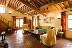
I have now found a delightful yellow that play up the apricot and it is lovely with the floors!! My wood in my house is something like this attached photo below and the colour of paint I have chosen is something like this same attached photo. Delightful combination imho.
One piece of advice that I learned along the way:
Not only does one have to paint test boards and move them around the house, it is not until one tests the paint on large pieces of wall that one will really know how your own house reflects and works with light. Paint colours that looked to be warm yellows with tendency towards apricot on the poster boards, then played rather green when on the actual wall. I learned that my house plays up green like crazy, so I had to move way over to a yellow with heaps of orange/red (almost an apricot paint tbh) to get it to show creamy yellow to creamy apricot-yellow in my house - in someone else's house this same colour might look way too orange. It has been a steep learning curve for me to choose the right yellow. For example, yellows that people on here said showed no green in any light in their house (some of which are mentioned in this thread), showed lots of green tendency in my house (BM Windham Cream, BM Vellum etc. - they showed not a hint of pink or orange on my walls but were greenish yellows). Every room is different and you have to learn how your room plays up colour.This is a photo (not my house!!) of a room with orange undertones in the wood that I think looks fabulous with yellow paint with the apricot tendency to it (vs. green). This is the look that I prefer with warm orangey woods, but it is personal taste of course. And this is how my new paint and floors will look once the work is completed.
This post was edited by Scarlett001 on Thu, Nov 21, 13 at 19:53
aliciaandbilly
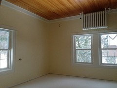
Original Author12 years agoHello all! I just wanted to say thank you so much for all of your advice and suggestions. After trying a bunch of samples we ended up going with Man on the Moon. It was one of the few "yellows" that didn't end up looking super peach-y at sunset. Thank you once again Gigi for sharing your picture of that color!
- 12 years ago
That turned out perfectly! It's every bit as beautiful as Gigi's room. A tough job well done!
 12 years ago
What a perfect creamy soothing yellow! I love it! It is so nice when you get just the right color.
- 12 years ago
""Undertone" has been/is commonly used as a figure of speech to describe a sensation of color. It's subjective which is why it has no place in color systems."
Don't let Maria Killam read that statement! Undertones is all she talks about.









User