Software
Houzz Logo Print
magada

Please please roll back former font size for comments !

11 years ago

It's now too big and personally i'm not at all finding it an improvement for general readability.

Maybe the team could do a poll for this ?

Comments (20)

  • 11 years ago

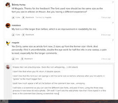
    HI Magada, Thanks for the feedback! The font used now should be the same size as the font you see in articles on Houzz. Are you having a different experience?

    magada thanked Emily Hurley
  • 11 years ago

    My font is a little larger than before, which is an improvement in readability for me.

  • 11 years ago

    Yes Emily, same size as article font now, 2 sizes up from the former size i think. And personally i find it uncomfortable, double the eye work for half the info in one sweep, a pain to read, especially for the longer comments.

  • 11 years ago

    It looks like I am shouting now. Even tho I am whispering... :) (hit return)

    I don't like that when you hit return, it double spaces.

    I don't like that this font (as I am typing) is still the same size as before, whereas after you hit submit, it "grows" to the much bigger font.

    Look how much space is left at the bottom of the comment box now... annoying.

    I will take a screenshot so you can see the different size fonts, and post it here, using the three step process it now takes to add a photo. OH wait! I can't see the add photo now that I have typed in a few lines in the comment box! (taking screenshot now,)


    I had to scroll, find the button, click Add a Photo, click the giant plus sign, browse to a photo (the screenshot), wait for it to load (takes longer now), preview it, then hit Insert, then hit Submit.

    I guess it's a nine-step process to add a photo now. :(

    magada thanked rredpenn
  • 11 years ago
    last modified: 11 years ago

    Yes, the double spacing is another thing rred.

    I like to put each new sentence on a new line, i think it's more readable like that, if you have a paragraph with about 10 sentences and no breaks it's less easier to assimilate i think. Reading forums just IS NOT the same thing as reading a book or newspaper.

    As for photos, i had to scrabble around a bit to post a houzz link this morning and thought why oh why.

    It seems to be a website geek thingy, they get twitchy if they can't play around with their toy, even when the layout is good and everyone is familiar and comfortable with it.

  • 11 years ago

    The best solution would be to allow readers to select a text size, as some sites do, either in user preferences or somewhere at the top of the page.

    magada thanked makaloco
  • 11 years ago

    Really appreciate you guys taking the time to so eloquently provide your feedback. It makes it so much easier to understand than a simple "Hate it!" :)

    We are all taking a look at what you are saying about the usability after these updates.

    The font size was indeed increased for readability. It can be tough to adjust to these kinds of changes sometimes, especially when you are a heavy user of a site and how you interact with it has basically become muscle memory. Even moving a button can feel disorienting. I totally get it.

    Know that our development team is taking this all in and I will pop back with any new information.

    magada thanked Emily Hurley
  • 11 years ago

    I like the fact that the font size has become bigger. It was too teeny before but I also didn't like double tapping and it being too large! So now it's just right for me and I appreciate the change back. Yes, as we type our font size is smaller, rred, but I guess it's a small price to pay for readability on the other comments. :-/


    I second that Houzz should try and explain these new changes before they actually happen to make the transition easier but hey ho, go with the flow, I guess.


    Btw, I am enjoying the gardenweb addition to the Houzz family. It should be fun!

    magada thanked unwantedadvice
  • 11 years ago

    Thank you, Emily. :) It's so nice to have a real person to communicate with regarding the changes. And it's nice to see you guys are taking our feedback/experiences with it seriously.

    I laughed at your muscle memory analogy...it's so true that even subtle changes can make you feel disoriented. That's why it's important to let your readers/users know that it will be intentionally different when rolling out new user features/interfaces, instead of just springing changes on everyone, and watching some of us squirm or get mad or have to disrupt multiple threads with "how-to" lessons. Posting a quick explanation or tutorial on the new features in "Using Houzz" would go far to eliminate the discomfort and unfamiliarity we feel whenever something new is added.

    The photo/vid/link adding is probably the most annoying of the new features to get used to. Maybe it will make comment posts flow better? But maybe not. I fear it also could make people less likely to want to post pictures. It takes a long time to manipulate the additional steps required. Some folks have been unable to figure out the new process yet.

    And pictures are the bread and butter of Houzz.

    Thanks again for listening to and communicating with us, Emily. We really do appreciate it! :)


    magada thanked rredpenn
  • magada thanked rredpenn
  • 11 years ago

    I find also that there are still hiccups with page refreshing that have "eaten" comments I had not yet submitted. That is really upsetting, and I know that has happened to others too. It's not a smooth-running interface yet.


    magada thanked rredpenn
  • 11 years ago

    Here is another reason the photo adding is not as user friendly. (See comment #15 [here[(https://www.houzz.com/discussions/anyone-else-unhappy-with-the-new-buttons-here-on-houzz-dsvw-vd~2828741).)


    magada thanked rredpenn
  • 11 years ago
    last modified: 11 years ago

    It's also hard to see the green "here" up there. People may miss that this is a link? The old way of posting a link was much more obvious... but now it doesn't light up and take you there. You HAVE to do it the new way.

    https://www.houzz.com/discussions/anyone-else-unhappy-with-the-new-buttons-here-on-houzz-dsvw-vd~2828741-else-unhappy-with-the-new-buttons

    magada thanked rredpenn
  • 11 years ago
    last modified: 11 years ago

    Actually i've just realized that hitting return doesn't produce a double space but a 1.5 space (ish).

    I guess this is a compromise for the fact that at this size a double return for a new paragraph would leave far too large a space so there can be no option for a normal space for a new line. Apart from using the space bar maybe …

    Nope, space bar don't work either, editor just ignores it.


  • 11 years ago

    So i think makaloco 's idea ( and while we're at it is it really necessary to have a link produced to a user's page when we copy/paste their name? ) is good. Reset to old text size as default and write in a size selector for those who find it too small.

    *Those who have really bad vision usually have their screen definition set lower anyhow so this new size won't be changing their lives.


  • 11 years ago
    last modified: 11 years ago

    Wow, i just posted a comment on a houzz article , went into edit to click on a photo on the same page to add URL, saw the edit box was now blank but went ahead thinking my comment was maybe stored anyhow but no, and i had to rewrite my comment. So just hope i remember to copy my comment first before editing to add photo now. If i lose a long comment that i've taken time and trouble researching sure i won't try writing it all over again.

    I can see new users just giving up in disgust.

    We really are in a fine mess lol.

  • 11 years ago

    Font in comment box while typing is now same size as font after posting...that helps make me feel less crazy, less like I'm shouting when I post. Noticed too that add a photo button now tells you to "browse" to a photo, rather than the big plus sign. Maybe will help those who can't figure it out? They are tweaking still. :)


    magada thanked rredpenn
  • 11 years ago
    last modified: 11 years ago

    Haha a real cliffhanger this is.

    And i've just noticed the GardenWeb Forums - truly awesome. Nice work houzz team, all else is forgiven ^^

  • 11 years ago

    Yes, "browse" makes much more sense! I also like the text box and published fonts the same size.