Software
Houzz Logo Print
charris93

Paint colors

11 years ago
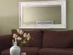
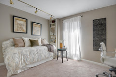
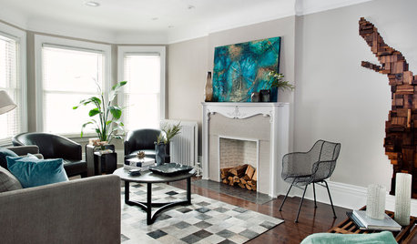
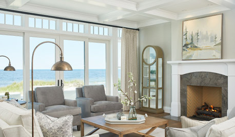
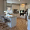
Does anyone know the paint color of this room? I'm thinking it's similar to Benjamin Moore's Berkshire beige.
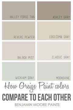
On another note--What are some good "greige" paint colors that you all have had good experiences with? I currently have my living area and a wall in the kitchen painted in Benjamin Moore Olive Branch, and I'm thinking a nice neutral greige will be nice. Suggestions please :) :)

Comments (55)

  • 11 years ago
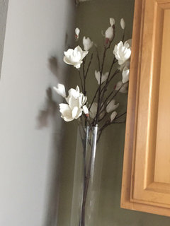
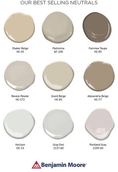
    It very well may be BM Revere pewter which is an excellent griege that goes well with anything, yellows, blues. I had Home depot mix it in a Behr base.


  • 11 years ago

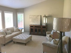
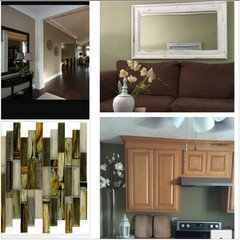
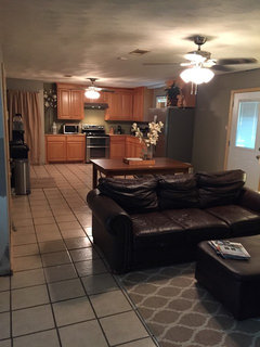
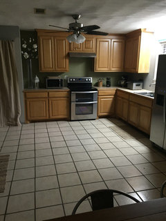
    These are a couple of pictures in which I'm hoping will coordinate well with a nice greige, possibly BM revere pewter. One is of my living room wall and the other is my kitchen (please excuse the countertops, I'm hoping to have those replaced by November). Suggestions on colors more than welcome
  • 11 years ago
    Colors on computer are not true colors. I suggest you get samples and put on your walls. You have a lot going on in this room a soft color would work. I would also remove one of items over sofa. Just center other one. Little bit too busy now.
  • 11 years ago
    BM, Revere Pewter is too blue. But trying first is way to go.
  • 11 years ago
    I really like BM Pale Oak, which has a slight green undertone, but it is paler than the color you show above.

  • 11 years ago
    @Nancy. I actually just have one item over my sofa, the other item you see is a reflection from the other wall. The original photo is a Google image I found, but really love the color. I'm hoping I can find something similar, or that someone can recommend a good color that will go well with my already existing olive green walls (as pictured) :) :)
    I do like that pale oak. I'm just hoping whatever color that I do choose will work well with my oak cabinets as well. So basically I need a miracle color that fits with olive green, oak cabinets, and a brown fireplace lol!!!!
  • 11 years ago
    The struggle is real haha :)
  • 11 years ago
    Charris, I have used SW Analytical Grey in my kitchen, nook and great room. I love the color and it goes with anything. It is the third color I have painted in there in 12 years and it is the one I will keep now. It is my new neutral!
  • 11 years ago
    I have and love SW Accessible beige (neutral greige). To me, the color you pictured in the first pic looks a little like SW Tony Taupe, but yours has just a bit more of a green undertone.

  • 11 years ago
    So, I am finally about to go get some paint samples Monday. As of the moment I have chosen two BM colors. 'Rockport Gray' and 'Berkshire Beige', both are beautiful greige colors (well, what I have seen from photos online).
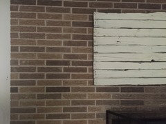
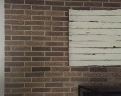
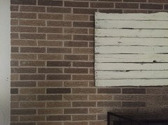
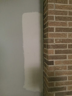
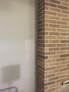
    However, the photo i attached is a closeup of our old fireplace ( the one I mentioned earlier in the post, which I have been given strict orders not to paint). So I really need to pick a greige that will coexist beautifully with the Browns from the brick. So any suggestions on a what greige will work with it?
  • 11 years ago
    Well, I bought and tried BM revere pewter, Gettysburg gray, and Rockport gray. Unfortunately, I'm do not like any. They are beautiful colors, for other homes.
    Revere pewter, turned out really gray silver.
    Rockport gray, turned out a deep dark gray with no warmth.
    And Gettysburg gray turned out very dark olive (which I might actually use in another room)
    However, my search continues. Since I have an open floor plan I'm really wanring a greige ( or possibly taupe) to tie the rooms all together but doesn't clash with our fireplace.
    Has anyone used SW perfect greige????? If so, please let me know the outcome. Thanks in advance:)
  • PRO
    11 years ago

    Ashley Grey

    Ashley Grey Dry


  • 11 years ago
    I haven't used perfect greige before, but I have SW tony taupe in the house and it's quite nice. Definitely a taupe and not a gray, but if you find perfect greige doesn't work, grab the card for tony taupe and see what you think. Looking at my wall right now, it's very similar to the pic you posted when you posted the dilemma.

  • 11 years ago

    A large horizontal painting or print over the sofa instead of a mirror.


  • 11 years ago

    This is a Houzz pic and not my house, but it's a quite accurate representation of tony taupe.

    Sandpoint View Condo Office · More Info

  • PRO
    11 years ago

    Two view of the same room Ashley Gray


  • 11 years ago
    Thanks!! I truly appreciate it!!! Ashley gray and Tony taupe are now both on my "samples to get" list. I really like them in the pictures provided. They both seem really warm :)
    The area being painted is an open concept, but it doesn't get much natural light. There are only two smaller windows in the area.

    If any other suggestions come to mind, by all means let me know!
  • 11 years ago
    Tomorrow I'll be picking up several new samples, hopefully one of them will be 'the one'. The list is as follows:
    BM Ashley gray
    BM Winter gates
    SW perfect greige
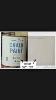
    SW Beige shadow
    BM tony taupe

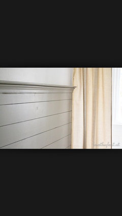
    I was wondering if anyone heard of/had experience with SW Beige Shadow? I'm attaching a couple pictures of Beige shadow, tell me what ya think? Yay or nay?
  • 11 years ago

    Tony taupe is SW rather than BM:)

  • 11 years ago
    Thank you Ann!!!! I'm pretty sure that would have caused quite the confusion when I go to Home Depot to have them mixed! :) :) much appreciated
  • 11 years ago
    Ideas
  • 11 years ago
    I think I'm developing a twitch in my eye...
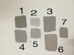
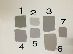
    Today I went and picked up the color samples. Just knew deep down that one of the four colors I was carrying home was THE color. Well, needless to say, my deep down feeling was wayyyyyy off.
    1. Gettysburg gray
    2. Revere pewter
    3. Rockport gray
    4. Winter gates
    5. Perfect greige
    6. Tony taupe
    7. Ashley gray (seriously looks like this was mixed wrong)

    If I had to choose a couple colors in which I'm leaning towards, they'd be: Rockport gray or perfect greige. Revere pewter looks good in the photo but very very gray silver in person. My partner is now becoming quite impatient because I cannot choose (he's not a sample kinda person). Thoughts on your favorite of the 7?
  • 11 years ago
    I think now that you have it narrowed down to just 2 colors you like, you should get a poster board, paint the middle the sage green that you picked and the grays on either side. Make sure you look at the colors in different light throughout the day.
  • 11 years ago
    I have revere pewter in my great room and if anything it shows up more brown than silver, but that might be the lighting also.
  • 11 years ago

    Just wanted to post these next to each other since I think I remember the new color needs to work well with the brick.

    My favorite is perfect greige.


  • 11 years ago

    Hi---

    Check BM's Brandon Beige, SW's Loggia and Stone Lion.

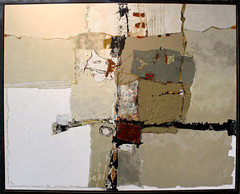
    Introduce a piece of art, design material/element that incorporates your olive greens, browns, and greige hues. Glass tile in pic...Good Luck!


  • 11 years ago

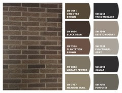
    charris93, these are some color suggestions from SW's "Chip It" based on the photo of your brick.

  • 11 years ago
    Thank you all! I'm going to sit with these swatches on the wall for a few days. See how light hits it and hope one really speaks to me. If not, I'll be picking up SW Functional Gray and BM Asford Greige. Then make my final choice ( because it HAS to be made soon) lol.

    I also painted Rockport gray, perfect greige, and revere pewter near the fireplace. But all three colors are hard to differentiate due to the area getting very little light. But as I stand now Rockport and perfect greige are very close calls.

    Again, you all have been so very kind to take the time to help. Please, stick with me along the process (the company is nice)

    :) :)
  • 11 years ago
    last modified: 11 years ago

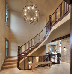
    Hi! I have read through, but I knew I saw this picture before....I had it saved long ago. I have the color for you... :)

    Transitional Living Room · More Info

    Brandon Beige 977 by Benjamin Moore · More Info
    Good luck! ;)

  • 11 years ago

    Ha ha....@Natalie...nailed it again. You amaze me... :)

  • 11 years ago

    Well, thanks ZaZ. :)

  • 11 years ago

    ;) No problem Natalie. When I'm impressed.... I have to say it!

  • 11 years ago


    Sparrow AF-720 by Benjamin Moore · More Info

  • 11 years ago
    Hey everyone! I certainly appreciate everyone's wonderful suggestions. Well, as you all know, I have tried several different warm gray paint samples throughout the kitchen, front living area, and dining area. Of course all read either too red/pink or too blue. Recently I've tried:

    Valspar gray silt (very green)
    BM river reflections (very gray)
    Serena and Lily mushroom (purple in daylight, red at night)

    So, it came to the point where I just had to pick the warmest one out of the bunch and take a risk. So, I went and had Rockport gray mixed at my local Home Depot. The color is not horrible... Just very blue gray most of the time. Which is so surprising because dozens of people claim it is almost brown. I'm attaching a couple pictures of the results.

    Do you all think this blue gray might be a result of not having gone with BM paints and instead having the BM color mixed in Behr?

    So, now I'm at a complete halt. I can repaint, which isn't so bad, but if I do there is NO room for another color error. Suggestions... Maybe a little encouragement (lol)

    :) :)
  • 11 years ago
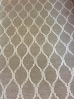
    Oh, and the above picture is of a rug that I recently bought..thinking it would go well with my natural theme that I want to achieve, and also work well with whatever paint color I choose.

    So, if you have suggestions please let me know
  • 11 years ago

    I like the rug and the paint looks nice. A further away pic would help if you want to post one.

  • 11 years ago

    Chariss93

    Did you try any of the paint colors I suggested? SW: Loggia and Stone Lion---BM: Brandon Beige.

    The Rockport Gray you posted, looks like a perfect match to BM's RG.

    I think you'll happier with a different color. Please consider those 3 I listed...

    Hope this is helpful... keep us posted...


  • 11 years ago
    @ Natalie Yes ma'am, I was very excited about you finding Brandon beige! Due to the fact that color was the entire reason for creating this post. So, a BIG thank you to you :) However, up next against the olive branch green read quite pink in mid day.

    I have not yet tried loggia or stone lion, but they will certainly be bumped up to the top of my list!
  • 11 years ago
    last modified: 11 years ago

    I'm running errands right now, let me get back with you. I'll take another look at my paint decks and try to figure out what's going on with these undertones. Talk to you later today... :))

  • 11 years ago
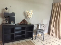
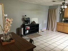
    @ Ann I'm attaching a picture of one of the main kitchen/dining room walls. In the picture you can see to the right samples of gray silt and mushroom ( please forgive the unpainted baseboard trim & the obnoxious coffe pot).
    Anyway, this wall has given me the most trouble because the window is directly in front of it, therefore the color one minute is different the next lol

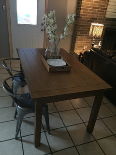
    Also, the two dining chairs are going with my new dining table ( another hassle I'm dealing with)
  • 11 years ago
    @ Ann I almost forgot, here is the color next to the fireplace. The swatch in this photo is also mushroom.
  • 11 years ago

    Hi Chariss93

    Ok you ready?

    There's 7 total. All are Sherwin Williams

    khaki shade, urban putty, Fenland, basket beige, macadamia, loggia and stone lion

    These colors have less red undertones, but more gold than some of the samples you've tested.

    I do not want you to waste money on more samples, so I suggest you pick up 3 paint chips of each color---tape them together and tape to your wall. Post photos of each color and then we can decide which one (s) to sample.

    Hope this is helpful. Looking forward to seeing the photos. :))


  • 11 years ago

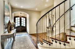
    Here are photos of Khaki Shade and Macadamia...

    Model Home, Starr Homes LLC · More Info

    Mediterranean Entry · More Info

  • 11 years ago
    It would appear that your sofa has a pink undertone, so your wall color needs to have a pink undertone as well...make sure that the greige you choose goes not have yellow or green undertone. That could be why the colors you tried look wrong? Also might I suggest you use larger color samples: paint 11x17" board (s) that can be moved about the room to get the true picture during different times of the day....
  • 11 years ago
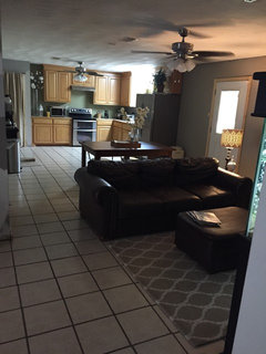
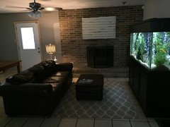
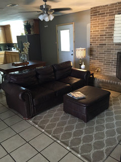
    @ Natalie I went through the colors you suggested. Thank you very very much by the way. I picked my favorite two loggia and stone lion, loggia being the most favorite. I ended up scraping stone lion because it read very orange in some places. Loggia was PERFECT for my hallway, however reads very light grayish in my kitchen/dining area. I thought it was because I have fluorescent lighting above my sink, turned it off and it was still not flattering. It's so weird because my hallway has fluorescent lights and loggia reads a beautiful taupe there. So, I'm going on a limb here and took many many pictures of my entire space (reluctantly so, because i know there's so much work to be done) that way you could really get a feel for the area.
    With all this 'color trouble' I am wondering if I should just stick with the current rockport gray, but I just don't know if it really fits the space. My partner says it has really grown on him. So, to make a long story short, the pictures will show what I am working with. In the next few months we plan to install a pendant above sink, recessed lighting in kitchen and over fireplace, and under cabinet lights too (just waiting so we can afford what we really want instead of settling). Just give me any criticism, advice, decor suggestions, anything that might help me pull this space together. There's many pictures and I know you have a life, but if your willing to help I'm willing to listen :)
    Side note: I'm really trying to go for a cozy natural feel. You know natural rugs and materials, cream linen pillows maybe. It doesn't have to be bright and happy :)
  • 11 years ago
    Continued.
    The picture with sample beside fireplace is loggia, and the picture of the bright swatch behind coffee bar is loggia as well
  • 11 years ago
    last modified: 11 years ago

    Hi---how did you know I was thinking about you? Your ears must have been buzzing. :)) Thanks---glad to hear you liked the Loggia-at least in the hall. :)

    Ok, a couple of things I'm noticing right away---first, there is a green cast in your space-so, I need to figure out why---I'm guessing it's your ceiling color. If you know the name, please let me know. I don't think it's the green by the cabs---couldn't be the fish tank, no?

    The other thing, is there is a lot of small linear shapes in the space, the floor tiles, the fireplace brick, the art above the fireplace, even the rug-though it does have curves, the pattern is small. I think a rug with a large organic pattern and a couple of toss pillows will soften those lines and make that area more inviting.

    New lighting will really help. If you're open to ideas I will make a suggestion that I think would be an improvement---paint or stain your cabinets. Add a backsplash too. Also, the drape, is that a pantry? You could switch it out to a bifold door from Lowes or Home Depot.

    Lastly, I like the Loggia by the FP--not sure over by the coffee bar---I think the mix of natural light and artificial light bouncing off the ceiling color is really changing the hues. Tell me, a do you have a lot of trees outside those windows? If so, then that's something else to consider.

    Let me know your thoughts about some of those things I mentioned and I can offer more advice.

    Thanks again for getting back to me-happy it worked out.

    Talk to you later. :))

  • 11 years ago
    @ Natalie, thanks for your suggestions. To answer some of your questions first. Behind the curtain is a pantry which also houses a portable white dishwasher. It is a tab bit deeper than the pantry so I had to take the door off in order to "hide" it. But maybe soon we can get a matching one and get some new doors on. The ceiling is painted white, I'm guessing just a standard white, we have not repainted them since we bought the house. Outside the kitchen window is a huge banana leaf tree that is super neon green, it blocks a lot of light so this winter when it dies down we plan on digging it up and hopefully it don't come back ( they are very hard to kill off). The aquarium is a whole other situation, LOL. My partner has been an aquarium enthusiast for years, it is big and obnoxious. But it won't fit anywhere else so I was obligated to let it be set up there, which was ok because in front of the fireplace is solely a sitting area. Right next to the sitting area is another open room which we use as the TV/living room. I will post pictures of that room soon so you can get a better idea of the flow.
    I too like loggia, but am so hesitant because the color looks so odd on the wall where the coffee bar is, maybe it would look better I knew what decor should be put on at wall...it's an odd wall to deal with.And yes, I completely understand about the linear lines/ small patterns. I never really noticed that until you pointed it out. I think break up the floor maybe with some nice solid rugs might look good as well. Maybe even a solid 3x6 rug for the kitchen too? I have thought about staining the cabinets, or even refacing them if allowable. But I am lost as to what color or finish. Maybe having the stray cabinet to the left of the stove replaces with glass doors for an airy feel.
    Oh my, I knew that I was in for a journey when we purchased this home because not only is it our first but it was a fixer upper, but I never thought it'd be so hard to make it into a welcoming home lol. Thanks goodness for houzz.
  • 11 years ago

    When you can, upload more photos of your home and I'll give you some ideas... :))