Software
Houzz Logo Print
kennadysmama

Paint Ideas Please

13 years ago
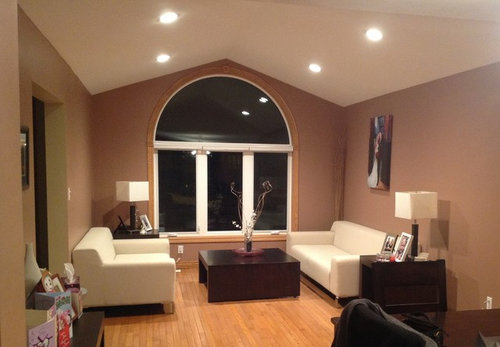
Hello,
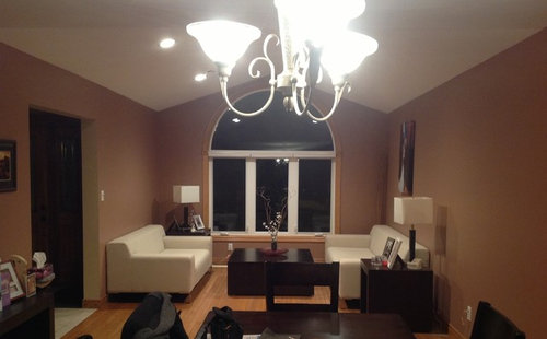
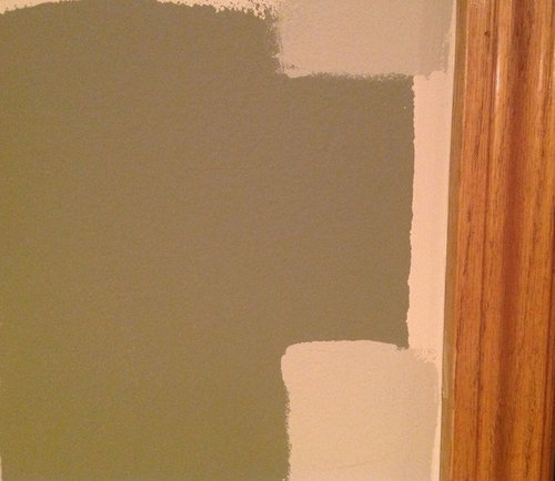
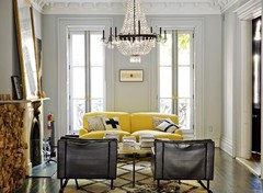
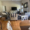
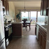
I am looking for an idea to paint my formal living room/ dining room combo in my house. Attached is two pictures of my space. The third picture is a picture of the other colours in my house. The green is my family room and we will be choosing one of the other two neutrals shown for my kitchen. Do anyone have any suggestions of a colour for my living/dining combo room? Thanks in advance for your ideas! :)

Comments (34)

  • 13 years ago
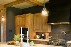
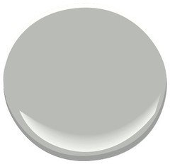
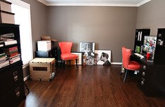
    I am so glad you said grey. That is what I was thinking. Originally I was thinking a slate grey (I love bold colour) but I was afraid it would be too consuming. I love this one picture I found but no one is sure of the paint colour. I thought something like this colour may look good in my space. What do you think?
  • 13 years ago
    I'd paint the living room white/off-white, along with the trim around the arched window, and change the lamp shades to a color...red or deep orange. They'll pop, and give a splash of color to the room. I'd add a fun rug in the seating area.
  • PRO
    13 years ago
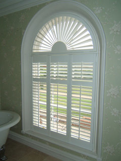
    I would recommend either Silhouettes or Shutters depening on the look your going for .They would both look great in the space.

    http://www.blindsdirectcanada.com/blinds-toronto/hunter-douglas/silhouette-toronto.html
  • 13 years ago
    You may want to start with a rug and take it from there.
    That said I also thought "grey". Check out BM Revere Pewter. You will probably want to paint all the trim around the window. I think the Grey will be nice and "fresh" with your light colored furniture and light lamp shades as well as with your darker furniture, and it will work with your floor. You can easily add color using fabric, pillows, and a rug.
  • PRO
    13 years ago
    What direction does your rooms face? North light is cooler and South warmer, if going grey would need to know this first or could create too cool of a room.
  • PRO
    13 years ago
    Also what accent colours would you like to add for cushions and things, as choosing the paint with the correct undertone will make these colours pop too.
  • 13 years ago
    Our Room is South Facing. :)
  • PRO
    13 years ago
    Ok good, so that is a warmer light, if you do a warm based grey it could go beige, so a grey with blue base would look better. Here is where your accent colours come in, to make those colours pop you need an undertone that is opposite. Do you have a colour you would like to introduce as accent?
  • PRO
    13 years ago
    Do you have a photo of your kitchen?
  • 13 years ago
    you may want to grab a grey from your external environment. tree bark grey. cool if you want the room cooler, warm if you want a warmer feel. also, determine which of the grey's responds well to natural and lamp light, as well as how your paint and light reflects your taste in art objects. enjoy!
  • 13 years ago
    I would like to use the green that is going to be my family room as an accent colour so it helps make everything cohesive :)
  • 13 years ago
    I guess I should say, I would like this to the accent colour...but I am open for ideas!
  • 13 years ago
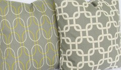
    My husband likes these. :)
  • PRO
    13 years ago
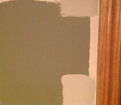
    What is colour name? It is not showing well for me.
  • 13 years ago
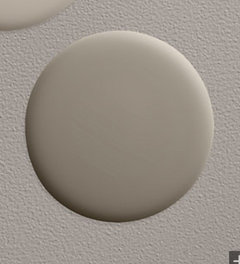
    "Deserted Island" by Behr UL190-2
  • PRO
    13 years ago
    Hmm, I find it a bit muddy. Could you post a picture of the family room.
  • PRO
    13 years ago
    I like your cushion choices, they would work very nicely in your living room. Not just for colour but the print is very appropriate.
  • PRO
    13 years ago
    Without seeing the family room, I would suggest a green that is a bit fresher looking, especially in combination with grey.
  • 13 years ago
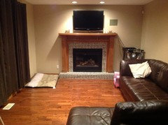
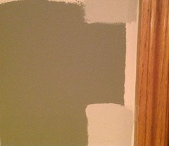
    Here is my family room. Please excuse the paint swatch taped to the wall, my dog bed which does not belong there and my daughters princess chair...also does not belong! lol But this gives you an idea.
  • PRO
    13 years ago
    That's what puts the family in family room! Can you take a close up of the tile around fireplace? Thanks!
  • PRO
    13 years ago
    kennadysmama, I really like what you have going on. I love the grey in your photo. It would be super sophisticated with shimmery silver linen pillows or more casual and just as great with the pillows your husband likes but those read a little more casual to me. I agree that a more vibrant green would be better for the family room. Think mint, sea foam or green apple. It would work well with the leather sofas too. Maybe add the grey and green pillows there.
  • PRO
    13 years ago
    I like Coventry Grey by BM for your living area, and perhaps Sabre Gray for the family room. The Sabre has a green undertone that would work with the woods and the leather. Coventry has a cooler undertone which would work very well in that Southern exposure. Whatever you do though, get some small testers and paint a 12x12 card and tape to walls and view at different times of day to see how you feel about it. If you like the colours you may want to go up or done one as well and try them too.
  • 13 years ago
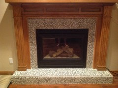
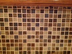
    Thanks for all the help! :) This is the close up of the fireplace. Also @Edits! Interior Inspirations- which grey are you speaking of in the photo? There are a few and I just want to make sure I am looking at the right one.
  • PRO
    13 years ago
    Those tiles have some browns and what is the other colour? Is it a dark grey? I also see a creamy white?
  • 13 years ago
    There are different shades of brown and cream glass tile and there is also slate tiles- so many have a blue or grey colour to them but there are also some rust coloured pieces as well.
  • PRO
    13 years ago
    The green paint you chose for the family room is almost a warm gray so if you prefer that direction then go for a gray green. You just need contrast for the white furniture in the living room and the walls need to have a haromoious flow from room to room. Choose any accent color you like for pillows and fincd a large scale painting in colors you like for the windowless wall opposite the entry in the room. Back to the family room. It is hard to see in the photos what the fireplace tile surround is. It looks like gray and white speckles. If that is true then you need to rethink the green color pallette and go with a warm gray color. I would also consider painting the fireplace off white or gray. Better yet have a more contemporary surround built. The natural colored wood and traditional stying does nothing to carry the contemporay direction of the living room into the family room. I agree that plantaion shutters on the window would look great. We do not see the dining room in any of your photos other than the chandelier which I recommend you change out to a more contemporary fixture as simple as a drum shade and hanging lower over the table (the bottom of the fixture 36" off the top of the table).
  • PRO
    13 years ago
    last modified: 13 years ago
    PS - change out those 6" recessed cans in the living room ceiling to 4". An area rug would anchor the seating area in the living room and give you another opportunity to add color.
  • PRO
    13 years ago
    Kennadaysmama, did you want other advice besides paint colour direction? Please let us know what other areas you would like help with.
  • PRO
    13 years ago
    kennadysmama, I was speaking of the kitchen with the grey walls and tile. I also like coventry grey that Susan Mills suggested, it is lighter than the kitchen grey. People have lots of different words to describe paint colors and it gets confusing if you are new to this. I think a good rule of thumb is to match tones in wall colors so you wouldn't use the warm green you started with in a room next to a cool grey generally speaking. So if you love that green, it would be a great match with coventry grey if you like the idea of a cool grey then a cool green like a green apple would be a better choice. I was thinking cool because I thought it would be great with your living room furniture. Hope that helps.
  • 13 years ago
    OK great Thanks!
    @ Edits! - Thanks for clarifying :) That makes sense to me. I am very new to this so even the idea of warm and cool colours is a new concept for me. So thanks very much.
    @ Susan Mills Design- I am open to any suggestions. I know my house needs some direction. The only thing we cant do is paint any of the oak (trim/floors/etc.). My husband adores it, I don't mind it -and we have decided it is going to stay. I know it isn't the most contemporary, but its what we have decided to work with! :) Also thank you for all of your ideas so far. I really appreciate it!
  • 13 years ago
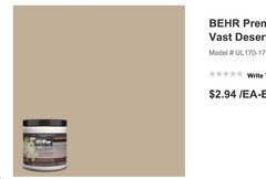
    As for the other colours in the house- I am lucky in the fact we are painting everything. So I really do not have any other wall colours I have to 'work with'. As for the neutral we were going to pick for the hallways, and up the stairs to our second floor- we were thinking either 'vast desert' or 'nile sand' both by Behr. I have attached a photo of both! They are also the two on either side of the green. :) We currently have a light tan with yellow and almost pinky undertones...and I hate it, so I wanted to go a different direction with that.
  • 13 years ago
    Also- I guess I should mention the other colour we were thinking of for the dining room/ living room combo was "Slate" by restoration hardware - but by the feedback giving so far, I am going to assume that may be too dark? Attached is just some photos of the paint- but as you know- its so hard to know what it would look like in your space with your lighting.
  • 13 years ago
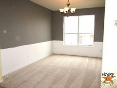
    We have had both darker grey and lighter in our living room, and preferred a slightly lighter shade such as this one. Benjamin Moore Stingray

    Woodinville Retreat · More Info

    Woodinville Retreat · More Info