Software
Houzz Logo Print
deborah_masterson

Help! What to paint my aqua kitchen??

9 years ago
last modified: 9 years ago
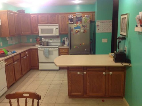
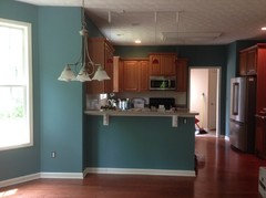
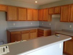
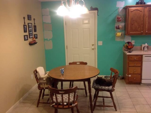
Two years ago I painted my kitchen from red to this bright aqua (I know I know it's really bright! ... I blame pregnancy hormones at the time)

I have never loved it and convinced my husband to let me paint it again...but I just can't decide what color will look best! Those oak cabinets are tough! And on top of that, it joins a wall of another color that it needs to look good next to as well (which I cannot change because it connects to living room and entryway). I should also note that we do not want to paint the cabinets.

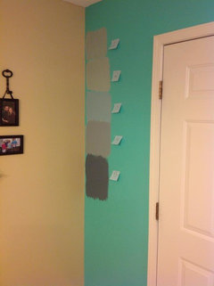
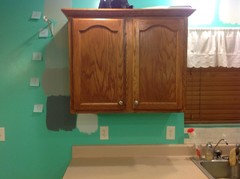
As you can see we have already put some samples on the wall but I still don't feel like I've hit the nail on the head yet.(Or maybe we have and I just don't see it!)

If you want to know what colors they are they are all Valspar and from top to bottom on the second picture...

1. Air Kiss

2. Dewdrop

3. Restoration Hardware's Silversage (mixed into Valspar)

4. Winter in Paris

5. Sparkling Sage

We are really open to different options. We just want it to look more calm and relaxing.

Comments (32)

  • 9 years ago
    I like the third (middle) color best.
    Deborah Masterson thanked Laurie Hutch
  • 9 years ago

    Thank you both. I'm not sure what that beige color is on the other wall but it might be in our garage! If I can find it, I will look into colors that go with it. I agree that the ones we chose so far are boring (I think my husband actually used that same term!)


  • 9 years ago
    last modified: 9 years ago
    Our house has a room that is a similar beige color. It looks nice with a light sage green next to it. I don't think you need to go completely away from color, just need to move towards one that isn't as bright.

  • 9 years ago

    We were thinking greens! The bottom sample is actually a sage color but is just too similar to the wall next to it. Maybe a lighter shade of sage...

  • 9 years ago

    I've also been looking at several shades of blues

  • 9 years ago
    You have a great opportunity to go with two colors here for a warm and vibrant look. The soffit can be a deep paprika and the walls a complimentary cumin that would still have some pop but be fun and exciting without the shock.
    Deborah Masterson thanked Deepali Tracey
  • PRO
    9 years ago
    I like the rustic colors in Sherwood Williams they are luxurious, calming and elegantly vibrant. They also bounce off other colors well. The brasin blue is really nice.
  • 9 years ago

    Thank you! I will look into those!

  • 9 years ago
    last modified: 9 years ago

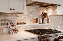
    I think it would be really helpful to put in a backsplash and then build your color scheme. A backsplash adds interest and texture.

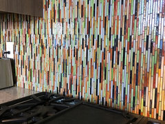
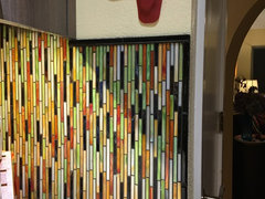
    Yay! Here's my backsplash... not sure why the photo didn't come through before...it looks more complex than it is. It comes in sheets of the little glass "straws" my walls are painted a light creamy yellow


    This is my newly remodeled kitchen. I love this crazy backsplash! Your instinct to do something bold with the aqua makes sense to me because of your neutral flooring. Your cabinets, in my opinion, are the strong suit of your kitchen. I would go with something warm with the paint color and maybe something really fun with the backslash... you obviously love color!

  • 9 years ago
    It would really help you see the true color of the paint if you used test boards painted in your choices rather than seeing them on the wall surrounded by your aqua.
    Deborah Masterson thanked Lynn Davis
  • 9 years ago

    That's a good idea! The aqua is definitely distracting

  • 9 years ago

    Thanks Tricia! I do like color! I wasn't able to pull up your photo but id love to see it

  • 9 years ago

    found another user here with similar kitchen to mine...what do we think of this color?

    Its peacock plume by Sherwin Williams

  • 9 years ago


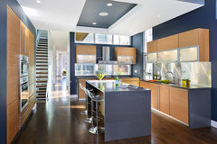
    Bucktown Modern · More Info
    I like this gray/blue color
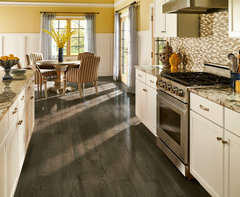
    Traditional · More Info
    and I am posting this one because I like the wainscoting. I like the peacock plume you posted, too!

    Deborah Masterson thanked kaye1951
  • 9 years ago

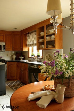
    My kitchen is oak and it is here:

    https://www.houzz.com/photos/my-pics-work-in-progress-phvw-vp~58830325

    https://www.houzz.com/photos/my-pics-work-in-progress-phvw-vp~71048330

    My paint is Valspar Churchill Hotel Ecru which is a great match to my backsplash. The backsplash color matches to Valspar Mystique.

    Another person with an oak kitchen did a green, though it is hard to see in the pic but it is in the comments section of this post if you are looking for ideas for oak kitchens:

    https://www.houzz.com/discussions/affordable-update-dsvw-vd~4347799?n=13

    In general, cool grays do not work well with warm wood tones. Neither brings out the best in the other. Cream, creamy beige and blues and greens work best. The blues and greens can have gray undertones.

    Here is an article about "grays" that work with warm wood tones. These grays are mostly really blues and greens. A sage green would be a good way to go. Usually, Valspar paints can be matched to other company colors.

    http://www.housekaboodle.com/gray-paint-colors-with-wood-trim/

    If you are thinking of doing a backsplash it is a good idea to do counters first if you are thinking of changing them too. Backsplash can get damaged by new counter installation or there can be gaps if the new counter and old counter are different thicknesses. If you are saving for countertops (not saying you need to) then you could do the peninsula in butcher block and save some money - something I did. I got mine from Menard's and it has held up just fine.

  • 9 years ago

    I like that peacock plume as well. I think something in the blue will blend well w/the goldish tone from the other wall, and go w/the oak cabs.

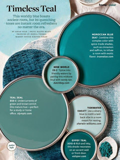
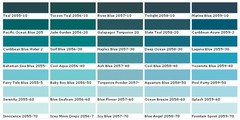
    some other teals. you can always lighten these by 25-50% too. get a few samples. And with Valspars paint guarantee, if you don't like the color once your try it out, return it and they'll mix you something new! Can't beat that! (even though I dislike their paint, they do have some great colors)

  • PRO
    9 years ago

    Selecting colors in the green and blue family will accentuate the orange of your cabinets.

  • 9 years ago

    Consider tile-look wallpaper for the walls that have cabinets (both walls of the L) or just as a backsplash. Then choose a color from it, something neutral, for the other walls.

  • 9 years ago
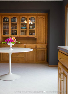
    Galveston Gray BM
  • 9 years ago

    I like the teal colors above, but if you use a bluish green rather than a warmer color, the reddish/orange tones in the stain on the cabinets will pop out because of the complimentary color aspect. The cabinets are nice, so if that's what you want, go for it!

  • 9 years ago

    Tricia Wood, I love your backsplash!!!! My kitchen and, it looks like, Deborah's kitchen have a ~4 inch back splash in same material as the countertop. Design-wise, does it work to install a different material to bring the backsplash up to the bottom of the cabinets?

  • 9 years ago

    Kaye, Although mine isn't done that way, if the small 4" backsplash and the bolder statement you might want to make with one similar to mine had some of the same color tones-- it might work... here's how mine is transitioned:

  • 9 years ago

    New samples!

  • 9 years ago
    last modified: 9 years ago

    I think the second from the bottom is my favorite, number 4. And after that, number 3.

  • 9 years ago

    Number 2

  • 9 years ago

    I like number 3

  • PRO
    9 years ago

    Looks like that other wall is kind of a pale ochre? For a neutral I'd suggest maybe Choice Cream or Prairie Grass from SW. Or if you want something more colorful, Anchors Aweigh, Quietude, or Dress Blues could be really nice.

  • 9 years ago

    You need to get a large piece of sample board - I am not sure what they use - maybe foam board and paint your top two favorites in a much larger sample. Also, since you will need two coats to cover the aqua anyway, consider doing a light cream or even white to neutralize the room first before making a final decision. Then you can paint large areas with the sample jars. Right now the aqua is reflecting onto the samples and possibly showing through the samples and distorting the color.

  • 9 years ago

    You are right! I think the aqua is throwing them off too

  • 9 years ago

    You will get the best result if you prime first when going from a dark color to a much lighter color. So I would follow the advice above from jhmarie and prime the walls first in order to get a blank slate for color selection.

  • 9 years ago
    Look at Sherwin Williams Wheetgrass. It is an earth green. I had the same oak cabinets that you so, and they really complement d each other well.