Software
Houzz Logo Print
vadim_vilensky

Dining Room Improvements

9 years ago
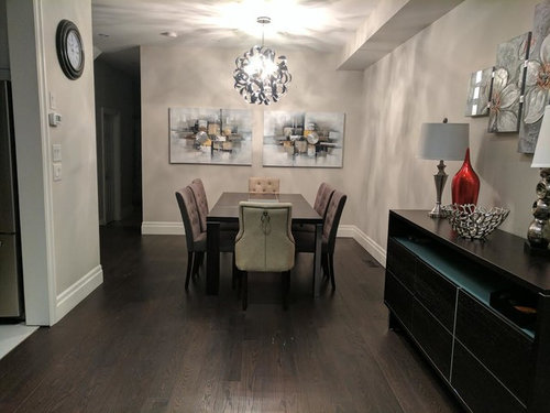
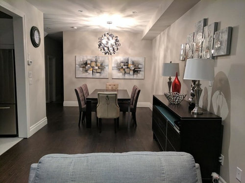
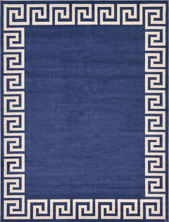
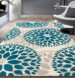
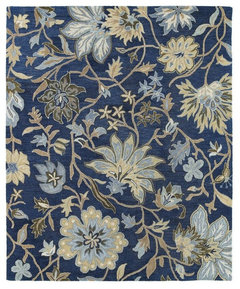
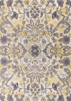
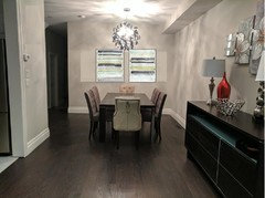
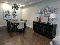
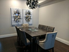
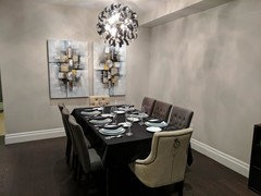
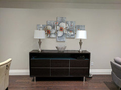
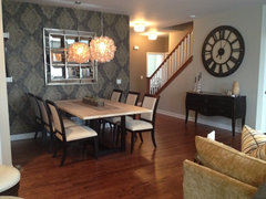
Do you think these new painting fit our dining room? We were thinking to add extra colour to these paints, add a large colorful carpet and accessories (navy blue). Any new ideas will be much appreciated


.

Comments (45)

  • 9 years ago
    I am sorry but it is super boring IMO.
    You need one large painting with color and a more free flow style.
  • 9 years ago
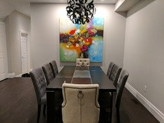
    Thanks for the feedback. We tried this painting first but it was conflicting with the light. We thought of adding colour to the new paints.
  • 9 years ago

    Wow, that's some serious input. Thank you! We are planning to add a navy blue carpet, center piece is still to be decided, but most likely something with lots of colour.

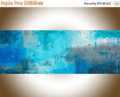
    What kind of narrow rectangular painting did you have in mind?

  • 9 years ago

    But more narrow perhaps. Dunno if you'll have to paint the walls a different color.

  • 9 years ago
    Small thing, I think the clock should come down on the wall. That is if it stays
  • 9 years ago

    I think the problem here is the chandelier...it's much too bright,and you can see the bulbs through the "frame". The chandelier should be about 34" inches above the table. Your looks much higher...if it is,lower it. If you like the paintings,keep them but I think you could be better...something with more colors but soft colors.

  • 9 years ago
    Have you ever tried hanging the art vertically...you also have some yellow in your painting
  • PRO
    9 years ago

    The two horizontal artworks don't seem the right shape for the room

  • 9 years ago

    Just my opinion but I think art work should be hung the way the artist intended...

  • 9 years ago
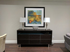
    We tried the other option, it actually looks much nicer now. We will add bright colours to the painting this weekend, navy blue, yellow, and other colours to brighten up the paintings. Then we will decide on a carpet (navy blue). any other thoughts?
  • 9 years ago
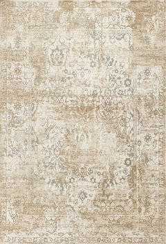
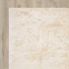
    Claire, the second carpet is beautiful. Where is it from?
  • PRO
    9 years ago

    Much better.

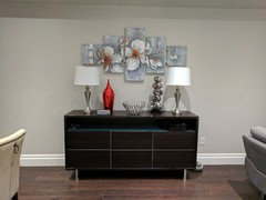
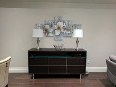
    Flower art over sideboard looks a bit cheesy, IMO. Not something a design professional would select for a space, but it's your home.

  • 9 years ago

    We are not designers, next house for sure we will hire an interior designer :) But with this home, we work on a limited budget.

  • 9 years ago

    You don't need an interior designer; you just arrange things that feel comfortable and true to your personalities. And then there's your friends on Houzz!

  • 9 years ago

    Haha, the friends at Houzz help a lot. Here is a great example of my recent kitchen reno. Still missing the crown moldings but a lot of the input came from members on Houzz :)

  • 9 years ago

    Looks like something out of a magazine!

  • 9 years ago
    Wayfair
  • 9 years ago
    last modified: 9 years ago

    Thank you everyone for the suggestions and the feedback. We had friends over last night, and they all asked where did I get these paintings from. Once the carpet arrives and some decor items, it will be a perfect picture :)

  • 9 years ago

    Cool, and don't forget to move the clock to another location.

  • 9 years ago
    different location or lower? We would like to replace it with a larger clock.
  • 9 years ago

    Yes, a larger clock that is lower. You can lower this one, until you get the new one.

  • 9 years ago

    No clock in this elegant room.

  • 9 years ago
    I have a question...what kind of decor do you have placed on your coffee table
  • 9 years ago

    No clock, please.

  • 9 years ago

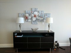
    I also feel the art above the buffet is a little high, the two lamps need to be pulled towards each other a bit, and I'm not crazy about that intense red vase. Just doesn't seem to fit the room. MHO

  • 9 years ago

    I see what you mean about the red vase. How would you improve the look of the buffet? How low should we place the painting? Will two to three inches lower work?

  • 9 years ago
    last modified: 9 years ago

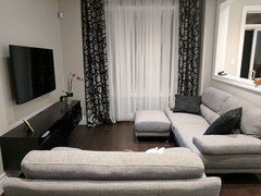
    Claire, we don't have a coffee table. Here is a picture of our living space. We will add colourful pillows soon. Anything else we can improve?

  • 9 years ago

    I think personally I would try looking at lowering art about 3 inches, remove everything but the two lamps you scoot towards each other a bit and leave bowl in middle. Could you try that and post pic?

  • 9 years ago
    Lol....someone's fixated on the clock
  • 9 years ago

  • 9 years ago

  • 9 years ago
    What stlparks says.

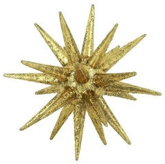
    Do you have an entryway table you can put the ornate piece there or on the dining table. Does it come in different sizes and you can put the vase next to your tv with a smaller decorative piece next to it like this.
  • 9 years ago

    Your home is beautiful!

  • 9 years ago
    I love your room, you have done a great job, may put some pro designers to shame. Enjoy
  • 9 years ago

    The right clock would be nice in this space. It helps with not putting artwork on every wall.

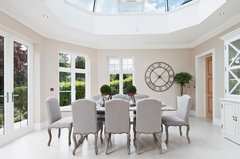
    Beechwood Manor · More Info

    Dining space · More Info

  • 9 years ago

    For your living room, my first thought was the drapes overwhelm the room. If you added more than a few colorful pillows, that would certainly help. But I'd lighten the drapes. Actually, I'd have only decorative blinds. The drapes sort of crowd the room.

  • 9 years ago

    I think you've done a very nice job with this space. I like the minimalist nature of it. If you keep the current art over the buffet, I'd add just a few touches of orange through the rest of the space, just enough to unify, not enough to overwhelm.


  • 9 years ago

    Thank you all! I will make some minor changes today and will upload the pictures. We will be adding a carpet under the dining table, which will have lots of colour. Perhaps we should also add a carpet in the living space? That will add and break the grey/black/white colours currently in the space. Thoughts?

  • 9 years ago

    Oh, the small tweaks to the credenza and lowering of the art sure made a difference. Listen to Grover about a touch of orange in the living room. Good job!

  • 9 years ago

  • 9 years ago
    I hanged the painting as per your suggestions. About 3" lower from the previous try. I feel like it needs to go above the lights, what do you think? Either way, it is way better than before.
  • 9 years ago

    It's fine for the lamps to overlap the painting. It makes the whole vignette feel more connected.

  • 9 years ago

    Beautiful home Vadim. And the kitty's orange toy is just perfect....just what Grover suggested! Bits of orange with your idea of navy could work very nicely.

    Have you changed the bulbs in the chandelier yet? Is it on a dimmer?


  • 9 years ago
    Thank you, couldn't have done it without everyone's help. The chandaler will soon be 36" above the table and the switch will be changed to a dimmer, so we can control the light :) Tried to replace it with LED lights instead of the G9 bulbs but it wasn't it.