Software
Houzz Logo Print
uneke2

Chevron or Herringbone Backsplash?

8 years ago
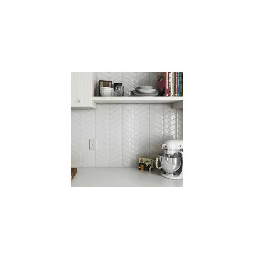
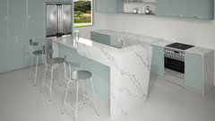
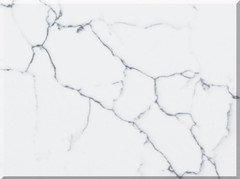
I am doing a white modern kitchen ( high gloss, plain cupboards and quartz large format marble-look counters in white with some black veins).


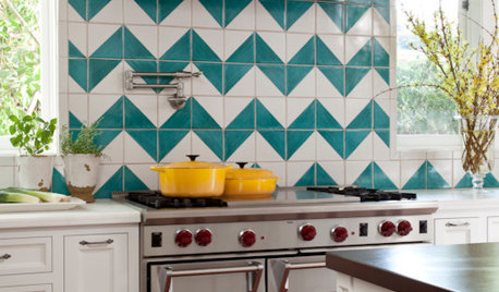
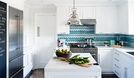
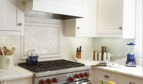
Should I do a chevron pattern like this example?


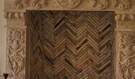
Or a herringbone?


HGTV House Hunters Renovation - Culver City · More Info


Does the chevron look more contemporary?


Thanks!

Carolyn

Comments (23)

  • PRO
    8 years ago

    Carolyn thanked BeverlyFLADeziner
  • 8 years ago

    Herringbone gets my vote. And the slight contrasting grout really adds to it IMO. And I like they way they carried it up the wall to the range hood.

    Carolyn thanked mvcanada
  • 8 years ago
    I also love the herringbone.
  • PRO
    8 years ago

    Herringbone is a traditional, many centuries old pattern, that emerged from the tile production centers of Europe and north Africa. A chevron is much more contemporary.

    Or avoid the traditional aspects of both of these and stack the tile. Or make it even more so by stacking it vertically.

  • 8 years ago

    Thanks Michael for the background on these designs. I was thinking the chevron is more contemporary, and so I leaned to it. So what is it about the herringbone that people are drawn to?

  • PRO
    8 years ago

    Have you selected a tile?


  • 8 years ago
    True, I am drawn to old-world charm, which might be why I choose herringbone. But I feel like the nature of the tiles (white, glossy) can still lend to your contemporary look.
  • 8 years ago
    Thanks for the background on the herringbone. I don't recall seeing it in kitchens until recently though. I was afraid it could be placed at 2017-2018.
  • PRO
    8 years ago

    Nope, its been around for ages.

  • 8 years ago

    I vote for chevron. It is more contemporary and more fitting for how you described your kitchen.

    But it depends on the counter; do you have photos of the counter top material. My concern is if the veining is distinctive and prominent, the tile might be too busy.

  • 8 years ago

    ci_lantro.... you must be a foodie with that handle. :-)

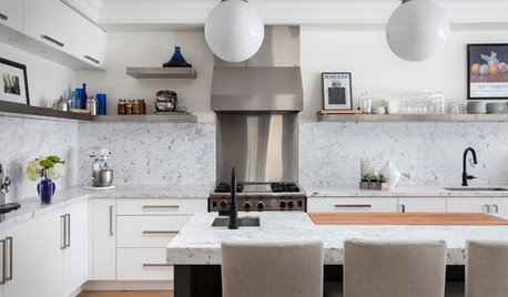
    Here is the counter look:


    What say you? OMG I must be getting weary - resorting to Shakespearian turns of phrase.

  • 8 years ago

    Michael. I have not yet selected my tile. And to make matters worse I just popped out to a tile store, and I found other options. I am so shiny-object driven.

    So I now have 3 in mind:

    1. The white chevron, but perhaps in a matte.... since the cupboards are a high gloss white.

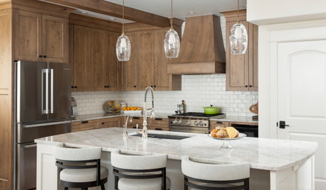
    2. Going back to this 3D organic look white tile..... because I am really drawn to the look. (And bonus it is amazingly well priced)


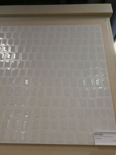
    3. And this gloss on matte look.


    One factor I am unsure about though is the tone of white. The chevron would be a white - white similar to the cabinets. The other aren't quite as white - white. There is a biscuit or slight cream undertone to them. Does this matter much. AM I being too matchy-matchy?

    In the post above this, at the behest of ci_lantro, I posted examples of the countertop.


    Ci_lantro, or anyone else in this thread, do you have thought too on this?

    Thanks!!

  • 8 years ago

    I like it with out a back splash! Clean and modern as is. Maybe add clear glass for ease of cleaning. Stunning kitchen!

  • 8 years ago

    Like Kilpatrick above, I like stacked tile, too.

  • 8 years ago

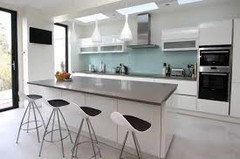
    Roarah.....Neither of these are my kitchen. Just examples from Houzz photos to show the 2 tile styles installed.

  • 8 years ago

    I definitely think your whites should match. Since all of the patterns you chose are pretty, get the one with the "right" white. If you don't, your backsplash is going to look yellowish, which is probably not what you want.

    Carolyn thanked kariyava
  • 8 years ago

    Kariyava....I think you are right. Now that I picture it, it would look off.

  • PRO
    8 years ago
    last modified: 8 years ago

    I would not do a shiny tile i a patteren with high gloss cabinets your eye needs some rest from all the gloss. Definately not 3d tile a pain the keep clean. If you want something gloss have you looked at back painted glass in a color it could be quite wonderful

  • 8 years ago

    Patricia....So I could go a white matte chevron?

    I do like the look of back painted glass. I hesitate to pick something with colour for a permanent feature for this open concept condo. I would be locked into that for my colour scheme.

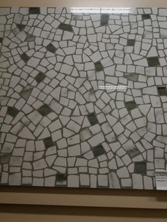
    What about a pattern with white in it? Perhaps something like this???.....it is a 2'x2' tile.


  • PRO
    8 years ago

    Carolyn,

    Keep investigating the pattern idea. I think that could be very interesting. And do avoid whites that don't match- it either has to be bang on or don't do it. And I agree with others - you need a counterpoint to the high gloss cabinets so a matte option would be a good one.

    Back painted glass is lovely - it will have the same gloss as the cabinets, if not more, unless you go frosted front which is difficult to clean (not recommended) and back painted glass is generally VERY expensive.

    Have a look at some of the organic patterns from Fireclay tile. They are more $ than Home Depot specials but their product line is interesting and the colors are amazing.

  • 8 years ago

    Hi Michael.....Thanks for the suggestion re Fireclay. They certainly of have some very interesting shapes. Really like the one they call Chaine Homme that look a bit like puzzle pieces. However, the ones I like are well above my budget.

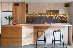
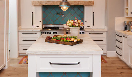
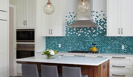
    I found this backsplash which uses the diamond shape and amps up the creativity by inserting some colour asymmetrically. That might be a way I can get an interesting backsplash on a budget. Just need to find such matte tiles in Toronto now.

    What do you think of this look for my white modern kitchen?


  • PRO
    8 years ago
    last modified: 8 years ago

    Carolyn, This is what I tell clients when they suggest this sort of thing... You have to design it and draw it up. Not because I'm lazy, but because you have to love it and take full ownership of it. If you don't or you hesitate at all on the idea then you will tire of the pattern very quickly. That said...

    Have a look at Daltile or Centura. Both make less expensive lines and are very good products. A Daltile option could be their Modern Kaleidoscope. It has a nice smaller pattern that won't overwhelm. And the greys make it a good backdrop for colorful countertop accessories... Meaning the ubiquitous bowl of green apples.

    The Centura "Chez Moi" tile could also be nice. Choose a soft tile color, keep it monochromatic, set it vertically and pair it with a bold grout line.

    Another option... Have you ever been to a ReStore? There are several in the GTA. They often have small quantity, end of lines of tile that you can pick up for a good price and you are supporting a great cause. I have done several small jobs where we picked up decent tile at the Restore. The draw back is that you need to go regularly if you don't see something you like as the stock rotates a lot. Or maybe if you like to shop that's not a draw back :)